

International Debt statistic 2013
.pdfO V E R V I E W
GNI, the decline in net capital flows was more striking: from 6.2 percent of GNI in 2010 to 4.9 percent in 2011 and well short of the 8.5 percent recorded in 2007. The downturn was driven primarily by the collapse in portfolio equity flows, which plummeted to −$2 billion, compared to a net inflow of $120 billion in 2010. In contrast, foreign direct investment continued its upward trajectory, rising by 11 percent in 2011 to a record high of $644 billion. As previously indicated the 10 percent decline in debt related flows in 2011 resulted entirely from the fall in net debt inflows from official creditors. Foreign direct investment was the single largest component of capital flows to developing countries in 2011, 58 percent, up from 48 percent in 2010. Many developing countries benefited from a further increase in workers’ remittances which were up 12 percent over their 2010 level to $355 billion (table V.1).
Foreign Direct Investment
Around half of global foreign direct investment in 2011 was directed to developing countries, with investors attracted by improvements in the
business and regulatory environment and relatively high economic growth. In common with 2010, an important share of the 2011 investment resulted from cross-border mergers and acquisitions (M&A), which typically respond more rapidly to changes in economic conditions, but greenfield investment held steady and, importantly, two thirds of this was directed at developing countries. SouthSouth investment, i.e. by one developing country in another, fell by 5 percent in 2011 due in part to repatriation of intercompany loans by Brazilian investors and stagnant flows from East Asia. However, South-South investment accounted for over 25 percent of global foreign direct investment.
Among developing countries the 10 largest recipients of foreign direct investment continued to dominate the direction of flows—as a group they absorbed over 70 percent of net foreign direct investment in developing countries in 2011, but individually, trends differed. Most of the top 10 recipients saw inflows increase from their 2010 level but with considerable variance in the pace of increase. It ranged from 12 percent in Chile to a doubling of
Table V.1. Net Capital Flows to Developing Countries, Equity and Debt, 2001–2011
$ billions
|
2001 |
2002 |
2003 |
2004 |
2005 |
2006 |
2007 |
2008 |
2009 |
2010 |
2011 |
|
|
|
|
|
|
|
|
|
|
|
|
Net private and |
|
|
|
|
|
|
|
|
|
|
|
official inflows |
216.9 |
171.9 |
264.7 |
373.3 |
513.1 |
705.8 |
1,180.2 |
812.6 |
701.7 |
1,211.1 |
1,106.8 |
Percent of GNI |
3.8 |
2.9 |
4.0 |
4.7 |
5.4 |
6.3 |
8.5 |
4.9 |
4.3 |
6.2 |
4.9 |
Net equity inflows |
165.7 |
163.3 |
183.8 |
252.8 |
374.3 |
505.7 |
692.3 |
583.3 |
542.1 |
702.9 |
642.2 |
Net FDI inflows |
159.0 |
155.0 |
157.4 |
215.9 |
306.6 |
398.0 |
559.4 |
636.9 |
427.9 |
582.7 |
644.4 |
Net portfolio equity |
|
|
|
|
|
|
|
|
|
|
|
inflows |
6.7 |
8.3 |
26.3 |
36.9 |
67.7 |
107.7 |
132.9 |
–53.6 |
114.2 |
120.2 |
–2.2 |
Net debt flows |
51.2 |
8.6 |
81.0 |
120.5 |
138.8 |
200.1 |
487.9 |
229.3 |
159.7 |
508.3 |
464.6 |
Official creditors |
30.9 |
6.8 |
–11.9 |
–24.3 |
–64.3 |
–68.9 |
1.6 |
30.4 |
81.0 |
73.2 |
30.0 |
World Bank |
7.4 |
–0.5 |
–2.6 |
2.4 |
2.6 |
–0.3 |
5.2 |
7.2 |
18.3 |
22.4 |
6.6 |
IMF |
19.5 |
14.2 |
2.4 |
–14.7 |
–40.2 |
–26.7 |
–5.1 |
10.8 |
26.8 |
13.8 |
0.5 |
Other official |
4.0 |
–6.8 |
–11.7 |
–11.9 |
–26.7 |
–41.9 |
1.6 |
12.4 |
35.9 |
36.9 |
22.8 |
Private creditors |
20.3 |
1.7 |
92.9 |
144.8 |
203.1 |
269.0 |
486.3 |
198.8 |
78.7 |
435.1 |
434.6 |
Net medium and |
|
|
|
|
|
|
|
|
|
|
|
long term debt |
|
|
|
|
|
|
|
|
|
|
|
flows |
0.1 |
–1.0 |
38.2 |
86.1 |
118.0 |
171.1 |
284.8 |
216.0 |
60.9 |
177.5 |
245.3 |
Bonds |
19.1 |
14.0 |
18.8 |
37.6 |
45.3 |
33.6 |
66.9 |
–8.6 |
61.0 |
129.7 |
123.8 |
Banks and other |
|
|
|
|
|
|
|
|
|
|
|
private |
–19.1 |
–15.0 |
19.4 |
48.5 |
72.7 |
137.5 |
217.9 |
224.6 |
–0.2 |
47.9 |
121.5 |
Net short-term |
|
|
|
|
|
|
|
|
|
|
|
debt flows |
20.3 |
2.8 |
54.7 |
58.6 |
85.1 |
97.9 |
201.4 |
–17.1 |
17.8 |
257.6 |
189.3 |
Change in reserves |
|
|
|
|
|
|
|
|
|
|
|
(– = increase) |
–80.4 |
–157.0 |
–280.5 |
–393.0 |
–397.4 |
–625.1 |
–1,067.8 |
–448.9 |
–632.1 |
–702.0 |
–492.0 |
Memorandum items |
|
|
|
|
|
|
|
|
|
|
|
Workers remittances |
90.0 |
108.0 |
133.7 |
154.7 |
180.0 |
213.6 |
259.7 |
301.0 |
285.0 |
315.6 |
355.0 |
|
|
|
|
|
|
|
|
|
|
|
|
Sources: World Bank Debtor Reporting System, International Monetary Fund, and Bank for International Settlements. Note: FDI = foreign direct investment; GNI = gross national income; IMF = International Monetary Fund.
11

I N T E R N A T I O N A L D E B T S T A T I S T I C S 2 0 1 3
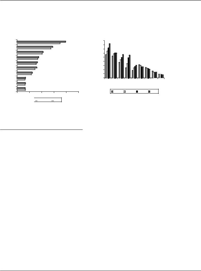
inflows into the hydro-carbon sector in Kazakhstan and a 76 percent jump in Turkey where investment focused on high value added, high-tech exportoriented projects, and cross-border mergers and acquisitions included two mega deals: BBVA’s (Spain) $5.9 billion acquisition of 25 percent of Turkiye Garanti Bankasi and Valleres’ (United Kingdom) $2.1 billion purchase of Genel Enerji. Among other major recipients, Brazil saw the net inflow of foreign direct investment rise 34 percent; net inflows to both India and Russia were up 22 percent. Only two countries in the group, China and Mexico, recorded a decline in net inflow of foreign direct investment in 2011, 10 percent and 6 percent, respectively (figure V.1). In China, inflows to the service sector continued to rise but those to the manufacturing sector are starting to come under pressure due to rising wage and production costs. However, China remained the single largest recipient of foreign direct investment among both developed and developing countries: it accounted for 34 percent of net foreign direct investment inflows to developing countries in 2011.
At the regional level, net inflows to subSaharan Africa rose the fastest, up 55 percent in 2011 to an all-time high of $41 billion. A rebound in foreign direct investment to South Africa, a continued rise in commodity prices and relatively positive outlook for the region as a whole underpinned the recovery. The traditional pattern of investment in oil and other mineral extraction industries continued, but 2011 also saw increased foreign direct investment in services (banking, retail and telecommunications) in response to the
Figure V.1. Net Foreign Direct Investment Inflows to Major Recipients, 2009–2011
$ billions
China
Brazil
Russian Federation
India
Mexico
Indonesia
Chile
Turkey
Colombia
Kazakhstan
0 |
50 |
100 |
150 |
200 |
250 |
300 |


 2011
2011  2010
2010  2009
2009
Sources: International Monetary Fund and World Bank estimates.
demands of the emerging middle class across the region. The net inflow of foreign direct investment to countries in Latin America and the Caribbean also reached record levels in 2011, $158 billion, 26 percent higher than their 2010 level, driven by expanding consumer markets, higher growth rates and natural resource endowments. Countries in Europe and Central Asia realized on average a 35 percent increase in net inflows in 2011 with several factors at play: competitive production costs and access to European Union markets, Russia’s accession to the World Trade Organization, improved business climates and new privatization programs in extractive industries, utilities, banking and telecommunications. In South Asia, inflows staged a turnaround from their 2009–2010 slide, rising 18 percent to $36 billion, primarily as a result of the sharp increase in inflows to India, spurred on by mergers and acquisitions in extractive industries. India accounts for more than 90 percent of foreign direct investment in the region.
The East Asia and the Pacific region continued to account for the largest share of net inflows of foreign direct investment to developing countries, 43 percent in 2011, but after surging in 2010 the net inflow of foreign direct investment declined by 5 percent in 2011. However, this was primarily due to the 10 percent drop in inflows to China, which dominated the regional outcome. When China is excluded inflows to countries in the East Asia and the Pacific region are shown to have risen on average by 18 percent in 2011. The Middle East and North Africa was the only other region to see net inflows fall in 2011. They plunged by 31 percent as political instability across the region brought flows to a halt in a number of countries. Egypt, the region’s largest recipient of foreign direct investment, saw flows turn sharply negative (−$0.5 billion) in 2011 as compared to a net inflow of $6.4 billion in 2010; inflows to Lebanon were pulled down by a slowdown in the real estate sector. There were, however, some bright spots, with inflows to Morocco up $1 billion in 2011 largely on account of investment in automobile production by Renault (France).
Portfolio Equity Flows
Portfolio equity flows again proved to be the most volatile of all capital flows in 2011. After falling precipitously following the advent of the global economic crisis in 2008 portfolio equity flows recovered rapidly in 2009 and 2010, particularly to those
12

O V E R V I E W
Table V.2. Net Inflow of Portfolio Equity to Major Recipients, 2005–2011 $ billions
|
2005 |
2006 |
2007 |
2008 |
2009 |
2010 |
2011 |
|
|
|
|
|
|
|
|
China |
20.6 |
42.9 |
18.5 |
8.5 |
29.1 |
31.4 |
5.3 |
Brazil |
6.5 |
7.7 |
26.2 |
–7.6 |
37.1 |
37.7 |
6.2 |
India |
12.2 |
9.5 |
32.9 |
–15.0 |
24.7 |
30.4 |
–4.1 |
South Africa |
7.2 |
15.0 |
8.7 |
–4.7 |
9.4 |
5.8 |
–3.8 |
Turkey |
5.7 |
1.9 |
5.1 |
0.7 |
2.8 |
3.5 |
–1.0 |
Thailand |
5.1 |
5.2 |
4.3 |
–3.8 |
1.7 |
2.6 |
0.5 |
Vietnam |
0.1 |
1.3 |
6.2 |
–0.6 |
0.1 |
2.4 |
1.1 |
Chile |
1.6 |
–0.1 |
0.4 |
1.9 |
0.3 |
1.8 |
4.5 |
Nigeria |
0.8 |
1.8 |
1.4 |
–1.0 |
0.5 |
2.2 |
2.6 |
Indonesia |
–0.2 |
1.9 |
3.6 |
0.3 |
0.8 |
2.1 |
–0.3 |
Top 10 recipients |
59.5 |
87.1 |
107.3 |
–21.2 |
106.5 |
119.8 |
10.9 |
Other developing countries |
8.2 |
20.6 |
25.6 |
–32.4 |
7.7 |
0.4 |
–13.1 |
Of which: |
|
|
|
|
|
|
|
Philippines |
1.5 |
2.5 |
3.2 |
–1.3 |
–1.1 |
0.5 |
1.0 |
Mexico |
3.4 |
2.8 |
–0.5 |
–3.5 |
4.2 |
0.6 |
–6.2 |
Russian Federation |
–0.1 |
6.5 |
18.7 |
–15.0 |
3.4 |
–4.8 |
–9.7 |
Total all developing countries |
67.7 |
107.7 |
132.9 |
–53.6 |
114.2 |
120.2 |
–2.2 |
|
|
|
|
|
|
|
|
Source: International Monetary Fund.
emerging markets viewed as having good growth prospects. Net inflows totaled $108 billion in 2009, a spectacular turnaround from the $54 billion outflow of 2008, and rose a further 22 percent in 2010 to $120 billion as investor concerns receded and stock markets in several emerging markets hit record levels. But, in 2011 a combination of factors sent portfolio equity flows into a tailspin, resulting in a net outflow of $2 billion. In part, flows slowed in response to policy actions by emerging markets to address concerns about inflationary pressures and destabilization of currencies and domestic financial markets. Investors were also deterred by the weaker global economic outlook and potential fallout from the Euro-zone crisis. The net inflow of portfolio equity flows to the top two recipients, Brazil and China, fell to one-sixth their 2010 level, and those to India plunged to an outflow of $4 billion in 2011 from an inflow of $30 billion in 2010. There were, however, some bright spots such as Chile, and investors were also attracted to opportunities in Africa, notably Nigeria (table V.2).
VI. Global Trends in External Debt and Public Sector Debt
The data reported to QEDS by developing and high income countries show a marked increase in the gross external debt position of the key
advanced economies in recent years. This is illustrated by the G7 countries where, since 2006, external debt stocks (measured on a gross basis) have risen on average by close to 30 percent to $42.5 trillion at end 2011. Japan has the fastest rise in external debt; its obligations more than doubled during this period, followed by Canada, up 71 percent and the United States 38 percent (table VI.1). Over the same period the external debt of developing countries, measured on the basis of the top 10 developing country borrowers, has risen three times as fast as that of the G7 countries. On average, around 26 percent of the external obligations of G7 countries are owed by governments and 45 percent constitute short-term debt.
When viewed in relation to gross domestic product (GDP), G7 countries are far more heavily indebted than their developing country counterparts. The stock of external debt of G7 countries has risen from an average of 115 percent of GDP in 2006 to 126 percent in 2011, peaking at 128 percent in 2008. Even after excluding the United Kingdom, where gross external debt levels are impacted by its role in global financial markets, the average external debt to GDP ratio remains above 100 percent. This is in stark contrast to developing countries where the comparable ratio for the top 10 borrowers averaged 18.9 percent in 2011, down from 21.6 percent in 2006 (figure VI.1).
13

I N T E R N A T I O N A L D E B T S T A T I S T I C S 2 0 1 3
Table VI.1. G7 Countries, External Debt Stock, 2006–2011 $ billions
|
2006 |
2007 |
2008 |
2009 |
2010 |
2011 |
|
|
|
|
|
|
|
Canada |
696.6 |
831.7 |
839.6 |
997.5 |
1,107.0 |
1,190.9 |
France |
3,817.6 |
4,841.9 |
4,879.5 |
5,164.3 |
5,119.1 |
5,003.8 |
Germany |
4,219.2 |
5,115.5 |
5,125.7 |
5,114.1 |
5,221.2 |
5,338.2 |
Italy |
2,108.0 |
2,549.3 |
2,395.3 |
2,551.2 |
2,435.2 |
2,349.7 |
Japan |
1,512.9 |
1,767.8 |
2,230.6 |
2,086.4 |
2,588.6 |
3,115.2 |
United Kingdom |
9,239.3 |
11,260.6 |
9,106.7 |
9,409.5 |
9,483.0 |
9,976.2 |
United States |
11,204.1 |
13,427.1 |
13,749.6 |
13,661.8 |
14,516.5 |
15,508.2 |
Total G7 countries |
32,797.8 |
39,794.0 |
38,327.0 |
38,984.7 |
40,470.6 |
42,482.0 |
|
|
|
|
|
|
|
Source: World Bank Quarterly External Debt Database.
Figure VI.1. External Debt to GDP Ratio, 2006–2011, for Selected Country Groups
Percent |
|
|
|
|
|
140 |
|
|
|
|
|
120 |
|
|
|
|
|
100 |
|
|
|
|
|
80 |
|
|
|
|
|
60 |
|
|
|
|
|
40 |
|
|
|
|
|
20 |
|
|
|
|
|
0 |
|
|
|
|
|
2006 |
2007 |
2008 |
2009 |
2010 |
2011 |
G7 Countries
G7 Countries excluding the United Kingdom
Top 10 Developing Countries
Sources: International Monetary Fund and World Bank Quarterly External Debt Database.
At the country level the disparity in the external debt to GDP ratio at end 2011 was wide, ranging from as low as 9.5 percent in China to 180 percent in France (figure VI.2) and the United Kingdom (an outlier and excluded from the chart) with an external debt to GDP ratio of 410.3 percent.
Data for the first half of 2012 indicate the external debt stock of G7 countries has slightly changed from its end 2011 level and is also broadly the same in relation to GDP. In contrast, the external debt of the top 10 developing country borrowers rose to $3.4 trillion at end June 2012, an average increase
Figure VI.2. Selected High-Income and Developing Countries, External Debt to GDP Ratio, 2011
Percent |
|
|
|
|
|
|
|
|
|
200 |
|
|
|
|
|
|
|
|
|
180 |
|
|
|
|
|
|
|
|
|
160 |
|
|
|
|
|
|
|
|
|
140 |
|
|
|
|
|
|
|
|
|
120 |
|
|
|
|
|
|
|
|
|
100 |
|
|
|
|
|
|
|
|
|
80 |
|
|
|
|
|
|
|
|
|
60 |
|
|
|
|
|
|
|
|
|
40 |
|
|
|
|
|
|
|
|
|
20 |
|
|
|
|
|
|
|
|
|
0 |
|
|
|
|
|
|
|
|
|
ChinaBrazil India |
|
|
Japan |
|
|
|
States |
Italy |
France |
Mexico |
|
|
|
|
|
||||
Turkey |
Canada |
Ukraine |
|
||||||
|
|
|
|
Germany |
|||||
|
Indonesia |
Kazakhstan |
Romania |
|
|||||
|
|
United |
|
|
|
||||
Russian |
Federation |
|
|
|
|
||||
|
|
|
|
|
|
|
|
||
Sources: International Monetary Fund and World Bank Quarterly External Debt Database.
of 7 percent over the end 2011 level (figure VI.3). However, growth kept pace, resulting in a very slight improvement in the external debt to GDP ratio to just below 19 percent at mid-2012.
Since the onset of the global economic crisis in 2008, the level of public debt has increased significantly in many countries but this has been particularly pronounced in the world’s more advanced economies. In the 17 Euro-zone countries, government debt to GDP rose from an average of 56 percent in 2008 to 76 percent in 2011, according to the information reported to the World Bank’s Public Sector Debt database. And this average masks a sharp run-up in government debt and very elevated debt to GDP ratios in countries where the impact of the crisis is most severe. In Greece, for example, government debt rose to 165 percent of GDP at end 2011 from 113 percent going into the crisis in 2008 (table VI.2).
14
O V E R V I E W
Figure VI.3. Top 10 Developing Country Borrowers, External Debt Stock 2012 to mid-2012
$ billions
China
Russian
Federation
Brazil
India
Turkey
Mexico
Indonesia
Kazakhstan
Ukraine
Romania
0 |
200 |
400 |
600 |
800 |
1000 |


 mid-2012
 2011
2011
Sources: International Monetary Fund and World Bank Quarterly External Debt Database.
Table VI.2. Euro-Zone 17 Countries, General Government Debt as a Percent of GDP, 2008–2011
Percent
|
2008 |
2009 |
2010 |
2011 |
|
|
|
|
|
Austria |
63.8 |
69.2 |
71.8 |
72.3 |
Belgium |
92.7 |
99.8 |
99.5 |
101.9 |
Cyprus |
48.9 |
58.5 |
61.5 |
71.6 |
Estonia |
4.5 |
7.2 |
6.7 |
6.0 |
Finland |
33.9 |
43.5 |
48.4 |
48.6 |
France |
75.5 |
87.2 |
90.6 |
96.2 |
Germany |
66.7 |
74.4 |
83.0 |
81.2 |
Greece |
113.0 |
129.4 |
145.0 |
165.3 |
Ireland |
48.2 |
68.7 |
95.7 |
109.8 |
Italy |
105.7 |
116.0 |
118.6 |
120.1 |
Luxembourg |
13.7 |
14.8 |
19.1 |
18.2 |
Malta |
62.3 |
68.1 |
69.4 |
72.0 |
Netherlands |
63.0 |
65.6 |
68.6 |
70.6 |
Portugal |
74.8 |
86.9 |
98.3 |
112.3 |
Slovak Republic |
27.9 |
35.6 |
41.1 |
43.3 |
Slovenia |
21.9 |
35.3 |
38.8 |
47.6 |
Spain |
35.4 |
48.6 |
54.7 |
60.7 |
Total Euro-zone 17 |
56.0 |
65.2 |
71.2 |
76.3 |
|
|
|
|
|
Source: World Bank Public Sector Debt Database.
Note: GDP = gross domestic product.
In the five countries at the center of the ongoing Euro-zone crisis the ratio of general government debt to GDP rose in each successive year since 2008 and, with the exception of Spain, was well over 100 percent in 2011. This contrasts with outcomes in some of the largest developing country borrowers where, over the same period, the comparable ratio has been on a downward
Figure VI.4. Select Countries: General Government Debt to GDP Ratio, 2008–2011
Percent |
|
|
|
|
|
180 |
|
|
|
|
|
160 |
|
|
|
|
|
140 |
|
|
|
|
|
120 |
|
|
|
|
|
100 |
|
|
|
|
|
80 |
|
|
|
|
|
60 |
|
|
|
|
|
40 |
|
|
|
|
|
20 |
|
|
|
|
|
0 |
|
PortugalIreland Spain |
Brazil Turkey Mexico China |
||
Greece |
Italy |
||||
|
|||||
|
2008 |
2009 |
2010 |
2011 |
|
Source: World Bank Public Sector Debt Database.
Note: GDP = gross domestic product.
trajectory. In Brazil, it dropped from 64 percent (2008) to 53 percent in 2011 and in Turkey it fell from 49 percent to 40 percent, and for China, the largest of all developing country borrowers, it was only 15 percent in 2011 (figure VI.4).
Annex A: World Bank External and Public Debt Data
Since its inception the World Bank has played a leading role in the compilation and dissemination of data on the external debt of developing countries. The World Bank Debtor Reporting System (DRS), on which the country pages and regional aggregates in this edition of International Debt Statistics are based, has been in existence for over 60 years. It provides policymakers and analysts with a long time series of detailed information on developing countries’ external debt stocks and flows for both public and private sector borrowers. More recently, however, the World Bank has instituted additional debt data series in response to changing global circumstance, evolving borrowing patterns and user demand. These include the Quarterly External Debt Statistics (QEDS) database and the Public Sector Debt (PSD) database, which like the DRS data, are available online as
part of the World Bank Open Data Initiative.
The QEDS database was developed jointly by the International Monetary Fund and the World Bank in the wake of the 1997 Asian crisis in response to widespread demand for comprehensive
15

I N T E R N A T I O N A L D E B T S T A T I S T I C S 2 0 1 3
and readily available high frequency data to facilitate macroeconomic analysis and cross-country data comparisons at the global level. The data are compiled and classified in accordance with the International Monetary Fund Special Data Dissemination Standard (SDDS) or General Data Dissemination System (GDDS) standards. They provide quarterly information on the stock of outstanding external liabilities, categorized by maturity and borrowing instrument. Reporting to the QEDS centralized database is strongly encouraged but participation is voluntary. To date 70 countries have agreed to participate in the SDDS/QEDS database, of which 69 countries currently provide data. A further 48 countries have agreed to participate in the GDDS/QEDS database, of which 42 countries have thus far reported to the database.
One important difference between the DRS and the QEDS database is country coverage. Countries reporting to the DRS are those that borrow from the World Bank (IBRD and IDA). However, QEDS is open to any country, developing or high income, that accepts the reporting standards and agrees to participate: 35 of the countries currently providing data to the QEDS are high income. QEDS data relate only to debt stocks, but the extended country coverage and quarterly update provides the basis for a timely analysis of external debt and borrowing trends on a global basis. QEDS data also serve to complement information captured through the DRS and to provide a leading indicator for current year trends in the level and pattern of external borrowing by developing countries.
In conjunction with the Open Data Initiative, in December 2010 the World Bank launched an online quarterly, Public Sector Debt (PSD) database. As with QEDS this database was also developed in partnership with the IMF to address the demand for comprehensive, high frequency data measuring the totality of countries’ public sector debt obligations, domestic and external. The volume of public debt issued in domestic markets has grown substantially in recent years as options for borrowing in these markets have expanded and governments have used issuance in domestic currency to reduce exposure to exchange rate fluctuations and to correct currency and maturity mismatch. Domestic debt now represents a significant portion of public sector debt in both high income and developing countries, particularly the more advanced emerging markets, and in some cases by far exceeds total external debt levels.
The PSD database is also designed to meet the widespread consensus among policymakers, academics, and market participants that any assessment of vulnerability to shocks, constraints on fiscal policy, and measurement of government liquidity and solvency must be made on a comprehensive basis, taking into account all type of public sector debt. As with QEDS, reporting to the PSD database is voluntary but country response has been strong. To date a total of 25 high income countries and 64 developing countries have agreed to participate. A total of 65 countries already provide data to the PSD database.
Annex B: Trends in IBRD and IDA Financing to Developing Countries, 2011
In 2011 the World Bank (IBRD and IDA) extended $34.4 billion in new loan commitments and made disbursements (from these commitments and the undisbursed pipeline of commitments made in prior years) of $25.7 billion: equivalent to 48 percent and 44 percent, respectively, of commitments and disbursements from all multilateral institutions combined (excluding the IMF) to public sector borrowers in 2011. IBRD and IDA also provide financial support to public sector borrowers in the form of grants (IDA) and guarantees, while other parts of the World Bank Group, IFC and Multilateral Investment Guarantee Agency (MIGA), provide loans and guarantees to private sector borrowers in develop-
ing countries (box annex B1).
Trends in IBRD Financing: New IBRD loan commitments signed in 2011 totaled $20.8 billion down by over a third from their 2010 level. Countries in Latin America and the Caribbean received a larger share of IBRD commitments than any other region in 2011, 28 percent, but they also bore the brunt of the overall decline. IBRD commitments to the region totaled $5.8 billion in 2011, less than half the $12.4 billion received in 2010. South Asia recorded an increase in IBRD commitments in 2011, this on account of a jump in new commitments to India, $3.7 billion compared to $2 billion in 2010, making India the single largest recipient of IBRD commitments in 2011. In all regions, commitments in 2011 were lower than in the previous year, with those to SubSaharan Africa recording the steepest decline, but this has to be viewed against the unprecedented
16

O V E R V I E W
Box Annex B1. World Bank Group Financing to Developing Countries
Financing from the World Bank Group takes a variety of forms: loans and guarantees from IBRD and loans, grants and guarantees from IDA to the public sector of the borrowing country; loans and equity financing from IFC to the private sector; and investment guarantees from MIGA.
Financing by the World Bank Group is captured in the data presented in International Development Statistics as follows:
•Loans from IBRD and IDA constitute part of the borrowing country’s public and publicly guaranteed debt and are also separately identified by source.
•Grants provided by IDA are recorded in official grants (published in online database).
•Loan financing from IFC is recorded as part of private, nonguaranteed debt.
•Equity financing from IFC and investments guaranteed by MIGA are recorded as part of foreign direct investment.
IBRD and IDA guarantees do not represent financing and are only recorded as a flow of funds if the guarantee is invoked.
Source: World Bank Debtor Reporting System.
level of commitments in 2010 as a consequence of the $3.8 billion extended to South Africa’s power utility company, Eskom. The concentration of IBRD commitments moderated: 10 borrowers accounted for 77 percent of new IBRD loans in 2011 compared to 85 percent in 2010.
Disbursements by IBRD from commitments made in 2011, and the undisbursed pipeline of commitments made in prior years, fell 34 percent in 2011 from their prior year’s level. The Middle East and North Africa was the only region to record an increase in IBRD disbursements in 2011, driven up by higher inflows to Morocco and Tunisia. Disbursements to countries in South Asia and East Asia plummeted in line with the rapid fall in disbursements to India to $1 billion ($3.3 billion in 2010), and those to the Latin America and the Caribbean region fell 46 percent, with disbursements to Brazil over $2 billion less than in 2010 and those to Colombia down by more than $1 billion. However, the region continued to command the largest share of IBRD disbursements, 35 percent of 2011 disbursements, followed by Europe and Central Asia with 26 percent (figure B1).
IBRD disbursements remained heavily concentrated, with 75 percent going to the top 10 borrowers in 2011 (figure B2). Countries reporting to the World Bank Debtor Reporting System1 had outstanding obligations to IBRD of $126 billion at end 2011. Of this amount over half (55 percent) was owed by six borrowers: in order of importance, Mexico, China, Turkey, India, Indonesia, and Brazil.
Figure B1. IBRD Disbursements – Regional
Distribution, 2009–2011
$ millions |
12,000 |
10,000 |
8,000 |
6,000 |
4,000 |
2,000 |
0 |
|
|
|
and |
|
and |
|
|
and |
|
East |
|
|
|
Asia |
-SaharanAfrica |
||||
|
|
Caribbean |
|
AsiaAsia Pacific |
|
|
Africa |
|
|
||||||||||
|
|
|
|
|
|
the |
Middle |
|
|
South |
Sub |
||||||||
|
America |
|
Europe |
|
|
|
|
|
|
|
|
|
|||||||
Latin |
|
CentralEast |
|
|
|
North |
|
|
|
|
|
|
|||||||
the |
|
|
|
and |
|
|
|
|
|
|
|||||||||
|
|
|
|
|
|
|
|
|
|
|
|
|
|
|
|
||||
|
|
|
|
|
|
|
|
|
|
|
|
|
|
|
|||||
|
|
|
|
|
|
|
|
2009 |
|
2010 |
|
|
2011 |
|
|||||
|
|
|
|
|
|
|
|
|
|
|
|
||||||||
Source: World Bank Debtor Reporting System.
Figure B2. Top 10 Recipients of IBRD
Disbursements, 2011
$ millions
Mexico
Brazil
Turkey
Indonesia
China
Romania
India
Philippines
Argentina
Morocco
0 |
500 |
1,000 |
1,500 |
2,000 |
2,500 |
Source: World Bank Debtor Reporting System.
17

I N T E R N A T I O N A L D E B T S T A T I S T I C S 2 0 1 3
Trends in IDA Financing: IDA resources are reserved for the world’s poorest countries, and its operations are concentrated primarily in South Asia and Sub-Saharan Africa. New commitments from IDA (loans and grants) rose by close to 20 percent in 2011 to $16 billion. Disbursements on IDA loans were up 10 percent from their 2010 level to $8.4 billion and those on IDA grants by slightly less, 8 percent, to $2.4 billion, but gains were not uniform across all regions. Countries in Sub-Saharan Africa were the principal beneficiaries and received 48 percent of IDA disbursements (loans and grants) in 2011. But, this share was down from 55 percent in 2010, reflecting a 14 percent fall in IDA loan disbursements to the region in 2011. In contrast, South Asia, the second most important destination for IDA resources, saw IDA disbursements jump 56 percent to $3.5 billion in 2011, largely as a consequence of a rapid increase in disbursements to India to $1.7 billion from $1.1 billion in 2010, and Pakistan, where they rose to $0.9 billion, more than double their 2010 level. IDA disbursements to countries in East Asia and the Pacific region were up by a more moderate 9 percent in 2011, due primarily to an increase in disbursements to Vietnam, currently the only major IDA recipient in the region. The share of IDA resources going to the three remaining regions, Europe and Central Asia, Latin America and the Caribbean and the Middle East and North Africa, remained moderate: together they received only 8 percent of total IDA disbursements in 2011, and each of these regions saw IDA disbursements fall in 2011 from 2010 (figure B3).
Figure B3. IDA Disbursements (Loans and Grants):
Regional Distribution, 2009–2011
$ millions
6,000 |
5,000 |
4,000 |
3,000 |
2,000 |
1,000 |
0 |
-SaharanAfrica |
|
Asia Pacific |
|
|
Asia |
|
|
|
|
Africa |
||||
Sub |
|
Asia |
the |
and |
|
|
and |
|
|
and |
|
East |
||
South |
East |
|
|
Central |
|
|
Caribbean |
North |
|
|||||
|
|
|
|
Europe |
Latin |
America |
Middle |
|
|
|||||
|
|
|
|
|
|
|
the |
|
and |
|
|
|
||


 2009
2009 
 2010
2010 
 2011
2011
Source: World Bank Debtor Reporting System.
Figure B4. Top 10 Recipients of IDA Disbursements (Loans and Grants), 2011
$ millions
India
Vietnam
Pakistan
Ethiopia
Nigeria
Ghana
Congo, Dem. Rep. 
Bangladesh 
Rwanda 
Kenya 
0 |
500 |
1,000 |
1,500 |
2,000 |
Source: World Bank Debtor Reporting System.
IDA resources are allocated to individual countries using a performance-based allocation system that also takes account of the size of the population and GNI per capita. IDA recipient countries in the top performance quintile receive around three times the commitment per capita as those in the lowest quintile. Disbursements in 2011 remained concentrated: the top five recipient countries received 46 percent and the top ten 63 percent of total IDA (loans and grant) disbursements (figure B4).
The outstanding IDA loan portfolio ($122 billion at end 2011) is also heavily concentrated, with five countries in East Asia and South Asia accounting for a little over half of the total (52 percent): in order of importance, India, Pakistan, Bangladesh, Vietnam and China. This is in part a consequence of the fact that 32 countries, primarily in Sub-Saharan Africa, had reached the HIPC Completion Point by end 2011 and benefited from debt relief from IDA under the HIPC and MDRI. African countries with the largest share of the outstanding IDA portfolio at end 2011 were Nigeria ($4.2 billion), Tanzania ($3.5 billion) and Kenya ($3.4 billion).
Note
1. Borrowers with outstanding obligations to IBRD, classified as high-income countries, and not included in the DRS, are Barbados, Croatia, Estonia, Hungary, Republic of Korea, Poland, Slovak Republic, Slovenia, and Trinidad and Tobago.
18

Summary Tables
19