

Животные цветными карандашами
.pdfTools of the Trade
As with anything we do, the quality of our colored pencil artwork is determined by the quality of the tools we employ for the job. The following is a list of supplies you will need to succeed.
PAPER
The paper you use with colored pencils is critical to your success. There are many fine papers on the market today. You have hundreds of options of sizes, colors and textures. As you try various types, you will undoubtedly develop your personal favorites. Before I will even try a paper for
Strathmore Renewal paper has soft colors with the look of tiny fibers in it. Artagain, also by Strathmore, has a speckled appearance and deeper colors. Both have a smooth surface.
colored pencil, I always check the weight. Although there are many beautiful papers available, I feel many of them are just too thin to work with. I learned this the hard way, after doing a beautiful drawing of my daughter only to have the paper buckle when I picked it up. The crease formed was permanent, and no amount of framing kept my eye from focusing on it first. From that point on, I never used a paper that could easily bend when picked up. The more rigid, the better! Strathmore has many papers that I often use. The following is a list of
Prismacolor pencils on mat board.
Prismacolor pencils on suede board.
Getting Started |
9 |

the ones I personally like to use the most and recommend to my students.
Artagain—Artagain is a recycled paper by Strathmore that has somewhat of a flannel appearance to it. This 60-lb. (130gsm) cover-weight paper comes in a good variety of colors. Although it has a speckled appearance, its surface has no noticeable texture. It is available in both pads and single sheets for larger projects.
Renewal—Renewal is another Strathmore paper, very similar to Artagain, but it has the look of fibers in it instead of speckles. I like it for its soft earth tones.
Crescent Mat Board—My personal favorite is Crescent because of the firmness of the board. It is already rigid and doesn’t have to be taped down to a drawing board. This makes it very easy to transport in a portfolio. Its wide range of colors and textures is extremely attractive. Not only do I match the color to the subject I am drawing, I will often use the same color of mat board when framing the piece to make it color coordinated.
Crescent Suede Board—Crescent Suede Board is another one of my favorites.
It has a surface like suede or velveteen. I have developed a technique using Prismacolor that makes it look like pastel when applied to this fuzzy surface.
PENCIL SHARPENERS
Pencil sharpeners are very important with colored pencils. Later in the book, you will see how many of the techniques require a very sharp point at all times. I prefer an electric sharpener, or a battery-operated one when traveling. A handheld sharpener requires a twisting motion of the arm. This is usually what breaks off the pencil points. The motor-driven sharpeners allow you to insert the pencil straight on, reducing breakage. If you still prefer a handheld sharpener, spend the extra money for a good metal one, with replacement blades.
ERASERS
I suggest that you have three different erasers to use with colored pencil: a kneaded eraser, a Pink Pearl eraser and a typewriter eraser. Although colored pencil is very difficult, if not impossible, the erasers can be used to soften colors as you draw.
The kneaded eraser is like a squishy piece of rubber, good for removing your initial line drawing as you
work. Because of its soft, pliable feel, it will not damage or rough up your paper surface.
The Pink Pearl eraser is a good eraser for general cleaning. I use it the most when I am cleaning large areas, such as backgrounds. It is also fairly easy on the paper surface.
The typewriter eraser looks like a pencil with a little brush on the end of it. It is a highly abrasive eraser, good for removing stubborn marks from the paper. It can also be used to get into tight places or to create clean edges. However, great care must be taken when using this eraser, because it can easily damage the paper and leave a hole.
MECHANICAL PENCIL
I always use a mechanical pencil for my initial line drawing. Because the lines are so light, unlike ordinary drawing pencils, they are easily removed with the kneaded eraser. As you work, replace the graphite lines with color.
TORTILLIONS
Tortillions are cones of spiral-wound paper. They are used to blend after you have applied the colored pencil to the paper. I use them only with Studio pencils. Prismacolor is much
10 Drawing in Color: Animals

too waxy for this technique. Verithins work somewhat but don’t blend as evenly as the clay-based pencils.
ACETATE GRAPHS
Acetate graphs are overlays to place over your photo reference. They have grid patterns on them that divide your picture into even increments, making it easier to draw accurately. I use them in both 1-inch (3cm) and 1⁄2-inch (1cm) divisions. They can be easily made by using a permanent marker on a report cover. You can also draw one on paper and have it copied to a transparency on a copy machine.
TEMPLATES
Templates are stencils that are used to obtain perfect circles in your drawing. I always use one when drawing eyes to get the pupils and irises accurate.
MAGAZINES
The best source for drawing material is magazines. I tear out pictures of every subject and categorize them into different bins for easy reference. When you are learning to draw, magazines can provide a wealth of subject matter. When drawing people, there is nothing better than glamour magazines.
CRAFT KNIVES
Craft knives are not just for cutting things; they can actually be used as drawing tools. When using Prismacolor, I use the edge of the knife to gently scrape away color to create texture such as hair or fur. A knife can also be used to remove unwanted specks that may appear in your work. As you can probably imagine, it is important to take care with this approach to avoid damaging the paper surface.
FIXATIVES
The type of spray that you use to fix your drawing depends again on the look you want your piece to ultimately have. I use two different types of finishing sprays, each one with its own characteristics.
Workable fixative—The most common of the sprays, the workable fixative is undetectable when applied. The term “workable” means that you can continue drawing after you have applied the spray. Experience has taught me that this is more true for graphite and charcoal than it is for colored pencil. I have found fixative to actually behave as a resist. I use it whenever I don’t want the appearance of my work to change. When using
Prismacolor, the wax of the pencil will rise to the surface, making the colors appear cloudy and dull.
Workable fixative will stop this “blooming” effect and make the colors true again.
Damar varnish—I use this spray when I want a high-gloss shine applied to my Prismacolor drawings. It will give the drawing the look of an oil painting and make the colors seem shiny and vivid. (Its primary use is to seal oil paintings.) I will often use this when drawing fruit and flowers, but it will also make a portrait beautiful.
HORSE HAIR DRAFTING BRUSH
This is an essential tool when you are drawing, but even more so when using colored pencil. Colored pencil, particularly Prismacolor, will leave specks of debris as you work. Left on the paper, they can create nasty smudges that are hard to erase later. Brushing them with your hand can make it worse, and blowing them off will create moisture on your paper, which will leave spots. A drafting brush gently cleans your work area without smudging your art.
Note—
When a fixative is used on colored pencils that have been blended with a tortillion, the pigment can seem to melt into a watercolor appearance. The colors will appear much
Getting Started |
11 |
C h a p t e r T h r e e
The Different“Looks” of
Colored Pencil
Drawing in colored pencil is a some what deceptive term because there are many types of colored pencils, each with their own formulation. Each brand of pencil has its own unique look, produces a different effect and requires a different technique. When deciding which pencil to use, you must decide which look you want your artwork to have.
When you begin a new project, you must first decide upon the look you would like to achieve, then find the pencil that will create that look. Each of these drawings has its own look. Some are bold and bright, others soft and delicate.
Because of the different colors and textures found in the varying species of animals, there is not one pencil that can always give you what you need. You will require a variety of pencils, and use many methods, to
COLORS USED
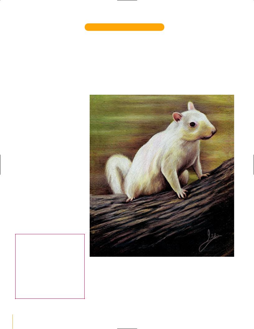
Squirrel: White, French Grey 20%, Light Umber, Dark Umber, Bronze, Sepia (fur) Salmon Pink (ears) Tuscan Red and Black (eye).
Background: Limepeel, Apple Green, Bronze, Light Umber, Yellow Ochre, Deco Yellow and White.
Tree Bark: Dark Umber, Light Umber, French Grey 20%, Deco Yellow, Black and White.
This drawing was done on smooth mat board. The smooth sur- |
WHITE SQUIRREL |
face allows you to apply firm pressure to the pencil, completely |
Prismacolor pencils |
covering the paper surface. This is called burnishing. That is how I |
on no. 3308 Oxford |
made the white fur fill in and the tree bark to appear textured. |
mat board |
Because of the opaque nature of these pencils, you can draw on |
10" x 8" (25cm x 20cm) |
dark-colored papers. This board was a medium gray color, and |
|
the white showed up beautifully. Whenever I need to apply heavy |
|
layers of color, or build up extreme texture, I use Prismacolor. |
|
Note: This drawing was sprayed with workable fixative when com- |
|
pleted, to prevent wax bloom. |
|
12 Drawing in Color: Animals

capture all of the different animals seen in nature.
Each of these drawings has a distinct look, and all were done with a different brand of pencil. Before I begin a piece, I have to analyze the characteristics of my subject and decide which pencil creates the look I desire.
PRISMACOLOR PENCILS
Prismacolor pencils have a heavy wax content and deep pigments, and therefore go on very concentrated and opaque. Prismacolor pencils are known for their thick leads and rich colors.
VERITHIN PENCILS
Verithin are good pencils to use when drawing animals. They are made by the same manufacturer as Prismacolor but have a thinner lead, which produces fine, thin lines. They also have less wax and go on a little “drier” than Prismacolor.
Verithin pencils also work well on dark paper. This rabbit was drawn on a medium gray board, and the white pencil shows up beautifully.
Verithin pencils do not burnish like Prismacolor. Instead, the colors “layer” without blending together. The result is a highly textured appearance.
J A C K R A B B I T
Verithin pencils on no. 3331 Sage mat board
14" x 11" (36cm x 28cm)
Study the drawing of the rabbit closely, and you can see different layers of colors. They were applied with short, quick strokes and look just like the layers of fur. Whenever I need to replicate coarse hair or layered fur, I use Verithin pencils.
COLORS USED
Rabbit: Black, Dark Brown, Terra Cotta and
White.
Background: Dark Green and Black.
The Different “Looks “ of Colored Pencil |
13 |

STUDIO PENCILS
Studio pencils are manufactured by Derwent. They are clay-based pencils as opposed to the wax-based pencils we looked at previously. Because of their formulation, these pencils have the advantage of being easily blended with a stump or tortillion (see page 10). The result is a smooth, subtle blending of tone.
Another advantage to using these pencils is that you can use them heavily and achieve dark color and deep tones. Because they are not wax-based, however, you will not get the same effects when burnishing as you would with Prismacolor.
COLORS USED
Puppy: Chocolate Brown, Ivory Black, Terra
Cotta, Burnt Yellow Ochre, Venetian Red
and Copper Beech.
Drinking Glass: Ivory Black, Venetian Red,
Turquoise Blue and Cedar Green.
Background: Cedar Green, Chocolate
Brown, Olive Green and Ivory Black.
Foreground: Ivory Black, Chocolate Brown
and Turquoise Blue.
Note —
The colors of the puppy and the background are all reflecting into the glass. Since glass and water are clear, they are drawn using the surrounding colors that bounce off of the shiny surfaces.
KIMBER AND THE DRINKING GLASS
Studio pencils on no. 912 India mat board
16" x 12" (41cm x 30cm)
Sometimes a subject will have a combination of textures to capture, and they will require a special application of the pencils to create. To render this drawing, I used a combination of techniques. I first placed in the colors of the puppy and blended the colors smooth with a tor- tillion—this creates the contours and form of the body. I then placed more color on top of the blended tones to create the texture of the fur. I used this technique for the entire drawing. Look at all the areas of the piece and you can see where I used both blending and pencil lines for realism.
14 Drawing in Color: Animals

C h a p t e r F o u r
Technique
LAYERING
To best teach layering I like to start my students out with Verithin pencils. This technique also carries over to the other brands as well. Once you learn how to layer colors well with these pencils, using the other brands will be easy.
Layering is the process of using a very sharp pencil point and applying the tone gradually and evenly. Do not let the pencil point become dull. This alters the width of the lead and makes the drawing look crayon-like.
A colored pencil has a “feel” to it. When drawing darker areas, I have a tendency to hold my pencil closer to the tip allowing me to use more pressure without breaking the lead. As I move to lighter areas I pull back, holding the pencil further back from the tip. This helps me touch the
paper surface lightly, giving it a softer appearance.
You should blend your tone very gradually as they fade from dark to light. There should be no choppiness between tones, no definite line where one tone ends and another begins. Practice first with value scales. The more you do, the more proficient you will become. Start with just black pencil at first, layering from dark to light by altering the pressure you apply to the pencil. Let the tone fade into the color of the paper.
It is important when you apply the pencil that your lines are very close together so they fill in any white space. Going back and forth slowly helps you do this.
BURNISHING
Once you are comfortable with the
layered approach, try Prismacolor pencils. You will see how different the pencils are.
Begin with three colors of pencils: Black, White and Cool Grey 50%. This process will begin the same as layering, but you will continue to build up the color until it completely covers the paper surface. This is where you will use burnishing, a technique in which you use a lighter color to blend the darker colors into one another.
For example, start the value scale with the Black and then apply the Cool Grey 50% next to and overlapping the Black. The lighter color (Cool Grey 50%) going into the darker one (Black) will soften the two colors together. Next, add White into and overlapping the Cool Grey 50%. Continue burnishing the
DON’T! This type of pencil application makes your work look like scribbled crayons.
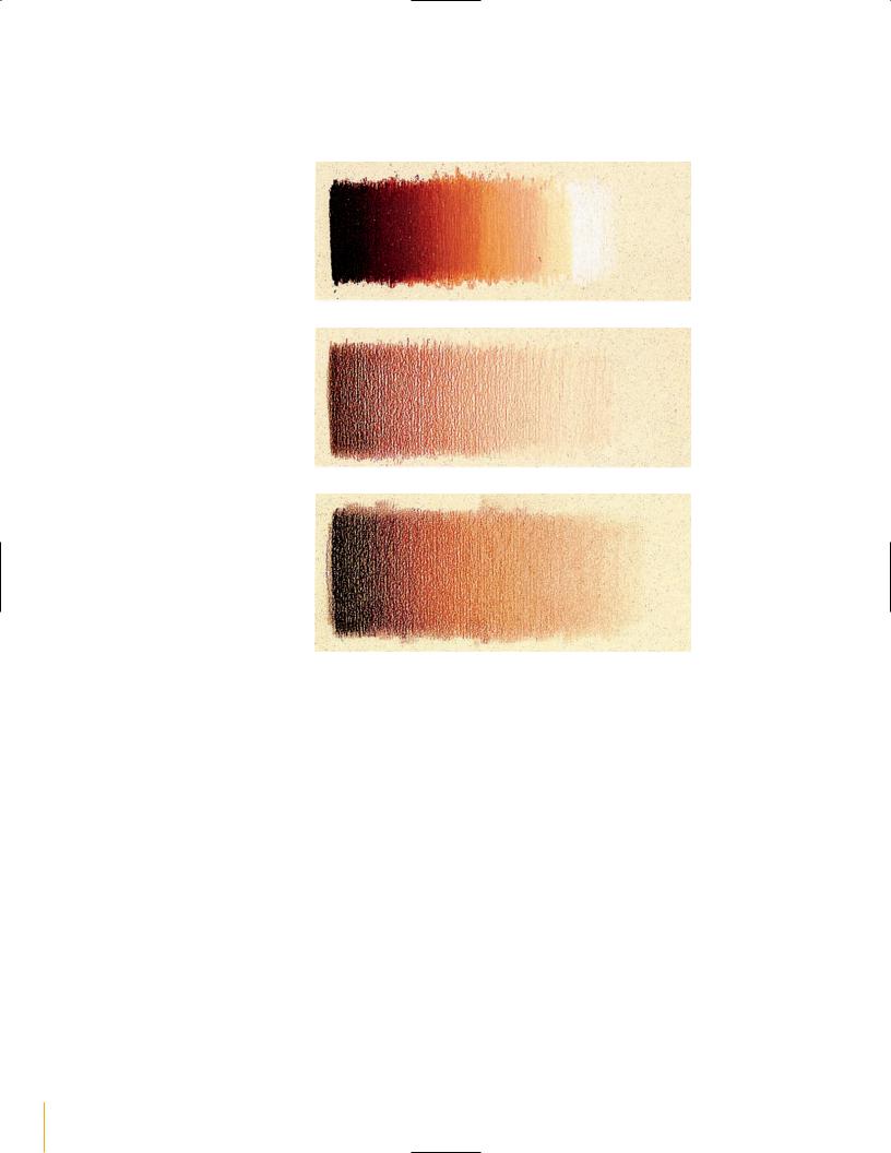
A value scale drawn correctly with Verithin pencils. The tones fade gradually without visible pencil lines. This is called layering.
A value scale drawn with Prismacolor pencils. This is called burnishing.
A value scale drawn with Studio pencils. This is called blending.
Technique 15
colors, alternating the addition of light and dark, until they blend together for a smooth, gradual look. This technique resembles a “painted” appearance.
Prismacolor drawing is the process of applying many colors, each one into the others, always using a lighter color to burnish. Sometimes you have to layer and burnish many times to get the look you want. This technique requires a lot of patience, but the nice thing about it is that it’s best done with a dull pencil point.
BLENDING
Blending is the application of claybased pencils that are smoothed out with the aid of a tortillion or stump. The tones appear very smooth and gradual. There appears to be no visible pencil lines, and the tones fade into one another, transitioning smoothly.
The following value scales show how each pencil appears when applied, revealing different, distinct personalities. Is one method better than another? No! I recommend learning them all.
A value scale in Prismacolor pencils (burnished).
A value scale in Verithin pencils (layered).
A value scale in Derwent Studio pencils (blended).
16 Drawing in Color: Animals

C h a p t e r F i v e
Basic Shapes and Shading
Because it is important to fully understand what it takes to create depth and realism in your work, I begin all of my books with the same information: the five elements of shading and practice exercises of the sphere. The five elements of shading can be found in every three-dimensional shape. The five elements of shading are as follows (listed in order from darkest to lightest):
1.Cast shadow. This is the darkest part of your drawing. It is underneath the sphere, where no light can reach. It gradually gets lighter as it moves away from the sphere.
2.Shadow edge. This is where the sphere curves and the rounded surface moves away from the light. It is not the edge of the sphere, but is inside, parallel to the edge.
3.Halftone area. This is the true color of the sphere, unaffected by either shadows or strong light. It is found between the shadow edge and the full light area.
4.Reflected light. This is the light edge seen along the rim of the sphere. This is the most important element to include in your drawing to illustrate the roundness of the surface.
5.Full light. This is where the light is hitting the sphere at its strongest point.
Full Light
Shadow Edge
Halftone area
Cast Shadow
Reflected Light
Basic Shapes and Shading |
17 |

Basic Shapes
The following are all of the basic shapes that can be seen when drawing animals. Each one has had the five elements of shading applied, giving them the illusion of form and realism. Each of these shapes should be drawn and practiced over and over, until the process becomes second nature to you.
As you analyze these shapes, try to think of where each of them would be found in the shapes of animals and their surroundings. Think of other subject matter as well, and you will see the importance of including these forms in your artwork.
THE CYLINDER
This shape can be seen in the neck area of an animal, and also in the trunks of trees.
THE SPHERE
Look for the five elements of shading here.
THE LONG CYLINDER
This can be found in the legs of an animal. It also can be found in the necks of long-necked animals, such as giraffes. The small limbs and branches of a tree will also be made up of this shape.
THE EGG
This can be seen in the shape of an animal’s head, and also in the body.
THE CONE
This can be seen in the shape of a bird’s beak.
18 Drawing in Color: Animals