

Nafziger Economic Development (4th ed)
.pdf176 Part Two. Poverty Alleviation and Income Distribution
FIGURE 6-5. Percentage Rates of Poverty ($2/day in 1985 PPP) and Extreme Poverty ($1/day in 1985 PPP), 1820–2000. Source: Bourguignon and Morrisson 2002:731–732, with linear extrapolation for years between the points for 1820, 1850, 1870, 1890, 1910, 1929, 1950, 1960, 1970, 1980, 1992, and 2000. The figures for 2000 are based on the percentage reduction from Bhalla (2002:144) and the relationship between poverty and extreme poverty in Sala-i-Martin (2002:34).
Let’s focus on Afro-Asia and Latin America. Latin America has the lowest poverty rates; extreme poverty has fallen over the last half of the 20th century but $2/day poverty has increased slightly. But Table 6-2 indicates Asia has a lower $1/day poverty rate than Latin America, but the same source, Xavier Sala-i-Martin (2002:37), indicates Latin America’s upward trend in the $1/day poverty rate while $2/day poverty is unchanged since 1980.
The Middle East and North Africa, included in Table 6-3, has a lower $2/day poverty rate than either East or South Asia but higher $1/day poverty than East Asia and the same as South Asia. India, three-fourths of South Asia’s population, has 1 percent $1/day and 14 percent $2/day in Table 6-2 and 13 percent $1/day and 26 percent (the Government of India estimate) $2/day in Bhalla (2002:125), a contrast to the World Bank’s poverty figures for India of 35 percent for $1/day and 80 percent for $2/day in Table 6-1. China, with 93 percent of developing East Asia’s population, has both poverty rates lower than India’s with Table 6-1, Bhalla (source for Table 6-3), and (except for $1/day) Table 6-2.
Africa’s poverty rate (Table 6-2) is higher than Asia’s and Latin America’s. Indeed, Africa (sub-Saharan Africa in Table 6-3) experienced virtually no rate reduction from 1950 to 2000. The combined poverty rates of the two major Asian regions did not fall lower than sub-Saharan Africa’s until the 1980s or 1990s. The World Bank, by contrast, ranked South Asia’s $2/day poverty rate higher than that of sub-Saharan Africa in both 1990 and 2000 (Table 6-1). (Below, after the section on the Lorenz curve and Gini index, we discuss the differences among the sources for the three tables.)
Concepts and Measures of Poverty: Amartya Sen’s Approach
The Cambridge University economist–philosopher Amartya K. Sen contends that traditional welfare economics, which stresses the revealed preferences or desire-based utilities of individuals in their acts of choice, lacks enough information about people’s

6. Poverty, Malnutrition, and Income Inequality |
177 |
Deaths per 1000 live births
Deaths per 1000 live births
|
Armenia 2000 |
|
|
|
|
|
Bolivia 1997 |
|
|
|
|||
200 |
|
|
|
|
|
200 |
|
|
Under 5 mortality is 143 |
||||
|
|
|
|
|
|
|
|
|
|||||
150 |
|
|
|
Under 5 |
|
150 |
|
|
|
|
|
|
Poorest |
|
|
|
mortality |
|
|
|
|
|
|
|
quintile |
||
|
|
|
|
|
|
|
|
|
|
|
|
||
|
|
|
|
is 63 |
|
|
|
|
|
|
|
|
|
100 |
|
|
|
|
|
100 |
|
|
|
|
|
|
|
50 |
|
|
|
|
|
50 |
|
|
|
|
|
|
Richest |
|
|
|
|
|
|
|
|
|
|
|
quintile |
||
|
|
|
|
|
|
|
|
|
|
|
|
|
|
0 |
|
|
|
|
|
0 |
|
|
|
|
|
|
|
|
2 |
3 |
4 |
5 |
|
|
2 |
3 |
4 |
5 |
|
||
0 |
1 |
0 |
1 |
|
|||||||||
Central African Republic 1994-95 |
|
|
|
Cambodia 2000 |
|
|
|
||||||
200 |
|
|
|
|
|
200 |
|
|
Under 5 mortality is 147 |
||||
|
|
|
|
|
|
|
|
|
|||||
150 |
|
|
Under 5 mortality |
150 |
|
|
|
|
|
|
|
||
|
|
|
|
|
|
|
|
|
|
|
|||
|
|
|
|
is 189 |
|
|
|
|
|
|
|
|
|
100 |
|
|
|
|
|
100 |
|
|
|
|
|
|
|
|
|
|
|
|
|
|
|
|
|
|
|
|
|
50 |
|
|
|
|
|
50 |
|
|
|
|
|
|
|
0 |
|
2 |
|
|
|
0 |
|
|
|
|
|
5 |
|
0 |
1 |
3 |
4 |
5 |
0 |
1 |
2 |
3 |
4 |
||||
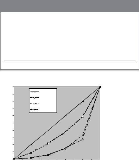
FIGURE 6-6. Child Mortality Is Substantially Higher in Poor Households. Source: World Bank 2004:20.
preferences to assess the social good. Accordingly, as an alternative, Sen’s welfare theory relies not on individuals’ attainments (for example, of basic needs) but individuals’ capabilities, an approach he believes can draw on a richer information base. From a feasible capability set, Sen focuses on a small number of basic functionings central to well-being.6 For Sen, living consists of the effective freedom of a person to achieve states of beings and doings, or a vector of functionings. He does not assign particular weights to these functionings, as well-being is a “broad and partly opaque concept,” which is intrinsically ambiguous.
Sen focuses on a small number of basic functionings central to well-being, such as being adequately nourished, avoiding premature mortality, appearing in public without shame, being happy, and being free. This freedom to attain, rather than the functionings themselves, is the primary goal, meaning that capability does not correlate closely to attainment, such as income. One example is life expectancy, a proxy for health, which, at 77 years, is as high for Costa Rica as for the United States, which
6Lacerchi, Saith, and Stewart (2003:255) are diagramatically clear: From a capability set, each individual chooses functionings or achievements.
178Part Two. Poverty Alleviation and Income Distribution
has an income per head nine times as high. Moreover, men in the Harlem district of New York City, despite the capability sets and choices available to the U.S. society, have less chance of living to 40 years than men in Bangladesh. This is not because Harlem has a lower GNP per capita than Bangladesh, Sen explains, but because of the high urban crime rate, inadequacy of medical attention, racism, and other factors that reduce Harlem’s basic attainments.7 Although people in Harlem have a greater command of resources than those in Bangladesh, the costs of social functionings, which include avoiding public shame and participating in the life of the community, are higher for Harlem residents (as well as U.S. residents generally, Sen argues) than for Bangladeshis (Sen 1973, 1981, 1987, 1992, 1999; Sugden 1993:1947–1462; McCord and Freeman 1990).
For Sen, poverty is not low well-being but the inability to pursue well-being because of the lack of economic means. This lack may not always result from a deficiency of capabilities. An extreme example will illustrate this even more clearly than that of the Harlem case. If Mr. Richman has a high income, but squanders it so that he lives miserably, it would be odd to call him “poor.” Here poverty is the failure of basic capabilities to reach minimally acceptable levels (Sen 1992:102–116).
Sen argues against relying only on poverty percentage or headcount approach
(H)to measure poverty and deprivation, the approach of World Bank economists, Ahluwalia, Carter, and Chenery (1979:299–341). As D. L. Blackwood and R. G. Lynch (1994:569) assert in their criticism of Ahluwalia et al.: “Poverty does not end abruptly once an additional dollar of income raises a family’s (or individual’s) income beyond a discretely defined poverty line. It is more accurate to conceive of poverty as a continuous function of varying gradation.” In addition to (H), Sen contends, we need an income-gap approach (I), which measures the additional income needed to bring the poor up to the level of the poverty line. This gap can be expressed in per-capita terms, that is, as the average shortfall of income from the poverty line. Having measures of H, as well as I, should reduce the strong temptation government faces to concentrate on the richest among the poorest, thus merely minimizing the percentage of the population in poverty (minimizing H) rather than minimizing the average deprivation of the poor (I). For Sen, adding an empirical measure, I, should improve policy effectiveness.
The World Bank, which became convinced of the validity of Sen’s critique of Bank-type analyses of poverty by 1990, defines the income or poverty gap as “the mean shortfall from the poverty line (counting the nonpoor as having zero shortfall), expressed as a percentage of the poverty line. This measure reflects the depth of poverty as well as its incidence.” In 2000, Bangladesh’s $1/day headcount poverty
7According to the U.S. Justice Department’s Bureau of Justice Statistics, in the United States, AfricanAmerican men aged 12 to 24 years were victims of homicide at a rate of 114.9 per 100,000 in 1992, compared to 11.7 per 100,000 for white men of the same age, and 8.5 per 100,000 for the general U.S. population (Kansas City Star 1994:A4).
Corrie (1994:53–55) discusses the Human Development Index (HDI) for the U.S. black child, including an HDI for all 50 U.S. states, based on poverty rates, low birthweight, incarceration rates, and unemployment rates for African Americans.
6. Poverty, Malnutrition, and Income Inequality |
179 |
rate was 36.0 percent, while its $1/day poverty gap was 8.1 percent (World Bank 2003h:58–61). Although 36 percent of Bangladesh’s population was extremely poor, a transfer of 8.1 percent of GNP would bring the income of every extremely poor person exactly up to the $1/day line. In China, although $1/day poverty was 16.1 percent, the cost of bringing the income of these poor to the $1/day line was only 3.7 percent (ibid., p. 58). For LDCs generally, 19-percent $1/day poverty (World Bank 2003f:30–31) could be reduced by a 1-percent transfer from LDC consumption or a one-half of one-percent transfer from world consumption. This assumes perfect nondistortionary targeting to the extreme poor without reducing mean consumption. Alas, we do not have perfect information to identify the poor nor do we know the effect of this transfer on the income of the nonpoor. Yet we have information on countries with extreme poverty and some detailed information on the regions, classes, and communities of the extreme poor.
A third empirical measure Sen recommends is the distribution of income among the poor, as measured by the Gini coefficient (G). Combining G, H, and I, which together represent the Sen measure for assessing the seriousness of absolute poverty, satisfies Sen’s three axioms for a poverty index: (1) the focus axiom, which stipulates that the measure depend only on the incomes of the poor; (2) the monotonicity axiom, which requires that the poverty index increase when the incomes of the poor decrease; and
(3) the weak transfer axiom, which requires that the poverty measure be sensitive to changes in the income distribution of the poor (so that a transfer of income from a lower-income poor household to a higher-income household increases the index).
The Lorenz Curve and Gini Index (G): Measures of the Distribution of Income
This discussion, however, is not limited to the income distribution of the poor but focuses on the Gini as a tool for measuring the overall income concentration among both nonpoor and poor.
Indices of income distribution measure relative poverty rather than absolute poverty. Income inequalities are often shown on a Lorenz curve (see Figure 6-7). If income distribution were perfectly equal, it would be represented by the 45-degree line (a). If one person, represented at the extreme right, received all the income, the Lorenz curve would follow half the perimeter of the box, the x-axis, and the right line parallel to the y-axis (e). In practice Lorenz curves are located between the 45-degree line and the line of complete inequality. Table 6-4, columns 2 and 3, shows the personal income distribution of two countries. Except for several sparsely populated LDCs, South Africa is the country that has the world’s highest personal income inequality (World Bank 2003h:64–66). Among Afro-Asian and Latin American LDCs, Bangladesh has the lowest inequality.
Income concentration for some DCs, such as Japan, Sweden, Finland, and Belgium, and some transitional countries in East Central Europe or the former Soviet Union, are lower than that for Bangladesh; however, most DC measures of income inequality, which are for households rather than persons, are not comparable
180 Part Two. Poverty Alleviation and Income Distribution
TABLE 6-4. Personal Income Distribution for Bangladesh, South Africa, and the World
(1) Population |
(2) Bangladesh |
(3) South Africa |
(4) World |
quintile |
(2000) (percent) |
(1995) (percent) |
(1993) (percent) |
|
|
|
|
1 |
9.0 |
2.0 |
2.0 |
2 |
12.5 |
4.3 |
3.7 |
3 |
15.9 |
8.3 |
9.4 |
4 |
21.2 |
18.9 |
12.5 |
5 |
41.3 |
66.5 |
72.4 |
Total |
99.9 |
100.0 |
100.0 |
Gini coefficient |
0.29 |
0.57 |
0.60 |
Sources: World Bank 2003h:64–66; Milanovic 2002b:73.
|
100 |
|
|
|
|
|
|
|
|
|
|
|
90 |
|
|
45 degree line |
|
|
|
|
|
||
|
|
|
Bangladesh |
|
|
|
|
|
|
||
|
|
|
|
|
|
|
|
|
|
||
|
80 |
|
|
South Africa |
|
|
|
|
|
|
|
|
|
|
|
|
|
|
|
|
|
||
GNP |
70 |
|
|
World |
|
|
|
|
|
|
|
60 |
|
|
|
|
|
|
|
|
|
|
|
of |
|
|
|
|
|
|
|
|
|
|
|
|
|
|
|
|
|
|
|
|
|
|
|
Percentage |
50 |
|
|
|
a |
|
|
|
|
|
|
40 |
|
|
|
|
|
b |
|
c |
|
|
|
|
|
|
|
|
|
|
|
|
|
||
30 |
|
|
|
|
|
|
|
|
|
e |
|
|
|
|
|
|
|
|
|
d |
|
||
|
|
|
|
|
|
|
|
|
|
|
|
|
20 |
|
|
|
|
|
|
|
|
|
|
|
10 |
|
|
|
|
|
|
|
|
|
|
|
0 |
|
|
|
|
|
|
e |
|
|
|
|
|
|
|
|
|
|
|
|
|
|
|
|
0 |
10 |
20 |
30 |
40 |
50 |
60 |
70 |
80 |
90 |
100 |
Percentage of population
FIGURE 6-7. Lorenz Curves for Bangladesh, South Africa, and the World. The Lorenz curve indicates a higher income inequality for the world (curve d) than for South Africa, the country that has virtually the world’s highest personal income inequality (curve c).a Curve b shows the income inequality for Bangladesh, the developing country with the world’s lowest personal income inequality.b Notes: a Highest except for neighboring Botswana, Namibia, and Swaziland; and Central African Republic, Guatemala, Nicaragua, and Sierra Leone, with populations less than seven million. b Lowest outside East Central Europe and the former Soviet Union. Sources: World Bank 2003h:64–66; Milanovic 2002b:73.
6. Poverty, Malnutrition, and Income Inequality |
181 |
to measures available for the majority of LDCs. Economists would prefer surveys of larger units, the household, to that of the individual, so that low-earning members of high-earning families are not classified as poor. Data on household income allow researchers to express poverty on a per-capita basis, at least if information is available for researchers to adjust income for household size. Still, one problem of household income data is the risk that researchers will ignore inequality within households (Fields 1994:89).
The data in Table 6-4 are arranged in ascending order from population quintile 1 (the 20 percent or one-fifth with the lowest income) to quintile 5 (the 20 percent with the highest income). These data are plotted on curves b and c in Figure 6-7.
At present, most measures of income distribution are for countries, or regions within a country, but there is a growing perception of the global economy as an international system. LDC populations who demand a new international economic order assume that the welfare of a jute farm laborer in Bangladesh, a foundry worker in Brazil, a textile manufacturer in Kenya, and a cabinet minister in India are linked to decisions made by bankers, industrialists, and economic policymakers in the United States, Western Europe, and Japan. Developing countries compare their living standards to those of developed nations. Accordingly, there is some validity to the concept of a world distribution of income.
Income inequality for the world exceeds that for any single country. The top 20 percent of the world’s income-earning households receive 72.4 percent of the global income, and the bottom 40 percent receive only 5.7 percent. In South Africa, the top 20 percent of the households receive 66.5 percent of the income, and the bottom 40 percent, 6.3 percent. South Africa’s curve c is to the left of the world’s curve d in Figure 6-7.
When x and y are Lorenz curve coordinates (based on cumulative values, not the incremental values listed in Table 6-3), and x and y are corresponding increments passing through these coordinates, then the Gini index of inequality
G = 2/10,000 (x − y) x |
(6-1) |
Summations are taken as many times as there are x increments between the limits (Merritt and Rokkan 1966:364). The Gini index is the area between curve a and the Lorenz curve as a proportion of the entire area below curve a. It ranges from a value of zero, representing equality, to 1, representing maximum inequality. The 1993 Gini for the world, 0.66, exceeds that for South Africa, 0.59. The global income distribution is more unequal than that within any single country, as cross-national disparities in GNP per capita are added to those of internal inequalities.
The World Bank, Institute for International Economics, and Sala-i-Martin: Three Views of Poverty and Inequality
How do the three sources, Sala-i-Martin (Table 6-2), Bhalla (Table 6-3), and the World Bank (Table 6-1; Milanovic, Figure 6-7, curve d, and Table 6-4 and Ravallion, Datt, and van de Walle) come up with their various figures?
182 Part Two. Poverty Alleviation and Income Distribution
Sala-i-Martin (2002:7–8) starts from quintiles (fifths, from lowest to highest) for each country, assuming that the logs of a country’s individual incomes are distributed normally, similar to a bell curve. He has data on the mean log-income and the variance (a measure of how spread out a distribution is). With these, he goes beyond the World Bank’s use of quintile data (for example, India’s lowest quintile had 8.1 percent of income shares, the second quintile 11.6 percent, the third 15.0 percent, the fourth 19.3 percent, the highest 46.1 percent) to interpolate distribution by percentiles, so that he has average incomes for each mean income of 100 1-percentile sets rather than five quintile sets. India, with 1 billion people in 2000, had 10 million in each percentile but 200 million in each quintile, indicating the quintile mean loses much information. His tests indicate that the size and density of each country/year’s kernel and the actual percentile distribution, using this technique, closely approximate the true shape plotted from actual detailed data, where they are available. The standard deviation of log income and the size of the population indicate the bandwidth for each kernel. He then integrates individual country/year distributions and density functions to construct a worldwide income distribution.
Sala-i-Martin (2002) uses a standard source – two World Bank’s economists, Deininger and Squire (1996) and upgrades – for estimates of quintile income shares for 68 countries in Group A between 1970 and 1998. Although most countries do not have observations for every year, missing years are approximated by linear extrapolation (that is, if 1972 is 20 and 1982 is 28, then 1977 is 24). For 29 countries, in Group B, for which Deininger and Squire have only one income distribution by quintiles for the period, Sala-i-Martin assumes constant income shares from 1970 to 1998. For 28 countries (about 4 percent of the sample population) for which there are no income distribution data, he assumes that all individuals within each country have the same income – the income per capita of that nation. Thus, his estimates encompass 125 countries with a combined population of 5.23 billion, 88 percent of the world’s 5.9 billion people in 1998.
Milanovic (2000a:8) charges Sala-i-Martin with “the Ricardian vice: fragmentary and sparse data overcome by making heroic and unwarranted assumptions.” Milanovic thinks that Sala-i-Martin has too few data points (on average 5–6 of 27 years for Groups A and B) and a lack of clarity about whether the source indicates consumption or income, or individual or household, distribution. Milanovic wants detailed household survey data from at least 90 percent of the world’s income or expenditure and population, something his study does not attain (Milanovic 2000b:60).
Moreover, Sala-i-Martin fails to include the former Soviet Union (FSU), former Yugoslavia, and Bulgaria (about 6 percent of the world’s population) in his sample. Including them might have invalidated his conclusion of falling income inequality, as the former communist countries’ inequality increased substantially during the transition. Milanovic’s study (2002) finds that the FSU increases the world’s Gini index of inequality by 1.5 percentage points between 1988 and 1993, a change that
6. Poverty, Malnutrition, and Income Inequality |
183 |
would have compensated for Sala-i-Martin’s falling inequality during this period.8 Milanovic’s conclusion (2000a:18) about Sala-i-Martin’s study is: “Never was so much calculated with so little.” By contrast, the standard errors for Milanovic’s Gini (2000b:72) are so high that they are consistent with no change or a reduction in inequality.
Milanovic (2002a:2) also contends that without China, Sala-i-Martin’s late-20th- century individual income inequality is no longer falling, but increasing slightly, similar to Milanovic’s (2000b) finding. Yes, but in doing so, we would exclude onefifth (1.2 billion of the then 6 billion) of the world’s population! And Milanovic (2000b:80–84) admits that if China’s and India’s incomes increase faster than the world’s, inequality falls substantially.
Bhalla (2002) wrote the monograph Imagine There’s No Country for the Institute for International Economics, an establishment think-tank in Washington, D.C. The work, named after a John Lennon song, tries to imagine the world’s distribution of income among individuals, as if there were no national boundaries. Bhalla, like Sala-i-Martin, uses published data on quintiles and means, assumes log-normal distribution, interpolates to estimate missing values, and estimates a Lorenz curve that yields 100 percentiles rather than just 5 quintiles. Bhalla criticizes World Bank economists for basing consumption inequality estimates on an average taken from household surveys (whose consumption spending was substantially underestimated) rather than the higher average consumption based on national-accounts data. Indeed the ratio of the survey mean to national account mean is 53 percent for income and 74 percent for consumption, a decade-long falling ratio that understates the mean around which a variance is computed. Thus, surveys are continually capturing a lower fraction of national accounts consumption and income (ibid., p. 109).9 Bhalla’s (and Sala-i-Martin’s) innovation is “breaking down of the population from quintiles to percentiles to better focus on individuals” (Hughes 2002–03:50).
The consumption or income means from surveys used by the World Bank for 1993 income inequality indicate that the average South Korean was richer than the average Swede or Briton (rather than 35 to 40 percent poorer, per national accounts), and the average Indian was 30 percent poorer than the average Ethiopian (rather than being three times richer, as national accounts imply). The World Bank (and Milanovic), by not adjusting survey means to be consistent with faster-growing national accounts means, underestimate mean consumption and overstate poverty, magnifying the errors in the poverty rate trend. To include missed-out consumption,
8The World Bank (2001h:3) estimates that from 1987 to 1998 $1/day poverty rose more than 20-fold in the formerly communist countries of East and Central Europe and Central Asia.
9The World Bank (2001h:26) agrees that “NSS [National Sample Survey] consumption is an increasingly smaller fraction of private consumption as estimated in the NAS [national accounts]. NSS consumption has declined relative to NAS consumption during the past three decades; the two were much closer in the 1950s and 1960s. . . . [P]overty would show a downward trend during the 1990s (as found by Bhalla 2000). . . . It is plausible that the NSS-based poverty numbers are underestimating the rate of poverty reduction in India.”

184Part Two. Poverty Alleviation and Income Distribution
Bhalla uses a multiplier, expenditures in national accounts/expenditures in the survey, to obtain average consumption expenditure, around which the variance is computed (ibid., 105–126).10
What measure should we use to measure the effect of growth on poverty? Ravallion, Datt, and van de Walle (1991:345–361; U.N. Development Program 2003:67) discuss the effect of growth on poverty by estimating that a 1-percent LDC per-capita consumption growth, with income inequality unchanging, would reduce the poverty percentage, H, by 2 percent yearly. They estimate that the elasticity of the poverty gap with regard to the Gini index,
(H2 − H1)/average H
(G2 − G1)/average G
(6-2)
8.4 (where 1 is the earlier time period and 2 is the later time period), is so high that the effect of a growth of 16 percent in mean consumption, 1985–2000, on poverty would be offset by a 4.3 percent increase in the Gini index.
Bhalla’s (2002:168–169) global individual income distribution from 1980 to 2000 paints a different picture, showing that income inequality continually fell. Moreover, his historical statistics indicate that, viewed from the last two centuries, 1980–2000 was not a period when global poverty reduction stagnated, as the World Bank indicates, but was the golden age for poverty reduction. $1/day poverty (1985 $PPP) fell 23.8 percent from 1980 to 2000, yielding the highest, 9.8, percentage-point poverty reduction per 10 percent growth (ibid., pp 145–146).
He argues that a large number of countries can show worsening income inequality and yet the world show falling inequality (ibid., p. 181). The main reason is the shift from the world’s lower class (less than $PPP10/day at 1993 prices) to the world’s growing middle class ($PPP10–$PPP40/day), especially in China, India, and other Asian countries. (Figure 6-8 shows the changing composition of that middle class.)
For Bhalla, the important measure is the elasticity of propoor growth, the (percentage increase in the consumption growth of the poor)/(percentage increase in the consumption growth of the nonpoor). If the elasticity is greater than 1, then the process is propoor, if less than 1 antipoor. Bhalla points out that some regional elasticities (sub-Saharan Africa based on consumer surveys, South Asia, and the Middle East) are less than 1. LDCs as a whole have elasticities close to 2 if you include China and India but no more than 1 if you exclude them. For the world, both DCs and LDCs, this elasticity is more than 4, using national-accounts data, and even more than 2, using consumer survey data (Bhalla 2002:168–172). Consumption by the world’s poor, driven largely by China and India, grew more rapidly than consumption by the rich, 1980–2000.
For Bhalla (2002:163), “The disillusionment with the processes of [1980 to 2000] growth was in large part an unintended outcome of . . . the measurement of poverty
10Martin Ravallion asks (2003:16): “If you don’t believe the overall survey mean, how can you believe the distribution obtained from the survey?” Moreover, critics think Bhalla, similar to Sala-i-Martin, is unclear about whether his data sources indicate consumption or income, or individual or household, distribution.

6. Poverty, Malnutrition, and Income Inequality |
185 |
FIGURE 6-8. Share of Each Region in the World’s Middle Class. Share of each region in the world’s middle-class population (annual income between $3,650 and $14,600 PPP at 1993 prices). Note: To obtain regional distributions of income country data were pooled using the simple accounting procedure method, a method similar to that indicated earlier by Sala-I-Martin to obtain approximate shares for each percentile, even when only quintile data are available. Source: Bhalla 2002:188.
[by the World Bank]. The mixed-up observation [is] due to the mix-up of using Peter’s poverty (from survey data) and Paul’s income (from national accounts data).” Despite this valid point, Bhalla is attacking a “straw man,” economists’ “received wisdom” of stagnant global poverty reduction and growing world inequality and income divergence from 1980 to 2000. Moreover, Bhalla (2002:206) has too little evidence to indicate that “it definitionally follows [from his study] that growth has been more than sufficient to reduce poverty.” The IMF economist Jeromin Zettelmeyer (2003:50) is right that the Bank is correct that “growth is good for the poor but that eradicating extreme poverty will require extra measures.”
Zettelmeyer (2003:54) ably sums up economists’ current knowledge on the subject:
Per capita income and consumption growth in the past two decades has been close to zero in all regions of the developing world except Asia, which has grown very quickly. Because Asia housed more than three-fourths of the world’s poor, the [world’s] poverty rate has fallen substantially (by about 0.7 of a percentage point a year since 1990, according to conservative Bank estimates). For the same reason, world individual income distribution has probably improved. But the lack of regional growth outside Asia is disturbing, and even the most optimistic projections predict large and stagnating poverty levels in Africa in the foreseeable future.
Glenn Firebaugh (2003:22) agrees with Bhalla, in opposition to World Bank researchers, that globalization, “the world’s spreading industrialization and growing economic integration in the late twentieth century and early twenty-first,” has