

FLTK human interface guidelines.2005
.pdfHuman Interface Guidelines - Fast Light Toolkit (FLTK)
Human Interface Guidelines
Last Updated 24 Aug 2005
Contents
∙Introduction
∙User Input
♦Mouse Buttons
♦Mouse Wheel
♦Keyboard Focus Cues
♦Keyboard Shortcuts
∙Controls (Widgets)
♦Buttons
♦Text Fields
♦Valuators
♦Lists
♦Menus
♦Scrolling
∙Layout and Design
♦Spacing
♦Sizing
∙Windows
♦Document Windows
♦Tool Windows
♦Dialog Windows
Introduction
This document describes guidelines for FLTK-based user-interfaces which are used by the FLTK developers for the widgets and applications that ship with FLTK. Since FLTK is a cross-platform toolkit, the layout and design guidelines described here may conflict with those recommended by your favorite vendor or environment. We we have chosen common elements from the CDE/Motif, GNOME, KDE, MacOS, and Windows environments to promote consistency and simplicity across platforms.
The following list of documents should serve as an introduction to the various user-interface guidelines for each platform, along with some recommended reading for user-interface design:
∙Apple Human Interface Guidelines
∙GNOME Human Interface Guidelines
∙KDE User Interface Guidelines
∙Microsoft - Official Guidelines for User Interface Developers and Designers
∙userlab.com Recommended Books
∙The Humane Interface: New Directions for Designing Interactive Systems
The following list of UI guidelines can be found from multiple sources and was compiled from a survey of people that do user interfaces - Google for references. The order is from most useful to least useful guideline:
1/8
Human Interface Guidelines - Fast Light Toolkit (FLTK)
∙Know thy user, and YOU are not thy user.
∙Things that look the same should act the same.
∙Everyone makes mistakes, so every mistake should be fixable.
∙The information for the decision needs to be there when the decision is needed.
∙Error messages should actually mean something to the user, and tell the user how to fix the problem.
∙Every action should have a reaction.
∙Don't overload the user's buffers.
∙Consistency, consistency, consistency.
∙Minimize the need for a mighty memory.
∙Keep it simple.
∙The more you do something, the easier it should be to do.
∙The user should always know what is happening.
∙The user should control the system. The system shouldn't control the user. The user is the boss, and the system should show it.
∙The idea is to empower the user, not speed up the system.
∙Eliminate unnecessary decisions, and illuminate the rest.
∙If I made an error, let me know about it before I get into REAL trouble.
∙The best journey is the one with the fewest steps. Shorten the distance between the user and their goal.
∙The user should be able to do what the user wants to do.
∙Things that look different should act different.
∙You should always know how to find out what to do next.
∙Don't let people accidentally shoot themselves.
∙Even experts are novices at some point. Provide help.
∙Design for regular people and the real world.
∙Keep it neat. Keep it organized.
∙Provide a way to bail out and start over.
∙The fault is not in thyself, but in thy system.
∙If it is not needed, it's not needed.
∙Color is information.
∙Everything in its place, and a place for everything.
∙The user should be in a good mood when done.
∙If I made an error, at least let me finish my thought before I have to fix it.
∙Cute is not a good adjective for systems.
∙Let people shape the system to themselves, and paint it with their own personality.
∙To know the system is to love it.
User Input
User input is supplied using the mouse and keyboard in FLTK. FLTK provides visual cues indicating which widget will receive keyboard input. Shortcuts (special key sequences) can be used to activate a widget or function.
Mouse Buttons
Most mice have 1 to 3 buttons; in some cases, the second button may also have a wheel that is used for scrolling. For the purposes of discussion, we will assume a right-handed mouse where button 1 is the leftmost button, button 2 is the middle button, and button 3 is the rightmost button.
Since all Apple computers come with a 1 button mouse and many users do not know how to use a
2/8
Human Interface Guidelines - Fast Light Toolkit (FLTK)
multi-button mouse, all programs should be usable with a 1 button mouse.
The left button is used to click on buttons, set the insertion point in text fields, drag text and/or objects, and select text and/or objects. Double-clicking the left button button typically activates or selects text and/or objects under the mouse pointer.
The middle button is typically used as a substitute for double-clicking button 1 and (in text fields) to paste selected text at the mouse pointer position.
The right button is typically used to display a context-sensitive menu for the control underneath the mouse pointer. On MacOS, the right button is simulated by holding the Ctrl key down and clicking the left button.
Mouse Wheel
The mouse wheel is used for scrolling. Normally, the mouse wheel will scroll whatever control is underneath the mouse pointer. Moving the wheel forward scrolls up, backward scrolls down, and (if so equipped) left/right movement scrolls in the corresponding direction.
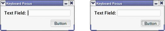
Keyboard Focus Cues
FLTK has visible focus queues that show which widget will receive keystrokes by default. For text controls, a cursor is shown inside the control. For non-text controls, a dotted border is drawn inside the edge of the control:
Text Field w/Focus |
Button w/Focus |
Keyboard Shortcuts
Keyboard shortcuts are typically combinations of one or more modifier keys with a letter or number. Special keys such as Enter, Return, and Escape are often used by themselves to activate functions in an application or window.
The following is a list of standard keyboard shortcuts that should never be used for other functions; FL_COMMAND is mapped to the clover (command) key on MacOS and the Ctrl key on other platforms:
Shortcut |
Description |
FL_COMMAND+'a' |
Select All |
|
|
FL_COMMAND+'A' |
Select None |
|
|
3/8
Human Interface Guidelines - Fast Light Toolkit (FLTK)
FL_COMMAND+'c' |
Copy |
|
|
FL_COMMAND+'f' |
Find |
|
|
FL_COMMAND+'g' |
Find Next |
|
|
FL_COMMAND+'n' |
New |
|
|
FL_COMMAND+'o' |
Open |
|
|
FL_COMMAND+'p' |
|
|
|
FL_COMMAND+'q' |
Quit (Application) |
|
|
FL_COMMAND+'r' |
Replace |
|
|
FL_COMMAND+'s' |
Save |
|
|
FL_COMMAND+'S' |
Save As |
|
|
FL_COMMAND+'u' |
Duplicate |
|
|
FL_COMMAND+'v' |
Paste |
|
|
FL_COMMAND+'w' |
Close |
|
|
FL_COMMAND+'x' |
Cut |
|
|
Controls (Widgets)
Widgets are the user interface controls that the user interacts with to perform some task. FLTK provides a rich set of widgets which are illustrated in the following sections.
Buttons
Text Fields
Valuators
Lists
Menus
Scrolling
Layout and Design
Good layout and design of user interfaces can take time, planning, and research, however the following guidelines can be used to simplify the process. In addition, FLUID offers guide lines based on these layout rules which makes it easy to design user interfaces that conform.
4/8

Human Interface Guidelines - Fast Light Toolkit (FLTK)
Sizing
FLTK controls should (consistently) use one of three standard sizes - tiny, small, and normal - as summarized by the following table:
Size |
Label/Text Size |
Widget Height |
Usage |
|
Tiny |
8 |
15 |
Small control panels, tool |
|
windows |
||||
|
|
|
||
|
|
|
|
|
Small |
11 |
20 |
High-density dialogs, tool |
|
windows |
||||
|
|
|
||
|
|
|
|
|
Normal |
14 |
25 |
Document, tool, and dialog |
|
windows |
||||
|
|
|
||
|
|
|
|
Spacing
Tiny widgets should be positioned with no space between them and the edge of the window:
Tiny Widgets
Small widgets should be positioned with 0 or 5 pixels between them and 5 pixels from the edge of the window:
Small Widgets
Normal widgets should be positioned with 0 or 10 pixels between them and 10 pixels from the edge of the window.
5/8

Human Interface Guidelines - Fast Light Toolkit (FLTK)
Normal Widgets
Windows
Windows are part of every GUI application and can generally be placed in one of three categories: document, tool, dialog.
Document Windows
Document windows, sometimes called application windows, are used as the main interface for an application. Traditionally, document windows have a menubar at the top, a toolbar below the menubar, a content area in the middle, and a status area at the bottom:
6/8

Human Interface Guidelines - Fast Light Toolkit (FLTK)
Document Window
Note:
The MacOS UI puts the menubar at the top of the screen instead of the top of the document window. This has some usability benefits because it allows the user to "slam" the mouse to the top of the screen and then position the mouse pointer in only one dimension to select a menu, and of course MacOS users are familiar with this placement of the menubar.
FLTK supports both in-window and system menubars on MacOS X. The choice of menubar is left up to the developer.
Tool Windows
Tool windows provide a palette of buttons and/or options for mode-based user interfaces. For example, an image painting application might have a tool window with selection and drawing tools. Clicking on a tool button selects that mode in the application.
7/8

Human Interface Guidelines - Fast Light Toolkit (FLTK)
Dialog Windows
Dialog windows are used to receive (input) or display (output) information. They are temporary windows, usually modal, and have one or more buttons at the bottom of the window. Dialog windows should not have a menubar - those are for document windows.
In almost all cases, an input dialog window will have a "Cancel" button along with one or more action buttons. The action buttons should be labeled with unambiguous verbs or phrases indicating their actions and not generic words like "Yes", "No", and "OK". The general rule of thumb is this: if you can remove everything from the window except the buttons and still have a meaningful dialog, then you have the right labels on your buttons:
Incorrect, Ambiguous Input Dialog |
Correct, Unambiguous Input Dialog |
Output dialogs typically display a single paragraph or sentence and have a single button labeled "OK" which dismisses the dialog. When displaying potentially complex information, an additional "Details" button is provided to expand the dialog or display a new dialog with the detailed information. "Close" buttons should not be used in output dialogs since "close" is a verb and is used in input dialogs:
Incorrect Output Dialog |
Correct Output Dialog |
8/8