


Collage BASICS
TECHNIQUES
One of the most common caveats shared by collagists is how important your choice of adhesives is. Finding the right one is the key not only to being able to join the often wildly disparate materials mixed-media encourages the use of, but it will help guarantee that a piece is archival, which is especially important if you plan to exhibit or sell your artwork. Rubber cement, for example, is easy to use but degrades over time and loses its adhesion, so for something that is meant to last, it’s a terrible choice. The best glues for paper are acid-free PVA, which dries clear and won’t yellow over time, or acrylic mediums, which dry clear, allow some repositioning, and can add translucency to lightweight papers. The latter are available in glossy and matte finishes. When collaging onto a paper or board support, you can minimize warping by coating both sides with acrylic medium as your first step.
For heavy objects, or metal and plastic pieces, you’ll need a craft glue such as Aleene’s Tacky Glue series, E6000, or an epoxy (if you don’t mind mixing parts). And always consider alternative ways of joining materials: Colorful tapes, masking tape, straight pins, staples, string, thread, jute, wire, tacks, grommets, and brads are all effective and also add interesting details and textures.
While it’s best to use acid-free papers where possible, most found papers (newspapers, magazines, vintage papers) aren’t pH neutral. At best, you can try to minimize discoloration by encasing pieces in acrylic medium, but they will still change somewhat over time. This is no reason to avoid them—found papers add character to your work and their ephemeral nature is part of their charm. But it’s good to know
what to expect from your materials. An alternative way to use found imagery is to use a photocopytransfer technique (see page 122) to transfer the image onto an acid-free paper or fabric, or even directly onto your collage surface. An advantage to this method is that it retains the original image, which can be reused. Some artists reference the same images often, creating a personal lexicon.
Finally, to minimize fading in mixed-media artwork, consider adding a coat or two of an acrylic varnish that contains a UV protectant. This is particularly important for pieces that include self-printed photography or ones that cannot be framed. Always test a product you are planning to use on scrap materials first to see if it will affect the color or sheen of your artwork’s surface.
BASIC SUPPLIES
In addition to the materials specified for each project, you’ll need at least some of the following supplies: newspaper or plastic to protect your work area, sharp scissors, craft knife and self-healing cutting mat, brayer, metal ruler, tweezers, pencil and eraser, archival pens, artist’s and foam paintbrushes in assorted sizes, water jar, paint palette, palette knife, and low-tack masking tape. For some projects, you’ll need basic household tools such as a hammer, awl, screwdriver, wire cutters, needle-nose pliers, and sandpaper. Some artists recommend working with a viewfinder (an empty picture-framing mat to assist building your composition) but others prefer to “eyeball it” as they go along. You can reduce drying time with a hair dryer, but most people find it easiest to just work on several pieces at once, letting some pieces dry while others are being assembled.
10 | Mixed-Media Collage

GLOSSARY
Appliqué — To form a design or motif by sewing shaped pieces of fabric onto a foundation fabric.
Assemblage — Sculptural or three-dimensional collage that is made by assembling diverse materials and found objects.
Claybord — Masonite board that is coated in a thin layer of clay. It
supports a wide array of media and the surface can also be inscribed.
Collage — Artwork that is created by adhering images, materials, and ephemera onto a surface.
Chine-collé — A process whereby thin papers are collaged onto printmaking paper during the printing process. The papers are placed on the inked plate, glue side up, with the printing paper on top. The plate and papers are then run through the press thereby simultaneously gluing and printing the papers.
Encaustic — An ancient technique of painting with pigmented hot wax.
Encaustic medium — A combination of pure beeswax and damar resin.
Gesso — A mixture of plaster and glue or size that is used as a background for paintings (or in sculpture).
Impasto — The technique of applying paint thickly on a surface so that brush or knife strokes can be seen.
Lauan — 1⁄4" (5 mm) plywood veneer, often used as a support for encaustic.
Monoprint — A print made from a painted printing plate with elements such as texture or imagery repeated in successive prints.
Each print is unique because it is painted in varying ways each time it is printed.
Monotype — A print made from a painted Plexiglas plate that produces a one-of-a-kind image.
Montage — The technique of assembling, overlaying, and overlapping many different materials to create an image or artwork.
Overprinting — The technique of printing onto paper multiple times for a layered effect.
Photomontage — The technique of combining several photographs or parts of photographs to create a composite picture or artwork.
Photo transfer — A process by which an image is transferred from a photocopy to another surface using solvent, acrylic medium, or transfer paper.
PVA glue — Polyvinyl acetate is an archival adhesive that is transparent when dry and is excellent for working with papers of varied weights and textures.
Vellum — The translucent papers available in many colors and patterns in art supply stores.
| 11

S E C T I O N 1
Profiles: An In-Depth Look
at the Work
of Five Contemporary
Mixed-Media Artists
Discarded tea bags, porcupine quills, terrible vacation photographs—anything and everything is up for grabs as collage materials for today’s mixed-media artist. Original, idiosyncratic, delightful, this catch-as-catch-can approach to making art is inspiring and can have eye-catching results,
but it also has its own set of technical challenges. The first section of Mixed-Media Collage allows you to be a fly on the wall in the studios of five talented mixed-media artists, viewing their artwork up close, while taking a comprehensive look at their techniques and sensibilities.
ENGINEERING ART WITH
Laurinda Bedingfield
A longtime resident of Somerville, Massachusetts, artist Laurinda Bedingfield creates work that displays
a distinctly urban mood while not quite crossing over into what might be called gritty or tough. She went to art school but then enjoyed a successful career as an engineer before ultimately quitting to pursue art full-time. A
printmaker and book artist, she combines her artistic and engineering skills to create three-dimensional collage constructions and limited-edition artist books. Many of these pay homage to the streets of Somerville and feature cut up photographs of building facades, backyards, and architectural details. Her technique for creating 3-D collages is broken down into detailed steps in this chapter while insights into other formats are provided in the presentation of a variety of other artworks.
CREATING FAUX ENCAUSTICS
WITH Barbara De Pirro
West Coast artist Barbara De Pirro is one of those people who finds a way to express her creativity in even the simplest of things. A walk to pick up the mail becomes an opportunity to build a sculpture out of twigs and
flowers or a shrine of rocks. With the mail tucked away at home, she will venture forth with her camera, recording the sculptures scattered on her property so she can then use the images in photo montages and mixed-media collages. She has developed a technique that is uniquely hers whereby she paints and collages using layer upon layer of acrylic gel medium to create an effect that is very much like encaustic but doesn’t require a heating palette or beeswax. This technique is presented in detail in this chapter, with a special emphasis on how she uses different acrylic products to add texture and dimensionality to her artwork.
12 | Mixed-Media Collage

EXPLORING THE IMAGE–WORD CONNECTION WITH Paula Grasdal
An avid reader, Canadian artist Paula Grasdal created a series of collages for this book that were inspired by texts, allowing her to explore how the written word can be represented and reinterpreted visually.
Though she enjoys working with a wide range of techniques, Grasdal favors using monoprinting as a way to generate one-of-a- kind collage materials. She finds that printmaking techniques encourage experimentation, allowing
her to transform basic papers into colorful and textured shapes. Inspired by the beauty of handmade papers, she often collages with translucent ones as they allow her to create complex surfaces and an illusion of depth as she floats images beneath multiple layers. This chapter presents Grasdal’s approach in detail while also showing how her choice of contemporary free verse and more traditional Sufi poetry lead to very different results.
CELEBRATING THE NATURAL WORLD
WITH Sharon McCartney
Images of birds, nests, insects, frogs, and other denizens of nature inhabit the work of Massachusetts artist Sharon McCartney. She works across multiple media, creating altered books, encaustic paintings, fiber works, acrylic canvases, and book sculptures.
Drawing on both her inspiration from nature and on her skills as a painter and draftsperson, McCartney creates a dialogue between her own representational drawings and the abstract mixedmedia surfaces she creates
using natural findings and paper ephemera. Here she shares some of her techniques for working with sewthrough interfacing to assemble wall-piece book constructions as well as miniature shrines.
AT PLAY WITH
Teesha Moore
Journaler, artist, publisher, and art-event coordinator, Teesha Moore wears many hats, so perhaps it’s not surprising that the characters that populate her work
are often wearing funky chapeaus themselves. Seattle, Washington–based Moore’s approach is intuitive, quirky, and playful, and one gets the feeling that for her, a perfect day is spent tooling around in the studio interacting with paper, paint, artist crayons, and perhaps, occasionally, her husband (and partner-in- crime) artist Tracy Moore. Pages from several of her journals are presented here, with insights into how she approaches creativity and makes her splendidly vivid compositions.
| 13

CHAPTER 1
Engineering Art with
Laurinda Bedingfield
A printmaker, book artist, and photographer, Laurinda Bedingfield has been a lifelong resident of Somerville, Massachusetts. She finds inspiration walking through her urban environment, digital
camera in hand, and using the images she records to make books. Although she studied art while growing up, she spent many years working as a civil engineer,
a career she left behind in 2002 to pursue art fulltime. Her interest in engineering continues to influence her creative projects, from her choice of subject matter to an ongoing fascination with structure. Using her photography, prints, and building skills, she has invented the three-dimensional book construction shown here.
14 | Mixed-Media Collage

BACKYARDS
12" 18" (3O.5 45.7 CM) UNMOUNTED 20" 25" (50.8 63.5 CM) MOUNTED
“I loved reading books as a child,” says Bedingfield. “Even my adult ambition to create a world within a book—the book as sculpture—probably comes in part from my fascination with the cartoon characters Gumby and Pokey walking into books to begin their adventures.” In that spirit, she built Backyards, an accordion book that can be displayed on a wall as a relief sculpture. The fixed nature of the piece enabled her to do more in three dimensions, since she didn’t have to worry about the book being functional. The
dimensionality makes it more of an environment, inviting the viewer to step inside. The main component is the artist’s digital photography printed onto heavy matte paper. Bedingfield also included a photograph of her cousin (the baseball player) and a childhood photo (the chair), adding a personal gloss with these elements, which she further emphasized by printing in sepia tones. For steps detailing Bedingfield’s technique for creating three-dimen- sional books, see pages 16–19.
| 15

Technique Highlight: BUILDING A
THREE-DIMENSIONAL
BOOK SCULPTURE
Shortly after creating Backyards (see page 14), Laurinda Bedingfield was approached by a gallery interested in her work. The gallery’s location in Gloucester, Massachusetts, a fishing town on the rocky coast of Cape Ann, inspired her to want to make a piece that was relevant to the location of the gallery. A book sculpture, with its photographic elements and three-dimensionality, seemed the perfect form for conveying the feel of a place or setting, so she set out with her digital camera to record her version of Gloucester, a town she had visited often with her family during her childhood. These images became Everett’s Place, which expresses not only the artist’s personal connection to the town (her paternal grandmother is from Gloucester) but also her melancholy over the diminished importance of the fishing industry as the area shifts its identity from blue-collar fishing port to an upscale residential and tourist destination.
MATERIALS
•heavyweight matte photo paper
•heavyweight backing paper
•thin aluminum dowels or bamboo skewers
•photographs
•computer
MAKE AN
1 ACCORDION SUPPORT:
Using a computer program such as Adobe Photoshop or Pagemaker, begin by assembling
images for the background. Select six photos and adjust them to create same-sized panels, then join them to make a single image. Print the image onto heavyweight matte photo paper, then cut and fold the printout along the panel edges to form an accordion structure. This will give the work its relief. To do this project without a computer, join six samesized photos or drawings by gluing them in the back with stiff paper hinges.
•color printer with colorfast inks
•archival varnish for UV protection*
•PVA
•basic supplies (see page 10)
*Self-printed photography can fade when exposed to sunlight. Because this piece is so dimensional, framing is tricky. Always use archival printer inks and consider coating all self-printed photos with two coats of archival varnish before starting the project.
16 | Mixed-Media Collage

ASSEMBLE 2 MATERIALS, CUT
IMAGES, PLAN THE COMPOSITION:
To create dimensional pages, print,
cut, and gather any images you want to lay over your folded background, playing with composition until you are satisfied. Plan the pages so that each one (this could be an assembly of several images) will fit onto one panel of the accordion background. This is a planning and layout stage, so hold off on gluing things for now.
REINFORCE THE PAGES:
3 Begin to reinforce the images that will compose the pages against warping (due to moisture and humidity) by gluing wood strips or
skewers to the back of each one in a triangle, square, or strip configuration to fit the image shape. The triangle is the strongest layout and useful for most shapes.
LAURINDA BEDINGFIELD | 17

ANCHOR THE 4 BACKGROUND:
Glue the accordion background to a heavyweight
backing. The one shown is glued to white printmaking paper. Attach the backing paper to a piece of foam core or gator board to stabilize its shape and make hanging possible.
ARRANGE AND GLUE ON IMAGES:
5 Glue the prepared images onto the accordion panels one at a time. Depending on the angle, some pages will need to be supported while they dry; you can do this by inserting little pieces of balsa wood to prop them into place. PVA dries quickly, making it an ideal adhesive for this project.
18 | Mixed-Media Collage
DISPLAY YOUR ART:
6 Once the piece is dry and the supports are removed, it is ready to be displayed.
LAURINDA BEDINGFIELD | 19

In the Studio WITH LAURINDA BEDINGFIELD
How long have you been an artist?
Off and on it’s been a lifetime, but I never did it fulltime until I left my job as an engineer in 2002. Between 1996 and 2002, I was making the transition by taking art classes and exploring various media. I had an interest in art at an early age, and it continued until high school. Summers I worked as a muralist for a city arts program that I developed. I left that interest when I began studying to be a civil engineer at MIT.
How did you come to be an artist?
This is a toughie. Well, probably because of my mother’s encouragement when I was a little kid. My parents signed me up for the children’s classes at the Boston Museum of Fine Arts, where I learned how to use a multitude of materials and figure out problems. But I think that I mostly learned that it was okay to be an artist and do this kind of work—which is a big deal considering this society’s and most parents’ dim view of the arts as a profession. When I had achieved all that I wanted to as an engineer, I began to drift back to this beginning, first without my knowing it,
then more consciously. Processes like that are not linear, but things would happen like I would go to a bookstore to buy
a novel and end up finding The Artist’s Way. So I would say I became an artist today through a process of rediscovering who I was and how I wanted to express my creativity.
When did you start to work in
more than one type of art-making technique to create a piece. For example, I might combine a background image created originally as an etching or monoprint with digital photo images attached either physically or digitally.
Do you feel that it is different from other media?
I think it can be a freer process. It lends itself to experimentation and play. But in my art-making, I feel the same excitement of discovery as with other art forms. I guess it could be a little more of a mystery because there are “no rules.” It’s not like learning the technicalities of painting, drawing, printmaking, and then making something based upon practicing that technique. Mixed media offers an infinite combination of materials and art forms. But like all art, you can’t just sit down and say, “I think I’ll do a mixed-media piece.” I do mixed media in response to the subject or objective of my piece.
Do you work thematically?
Yes, I guess so. I do have a favorite subject matter for my art: notions of place, home,
loss, memories, and associated feelings of mine toward these things.
What are your favorite materials?
This one is easy! Rusty metals, paper, wood, and old prints. Sometimes found objects if they are really interesting.
mixed-media collage?
I have done mixed-media collage off and on for the past six years.
What does the term “mixed media” |
|
mean to you? |
|
By “mixed media” I mean that I use |
Artist book cover |
How do you get started on a piece?
To start a piece I usually devise some kind of a challenge for myself like, “Let’s see what I can do with five of these leftover monoprints.” In some cases, the materials dictate the subject. I have been known to
20 | Mixed-Media Collage

Polaroid transfer
run outside looking for a cigarette pack, squashed in the gutter, to finish a piece. I start by playing with the materials. And sometimes I’ll see something I like in an art book or at a gallery and give myself the “assignment” of making one, too. I have recently given myself the assignment to make one collage every week from the New York Times Sunday magazine section. Its imagery inspires me and compels me to make my personal statement in response. I don’t know where it is going, but I would like to make a long ribbon of these collages and display them around a room somehow.
How do you work up a composition when you are making a collage?
I’d like to say I don’t know but that’s probably not helpful. It’s a messy process to say the least. For me, collage is a very loose, freewheeling kind of process— more so than any other art form. When I do collage it is with a playful approach—cutting, placing, and replacing pieces until I like the effect. There is a composition because that is what ultimately satisfied me and tells me, “OK, this is it. Stop.” But I don’t think or visualize the exact composition before I start. It just happens. Sometimes I am informed by it rather than the other way around. I suppose I try to arrange pieces by color, texture, shape, and content until the whole flows as one piece. I’m glad collage exists as an option in my art-making because I have so much material to recycle from my printmaking days. Printmakers generate quite a lot of “duds” before they get that one final good print. We are always experimenting with layering in printmaking, which also suggests using the “leftovers” or “unsuccessful” prints in a collage. The collage process is like magic. I keep playing with materials and ideas until something feels right. I need to take breaks because too much composing can ruin the feel of the work. Looking “right” means a balance of color, texture, shapes. Sometimes I need to leave it for
a few days and come back to it with fresh eyes. Usually my first impression and intuitions are the ones I go with. When I get into the flow of the collage, I know by the way things come together—it becomes an organic, free-floating process. When I have tried to make a second collage similar to the first, it never looks as good or works the same way.
Do you have any particular influences?
The way I see it (and feel it) everything influences my collage art. But I guess the pieces reference places I’ve been, my daily environment, my memories, and experiences more so than cultural or political references. My personal is also my political in many cases and my resulting pieces can be interpreted by others in a societal or political way. Making art allows me to deal with and come to terms with losses and perceived injustices. So these are the influences for my making art, but I can be inspired to use certain elements and forms by a variety of things and places: art galleries, art books, trade magazines, public art, talking to friends, artist talks.
Do you have any advice for people who are just starting to do mixed-media collage?
I think collage should be a spontaneous and freewheeling process. So my advice would be to do it for fun. It seems to be most successful when it surprises you as you create. That kind of process is fun and yields an easy, more natural-looking piece of art.
LAURINDA BEDINGFIELD | 21

NEIGHBORHOODS
MERGED
22" 28" (55.9 71.1 CM)
The best ideas for art seem to come out of experience and deep knowledge. For Laurinda Bedingfield, there is a strong connection between what she expresses artistically and her background in civil engineering. THE SPARK: A show featuring art made using maps inspired her to build a piece on a city assessor’s map. At the same time, she was burning wood and paper discards in a steel chiminea in her yard, and she was fascinated by the ash remains. Loving the delicate folds, shapes, and color shades, she wanted to use them. THE PROCESS: Bedingfield found that by repeatedly spraying the fragile ashes in situ with an acrylic coating (drying between coats), the formations held together. She very carefully pulled out sections and began creating the “island” in her collage with the map as a background. She cut a strip from a photograph of some pavement and collaged it onto the surface. The placement suggested a pavement river—just right for her urban layout. She then created houses by wrapping wood blocks in newsprint and coating them lightly with gesso. While those dried, she glued down the ashes, then added the blocks. She installed the fragile piece into a shadow box frame with a clean white mat for contrast. THE NITTY GRITTY: Along with basic supplies (see page 10), the artist used backing board, a city assessor’s map (glued onto cardboard), ashes, spray acrylic fixative, wood blocks, a digital photograph, newsprint, a computer, an ink-jet printer, and PVA.
22 | Mixed-Media Collage

Seamlessly integrated, The Paper Mill draws on several photographic techniques: digital and conventional photo collage, as well as Polaroid transfer. THE SPARK: During a time when she was photographing old brick industrial buildings in her neighborhood, Laurinda Bedingfield came across a Polaroid transfer she had made of a piece of mill equipment. It occurred to her that the two kinds of images seemed right together. Her father had worked at the paper mill and they were visiting it together when she took the photograph. The collage reflects her sense of nostalgia for her own childhood as well as for a bygone era of heavy industry and fascinating machinery. THE PROCESS: She began by scanning the transfer into her computer and, working in Adobe Photoshop, she layered it in different ways with the digital photographs she had taken of the brick buildings. When she was satisfied with the composition, she printed the digital photo collage onto heavyweight matte photo paper several times. Using one printout as her background, she cut out different parts of the other ones and collaged them onto the background to add a subtle dimensionality. THE NITTY GRITTY: Along with basic supplies (see page 10), the artist used heavyweight matte photo paper, digital photographs, Polaroid transfer, a computer, an ink-jet printer, and PVA.
THE PAPER MILL
18" 24" (45.7 61 CM)
LAURINDA BEDINGFIELD | 23

RANDOM WALKS
12" 38" (30.5 96.5 CM)
Reading the book Women Who Run with the Wolves long ago left an image of the goddess Baby Yaga and her house (on stilted legs with chicken feet) in Laurinda Bedingfield’s imagination. That image pops up in her art now and then, including the stilts that bind and support this book. THE SPARK: What got her started on this project was mostly having an abundance of incomplete test prints left over from practicing different processes: gelatin prints, photocopy transfers, solar plate prints, and old monoprints. The gelatin prints were on textbook pages, reminding her of college, so she decided to put together a loose, visually abstract narrative of the random walk of (her own) life. THE PROCESS: Bedingfield assembled her materials and spread them over a large workbench. Then the fun began: She experimented with overlaying print pieces and cutout images on top of textbook pages that were interesting enough to hold up visually
24 | Mixed-Media Collage

against the collage elements. Once the panels were completed, she glued tabs on each edge of each panel so that she would be able to slide a round dowel into the tabs of two pages to bind them together. The tabs had to be located so as not to interfere with each other but allow the pages to be even when the book was assembled and standing up on its stilts. The whole piece was assembled using PVA glue, which dries quickly and is strong. THE NITTY GRITTY: Along with basic supplies (see page 10), the artist used printmaking paper, water-mixable oil paints (as inks), textbook pages, photographs printed onto heavy matte paper, recycled monoprints, photocopy transfers, solar etchings, gelatin monotypes, wood skewers, a rubber stamp, a computer, an ink-jet printer, and PVA.
LAURINDA BEDINGFIELD | 25

CHAPTER 2
Creating Faux Encaustics with
Barbara De Pirro
An artist for whom creativity is not a thing apart but integrated into her daily life, Barbara De Pirro works in many media: photography, painting, and sculpture, with forays into wearable art, textile painting, and printmaking. She lives in the country southwest of Seattle, Washington, where she finds inspiration in quiet moments in her garden, walks on the beach, or sifting through materials in her studio. A typical day (when she’s not traveling and teaching) might find her in the garden arranging and rearranging collections of twigs, shells, and stones to create shrines,
borders, and sculptures. With her camera and sketchbook always handy, she captures images that later become ideas for paintings. Over the past several years, De Pirro has developed a technique for collaging on wood with photographs and monoprints. By adding multiple layers of acrylic gloss gel, she achieves a translucent depth that mimics the look of encaustic but has the advantage of not requiring the use of beeswax, encaustic medium, or the regulating of temperatures with a hot palette.
De Pirro created Opening after a visit from an old friend, a meeting that held great meaning to her. Stepping into her studio, she was suddenly seeing her materials with fresh eyes. Examining her painted papers through the framework of a circle template, her design began to take shape and reminded her of life’s cycles and the circular nature of relationships— the way things can change while the core remains the same. Working with a wood-panel support, acrylic paints, gel mediums, and the circular paper cutouts, she was inspired to create a peaceful meditation on the nature of cycles. The subtle variations of color and texture and the use of shadows keep the eye moving across the surface while the many layers of acrylic medium create depth, giving the work a strong visual presence despite the understated palette. For steps detailing De Pirro’s unique technique, see pages 28–31.
26 | Mixed-Media Collage

OPENING
24" 12" 2"
(61 30 5.1 CM)
RICHARD NICOL
| 27

Technique Highlight: ACHIEVING THE LOOK
OF ENCAUSTIC WITH
ACRYLIC GEL MEDIUMS
As an artist sponsored by Golden Artist Colors, Barbara De Pirro travels throughout the northwest United States to teach workshops and demonstrate techniques using the company’s products. A particular interest in acrylic mediums led her to experiment with layering the material over paintings and collage, and over time, she developed a technique that allows her to create a thick, textured surface that mimics the look of encaustic painting. Her medium of choice is acrylic gloss gel, which even in multiple layers dries clear and layers easily over monoprints,
photographs, and other collage materials.
PREPARE THE SUPPORT,
1 ADD COLLAGE IMAGERY:
To begin this project, make or purchase a wood-panel support (De Pirro builds her
own, then sands, primes, and seals them with acrylic wood sealant). Collage imagery onto your prepared surface, burnishing out any extra adhesive. The panel shown was collaged using monoprints and painted papers. (Tip: Soft gloss gel
is a good adhesive for this part of the technique; it is archival and also thick enough to handle most weights of paper.) Allow the panel to dry overnight, then seal the surface by coating it with a thin layer of soft gloss gel. The collaged papers must be totally dry, otherwise they could buckle or wrinkle as layers of gel medium are added.
MATERIALS
• wood-panel support |
• soft semigloss or matte gel |
• acrylic wood sealant |
• fluid acrylic paints |
• gesso |
• paper ephemera |
• light molding paste |
• card stock |
• soft gloss gel |
• basic supplies (see page 10) |
28 | Mixed-Media Collage
ADD DIMENSION AND TEXTURE:
2 Create stencil designs out of card stock. Lay the stencil on the collaged board and apply a thick coat of light molding paste (thick gels
can also be used), and using a palette knife, gently press the paste into the opening of the stencil, smoothing and texturizing it. While the paste is still wet, very carefully remove the stencil. The raised design should hold its shape, standing out from the collaged surface (as shown, right). Create as many designs as desired, then allow the piece to dry overnight.
Tip: Light molding paste is archival and allows the creation of a wide range of textures; it dries to a very porous surface that responds beautifully to water mediums.
ADD LAYERS OF COLOR:
3 Mixing fluid acrylic paint with water allows it to respond like watercolor with one notable exception: Once dry, acrylic is not resoluble, so you can lay color
upon color without pulling up the previous layer. Using a brush, build layers of color within the raised stencil design, allowing the thinned paint to pool, puddle, and soak into the surface. Once finished, let it dry for an hour.
BARBARA DE PIRRO | 29

SEAL THE SURFACE:
4 Using a brush, coat the entire surface with a thin application of soft gloss gel. This seals the surface. Let it dry for one to two hours. The
image above shows the surface while wet; the image on the right shows it once it has dried.
30 | Mixed-Media Collage

BUILD UP LAYERS OF
5 TRANSPARENT GEL:
Now it’s time to build up the deep transparent layers that will mimic the look of encaustic. The matting agent in
acrylic, when applied in a thick application, can dry to a foggy appearance and potentially block out your collage imagery, so use heavy gloss gel, which is the most transparent when dry. (If you prefer a matte or semigloss finish, you can modify the surface as a final step.) Apply an even coat of heavy gloss gel using
a palette knife (as shown, right). The product maintains the appearance of the wet texture when dry, so you can manipulate the surface to add as much or as little texture as you like. Once you are satisfied, let the first coat dry for a couple of days. It is completely dry when the whiteness of the product turns clear. Apply as many coats as you wish using this technique, making sure to let each coat dry thoroughly. De Pirro uses up to six layers on her pieces.
FINESSE THE SHEEN:
6 After your transparent layers are completely dry, you can tone down the shine of the surface by applying a thin coat of soft semigloss or matte gel.
BARBARA DE PIRRO | 31

In the Studio WITH BARBARA DE PIRRO
How long have you been an artist?
All my life. Even before I was able to hold something in my hand, my mother says she could tell by the way I moved my hands that something was up. As soon as I could hold something, I started drawing. The older I got, the more she introduced me to different media. She’s a textile artist, and so I was surrounded by that growing up. I also have a lot of relatives who are artists in different media. My brother and father are not artists but are very mechanical and creative in that way.
When did you start to work in mixedmedia collage?
I guess I’ve always had the interest. When I was young, whatever I had available to me, I would try to create something out of it, whether it was a collection of shells and rocks I had gathered or papers that were lying around or little bits of fabric. I always had the interest of combining a range of different materials together. We didn’t have a lot of money growing up, so I would save everything, or I would go to thrift stores and find objects that looked interesting. At an early age, I had an interest in all these different shapes and objects and was looking at them from a design viewpoint. So it’s always been a part of my process. Even the arrangement of objects that I use as my materials in my studio, I’ll see something that maybe I can do a sketch from or photograph to make a three-dimensional sculpture out of it.
You moved to the country a couple of years ago. Has that affected your art?
Definitely. Part of the reason I had to move out to the country was that I was getting too much external stimulus from the city and it was distracting. Coming out here, when I’m able to have my creative time, I’m
able to really see and feel things on a very deep level. A lot of times, people aren’t willing to take the time, because they get caught up in a lot of things and don’t allow themselves the time to just sit and relax. That is a very important part of the process.
What does the term “mixed media” mean to you?
A mixture of different materials that are blended together to create a piece.
Do you feel that it is different from other media?
I do. Not everybody can work in that way. I work with a lot of different artists and there’s a large group that focuses in one medium. If they have too many projects or media going, it’s overwhelming to them. If you work in mixed media, you not only have the ability to work in different media but it inspires you to do that. That’s what I find with myself. All the different things I do, I find that they don’t distract from each other, but one inspires the other. Everything in my world inspires my art.
Do you work thematically?
I have in the past. When I was just beginning to show my work, there would be themed shows and I would create within a theme. For the most part now, I don’t create thematic works per se but what does happen is if I’m working on a larger piece I may also be working on some smaller panels and that theme may carry over into those pieces. I’m not doing it consciously to create a thematic body of work, but sometimes I find if I work on a large and small piece together, I end up coming up with new ways of exploring ideas because I’m looking at things differently.
32 | Mixed-Media Collage

Do you have favorite materials?
Acrylic products I would say, which seems like an obvious one. It’s not my only favorite, but I use them quite a bit in the majority of my media. Because of my exposure to the product through my job and my relationship with Golden, I do more with them. I’m very experimental. I like them because there is such a broad spectrum of different gels and media. For the most part, they are one of the safer products to work with from a health point of view. Also, because I
do sell my paintings, acrylic is important because it’s archival.
How do you work up a composition?
together, but I’m more interested in challenging myself to create in different ways. But because I have developed a style, my work is more cohesive than it was in the beginning.
Can you tell me something about your Bali paintings?
My visit to Bali was one of my most amazing trips. The colors, textures, patterns, sounds, scents—they all had a life-changing effect on me. I attempted to photograph my perceptions of this place. Returning home, I submerged myself in my images, arranging them in groupings, clustering them together to express how I had experienced them.
I have an idea or I’m playing with materials or an idea comes from the arrangement of objects or materials that I’m working with, and it’s just a part of how I create. For example, I’m a photographer, but for the longest time I never referred to myself as a photographer, because I originally started photographing as a reference—I might record the patterns on bark or a lava pattern or some plant life and then use that as a reference for my drawing or a painting. The images themselves all end up translating in different ways. Maybe there’s a pattern I like, so I’ll scan it in my computer so that it flattens it out. Or maybe the color is distracting to me, so I’ll scan it in grayscale so that it’s black-and-white to see what patterns surface. Then I’ll end up with all these papers that I’ve printed out. I’ll make photocopies of them, turning them into collage materials.
Do you find it useful to work on series?
Not as often any more. There was a period when I did quite a few series because I was working toward creating a show and I wanted it to be cohesive. When I came back from Italy, I created a body of work out of that experience. Now I’m at a point where I’ll occasionally end up with a grouping that works
How has your work changed over time?
The designs in my work are becoming very simple but within each of the layers there is a lot of complexity. I try to find balance and stay grounded.
De Pirro created Bali using color photocopies of her own photography and her signature faux encaustic technique (see pages 28–31).
Do you have any advice for people who are just starting to do mixed-media collage?
Allow yourself to freely explore your ideas without judgment. Don’t create boundaries that will stifle your creative process.
RICHARD NICOL
BARBARA DE PIRRO | 33

RICHARD NICOL
LOOSELY
STRUCTURED
31" 23" 2" (78.7 58.45.1 CM)
Barbara De Pirro is an avid gardener who finds inspiration in the natural environment as she prunes, weeds, and digs. THE SPARK: For Loosely Structured, she was intrigued by the structure of a plant cage she had built using apple-tree prunings and English Ivy (see photo, right). Inspiration led to her use of vertical lines and circular imagery, not a direct representation but more of a visual paraphrasing. THE PROCESS: This piece was created using the same basic technique described on pages 28–31, but with some key differences. Instead of starting by adding texture with light molding paste, she created an underpainting using acrylic paints mixed with medium. In strong contrasting colors,
she painted loose patterns and shapes that would read easily through the layers of gel she would later apply. She let the panel dry overnight. Next, she built up layers of opaque fiber paste, letting each coat dry to the touch until it was fairly thick; she then let the panel dry overnight. (Tip: Fiber paste creates a paper pulplike surface that can be sanded, yet it is also absorbent and creates wonderful results with water media.) She sanded the panel to expose some underpainting, then applied a wash of fluid acrylic paint mixed with water (water breaks down the binder in the acrylic paint, allowing the color to float, pool, and absorb into the textured surface). When the surface was dry, she painted a faint pattern down the center, then added paper collage elements, adhering them with acrylic transparent gels. After again letting the panel dry overnight, she added multiple layers of acrylic gloss gel, as described on page 31 in step 5. THE NITTY GRITTY: Along with the supplies listed on page 28, the artist used opaque fiber paste, acrylic medium, and handpainted archival papers.
34 | Mixed-Media Collage

RICHARD NICOL
A city dweller until just a few years ago, Barbara De Pirro left the urban environment she knew so well to move to the country. To prepare her gardens for planting, she spent hours digging in the clay outside her home. THE SPARK: Although the work was physically exhausting, she found real beauty in the textural layers of the earth. Waterlines is one of a series of paintings completed during this transition time. THE PROCESS: This piece was made using the same basic technique described on pages 28–31, but with some key differences. Instead of starting by adding texture with molding paste, she cut and tore designs out of her collection of monoprints and adhered them to the support using acrylic transparent gels, burnishing to squeeze out excess gel, then letting the panel dry overnight. Next, she sealed the surface with two coats of soft gel gloss and let the panel dry overnight. She adhered strips of masking tape to her piece, positioning them as a stencil to create an exposed band. After burnishing the edges, she used a palette knife to spread coarse granular and pumice gels onto the exposed surface. She carefully removed the tape while the product was still wet and again let the panel dry overnight. She then added multiple layers of acrylic gloss gel, as described on page 31 in step 5. THE NITTY GRITTY: Along with the supplies listed on page 28, the artist used acrylic medium, acrylic fine and coarse pumice gel, acrylic coarse alumina, acrylic clear granular gel, and monoprinted archival papers.
WATERLINES
16" 12" 3"
(40.6 30.5 7.6 CM)
BARBARA DE PIRRO | 35

RICHARD NICOL
ART STUDIES
6" 4" EACH (15.2 10.2 CM)
Like most people with a passion for collage, Barbara De Pirro saves her leftover paper scraps, storing them in loosely organized boxes in her studio. Sometimes she will simply sit down and start arranging, cutting, tearing, painting, and gluing paper bits onto card stock to make small studies. THE SPARK: Working without a plan in mind, she creates quickly, always following what feels right in the moment. The spontaneity of the process leads her to new ideas and unusual combinations of shapes, patterns, textures, and colors, taking her away from old pathways into new territory. Once the studies are done, she can hold them in her hands and shuffle through them occasionally, like a deck of cards or a sketchbook, sparking ideas when she is ready to work larger. THE PROCESS: The pieces shown have all been mounted onto card stock reused from product packaging. De Pirro collages with scraps of handpainted and monoprinted papers as well as her own photography, both as prints and abstracted into sketches. She arranges each card quickly, gluing the pieces in place with semigloss or matte soft gel. To give the surface a waxlike appearance, she coats the studies twice with a matte acrylic gel. THE NITTY GRITTY: Along with the supplies listed on page 28, the artist used card stock, gesso, acrylic medium, painted papers, monoprints, and color photocopies of her photography.
36 | Mixed-Media Collage

This piece is part of a series Barbara De Pirro created during a retreat in Canada. THE SPARK: To tap into a more spontaneous energy, she bounced between several paintings at a time, intuitively applying images, texture, pattern, and color. She finds that working in this manner inevitably brings forth new ways of looking and creating. THE PROCESS: De Pirro used the same basic technique described on pages 28–31, but with some key differences. She used a wooden box lid as her support, prepping it as she does the wood panels. After applying a coat of molding paste, she used a handcarved stamp to imprint a pattern. When the panel was dry, she added a wash of acrylic paint mixed with water (water breaks down the binder in the paint, allowing the color to float, pool, and absorb into the textured surface in intriguing ways). She let the panel dry for several hours. She added an image transfer using a black-and-white photocopy of one of her abstracted photos and soft gel gloss. The highly textured surface of the painting broke up the image, an imperfection embraced by the artist. To complete the piece, she added multiple layers of acrylic gloss gel, as described on page 31 in step 5. THE NITTY GRITTY: Along with the supplies listed on page 28, the artist used acrylic medium, acrylic varnish with a UV protectant, photocopy transfers, and a handcarved block.
CANADIAN RETREAT
5" 7"
(12.7 17.8 CM)
RICHARD NICOL
BARBARA DE PIRRO | 37

CHAPTER 3
Exploring the
Image-Word
Connection
with Paula Grasdal
Finding inspiration in the natural world, Sufism, poetry, and Persian art imagery, artist Paula Grasdal employs a variety of printmaking techniques to create the images and textured materials she uses to assemble multilayered collages. She enjoys monoprinting because the process encourages experimentation (like printing the “ghost” plate or adding elements such as cut shapes to the printing plate), and the end product is a series of unique prints. Collagraphy (making prints from a textured board) is another favorite as it adds texture and other embossments. “I really like the process of experimenting with materials and techniques without an end result in mind and just playing,” she says. “Often I’ll have a general idea of what I want to do, like an aesthetic I want to get across or a theme, but I won’t have a definite sketch in mind, so it frees me up to be intuitive. For me it’s all about the process.”
Night Poem is the result of a collaboration between the artist and a writer friend (the author of this book). Using a poem as her starting point and printmaking techniques as her method, Grasdal sought to evoke the message of the writing without illustrating the text (reprinted below). She accomplished this by focusing on the colors mentioned—blue glass, shadows, white snow—and the wistful mood. She embossed sheets of damp acid-free printmaking paper to create unique collage materials, and added light and shadow to the completed piece with gesso, paint, and graphite. The interplay between the deep blues and the chalky whites evokes a snowy night and the glow of a solitary moon against a night sky. For steps detailing Grasdal’s use of printmaking techniques in her collages, see pages 40–43.
Snow falls, turning night to poem
The light from the street is bright through the window Old love ticks dully in the mind
There is a word for it
Snow cloaks 100th Street, and poetry won’t coalesce Are you happy?
Body illumined, does the soul hover transfixed?
Night droplet melts to consciousness
Movement remembered
Kindles the heart
Snow falls, lulling poem to silence A light in the window
Slate shadows conjure phantom skin, wake desire
Psyche’s dreaming cues night’s passage
As snow whitens a city beyond blue glass
Memory
Kindling like snowfall
—HOLLY HARRISON
38 | Mixed-Media Collage
NIGHT POEM
12" 12" (30.5 30.5 CM)
| 39

Technique Highlight: PRINTMAKING AND COLLAGE
Printmaking is not only an art form in and of itself, but it can be a great way to create beautiful and unique raw material for making collages. Paula Grasdal enjoys printing on rice paper and tissue paper because the translucency of the paper allows her to build up a richly detailed surface in a collage. At the same time, she is able to create the illusion of depth by floating images inside multiple layers of paper. Reef, the development of which is shown here, was inspired by the tidal pools and ocean life of the Pacific Northwest. While Grasdal’s work is abstract, the monoprinting technique can be easily adapted to other styles, incorporating drawings, photocopy transfers, and other images. For this project, you do not need to use a printing press.
MATERIALS
• stretched canvas or wooden panel (this one is 12" 12" |
• Plexiglas printing plate |
[30.5 30.5 cm]) |
• Plexiglas for pressing the paper |
• assorted translucent papers such as rice paper |
• burnishing tool (a wooden spoon works well) |
and tissue paper |
• spray bottle |
• water-mixable oil paints* |
• PVA |
• chalk pastel |
• basic supplies (see page 10) |
• plain newsprint |
|
PREPARE PAPER
1 FOR PRINTING:
Paper that is damp will absorb paint more readily, so
start by cutting or tearing the rice paper into pieces (the ones shown range from 3" 5" [7.612.7 cm] to 6" 10" [15.2 25.4 cm]), misting every other sheet with water and pressing them under a piece of Plexiglas, with the damp and dry sheets alternating. Keep pressed for 10 minutes or until you are ready to use them. Tear plain newsprint into strips or shapes and set aside. (These will be used as masks when printing, see step 3.)
*Water-soluble block-printing inks can be substituted, but these could smudge slightly when they come into contact with the diluted PVA.
40 | Mixed-Media Collage

INK THE PRINTING PLATE:
2 Roll a brayer in paint until it is evenly coated. Roll the paint onto the printing plate (you can do this as a solid block of color or in patterns using different colors).
MASK OUT AREAS ON THE PRINTING PLATE:
3 To create patterns on the paper when you print it, arrange the torn strips of newsprint (masks) on the painted plate. You can also use stencils, but keep in mind that the print will be a mirror
image, so letters should first be flipped.
PRINT THE PAPER:
4 Place the damp rice or tissue paper on the printing plate, cover with newsprint for protection, and burnish the paper to transfer the paint. (Tip: You can remove the torn shapes
from the plate after the first print and reprint the same plate. This will give you a negative of the previous print.) Repeat the printing process on a variety of papers; this is an opportunity to get to know the inks, seeing how they react to different papers. To keep colors pure and intense, wash your plate between prints. However, letting the paint build up on the plate will allow for beautiful accidents to
occur when colors mix, making the resulting prints rich in texture. When you have generated enough collage material, allow the printed papers to dry.
PAULA GRASDAL | 41

OVERPRINT THE PAPER:
5 There’s no limit to how many times you can print on a piece of paper, varying colors and patterns to
add complexity. To create strong contrasts, let the paper dry fully before overprinting. Alternately, printing onto freshly printed paper will allow the inks to interact in unexpected ways. Another variation is to rearrange the paper masks on the inked plate before overprinting, as was done here.
ARRANGE AND GLUE THE PAPERS:
6 Tear or cut the printed papers, then assemble them on the canvas (or wood) support to create a layered effect. While Grasdal has used mostly abstract shapes
and patterns, the same technique can be used to build a still life, landscape, or portrait. Adhere the papers with PVA that has been slightly diluted with water. Keep adding layers of plain and printed paper until you have created a rich surface. Allow to dry thoroughly.
42 | Mixed-Media Collage

CUT AND GLUE PAPER
7 SHAPES:
To add linear elements, create drawings on tissue paper and layer these over the collage
surface. To add dimensionality, draw a design on heavier rice paper and cut it out with small scissors or a craft knife. To build up the surface, you can use the sheer rice paper to layer images over shapes cut out of opaque papers. Allow to dry.
ADD FINISHING TOUCHES:
8 To add further dimensionality, adhere the cutout to the surface and highlight it with
a chalk pastel (white was used here). You can create a finished edge by collaging the sides of the canvas with leftover scraps of printed paper.
PAULA GRASDAL | 43

In the Studio WITH PAULA GRASDAL
How long have you been an artist? |
|
quite a lot of work just coming up with an idea in |
|
I think for about twenty years. |
|
the first place, so it makes sense to exhaust it. Why |
|
|
|
keep reinventing the wheel? You want to explore the |
|
How did you come to be an artist? |
|
idea, you don’t want to just drop it right away. And |
|
I sort of fell into it at school because I was taking a |
sometimes you come back to a theme but from a |
||
program that was art history and fine arts combined. |
different angle, especially if you are switching media |
||
I wanted to be a curator and then I liked the art part |
or techniques. I think a lot of artists have a set of |
||
better, so I decided after my first year to be an artist. |
inspirations that they just keep coming back to. |
||
Being a curator is all in your head so that wouldn’t |
|
|
|
have been suitable for me. |
|
What are your favorite materials? |
|
|
|
I like translucent paper and Japanese paper, to be |
|
When did you start to work in mixed-media collage? |
specific. I also really like plain brown paper. I love |
||
I think it was probably about ten or twelve years ago |
gesso and the chalkiness of it, and the fact that you |
||
when I was doing the textile program. We started |
can sand it or inscribe into it. And I like mesh. Those |
||
doing collages with fabrics and found objects, sewing |
three are the big ones. Beyond that anything goes. |
||
on found objects and using paper with textiles. The |
|
|
|
program included papermaking, dyeing, and appliqué. |
How do you get started on a piece? |
||
It was very process-oriented, so I intuitively latched |
It changes depending on what I’m doing. Right now, |
||
onto working more with paper and experimenting. |
because I’m monoprinting on rice paper, I start by |
||
Before then I was basically painting. |
|
|
inking up a plate, tearing up shapes |
|
|
|
from plain newsprint, and putting |
Now you use almost exclusively |
|
|
them on the plate to block out areas. |
paper, right? |
|
|
Then I put the plate through the |
Yes, I think it’s the most beautiful |
|
|
press, reink it, and put the same |
material. I love paper. |
|
|
paper and plate through the press, so |
|
|
|
that I’m getting layers. I don’t care |
What does the term “mixed media” |
|
|
too much about it as a print because |
mean to you? |
|
|
I’m thinking of it as collage material. |
I think it means freedom, because |
|
|
It’s very playful, so it’s a good way to |
you’re not tied down by traditional |
|
|
get started because I’m not thinking |
rules. You’re able to experiment with |
|
|
about perfection. |
as many different media as you like, |
|
|
|
and you can combine them in any |
|
|
How do you work up a composition |
way that you like. I think it does help |
|
|
when you are making a collage? |
to know some rules, too, but I think it |
|
|
I don’t do it beforehand. At the |
really implies freedom to experiment. |
|
|
most, I’ll do a thumbnail sketch. |
|
|
|
Usually what happens is I’ll have all |
Do you work thematically? |
|
|
these printed papers, and I’ll kind of |
Yes, I do. It makes things easier. It’s |
Untitled six-panel collage |
lay them out in front of me. Then I’ll |
|
44 | Mixed-Media Collage

glue stuff down and compose as I |
|
go. So I’ll put down a layer and |
|
think, “Okay, what works?” Then I |
|
put down another layer, and I’ll |
|
think, “Well, that’s a bit too busy,” |
|
and then I might obscure some |
|
areas. I am basically composing by |
|
laying out materials, placing them |
|
and gluing them, and then compos- |
|
ing again on top of that layer. It’s a |
|
process of creating maybe three or |
|
four preliminary compositions to |
|
create one final composition. |
|
You’re reacting to what’s there until |
|
it’s done. |
|
Exactly. |
Transformation |
|
|
Do you find it useful to work on |
|
series? |
|
Definitely. It’s a valuable thing because you can explore a technique and a theme and exhaust it, and it becomes richer. If you keep reinventing new ideas, it takes a lot of energy, and it’s not necessarily inspired. If you have something you are really passionate about, it shows in the work.
How long might you work on a theme?
Years. I’d say up to three years.
How do you handle “mistakes”?
I don’t think there are any mistakes. With printmaking, and monoprinting especially, you don’t know what you’re going to get. Almost everything is a surprise. But because of that, you might paint over it or you might rip it up, and it might work out better. It gives you the freedom to alter it. But if it’s a beautiful print, there’s no way I would alter it.
Do you have any tips for handling creative block?
I’ve experienced that a lot, so I would say a couple of things. One is to organize your things, handle your materials, and set up to work. That gets the juices going. You might not even make anything that time, but it helps to get things started. Another is to make something to throw out. Then you don’t have this idea of perfection in your head. And usually you don’t end up throwing it away.
Do you have any particular influences?
Joseph Cornell. It used to be his aesthetic, but now his influence is
more his sensibility. He was quite poetic in the way he put together images, he was so nonlinear and intuitive. He worked visually like a poet puts together words. I’m also really interested in Wabi Sabi, the Japanese philosophy of simplicity and rusticness, celebrating the ephemeral and seeing beauty in things that are weathered. Things that are ordinary but also really beautiful.
Do you have any advice for people who are just starting to do mixed-media collage?
Yes. I would say that there are so many options that it can be overwhelming. If you’re just getting started, really limit yourself. Say, limit your palette to monotone or sepia or something like that. Or limit your theme to one thing like “forest floor” and work with that and see what happens. So limit materials or color or theme or all three. Sometimes the best stuff comes out of limitations, because then you have to be more inventive.
PAULA GRASDAL | 45

SHADOW
GARDEN
BOX:
6 1⁄2" 7 1⁄2" (16.5 19.1 CM)
BOOK PANELS:
5 1⁄2" 5 1⁄2" (14 14 CM)
Intrigued by the mystery of old boxes and the pull to open them, Paula Grasdal altered a cigar box, then created a surprise to store inside: a multipaneled accordion book that stretches to 29" (73.7 cm). THE SPARK: The panels form a loose visual narrative that reflects the artist’s love of Sufi poetry and Persian miniatures and are filled with botanical images and sensuous abstract shapes. THE PROCESS: Grasdal began by cutting shapes out of thin card stock and mesh. Next, she made embossed prints by painting on a Plexiglas printing plate with oil paints, placing the cutouts (some of them also painted) on the plate, pressing damp printmaking paper on top, and running the whole thing through a small printing press. To build pages for an accordion book, she cut five equal-size panels out of illustration board. Next, she cut plant and bird shapes out of the embossed prints and collaged them onto each panel, planning the compositions as a series.
46 | Mixed-Media Collage

To create shadow shapes (like the flying bird), she coated some of the embossed prints with gesso, let them dry, then burnished them with powdered graphite to create a subtle metallic effect. As a last step, she aged and sealed the panels with tinted finishing wax. To assemble the book, she spaced the panels 1⁄ 2" (1.3 cm) apart and joined them with mesh strips. Grasdal altered the box exterior using old book pages and a cutout she burnished with graphite. She lined the interior with crinkly silver paper aged with graphite powder. THE NITTY GRITTY: Along with basic supplies (see page 10), the artist used illustration board, printed and embossed acid-free printmaking paper, thin card stock, mesh, a cigar box, silver paper, book pages, water-mixable oil paints, gesso, graphite, finishing wax, a Plexiglas printing plate, a printing press, and PVA. For an alternative to using a printing press, see pages 40–42.
PAULA GRASDAL | 47

SILENT GARDEN
(DIPTYCH)
12" 12" (30.5 30.5 CM)
AND
9" 12" (22.9 30.5 CM)
Using basic printmaking techniques and drawing on the color palette and visual motifs of Persian art, Paula Grasdal created a diptych that evokes the stillness of a courtyard in a Persian miniature. THE SPARK: Sufi poetry, with its sensual botanical imagery and philosophical teachings, serves as the inspiration for this collage as well as for Shadow Garden (see page 46). In particular, Grasdal had in mind “The Insightful Indian Sage” by Nezami, which reads in part: “A Hindustani sage passed by/a perfumed garden …where each rose/girded its loins in a blood blush…and the ephemeral tulips slept out brief lives/in a pretty stupor.” THE PROCESS: Grasdal first cut shapes out of thin card stock and mesh. She placed the shapes on sheets of dampened printing paper and ran them through a printing press to emboss the paper. She then cut up the embossed papers and placed them on the wooden support, playing with them to create a composition. She applied gesso to the papers and after letting them dry, highlighted the raised areas with chalk pastels. She also cut up metal mesh, adding patina to some shapes with an instant-rust kit and gessoing others. Finally, she assembled the collage on the wooden panels using PVA, first gluing down the painted paper, then adding the mesh. THE NITTY GRITTY: Along with basic supplies (see page 10), the artist used wooden support panels, printed and embossed printmaking paper, water-mixable oil paints, card stock, mesh, faux-rust patina, gesso, a printing press, and PVA.
48 | Mixed-Media Collage
While not all artists find working thematically to be useful, Paula Grasdal enjoys revisiting ideas and places that inspire her. Much of her work celebrates the beauty of the natural world. THE SPARK: Tide, with its reef patterns and blue-dominated palette, was inspired by walks taken along the beach near her home in the Pacific Northwest. She sought to capture that sense of how patterns are formed when you look through the ripples in the water’s surface at plant life, shells, coral, and other objects below. THE PROCESS: “I like to build a complex surface with layers of translucent printed papers,” says Grasdal. “The layers partially obscure and reveal underlying images to create a mysterious effect. I’m interested in ecosystems, organic shapes, complex patterns, layers, and translucency.” Within the complex-patterned surface, she made sure to leave areas of calm for the eye to rest. She created collage materials by monoprinting a variety of translucent rice papers and overlaying the patterns with collage. For a description of her technique, see pages 40–43. THE NITTY GRITTY: Along with basic supplies (see page 10), the artist used a stretched canvas, assorted rice and tissue papers, plain newsprint, water-mixable oil paints, a brayer, a burnishing tool (such as a wooden spoon), a spray bottle, a Plexiglas printing plate, and PVA.
TIDE
12" 12" 3"
(30.5 30.5 7.6 CM)
PAULA GRASDAL | 49

JOHN POLAK
CHAPTER 4
Celebrating the Natural World with
Sharon McCartney
Mixed-media artist Sharon McCartney uses collage in a variety of formats, creating altered books and book sculptures, encaustic paintings, fiber works, acrylic canvases, and, most recently, a series of booklike panels that hang from vintage folding rulers of
which Blest Foreboding is an example. Her work is characterized by a dialogue between her own
representational drawings and watercolors and the more abstract mixed-media surfaces she creates using natural details, watercolor and acrylic paints,
50 | Mixed-Media Collage

and ephemera such as hand-printed papers, botanical engravings, stamps, and old correspondence. She embellishes surfaces with stitching and beading, showing the hand of the artist on every level. McCartney is a life-long collector of natural objects and her work is a celebration of nature. Her subjects are birds, wildflowers, and insects, which act as personal icons representing themes of vulnerability, transformation, and survival.
Blest Foreboding — and the other works in what McCartney calls her Lesson Sampler Series — was inspired by the artist’s interest in vintage needlework samplers. During the eighteenth and nineteenth
BLEST
FOREBODING
14" 24" (35.6 61 CM)
centuries, samplers were used by British and American girls for practicing individual embroidery stitches and to display personal accomplishments. McCartney calls her invented format a “wall-piece book construction” and treats each panel as an individual page, always keeping in mind the interconnectedness of the panels and the narrative flow of the whole. She works on several panels simultaneously, which not only is a practical way to keep going while each panel dries, but also encourages an interaction between images, ideas, and embellishments as the piece becomes a cohesive whole. For steps detailing how to make
and connect the panels, see pages 52–55.
| 51

Technique Highlight: ASSEMBLING
A WALL-PIECE
BOOK CONSTRUCTION
To create the multipaneled, mixed-media piece Blest Foreboding, Sharon McCartney built up a series of panels made of 1⁄4" (6 mm) sew-through interfacing, a material traditionally used for making hat brims and studio quilts. The interfacing keeps the panels from warping and adds structure to almost any paper, reinforcing the surface for sewing. Because they are lightweight, the panels can be easily combined to create larger pieces by hanging them from a support rod or grouping them to create a mobile or kinetic sculpture. The artist uses the same basic technique for making shrines (see pages 60–61).
MAKE THE PANELS:
1 To begin, choose a paper that will serve as the background for your collage panel and
cut it to a desired size and shape (the rectangles shown are 14" 5" [35.6 12.7 cm]). To back the paper with interfacing, cut to size and attach it using an acid-free iron-on adhesive. McCartney makes many of her own papers using various low-tech printing techniques, such as gelatin printing, paste paper, photocopy transfers, and a sun-printing method that uses the light-sensitive paint Setacolor. She then combines these with vintage and other decorative papers.
MATERIALS
•1⁄4" (6 mm) sew-through interfacing
•acid-free iron-on adhesive
•supporting rod
•fasteners such as ribbon, twine, embroidery thread,
and wire
•assorted handmade and patterned papers
•found or created imagery
•embellishments and found objects
•PVA glue
•matte or gel medium
•embroidery needles
•dressmaker’s wheel
•eyelet kit and 1⁄8" (3 mm) hole punch
•basic supplies and household tools (see page 10)
52 | Mixed-Media Collage

APPLY IMAGERY, ADD STITCHING:
2 Begin to apply imagery using PVA. Here a gelatin print has been glued onto the background paper to serve as the background for another image. For a more
defined edge, add a border of stitching.
Tip: Use a dressmaker’s tracing wheel to perforate holes for straight stitching and an awl to plan out and poke holes for individual stitches. This makes it easier to sew through all the layers and eliminates the risk of unwanted holes.
CREATE LAYERS, WORK
3 IN MULTIPLES:
Continue to layer paper onto the panels, keeping in mind the contrasting patterns and
surfaces. Pilfer from a wide array of sources to assemble your ephemera. For example, the artist uses her own drawings, photocopy transfers, watercolors, cutouts from old botany and zoology books, and fabric scraps. Make numerous image panels at one time—more than you need for a project—and experiment with scale, shape, and composition.
Tip: You can apply images directly onto the background using photo-transfer techniques (see page 122).
SHARON MCCARTNEY | 53
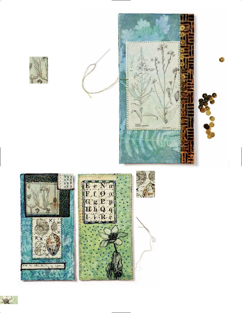
ADD
4 EMBELLISHMENTS:
While McCartney tends to use paper and fabric
to build her collages, the panels can support a wide range of materials and found
objects. Because the interfacing can be sewn, you can attach practically anything by using thread or wire instead of (or along with) glue. Here a row of sewn-on metal sequins adds sparkle along an edge, in contrast to the soft matte surface of the paper.
PLAY WITH COMPOSITION,
5 ADD DIMENSION:
To make your panel more dimensional, sew on borders or glue on ribbons and chunky threads. This
will allow you to vary the composition by highlighting some of the images with framing.
Also try stitching shapes across images or backgrounds to produce a more tactile
and visually interesting surface (the panel on the left features embroi-
dered X’s; the one on the right has been filled with French knots).
Notice how the artist plays with a grid structure, creating tension
between the rigid lines of the grid and the sinuous, natural forms of the images.
54 | Mixed-Media Collage

ADD FINISHING
6 TOUCHES:
Once the panels are complete, seal each one with an
acrylic glaze, combining matte and gloss for a satin finish. You can also use matte or gel medium. To back the panels, attach plain or patterned paper using an acid-free ironon adhesive. This helps keep the panel from warping and hides the stitching. Seal the backing with glaze as well. As a final step, if desired, run the tracing wheel around the panel edges and bind with a whip
stitch. To use twine, wire, or leather cording, you can use an awl or paper punch to make larger holes. Alternately, create a border using bookbinding tape or a thin strip of patterned or plain paper, or finish the edges with a sewing machine.
Tip: When the panels are done, use acrylic paints along the panel edges to integrate them with the rest of the work. This eliminates the very slight raw edge of the paper.
ASSEMBLE AND JOIN THE PANELS:
7 Attach eyelets into the top corners of each panel following manufacturer’s instructions. You’ll need to find or make a supporting rod: Consider using
branches, painted or paper-wrapped dowels, knitting needles, metal piping, an old recorder, or wood stripping that has been painted or collaged. Attach the panels to the rod by threading a fastener through the eyelet holes; wire, leather cording, safety pins, thread, twine or fine ribbon would all work. If desired, add holes at the bottom of the panels for hanging embellishments. Because her work is nature themed, McCartney favors feathers, stones, beach glass, seed pods, tiny toys, small bones, buttons, beads, and small figures.
SHARON MCCARTNEY | 55

In the Studio WITH SHARON MCCARTNEY
How long have you been an artist?
I have been an artist pretty much all my life, but it has been my profession for about fifteen years now.
How did you come to be an artist?
Oh, that’s a hard one because I feel like I have always been an artist. I have done crafts and two-dimen- sional artwork since I was a kid. I did a lot of sketching, attended a lot of classes. I did just about every single craft you can think of, and I just kept going with it throughout high school and college. I took a brief detour into art history and then decided I couldn’t be happy without painting. Professionally, I got started doing traditional watercolors.
When did you start to work in mixed-media collage?
have either inspired me or become actual pieces in artwork. I’m able to use those collections to build layers and create different levels of surface design and to combine these with representational images. Overall it’s less about the “window” illusion and more about addressing the work as an object.
Is it hard for you to use your stuff?
It’s hard for me to use some of the vintage papers I know I can’t replace. But I’ve never been an artist who photocopies a lot of vintage stuff to use. I like the physical texture of vintage paper, the softness of it, and the way that watercolor responds to it. If you keep just photocopying the vintage stuff, you lose something in the execution of your work.
I kept wanting to go back to needlework and embroidery, and I kept collecting things like lace and different decorative papers, looking for ways to incorporate them into my work. So I started working with the idea of Japanese scroll paintings. Those were the first pieces I did with different layers of paper and watercolor and cutting out images and superimposing representational art over pattern.
What does the term “mixed media” mean to you?
What exactly?
I think you lose the real tangible link to the past. It dilutes the image to present it on really shiny new paper. I will use photocopies of black line drawings and will transfer them onto old paper. These transfers sink into the old paper differently because that paper was often unsized or its surface has broken down a bit. I use the same transfer process directly over old writing and shorthand, and then watercolor over that.
It’s not just a mixture of materials, but the idea of being able to say something better using a variety of approaches than with a single medium. If you’re doing mixed media, there’s got to be a reason to be doing it, and it can’t be just embellishment. For me it was that combination of wanting to play with surface patterns and wanting to explore the abstract qualities of collage and then adding to these representational depictions of my subjects.
Do you feel that it is different from other media?
It definitely is about collecting and accumulating. I’ve always had piles of little papers and things that
Why are you so interested in old writing?
I like the craftsmanship of old writing. I think in past times writing was a real art form in itself—people practiced penmanship, they used better material, and they applied themselves to writing beautiful and thoughtful letters. I love the gestures of old handwriting, the extra curls and loops, and sometimes I’ll even cut those into fragments and use them as shapes and marking. The other thing I like is how people used to value paper. People wrote letters across a page and then turned it around and wrote overtop of their writing. The patterns created by this are amazing.
56 | Mixed-Media Collage

Do you work thematically?
I don’t tend to do that so much as I think in terms of series. I often prepare six to ten pieces at a time and I think of them as a collective. I carry ideas from one piece to another. I find it takes the pressure off of getting too precious on one piece.
What are your favorite materials?
I still love working in watercolor, but I also use acrylic in similar ways. Painting is primary in my work, but the other materials I enjoy using are any kind of stitching and threadwork. I also absolutely love making my own materials for collage. I use Setacolor, gelatin printing, or sometimes just paint on old paper. Found objects (especially natural ones) and vintage textiles also figure prominently in my work.
How do you get started on a piece?
I tend to start by working in my sketchbook for a few days, coming up with ideas and making thumbnail sketches of things I want to try. Then I go to my reference photographs and collection of my drawings and choose subjects that I want to use.
How do you work up a composition when you are making a collage?
I will prepare six to ten backgrounds and start working with groups of my materials, laying them out, picking things that will work well together. I’ll have maybe six different compositions, and I’ll come up with different color and textural combinations and see where they lead me. And sometimes the form I’m working with dictates the composition.
Do you have a favorite shape you like to work in?
I tend to prefer less traditional formats like squares or long panels. These lend themselves well to dividing the composition into a collection of
shapes where every component is important and you
can create a dynamic tension and pathways between them.
How do you handle “mistakes”?
Sometimes I will cut up the piece and use it somewhere else. If I’m having trouble with a piece, I try to leave it alone for a few days. I rarely give up completely. With collage, you can always cover over something and go off in a different direction.
Do you have any tips for handling creative block?
Again, I think working on a number of different things at once helps. And also making collage materials—it’s fun, it’s loose, and there’s no right or wrong.
Do you have any advice for people who are just getting started at doing mixed-media collage?
Take a lot of workshops, because they allow you to get other people’s approaches and to get your hands dirty. Don’t be overly hung up on the right way to do something. One of the beauties of mixed media is that you can find more than one way to accomplish something. I advocate a lot of experimenting and keeping a journal or sketchbook. Write down ideas and things that work for you, and collect swatches of colors and textures you like, and
postcards of artists who inspire you.
JOHN POLAK
SHARON MCCARTNEY | 57

ABIDE
AND
IF SEEDS ARE
ALLOWED TO RIPEN
10" 5 1⁄4" (25.4 13.3 CM)
AND
9 1⁄4" 5 1⁄4" (23.5 13.3 CM)
Part of a series Sharon McCartney created for a small-works exhibition, the pieces shown here are cocktail napkins she altered using favorite techniques: photocopy transfers, painting with watercolors, and handstitching. THE SPARK: Working small provided the artist with an opportunity to do riffs on elements of her larger pieces, exploring more intimate moments while making use of her collection of drawings and experimenting with composition and combinations of materials. It also allowed her to recycle leftovers from other projects that were too interesting to throw out. THE PROCESS: Integral to all of McCartney’s work is the layering of images and materials. By adding and subtracting forms, images, patterns, lines, and areas of color to each piece, she is able to produce a rich history that is as unique as the found object she works on. To alter the napkins, she began by stiffening them with fabric stiffener to create a more workable support. She chose a main image panel for each piece and surrounded it with supporting bits of ephemera and lace. After everything was glued in place and dry, she stitched over each piece, adding buttons, beads, and other embellishments. THE NITTY GRITTY: Along with basic supplies (see page 10), the artist used vintage finds such as cocktail napkins, letters, botany and zoology books, sheet music, stamps, as well as photocopy transfers of her own drawings, handprinted papers, embroidery thread, buttons, beads, lace fragments, fabric stiffener, watercolors, graphite, and PVA.
POLAK |
POLAK |
JOHN |
JOHN |
58 | Mixed-Media Collage
JOHN POLAK
Like many mixed-media artists, Sharon McCartney is a collector of cool stuff. “I’ve been collecting old handkerchiefs and domestic textiles for years,” she says. “I love their patterns, the careful handwork,
and attention to detail.” THE SPARK: Reluctant to cut up the pieces she treasured, McCartney altered them by adding transfers of her own drawings, ephemera, and surface design techniques. The square format is a favorite and, in a similar vein to the altered books she also makes, she enjoys the challenge of an existing pattern. THE PROCESS: To soften the palette, McCartney treated the handkerchief with transparent lightreactive paint. She also masked out areas by scattering rice and barley onto the painted surface, then exposing it to sunlight. Once the paint dried, she brushed off the grains, revealing white patterns on the fabric beneath. Next, she used fabric stiffener to stiffen the cloth, then collaged the surface with paper
panels featuring her own drawings and marks made with watercolor and acrylic paints. After further embellishing the surface with ephemera, she enhanced the white patterns with white thread and a seed stitch, creating a raised texture that pulls all the elements together. THE NITTY GRITTY: Along with the supplies listed on page 58, the artist used a vintage handkerchief, transparent light-sensitive paints, teabag paper, and a fossil leaf. She used an iron-on adhesive to adhere the larger panels and PVA for the smaller elements.
EVENING FLIGHT
12" 11 1⁄2"
(30.5 29.2 CM)
SHARON MCCARTNEY | 59

FIBER FRAGMENT
SHRINES
6" 4" (15.2 10.2 CM)
TO
9" 4" (22.9 10.2 CM)
Working at varying levels of complexity and in widely different size formats allows Sharon McCartney to work through ideas for larger pieces while also completing a sizable
body of smaller work. THE SPARK: “Because I have a background in art history, I am drawn to unusual forms from different eras,” she says. “I am interested in European shrines and reliquaries of the late Middle Ages, I love Japanese painting on folding screens and scrolls from the Edo period, and I have also spent a lot of time looking at Persian miniatures and late-nineteenth-century French painters. I often find inspiration in those kinds of forms and translate them to something shrinelike.” She created these fiber fragment shrines for a workshop she designed to allow her students, mostly fiber artists, to make use of their collections of materials and found objects. The pieces are meant to be fun and easy, a quick combination of images and details. THE PROCESS: By adapting her panel-making technique (see pages 52–55), the artist created small shrines that can be hung on a wall or framed. To begin, she made a pattern in the shrine’s intended shape and cut six versions: one of decorative paper, two of sew-through interfacing, and three of iron-on adhesive. One advantage to designing the shrine (as opposed to using a found object base) is that the
60 | Mixed-Media Collage

structure is totally flexible: It can be a simple panel or it can showcase a central image within a window or behind a peekaboo flap, and it can be cut to any size or shape. To make the shrine front, McCartney sandwiched the adhesive between the decorative paper and interfacing shapes, then used an iron to bond it. (Tip: Always use a pressing sheet and set your iron at medium to avoid damaging the materials.) She then embellished the front, setting aside large objects to be glued on last. To make the shrine back, she sandwiched the adhesive between fabric backing and an interfacing shape, used an iron to bond it, then trimmed away the extra fabric. To assemble the pieces, she sandwiched the adhesive between the front and back panels, bonding them with an iron and allowing extra time for the thick panels to hold. (Where needed, she added PVA at the edges to strengthen the bond.) Once the glue was dry, she trimmed away the extra fabric, then reinforced the edges with a wide zigzag stitch. She coated the completed front with acrylic glaze to unify the surface and protect it, then set it aside to dry. Finally, she inset eyelets and hung embellishments from them. THE NITTY GRITTY: Along with the supplies listed on page 52, the artist used sew-through fabric backing, acrylic paints, watercolors, and a sewing machine.
SHARON MCCARTNEY | 61

CHAPTER 5
At Play with
Teesha Moore
Collage artist and journaling pioneer Teesha Moore is used to wearing many hats. Along with raising two daughters with her husband, artist Tracy Moore, she founded and organizes Artfest, a multiday art-workshop extravaganza in Port Townsend, Washington, that brings together artists from all over, and Artfiberfest, its fabric-arts cousin. She has also edited and published several ’zines, such as the four-issue Play, The Studio, and Art & Life, a quarterly still in production. Along with offering workshops throughout the United States, she runs a rubber-stamp business, Zettiology. Moore’s initial impetus to make art was the journals she creates that feature her artwork, writing, and quotations by other writers and artists. She works intuitively, playing with color and graphic design elements. She generally doesn’t proceed with a final composition in mind, but instead finds herself journaling because, as she puts it, “It’s an activity I simply must do on a regular basis to let my built-up creativity splatter onto the pages.”
The Egg Elf, the journal page shown here, features a delightful Moore creation in the form of a stylishly clad Audrey Hepburn–like Cyclops. When the artist saw the “weird and almost rubbery” coat in Vogue magazine, she liked that it was white and felt it would make a nice figure of some kind. Once she had painted a vibrant background and added the figure, she kept collaging on bits and pieces that were lying around her desk. When those were in place, she drew on the page with a wide array of pens, integrating the collage materials and adding color and personality to the images. Because she is a journaler, Moore considers a page incomplete without text; so when the art is done, she always adds her own thoughts or a quote of some kind that seems to fit. Here the words give the image a spin, adding a sense of mystery and intrigue to the coated figure and the hidden promise of the eggs. For steps detailing Moore’s approach to journaling and collage, see pages 64–67.
THE EGG ELF
10" 8" (25.4 20.3 CM)
62 | Mixed-Media Collage

TEESHA MOORE | 63

Technique Highlight: CREATING A
MIXED-MEDIA
JOURNAL PAGE
Creating artwork in her journals is a joyful process for Teesha Moore, one in which she lets intuition take over as she works with familiar materials, painting, cutting, pasting, and writing until the pages are complete. To share her process and provide the images shown below, she interrupted her creative flow, stopping at several points mid-process to make scans of two pages in various stages of development. The development of See Into Life, originally inspired by a glossy magazine photo, is shown in its entirety, while Circus Curse is printed in its final form on page 73.
MATERIALS
•watercolor 140 lb. (252 gsm) hot press paper
•watercolor paints or liquid acrylics
•paper ephemera (often reworked photocopies of other journal pages)
•water-soluble artist crayons
1 |
PAINT A WATERCOLOR BACKGROUND: |
|
Paint a background for your collage. |
||
|
||
|
Moore uses watercolor paints, but liquid |
|
|
acrylics could work just as well for this |
|
|
|
•gel pens (especially neon)
•colored pencils
•assorted pens
•acid-free permanent double-sided tape
process. Work on several pages simultaneously. Using different color stories will keep things lively while you work, plus it could encourage you to move out of relying on the same favorite palette.
64 | Mixed-Media Collage

ADD COLLAGE ELEMENTS:
2 Assemble your collage materials and start playing around with compositions on the different pages. Moore likes to place things according to color, for instance, if
she finds a pink-and-orange picture of a cupcake she just has to use, she’ll place it on every page to see what looks best. Her initial thought might be blue, but she’ll find that it looks even better on yellow. So she glues it down. She also loves borders and uses paper scraps to make borders around every page, playing with color and pattern as she glues. Keep in mind as you work that you will want to leave room for adding text or journal thoughts at the end.
The start of Circus Curse
The start of See Into Life
TEESHA MOORE | 65

INTEGRATE THE
3 COLLAGE ELEMENTS:
Using a favorite drawing medium (Moore uses water-soluble artist crayons for this step), draw lines
on and off the collage pieces. This will give your piece energy and movement and allow you to incorporate the collage onto the painted background instead of just having it sit on top. It also adds more color.
Midway through See Into Life
Midway through Circus Curse
66 | Mixed-Media Collage

ADD FINE DETAILS AND THE TEXT:
4 To finish the artwork, go crazy with colored pencils, pencils, gel pens, markers, and fine line black pens. Consider adding shading with color, doodling (for
which the various pens work well), and any other elements that show your hand at work on the collaged surface. With the artwork in place, it’s time to journal or add quotes.
Tip: Neon gel pens bring light to the page and
are particularly useful for writing and doodling.
TEESHA TALKS TEXT
When you feature a quote as your text, how do you choose it?
Sometimes if the picture reminds me of a certain topic I start there. Fifteen years ago I kept a quote journal but soon realized that what can be relevant to your life at age twenty-seven can have little or no meaning to you a year later. Since then I’ve marked up the pages of my quote books with big pink X’s. Now I just open a favorite one and see what jumps out at me. I’ve learned the value of using less control and being more open to what the universe wants to say
on my journal pages.
For the lettering, do you do calligraphy? Or is it mostly stamped letters? Do you ever use alphabets designed by someone else?
I don’t know calligraphy but have always been entranced with graphic text. I play around with letterforms in my journal, sometimes imitating styles I see in magazines or graphic design books. I
love alphabet rubber stamp sets. I generally stay with a basic typeface as it reminds me of the early days of mail art when I first got sucked into the crazy world of art.
Do you ever do a page without text?
I suppose there are a few, but I consider them unfinished. So the answer is no. It’s a journal. For me, words are part of the page. I don’t want to lose the integrity of the journal, otherwise it becomes a sketchbook.
TEESHA MOORE | 67

In the Studio WITH TEESHA MOORE
How long have you been an artist?
I have been an artist all my life. I think everyone is an artist in something, perhaps their artistry comes out in music or dance or cooking. Mine happened to be visual. Creating always made me happy and seemed to satiate a hunger I’d always have.
How did you come to be an artist?
I wanted to go to art school really bad. I wanted to immerse myself in learning everything I could about it. But my parents said they would only pay for my education if I went to a Christian college. I enrolled in Seattle Pacific University as an art major and lasted one quarter. They started me off with math, physical education, art history, and one drawing class. I would live for the drawing class. But all we did was go through the Betty Edwards book Drawing on the Right Side of the Brain. The teacher showed up for the first class and we saw him twice after that. I figured if college was simply a matter of going through books and learning, I could do that on my own. My
boyfriend dropped out, too. He proposed to me two months later and we were married four months after that (and twentyfive years later, we are still together). He worked in construction and I worked from home making stationery and custom wedding invitations. We supplemented our skills by attending workshops, reading voraciously, and just “doing.” I’m happy it worked out the way it did and have no regrets.
When did you start to work in |
|
mixed-media collage? |
|
It was when I started journal- |
Breathing Out |
ing, actually. I started out by pasting anything and everything from my day onto the pages: business cards, wrappers, receipts. Then, as I’d leaf through magazines, I’d see something that I really liked, so I started pasting in pictures. I started to make images from the collage pieces. For instance, I made a lot of “people” using odd things for arms and legs and bodies and hair. All the other media came into play because I’d be experimenting and so I’d try it out in my journal. Some things I liked and some things I didn’t. For instance, heavy acrylics do not work well within a journal, while crayons add so much color and energy.
What does the term “mixed media” mean to you?
Using a variety of products. I don’t really consider myself a mixed-media artist, but I guess I am. I’ve just never classified myself.
Do you feel that it is different from other media?
Well, mixed media is a freedom to do anything and everything. I don’t go much for titles. I’d think it would be terribly restricting to make up business cards stating that you are a painter, or a sculptor, or you work in pastels. To me, an artist is someone who creatively expresses herself visually. Why limit yourself? Even the title of “mixed-media artist” almost seems limiting.
Do you work thematically?
No, not really. It’s just whatever comes out, comes out. If I happen to be inspired by something I see, then I will do
68 | Mixed-Media Collage
some pages related to that. But usually I like the surprise of not knowing how the page will end up.
What are your favorite materials?
Without a doubt, Caran d’ache Neocolor II crayons. You can add water and turn them into watercolor, they provide rich
color, and I love the look of crayon lines. I also adore pens and have tons and tons of colors and ink types: gel, soufflé, felt tip, permanent markers, highlighters, fine line, and so on. I also really like all types of pencils, too.
Do you find it useful to work on series?
Well, if you mean several pieces at once, yes I do that, but I don’t necessarily think in series. OK, I take that back. I have done a few things in series. But it is more of an obsession with a particular idea. I will keep doing it until I’m sick of it.
How do you handle “mistakes”?
I love mistakes, because they give you an opportunity to create something even better. You now have a task—to turn something that isn’t looking so good into something that looks great. I love these moments. I can’t always turn a piece around, but more times than not, it pushes me to do things I would have never thought of before. My favorite pieces are ones that weren’t working and I felt compelled to make them work. Mistakes are always welcome in my journal.
Do you have any tips for handling creative block?
Get out your journal and just play. If you don’t feel like getting out all your media, just start doodling. You need to do something to unlock that creativity
door that sometimes can be all chained up. You’d be surprised at how doodling
so easily breaks the chains. In the same vein, just get out a little paint, a piece of paper, and a brush, and start making strokes. Don’t worry about making a picture, but instead play with color and see what happens.
Do you have any particular influences?
Absolutely. Graphic design has influenced me the most. I adore it and can never get enough. Certain music can really influence a trancelike state when I am creating so that it is easier to tap into that creative force that can flow right through you onto the paper. Certain artists at certain times in my life. These are always changing but have included Gil Bruvel, Henrik Drescher, David Mack, Dave McKean, Chagall, Modigliani, Raphael, and Lane Smith. Movies also can influence me, like Moulin Rouge, The 5th Element, Dark City, What Dreams May Come, James and the Giant Peach, and all of Tim Burton’s movies, of course!
Do you have any advice for people who are just getting started doing mixed-media collage?
Start with something simple, like painting your background. Once you’ve done that, you are halfway there. Then play. Then if it isn’t working, put a little more thought into how to fix it. Lastly, too many people stop too soon on a piece as far as I’m concerned. Push yourself past the point when you feel like if you do anything else to it, you will ruin it. All work has this point at least twice. You need to push past it, because a piece of art is never done. There is always something more that can be done. Whoever said, “More is more” is my kind of woman!
TEESHA MOORE | 69

WEE FRIENDS
10" 8" (25.4 20.3 CM)
Many artists fall in love with special materials or objects and Teesha Moore is no exception. THE SPARK: Because she loves colorful butterfly wings, she was looking for a way to use them. She started out by creating a sort of “specimen wall.” But being more interested in expressing alternate realities than she is in recreating what we already know, she gave it her own playful (and affectionately creepy) spin by adding human heads. When she was done, she told the story of the Wee Friends in the spaces she had left behind. THE PROCESS AND THE NITTY GRITTY: Moore’s work is all made using the same basic approach, which can be described as a process of adding layers using different media. First, there is a watercolor layer, where she paints the background and establishes the dominant color of a page. Next comes the collage layer, where she thumbs through piles of stuff she has in her studio and uses it to create colorful borders around each page. Then comes the crayon layer, where she uses artist crayons to make lines on and off the collage elements, adding color and movement and connecting the collage to the surface. And for the final layer, she uses colored pencils, pencils, gel pens, markers, and fine line black pens to add detail lines, shading, more color, and the text. For more on her techniques, see pages 64–67.
70 | Mixed-Media Collage

Sometimes an accidental collision of seemingly unrelated ideas can provide an artist with the subject of a piece. THE SPARK: Teesha Moore is entranced by round things, so when she found the images of sea urchins, she had to use them. At the same time, she had been thinking about the premise of the sci-fi movie The Matrix, in which we are all just figments of our own imaginations. Somehow joining the floating planetlike urchins and the off-center figure with her searching, soulful eyes created a visual expression of Moore’s thoughts. She does confess to messing up on the quote. “It ended up getting twisted around,” she explains, “but I found the end result even more interesting.” THE PROCESS AND THE NITTY GRITTY: To get started on a journal page (or any collage), Moore suggests painting the background so there is no white. It’s easy and all you have to do is pick a color. Her next step is to start putting the collage in place and allowing a picture to take shape. “I work up a composition through instinct and keeping my mind out of the process,” she says. “I try to go with first inclinations and just trust the process. It usually knows better than I do. A good motto to use: ‘Don’t think, just do.’” For a detailed description of her techniques, see pages 64–67.
THE ART MATRIX
10" 8"
(25.4 20.3 CM)
TEESHA MOORE | 71

BIRD FAIRY
12 1⁄2" 11"
(31.8 27.9 CM)
Collage is a lot like musical improvisation. Artists often work with whatever materials are at hand, riffing off of images and texts as they piece together a cohesive whole. Bird Fairy is from one of Teesha Moore’s older journals (in a size she has since abandoned), and her style is rougher and edgier, embodying an off-the-cuff creativity. The color palette is moody and dark, and rather than presenting her texts in the more graphicsinfluenced style of her recent work, she explores personal thoughts and ideas in a meandering script. THE SPARK: Like The Egg Elf (see page 62), this page was inspired by a piece of clothing, in this case a knitted vest in a magazine. Once Moore had plopped it on the page, she just kept right on going. THE PROCESS AND THE NITTY GRITTY: “With all my work,” says Moore, “I usually like it right when I finish with it, and then I don’t like it. It has always been that way for me. I am satisfied and then not. But it doesn’t matter because it is all about the process for me. Whether a page turns out or not is no big deal and therefore it frees me up to be crazy and take chances and not get so caught up with something not working or ruining it.” For a detailed description of the artist’s techniques, see pages 64–67.
72 | Mixed-Media Collage
Like many artists who work intuitively, Teesha Moore often finds personal meanings in her work upon completing it. Sometimes these revelations are even a bit of a surprise. When she was working on Circus Curse, she was collaging with the paper scraps that were at the top of her collage bin. She wasn’t thinking about anything but was just letting it happen. THE SPARK: Once she was done with the artwork, she saw that the positioning of a little man in the background and the circus performer looking back over her shoulder told a kind of story. It made her think of a lost love, so she wrote a little narrative about the starcrossed couple and their night of enchantment and longing tinged with regret. THE PROCESS AND THE NITTY GRITTY: Technically speaking, Moore uses the same basic process to create her collaged journal pages (described in full on pages 64–67). “Doing journal work inspires and informs all the other areas of my life,” she says. “It’s like breathing, eating, and sleeping. I have to do it, whether I am good at it or not. My artwork comes from deep down inside. It seems to come from a source outside myself that I channel. I feel like I just go along for the ride and see what happens.”
CIRCUS CURSE
10" 8"
(25.4 20.3 CM)
TEESHA MOORE | 73

S E C T I O N 2
Gallery: A Sweeping Look
at Work by Twenty
Contemporary
Mixed-Media Artists
While the Profiles section of this book follows the modernist precept “Less Is More,” presenting fewer artists and focusing closely on their work and processes, the Gallery is all about abundance: twenty artists using differing techniques in varied styles. With techniques ranging from Tracy
Spadafora’s combining of encaustic medium with wax candies and Peeps to Michael de Meng’s assembling of old junk with a caulk gun, Liquid Nails, and a sense of humor, the artists in the Gallery have all found inventive ways to mix media, bringing together a jumble of materials and techniques to express themselves more fully and eloquently than they might otherwise have done. As Maria Keehan puts it, “You never know when that seriously ugly brooch is going to be the perfect solution to all your assemblage problems.”
One thing these diverse artists have in common is their embracing of the freedom that working in mixed media brings. Jane Maxwell has been repurposing manure bags, using colorful vintage ones she snapped up at the Brimfield Antiques Fair as a vivid background for abstract works featuring cut up rulers. Shelby Fischer delves into the macabre world of pulp literature, reinvigorating the antiheroes and femme fatales of the genre by bathing them in colorful glitter and rhinestones.
Not only do mixed-media artists seek out interesting materials and processes, they tend not to worry that much about perfection, instead reveling in the mistakes that might make other people
cringe. Jen Flores has a background in oil painting but has created a wickedly funny style making assemblages with found objects and painted backgrounds. “I keep an open mind when something goes in an unexpected direction,” she says. “I confess I actually like when mistakes happen; it keeps
me thinking, providing fresh ideas and new direction.”
Tracy Spadafora, see page 110
Whatever the message or the content of their work, for these artists it always seems to come back to this: Mixed-media collage is a materials-driven process, one that values spontaneity, intuition, and an appreciation for (rather than a fear of) stepping into the unknown.
74 | Mixed-Media Collage


ALETA BRAUN
WINTER SOLSTICE
11" 14" (27.9 35.6 CM)
CLAIRE ASHBY
Just as writers will say their characters sometimes make their own decisions, visual artists can discover that an artwork has a mind of its own. Aleta Braun set out to make Winter Solstice as part of a series, but the piece had its own ideas. THE SPARK: Braun was inspired by the winter solstice and the life cycles of a tree. She also references a childhood story: Her mother told her that if she looked to the brightest star, she would find her late grandfather there. Over the years, these protective eyes have appeared in her work. THE PROCESS: The artist starts with an idea, color, texture, or a bit of paper or cloth. She plays with components against a background before gluing. It’s an organic, intuitive, materials-oriented process
with moments of intentional sequence: realizing some things will need to be glued down first or that something might have to be sewn. To make Winter Solstice, she painted an earthy red underpainting with oils on canvas board. When it was dry, she painted a darker layer over it and then scratched back down to the red in places. For the tree, she squeezed white paint from a plastic bag to get a fine line impasto. For texture and visual interest, she added zigzag stitching and handsewed beads to patterned paper, then collaged it in place. THE NITTY GRITTY: Along with basic supplies (see page 10), the artist used canvas board, oil paints, patterned paper, beads, a sewing machine, and PVA.
76 | Mixed-Media Collage

Like many artists, Aleta Braun has a second career (as a reflexologist); because her studio time is limited, she always plays a particular piece of music first thing, to help open herself up to the creative process. THE SPARK: This piece was made while she was taking an encaustic workshop with Judith Hoyt. Braun was still learning the technique so she brought along familiar materials. THE PROCESS: She knew she would be working on a 12" (30.5 cm) square support, so she prepared paper that size in her studio beforehand, adding a spiral in zigzag with her sewing machine. In the workshop, she responded to paper ephemera provided by the instructor and experimented. She explored the new technique, colors of pigment, and was inspired by the work and energy of the other participants. The result is a satisfying pastiche of favorite items, loose and spontaneous, reflecting her mood of play and exploration. The spiral draws the viewer in while the eyes across the top offer a startling perspective: artwork that’s looking back at you. A dried seedpod provides a prickly counterpoint to the smooth wax surface of the encaustic medium. THE NITTY GRITTY: Along with basic supplies (see page 10), the artist used a wood support, watercolor paper and paper ephemera, graphite, a dried magnolia seedpod, encaustic medium, pigment, and a sewing machine. For information on encaustic technique, see page 123.
ALETA BRAUN
UNTITLED
ENCAUSTIC,
WINTER 2006
12" 12"
(30.5 30.5 CM)
CLAIRE ASHBY
GALLERY | 77

Feature: COLLAGE AS A WRITING TOOL
Brainstorming with Scissors and Glue
JENNIFER CRUSIE
Collage has become really important to me when I write fiction. I believe our stories exist in some complete form in our subconscious, and our problem is to bring them to the surface. I think most of writing is just getting out of my own way to let the story emerge because I’m always trying to craft the story as I write the first draft, making sure everything is going the way my left brain planned
it. It’s really easy to crush the life out of a story that way, but I’ve been writing for so long that it’s almost impossible not to shape it as I write.
Collage is a way for me to get to my story, bypassing my well-trained formalist writer brain and jack directly into that subconscious soup of image and object, picking up things because they feel right and gluing them next to each other in a pattern that feels right. I move things around a lot as
I work, which is one of the reasons why my collages aren’t artworks: there’s too much unartistic torn paper and glue splotches and scribbled marker. I
slop paint and marker on to change color as shorthand visual notes to myself, not to make visual poetry. If the storytelling part of my brain says, “That’s it!” it stays, even if the artist part of my brain says, “You’re kidding, right?” And because it feels like play, not work, the book opens up for me. I’m much more creative with scissors and paper and glue than I am staring into the
computer screen, because it doesn’t feel like a book when I’m pinning something to foam core. When I’m typing, I know it’s going to be published. When I’m playing with stickers and rubber stamps, I’m just fooling around building a fantasy world and making up stories and people that live in it. Anything goes, no pressure at all. I feel the way I did before I was published, completely free again.
Having said that, the Trudy Hot Toy collage was one of the most planned collages I’ve ever done. Trudy goes into an old toy store on Christmas Eve to find a toy, so I pulled a very splintered old shadow box out of my junk stash and used that because it reminded me of the old splinted wood shelves in the toy store. Then I glued Trudy and everything that made up her charac-
78 | Mixed-Media Collage
ter to the frame because she’s at the forefront of the story—the novella is entirely in her point of view— and put all of her antagonists, everything that was pushing her from behind (the hero, her family, the bad guy) into the box. And then, because it was a Christmas novella, I kept obsessively gluing on Christmas things. I’d think it was done and then I’d keep gluing, wondering in the back of my mind why I couldn’t stop. Finally I had so much stuff on there it was ridiculous, and that’s when I realized that it looked like Christmas to me: too much stuff, too much glitter, too much everything, with Trudy standing in the middle of it with her hands on her hips, completely exasperated. And, of course, that’s when it looked like the story, too. A lot of the story came straight out of the images in that collage. The broken gingerbread motif came from the gingerbread stickers that broke while I was trying to glue them in, and the cow came from a pencil topper I found in a drawer and ripped off so I could use it. It’s the subconscious at work: I could have just glued the gingerbread back
together and not written in the struggles with the broken cookies, and there were other pencil toppers in the drawer, but those were the things my brain snagged on and said, “Ooooh, that!” They went into the collage and from there right into the story.
The Bet Me collage was even more planned than the one I made for Hot Toy. It’s a very simple collage because it was done after the book was done, as a way of helping to focus the rewrite. I divided the world of the book into three areas: public outside (the park), public inside (the bar, the restaurant, the bridal shop, the wedding chapel), and private inside (Min’s apartment) and chose only the most important images for each. Narrowing the images to just a few really made
Crusie created this collage while working on the novel Bet Me.
me concentrate on what the story needed, not on what scenes I liked having written. I had a huge baseball in the bottom layer of the collage that just didn’t belong there. I finally took it out and put in three baseball stickers. I needed the three-peat of the three baseball scenes in the book, but I did not need the huge last scene I’d written, so I cut it way back until it was simply the third in a series and the book was much better for it. My ego wouldn’t let me cut it, but my subconscious in the collage told me that scene was sitting in the book like a giant egg the same way that giant baseball had overwhelmed the collage.
A better example of the seat-of-the-pants collage is the Mare/The Unfortunate Miss Fortunes collage (see page 80); that one truly was a glue-on-tear-it-off- move-it-around work-in-progress for the entire book, and it had a huge impact on the finished story.
Subconscious to paper-and-glue to story—I can’t imagine writing without collage now.
Jennifer Crusie is the best-selling author of fifteen novels, a book of literary criticism, and numerous essays. Her work has been published in 20 countries.
GALLERY | 79

JENNIFER CRUSIE
MARE AND THE
UNFORTUNATE MISS
FORTUNES
24" 16" 16" (61 40.6 40.6 CM)
Novelist Jennifer Crusie uses collage to keep herself from getting too bogged down in the writing process. Working back and forth, writing and gluing, lets her see the story with fresh eyes. THE SPARK: This collage is a result of the author brainstorming for her character, Mare, in a collaborative paranormal novel about three sisters. THE PROCESS: She began with a small easel and glued two picture frames to the top, one for each of Mare’s sisters, and an image of Mare at the top looking out over everything. In brainstorming collages, Crusie isn’t looking for exact likenesses as much as attitudes and feelings, so she might use pictures of different people to represent the same character. She filled the center with drapery, the way Mare covers her bedroom walls with drapery, and then added the people and objects that populate Mare’s world. The blue glittery stars represent Mare’s magic, and the rocks, the bed, and the gold glitter at the bottom represent scenes from the last act of the book as Mare fights the good fight at the end of her journey. THE NITTY GRITTY: Along with basic supplies (see page 10), the author/artist used a photo easel, a wood tray, picture frames, glitter, dried leaves, wrapping cord, photographs, stickers, computer type, magazine cutouts, wire, stones, wrapping paper, sunglasses, artificial flowers, die cuts, postcards, yarn, rubber stamps, candy wrappers, netting, clear tape, double-sided tape, PVA, and Goop.

Why I Never Graduated Collage
ALISA KWITNEY
Like a lot of comic book writers and editors, I have always been frustrated by my lack of artistic talent. I mean, sure, I can write panel descriptions that would not make the artist howl with frustration as he or she attempts to draw from my script. And I understand how to conceptualize the graphic novel page as a whole. What’s more, I can tell if a cover will “work” from across a room. (An image that only looks good close up will not attract a person browsing in a store. This explains the preponderance of pneumatically breasted super heroines dressed in brightly colored spandex.) At my imprint, Vertigo, we took a different approach, favoring sophisticated, edgy images, including a fair amount of collage. This made the cover editor think we were a little weird. “What’s this,” he’d say, “a nipple on her head?”
Comic book pages are, in essence, collages of images and text, and for seven years I made my living midwifing some rather good ones. But I can’t draw. I can’t even doodle the nifty gorgon headdresses my fellow editors would whip out during meetings, all the while insisting they were, in fact, taking steps to keep Swamp Thing from shipping late.
My feelings of artistic inferiority diminished somewhat when I left my job and began to write novels full time. I concentrated on writing strong visuals and forgot about any misguided attempts to draw. And then I met Jennifer Crusie. Now, I already felt a little in awe of Jenny, who not only writes funny and smart and sexy, but who can also explain the theory of funny and smart and sexy. These are two skills that are usually mutually exclusive, like the ability to surf professionally and the ability to teach applied physics. So when Jenny explained that whole thing about making collages before she started writing in order to free her subconscious and reveal her book’s underlying themes, I was sold. I got snipping and
pasting glossy magazine pages, trying to free my inner Fauvian spirit and get out of my own way.
I wound up with a bunch of glossy men and women who looked like they were advertising odd products, including Monopoly money and a big-head doll from the broken-toy bin. The more I looked at my creation, the more my sense of my story receded. Then my kids came home from school. “What the heck is that?” asked my son. “That’s my Rapunzel Barbie!” wailed my daughter. “The money is falling off,” added my son. “You used the wrong glue.” I went back to my old lack-of-method of writing novels.
Here’s how it works: First, I get an idea, like, “What kind of woman would move to the country without knowing how to drive?” Then I add to the idea folder in my head. If the woman is an outsider, wouldn’t it be interesting to pair her up with a man who looks like he belongs, but feels discordant with his surroundings? I start to accumulate images, scenes, bits of people I know and others I have only glimpsed in passing. I feverishly write notes on scraps of paper that I later lose. I drive in my car, blasting bad seventies music or Russian showtunes or whatever odd theme music strikes my fancy. Then I combine all these disparate bits to make my characters. The characters kind of make the plot and the plot also makes the characters, because really, plot is just a nice way of saying, “This is how to torture your imaginary friends in order to make them change and grow.”
So I suppose I do collage, it’s just that I do it in my head, Frankensteining the bits and pieces of people and ideas and combing them into something new.
Alisa Kwitney is the critically acclaimed author of
Flirting in Cars, Sex as a Second Language, and The Dominant Blonde.
GALLERY | 81

MICHAEL DE MENG
MONARCH
7" 4" 2" (17.8 10.2 5.1 CM)
When it comes to mixed-media artist Michael de Meng’s work, anything and everything is fair game. In fact, he often does not know the original purpose of the “stuff ” he uses, only that how he is repurposing it in his art is somehow right. THE SPARK: Inspired by Mexico’s Day of the Dead festival, de Meng’s art explores issues of mortality, which are reflected here not only in the religious imagery and butterfly reference but also in his materials: defunct objects to which his work brings new life. THE PROCESS: To create this sardine-can shrine, he began by trying out a number of found items until he found the pair of metal forms that created the wings effect. Placing different collage elements in the center, he let the interplay of materials and shapes guide his composition, gluing things as he worked. To bring cohesion to the disparate elements, he added a coat of rust-colored paint, then layered on smaller elements such as the crown over the man and the gear on top. Finally, to weigh it down, he added the chain with the metal plug. The resulting piece is an intriguing balance of opposing elements: light and dark, flight and heft, whimsy and gravity, boldness and subtlety. THE NITTY GRITTY: Along with basic supplies (see page 10), the artist used a sardine can, various typewriter parts and found metal objects, an unidentified metal plug on a chain (where it came from is anyone’s guess), rust-colored paint, a caulk gun, and Liquid Nails.
82 | Mixed-Media Collage

Like many collage artists, Michael de Meng’s process is materials driven. He calls himself a good listener, someone who lets images and artifacts guide him, the juxtaposing of random objects ultimately creating unexpected meanings. THE SPARK: Like most of his work, this piece explores how everyday objects, even banal ones, can be transformed into items that are seemingly sacred, a process the artist likens to mythologizing the mundane. THE PROCESS: With a bunch of stuff lying around and a caulk gun full of Liquid Nails nearby, de Meng took his carefully cleaned sardine can in hand and got started. Because he is riffing on the actual objects, he is never quite sure what direction a piece might take. Here he glued and nailed the main pieces together, drilling holes as needed for the metal objects to be joined. Once the outline was established, he added smaller collage elements, then applied a mixture of washes and patterns. Finally, he added the smaller objects, refining the look and message of the piece, and blending with paints as needed. The resulting Santa Canna is a playful personification of a sardine-can saint, complete with veiled eyes, a crown of matches, and a scroll-like beard. THE NITTY GRITTY: Along with basic supplies (see page 10), the artist used a sardine can, nails, paper, a book of matches, some mysterious but cool-looking items, a handheld drill, paint, a caulk gun, and Liquid Nails.
MICHAEL DE MENG
SANTA CANNA
7" 3" 2"
(17.8 7.6 5.1 CM)
GALLERY | 83

DORIT ELISHA
ART IS EVERYWHERE
32" 33" (81.3 83.8 CM)
STEPHEN BAY
A printmaker and mixed-media collage artist, Dorit Elisha created Art Is Everywhere as a page in a giant imaginary journal (the start of a series). THE SPARK: Intrigued by an old, yellowed map of San Francisco, detailing an area near where she lives, she thought it would make an evocative background for a collage. THE PROCESS: Keeping in mind her plan to use the map as her base (and responding to the faded palette), Elisha began to assemble materials, including screen-printed images of antique dolls and vintage papers from her childhood. Black-and-white contact sheets made by her father, a professional photographer, provided some of the imagery. From another source, she chose a flying dove to reference stories of peace she heard growing up in Israel and to symbolize her own identity as an artist. After gluing the various papers in place and letting them dry, she stitched over the entire collage with a sewing machine—a favorite technique. Finally, she antiqued the pages by painting over parts with white paint. THE NITTY GRITTY: Along with basic supplies (see page 10), the artist used an old map, vintage and found papers, photographs, screen-printed papers, foil, transparencies, acrylic paints, gel medium, a sewing machine, and an acid-free gluestick.
84 | Mixed-Media Collage

Sometimes a personal theme in art ends up reflecting a universal experience. Such is the case with Dorit Elisha’s My Life as a Three-Ring Circus, part of an ongoing series that uses maps as giant journal pages (see also previous page). THE SPARK: Her idea was to portray her busy lifestyle and multiple roles within it: mother, wife, friend, artist, and teacher. Many artists will be familiar with the struggle to find time and energy to create while also living an overscheduled life. THE PROCESS: Elisha chose a colorful and visually busy vintage map to use as her support and background. She selected an image of a woman (a color photocopy of one of her original screen prints) to represent herself, placing it at the bottom and collaging on juggler arms. Her canvas self juggles five ball-shaped collages that represent the different roles she plays in her life; each ball is edged with machine stitching. Circus clowns, jugglers, tandem-bike riders, and other figures add color and chaos. Once the shapes and images were in place, she went back in with acrylic paints to unify the background and create a coherent whole. THE NITTY GRITTY: Along with basic supplies (see page 10), the artist used a vintage map, photocopied screen prints, found images, acrylic paints, crayons, gel medium, a sewing machine, and an acid-free gluestick.
DORIT ELISHA
MY LIFE AS A
THREE-RING CIRCUS
34" 33"
(86.4 83.8 CM)
STEPHEN BAY
GALLERY | 85

SHELBY FISCHER
SPIRITUAL CASTAWAY
12" 12" (30.5 30.5 CM)
The search for materials has taken artist Shelby Fischer on a wild, glitter-filled ride. Using what some might consider a lightweight material (not for “serious” artists), she creates vibrant, eye-popping canvases peopled with renegade, outsider figures and fierce animals. THE SPARK: Drawn to the unembellished magazine images, Fischer saw opportunities for creating a mysterious relationship between the men and the magical ball as well as for glittering the flowing robes. THE PROCESS: She began by painting the canvas support with acrylics, then attached gossamer star paper using matte gel medium she had diluted with water. She kept adding layers of paper until she got the look she wanted (she might use up to twenty). Next, she turned to her stash of magazine cutouts, moving them around against the background until she had an “aha” moment. She then taped everything in place and lived with it for a few days before gluing. Then she added glitter and rhinestones to create a vibrant tableau. Finally, she added a “frame” of distress ink, gold leaf, and ink, and coated the background with glossy varnish. (Tip: Because her work is so layerand glue-intensive, Fischer lets it dry thoroughly between processes.) THE NITTY GRITTY: Along with basic supplies (see page 10),
the artist used a stretched canvas support, assorted papers, images from early-twentieth-century magazine covers, glitter, rhinestones, glass beads, gold leaf, inks, acrylic paints, acrylic and gel matte medium, gloss gel/varnish, gloss medium/varnish, and an acid-free glue pen.
86 | Mixed-Media Collage

Key to the success of Thank you, Albert is the tension created between the buttoned-down Victorianism of the central figure and her counterpart’s daring leap through and away from the confines of the noose. And in this sense, the piece is characteristic of Shelby Fischer’s desire to tell powerful, poignant stories through the juxtaposition of strongly resonant images. THE SPARK: Although the artist didn’t realize it until well after she had finished, the piece was influenced by the writings of Albert Camus (whom she thanks in the title). To create her high-flying heroine, she cut figures from early-twentieth-century magazine covers and experimented with the different elements (the noose, a diamond-studded whip, an almost psychedelic background). The resulting piece is a quirky mixture of disparate elements: fantasy, horror, and fashion. THE PROCESS AND THE NITTY GRITTY: Fischer uses the same basic approach for most of her collages, working the background with multiple layers of paper, playing around with cutout images, and loading up the surfaces with glitter and rhinestones. For a detailed description of the techniques and materials she uses, see previous page.
SHELBY FISCHER
THANK YOU, ALBERT
12" 12"
(30.5 30.5 CM)
GALLERY | 87

JEN FLORES
HOT DAMN GODDESS
14" 11" (35.6 27.9 CM)
A longtime painter, Jen Flores took a detour several years ago into mixed-media collage, enjoying the freedom and challenge of working with unusual materials. THE SPARK: Along with Botticelli, Flores credits British artist Paul Spooner with inspiring her approach to Hot Damn Goddess and Venus with Shells and Leather.
His mechanical sculpture The Last Judgment shows a life-size wooden skeleton consuming people, who are then digested (via conveyor belt) to either heaven or hell. She refined this idea by drawing parallels to social perceptions of women as either saints or sinners and found the ideal form to be a diptych. THE PROCESS: To create Venus, Flores recarved an Indonesian balsa wood figurine and slipped on the leather jacket, originally a key chain. She adhered a photocopy of a desert scene and an antique postcard onto a wooden support, and painted over parts to create continuity. She then used the same process of gluing and wiring things in place as she did for Venus with Shells and Leather (see next page). Attaching the glass bottles was tricky: She glued them onto the support with silicone, then filled the space around each bottle with a thick glue–glass bead mix. THE NITTY GRITTY: Along with basic supplies (see page 10), the artist used a wood panel support, a balsa wood figurine, a tiny leather jacket, glass beads, photos, hot sauce bottles, found metal pieces, acrylic paints, a handheld drill, and silicone.
88 | Mixed-Media Collage
Working with tongue planted firmly in cheek, mixed-media artist Jen Flores created a two-part homage to Sandro Botticelli’s Birth of Venus, replacing the willowy Renaissance beauty with a twenty-first-century biker chick. THE SPARK: The beauty of the original so inspired Flores that she began to toy with the imagery in Adobe Photoshop and invented a more playful Venus that embodied a Saint/Sinner theme. Her Venus is clad in a leather jacket and has boldly flung open her arms to embrace her surroundings: the ocean, shells, sparkling jewels, and dancing dolphins. Meanwhile, her muse gazes demurely over her shoulder. THE PROCESS: After adhering a photo of the original artwork to the support panel with acrylic gel medium, the artist altered the image with acrylic paints, then attached the scallop shell by drilling holes through it and the panel, then adding silicone glue reinforced with wire. She prepared a cast-clay
figurine by dressing it in the leather jacket and drilling a hole in the back so she could both screw and glue it in place (all of the large pieces are fastened as well as glued). Then she created sea foam out of varioussized glass beads and added embellishments such as tiny shells and starfish. THE NITTY GRITTY: Along with the supplies used on page 88, the artist used a cast-clay figurine, scallop shells, and vintage jewelry. She attached materials using silicone, weld glue, acrylic gel medium, screws, and wire.
JEN FLORES
VENUS WITH SHELLS
AND LEATHER
11" 8.5"
(27.9 21.6 CM)
GALLERY | 89

LORRAINE GLESSNER
BLOSSOM
12" 12" (30.5 30.5 CM)
Preserving altered silk fabrics and organic materials in encaustic wax allows artist Lorraine Glessner to form a connection with the patterns and cycles of the natural world. THE SPARK: Blossom seeks to capture an elusive moment, the time of growth just before the bloom, when the structure of a blossom is formed but remains enclosed, its beauty promising to unfurl but not yet visible. THE PROCESS: Glessner’s pieces consist of intricate surfaces created by sealing transparent silks, thread, paper, paint, and images into layers of encaustic medium and beeswax. To prepare the silk underlayer, she subjects it to many processes such as burning and branding, rusting, decomposition, burying, or exposing it to the elements. She then stretches it over a Claybord support, adding layers of wax and deconstructing them by burning, branding, scraping, and inscribing the surface. She adds subsequent layers of transparent silks, thread, hair, paper, paint, image, wax, and branded marks, letting the composition grow in response to the patterns in the fabric. The repeated grid patterns and geometrical imagery provide a strong visual foil to the sinuousness of the organic materials, as well as metaphorically referencing the natural order of things. THE NITTY GRITTY: Along with basic supplies (see page 10), the artist used a smooth Claybord support, beeswax, encaustic medium, digital images, translucent papers, photographs, oil paint on silk, and organic ephemera. For more information about encaustic technique, see page 123.
90 | Mixed-Media Collage

Buried beneath layers of encaustic wax, the organic materials, altered silk fabrics, and photographic images of Lorraine Glessner’s work reflect and comment on the beauty of the natural world. Lightly organized by a grid formation, her canvases feature repeated images of circles and spirals, which she uses to suggest layers of meaning, processes, interrelationships, wholeness, and the lifecycles that order the universe. THE SPARK: Bloom celebrates beginnings and, as is typical of Glessner’s art, it reflects both the ideas and the emotions that inform her work. She began to make the piece at the start of spring, when she could just smell things beginning to grow and the chill had left the air. She uses her signature grid pattern only minimally here, allowing for a looser, more playful feel. THE PROCESS AND THE NITTY GRITTY: To make Bloom, Glessner used the same basic process as she did for Blossom (see previous page), but with one exception. Here she used a heated drawing tool that is designed to draw lines with molten encaustic. It was the first time she had used it but she quickly absorbed it into her tool kit, finding that it enables her to incorporate fine lines and increased texture into her work. (Tip: When working with wax, she recommends using filtered wax instead of bleached as bleaching chemicals are harmful and also yellow over time.)
LORRAINE GLESSNER
BLOOM
12" 12"
(30.5 30.5 CM)
GALLERY | 91

HOLLY HARRISON
PLAYTHING
9" 12" (22.9 30.5 CM)
Writer Holly Harrison loves the medium of collage and finds that working with her hands is a great corrective to overthinking while writing. THE SPARK: She used self-printed photographs of her daughter to create a series of 5" (12.7 cm) studies by altering them in different ways, then decided to rework one of them on a larger scale. THE PROCESS: She prepared the support using the same basic technique as for her self-portrait (see next page). Surprisingly, working larger led her to simplify the image rather than add more elements. After printing the photograph in sections, she distressed it with sandpaper, and drew on it with color pencils. She chose visually interesting materials to create Mira’s bathing suit (a printmaking discard), the water (handmade paper), and the ball (distressed with sandpaper). And although she liked the tension of the off-center image, she felt her daughter’s excitement needed a focus. A beach ball seemed just the thing, and she gave it a visual spin. THE NITTY GRITTY: Along with basic supplies (see page 10), the artist used a canvas-board support, photographs, heavyweight matte photo paper, assorted printed and handmade papers, watercolor pencils and acrylic paints, joint compound, archival varnish with a UV protectant (for the photograph), a computer, an ink-jet printer, acrylic matte medium, and PVA.
92 | Mixed-Media Collage

Working with so many talented artists is always inspiring to Holly Harrison, who considers herself a writer first and a visual artist-in-training second (though she really hates to compartmentalize creativity). THE SPARK: The main image is a photograph taken by a friend’s three-year-old daughter, Mimi. It seemed to capture a fleeting moment, one that Harrison wanted to explore in a collage. THE PROCESS: To prepare the background, she worked the support with watercolor pencils and acrylic paints, then slathered it messily with joint compound to add texture. After letting it dry overnight, she smoothed it down with sandpaper. She printed the photograph in four sections and pasted them together David Hockney–style. She then sanded the assembled photo, distressing the surface and emphasizing the joins. Next, she played with materials, adding and subtracting, placing and replacing, until she found a composition she liked. The repeated image of two birds in a tree is a detail from one of her photographs, altered in Adobe Photoshop. To print the image onto rice paper, she ironed the rice paper onto freezer paper, cut it to size, printed the image, then peeled away the rice paper. Using acrylic medium to paste it in place allowed color to bleed through from below. (Tip: You could also apply photocopy transfers to the surface.) To protect the photographs, she sprayed the finished piece with two coats of archival varnish. THE NITTY GRITTY: Along with the supplies listed on page 92, the artist used rhinestones and cotton fabric.
HOLLY HARRISON
ON WOOSTER STREET
12" 16"
(30.5 40.6 CM)
GALLERY | 93

CLAUDINE
HELLMUTH
WHAT WERE YOU
DOING ALL DAY?
10" 10" (25.4 25.4 CM)
Artist Claudine Hellmuth enjoys creating playful collages around domestic themes in her signature style, a combination of collage and skillful pen-and-ink drawing. THE SPARK: Here she portrays a woman and a man, each caught up in their own pursuits. Both pieces poke delicate fun at the traditional concept of the perfect domestic scenario: the fulfilled housewife and pampered husband. With a faraway, dreamy look in her eye, the woman ponders where her day has gone, while the viewer is left to imagine the endless list of household chores she has accomplished. THE PROCESS: To create a cheerful kitchen for her happy homemaker, the artist started by gluing a background of colored tissue paper onto a stretched canvas, and then added a floor made of patterned origami paper. The oven is a painted recipe. She dressed her central character using colored paper and chose a black-and-white photocopy from her collection of antique photos for the head. Once the piece was dry, she added line work using a black fine-tipped pen. With the use of flattened perspective, direct lines, and simple shapes, Hellmuth creates a unique relationship between the illusion of naiveté and the knowing irony of her text. THE NITTY GRITTY: Along with basic supplies (see page 10), the artist used a stretched canvas support, various papers (origami, tissue, colored, and patterned), photocopies, Pitt artist pens (and pigmented India ink), acrylic paints, and gel medium.
94 | Mixed-Media Collage

A companion piece to What Were You Doing All Day? (see previous page) in which a housewife loses track of time, One of the Best Pastimes shows the male equivalent of a day at home. Here a much more handsome Archie Bunker watches TV while drinking a beer as a cat poses elegantly at the foot of his chair. THE SPARK: Toying with 1950s stereotypes, Claudine Hellmuth has created a wry portrait of a husband enjoying a lazy Sunday afternoon (presumably while his wife makes dinner and serves him drinks). THE PROCESS: After gluing a background of colored tissue onto a stretched canvas, she created the floor using patterned origami paper. She cut a chair shape out of paper and painted it cobalt blue before gluing it in place. She then gave the man a fetching outfit made of patterned paper matching his wife’s dress, along with a black-and-white head photocopied from an antique photograph. Once everything was glued down and dry, she added line work using a black fine-tipped pen. By combining collage elements with drawing, Hellmuth enjoys a lot of freedom, unifying disparate elements and materials through a signature drawing style. THE NITTY GRITTY: See previous page.
CLAUDINE
HELLMUTH
ONE OF THE BEST
PASTIMES
10" 10"
(25.4 25.4 CM)
GALLERY | 95

MARIA G. KEEHAN
CARSPOTTING
14" 11" 2" (35.6 27.9 5.1 CM)
STEFAN HAGEN
Although painter and collage artist Maria Keehan doesn’t love the practice of caging tropical birds, the escape of her nieces’ beloved pet parakeet moved her to depict the tale. THE SPARK: Keehan juxtaposes three moments in time: the end of Oiseau’s multiday flight, her nieces searching the skies, and their dog, Lucy, looking hopefully at any bird. THE PROCESS: Keehan built the three-panel structure out of foam core (gluing it into a wooden frame). She mounted some images onto Bristol board, painting the backs to match the background, and others onto tissue paper, making foam core pedestals to support them. To make the trees, she collaged magazine images onto Bristol board, painted them thickly, and cut out descending circle shapes. She secured them on a painted toothpick, which she stuck (and glued) into the back. Oiseau is a sketch on Bristol board that she heavily collaged on both sides with tissue paper, bird pictures, paint, pencil markings, and feathers. She unified coloration of the images using paint and markers, then added “breakout” color afterward. THE NITTY GRITTY: Along with basic supplies (see page 10), the artist used a wood frame, photographs, foam core, Bristol board, acrylic paints, colored pencils, markers, tissue paper, old art books, magazines, flea market finds, toothpicks, fabric trim, rocks, feathers, acrylic matte medium, and PVA.
96 | Mixed-Media Collage

STEFAN HAGEN
Conceived as a companion piece to Carspotting (see previous page), Safehouse tells how the escapee parakeet Oiseau is found by a stranger and reunited with his owners. THE SPARK: Like so many family stories, the tale of Oiseau’s adventures has taken on a life of its own for artist Maria Keehan and her family. Here she playfully explores the miraculous nature of his return, and answers the question, “How is it possible for a stranger miles away to bring a small missing parakeet home?” THE PROCESS: Using the same techniques she developed for Carspotting, Keehan built a second three-paneled box to house the assemblage. The main image shows Oiseau (a book picture mounted on Bristol board and collaged with layers of tissue and bird pictures) perched on the stranger’s hand; the lower-left panel represents her nieces’ pediatrician’s office (a major player in the bird’s return); and the right section is the artist’s fantasy rendering of one of the exam rooms filled with colorful parakeets. THE NITTY GRITTY: Along with the supplies used on page 96, the artist used parakeet books, origami paper, found baby figurines, rickrack, and fabric appliqués.
MARIA G. KEEHAN
SAFEHOUSE
14" 11" 2"
(35.6 27.9 5.1 CM)
GALLERY | 97

Garden, she painted the dress blue, then tore up some long-coveted botanical prints and used them to deckle the edges and to collage the surface. She also collaged and painted the birds. To create the background, she added multiple layers of linoleum block prints and splatters of acrylic paint to create the impression that the dress was walking through a garden of flowers. For World Traveler, she used the same basic techniques, substituting materials that reflect the theme of travel instead of nature. She loved the faded colors of some old maps and tore them up to collage the dress and background surfaces, adding circles that were leftover from another project to make the composition more interesting. She made the purse out of sheer fabric and pink ribbon, then tucked in some old letters and postcards she had found at a stamp store. Once all the collage elements were in place, she assembled the various pieces using heavy gel medium, allowing them to dry thoroughly. THE NITTY GRITTY: Along with basic supplies (see page 10), the artist used wooden ovals discarded by a friend, birch paneling, paper ephemera, embroidery thread, curtain fabric, ribbon, vintage buttons, acrylic paints, enamel house paint, linoleum blocks, a jigsaw, nails, and heavy acrylic gel medium.
GALLERY | 99
ANNE LEWIS
OFF KILTER
11" 81⁄2" (27.9 21.6 CM)
Off Kilter is the first piece in what Anne Lewis casually calls her “Sew more, glue less” series, in which she uses sewing as both a design element and a stand-in for glue. THE SPARK: This work is born of the artist’s practical wish to use up small paper scraps in the studio. Though abstract, the collage is about relationships. One can clearly see that the stacked shapes are human forms, with the left one barely held together by slim thread lines and the right one more solidly assembled. The tension between the two gives the piece visual interest and a sense of an untold story. THE PROCESS: Lewis uses collage papers she has previously prepared by stroking leftover paint onto nearby paper stock as she works on projects. For Off Kilter, she sorted through her stash, choosing colors and adding patterns with a brush and opaque white ink. She cut shapes and arranged them on a background, letting the composition evolve. She liked the shadow created along the edges of the shapes before they were glued down. To retain it, she sewed the shapes onto the background using vertical and horizontal sewing lines, and leaving a bit of “lift”. After her sewing machine jammed, she added some pieces with PVA. THE NITTY GRITTY: Along with basic supplies (see page 10), the artist used archival paper, Bristol board, cold-press watercolor paper, scraps of “prepared” papers, opaque white ink, acrylic tube paint, sewing thread, a sewing maching, and PVA.
100 | Mixed-Media Collage

MARTHA LENT
FROM LEFT
GARDEN OF EDEN
AND
WORLD TRAVELER
291⁄2" 23"
(74.9 58.4 CM)
AND
291⁄2" 20"
(74.9 50.8 CM)
For the past two summers, illustrator and mixed-media artist Martha Lent has hopped into a minivan and traveled some 15,000 miles from Florida to Washington state. When she’s not setting up at art shows and participating in festivals, she hikes, camps, explores, and visits thrift stores in search of ideas and supplies. THE SPARK: Inspired by a painting workshop to make art that is more personal, Lent drew on her love of nature and travel to create Garden of Eden and World Traveler. She often uses dress imagery in her artwork, finding that within the familiar yet evocative shape she is able to explore a wide range of ideas and experiences. THE PROCESS: Although she sketches out her ideas and composition in advance (often sketching up to ten versions until she gets it right), she keeps things interesting by leaving room for creative expression, in case she’s inspired to try something new along the way. She used chunky, hand-cut wooden ovals as her base for each piece, painting them with glossy white house paint then distressing the surface with sandpaper. She then cut the dress and bird shapes out of birch paneling using a jigsaw. She mounted them onto small chunks of wood (to raise them off the surface of the oval), then glued and nailed them into place. For
98 | Mixed-Media Collage

When life outside the studio is hectic, Anne Lewis finds peace in making very simple compositions, which allows her to focus on the pleasure inherent in creating. THE SPARK: For Side by Side, she wanted to spend time with a composition that was balanced and steady. THE PROCESS: Lewis cut favorite shapes out of watercolor paper and attached them to a hardboard support with gel medium. Using an old stiff brush, she added gesso, stroking in all directions for lots of texture. She painted the dry gesso with red and orange acrylic pigment, and once dry, lightly penciled in imagery. She then sorted through her big bin of collage papers, choosing what the red background needed for company. (Tip: The artist suggests working on several pieces with the same color background, so you can move elements back and forth between them while composing.) After adhering the shapes with gel medium, she placed tracing paper over the artwork for protection, and used a printmaker’s baren to burnish it. As a final step, she added a coat of gloss medium, being careful not to apply medium on top of medium (which creates clouding). THE NITTY GRITTY: Along with basic supplies (see page 10), the artist used a hardboard-panel support, gesso, acrylic paints, cold-press heavyweight watercolor paper, cloth and paper collage elements, tracing paper, a printmaker’s baren, gloss medium and varnish, and acid-free paste.
ANNE LEWIS
SIDE BY SIDE
14" 11"
(35.6 27.9 CM)
GALLERY | 101

LK LUDWIG
INTO THE WOOD
12" 14" 21⁄2" (30.5 35.6 6.4 CM)
An avid photographer and altered book artist, LK Ludwig casts a wide net when collecting materials, scooping up found objects, fabric scraps, paper ephemera, and natural finds. THE SPARK: On the pages of an old 78 phonograph album, she created a place to visually explore personal feelings. The cover, with its enshrined nest, expresses the safety of home and the fragility and preciousness of love. THE PROCESS: To create the highly dimensional cover, Ludwig started with a background of vintage barkcloth, millinery leaves, and brass stencils backed with images of birds. Next, she added a shrine made from a cigar box painted white. (She used the cut up lid to create the peaked roof.) She collaged the interior using photographs of birds, image transfers of eggs, brass stencils, and a vintage book page. After nestling a bird’s nest in place with PVA, she sealed the shrine with two overlapping sheets of mica, adding visual interest by cutting the edge with pinking shears. As a contrast to the reflective mica, she glued mesh (patinated with an oxidizing solution) to the triangle beneath the roof. Finishing touches include a decorative brass edging and a branch glued to the base for visual balance. THE NITTY GRITTY: Along with basic supplies (see page 10), Ludwig used an old phonograph album, a cigar box, fabric dye, brass stencils, natural finds, and ephemera. She attached the items using PVA, Gorilla Glue, acid-free gluestick, and floral wire.
102 | Mixed-Media Collage

Responding to events in her life and exploring her feelings about them allowed LK Ludwig to craft a complex, multitextured altered book, whose pages offer a series of vignettes about the people she loves. THE SPARK: The spread shown is dominated by the image of a little girl and a gilded heart. The girl is the artist’s daughter, photographed in a moment of displeasure, expressing her independence, a bittersweet moment that begins the process of leaving the nest. THE PROCESS: Over the course of several weeks, Ludwig altered all the pages and rebound the book using a single-sheet binding technique. On the left, she applied background color, then glued on the elements: a cardboard rectangle covered with patinated metal foil, a collage of her daughter, and feathered wings. On the right, she first prepared a papier-mâché heart by cutting it in half, painting it gold, and rubbing it with dirt. She cut an opening and inserted a small container with a bird inside, then sealed it in with mica. After painting the page red, she attached the heart and some driftwood using eyelets and red thread. The heart supports a tiny envelope she made of precious metal clay (fired in a kiln). She inserted a tiny book made of patinated copper foil tape and attached a heart charm with thread. THE NITTY GRITTY: Along with basic supplies (see page 10), the artist used a vintage phonograph album, photographs, found objects, wings, metal foil, cardboard, mica, copper foil tape, patina solution, black ink, fabric dye, paints, precious-metal clay, a kiln, an eyelet kit, and PVA.
LK LUDWIG
INTO THE WOOD
(INTERIOR SPREAD)
12" 28" 21⁄2"
(30.5 71.1 6.4 CM)
GALLERY | 103

KEITH MADDY
I AM REALLY
BEAUTIFUL
7" 11" (17.8 27.9 CM)
Artist Keith Maddy created I Am Really Beautiful as part of a series made on the pages of a disassembled vintage photo album. THE SPARK: The title is an affectionate reference to the found note in the center, which reads in part: “Got my hair cut today, and you know what? I just discovered it—I am really beautiful.” In the piece, Maddy explores and develops the relationships between the different curved lines: the handwriting, the edges of the tissue paper, the outline of the flowers in the lace, the woman’s hair and eyelashes, the boat, the scribbles, and the clipped lines of a doily center. The mood of the piece is nostalgic, the materials organic and tactile. THE PROCESS: He began by laying out the four pieces that are the horizontal backbone of the collage, playing with the arrangement until he was satisfied with their relationship to each other, then pasted them in place. To add color, texture, and another layer of lines, he glued on sheer tissue paper and material from a scarf. Finally, to give weight and balance to the collage, he placed in a round fragment from a doily center and hand-drew a loop to emphasize the curvature of lines, ovals, and circles. THE NITTY GRITTY: Along with basic supplies (see page 10), the artist used a vintage photo album, a scarf, found papers, tissue paper, graphite pencil, a wood-burning pen, and wallpaper paste.
104 | Mixed-Media Collage

A colorful exploration of sinuous forms, Internal External is another in the series of collages that Keith Maddy created by working the pages of a vintage photo album (see previous page). THE SPARK:
Although the dominant image is the human arterial system, the inspiration is something more abstract. Likening his collages to visual poetry, Maddy explores the relationship of textures and lines from disparate elements and combines them to create a cohesive whole. The images of birds flying serves to echo the curvature of the arterial system and hints at a larger interconnected ecosystem. The piece has a slightly surrealist feel and works on many levels, the external and internal forms interacting seamlessly with one another as in a dream. THE PROCESS: Maddy started with the imagery (the boy, birds, shoes, and arterial structure) and then used a wood-burning tool to burn curved lines into the thick black paper. He added patches of color using gesso and colored pencils to highlight shapes and create visual balance. To create a unified palette, he gently sanded the collage surface, erasing parts and softening others to a translucent hue. THE NITTY GRITTY: Along with basic supplies (see page 10), the artist used a vintage photo album, pages from vintage children’s books, newspaper print, gesso, colored and graphite pencils, a wood-burning pen, and wallpaper paste.
KEITH MADDY
INTERNAL EXTERNAL
7" 11"
(17.8 27.9 CM)
GALLERY | 105

JANE MAXWELL
FULL CIRCLE SERIES
101⁄2" 13"
(26.7 33 CM)
AND
14" 14" (35.6 35.6 CM)
The two works shown here are part of Jane Maxwell’s Full Circle Series, a recent effort in which, while continuing to examine women and body image, she plays on the cyclical nature of the ideal body quest. As she puts it, women who diet often end up in a frustrating cycle of deprivation and weight loss followed by lack of sustained willpower and ultimate weight gain. The yardstick circles in this series represent measurement, success, failure, scale, and mirror. THE SPARK: Maxwell found large, colorful manure bags, which make up the background of the work, at an antiques fair. She had been using rulers and yardsticks in another series about body image and “measuring up.” When she found the bags, she loved the eye-catching colors and the strong graphics and thought they would work well with leftover yardsticks in her studio. THE PROCESS:
The colorful circles were created from vintage yardsticks. To make circles out of long rectangles, Maxwell first glued the rulers and yardsticks side by side onto plywood. Once they dried, she used an electric jigsaw to cut out circular forms, intentionally varying shapes, sizes, and solid versus outlines. She then sanded the
106 | Mixed-Media Collage

shapes to smooth them. To create the background, she used a wooden box canvas and an extra piece of plywood (she calls it a “plywood top”) cut to fit the canvas front. She then created a paper collage out of bold graphic elements cut from the manure bags on the plywood top. When the glue was dry, she moved around the yardstick circles on the graphic collage until the composition was right, then traced the forms onto the surface with a pencil. Using a jigsaw, she cut shapes into the collaged plywood top to allow the yardstick circles to fit into the composition like puzzle pieces. Finally, she collaged the sides of the canvas with manure bag cutouts and used scraps to cover the front (so that no wood is visible once the plywood top is in place). As a last step, she nailed the plywood top onto the canvas, and then glued and nailed the yardstick circles in place. THE NITTY GRITTY: Along with basic supplies (see page 10), the artist used a wooden box canvas, vintage rulers and yardsticks, vintage manure bags (unused), a sander, an electric jigsaw, nails, and PVA.
GALLERY | 107

ANNIE SILVERMAN
THE EMPRESS OF
MIRTH
12" 6" 11⁄2" (30.5 15.2 3.8 CM)
PETER TANNENBAUM
Wood-cut and book artist Annie Silverman found inspiration for The Empress of Mirth in a toy-theater construction workshop with the Oiseaux Sisters. THE SPARK: She had once seen a toy theater performance where a woman’s Victorian skirt was the theater and that idea had stayed with her. She added found text by looking up definitions of the word “joy.” THE PROCESS: Silverman began by photocopying and enlarging the figure of the woman, then mounted the image onto card stock. She painted and collaged a background, then created a “box” by joining the background to the skirt with a 2"-wide (5.1 cm) strip of paper (the “sides” of the box). To allow the strip of paper to follow the curve of the skirt and bodice, she cut out triangles (like dressmaker darts), and then glued a bit at a time, weighting the wet pieces until they were dry. Then she very carefully cut out the windows. The empress’s heart is a book, made from one of the artist’s repurposed prints. It contains a found poem: “Of her heart/The deepest secret/Private papers!/A delightful little story?/Joy, Mirth/Hilarity, delight, glee/in her heart.” The curved sign is made of metal foil that Silverman cut and embossed using steel stamp letters. She achieved the mottled surface by repeatedly sanding, painting, and buffing the surface. THE NITTY GRITTY: Along with basic supplies (see page 10), the artist used an enlarged photocopied postcard image, found text, permanent markers, card stock, cardboard, metal foil, metal stamps, acrylic paints, an intaglio print, wire, collage images with a circus/carnival theme, and PVA.
108 | Mixed-Media Collage
Collage artists are always in search of unique materials: found objects, flea market finds, even recycled bits of old artwork. As a printmaker, Annie Silverman has only to go to her stash of prints, which she readily cuts up to use in all kinds of ways. THE SPARK: With a background in three-dimensional arts, Silverman is interested in creating dimensional prints, though this is far from a traditional approach to printmaking. This piece brings together several techniques and ideas, including the creation of “punk guardian angels,” wire nests, and collaged eggs. THE PROCESS: To create the angels, she carved a woodblock of an original ink drawing, then printed it in black ink onto heavy Japanese paper. She used several different printed wings to make the figures dimensional, folding and gluing them along the top edge of the existing set of wings. She glued and anchored a handmade wire spring to each angel’s back, so it could be hung on a wall. To add color, she used colored inks and, in some cases, chine-collé. She created the complex wire structure by joining spokes of wire into a circular form with a wire rim and “sewing” them in place with thinner wire (a technique she learned from Ellen Wieske). She made the birds and eggs out of Bristol board and collaged them on both sides with found papers and cut up prints. The birds are attached to a wire by means of a hook behind the wings, which allows them to move freely. THE NITTY GRITTY: Along with basic supplies (see page 10), the artist used 18-, 20-, and 22-gauge steel wire, printmaking paper, Bristol board, India ink, colored inks, wood-block prints, decorated papers, and PVA.
ANNIE SILVERMAN
PUNK GUARDIAN ANGELS, NEST, BIRDS, AND EGGS
24" 22"
(61 55.9 CM)
PETER TANNENBAUM
GALLERY | 109

TRACY SPADAFORA
LAWN ORNAMENTS
12" 12" (30.5 30.5 CM)
Like so many mixed-media artworks, this series was made using someone else’s trash. THE SPARK: After getting her hands on thrown-out schematic maps from Boston’s Big Dig (an enormous road-reconstruction project), Tracy Spadafora decided to use them as a collage background for a series of encaustic paintings. Not only did the maps give her ideas for the composition of various pieces, but as she worked on the series, a visual and conceptual dialogue developed between the images she scribed into the surface and the maps underneath. THE PROCESS: The artist began by gluing the schematic maps onto the lauan panel using acrylic gel medium. She allowed it to dry thoroughly, then covered the maps with a very thick coat of encaustic medium, smoothing it out with a photography tacking iron. When the wax had cooled, she scribed lines, marks, and textures into the surface and rubbed different colors of oil paint into the marks. She allowed the oil paint to dry to the touch and then applied thin glazes of oil and encaustic paint to finish the painting. THE NITTY GRITTY: Along with basic supplies (see page 10), the artist used a support panel she made of 1⁄4" (6 mm) lauan braced by a 1" 2" (2.5 5.1 cm) pine frame, found maps, encaustic medium, encaustic paint, oil paint, a photography tacking iron, and acrylic gel medium.
110 | Mixed-Media Collage

Another piece from Tracy Spadafora’s Big Dig Series, Natural Selection explores the classic theme of humanity versus nature, which the artist has used in her work for many years. THE SPARK: Responding to the development of her own urban neighborhood, Spadafora addresses the theme of urban sprawl. By referencing Darwin’s famous theory, the title allows the viewer to understand that this is not simply a visually pleasing landscape, but a battleground between an architected world (represented by the maps beneath) and the natural world (represented by the plant forms on the surface). It would appear that in the artist’s vision, nature comes out on top—which can be seen as either a hopeful or pessimistic gloss, depending on one’s feelings about humanity and the natural order of things. THE PROCESS AND THE NITTY GRITTY: The artist created this piece using the same basic process and materials she used to make Lawn Ornaments (see previous page).
TRACY SPADAFORA
NATURAL SELECTION
12" 12"
(30.5 30.5 CM)
GALLERY | 111

TRACY SPADAFORA
SWEET MEMORIES II
14" 14" (35.6 35.6 CM)
After working with encaustic for years, it is only natural that Tracy Spadafora would be drawn to all kinds of wax things and wonder how they could be used in her collage paintings. THE SPARK: Recalling the penny candy from her childhood, she took a break from her more thoughtful work and began to play, working out visual arrangements and technical glitches. THE PROCESS: Once she decided which candies to use, Spadafora laid them out against a white background, arranging and rearranging them until she found a composition she liked. She decided to work on the reverse side of her painting support so that the brace could act as a frame into which she could pour the encaustic medium. First she glued down a piece of absorbent white paper to create a bright background to really make the colors pop. Then she laid out the bottles and Life Savers candies, tacking them into place with some beeswax. She poured encaustic wax into the frame, about 1⁄4" (6 mm) deep, to bury and secure the candy, leaving just enough exposed for a three-dimensional effect. Finally, she painted the geometric design around the frame using encaustic paint. THE NITTY GRITTY: Along with the supplies listed on page 110, the artist used wax candy bottles and Life Savers candies, and absorbent white paper.
112 | Mixed-Media Collage
Part of the fun of mixed media is trying out improbable materials—in the case of Tracy Spadafora’s playful series, it’s candy. THE SPARK: A nostalgic nod to the ephemeral joys of childhood, Sweet Memories III is a visual feast of brightly colored peppermints and wax bottles artfully arranged to highlight a delicious pair of deep red wax lips. THE PROCESS: The artist used the same process as before (see previous page), but ran into some technical problems with the use of peppermint candies. As an early version of the painting was hanging on her studio wall, the peppermint candies along the edges started to melt with the heat of the summer sun. She was able to fix the problem by completely covering the candy with a coat of encaustic medium. The wax candy, which is made of paraffin, is similarly more vulnerable to heat than the encaustic paint is, so Spadafora recommends coating each piece in encaustic medium to protect it. THE NITTY GRITTY: Along with the supplies listed on page 112, the artist used wax candy lips and peppermint candies instead of Life Savers.
TRACY SPADAFORA
SWEET MEMORIES III
14" 14"
(35.6 35.6 CM)
GALLERY | 113

MELISSA
WEISS STEELE
FROM LEFT
PEACOCK HEAD
FLYING BLIND AND
YELLOW WING
111⁄2" 14"
(29.2 35.6 CM) 7" 11"
(17.8 27.9 CM) AND 11" 16"
(27.9 40.6 CM)
Juxtaposing images and playing with scale, artist Melissa Weiss Steele has created a series of horses that is composed of impossible things—skies, peacock feathers, and arms that act as legs and tails. THE SPARK: She finds inspiration in her materials, focusing on color palettes and often a central object or image. It might be a head or torso of a figure or the deep blue-green of one of the watercolor paintings she creates then readily cuts up to use as collage material. THE PROCESS: Weiss Steele uses a simple and intuitive approach to most of her work, cutting up various materials and moving them around until she finds a composition that feels right (and she has achieved an “aha” moment of cohesion). She then assembles the piece with tape and gluestick. THE NITTY GRITTY: Along with basic supplies (see page 10), the artist used photocopied objects and images, paper ephemera such as old calendars, gallery announcements, magazines, watercolor paintings, tape, and an acid-free gluestick.
114 | Mixed-Media Collage

Working with found papers, color photocopies, and her own watercolor paintings, Melissa Weiss Steele is able to juxtapose wildly disparate images while at the same give them cohesion by containing them within a recognizable form—a warrior horse, a human figure. THE SPARK: She takes her inspiration from the materials she works with, building a piece around something that resonates for her, often on a personal level. For example, the swirls in Guessing Blue (below, left) are from stained-glass windows designed by her father while Harvest Reaper (below, right) is an exploration of death and rebirth as well as a reflection of her enthusiasm for Mexican art and religious imagery. THE PROCESS: The artist’s process is not easily separated from the inspiration. She works from piles of materials on her living room floor, choosing intuitively and arranging the pieces before finally assembling them with tape and gluestick. THE NITTY GRITTY: Along with basic supplies (see page 10), the artist used photocopied objects and images, paper ephemera such as old calendars, gallery announcements, photographs, magazines, watercolor paintings, tape, and an acid-free gluestick.
MELISSA
WEISS STEELE
FROM LEFT
GUESSING BLUE
WARRIOR HORSE
AND HARVEST REAPER
91⁄2" 161⁄2"
(24.1 41.9 CM) 81⁄4" 241⁄2"
(21.2 62.2 CM) AND 12" 231⁄2" (30.5 59.7 CM)
GALLERY | 115

JONATHAN TALBOT
PYRENEES PATRIN
3" 3" (7.6 7.6 CM)
Referencing the Romany word for signs left behind to share information with others, “patrin” is a kind of signature for painter and collage artist Jonathan Talbot, who sees his artwork as a patrin he sends out into the world in the hope that it will let the viewer experience the world from a new perspective. With the collages shown here, he provides a glimpse into his artistic process. When he is in his “playful exploration mode,” he works small, letting the materials and elements at hand guide him in creating a composition. Later, he will choose a small study that speaks to him and rework it on a larger scale. Pyrenees Patrin is one of these small studies and Large Pyrenees Patrin, on the following page, is a more deliberate creation. THE SPARK: While Talbot was exploring, he included handprints, a favorite element, as an act of homage to the earliest painters who dipped their hands in color and pressed them against the walls of the caves where they lived. The handprint became the dominant image in the larger piece and its application to the surface quite a technical challenge. THE PROCESS: The smaller work evolved in a straightforward manner: He painted the background, pasted down a page of sixteenth-century Spanish text, added gold leaf, and placed his own handprint in red acrylic on the surface. He then added a printed (crosshatched) illustration fragment and the yellow diagonal strip of paper. Feeling that the red handprint was still too prominent, he superimposed an off-white handprint over it and then added highlights with a paintbrush. The two lighter diagonal strips and the postmark completed the composition. When the piece was dry, he added a protective coat of semigloss acrylic varnish. THE NITTY GRITTY: Along with basic supplies (see page 10), the artist used 300 lb. (488 gsm) watercolor paper, acrylic paints, antique paper scraps, handprints, paper ephemera, black and red thread, gold leaf, and an antique postmark (1880). Both works were made using a no-liquid- adhesives technique developed by the artist in which he adheres elements covered with dry acrylic medium by “ironing them down” with a heated iron (he uses silicone-coated paper to protect the work during this process). For a detailed description of his technique, see Collage: A New Approach (Jonathan Talbot, 2001).
116 | Mixed-Media Collage

Large Pyrenees Patrin is a larger, more deliberate reworking of a small study (see previous page), and is one of eleven large works in his ongoing Patrin series (there are more than 250 in total). THE SPARK: When Talbot is exploring ideas, he usually completes a piece before looking for meaning. The study Pyrenees Patrin spoke to him of people escaping occupied France during World War II, however, the larger collage ended up as a less complex composition that focuses on Catholicism. THE PROCESS: Because of its size, this piece involved more technology. To start, Talbot prepared three laser transfers. First, he scanned sixteenthcentury Spanish text into his computer, enlarged it, flopped it, and printed it. He also did this with an antique postmark. Then he made a fresh handprint on white paper, scanned it, enlarged it, created its outline and deleted its color, and then flopped and printed it. Since he could only print at a width of 8" (20.3 cm), he printed the image in sections then taped them together. After painting the canvas and coating it with acrylic medium, he transferred the text and handprint to the surface and spent about twenty hours washing away the paper (he transferred the postmark to watercolor paper and collaged it on later). He then added gold leaf and white paint to the handprint. Then the work took on a life of its own: He put it up on his easel and let gravity assist him in adding red “drips” of paint. He finished the piece with a coat of semigloss acrylic varnish. THE NITTY GRITTY: Along with the supplies listed on page 116, the artist used canvas mounted on an aluminum and wood panel, a laser printer, and a computer. For more information on laser transfers, see page 122.
JONATHAN TALBOT
LARGE PYRENEES
PATRIN
40" 40"
(101.6 101.6 CM)
GALLERY | 117

MJ VIANO CROWE
MERMAID’S VOYAGE:
UNDER THE SURFACE
OF MEMORY
15" 15" 5" (38.1 38.1 12.7 CM)
Mermaid’s Voyage is the last of eight mixed-media works from the series In the Memory of the House, created over a period of three years by artist MJ Viano Crowe. Exploring the symbol of the house as a metaphor for security, love, and relationships, she cobbled together components to create totemic house-shaped structures with roofs, attics, and cellars. THE SPARK: In Jungian philosophy, the mermaid represents the anima, guiding dreamers to explore feminine aspects of their potential that are foreign and uncharted. Here the mermaid artist floats in an enigmatic blue sea, her hand protectively embracing the house and the figures within it as she quietly but resolutely looks beyond the frame into the distance. THE PROCESS: Viano Crowe began by adding gesso to book board, which she later inlaid into a 5"-deep (12.7 cm) frame she constructed using vintage kitchen valances found at a flea market. She admits to procrastinating throughout her process. Working in her home studio, and thus surrounded by the work, she breaks for meditative sweeping sessions, “putting the house in order” before digging in. Then there were detours: After chopping up and discarding parts, she would have a change of heart and search frantically to retrieve them, using them in an unexpected way. Toying with composition, materials, and imagery, her process is organic, born of frustration, exhilaration, hard work, and play. THE NITTY GRITTY: Along with basic supplies (see page 10), the artist used book board, acrylic paints, gesso, tattoos, clear tape decals, transfers, toys, moss, polyester hair, canvas, beach finds, and vintage Masonite kitchen valences. (Tip: Her favorite adhesive is Quick Grip, which binds almost anything in minutes.)
118 | Mixed-Media Collage
Summer Cottage gets its title from a line in the Annie Dillard short story “Teaching a Stone to Talk.” It reads: “Opening up a summer cottage is like being born. At the moment that you enter, you have all the time that you’re ever going to have.” The piece is an homage to summers MJ Viano Crowe has spent at her Maine cottage, a simple structure poor on amenities (such as indoor plumbing) and rich on serenity. THE SPARK: Swimming daily in the nearby lake provides a kind of meditation for the artist, cleaning away the grit of work and restoring mental equilibrium. Outside the cabin where she makes art, hummingbirds hover. In this work, the cabin wears a woman’s face, her hair serving as a nest for several tiny birds. THE PROCESS AND THE NITTY GRITTY: Inspired by the natural scenery and the sounds of wildlife, Viano Crowe created this piece using the same techniques as for Mermaid’s Voyage (see previous page). She shuffled and rearranged materials like puzzle pieces to see if different combinations of images might yield new meanings. She concentrated on a simply drawn house surrounded by mermaids and other fluid creatures: a slim ballerina twirls among flowers and insects while a mermaid hovers, held aloft by butterfly wings. In Jungian philosophy, the butterfly alludes to resurrection and the soul, emerging from its chrysalis to be reborn—an apt metaphor for the new life given to found materials in mixed-media collage.
MJ VIANO CROWE
SUMMER COTTAGE
15" 15" 5"
(38.1 38.1 12.7 CM)
GALLERY | 119

ARTISTS AND THE INTERNET
Although the Internet is still in its infancy, it’s already difficult to imagine writing a book about art without it. Artist websites make it possible not only to enjoy virtual studio visits but also to encounter artists from all over the world who are working in a wide range of media. Web searches make it possible to do research without ever leaving the house. And email facilitates an easy, timely exchange of ideas and digital images with contributors.
So how has the Internet changed the way artists make art or pursue their careers? Not surprisingly, answers to this question from the book’s contributors fall along a wide spectrum. Many artists have eagerly embraced the new technology, using it to set up websites, contact galleries, and even to find content for collages. “The Internet has changed my process dramatically,” explains Martha Lent. “As an illustrator, graphic designer, and fine artist, I am constantly utilizing the Internet to help me research. I look for images, ideas, and art that relates to a particular era or style I am going for. I like to see what other mixedmedia artists are up to, stay current with trends, or look into galleries that might be a good fit for my work.” Other artists have been more resistant, perhaps using email but really preferring to focus on making art when they are in the studio. “I’m a dinosaur of sorts,” confesses Aleta Braun. “I don’t do much artrelated stuff on the Internet. Since I typically can spend only one day a week in the studio, I want to make art not be on the computer. My studio time is a respite from all the information out there.”
For almost everyone, however, an undeniable benefit the Internet provides is access: access to materials, to other artists, to information, and to an audience.
Even the most reluctant browsers admit that they find shopping online to be a money-saver—and more important—a time saver. Jane Maxwell uses
mostly vintage materials in her work and is a huge fan of Internet shopping. “Can you say eBay?” she enthuses. “I shop there for everything. It’s a great way to get quantities of interesting materials cheaply and efficiently. The Internet has cut out hours of legwork and searching. I can purchase materials from all over the map with a click of a mouse!” Less time hunting for materials means more time for making art in the studio.
Along with materials, some artists find ideas and images for their work’s visual content. “The Internet is a tool like any of the traditional art tools I use,” says Jen Flores. “Some of the imagery I use is scanned and modified through [Adobe] Photoshop. Websites are a virtual library and open the door to more artists.” It’s also a way for visual thinkers to stay in touch with the world of contemporary art—visu- ally. “The best thing about the Internet for me is the easy accessibility of communication by images,” says Sharon McCartney. “It’s just easier to see what’s out there these days, and to communicate with galleries and other curators. And, of course, I buy a lot of my materials online.”
The Internet is a virtual community builder, erasing the isolation of working alone and providing a network of like-minded artists to freely exchange ideas and support. “Inspiration is a click away,” says Dorit Elisha. “And so is important information like supply resources, books, museums and galleries, workshops, techniques, and art history. The best part for me has been the easy connection with other artists, and the possibility of collaboration.” Even just visiting different websites can foster a sense of community and connection. “What the Internet gives is access to tons of artists,” says Paula Grasdal. “Instead of going to the library, you can surf the Web. Artists usually have links to other artists, so I think that’s helpful. I’ve
120 | Mixed-Media Collage

found artists on the Web that I probably wouldn’t have discovered otherwise.” And for at least one artist, telecommuting has completely changed her lifestyle. “The Internet has allowed me to live out in the country, truly,” says Barbara De Pirro. “I use it for researching ideas (a cyber encyclopedia), finding resources, marketing my art
and my workshops, researching potential galleries, searching out exhibitions, and even submitting images to clients. It is a tremendous resource.”
Artists who are also teachers find it to be an invaluable teaching resource. Lorraine Glessner, an encaustic painter, credits the Internet with introducing her to Joanne Mattera’s book, basic techniques, historical information, and supplies, allowing her to embrace the medium. “Researching artists, history, and techniques for teaching purposes is perhaps one of the most significant ways in which the Internet affects my work,” she says. “The research I do enables me to keep current as an artist as well as expand on my ideas in the studio. The visual inspiration has allowed me to learn and see things that would have taken a lifetime to accomplish. I can then pass this knowledge on to my students.”
The Internet is an incredible marketing tool and can provide savvy artists with access to an audience—and possibly buyers—for their artwork. “I can talk at length about how the Internet has changed my life,” says Claudine Hellmuth. “Without it, I wouldn’t have had anywhere near the career I am having now. Everything—my books, licensing, DVDs—has come about because of my website and my Internet pres-
ence. I say YAY Internet!” Additionally, the Internet is a great tool for researching opportunities for showing artwork. Keith Maddy explains: “The Internet has not affected the way I make art, nor my pursuit of art, but it has made looking for art-related opportunities a lot more readily available.” And, says Laurinda
Bedingfield: “Having online capability has made the business of art-making much easier. It is easier to find and enter shows, contact other artists, and search for materials.”
Finally, there’s inspiration—the spark we all look for to move us past the fear of the blank page and onto making art. “I get an incredible amount of inspiration from the Internet,” says Shelby Fischer. “From quirky sites like Boing Boing to music (large-hearted boy) to artist’s/design blogs/websites, it’s a cornucopia of inspiration. I spend about an hour or two every morning perusing my favorite sites. The ability to get information any time of day or night never ceases to amaze me.” Adds Teesha Moore: “I would have to say that the Internet has not changed the way I make art. It has definitely affected my pursuit of art. It simply makes it easier to find artwork that inspires me. I used to wander galleries and museums and read magazines and go shopping at little boutiques to gather up ideas and inspirations. Now, I simply browse through some of my favorite artists’ websites; and if I have the luxury of time, I will then browse through their links, and then the links of those people. This really consolidates the style of art I like and allows me to see much more in a shorter time frame.”
GALLERY | 121

Photo-Transfer Techniques
The use of photo transfers provides a wonderful way to alter images as well as to incorporate one-of-a- kind items without parting with the originals. The transfer process will soften an image, producing a watercolor or weathered effect. Photo transfers fall into two categories: those involving toner copies (photocopies or laser printouts) and those involving ink-jet printouts. Both types work with black-and- white or color originals. Additionally, images can be transferred onto almost any absorbent surface: fabric, a variety of papers, or even spackling.
General guidelines: Always work in a well-ventilated area, far from an open flame, wearing rubber gloves. For text or an image where direction matters, remember to flip the image before transferring it. This can be done in two ways: Photocopy your image onto a transparency, flip it over, and recopy it. Or if you have Adobe Photoshop, scan the image and flip it horizontally before printing it out. (Some copy machines can also produce a mirror print.)
Toner copy transfers are released using a solvent, such as acetone (black-and-white only), xylene, Citrasolve, oil of wintergreen, or paint thinner. Place the image face down on the transfer surface. Apply solvent to the back with a clean white rag. Burnish with a bone folder or wooden spoon, lifting a corner of the paper to check its progress. Toner copy transfers work best on natural fibers such as paper, silk, or cotton and are effective on absorbent surfaces such as spackling or joint compound. Transferring images onto sheer materials such as silk organza, craft tissue paper, or rice paper allows for overlays of translucent images in a collage.
Ink-jet transfers can be done using water or acrylic gel medium, though neither process works well with
archival inks. For a water transfer, print an image onto glossy ink-jet photo paper, spray the transfer surface with water, apply the photo paper image side down, and burnish. The amount of water depends on the texture and rag content of the transfer surface: Slick paper requires less water whereas textured requires more. For a gel medium transfer, print your image onto cheap (not quick-dry) ink-jet transparencies, generously apply gel medium to the transfer surface, apply the image, and burnish. To transfer images onto fabric, apply gel medium to a color inkjet paper printout and the fabric (using a support), then join together. Let dry for twenty-four hours, then soak in water to soften and remove
the paper.
Three Easy Transfers:
•Chartpak colorless blenders are markers filled with xylene, allowing the application of solvent and burnishing to occur all in one step. This makes them very handy for small images and working directly on a book page.
•Clear packing tape or clear shelf-lining paper can be used for a solvent-free transfer. Place the tape or shelf paper on an image and press down. Soak in water to remove the paper residue; the ink will remain on the tape. Glue the tape onto
your collage.
•Heat transfer paper allows you to adhere color images to fabric or heavy paper. Make a color photocopy of an image onto transfer paper, trim to size and iron, image side down, using the manufacturer’s instructions for heat settings and time.
Adapted from essays by LK Ludwig and Paula Grasdal originally published in Collage for the Soul by Holly Harrison and Paula Grasdal.
122 | Mixed-Media Collage

Encaustic Collage
PAULA GRASDAL
Encaustic is an ancient technique of painting with pigmented hot wax that produces a luminous and tactile surface. Encaustic paint has three main ingredients: Purified beeswax, damar resin (a natural tree resin), and pigment. Encaustic medium, which is beeswax mixed with damar, produces translucent glazes when mixed with the pigmented wax. Encaustic can be cast, carved, scraped, scratched, and embedded with collage materials to produce a wide variety of intriguing results.
Recent availability of premixed encaustic paints and medium has inspired the reemergence of this versatile medium. Artists such as Lynne Perrella, Tracy Spadafora, and Cynthia Winika incorporate collage elements into their encaustic paintings to great effect. The warm wax acts like an adhesive and the artist simply encapsulates the absorbent collage materials in the wax. Paper, fabric, photos, leaves, gold leaf, or thread are just a few of the many suitable materials.
BASIC TECHNIQUES
Encaustic technique can be broken down into three basic elements: Heating the pigmented wax on a hot palette, painting the hot wax onto an absorbent surface, and fusing each layer with a heat source. For heating the wax, place various colors in small tins on a hot palette (this can be purchased from R&F Handmade Paints or improvised using a Teflon griddle on a hot plate heated to no more than 220°F (104°C). Using natural bristle brushes (synthetic ones will melt), blend the colors on the hot palette and paint onto the support. Any absorbent surface— a braced wooden panel, watercolor paper, plaster or Claybord—is suitable as a support for wax. Fuse each layer by reheating the wax with a heat gun or tacking iron (this step is important as wax tends to separate into discrete layers). Ventilate well with an exhaust
fan next to your work surface as overheated wax fumes can be toxic. If your wax starts smoking, it is too hot—turn down the heat on your palette even if the temperature gauge is at 220°F (104°C).
COLLAGING WITH WAX
Layering delicate paper and wax creates a subtle effect of floating textures and images. Try drawing on translucent rice paper with oil pastel and then embedding it in wax: The paper will seem to disappear, leaving the drawing suspended. Many layers of wax and paper can be added to create a rich surface with lots of depth. Another technique is to cover the support with collage material before adding
the encaustic.
EXTENDING THE PROCESS
There are many methods of working with encaustic; here are a few ideas for inspiration. Images can be transferred onto the wax at any stage in the layering process (and no solvents are necessary). Simply place a photocopy of an image face down on cool wax and burnish it with a bone folder. Peel off the paper to reveal a reversed image on the wax. Gilding can be added as a final stage by simply burnishing the metallic leaf with a cotton ball. To embed a line drawing in the surface, incise the wax with a stylus, rub an oil pastel into the lines, and remove excess pastel to reveal the markings. Finally, for an antique effect, layer contrasting encaustic paints on top of each other and, like an archeologist, scrape into the surface to reveal the underlying colors.
For more information on encaustic, see The Art of Encaustic Painting by Joanne Mattera.
Originally published in Collage for the Soul by Holly Harrison and Paula Grasdal.
GALLERY | 123