

The Essential Guide to UI Design
.pdf310 Part 2: The User Interface Design Process
MENU 4
MENU 3
MENU 2
MENU 1
Choice 1
Choice 2
Choice 3
Figure 4.2: Sequential linear menus.
ALTERNATIVE 1 |
|
ALTERNATIVE 3 |
|
||
Choice 1 |
|
Choice 1 |
Choice 2 |
|
Choice 2 |
Choice 3 |
|
Choice 3 |
ALTERNATIVE 2 |
|
ALTERNATIVE 4 |
Choice 1 |
|
Choice 1 |
Choice 2 |
|
Choice 2 |
Choice 3 |
|
Choice 3 |
Choice 3 |
|
Choice 3 |
|
|
|
|
|
|
Figure 4.3: Simultaneous menus.
Problems with simultaneous menus are that for large collections of menu alternatives screen clutter can easily occur, and screen paging or scrolling may still be necessary to view all the choices. This type of menu must also clearly indicate menu choice relationships and dependencies, something better accomplished in a linear menu string, or a hierarchical menu, described next. Presenting many menu dependencies and relationships on a screen, especially if poorly indicated, can also be very confusing for a novice user.
Hierarchical or Sequential Menus
When many relationships exist between menu alternatives, and some menu options are only appropriate depending upon a previous menu selection, a hierarchical structure is the best solution. In Web site design, hierarchical menus are often referred to as

Step 4: Develop System Menus and Navigation Schemes 311
sequential menus. A hierarchical structure results in an increasing refinement of choice as menus are stepped through, for example, from options, to suboptions, from categories to subcategories, from pages to sections to subsections, and so on. A hierarchical structure can best be represented as an inverse tree, leading to more and more branches as one moves downward through it. Hierarchical structures are characterized by depth and breadth, depth being the number of choice levels one must traverse to reach the destination, breadth being the number of alternatives found at each level. Menu depth and breadth has been a well-researched topic and will be fully discussed in succeeding pages. Common examples of hierarchical design today are found in menu bars with their associated pull-downs, and in Web sites with their navigation links.
The order and structure of branching in a hierarchy is preset and the normal order of flow one-way: top down. A disadvantage of a hierarchical scheme is that the defined branching order may not fit the user’s conception of the task flow. If users are not familiar with the hierarchical menu, or are unable to predict what suboptions lie below a particular choice, they may go down wrong paths and find it necessary to go back up the tree to change a choice, or perhaps even return to the top-level menu. It is important, then, that hierarchies be consistent with user expectations, and that choice uncertainties be reduced as much as possible. It must also be easy to back upward through the tree to facilitate exploration of the tree.
Hierarchical menus are illustrated in Figure 4.4. Note that the top level of the tree is considered level 0 with subsequent levels numbered sequentially beginning with number 1. Starting at the top, level 0, two selections, or mouse clicks, are required to reach level 2.
Connected Menus
Connected menus are networks of menus all interconnected in some manner. Movement through a structure of menus is not restricted to a hierarchical tree, but is permitted between most or all menus in the network. From the user’s perspective there is no top-down traversal of the menu system, but an almost unhindered wandering between any two menus of interest. A connected menu system may be cyclical, with movement permitted in either direction between menus, or acyclical, with movement permitted in only one direction. These menus also vary in connectivity, the extent to which menus are linked by multiple paths. (In a hierarchical menu system, the ability to go back to a previous menu or to return to the top-level menu are also examples, although restricted, of connected menus.)
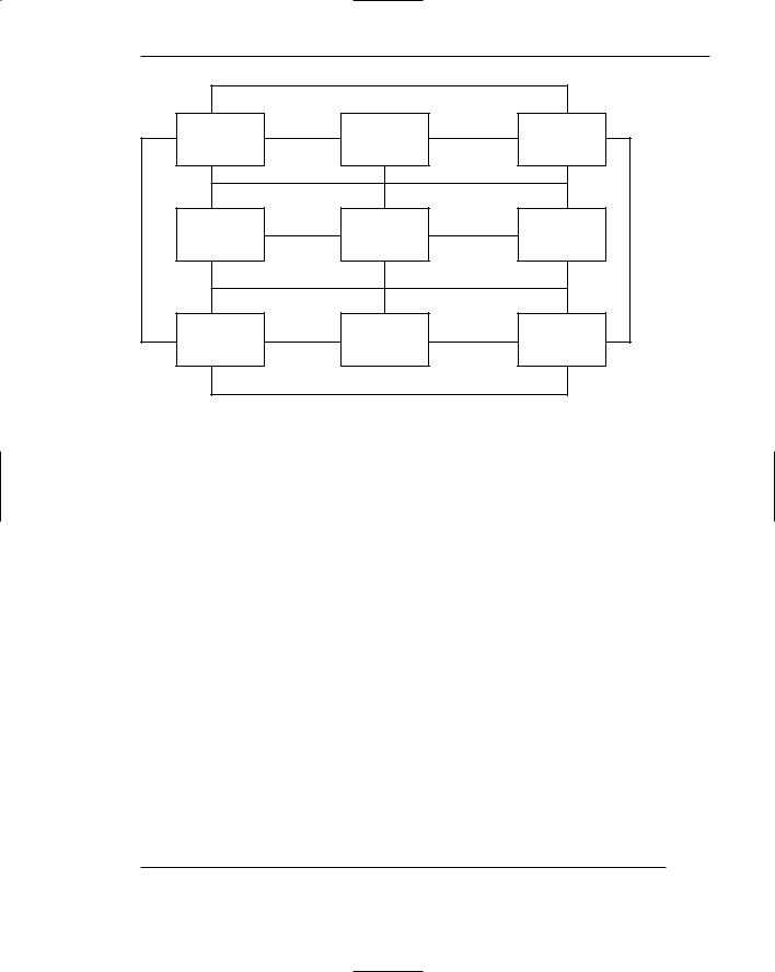
The biggest advantage of a connected menu network is that it gives the user full control over the navigation flow. Its disadvantage is its complexity, and its navigation may be daunting for an inexperienced user. An example connected menu structure is represented in Figure 4.5.

Level 0 |
Menu 1 |
|
level 1 |
Menu 2 |
Menu 3 |
Menu 4 |
|
|
|
Level 2 |
Menu 5 |
Menu 6 |
Menu 7 |
Menu 8 |
Menu 9 |
Menu 10 |
Menu 11 |
|
|
|
|
|
|
|
Level 3 |
Menu 12 |
Menu 13 |
Menu 14 |
|
|
|
Figure 4.4: Hierarchical or sequential menus.
Step 4: Develop System Menus and Navigation Schemes 313
Menu 1 |
Menu 2 |
Menu 3 |
Menu 4 |
Menu 5 |
Menu 6 |
Menu 7 |
Menu 8 |
Menu 9 |
Figure 4.5: Connected menus.
Event-Trapping Menus
Event-trapping menus provide an ever-present background of control over the system’s state and parameters while the user is working on a foreground task. They are, in essence, a set of simultaneous menus imposed on hierarchical menus. In a graphical system, for example, existing together are a simultaneous menu, the menu bar, and a hierarchy — the menu bar and its pull-downs. Event-trapping menus generally serve one of three functions; (1) They may immediately change some parameter in the current environment (bold a piece of text), (2) they may take the user out of the current environment to perform a function without leaving the current environment (perform a spell check), or (3) they may exit the current environment and allow the user to move to a totally new environment (Exit).
These menus can also change content based upon the system state, or an event, existing at that moment. A Paste option in a word-processing application, for example, will only function if there is something in a clipboard to paste. A Grid option on a pulldown, as another example, will toggle between a “Hide Grid” or “Show Grid” state, depending upon whether or not a grid is displayed on the screen at that moment. Event-trapping menus such as menu bars are constantly available to aid in establishing a sense of context, or where one is, while things may be changing in the foreground.
Functions of Menus
From the user’s perspective, a menu can be used to perform several functions: to navigate to a new menu, to execute an action or procedure, to display information, or to input data or parameters.

314 Part 2: The User Interface Design Process
Navigation to a New Menu
Each user selection causes another menu in a hierarchical menu tree to be displayed. The purpose of each selection is to steer the user toward an objective or goal. Selection errors may lead the user down wrong paths, and cost time and, perhaps, aggravation, but these errors are nondestructive and usually undoable.
Execute an Action or Procedure
A user selection directs the computer to implement an action or perform a procedure. The action may be something like opening or closing a file, copying text, or sending a message. In some cases, execution may only occur after a hierarchical menu tree is navigated. In other cases, actions may be performed as successive hierarchical menus are encountered and traversed. Selection errors may or may not have serious consequences, depending upon the nature of the action. Accidental selection of critical irreversible actions must be prevented in interface design.
Displaying Information
The main purpose of selecting a menu choice may simply be to display information. The user may be searching for specific information in a database or browsing the Web. The user’s focus is primarily on the information desired and less on the selection function. In many cases, information retrieval may occur only after a hierarchical menu tree is navigated. The content material and the user’s interests will determine the paths followed. Users may spend considerable time and effort understanding and processing uncovered information to evaluate subsequently displayed menu choices. Wrong turns in the process will again cost time and perhaps aggravation, but these errors are nondestructive and usually undoable.
Data or Parameter Input
Each selection specifies a piece of input data for the system or provides a parameter value. Data or values may be input on a single menu or spread over a hierarchy of menus. The user’s focus is primarily on the information being provided and, again, less on the selection function. Selection errors can be easily corrected if detected by the system.
Content of Menus
A menu consists of four elements: its context, its title, its choice descriptions, and its completion instructions. These concepts are introduced here and will be expanded in detailed guidelines to follow on succeeding pages.

Step 4: Develop System Menus and Navigation Schemes 315
Menu Context
A menu’s context provides information to keep the user oriented. This kind of information is critical in complex or hierarchical menu systems, where loss of position or disorientation can easily occur. Feedback is necessary that tells users where they are in a process, what their past choices were, and possibly how much farther they still have to navigate. Human memory being what it is, where one is and how one got there all too easily slip from consciousness.
Verbal linkage, spatial linkage, or both may be used to provide navigation feedback. Verbal linkage involves providing, on the current menu screen, a listing of choices made on previous menus that have led to this position. It also involves assuring the user that the displayed menu is the menu desired. Its title should mirror the option selected on the previous menu, and its content should reflect its title. Spatial linkage can be accomplished by graphic methods. Each succeeding menu screen can be displayed overlapping the previous menu screen so a succession of choices can be seen in a single view. A sense of progress and distance can then be easily ascertained.
Menu Title
A menu’s title provides the context for the current set of choices. The title must reflect the choice selected on the previously displayed menu.
Choice Descriptions
Choice descriptions are the alternatives available to the user. These descriptions can range from a mnemonic, numeric, or alphabetized listing of choices, to single words or phrases, to full sentences, or more. The style chosen will reflect the experience of the user (novice or expert), the nature of the choices (well-learned alternatives or not), the nature of the selection mechanism (keyboard or mouse), and the nature of the system (business system application or Web page).
Completion Instructions
Completion instructions tell users how to indicate their choices. They may include the rationale for why the user is being asked to make this choice and the impact the choice will have on subsequent processes. Explicit instructions may be needed for first time or casual users of a system. Experienced users will find overly verbose instructions unnecessary. The needs of all system users, and the nature of the system, must again be considered in creating this kind of on-screen guidance.
Formatting of Menus
The human-computer interface has a rich history of experimental studies with menus, the results of which can and have been applied to graphical screen and Web page menu design and presentation. What follows is a series of guidelines for formatting menus.

316 Part 2: The User Interface Design Process
Consistency
■Provide consistency with the user’s expectations.
■Provide consistency in menu
—Formatting, including organization, presentation, and choice ordering.
—Phrasing, including titles, choice descriptions, and instructions.
—Choice selection methods.
—Navigation schemes.
Like all aspects of screen design, menu design consistency is an integral component of system usability. Menu formatting, phrasing, choice selection, and navigation must be consistent throughout a graphical system or Web site.
Display
■If continual or frequent references to menu options are necessary, permanently display the menu in an area of the screen that will not obscure other screen data.
■If only occasional references to menu options are necessary, the menu may be presented on demand.
— Critical options should be continuously displayed, however.
Whether to display a menu continually, or on demand, is determined by the menu’s frequency of use. Always permanently display menus that are frequently referenced. This will provide memory support and immediate access to what is needed most. Occasionally needed menus may be presented on request via pop-ups or pull-downs. Critical options, however, should always be continuously displayed. Wright, Lickorish, and Milroy (1994) found superior performance for permanently displayed menus as opposed to menus that had to be retrieved through mouse clicks. They speculate that because retrieving a menu for display requires more actions, this may also impair people’s memory for other tasks being performed.
Presentation
■Ensure that a menu and its choices are obvious to the user by presenting them with a unique and consistent structure, location, and/or display technique.
■Ensure that other system components do not possess the same visual qualities as menu choices.
A menu and its choices should be immediately recognizable by the user as being a menu of choices. This can be accomplished through giving the menu a distinctive and consistent structure and presenting it in a consistent screen or page location. Presentation techniques must, of course, be compatible with those used for other purposes on the remainder of the screen. A good way to set a menu off from the remainder

Step 4: Develop System Menus and Navigation Schemes 317
of the screen is to enclose it in a box or display it using a background that contrasts with the remainder of the screen. Techniques chosen should be consistent throughout the system. Web page navigation links, which may be scattered throughout a page, are displayed underlined and in a unique color to differentiate and identify them.
Ensure that other system elements do not possess qualities that allow users to confuse them with menu choices. In Web page design, for example, the underlining of any system component other than navigation links is not recommended because of the possibility that they may be confused with links.
Organization
■Provide a general or main menu.
■Display
—All relevant alternatives.
—Only relevant alternatives.
• Delete or gray-out inactive choices.
■Match the menu structure to the structure of the task.
—Organization should reflect the most efficient sequence of steps to accomplish a person’s most frequent or most likely goals.
■Minimize number of menu levels within limits of clarity.
—For Web sites, restrict it to two levels (requiring two mouse clicks) for fastest performance.
■Be conservative in the number of menu choices presented on a screen.
—Without logical groupings of elements, limit choices to 4 to 8.
—With logical groupings of elements, limit choices to 18 to 24.
■Provide decreasing direction menus, if sensible.
■Never require menus to be scrolled.
In organizing a menu, the goal is to simply and effectively reveal its structure, while also reducing the number of actions needed to locate the target item.
General menu. The top-level menu in a hierarchical menu scheme should be a general or main menu, consisting of basic system options. This will provide a consistent starting point for all system activities and a “home base” to which the user may always return.
Relevant alternatives. A menu should provide all relevant alternatives, and only relevant alternatives, at the point at which it is displayed. Including irrelevant choices on a menu screen increases learning requirements and has been found to interfere with performance. There are two exceptions to this rule, however. Alternatives that are conditionally inactive may be displayed along with the conditionally active choices, if the active choices can be visually highlighted in some manner (such as through bolding or reverse video), or the inactive choices can be visually subdued (perhaps as through graying them out). One study, however, found that completely eliminating inactive alternatives on a menu resulted in faster choice access time, when compared to leaving inactive alternatives on a

318 Part 2: The User Interface Design Process
menu, but displayed in a subdued manner. This study concludes that eliminating conditionally inactive choices from a menu appears to be the best approach. Mayhew (1992) suggests that while deletion does provide an advantage to expert users of keyboard-driven menus, graying out seems to be advantageous to novices in systems using pointer-driven selection devices. She concludes that because menus are geared toward novices, graying appears to be the best overall choice. In general today’s graphical systems follow the gray-out approach for inactive menu choices. Whatever method is chosen should be consistently followed throughout a system. Options to be implemented in the future may also be displayed if they can be visually marked in some way (through a display technique or some other annotation).
Matching menu structure to the tasks. Menus should be organized according to how people structure their tasks. They should reflect the most efficient sequence of steps to accomplish a person’s most frequent or likely goals.
Minimize number of levels. The issue that must be addressed in creating a multilevel menu structure is determining how many items will be placed on one menu (its breadth) and how many levels it will consume (its depth). In general, the more choices contained on a menu (greater breadth), the less will be its depth; the fewer choices on a menu (less breadth), the greater will be its depth.
The advantages of a menu system with greater breadth and less depth are
■■Fewer steps and shorter time to reach one’s objective.
■■Fewer opportunities to wander down wrong paths.
■■Easier learning by allowing the user to see relationships of menu items. A broad menu’s disadvantages are
■■A more crowded menu that may reduce the clarity of the wording of choices.
■■Increased likelihood of confusing similar choices because they are seen together.
The advantages of greater depth are
■■Less crowding on the menu.
■■Fewer choices to be scanned.
■■Easier hiding of inappropriate choices.
■■Less likelihood of confusing similar choices because there is less likelihood that they will be seen together.
Greater depth disadvantages are
■■More steps and longer time to reach one’s objective.
■■More difficulties in learning because relationships between elements cannot always be seen.
■■More difficulties in predicting what lies below, resulting in increased likelihood of going down wrong paths or getting lost.
■■Higher error rates.
In text-based and graphical systems, a good number of studies have looked at the breadth-depth issue. Included are studies by Kiger (1984) and Jacko and

Step 4: Develop System Menus and Navigation Schemes 319
Salvendy (1996). Some have concluded that breadth is preferable to depth in terms of either greater speed or fewer errors, that a low number of levels (two to three) and an intermediate number of choices (four to eight) results in faster, more accurate performance as opposed to fewer or greater numbers of levels and choices, and that four to eight choices per menu screen is best. Another study found that one level was easiest to learn, and a couple of studies have concluded that a menu could contain up to 64 items if it were organized into logical groups. The least desirable alternative in almost all cases was deep-level menus that simply presented the user with a binary choice (select one of two alternatives) on each menu. In an early study of hypertext, Snowberry et al. (1983) found that as hypertext depth increased, performance and preference declined and errors increased. The general conclusion of these studies:
■■People found resources faster in, and understood better, broader, shallow menu structures than narrow deep ones.
In Web site design, studies have also looked at the breadth-depth issue (Zaphiris and Mtei, 1998; Larson and Czerwinski, 1998). Both found that a twolevel (two mouse click) Web site was searched faster than those containing more levels. Zaphiris (2001) modeled user performance in menu search using the results of previous studies and concluded that a menu design of either extreme (very deep or very broad) undermines learnability and usability.
Straub (2003a) describes additional research that suggests a concave hierarchical menu structure is optimal for browsing (Norman and Chin, 1988; Bernard, 2002). A concave shape presents a broad initial selection screen followed by menus with small categories. The terminal menu then contains an option set that is again somewhat broad. Straub’s broad conclusion from the research is this:
■■Too deep is too deep. People have a more difficult time understanding, and consequently navigating, deep sites.
■■Too broad is too broad. Extremely broad sites also present a challenge to efficient navigation.
■■Effective sub-grouping reduces perceived breadth. Logical grouping improves performance for even the broadest structures.
■■Clear labels improve navigation accuracy. Creating clear and distinct labels for navigation elements enhances performance (as described in Step 3.)
The conclusion that one might derive from these studies is this: Fewer levels of menus aid the decision-making process, but trying to put too many choices on a single menu also has a negative impact. The final solution is a compromise: Minimize the number of levels within limits of clarity. What is clarity? The studies seem to indicate that, if the choices to be displayed cannot be segmented into logical categories, then confine the number of alternatives displayed to four to eight per menu. (Straub suggests a maximum of 16 for links.) If logical categorization is possible, and meaningful, logical category names can be established, then a larger number of choices can be presented. The maximum number of alternatives will, however, be dependent upon the size of the words needed to describe the alternatives to the user. Wordy captions will greatly restrict the number of alternatives capable of being displayed. There is one exception to these