

The Essential Guide to UI Design
.pdf
350 Part 2: The User Interface Design Process
link. Guidelines enabling the various controls to achieve distinctiveness are described in the following control-specific sections.
Consistent. Like all elements of the interface, navigation links, toolbars, and command buttons must be consistent in appearance and behavior.
Textual. All navigation must have a textual label or description. Navigation using textual descriptions is much preferable to graphical-only navigation because the purpose and function of graphic images are often unclear. They also take longer to download. Textual links are also necessary for users who do not have graphics, or who have chosen not to display graphics.
Provide multiple navigation paths. Offer multiple paths or ways to move around the Web. Provide structural components such as site maps, a table of contents, and indexes to go directly to a point of interest, provide content links to move around nonsequentially, and provide command buttons, such as Next and Previous, to move sequentially.
Navigation Elements
■Differentiate and group navigation elements.
—Provide a global navigation bar at the top of each page.
—Provide a local category or topical links navigation bar on the left side of a page.
•For long lists, consider placing within a frame.
—Optionally, provide a secondary navigation column on the right side of the page.
—Provide explicit or embedded textual links within the contents area.
•Consider duplicating embedded links in the left side navigation bar.
—Place minor illustrative, parenthetical, or footnote links at the end of the page.
—For long pages provide
•“List of Content” Links.
•Important global or local links in a navigation bar repeated at the page bottom.
■Create a common and consistent theme.
■Never create pages without navigational options.
A Web site contains at least three levels of navigation elements: global or site-wide; local and specific; and minor or footnote. Clearly differentiate these navigation elements from one another and locate them consistently from page to page. The recommended structure, illustrated in Figure 4.17, separates these navigation elements from content, making it easy for users to find each. People using Web sites are now becoming accustomed to finding important navigation elements at the page top and in panels on the left and right side.
Two studies looking at user performance in using, and preferences for, the location of Web site navigational options have been described by Bailey (2006). Alternatives reviewed included options located at the page top [T], down the left side [L], and down the right side [R]. The study researchers, Kingsburg and Andre (2004), began by surveying existing Web site structures. They reported that the most common navigational structures were: (1) An initial selection is made from a page top navigation panel followed by a selection, and subsequent selections, from the left navigation panel (TLL), and (2) initial and subsequent selections are all made from the left panel (LLL).

Step 4: Develop System Menus and Navigation Schemes 351
In a scenario requiring three navigational selections, their first study evaluated top and left panels only. In general, they found
■■Navigation was faster
■■When the first and second selection was made from the left panel.
■■When the panel used for the first selection (top or left) was split or separated from the panels used for the second and third selections.
■■People preferred
■■The first selection be made from the left panel.
■■The first and second selections both be made from same panel, top or left.
■■The second and third, or first, second and third selections be made from the same panel.
■■The best performing and most preferred structures were
■■Left-left-left (LLL).
■■Left-top-top (LTT).
Next, Kingsburg and Andre added a right-side panel in a similarly structured study. They found
■■Navigation was faster
■■When the first selection was made from the left panel (not top or right).
■■When all selections were made from the same panel.
■■People preferred
■■When all selections were made from the same panel.
Among this study’s findings were that a right panel is a viable design option. Overall conclusions were
■■Selection limited to either the left or right panels resulted in best performance and was preferred by users.
■■Performance-wise, it is better to start in the left, not the right panel.
Figure 4.17: Web navigation component locations.

352 Part 2: The User Interface Design Process
The navigation structures yielding slower performance and lower preference ratings were Top-Top-Top (TTT), Top-Left-Top (TLT), and Right-Top-Right (RTR). Perhaps these alternatives came out poorly because of less efficient scanning organization (TTT), excessive eye and pointer movement (TLT, RTR), or backward eye flow (RTR).
Another recent study by Oulasvirta et al. (2004) found that for people reading left- to-right languages, the tendency is to look to the left for the navigation panel.
Global. Global or site-wide navigation elements provide access to the site’s total scope or categories of available information. An evolving standard in design is to locate the global navigation elements horizontally at a page’s top. Locating the global links at the page top makes sense if one considers the logical flow of information through a screen. A selection from this global area eventually results in display of a page and its content, a top-to-bottom sequential eye flow. In the eyetracking study reported by Nielsen (2006) in Step 3, a user’s first search of a Web page horizontally across the page top (top bar in the F) may reflect an expectancy that important navigational elements are across the page top.
Category or topical. Local, specific and contextual navigation elements within the category or topical area being presented are typically displayed in a columnar array down the left page side. For long lists consider placing the links within a frame navigation panel. A study found users preferred non-scrollable frames rather than having the links move off as a page is scrolled (Bernard et al. 2001d). A second listing of links can also be presented in a column on the right side. Again, in the eye-tracking study reported by Nielsen (2006) in Step 3, a user’s early vertical search of a Web page’s left side (vertical bar in the F) may reflect an expectancy that important navigational elements are also along the left side of the page.
Embedded links. Phrases or embedded links will be provided within the contents area of a Web page. An embedded link is one found in the middle of prose or continuous text. Embedded links are frequently used to lead to supporting information or provide definitions of terms. They are designate by an underline and a unique color. Because users preferred redundant links, consider duplicating embedded links in the left side navigation bar (Bernard et al., 2001d).
Minor. Minor illustrative, parenthetical, or footnote links can be arrayed horizontally at the page bottom.
List of Content. For long pages with sections that are not visible without page scrolling include a set of links to each page section at the top of the page. These “anchor” or “within page” links provide a reminder of the page’s contents, a page outline that can easily be reviewed, and a quick way to navigate to desired sections. These links also assist people in getting to a specific section if they arrive from a different page.
Important links. For long scrolling pages, repeat important global or local links at the page bottom. When finishing a page, the user, then, will not have to scroll upward to locate important navigation links.
Common theme. A common and consistent Web site navigation theme will enable people to more easily understand and learn its structure. Incorporate different

Step 4: Develop System Menus and Navigation Schemes 353
styles for these different navigation elements to aid people in understanding the differences in their meaning and function.
Always present options. All pages must have navigation options. Never create pages without navigation options. Many Web pages contain links opening a new browser window, thereby disabling the browser Back button. If the new window opens in a full screen people may not realize that they have been directed to another window and they may not know what to do. Links that do not behave as expected inhibit a person’s understanding of a system. If such links are incorporated within a Web site, always include a prominent action control on the new window to close it and return the user to the original window.
Other Web Site Navigation Elements
In addition to Navigation bars, many other Web site elements are important components of the Web navigation system. Among these are overviews, including executive summaries, site maps, indexes, and tables of contents. Other elements are historical trails and search engines.
Overviews
■Provide
—An executive summary that provides a preview of the site and contains links to all major concepts.
—A site map illustrating the site’s hierarchical structure and the relationships of components.
—Both global and local maps.
—An alphabetized site index.
—A table of contents.
■Allow accessibility from any point in the Web site.
Overviews provide a top-level view of a site’s organization and content. Having an understanding of how a site is organized, the landmarks available within it, and the content it contains, assists the navigation process. In driving an automobile, referring to a road map before embarking on trip usually results in reaching one’s destination faster, easier recovery from inadvertent wrong turns, a better ability to handle any unexpected detours that may be encountered, and a less stressful trip.
Overviews are most useful if provided in several forms. They may be needed during a Web interaction as well as before starting into a site. A graphical system help function, for example, may be available in tutorial form, be accessible by topics, or be organized in alphabetic form for easy scanning. It is difficult to predict the user’s exact need at any moment in a session.
An executive summary will provide an overview of the site in narrative form and contain links to all major concepts. For large Web sites, a site map can be used to illustrate the site’s hierarchical structure in either graphical or textual form. These elements provide a prospective on one’s position in the spatial hierarchy. A good site map helps

354Part 2: The User Interface Design Process
facilitate site learning and should encourage comprehensive exploration of a site. Maps may be made available at both a global or local level within the site, depending upon the site’s complexity. They can be designed to resemble a traditional table of contents or a simple index. An alphabetized site index will permit quick access through keywords and specific topics. A table of contents, structured as in a printed book, will permit review of major topics and the subtopics within. Because, based upon user studies, site maps are not always obvious and easy to find, a clear link saying Site Map should be placed on a consistent location on every page. A site map should be presented in one page, if possible. Do not exceed a couple of screenfuls, however. All of a Web site’s overview elements should be accessible from any point within the site.
Historical Trails
■Provide
—Breadcrumb trails.
• Locate at the top of the page below the navigation links.
—History lists.
—History trees.
—Footprints.
—Bookmarks.
Historical navigation aids try to show the user’s position in an information space by showing where they have come from, or where they have been. Seeing a navigation path is thought to enable a user to better understand the context of the currently displayed page. Displayed paths also provide a means to easily return to places of interest.
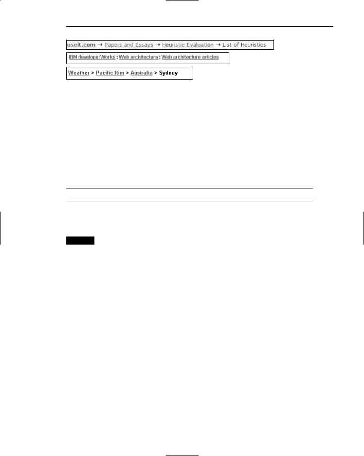
Breadcrumb trail. A breadcrumb trail in a hierarchical Web site structure is a sequential textual listing of pages traversed from the parent page to the page currently being displayed. A trail, illustrated in Figure 4.18, is also a series of links that permit the user to go back to any page in the sequence with one click. Breadcrumb trails normally appear near the top of a page.
Studies have shown that spontaneous breadcrumb usage is not high in Web site navigation. The question being asked is, Why? Is it because they are not noticeable on a page, is it because people don’t know what they are, or is because people don’t care about them? Studies exploring their value have had mixed results. Some studies have found more efficient navigation and/or improved user satisfaction (Bowler et al., 2001; Maldonado and Resnick, 2002; Hull et al., 2004). Another found no navigation benefits (Lida et al., 2003). So, the jury remains out on their utility. Perhaps, like scrolling, people will learn to use breadcrumbs. Because they do provide some users some benefits now, and perhaps usage will increase with user experience, their inclusion on a page still appears beneficial.
At this moment no standard exists for how to separate the page names in a trail. Symbols used include an arrow (->), a colon ( : ), a greater than sign ( > ), and a slash ( / ). Until a standard evolves, any of the above symbols remain acceptable. Do not use anything else, however. Position a breadcrumb trail at the top of the page below any existing navigation links.
Step 4: Develop System Menus and Navigation Schemes 355
Figure 4.18: Breadcrumb trails.
Other historical trail elements. A history list is a sequential textual listing of sites or pages visited over a specific time period, a session, a day, or some other time period. A history tree is an overview map of a site’s structure with pages already visited marked by an indicator such as a plus sign, check mark, or asterisk. The markings serve as footprints, guiding the user back to pages of interest, and/or signaling which have already been seen and may no longer be of interest. A bookmark is similar to a history list except that it is designated by the user to mark locations of continuing interest.
Search Facility
■ Provide a search facility.
Another form of navigation support is provided by a site search facility. Provide such a facility within larger sites. Search facilities were addressed in Step 3.
MYTH Real users don’t mind complex navigation.
Links and Actions
A Web page consists of a collection of links, both textual and graphic in nature, and a sprinkling of toolbars and command buttons. Links are commonly used to go to information, usually on another page. Commands and toolbars are commonly used to perform actions. How should links be presented to make them obvious? What kinds of links should be included on a page? How many links should exist on a page? These and similar questions are addressed next.
Kinds of Links
Typically, three kinds of links are provided for Web sites: internal, anchor, and external. Internal links provide navigation within a Web site, permitting the user to freely move about between a site’s pages. Anchor links, also called associative or within-page links, are used when a page is exceptionally long. A page contents list is presented at the top of the page with links to the corresponding information or section within the page. When clicked, the corresponding section is then displayed. External links point
to new pages on other Web sites.
Navigational elements consist of textual phrases, images, and command buttons.

356Part 2: The User Interface Design Process
Textual Phrase Links
■Provide a mix of textual phrase links
—In explicit menus.
—Embedded within page text.
Textual phrases are words, or short pieces of highlighted text, serving as links. Text links are the preferred style of link in Web page design because they are more easily recognizable as clickable, download faster, are more understandable than images, and are preferred by users. They can also be easily modified visually to indicate that they have already been clicked. Another advantage is that using text links enables people with text-only and deactivated graphical browsers to see the navigation options.
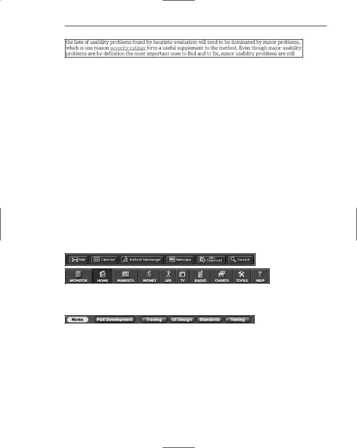
Textual phrase links possess two distinct structures: explicit and embedded. An explicit menu is a listing of textual phrase links set apart from the main page content, often in toolbars or panels. These listings usually include links to various Web site topics, links to site global features such as the site map or search facility, and perhaps links to other related sites. These listings closely resemble typical screen menu arrays in their structure and presentation. A typical explicit menu is shown in Figure 4.19. An embedded menu is a link contained within the textual content of a page. Certain words or phrases are designated as links, highlighted, and when selected display the linked component for the user. An embedded menu is illustrated in Figure 4.20. Web sites usually contain both explicit link listings and embedded links in various mixes.
Lai and Waugh (1995) studied the effect of explicit listing hierarchical menus and embedded menus on a search task. They compared the three menu structures: (1) menus composed solely of explicit listings, (2) solely embedded menus, and (3) mixed explicit and embedded menus. They found that the best menu structure was determined by the kind of search task performed. Explicit listings worked better for straightforward search tasks, whereas menus containing embedded links worked best for complex and not fully known searches. The embedded menus improved search accuracy, but not search efficiency.
Bernard and Hull (2002) found no reliable performance differences between embedded links and explicit links. Users, however, preferred to have them embedded. Bernard et al., (2001d) found that redundant links were preferred by users, that is, duplicate links that were both embedded and outside the text on the left margin. Providing a mix of explicit listings and embedded menus in Web site design will best satisfy the needs of all site users.
Figure 4.19: Textual explicit links.
Step 4: Develop System Menus and Navigation Schemes 357
Figure 4.20: Textual embedded link.
Image Links
Graphical images or icons may appear in an array in the form of a navigation bar, as illustrated in Figure 4.21, or be individually located at relevant points within a page. As just described, text links are more easily recognizable than images, even if the images contain textual phrases. In one study people showed considerable confusion concerning whether or not certain page images were clickable (Koyani et al., 2004). People could not tell whether the images were true links without placing the pointer over the images. This is a slow process. Guidelines for creating and displaying graphics and icons are discussed in Step 11.
Command Buttons and Toolbars
Command buttons and toolbars, used to perform actions, may appear in an array in the form of a navigation bar, or be individually located at relevant points in a page. The advantage of standard Windows-type graphical command buttons are that many people commonly recognize them as clickable elements. This may not be true for unique and more stylized buttons, however. Command buttons and toolbars should never be used to retrieve or show information. Always use links for this purpose. Guidelines for creating and displaying command buttons and toolbars are discussed in Step 7.
Figure 4.21: Graphical or iconic navigation bars.
Figure 4.22: Command button navigation bar.

358Part 2: The User Interface Design Process
Presenting Links
■Provide consistent clickability cues.
—Avoid misleading cues to click.
■Use Textual links.
—Underline all link text, including that
•Embedded in page content.
•Contained in explicit menu listings.
•Contained in headings.
•Used as graphical labels.
—Exceptions:
•Links on navigation-only menus and in lists do not necessarily need underlining.
—Do not underline any text that is not a link.
—Distinguish between unselected/unvisited links and selected/visited links.
—Make unselected /unvisited links blue.
•Make selected/visited links purple.
•Never show other text in the chosen selected/unselected colors.
■Distinguish internal, external, and anchor links.
—Identify external links by
•Including destination URL address below the link.
•Including an “exit disclaimer” adjacent to the link.
•Providing an interim page after clicking an external link.
—Identify an anchor link with a “Page Contents” heading.
■Graphical links:
—Clearly identify clickable regions of images.
—Distinguish graphical links from decorative graphics through underlining graphical text labels.
■Links in toolbars:
—Distinguish links contained in toolbars through:
•Presenting in consistent locations.
•Using different colored backgrounds.
■Fat links:
—Consider fat links, if appropriate.
Links must be easy to find. They must not be confused with other screen graphics or textual content. Having to search for links can be a tedious and frustrating process. Whether a link has been navigated before must also be obvious. When looking for something new, continually embarking down a path already traveled can also be frustrating.
Clickability cues. It should be obvious which items on a page are clickable. Provide a visual indication that an item or word on a page is clickable using techniques such as color, underlining, bullets, and arrows. People should not have to move the cursor around a Web site to determine what is clickable. Scanning a page with a cursor is called minesweeping. Scanning with one’s eyes is much faster than minesweeping. Be consistent in the use of conventions and techniques to indicate

Step 4: Develop System Menus and Navigation Schemes 359
links. Use of a particular symbol should (1) always indicate clickability, or (2) never indicate clickability. Otherwise the user will be confused and a mental model of the system will be more difficult to learn.
Underline text links. To identify a link, the well-established convention is to underline the link text. All link text must be underlined, including that embedded in page content, that presented in explicit listings, that contained in headings, and that taking the form of labels in graphical images.
If design clearly indicates a page area’s navigational function, underlining may be safely eliminated. Consider, however, displaying an underline under non-underlined links when the pointer is placed over the text. This will reinforce the element’s clickability.
Designate used links. Unselected or unvisited links must be distinguishable from selected or visited links. The ability to understand what links have been followed is one of the few standard navigational aids available in browsers. In a study, providing this type of feedback was the only variable that increased a person’s speed in finding information (Koyani et al., (2004). Stick with the default colors of blue for links already followed and purple for links not yet ventured down. While the choice of blue as a text color was poor because of its degraded reading ability, it is now well learned. Van Schaik and Ling (2003) found that blue links are easier to click than black ones, even though black ones have higher visual contrast and are easier to see. Blue’s use is recommended because it is now very familiar. Using nonstandard link colors can lead to problems. It is difficult to remember which color means what, thereby increasing link selection errors. It can also lead to confusion with normal underlined text in a document. If on a Web site multiple links lead to the same destination, change all links to the “visited” color. Finally, to avoid viewer confusion, never present other page components in a link’s chosen selected/unselected colors.
Distinguish kinds of links. Visually distinguish links leading to different Web destinations. A study found that people often assume that a link will take them to another page in the Web site where they are browsing (Koyani et al., 2004). If the link simply moves within a page, or goes to another Web site entirely, confusion can result. A link that moves to another Web site can also be aggravating if the person was not ready to move on. A link’s destination should be as predictable as the content at the other end.
Koyani et al. recommend the following methods for notifying a user that a link will leave the current Web site. Include the URL address of the destination below the link text as shown in Figure 4.23. Provide an Exit disclaimer command button adjacent to the link as shown in Figure 4.24. Provide an interim page after clicking the external link and before going to the new Web site as illustrated in Figure 4.25. Whichever technique is chosen, it should be followed consistently within a Web site.
Designation of these different destination types can also be accomplished by grouping links by type, giving them a descriptive heading, and placing them in unique and consistent locations on a page. Anchor links, for example, can be given a heading such as “Page Contents” as illustrated in Figure 4.26. A destination convention has yet to be established in Web site design. When one is established, it should be applied.