

Chapter 5
Figure 5-3
The SiteMapPath control works automatically by itself with very little work on your part. You just add the basic control to your page, and the breadcrumb navigation you have just seen is automatically created. However, you can use the properties discussed in the following sections to modify the control’s appearance and behavior.
The PathSeparator property
One important property for the SiteMapPath control is the PathSeparator property. By default, the SiteMapPath control uses a greater than sign (>) to separate the link elements. You can change this by reassigning a new value to the PathSeparator property. Listing 5-3 illustrates the use of this property.
Listing 5-3: Changing the PathSeparator value
<asp:SiteMapPath ID=”Sitemappath1” Runat=”server” PathSeparator=” | “>
</asp:SiteMapPath>
Or
<asp:SiteMapPath ID=”Sitemappath1” Runat=”server”> <PathSeparatorTemplate> | </PathSeparatorTemplate>
</asp:SiteMapPath>
The SiteMapPath control in this example uses the pipe character (|), which is found above your Enter key. When it is rendered, you get the results shown in Figure 5-4.
Figure 5-4
132

Site Navigation
As you can see, you can use either the PathSeparator property or the <PathSeparatorTemplate> element within the SiteMapPath control.
With the use of the PathSeparator property or the <PathSeparatorTemplate> element, it is quite easy to specify what you want to use to separate the links in the breadcrumb navigation, but you might also want to give this pipe some visual style as well. You can add a <PathSeparatorStyle> node to your SiteMapPath control. An example of this is shown in Listing 5-4.
Listing 5-4: Adding style to the PathSeparator property
<asp:SiteMapPath ID=”Sitemappath1” Runat=”server” PathSeparator=” | “> <PathSeparatorStyle Font-Bold=”true” Font-Names=”Verdana” ForeColor=”#663333”
BackColor=”#cccc66”></PathSeparatorStyle>
</asp:SiteMapPath>
Okay, it may not be pretty (I am not much of a designer), but by using the <PathSeparatorStyle> element with the SiteMapPath control, I am able to change the visual appearance of the separator elements. The results are shown in Figure 5-5.
Figure 5-5
Using these constructs, you can also add an image as the separator, as illustrated in Listing 5-5.
Listing 5-5: Using an image as the separator
<%@ Page Language=”VB” %>
<html xmlns=”http://www.w3.org/1999/xhtml” > <head ID=”Head1” runat=”server”>
<title>Using the SiteMapPath Server Control</title> </head>
<body>
<form id=”form1” runat=”server”>
<asp:SiteMapPath ID=”Sitemappath1” Runat=”server”> <PathSeparatorTemplate>
<asp:Image ID=”Image1” Runat=”server” ImageUrl=”divider.gif” /> </PathSeparatorTemplate>
</asp:SiteMapPath>
</form>
</body>
</html>
133

Chapter 5
To utilize an image as the separator between the links, you use the <PathSeparatorTemplate> element and place an Image control within it. In fact, you can choose any type of control you want to be placed between the navigation links that the SiteMapPath control produces.
The PathDirection property
Another interesting property to use with the SiteMapPath control is PathDirection. This property changes the direction of the links generated in the output. Only two settings are possible for this property: RootToCurrent and CurrentToRoot.
The Root link is the first link in the display. This is usually the Home page. The Current link is the link for the page currently being displayed. By default, this property is set to RootToCurrent. Changing the example to CurrentToRoot produces the results shown in Figure 5-6.
Figure 5-6
The ParentLevelsDisplayed property
In some cases, your navigation may go quite deep. You can see on the site map shown in Listing 5-1 that you go three pages deep, which isn’t a big deal. Some of you, however, might be dealing with sites that go quite a number of pages deeper. In these cases, it might be bit silly to use the SiteMapPath control. Doing so would display a huge list of pages.
In a case like this, you can turn to the ParentLevelsDisplayed property that is part of the SiteMapPath control. When set, this property displays pages only as deep as specified. Therefore, if you are using the SiteMapPath control with the web.sitemap, as shown in Listing 5-1, and you give the ParentLevelsDisplayed property a value of 3, you don’t notice any change to your page. It already displays the path three pages deep. If you change this value to 2, however, the SiteMapPath control is constructed as follows:
<asp:SiteMapPath ID=”Sitemappath1” Runat=”server” ParentLevelsDisplayed=”2”>
</asp:SiteMapPath>
Notice the result of this change in Figure 5-7. The SiteMapPath control shows links only two pages deep and doesn’t show the Home page link.
134

Site Navigation
Figure 5-7
By default, no limit is set on the number of links shown, so the SiteMapPath control just generates the specified number of links based on what is labeled in the site map file.
The ShowToolTips property
By default, the SiteMapPath control generates tooltips for each link if a description property is used within the web.sitemap file. Remember, a tooltip is the text that appears on-screen when an end user hovers the mouse over one of the links in the SiteMapPath control. I showed you this capability earlier in this chapter.
There may be times when you do not want your SiteMapPath control to show any tooltips for the links that it generates. For these moments, you can actually turn off this capability in a couple of ways. The first way is not to include any description attributes in the .sitemap file. If you remove these attributes from the file, the SiteMapPath has nothing to display for the tooltips on the page.
The other way to turn off the display of tooltips is to set the ShowToolTips property to False, as shown here:
<asp:SiteMapPath ID=”Sitemappath1” Runat=”server” ShowToolTips=”false”>
</asp:SiteMapPath>
This turns off the tooltips capability but still allows you to use the description property in the .sitemap file. You may still want to use the description attribute because it allows you to keep track of what the links in your file are used for. This is quite advantageous when you are dealing with hundreds or even thousands of links in your application.
The SiteMapPath control’s child elements
You already saw the use of the <PathSeparatorStyle> and the <PathSeparatorTemplate> child elements for the SiteMapPath control, but additional child elements exist. The following table covers each of the available child elements.
135

Chapter 5
Child Element |
Description |
|
|
CurrentNodeStyle |
Applies styles to the link in the SiteMapPath navigation for the |
|
currently displayed page. |
CurrentNodeTemplate |
Applies a template construction to the link in the SiteMapPath |
|
navigation for the currently displayed page. |
HoverNodeStyle |
Applies styles to the link in the SiteMapPath navigation over |
|
which the end user is hovering the cursor. |
NodeStyle |
Applies styles to all links in the SiteMapPath navigation. The |
|
settings applied in the CurrentNodeStyle or RootNodeStyle |
|
elements supersede any settings placed here. |
NodeStyleTemplate |
Applies a template construction to all links in the SiteMapPath |
|
navigation. The settings applied in the CurrentNodeStyle or |
|
RootNodeStyle elements supersede any settings placed here. |
PathSeparatorStyle |
Applies styles to the link dividers in the SiteMapPath navigation. |
PathSeparatorTemplate |
Applies a template construction to the link dividers in the |
|
SiteMapPath navigation. |
RootNodeStyle |
Applies styles to the first link (the root link) in the SiteMapPath |
|
navigation. |
RootNodeTemplate |
Applies a template construction to the first link in the |
|
SiteMapPath navigation. |
|
|
TreeView Ser ver Control
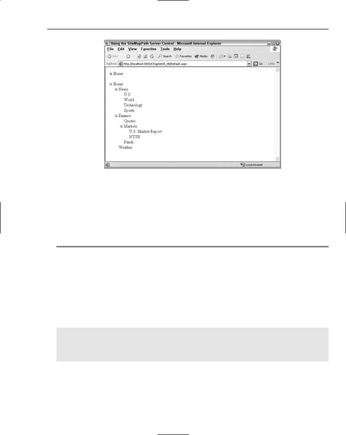
I have to say that I really like this new control. The TreeView server control is a rich server control for rendering a hierarchy of data, so it is quite ideal for displaying what is contained in your .sitemap file. Figure 5-8 shows you how it displays the contents of the site map (from Listing 5-1) that you have been working with thus far in this chapter. This figure first shows a completely collapsed TreeView control at the top of the screen, while the second TreeView control has been completely expanded.
This control can preload the nodes to be displayed, even if they are hidden, at first, by the collapsible framework of the control. If you use a client-side script, the control does not need to make a call back to the server if someone expands one of the nodes in the control. Just the fact that it won’t make a postback and redraw the page gives this control a snappiness that will cause your end users to really enjoy using it. Of course, this capability is only there if the browser accepts the client-side code that the TreeView control can generate. If not, the control knows this and renders only what is appropriate and performs postbacks for those clients who cannot work with this client-side script.
The TreeView control is quite customizable, but first take a look at how to create a default version of the control using the .sitemap file from Listing 5-1. For this example, continue to use the MarketsUS.aspx page you created earlier.
136
Site Navigation
Figure 5-8
The first step is to create a SiteMapDataSource control on the page. When working with the TreeView control that displays the contents of your .sitemap file, you must apply one of these datasource controls. The TreeView control doesn’t just bind to your site map file automatically as the SiteMapPath control does.
After a basic SiteMapDataSource control is in place, position a TreeView control on the page and set the DataSourceId property to SiteMapDataSource1. When you have finished, your code should look like Listing 5-6.
Listing 5-6: A basic TreeView control
<%@ Page Language=”VB” %>
<html xmlns=”http://www.w3.org/1999/xhtml” > <head ID=”Head1” runat=”server”>
<title>Using the SiteMapPath Server Control</title> </head>
<body>
<form id=”form1” runat=”server”>
<asp:SiteMapPath ID=”Sitemappath1” Runat=”server”> </asp:SiteMapPath>
<br /><p>
<asp:TreeView ID=”Treeview1” Runat=”server” DataSourceID=”Sitemapdatasource1”> </asp:TreeView>
<asp:SiteMapDataSource ID=”Sitemapdatasource1” Runat=”server” /></p> </form>
</body>
</html>
After the page is run and the TreeView control is expanded, the results are displayed as shown in Figure 5-9.
137

Chapter 5
Figure 5-9
This is a very basic TreeView control. The great thing about this control is that it allows for a high degree of customization and even gives you the capability to use some predefined styles that come prepackaged with ASP.NET 2.0.
Identifying the TreeView control’s built-in styles
As stated, the TreeView control does come with a number of pre-built styles right out of the box. The best way to utilize these predefined styles is to do so from the Design view of your page. By rightclicking on the TreeView control on your page from the Design view in Visual Studio 2005, you find the Auto Format option. Click this option and a number of styles become available to you. Selecting one of these styles changes the code of your TreeView control to adapt to that chosen style. For instance, if you choose MSDN from the list of options, the simple one-line TreeView control you created is converted to what is shown in Listing 5-7.
Listing 5-7: A TreeView control with the MSDN style applied to it
<asp:TreeView ID=”Treeview1” Runat=”server” DataSourceID=”Sitemapdatasource1” nodeindent=”10” font-names=”Verdana” font-size=”8pt” forecolor=”Black” imageset=”Msdn”>
<HoverNodeStyle BackColor=”#CCCCCC” VerticalPadding=”1” BorderColor=”#888888” BorderStyle=”Solid” BorderWidth=”1px” Font-Underline=”True” HorizontalPadding=”3”>
</HoverNodeStyle>
<SelectedNodeStyle BackColor=”White” VerticalPadding=”1” BorderColor=”#888888” BorderStyle=”Solid” BorderWidth=”1px” HorizontalPadding=”3”> </SelectedNodeStyle>
<NodeStyle VerticalPadding=”2” Font-Names=”Verdana” Font-Size=”8pt” NodeSpacing=”1” HorizontalPadding=”5” ForeColor=”Black”> </NodeStyle>
</asp:TreeView>
138