


Site Navigation
Listing 5-16: A simple use of the Menu control
<%@ Page Language=”VB” %>
<html xmlns=”http://www.w3.org/1999/xhtml” > <head runat=”server”>
<title>Menu Server Control</title> </head>
<body>
<form id=”form1” runat=”server”>
<asp:SiteMapDataSource ID=”Sitemapdatasource1” Runat=”server” /> <asp:Menu ID=”Menu1” Runat=”server” DataSourceID=”Sitemapdatasource1”> </asp:Menu>
</form>
</body>
</html>
From this example, you can see that I’m using a SiteMapDataSource control that automatically works with the application’s web.sitemap file. The only other item included is the Menu control, which uses the typical ID and Runat attributes and the DataSourceID attribute to connect this control with what is retrieved from the SiteMapDataSource control.
Although the default Menu control is pretty simple, you can highly customize how this control looks and works by redefining the properties of the control. The following sections take a look at some examples of how you can modify the appearance and change the behavior of this control.
Applying different styles to the Menu control
By default, the Menu control is pretty plain. If you want to maintain this appearance, you can use what is provided or simply change the font sizes and styles to make it fit in more with your site. There are actually quite a number of ways in which you can modify this control so that it appears unique and fits in with the rest of your site. You can either customize this control’s appearance yourself or you can use one of the predefined styles that come with the control.
Using a pre-defined style
Visual Studio 2005 includes some pre-defined styles that you can use with the Menu control to quickly apply a look and feel to the displayed menu of items. Some of the provided styles include Classic and Elegant. To apply one of these pre-defined styles, you work with the Menu control from the Design view of your page. Within the Design view, highlight the Menu control and expand the control’s smart tag. From here, you see a list of options for working with this control. To change the look and feel of the control, click the Auto Format link and select one of the styles.
Performing this operation changes the code of your control by applying a set of style properties. For example, if you select the Classic option, you get the results shown in Listing 5-17.
157
Chapter 5
Listing 5-17: Code changes when a style is applied to the Menu control
<asp:Menu ID=”Menu1” Runat=”server” DataSourceID=”Sitemapdatasource1” BackColor=”#F7F7DE” BorderWidth=”1px” BorderColor=”#CCCC99” Font-Names=”Verdana” Font-Size=”10pt” BorderStyle=”Solid”>
<StaticMenuStyle BorderColor=”#CCCC99” Font-Names=”Verdana” Font-Size=”10pt” BackColor=”#F7F7DE” BorderStyle=”Solid” BorderWidth=”1px”> </StaticMenuStyle>
<StaticMenuItemStyle BorderColor=”#CCCC99” Font-Names=”Verdana” Font-Size=”10pt” BackColor=”#F7F7DE” BorderStyle=”Solid” BorderWidth=”1px”>
</StaticMenuItemStyle>
<DynamicMenuStyle BorderColor=”#CCCC99” Font-Names=”Verdana” Font-Size=”10pt” BackColor=”#F7F7DE” BorderStyle=”Solid” BorderWidth=”1px”> </DynamicMenuStyle>
<DynamicMenuItemStyle BorderColor=”#CCCC99” Font-Names=”Verdana” Font-Size=”10pt” BackColor=”#F7F7DE” BorderStyle=”Solid” BorderWidth=”1px”> </DynamicMenuItemStyle>
</asp:Menu>
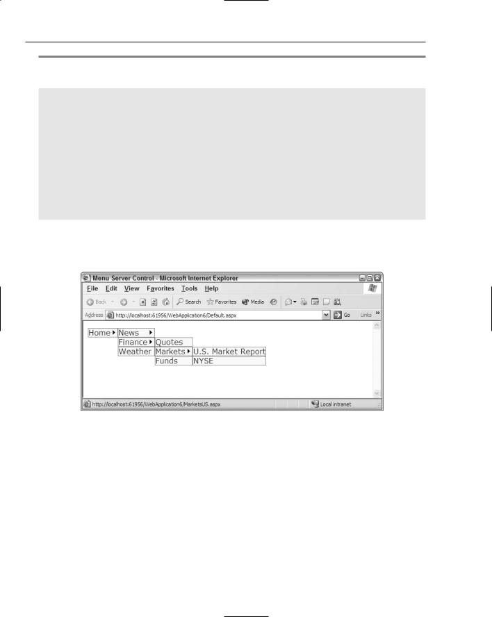
You can see that it added a lot of styles that change the menu items that appear in the control. Figure 5-20 shows how this style selection appears in the browser.
Figure 5-20
Changing the style for static items
The Menu control considers items in the hierarchy to be either static or dynamic. Static items from this example would be the Home link that appears when the page is generated. Dynamic links are the items that appear dynamically when the user hovers the mouse over the Home link in the menu. It is possible to change the styles for both these types of nodes in the menu.
To apply a specific style to the static links that appear, you must add a static style element to the Menu control. The Menu control includes the following static style elements:
<StaticHoverStyle>
<StaticMenuItemStyle>
158

Site Navigation
<StaticMenuStyle>
<StaticSelectedStyle>
<StaticTemplate>
The important options from this list include the <StaticHoverStyle> and the <StaticMenuItemStyle> elements. The <StaticHoverStyle> is what you use to define the style of the static item in the menu when the end user hovers the mouse over the option. The <StaticMenuItemStyle> is what you use for the style of the static item whether or not the end user is hovering the mouse over the option.
Adding a style to the static item in the menu for when the end user hovers the mouse over the option is illustrated in Listing 5-18.
Listing 5-18: Adding a hover style to static items in the menu control
<asp:Menu ID=”Menu1” Runat=”server” DataSourceID=”Sitemapdatasource1”> <StaticHoverStyle BackColor=”DarkGray” BorderColor=”Black” BorderStyle=”Solid”
BorderWidth=”1”></StaticHoverStyle>
</asp:Menu>
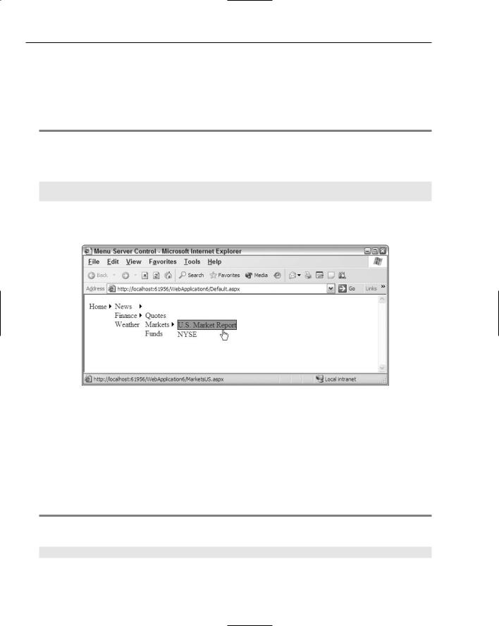
This little example adds a background color and border to the static items in the menu when the end user hovers the mouse over the item. The result is shown in Figure 5-21.
Figure 5-21
Adding styles to dynamic items
Adding styles to the dynamic items of the menu control is just as easy as it was in adding them to static items. The Menu control includes a number of different elements for modifying the appearance of dynamic items, including the following:
<DynamicHoverStyle>
<DynamicMenuItemStyle>
<DynamicMenuStyle>
159
Chapter 5
<DynamicSelectedStyle>
<DynamicTemplate>
These elements change menu items the same way as the static versions of these elements, but they change only the items that dynamically pop-out from the static items. Listing 5-19 shows an example of applying the same style to the dynamic items as was applied to the static items.
Listing 5-19: Adding a hover style to dynamic items in the menu control
<asp:Menu ID=”Menu1” Runat=”server” DataSourceID=”Sitemapdatasource1”> <StaticHoverStyle BackColor=”DarkGray” BorderColor=”Black” BorderStyle=”Solid” BorderWidth=”1”></StaticHoverStyle>
<DynamicHoverStyle BackColor=”DarkGray” BorderColor=”Black” BorderStyle=”Solid”
BorderWidth=”1”></DynamicHoverStyle>
</asp:Menu>
This code produces the results shown in Figure 5-22.
Figure 5-22
Changing the layout of the menu items
By default, the dynamic menu items are displayed from left-to-right. This means that as the items in the menu expand, they are just continually displayed in a vertical fashion. You can actually control this behavior, as there is another option available to you.
The other option is to have the first level of menu items appear directly below the first static item (horizontally). You change this behavior by using the Orientation attribute of the Menu control, as shown in Listing 5-20.
Listing 5-20: Forcing the menu items to use a horizontal orientation
<asp:Menu ID=”Menu1” Runat=”server” DataSourceID=”Sitemapdatasource1” Orientation=”Horizontal”>
</asp:Menu>
160

Site Navigation
This code produces the results shown in Figure 5-23.
Figure 5-23
The Orientation attribute can take a value of Horizontal or Vertical only. The default value is
Vertical.
Changing the pop-out symbol
As the default, an arrow is used as the pop-out symbol for the menu items generated, whether they are static or dynamic menu items. This is again shown in Figure 5-24.
Figure 5-24
You are not forced to use this arrow symbol; in fact, you can change it to an image with relatively little work. Listing 5-21 shows how to accomplish this task.
Listing 5-21: Using custom images
<asp:Menu ID=”Menu1” Runat=”server” DataSourceID=”Sitemapdatasource1” Orientation=”Horizontal” DynamicPopOutImageUrl=”myArrow.gif”
StaticPopOutImageUrl=”myArrow.gif”>
</asp:Menu>
To change the pop-out symbol to an image of your choice, you use the DynamicPopOutImageUrl or StaticPopOutImageUrl properties. The String value these attributes take is simply the path of the image you want to use. Depending on the image used, it produces something similar to what you see in Figure 5-25.
161
Chapter 5
Figure 5-25
Separating menu items with images
Another nice styling option of the Menu control is the capability to add a divider image to the menu items. You use the StaticBottomSeparatorImageUrl, StaticTopSeparatorImageUrl,
DynamicBottomSeparatorImageUrl, and DynamicTopSeparatorImageUrl properties depending on where you want to place the separator image.
For example, if you wanted to place a divider image under only the dynamic menu items, you would use the DynamicBottomSeparatorImageUrl property, as shown in Listing 5-22.
Listing 5-22: Applying divider images to dynamic items
<asp:Menu ID=”Menu1” Runat=”server” DataSourceID=”Sitemapdatasource1” DynamicBottomSeparatorImageUrl=”myDivider.gif”>
</asp:Menu>
All the properties of the Menu control that define the image to use for the dividers take a String value that points to the location of the image. The result of Listing 5-22 is shown in Figure 5-26.
Figure 5-26
162