

Графики математических функций
При построении графиков элементарных математических функций значения функций задаются в конечном числе точек. Если просто соединить эти точки отрезками прямых линий, то полученная ломаная совсем не будет похожа на истинный график функции.
Если Вы начнете увеличивать число точек, в которых вычисляются значения функции, то это потребует введения большого количества данных, и построение графика потеряет наглядность.
Мы не будем увеличивать число точек, в которых вычисляются значения функций, а воспользуемся при построении графиков интерполяционными многочленами, при помощи которых реализован процесс построения гладких кривых в формате диаграмм График.
Этот режим построения можно задать при выборе типа и формата диаграммы.
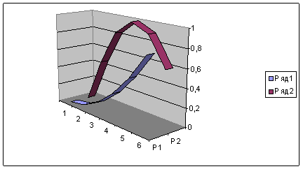
В результате графики будут иметь вид гладких кривых, проходящих через заданные точки. Построим графики двумерных функций у=х*х/8, y=sin(x) и у=1n(1+х) и расположим их на одном рисунке, и трехмерной функции - гиперболического параболоида, который описывается уравнением вида z=(x/a)2 -(у/Ь)2.
При построении графиков часто возникает проблема отображения на ограниченном экране широкого диапазона изменения данных. Одним из способов решения этой проблемы является введение логарифмической шкалы для области значений.
Excel поддерживает при построении графиков логарифмическую шкалу как для обычных типов графиков, так и для смешанных, то есть на одной оси Вы можете ввести логарифмическую шкалу, а на другой - линейную.

![]()
![]()
![]()
|
Перейти на Главную страницу |
Перейти
на Сайт: www.shans-i.narod.ru
|
You are on the Home/Excel/Charts/3D Surface page
![]() Share
Your
Comments
Share
Your
Comments
About this site
Начало формы
![]()
![]()
![]()
![]() Web
Web
![]() This
Site
This
Site
![]()
![]()
![]()
![]()
![]()
![]()
![]()
Конец формы
![]()
![]() TM
Plot
Create
a chart from any cell with a formula
TM
Plot
Create
a chart from any cell with a formula
TM Calendar An easy-to-use calendar with reminder capability for Microsoft Excel
![]() TM
AutoChart
Link
chart axis values to worksheet cells
TM
AutoChart
Link
chart axis values to worksheet cells
What does the final graph look like?
Enter the function to be graphed
Create a table of data for the chart
Create the chart
What Excel really does and why a 3-D surface chart is not a 'true' 3-D chart
|
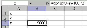
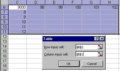
The goal Plot z=(x-10)3 + (y-100)2 as in the chart on the right |
|
|
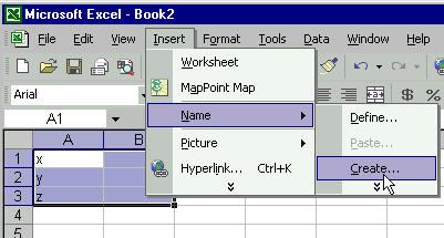
Enter the function to be graphed To ease understanding of how Excel creates a 3-D surface chart, we will start by naming the cells that will contain the x, y, and z values. Enter the text x, y, and z in cells A1:A3 as on the right. Then, select A1:B3 and select the menu item Insert | Name > Create... |
|
|
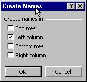
Accept Excel's default choice of 'Left column' by clicking the OK button. |
|
|
Now, enter the function in cell B3 as shown on the right. Note that the formula uses the names of the cells, rather than the cell addresses. If we had not named the cells, the formula might have looked like =(B1-10)^3+(B2-100)^2 |
|
|
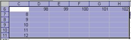
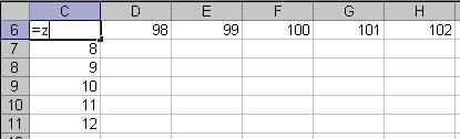
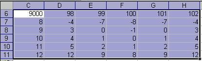
Create the data table for the chart
|
|
|
|
|
|
|
|
|
|
|
|
|
|
|
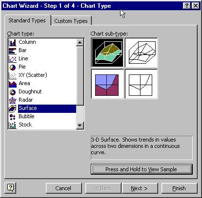
Create the chart Step 1: Create the basic chart Step 2: Specify the 'x-values' Step 3: Specify the 'y-values' Step 4: The result |
|
|
Step 1: The basic chart
|
|
|
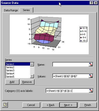
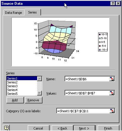
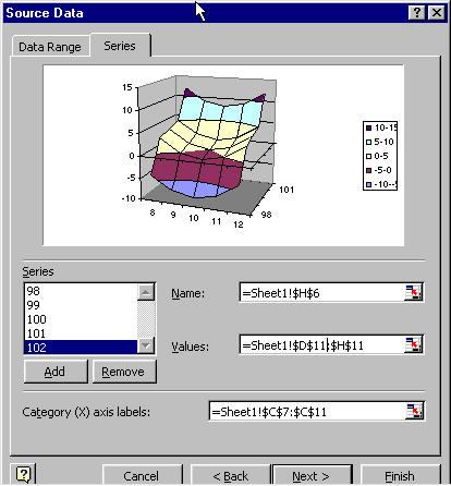
Step 2: Specify the 'x-values'
|
|
|
Step 3: Specify the 'y-values'
|
|
|
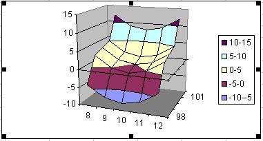
Step 4: The result |
|
|
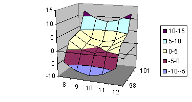
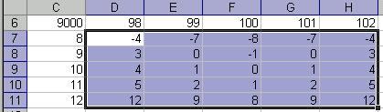
What's the limitation on creating a 3-D chart? In creating the chart above, the x-values were entered not a real numeric values but as 'category labels.' This was done in Step 2 of the Chart Wizard. Excel does not attach any numerical significance to these labels. All the labels are arranged so that they are next to each other at equal distances. Similarly, the y-values are not real values. Excel draws a 3-D chart by charting multiple series and overlaying a surface across all the series. What looks like y-values of 98, 99, etc., are nothing but series names specified in Step 2 of the Chart Wizard. This example deliberately picked x-values such that the difference between adjacent values was the same (1 in this case). The y-values have the same characteristic, with each being 1 more than the previous one. Any category chart which contains equidistant x-values will look OK. However, consider the case where the x values are 8, 9, 10, 15, and 20. The chart corresponding to this data set is shown on the right. |