

Pro Visual C++-CLI And The .NET 2.0 Platform (2006) [eng]-1
.pdf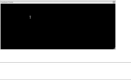
318 C H A P T E R 9 ■ B A S I C W I N D O W S F O R M S A P P L I C A T I O N S
void InitializeComponent(void)
{
this->SuspendLayout();
//
// Form1
//
this->AutoScaleMode = System::Windows::Forms::AutoScaleMode::Font; this->BackColor = System::Drawing::Color::Black;
this->ClientSize = System::Drawing::Size(692, 274); this->Cursor = System::Windows::Forms::Cursors::UpArrow; this->FormBorderStyle =
System::Windows::Forms::FormBorderStyle::SizableToolWindow; this->Name = L"Form1";
this->SizeGripStyle = System::Windows::Forms::SizeGripStyle::Show; this->Text = L"Custom Form";
this->TopMost = true; this->ResumeLayout(false);
}
#pragma endregion };
}
The running of CustomHello.exe results in the display in Figure 9-4. Notice that this form is quite a bit different from the default form generated by the previous example, Hello.exe. For instance, this form has no control box and no minimize or maximize button, and in the bottom right there is a form-sizing grip and an up-arrow cursor.
Figure 9-4. A very customized form
■Note For the rest of the chapter I will not list the .cpp file, as it is the same for every example. I will also remove compiler-generated comments and directives, unless they aid in the reading of the code, just to save a tree or two when printing this book.
C H A P T E R 9 ■ B A S I C W I N D O W S F O R M S A P P L I C A T I O N S |
319 |
Handling Win Form Delegates and Events
Remember back in Chapter 4 when I discussed delegates and events and you thought to yourself, “That would be a great way to handle an event-driven GUI application!” You know what? You were right. This is exactly how the Win Form handles its userand system-generated events.
Win Forms uses the .NET Framework’s event model to handle all the events that take place within the form. This requires a delegate, an event source class, and an event receiver class. (You might want to revisit Chapter 4 if this means nothing to you.) Fortunately, many of the delegates and event source classes you need to worry about are already part of the .NET Framework class library. You need to define the event receiver class.
For the following example, you’ll use the MouseDown event that’s defined in the event source class System::Windows::Forms::Control:
event MouseEventHandler ^MouseDown;
This event uses the MouseEventHandler delegate, which is defined in the
System::Windows::Forms namespace:
public delegate void MouseEventHandler(Object^ sender, MouseEventArgs^ e);
For those of you who are curious, the class MouseEventArgs provides five properties that you can use to figure out information about the MouseDown event:
•Button: An enum class specifying which mouse button was pressed down.
•Clicks: The number of times the mouse was pressed and released.
•Delta: The number of detents the mouse wheel was rotated. A detent is one notch of the mouse wheel.
•X: The horizontal location of the mouse where it was clicked.
•Y: The vertical location of the mouse where it was clicked.
The first step in creating an event receiver class is to create the event handler that will handle the event generated by the event source class. So, in the case of MouseDown, you need to create a method with the same signature as MouseEventHandler. Notice also that you make the handler private. You don’t want any outside method calling this event by accident, as it’s only intended to be called within the event receiver class.
private:
void Mouse_Clicked(System::Object^ sender, System::Windows::Forms::MouseEventArgs^ e)
{
}
Once you have the handler, all you need to do is delegate it onto the MouseDown event. As you may recall from Chapter 4, C++/CLI uses multicast delegates; therefore, you can chain as many handler methods as you need to complete the MouseDown event.
MouseDown += gcnew MouseEventHandler(this, Mouse_Clicked);
If at a later time you no longer want this handler to handle the MouseDown event, all you need to do is remove the delegated method.
MouseDown -= gcnew MouseEventHandler(this, Mouse_Clicked);
320 C H A P T E R 9 ■ B A S I C W I N D O W S F O R M S A P P L I C A T I O N S
After describing all this, I’ll now tell you that you can create and delegate event handlers automatically using the design tool and you don’t have to worry about syntax or coding errors for the declarations. All you have to code is the functionality that handles the event. To add event handlers to a control or (in this case) a form, follow these steps:
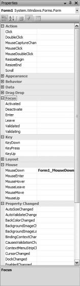
1.In the Properties window, click the icon that looks like a lightning bolt. This will change the view from properties to events (see Figure 9-5).
Figure 9-5. Properties view of event handlers
2.Double-click the event you want to add to the control or form. This will create all the appropriate code in the form using the default name.
C H A P T E R 9 ■ B A S I C W I N D O W S F O R M S A P P L I C A T I O N S |
321 |
or
Enter the name of the new method in the text box next to the event handler you are creating.
or
If you have already written the method, select the method from the drop-down list next to the event that you want it to handle.
Listing 9-4 is a fun little program that jumps your Win Form around the screen depending on where your mouse pointer is and which mouse button you press within the client area of the form. As you can see, event handling is hardly challenging. Most of the logic of this program is designed just to determine where to place the form on a MouseDown event.
Listing 9-4. Mouse Jump: Press a Mouse Button and See the Form Jump
#pragma once
namespace |
MouseJump |
{ |
|
using |
namespace System; |
using |
namespace System::ComponentModel; |
using |
namespace System::Collections; |
using |
namespace System::Windows::Forms; |
using |
namespace System::Data; |
using |
namespace System::Drawing; |
public ref class Form1 : public System::Windows::Forms::Form
{
public:
Form1(void)
{
InitializeComponent();
}
protected:
~Form1()
{
if (components)
{
delete components;
}
}
private:
System::ComponentModel::Container ^components;
#pragma region Windows Form Designer generated code
void InitializeComponent(void)
{
this->SuspendLayout();
//
// Form1
//
322 C H A P T E R 9 ■ B A S I C W I N D O W S F O R M S A P P L I C A T I O N S
this->AutoScaleDimensions = System::Drawing::SizeF(6, 13); this->AutoScaleMode = System::Windows::Forms::AutoScaleMode::Font; this->ClientSize = System::Drawing::Size(450, 300);
this->Name = L"Form1"; this->Text = L"Mouse Jump"; this->MouseDown +=
gcnew System::Windows::Forms::MouseEventHandler(this, &Form1::Form1_MouseDown);
this->ResumeLayout(false);
}
#pragma endregion
private:
System::Void Form1_MouseDown(System::Object^ sender, System::Windows::Forms::MouseEventArgs^ e)
{
//Get mouse x and y coordinates int x = e->X;
int y = e->Y;
//Get Forms upper left location Point loc = DesktopLocation;
//Handle left button mouse click
if (e->Button == Windows::Forms::MouseButtons::Left)
{
Text = String::Format("Mouse Jump - Left Button at {0},{1}", x, y);
DesktopLocation = Drawing::Point(loc.X + x, loc.Y +y);
}
// Handle right button mouse click
else if (e->Button == Windows::Forms::MouseButtons::Right)
{
Text = String::Format("Mouse Jump - Right Button at {0},{1}", x, y);
DesktopLocation = Point((loc.X+1) - (ClientSize.Width - x), (loc.Y+1) - (ClientSize.Height - y));
}
// Handle middle button mouse click else
{
Text = String::Format("Mouse Jump - Middle Button at {0},{1}", x, y);
DesktopLocation = Point((loc.X+1) - ((ClientSize.Width/2) - x), (loc.Y+1) - ((ClientSize.Height/2) - y));
}
}
};
}
C H A P T E R 9 ■ B A S I C W I N D O W S F O R M S A P P L I C A T I O N S |
323 |
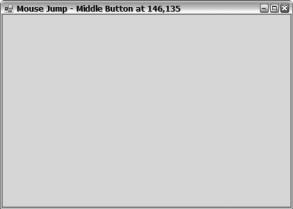
The MouseJump.exe application shown in Figure 9-6 is hardly exciting, because you can’t see the jumping of the form in a still image. Notice that the coordinates at which the mouse was last clicked are displayed in the title bar.
Figure 9-6. The form after a mouse jump
Adding Controls
Okay, now that you have covered the basics of a form and how to handle events from a form, you’ll go ahead and make the form do something constructive. To do this, you need to add what the .NET Framework class library calls controls.
Controls give you the ability to build an interface by breaking it down into smaller components. Each control provides a specific type of input and/or output functionality to your Win Form. For example, there are controls to place a label on the screen, display and input text data, select a data item from a list, and display and (if you want) update a tree of data. There is even a control to display a calendar.
All controls inherit from the Component and Control classes, with each class providing a number of standard methods and properties. Each control will have a few methods and properties of its own that make it unique. Also, all controls have events, for which you can create handlers. You can find all controls provided by the .NET Framework class library within the System::Windows::Forms namespace.
You can add controls to a Win Form in one of two ways, just like almost any other process when it comes to Win Forms. You can use Visual Studio 2005 GUI tool to drop and drag the controls to the Win Form, or you can code the controls by hand using Visual Studio 2005’s IDE editor (or almost any other editor for that matter).
Let’s look at how to drag and drop controls onto a Win Form, as this is essentially what you’re going to mimic when you code by hand. The steps are as follows:
1.Resize the form to the size you want by dragging the borders of the form in the design window. Make it a little bigger than you think you’ll need. Don’t worry—you can change the size later to enclose the controls better. I’ve learned from past experience that having the extra real estate makes things easier when designing.
2.Bring the cursor over the Toolbox tab (if you don’t have it tacked open). This will expand the Toolbox.
324 C H A P T E R 9 ■ B A S I C W I N D O W S F O R M S A P P L I C A T I O N S
3.Click, hold, and then drag the control you want from the Toolbox to the form. (If you don’t have the Toolbox tacked open, you may need to drag the control to an open location on the form and release it there. This will cause the Toolbox to close so that you can click again and drag the control to the desired location on the form.)
4.Alter the properties of the controls as you wish by changing them in the Properties view. I recommend changing the Name property at a minimum, but there is nothing stopping you from using the default name for the control.
5.Add event handlers as desired. You might consider holding off on this step until you have the entire Win Form laid out.
6.Repeat steps 1 through 5 for all other required controls.
Behind the scenes, these steps add a definition of the control to the class and then create an instance of it. Each property that is changed adds a line of code that updates one of the control’s properties. Each event handler added adds a delegation statement and then creates an event handler.
As a developer, you can rely solely on the drag-and-drop functionality of Visual Studio 2005 or you can do as I do and use the tool to build the basic design but then fine-tune it within the code itself. You could also be a glutton for punishment and do it all by hand. But why bother? The tool is there, so why not use it?
Okay, now that you know how to add a control to the Win Form, you’ll take a look at an assortment of the more common controls provided by the .NET Framework class library, starting with one of the easiest: Label.
The Label Control
The name of this control is a little misleading. It gives you the impression that its only purpose is to display static text in the form. Nothing could be further from the truth. The Label control is also great for displaying dynamic text to the form. Heck, the Label control can even trigger an event when clicked.
In general, though, you’ll normally use a Label control to statically label something else. The usual process of creating a label is simply to create the Label control and then set its properties so that the control looks the way you want it to. Here are some of the more common properties used by the Label control:
•BackColor is a System::Drawing::Color that represents the background color of the label and defaults to the DefaultBackColor property.
•Font is a System::Drawing::Font that represents the font used by the label and defaults to the
DefaultFont property.
•ForeColor is a System::Drawing::Color that represents the foreground color (or the actual color of the text) of the label and defaults to the DefaultForeColor property.
•Image is a System::Drawing::Image that represents the image displayed within the label. The default is null, which signifies that no image is to be displayed.
•ImageAlign is a ContentAlignment enum class that represents the alignment of the image within the label. I like to visualize the different alignments by picturing a tic-tac-toe game in my head, with each box a possible alignment. The default alignment is the center box of the tic- tac-toe game or ContentAlignment::MiddleCenter.
•Text is a String containing the actual text to be displayed.
•TextAlign is a ContentAlignment enum class that represents the alignment of the image within the label. The default is based on the culture of the computer. Because my computer has a culture of en-us, the default alignment is the top-left corner, or ContentAlignment::TopLeft.
C H A P T E R 9 ■ B A S I C W I N D O W S F O R M S A P P L I C A T I O N S |
325 |
•UseMnemonic is a Boolean that specifies whether or not the ampersand (&) character should be interpreted as an access-key prefix character. The default is true.
Now that you have seen the more common properties, for grins and giggles you’ll implement a Label control using some of its less common properties (see Listing 9-5).
Listing 9-5. The MightyLabel, an Implementation of the Uncommon Properties
#pragma once
namespace |
MightyLabel |
{ |
|
using |
namespace System; |
using |
namespace System::ComponentModel; |
using |
namespace System::Collections; |
using |
namespace System::Windows::Forms; |
using |
namespace System::Data; |
using |
namespace System::Drawing; |
public ref class Form1 : public System::Windows::Forms::Form
{
public:
Form1(void)
{
labelSwitch = true; InitializeComponent();
}
protected:
~Form1()
{
if (components)
{
delete components;
}
}
private:
System::Windows::Forms::Label^ MightyLabel; bool labelSwitch;
System::ComponentModel::Container ^components;
#pragma region Windows Form Designer generated code
void InitializeComponent(void)
{
this->MightyLabel = (gcnew System::Windows::Forms::Label()); this->SuspendLayout();
//
// MightyLabel
//
this->MightyLabel->BorderStyle = System::Windows::Forms::BorderStyle::FixedSingle;
326 C H A P T E R 9 ■ B A S I C W I N D O W S F O R M S A P P L I C A T I O N S
this->MightyLabel->Cursor = System::Windows::Forms::Cursors::Hand; this->MightyLabel->Location = System::Drawing::Point(63, 91); this->MightyLabel->Name = L"MightyLabel";
this->MightyLabel->Size = System::Drawing::Size(150, 35); this->MightyLabel->TabIndex = 1;
this->MightyLabel->Text =
L"This is the mighty label! It will change when you click it"; this->MightyLabel->TextAlign =
System::Drawing::ContentAlignment::MiddleCenter; this->MightyLabel->Click +=
gcnew System::EventHandler(this, &Form1::MightyLabel_Click);
//
// Form1
//
this->AutoScaleDimensions = System::Drawing::SizeF(6, 13); this->AutoScaleMode = System::Windows::Forms::AutoScaleMode::Font; this->ClientSize = System::Drawing::Size(292, 273); this->Controls->Add(this->MightyLabel);
this->Name = L"Form1";
this->Text = L"The Mighty Label"; this->ResumeLayout(false);
}
#pragma endregion
private:
System::Void MightyLabel_Click(System::Object^ sender, System::EventArgs^ e)
{
if (labelSwitch)
MightyLabel->Text = L"Ouchie!!! That hurt.";
else
MightyLabel->Text = L"Ooo!!! That tickled."; labelSwitch = !labelSwitch;
}
};
}
As you can see, dragging and dropping can save you a lot of time when you’re designing a form, even in such a straightforward case. But even this simple program shows that a programmer is still needed. A designer can drag and drop the label to where it’s needed, and can even change the control’s properties, but a programmer is still needed to give the controls life or, in other words, to handle events.
Notice that a Form class is like any other C++/CLI class in that you can add your own member variables, methods, and properties. In this example, I add a bool member variable called labelSwitch to hold the current state of the label. I initialize it in the constructor just as I would in any other class and then use it within the Click event handler. Basically, as long as you don’t code within the areas that the generated code says to avoid, you’re safe to use the Form class as you see fit.
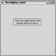
Figure 9-7 shows what MightyLabel.exe looks like when you execute it. Be sure to click the label a couple of times.
C H A P T E R 9 ■ B A S I C W I N D O W S F O R M S A P P L I C A T I O N S |
327 |
Figure 9-7. The MightyLabel example
The Button Controls
Buttons are one of the most commonly used controls for getting user input found in any Win Forms application, basically because the average user finds buttons easy to use and understand. And yet they are quite versatile for the software developer.
The .NET Framework class library provides three different types of buttons: Button, CheckBox, and RadioButton. All three inherit from the abstract ButtonBase class, which provides common functionality across all three. Here are some of the common properties provided by ButtonBase:
•FlatStyle is a FlatStyle enum class that represents the appearance of the button. The default is FlatStyle::Standard, but other options are Flat and Popup.
•Image is a System::Drawing::Image that represents the image displayed on the button. The default is null, meaning no image is to be displayed.
•IsDefault is a protected Boolean that specifies whether the button is the default for the form. In other words, it indicates whether the button’s Click event gets triggered when the Enter key is pressed. The default is false.
•Text is a String that represents the text that will be displayed on the button.
Remember, you also get all the properties of Control and Component. Thus, you have a plethora of properties and methods to work with.
Button
The Button control does not give much functionality beyond what is defined by the abstract ButtonBase class. You might think of the Button control as the lowest-level implementation of the abstract base class.
Most people think of Button as a static control that you place on the Win Form at design time. As the example in Listing 9-6 points out (over and over again), this is not the case. Yes, you can statically place a Button control, but you can also dynamically place it on the Win Form.