

- •CONTENTS
- •PREFACE
- •ABOUT THE EDITORS
- •ABOUT THE CONTRIBUTORS
- •1. HISTORY OF THE DISCIPLINE
- •2. POSTMODERNISM
- •3. NEOINSTITUTIONALISM
- •4. SYSTEMISM
- •5. RATIONALITY AND RATIONAL CHOICE
- •6. PRINCIPAL–AGENT THEORY
- •7. POLITICAL PSYCHOLOGY
- •8. STRAUSSIANS
- •9. SYSTEMS THEORY AND STRUCTURAL FUNCTIONALISM
- •10. POLITICAL DEVELOPMENT AND MODERNIZATION
- •11. STATISM
- •12. DEPENDENCY AND DEVELOPMENT
- •13. CIVIL WARS
- •14. TERRORISM
- •15. POLITICAL AND MILITARY COUPS
- •16. RESOURCE SCARCITY AND POLITICAL CONFLICT
- •17. ETHNIC CONFLICT
- •18. COMPARATIVE POLITICAL PARTIES
- •19. ELECTORAL SYSTEMS IN COMPARATIVE PERSPECTIVE
- •20. COMPARATIVE FEDERALISM, CONFEDERALISM, UNITARY SYSTEMS
- •21. PRESIDENTIALISM VERSUS PARLIAMENTARISM
- •22. COMPARATIVE JUDICIAL POLITICS
- •23. CIVIL SOCIETY
- •24. POLITICAL CULTURE
- •25. RELIGION AND COMPARATIVE POLITICS
- •26. ETHNIC AND IDENTITY POLITICS
- •27. SOCIAL MOVEMENTS
- •28. GENDER AND POLITICS
- •29. COMPARATIVE ENVIRONMENTAL POLITICS AND CONFLICT
- •30. TOTALITARIANISM AND AUTHORITARIANISM
- •31. SEMIAUTHORITARIANISM
- •32. MODELS OF DEMOCRACY
- •33. PROCESSES OF DEMOCRATIZATION
- •34. COMPARATIVE METHODS
- •35. CASE STUDIES
- •36. HISTORY OF INTERNATIONAL RELATIONS
- •37. REALISM AND NEOREALISM
- •38. IDEALISM AND LIBERALISM
- •39. DEPENDENCY AND WORLD-SYSTEMS
- •40. FOREIGN POLICY ANALYSIS
- •41. FEMINIST INTERNATIONAL RELATIONS
- •42. LEADERSHIP AND DECISION MAKING
- •43. BALANCE OF POWER
- •44. DETERRENCE THEORY
- •45. RIVALRY, CONFLICT, AND INTERSTATE WAR
- •46. THE DEMOCRATIC PEACE
- •47. GLOBAL POLITICS OF RESOURCES AND RENTIERISM
- •48. COMPLEX INTERDEPENDENCE AND GLOBALIZATION
- •49. INTERNATIONAL POLITICAL ECONOMY AND TRADE
- •50. NONSTATE ACTORS IN INTERNATIONAL RELATIONS
- •51. INTERNATIONAL ORGANIZATIONS AND REGIMES
- •52. INTERNATIONAL LAW
- •53. INTERNATIONAL ENVIRONMENTAL POLITICS
- •54. EVOLUTION OF SCIENCE IN POLITICAL SCIENCE
- •55. POSITIVISM AND ITS CRITIQUE
- •56. CONSTRUCTIVISM
- •57. REGRESSION ANALYSIS
- •58. CONTENT ANALYSIS
- •59. LONGITUDINAL ANALYSIS
- •60. QUALITATIVE VERSUS QUANTITATIVE RESEARCH
- •61. SURVEY RESEARCH
- •62. EXPERIMENTS
- •63. FORMAL THEORY AND SPATIAL MODELING
- •64. GAME THEORY
- •65. THE ANCIENTS
- •66. ASIAN POLITICAL THOUGHT
- •67. ISLAMIC POLITICAL THOUGHT
- •68. CHRISTIAN POLITICAL THOUGHT
- •69. EARLY MODERNS AND CLASSICAL LIBERALS
- •70. NEOCLASSICAL LIBERALS
- •71. MODERN DEMOCRATIC THOUGHT
- •72. MODERN LIBERALISM, CONSERVATISM, AND LIBERTARIANISM
- •73. ANARCHISM
- •74. NATIONALISM
- •75. FASCISM AND NATIONAL SOCIALISM
- •76. MARXISM
- •77. REVISIONISM AND SOCIAL DEMOCRACY
- •78. LENINISM, COMMUNISM, STALINISM, AND MAOISM
- •79. SOCIALISM IN THE DEVELOPING WORLD
- •81. URBAN POLITICS
- •82. MEDIA AND POLITICS
- •83. U.S. CONGRESS
- •84. THE PRESIDENCY
- •85. AMERICAN JUDICIAL POLITICS
- •86. AMERICAN BUREAUCRACY
- •87. INTEREST GROUPS AND PLURALISM
- •88. AMERICAN FEDERALISM
- •89. AMERICAN POLITICAL PARTIES
- •90. STATE AND LOCAL GOVERNMENT
- •91. PUBLIC POLICY AND ADMINISTRATION
- •92. CAMPAIGNS
- •93. POLITICAL SOCIALIZATION
- •94. VOTING BEHAVIOR
- •95. AMERICAN FOREIGN POLICY
- •96. RACE, ETHNICITY, AND POLITICS
- •98. RELIGION AND POLITICS IN AMERICA
- •99. LGBT ISSUES AND THE QUEER APPROACH
- •INDEX
57
REGRESSION ANALYSIS
MARK ZACHARY TAYLOR
Georgia Institute of Technology
This chapter provides a brief introduction to regression analysis. Regressions are a form of statistical analysis frequently used to test causal hypotheses in social science research. A simple way of thinking about
regressions is to try, given a scatterplot of data, to fit the best line to run through, and thereby describe, those data. Regressions are useful because that line can tell researchers a lot more about whether the data support a hypothesis than just the scatterplot alone.
Research papers and articles using regressions usually have a typical format. First, the author poses a research question or causal hypothesis. He or she then reviews recent debate and research regarding this question. Next, the author suggests a statistical regression model and data with which to help answer the research question (i.e., test the causal hypothesis) and thereby advance the scientific debate. The big scientific payoff comes in discussing the results of the statistical analysis, which usually includes a few tables of regression results. Finally, conclusions are drawn, and perhaps implications are suggested for policy or future research.
This chapter provides an introductory explanation of what bivariate and multivariate regressions are and how they work. The basic method of calculating regressions is called ordinary least squares (OLS), which is the focus of this chapter. OLS is the four-door sedan of statistics. It is the technique that most researchers prefer to
use. Certainly there are more complex and esoteric techniques, such as probit, logit, scobit, distributed lag models, and panel regression.1 However, scientists use these techniques only in those special cases where OLS does not work so well. Therefore, this chapter also discusses briefly the conditions under which OLS can fail and offers some fixes within OLS that researchers use to address these failures.
Drawing a Regression Line:
The Basics of Bivariate Regression
Given knowledge of introductory statistics (i.e., descriptive statistics, probability, and statistical inference), a student’s next step is typically to take intermediate statistics, which for political scientists is always regressions. Why? Because testing theories of causality is the main goal of political scientists, who hypothesize that X causes Y; then, to test this hypothesis, they gather data and use regression analysis to see whether those data show any evidence of a causal relationship between X and Y.
Couldn’t we just use introductory statistics to ask whether X and Y correlate or covary? Sure we could, but it would not tell us a whole lot. Let’s see why, with an example of a bivariate regression, which is a regression
478
that has only two variables: one independent and one dependent.
Say the city newspaper reports that a strange flu has broken out in town, and it prints a chart of the number of sick people by zip code. You talk to a few flu sufferers, ask what they did during the days leading up to the flu, and find that they have one thing in common: They each went to meet with the city’s mayor. So you ask yourself why that should cause the flu. Then you realize that the mayor is one of those old-style, glad-handing politicians whose style is to handshake and hug everyone he or she meets. So you hypothesize that the flu is caused by a virus that the mayor has and he or she is passing it on by this contact. But if you called the mayor’s office or state health officials with this claim, the officials would think you were crazy. To better convince them, you need to provide some evidence to support your hypothesis. How can you do this?
You certainly cannot contact everyone in the city, asking if they visited the mayor recently and now have the flu. However, you could consult the mayor’s official visitors’signin book, which records each visitor’s name and address. Therefore, for each zip code, you could plot the number of visitors to the mayor on one axis and, using the newspaper’s
Regression Analysis • 479
chart, the incidence of flu on the other. It’s simple; just draw a scatterplot.
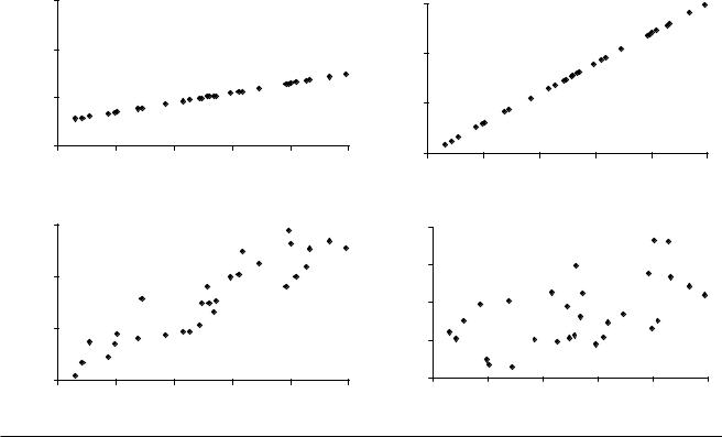
Figure 57.1 shows a few possible scatterplots that might result from these data. Each scatterplot represents just one of an infinite set of possible results. If your data produced any of the first three scatterplots, then you could be pretty sure there is a relationship between visits to the mayor’s office and incidence of the flu. But in the fourth scatterplot, you are not so sure. Therefore, the first thing you would like is a technique by which you could be more confident of whether you are observing a relationship in scatterplot 4. Descriptive statistics, like covariation and correlation, will not help much with this.
Also, look at the first three scatterplots Each graph clearly shows some sort of a relationship between visits to the mayor and incidence of flu, but they are distinctly different relationships. It would be nice if you could say something about how they are different. Again, descriptive statistics are not much help here.
Let’s start by figuring out how the relationships are different in scatterplots 1, 2, and 3. One technique is to simply draw a line through the data. How does drawing a line help? Remember from elementary algebra that given a
Illness
Illness
#1
3,000 |
|
|
|
|
|
2,000 |
|
|
|
|
Illness |
1,000 |
|
|
|
|
|
|
|
|
|
|
|
0 |
|
|
|
|
|
0 |
200 |
400 |
600 |
800 |
1,000 |
|
|
Visits to Mayor |
|
|
|
3,000 |
|
|
#3 |
|
|
|
|
|
|
|
|
2,000 |
|
|
|
|
Illness |
1,000 |
|
|
|
|
|
|
|
|
|
|
|
0 |
|
|
|
|
|
0 |
200 |
400 |
600 |
800 |
1,000 |
#2
3,000
2,000
1,000
0
0 |
200 |
400 |
600 |
800 |
1,000 |
Visits to Mayor
#4
4,000
3,000
2,000
1,000
0
0 |
200 |
400 |
600 |
800 |
1,000 |
Visits to Mayor |
Visits to Mayor |
Figure 57.1 Illness Versus Visits to the Mayor
480 • POLITICAL SCIENCE METHODOLOGY
bunch of Y’s and X’s defined as points on a line, the equa- |
||||||||||
tion for that line is |
|
|
|
|
|
|||||
|
Y = (slope * X) + intercept. |
|
(1) |
|||||||
First, the slope of the line will tell how much of an |
||||||||||
increase in |
Y is related to an increase in one unit of X. |
|||||||||
Second, the intercept of the line with the |
y-axis will tell |
|||||||||
how much Y there will be when there is no X at all (when |
||||||||||
X = |
0). |
|
|
|
|
|
|
|
|
|
So let’s try to draw some lines through our mayor visits |
||||||||||
versus illness data. The first two are easy since the data |
||||||||||
points are perfectly lined up. In scatterplot 1, you would |
||||||||||
use simple algebra on the raw data (not shown) to figure |
||||||||||
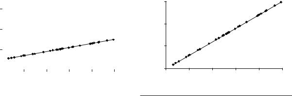
out that the slope is 1, and the intercept is 500. Therefore, |
||||||||||
the result is Figure 57.2. |
|
|
|
|
|
|||||
In scatterplot 2, you again use the raw data to calculate |
||||||||||
that the slope is 3, and the intercept is 0. Therefore, the |
||||||||||
result is Figure 57.3. |
|
|
|
|
|
|||||
Now that we know these simple equations, we have |
||||||||||
two drastically different interpretations of the data. In |
||||||||||
scatterplot 1, the slope is 1. This means that for every one |
||||||||||
visit to the mayor, one person gets sick. Also, the inter- |
||||||||||
cept is 500; this implies that if no one visited the mayor, |
||||||||||
then 500 people would be sick. So the line in scatterplot 1 |
||||||||||
does not sound like a flu virus. That is, if someone visits |
||||||||||
the mayor and catches the flu, then he or she should bring |
||||||||||
it home to infect his or her friends, family, and then |
||||||||||
coworkers. So every one visit to the mayor should prob- |
||||||||||
ably result in multiple people getting sick. In other |
||||||||||
words, the slope should be higher, which is exactly what |
||||||||||
one sees in scatterplot 2. |
|
|
|
|
||||||
Furthermore, if the mayor is the source of the flu, then |
||||||||||
the following should apply: If no one visits the mayor, |
||||||||||
then few people should get sick. That is, the intercept term |
||||||||||
should be close to zero. Again, this looks more like what |
||||||||||
|
|
|
|
|
|
|
#1 |
|
|
|
|
3,000 |
|
|
|
|
|
|
|
|
|
|
|
|
|
|
|
|
|
|
||
Illness |
2,000 |
|
|
|
|
|
|
|
|
|
1,000 |
|
|
|
|
|
|
|
|
|
|
|
|
|
|
|
|
|
|
|
|
|
|
0 |
|
|
|
|
|
|
|
|
|
|
|
|
|
|
|
|
|
|
|
|
|
0 |
200 |
400 |
600 |
800 |
1,000 |
||||
|
|
|
|
|
|
Visits to Mayor |
|
|
|
|
|
|
|
|
|
|
|
||||
Figure 57.2 |
Scatterplot 1 |
|
|
|
|
|
||||
NOTE: Sick people = 1 * [mayor visits] + 500 |
|
|
|
|||||||
we see in scatterplot 2. But in scatterplot 1, the line predicts 500 sick people even when no one visits the mayor.
Therefore, the equation for the line drawn in scatterplot 2 looks like evidence of a virus: If no one visits the mayor, no one gets sick, and for every person who visits the mayor, several people get sick. Meanwhile, the equation for the line drawn in scatterplot 1 does show that visits to the mayor’s office correlate with illness, but this relationship does not look like a virus. So if your research produced scatterplot 1, then you might have to reject the virus hypothesis and formulate another one. For example, maybe it’s the bad coffee they serve, moldy walls in city hall, or some sort of noxious gas at that particular subway stop. In this case, you would then want to gather new data (e.g., on the incidence of coffee drinking, mold allergies, etc.) to better test these new hypotheses.
This is exactly how political scientists use regressions. We first ask, “What causes Y to vary?” Then we formulate a hypothesis in which we theorize an X that causes Y to vary.2 Then we gather data on X and Y and use regression analysis to draw a line through the data. Finally, we ask whether the slope, the intercept, and perhaps the shape of the line supports our hypotheses about what’s going on between X and Y.
In a typical undergraduate regressions course, students might practice calculating some of the underlying mathematics by hand. But in practice, statistical software packages such as STATA, SPSS, SAS, R, Eviews, and dozens of others do the mathematical work for you. Data can be directly entered into these programs or imported from a typical spreadsheet program.3 To perform a regression, one need only type a few simple commands and then examine the computer readout. Table 57.1 shows part of a readout typical of that provided by many statistical software packages. This readout may look ugly, but it is just computerese
#2
3,000
2,000 |
|
|
|
|
|
Illness |
|
|
|
|
|
1,000 |
|
|
|
|
|
0 |
|
|
|
|
|
0 |
200 |
400 |
600 |
800 |
1,000 |
|
|
Visits to Mayor |
|
|
|
Figure 57.3 |
Scatterplot 2 |
|
|
|
|
NOTE: Sick people = 2 * [mayor visits] + 0 |
|
|
|||
Regression Analysis • 481
|
|
|
|
|
|
|||
Command: regress illness visits |
|
|
|
|
|
|||
Number of obs = |
29 |
|
|
|
|
|
|
|
R squared |
= |
0.84 |
|
|
|
|
|
|
|
|
|
|
|
|
|
|
|
illness |
|
|
Coef. |
Std. Err. |
t |
P > |t| |
[95% Conf. Interval] |
|
|
|
|
|
|
|
|
|
|
visits |
|
|
2.68 |
0.23 |
11.76 |
0.00 |
2.21 |
3.15 |
cons |
|
|
152.63 |
133.51 |
1.14 |
0.26 |
−121.25 |
426.51 |
|
|
|
|
|
|
|
|
|
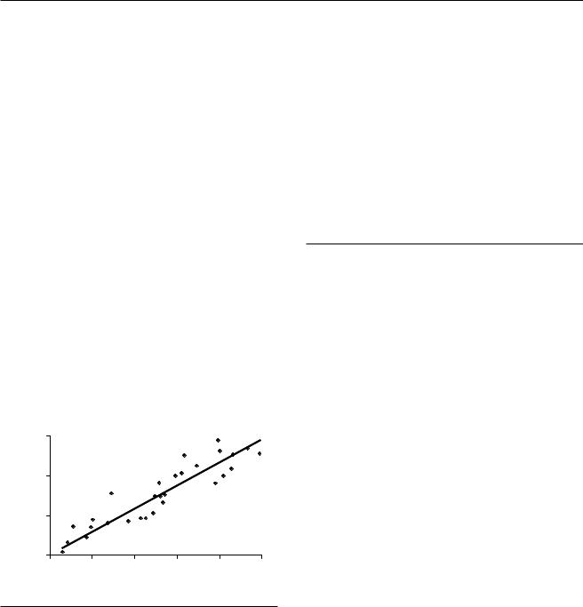
Table 57.1 Sample Readout of Regression in Scatterplot 3
for scatterplot 3. This chapter now discusses how to make sense out of it. (see Figure 57.4)
First, where in the computer readout is the line’s equation? You can find it in the lower left quadrant of the readout. The Y, or dependent variable (illness), is listed at the top of the column, with the independent variable (visits) and intercept term ( cons for constant) below it. The values of the slope and intercept term are listed in the column labeled Coef. (for coefficient). Therefore, the readout tells that the line that best fits the data is described by illness 2.68 (visits) 152. We get two pieces of information from =this equation: +
1.For every 1 additional visitor to the mayor, an average of 2.68 people get sick.
2.When nobody visits the mayor, an average of 152 people get sick.
Note that we do not interpret these numbers as follows: One visit causes 2.68 cases of illness. Why? Remember that regressions can show correlation but not causality. Social scientists use statistics to argue for causality by asking whether the correlations they show match those predicted
#3
3,000
2,000
Illness
1,000
0
0 |
200 |
400 |
600 |
800 |
1,000 |
Visits to Mayor
Figure 57.4 Scatterplot 3: With Regression Line (y = 2.68x + 152)
by our hypotheses. Thus, statistics rarely prove a hypothesis, but they can provide evidence for or against it. Hence, the researcher’s most important task is to identify the regression equation and data that will best test his or her hypothesis and thereby best convince an audience of fellow scientists that it is true.
But what about all of the other information presented in the computer readout?
The Coefficient of Determination (R2)
R2 (or R squared) is known as the coefficient of determina tion or the goodness of fit test. Its value can range from 0 to 1; it tells you how linear the data are. What does this mean exactly? Let’s look again at our four preceding scatterplots, this time with the OLS regression lines drawn through them (Figure 57.5). It may not look like it, but the relationships estimated in scatterplots 2, 3, and 4 are all based on the same underlying equation: y 3x; hence, the true regression line’s slope is 3, and the true= intercept is 0. But there is something clearly different going on in each of them. Let’s investigate.
In scatterplot 2, the line goes through each of the data points. That is, the regression line completely fits each and every data point; it therefore explains all the data. This means that all the variation in Y is explained by X; all the variation in illness is explained by visits to the mayor.
But in scatterplots 3 and 4, the data points wander or err on either sign of the line. That is, the Xregression line explains some of the data (the variation in explains some of the variation in Y), but there is some left over, unexplained, or residual variation. More precisely, for any data point not on the regression line, part of its height is explained by the line, and part is not. The percentage of (height)2 that is explained by the regression model tells us the percentage of Y explained by X. That percentage is known as R2 and is reported as a number from 0.00 to 1.00. In scatterplots 1 and 2, the R2 = 1.00 because X explains all

482 • POLITICAL SCIENCE METHODOLOGY |
|
|
|
||||
3,000 |
|
|
#1 |
|
|
|
3,000 |
|
|
|
|
|
|
||
2,000 |
|
|
|
|
|
|
2,000 |
Illness |
|
|
|
|
|
Illness |
1,000 |
1,000 |
|
|
|
|
|
|
|
0 |
|
|
|
|
|
|
0 |
0 |
200 |
400 |
600 |
800 |
1,000 |
|
0 |
|
|
Visits to Mayor |
|
|
|
|
|
3,000 |
|
|
#3 |
|
|
|
4,000 |
|
|
|
|
|
|
||
2,000 |
|
|
|
|
|
|
3,000 |
|
|
|
|
|
Illness |
|
|
Illness |
|
|
|
|
|
2,000 |
|
|
|
|
|
|
|
|
|
1,000 |
|
|
|
|
|
|
1,000 |
|
|
|
|
|
|
|
|
0 |
|
|
|
|
|
|
0 |
0 |
200 |
400 |
600 |
800 |
1,000 |
|
0 |
Visits to Mayor
Figure 57.5 Illness Versus Visits to the Mayor (With Regression Lines)
#2
200 |
400 |
600 |
800 |
1,000 |
Visits to Mayor
#4
200 |
400 |
600 |
800 |
1,000 |
Visits to Mayor
of the variation in Y; there is no unexplained portion of the data. In scatterplot 3, the R2 0.84, which means that 84% of the variation in illness is explained= by visits to the mayor. In scatterplot 4, the R2 0.31, which means that, for these data, 31% of the variation= in illness is explained by visits to the mayor.
What’s behind the unexplained part of the data? It might simply be randomness. For example, people in one zip code may have been accidentally rubbing virus into their eyes more because of a random spike in air pollution this month, or the weather in another zip code was randomly warmer, making flu resistance slightly higher there.
However, there could also be a systematic cause for some of the unexplained data. Let’s say that Norwegians are genetically more susceptible to this mystery flu, and the neighborhoods represented by data points above the regression line have more Norwegians than those below. The zip codes with more Norwegians would then have higher incidence of flu than one could explain using just visits to the mayor. And if we included another X in the regression, in which X the percentage ofRthe population that’s Norwegian, we would= get a higher 2 because that part of the variation in Y would be explained. We will talk
a little more about adding more X’s and what that means in a subsequent section, but first let’s finish up with R2.
A small warning about R2 is appropriate here. Decades ago, eager young researchers used to jump on this R2 measure and conclude something like the following:
Aha! Regressions 1 and 2 are better than 3 because they have higher R2; likewise, Regression 3 is better than 4 because it has a higher R2. It explains more of the variation in the depen dent variable.
But that is not entirely accurate. Remember that the true equation that generated the data (y 3x) is the same for scatterplots 2, 3, and 4. The only difference= is that the latter scatterplots have higher levels of randomness added to theydata.xSo the exact equation for these scatterplots is this: 3 ε, where ε is some small random number. But the= fundamental+ relationship between X and Y is the same across the scatterplots; therefore, one regression line is not somehow better than the other. Yes, in Regressions 3 and 4, there is a large amount of unexplained variation that is not present in 2. But that does not necessarily make the former bad regression lines. After all, Regressions 3 and 4 still show a relationship between

X and Y that indicates that a virus is present: high slope, low intercept. R
So what does 2 really tell you? It does not tell you whether you have a relationship between X and Y or whether one regression estimate is somehow better than another. What it tells you is how closely grouped around the regression line the data are. It tells you how linear the relationship is. For example, if we had a U-shaped scatterplot, then OLS would produce a low R2, since it would not be able to fit a straight line to the U of data. But that low R2 does not mean that there is no relationship at all, just that there is no linear relationship. So although you generally cannot use R2 to say that one regression is better than another, you might use R2 to judge whether the data are linear, whether there are some missing independent variables causing a lot of systematic error (wandering), or whether there is a large component of randomness affecting your dependent variable.
Standard Errors of Coefficients
The most important information to come out of any regression is often the slope of the regression line (aka the coefficient) and perhaps its intercept. These are the two pieces of analysis that really tell us something useful about the relationship between X and Y. For example, remember our four preceding scatterplots. In them, the slopes, and to a lesser extent the intercepts, provided evidence as to whether we were dealing with a contagious virus.
But the numbers that OLS produces for the slope and intercept are just statistical estimates. Again, recall that the city has a large population, split up into dozens and dozens of zip codes. In our example, we merely took a sample of them and used this small sample to estimate the unknown parameters of the entire population. But how confident can we be in our estimates? In our example, how confident can we be that the true relationship, the relationship for everyone in the city, is actually illness 3 (visits) 0?
One important indicator of how= far off +the estimate might be is the standard error of the slope coefficient. The standard error is simply the standard deviation of how much the data wander around the regression line. It can therefore give us an indication of how much that point estimate is likely to vary from the true value.
You can use the standard error of the slope coefficient in the same way that you used standard deviations to judge sample averages in introductory statistics. In introductory statistics you should have learned that if a sample is selected at random, then as you increase the sample’s size, the mean and variance of that sample will look more and more like the mean and variance of the population from which that sample was drawn. Furthermore, we know that for data that are normally distributed, 68% of the data will lie within 1 standard deviation of the mean, 95% of the
Regression Analysis • 483
data will lie within 2 standard deviations, and so on. And thanks to the central limit theorem, we know that many important statistics, like means and variances, are normally distributed.
The slope and intercept terms that we estimate in regression analysis are no different. We can measure how much our data wander, and use this information to get a sense of how accurate our estimates of the slope and intercept are. Because of the central limit theorem, we can say that, yes, the slope and intercept we estimate from our sample may be a little higher or lower than that of the population from which our sample came. But 95% of the time, the estimates based on our sample data will wander within plus or minus 2 standard deviations of the population’s values. Thus, we can be 95% confident that the population’s slope and intercept lie within 2 standard errors (technically 1.96) of the coefficients we estimated from the sample.
For example, if our slope estimate is 3 and the standard error (the standard deviation of the wandering of the data) is 0.5, then we can be 95% confident that the true slope is 3, plus or minus 2 standard errors. That is, the sample came from a population with a regression slope between 2 and 4. This means that we are 95% confident that there is a positive (i.e., nonzero) relationship between visits and illness. We therefore say that the coefficient on visits to the mayor is statistically significant, given a 95% confidence level. In this particular case we can go further and say that the slope is greater than 1, that this relationship is greater than 1 to 1 (between 2 to 1 and 4 to 1). Hence, if a virus hypothesis predicts a relationship greater than 1 to 1, then our data support this hypothesis.
However, if our slope estimate is 3 and its standard error is 2, then we can be 95% confident that the population’s slope is between 1 and 5. Note that this range includes 0. In other words,− the data wander so much, and therefore our estimate of the slope wanders so much, that it probably wanders over 0. And if the slope is 0, then there is no relationship; we cannot confidently reject the possibility that there is no relationship between visits to the mayor and illness. Hence, one of the most important implications of the standard errors is whether we can be 95% confident that the slope coefficient is not 0 (no relationship between X and Y). A quick rule of thumb here is that if the coefficient is greater than twice the standard error, then it is significant at the 95% confidence level.
There are four ways of reporting this information, all of which can be found in the computer readout (see Table 57.1). The first way is simply to report the standard errors and let the reader do his or her own multiplication or division by 2 (technically 1.96). The second way is to report the results of the division. That is, report the ratio between the coefficient and the standard errors. Remember that we want 2 or more standard deviations away from 0 in order to be confident in rejecting the possibility of no relationship.

484 • POLITICAL SCIENCE METHODOLOGY
So we want a ratio greater than 2 (technically 1.96). This is known as a t score, t ratio, or t statistic. Third, you could report the p value, which is the probability of the coefficient being zero. Finally, one could report the confidence interval itself, though this is rarely done.
Since these measures are just different ways of reporting the same data, authors and journals vary in the formats they favor. Furthermore, when reporting regression results in a table, authors usually highlight statistically significant findings with asterisks. That is, coefficients that the author is 95% confident are not 0 might receive a single asterisk next to the standard error; coefficients with 99% confidence get two asterisks, and so on. For example, a coefficient of 3 with a standard error of 1.5 would have a t statistic of 2, or a p value of .05, and regardless of which of these were reported, it would receive an asterisk next to it.
Multivariate Regressions
Bivariate regressions are useful, but usually when we want to explain something, we have more than one independent variable that we want to control for. Let’s go back to our flu example. What if we finally realize that the number of Norwegians in a zip code affects how many people there get the flu, or maybe we want to control for whether the district gave out flu shots or access to health care. In physics and engineering, when you start adding more variables, things start getting really complicated, as do the mathematics to explain them. Good news: That’s not true in statistics. Regressions work almost exactly the same way with 2 variables as with 3, 4, or 100. Indeed, the real payoff of regression analysis comes when we move from the bivariate case of X causing Y to the multivariate case of two or more different X’s causing Y.
Why? Put simply, the coefficients produced by multivariate OLS tell us the amount that Y changes for each unit increase in each X, holding each of the other independent variables constant. This ability to hold constant is hugely important. In controlled laboratory experiments, scientists hold everything constant except for one causal variable. They then vary that one causal variable and see what effect it has on the phenomenon they are studying (the dependent variable). It is their ability to isolate all causal factors except one that gives controlled experiments their great explanatory power.
Multivariate OLS allows us to hold variables constant mathematically. Say we want to study the effect of two independent variables (X1 and X2) on a dependent variable (Y). When calculating the effect of a change in X1 on the average Y, OLS mathematically partials out the effect of X2 on Y. It also mathematically strips out the parts of X2 that might affect X1. This has the effect of isolating X1 and its effect on Y. Hence, we can interpret the coefficient on X1 as being the average change in Y for a unit change in X1,
holding all other variables constant (or controlling for all other variables). OLS simultaneously does this for each of the other independent variables included in the regression. So the coefficient for each independent variable can be interpreted as the effect of that variable, holding all of the others constant. This is fantastic for political scientists since it is usually not practical or possible for us to conduct laboratory experiments. It means that in situations where we cannot exert experimental control to produce data and thereby test hypotheses, we can instead use OLS to exert statistical control over data we collect and thereby test hypotheses.4 Y
In the multivariate case, we still have just one (just one dependent variable, just one effect we are trying to explain), but now we can estimate the effects of multiple different X’s (multiple different causal variables). The concepts all work exactly the same way as for the bivariate case. The basic difference is the number of dimensions. In the bivariate case, we have a two-dimensional plane of data (x on the x-axis, y on the y-axis), and OLS fits a one-dimensional line through it. When we increase to the three-variable case (two independent variables and one dependent variable), then we have a three-dimen- sional cube of data, and OLS fits a two-dimensional plane through it. But we still interpret the coefficients and standard errors in just the same way as in the bivariate case.
For a quick example, let’s go back to our mysterious flu case and say that we suspect Norwegians are much more susceptible to this flu than everyone else. So we add to our data set an independent variable that tracks the percentage of each zip code’s population that is Norwegian. Now instead of regression of Y on X (illness on visits to the mayor), we now regress Y on X1 and X2 (illness on visits to the mayor and %Norwegians). The equation reads like this:
illness = 2.0 (visits) + 5.8 (%Norwegians) + 106. (2)
We can interpret this equation in the following manner: If we hold constant the percentage of population that is Norwegian, then for every one additional visit to the mayor, there will be an average of 2.0 more sick people. If we control for the number of mayor visits, then for each additional 1% increase in the Norwegian population, there will be an average of 5.8 more sick people. Finally, if no one visits the mayor and there are no Norwegians, then we should still expect an average of 106 cases of illness.
Gauss-Markov Assumptions
The Gauss-Markov theorem proves that OLS produces the best linear unbiased estimators (i.e., the best fitting lines). But it only works under certain conditions. Indeed, we
have already seen examples of some of the things that can go wrong when using OLS. These are really just examples of Gauss-Markov assumptions that need to be fulfilled in order for OLS to work properly.
Assumption 1: A Continuous Dependent Variable. OLS assumes that your Y is a continuous variable (e.g., population, gross domestic product, or percentage of votes received). OLS does not work when your dependent variable is a category (e.g., Republican, Democrat, Independent, Socialist, Capitalist, or Communist) or dichotomous (e.g., war or peace, win or lose, yes or no). In these cases, the fix is to use a slightly more advanced regression technique, such as probit or logit. But there is no need to worry if any of the independent variables is a noncontinuous variable; OLS can handle that just fine.
Assumption 2: A Linear Relationship. Since OLS draws lines through data points, the relationship you hypothesize must be linear. The flip side is this: Just because OLS fails to produce significant coefficients, it does not mean that there is no relationship between X and Y. Consider a U-shaped relationship between X and Y. If you performed regression analysis on data describing this relationship, the result would be a line with zero slope and a very low R2. You would likely walk away from such a regression mistakenly thinking, “No relationship here.” OLS would likewise fail to properly recognize exponential relationships, logarithmic relationships, quadratic relationships, and so on.
What is the proper fix? Transform the data. That is, if you suspect a nonlinear relationship, then perform a mathematical operation on the data that would turn it linear for the purposes of testing. For example, if we suspected the inverse U shape that follows, we might divide the data and invert one half of it and then use OLS to try to fit a line to it, or we might perform one regression on the lower half of the data (looking for a positive slope) and another regression on the higher half (looking for a negative slope). You can likewise use logarithms, exponents, and squares to transform other types of data where appropriate.
Assumption 3: The data are accurate and the sample is random. As with all statistical analysis, the results from OLS are only as good as the data. Hence, OLS assumes that measurement errors are minimal and that existing errors are random. In other words, there should be no systematic bias in the data. So in the preceding mayor–illness regressions, if you had accidentally taken most of your data from heavily Norwegian neighborhoods (or from neighborhoods with no Norwegians at all), then you would have gotten inaccurate regression results because your sample would not have been representative.
Beyond these three fairly obvious assumptions, the way to think about the Gauss-Markov assumptions is to ask what can go wrong with your regressions. Since we care mostly about estimating the slopes correctly, there are usually only two things that can go wrong in OLS:
Regression Analysis • 485
Either the estimates of the coefficients can be off (biased), or the standard errors can be off (inefficient). Therefore, we should focus on conditions that can cause these problems.
Assumption 4: No Model Specification Error. Put simply, in addition to linearity (Assumption 2 above), this means that all relevant X’s should be included in the model, and irrelevant X’s should not be included in the model. Omitting a relevant variable (called omitted vari able bias) can result in biased estimation of the coefficients, while including irrelevant variables can inflate the standard errors of the other X’s. X
Why? Because if you control for an that does not really matter but is highly correlated with an X that does, it will steal some of its explanatory power. For example, say a lot of the people who were visiting the mayor and getting sick happened to be Democrats. If you included party affiliation (e.g., Democrat vs. Republican) as one of your regressors, then OLS would look at the data and say, “Wow, visits to the mayor matters a lot . . . and so does being a Democrat.” However, we know that being a Democrat does not make you ill (regardless of how it might make Republicans feel). But if you were to include party affiliation in the regression model, then the coefficient for visits to the mayor would be smaller than it should be because the coefficient for Democrat would steal from it.
Assumption 5: Homoskedastic Errors. Homoskedasticity is Greek for equally spread out. It refers to the fact that OLS requires that the errors all have the same spread (variance) for each value of the independent variable. In the preceding flu example, the visits to the mayor and Norwegians data might err differently for different zip codes. The variance might be quite wide in downtown zip codes, where many people visit city hall daily and others not at all. Meanwhile, out in the suburbs, people might generally visit the mayor one or fewer times per year; thus, when viewed as a group, their individual visits are each closer to the group’s mean. But OLS assumes that homoskedasticity. If you have heteroskedastic errors, then OLS will still produce good coefficients, but the standard error estimates will be too small. Therefore, you could wind up mistaking a significant finding for an insignificant one. This is commonly a problem with regressions involving data on multiple geographic areas (countries, states, cities) or organizations (firms, political parties). The solution is to use a slightly modified form of OLS that weights its estimates. In practice, this usually just means entering an additional command in your computer software.
Assumption 6: Errors are normally distributed. Ideally, if one could measure all of the residuals and then plot them on a graph, they should have a Gaussian or so-called normal distribution. This is possibly the least important assumption, but some researchers argue that where it holds true OLS produces the best estimates.
Assumption 7: No Autocorrelation. This means that the residuals should not be correlated with each other

486 • POLITICAL SCIENCE METHODOLOGY
across observations. This is rarely a problem with crosssectional regressions. Cross-sectional regressions are those that analyze different units (e.g., nations, states, or companies) during a snapshot in time. For example, a regression of economic growth in 100 countries during 2005 is a cross-section. However, if you want to analyze data across time (e.g., economic growth in the United States from 1900 to 2008), known as time series, then autocorrelation becomes a problem. Why? Consider presidential popularity, economic growth, or the stock market. Today’s value of these variables depends, at least somewhat, on their value yesterday, the day before, and the day before that. Therefore, some of today’s errors (wandering data) will be correlated with or caused by yesterday’s errors, those of the day before, and so on. This correlation implies that some variable has been left out. OLS does not deal with this well. There are techniques to diagnose autocorrelation, and there are some simple fixes available (such as including year dummies or a time trend variable). But you often have to use a different regression technique, such as time-series analysis (for single units observed over a long period of time, e.g., stock prices) or time-series cross-section (for multiple units observed over a period of time, e.g., cross-national comparisons of economic growth).
Assumption 8: The errors should not correlate with any of the X’s. Some statisticians argue that this is the only important assumption. It is actually another way of saying that you have not left any variables out of your equation. How can the error estimates be correlated with any of the X’s? The error term actuallyXrepresents all causal factors not included as individual ’s. In the preceding illness example, this would include everything from random factors like the weather and nose picking to possibly important factors like the number of Norwegians. And we know that ifXyou omit a variable and it is correlated with any of the ’s, then the regression will produce biased results.
Dummy Variables
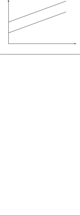
Although OLS does not work when the dependent variable is dichotomous or categorical, it can handle dichotomous independent variables just fine. A dichotomous or dummy variable is a variable that can be coded only as 1 or 0. For example, you might use dummies to code variables like political party, ethnicity, country, or war. But the interpretation of dummy variables is very different from that of continuous variables. Specifically, you do not interpret the coefficients of dummy variables as slopes of a line. Instead, you interpret dummies as creating a separate regression line, with the same slope but a different intercept.
Let’s see a simple example. Say you want to explain differences in worker salaries (Y = salary). You hypothesize
that salary is a function of education. You also suspect that gender discrimination affects salary decisions; therefore, you want to control for gender too. So your model is salary schooling gender. Salary and years of schooling are=continuous+numbers, but how should you handle gender? The solution is to create a dummy, say male, in which you code 1 for men and 0 for women. Note that you do not create a gender dummy since it would not be intuitively clear what a 1 or 0 gender would mean. You also do not create both a male and a female dummy since this would be redundant (knowing the value for male makes a female dummy unnecessary); this would also crash the mathematical solution to the regression, but this chapter leaves that part of the explanation to your statistics class.
Next, you would collect salary, schooling, and gender data on a large number of individuals. You would then run a regression on the data and observe the coefficients and standard errors just like with any other regression. But the interpretation of these coefficients is a bit different for the male dummy. Let’s say the results produce a regression line that looks like this:
salary = $5,500 |
(schooling) + |
|
$3,000 |
(male) + $9,000. |
(3) |
These results suggest that workers make $5,500 more |
|
in income for each additional year of schooling they |
|
receive. It also shows that male workers make $3,000 |
|
more than females. In other words, the male dummy can |
|
be 1 or 0, while its coefficient is $3,000. Together, they |
|
multiply to be either 0 (for females) or $3,000 (for males); |
|
hence, dummies simply add to the intercept term. In other |
|
words, the model implies two different regression lines, |
|
one for females and one for males. (See Figure 57.6.) The |
|
slopes are the same, but the intercepts are different, with |
|
the difference between the two lines being the dummy’s |
|
coefficient. |
|
male salaries = $5,500 (schooling) + $12,000. |
(4) |
female salaries = $5,500 (schooling) + $9,000. |
(5) |
Another way of interpreting this regression is that |
|
since you always include one fewer dummy than the |
|
number of categories, the coefficients for the dummies |
|
tell how much effect the variable has relative to the |
|
missing category. This can be seen more clearly if we |
|
add race to Equation 5. Race is a categorical variable but |
|
not a dummy variable because there are more than two |
|
race categories. We therefore turn race into dummy vari- |
|
ables by creating a dummy for each category we want to |
|
analyze: |
|
income = schooling + female + |
|
Asian + black + Latino. |
(6) |
|
Income = $5,500 (schooling) + $12,000 |
||
Salary |
Male = 1 |
|
|
Income = |
$5,500 (schooling) + $9,000 |
||
|
|||
|
Female = 0 |
|
|
Years in School
Figure 57.6 Dummy Variables
In this case, we suspect that racial discrimination |
|
also affects salaries. Let’s assume that our hypothesis |
|
focuses on four major race categories (Asian, black, |
|
Latino, white). To control for race, we would include in |
|
the regression model dummies for only three |
of these |
categories, say Asian, black, and Latino. But we do not |
|
put in a dummy for white because it would be redun- |
|
dant. The resulting coefficients for Asian, black, and |
|
Latino would therefore tell how much workers in these |
|
race categories earn relative to workers in the missing |
|
category, white. Let’s say the regression results look |
|
like this: |
|
salary = $3,723 (years in school) + $509 (male) – |
|
$680 (Asian) + $1,920 (black) – |
|
$900 (Latino) + $15,680. |
(7) |
These hypothetical regression results suggest the following, at least for the sample for which we collected data:
1.Each year of schooling results in a salary increase of $3,723 (holding race and gender constant).
2.Male workers make $509 more than female workers (holding race and schooling constant).
3.Asians make $680 less than whites (holding gender and schooling constant).
4.Blacks make $1,920 more than whites (holding gender and schooling constant).
5.Latinos make $900 less than whites (holding gender and schooling constant).
6.The salary of an uneducated, white female worker (i.e., a value of 0 for all variables) is $15,680.
Interaction Terms
A final device often used in social science regressions is an interaction, or multiplicative, term. An interaction
Regression Analysis • 487
term multiplies two independent variables together. They |
||
are used to model hypotheses in which the effect of X1 |
on |
|
Y is conditional on X2 (or vice versa). Let’s see how this |
||
might work. |
|
|
Sticking with our preceding example, say we hypoth- |
||
esize that salaries are a function of education and expe- |
||
rience. But we believe that the effects of education on |
||
salary are conditional on experience. That is, the effect |
||
on salary of a worker’s education will depend on his or |
||
her experience on the job. An experienced worker will |
||
get a larger salary bump from an MBA than someone |
||
fresh out of college. Such a regression model would look |
||
like this: |
|
|
salary = X1 |
(education) + X2 (experience) + |
|
X3 |
(education*experience), |
(8) |
where (education*experience) is the interaction term. |
|
|
The interaction term’s coefficient, X3, tells us the |
||
effect on income of being educated and experienced |
||
that is not explained by education and experience when |
||
they are considered separately. More precisely, X3 |
tells |
|
you how much the effect of education (on salary) changes |
||
per unit increase in experience (and vice versa). It |
||
therefore tells you how the effect of education (on |
||
salary) is conditional on experience (and vice versa). |
||
The term vice versa gets repeated here because thetwo |
||
statements are mathematically equivalent. Statistics |
||
cannot tell you which independent variable drives the |
||
other in the interaction term. Rather, good theory |
||
should come first and inform us how to interpret the |
||
interaction term. |
|
|
Notice that X1 no longer tells you the average effect of |
||
a unit increase of schooling on income, holding experi- |
||
ence (X2) constant. Instead, the coefficient on education |
||
now tells you the effect of 1 year of education when |
||
experience = 0. |
|
|
Likewise, X2 no longer tells you the average effect of a |
||
unit increase of experience on income, holding education |
||
(X1) constant. The coefficient on experience now tells us |
||
the effect of 1 year of experience when education = 0. This |
||
can be seen a lot easier in an example. Say we run the pre- |
||
ceding regression on salary, education, and experience |
||
data and produce the following coefficients: |
|
|
salary = $3,000 (education) + $700 (experience) + |
|
|
$250 (education*experience) + $5,000. |
|
(9) |
Therefore, if we start with a totally uneducated worker and add education 1 year at a time, we would begin to get the results in Table 57.2.
The regression results tell us that an uneducated worker with no experience could expect a salary of $5,000. Every year of additional education would add not only $3,000 in salary directly from schooling but
488 • POLITICAL SCIENCE METHODOLOGY
|
|
Education (in Years) |
Salary ($) |
|
|
0 |
0 + 700 (experience) + 0 (experience) + 5,000 |
|
|
1 |
3,000 + 700 (experience) + 250 (experience) + 5,000 |
|
|
2 |
6,000 + 700 (experience) + 500 (experience) + 5,000 |
|
|
Table 57.2 Interpreting Interaction Terms
also some additional income that would depend on the amount of experience (i.e., interaction term). Hence, the $3,000 coefficient tells us the effect of 1 year of education when experience 0. The $250 coefficient tells us how much the effect of= education (on income) changes per unit increase in experience (or vice versa). Note that this means that the effect of education on income is different for different levels of experience (and vice versa). Workers with only 1 year of education can expect each year of experience to add $700 $250 to their incomes. But workers with 2 years of education+ will get more out of their experience: $700 $500. Therefore, the effects of education are conditional+ on the amount of experience (and vice versa).
When including an interaction term, many researchers also include its components separately, as was done here. This is because they want to show that the interaction term is significant even after they control for its components. However, there is nothing wrong with a theory that hypothesizes that the interaction term alone is what matters.
Future Directions
The English poet Alexander Pope once wrote that “a little learning is a dangerous thing.” So consider yourself warned: You have now learned enough about regressions to be dangerous. But in order to be useful, you need to learn more. The good news is that if you have taken the time to understand the basic concepts described in this chapter, then learning more should be easy. In fact, SAGE Publications offers a special series, Quantitative Applications in the Social Sciences, of more than 160 little green books, each dedicated to a different statistics topic. They are generally very well written, highly accessible, light on math and theory, but heavy on examples and applications. Therefore, if you mostly understood this chapter, but want to nail down some individual concepts better, or dig a bit deeper, then these books should be your next step. Some of the most relevant booklets have been listed in the references,
along with some very useful textbooks, articles, and book chapters.
Notes
1.Probit, logit, and scobit are used when the dependent vari able is not continuous. Distributed lag models are used to analyze variables that change over time and where the current value of the dependent variable is partly explained by its previous (“lagged”) values. Panel regressions are used to analyze variables that change across both time and space (e.g., country, state, city).
2.Good researchers also include an explanation of the causal mechanism (precisely how X causes Y to vary) in their theories.
3.Many spreadsheet programs, such as Excel and CALC, can perform basic regressions as well.
4.Readers who need more convincing, and want to see exactly how OLS exerts mathematical control over data, should consult the books recommended at the end of this chapter.
References and Further Readings
|
|||
Achen, C. (1982). Interpreting and using regression. Beverly Hills, |
|||
CA: Sage. |
|
||
Achen, C. (1990). What does “explained variance” explain? |
|||
Political Analysis, 2, 173 184. |
|
||
Beck, N. |
(2008). Time series cross section methods. In |
||
J. M. |
Box Steffensmeier, H. E. Brady, & D. Collier |
||
(Eds.), |
The Oxford handbook of political methodology |
||
(pp. 475 493). New York: Oxford University Press. |
|||
Berry, W. D. (1993). Understanding regression assumptions. |
|||
Newbury Park, CA: Sage. |
Multiple regression in prac |
||
Berry, W. D., & Feldman, S. (1985). |
|||
tice. Beverly Hills, CA: Sage. |
Understanding multivariate |
||
Berry, W. D., & Sanders, M. (2000). |
|||
research: A primer for beginning social scientists. Boulder, |
|||
CO: Westview Press. |
|
||
Brambor, T., & Clark, W. R. (2006). Understanding interaction |
|||
models: Improving empirical analyses. Political Analysis, |
|||
14, |
63 |
82. |
|
Chatterjee, S., & Wiseman, F. (1983). Use of regression diagnos tics in political science research. American Journal of Political Science, 27, 601 613.
Fox, J. (1991). Regression diagnostics: An introduction. Newbury Park, CA: Sage. Econometric analysis .
Greene, W. H. (2000). (4th ed.) Upper Saddle River, NJ: Prentice Hall.
Hardy, M. A. (1993). Newbury
Gujarati, D. N. (2009). Basic econometrics. New York: McGraw Hill. Regression with dummy variables.
Park, CA: Sage. Interaction effects in multiple
Jaccard, J., & Turrisi, R. (2003). regression. Thousand Oaks, CA: Sage.
Kennedy, P. (2003). A guide to econometrics (5th ed.). Cambridge: MIT Press.
King, G. (1986). How not to lie with statistics: Avoiding common mistakes in quantitative political science. American Journal of Political Science, 30, 666 687.
Lewis Beck, M. S. (1980). Applied regression: An introduction.
Beverly Hills, CA: Sage.
Regression Analysis • 489
Lewis Beck, M. S., & Skalaban, A. (1990). The R squared: Some straight talk. Political Analysis, 2, 153 171.
Pevenhouse, J. C., & Brozek, J. D. (2008). Time series analysis. In J. M. Box Steffensmeier, H. E. Brady, & D. Collier (Eds.), The Oxford handbook of political methodology (pp. 456 474).
New York: Oxford University Press.
Pollock, P. H. (2006). A STATA companion to political analysis.
Washington, DC: CQ Press.
Pollock, P. H. (2008). An SPSS companion to political analysis.
Washington, DC: CQ Press.
Schroeder, L., Sjoquist, D. L., & Stephan, P. E. (1986).
Williams, F., & Monge, P. R. (2000).
Understanding regression analysis: An introductory guide. Beverly Hills, CA: Sage. Reasoning with statistics: How
to read quantitative research. Orlando, FL: Harcourt Brace. Wooldridge, J. M. (2008). Introductory econometrics: A modern
approach (4th ed.). Mason, OH: South Western.