

The Essential Guide to UI Design
.pdf
450 Part 2: The User Interface Design Process
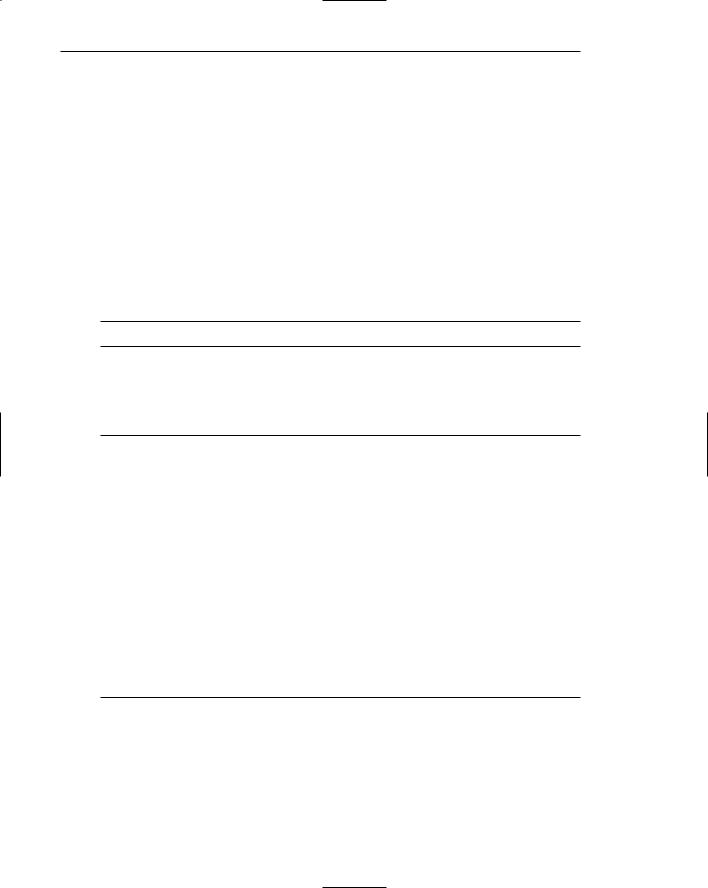
A much too large Color Palette button.
A properly sized
Color Palette button.
Figure 7.4: Improper and proper button sizes.
Number
■ Restrict the number of buttons on a window to six or fewer.
The maximum number of buttons on a window must reflect a balance between effectiveness, real estate efficiency, and operational simplicity. Having no more than six buttons per window or dialog box seems to appropriately balance these issues. If an extra button or two is necessary and space is available, they may be included.
Location and Layout
■Maintain consistency in button location between windows.
■Never simply “fit” buttons in available space.
■If buttons are for exiting the dialog
—Position them centered and aligned horizontally at the bottom.
■If buttons are used for invoking a dialog feature or expanding the dialog
—Position them centered and aligned vertically on the right side.
■If a button has a contingent relationship to another control
—Position it adjacent to the related control.
■If a button has a contingent relationship to a group of controls
—Position it at the bottom or to right of related controls.
■If there are space constraints, exiting and expanding/invoking feature buttons must be placed together
—If at the bottom, place exiting buttons to the right, separating the groupings by one button’s width.
—If along the right side, place exiting buttons at the bottom, separating the groupings by one button’s height.

Step 7: Choose the Proper Screen-Based Controls 451
■For exiting and expanding/invoking feature buttons, do not
—Align with the other screen controls.
—Present displayed within a line border.
■Provide equal and adequate spacing between adjacent buttons.
■Provide adequate spacing between buttons and the screen body controls.
■For Web pages spanning more than one screen
—Repeat the buttons at the top and bottom of the page.
Command buttons should be positioned in consistent positions within a window. This enables a person to memorize button locations and predict where they will appear when a window is presented. For an experienced user this permits faster pointing and activation because a button may be identified simply by its location without its label having to be read, and a mouse movement to that location may be commenced before a window is even displayed. Consistent locations also aid in quickly discriminating the different kinds of buttons described below. A common failing of many windows is that buttons are positioned within windows after locations for the other window controls are established. When this occurs, buttons are positioned where there is space available. The result is usually a hodgepodge of locations. Never simply “fit” buttons in available space. Allocate a space for buttons before the other control locations are established.
Button location within a window is dependent upon the type of button. Buttons exiting a dialog, and usually closing the window, should be positioned horizontally and centered across the lower part of the window. This positioning places the buttons at the end of the dialog. A study of Web pages (Spool et al., 1997) found that people preferred to scroll to the bottom of a page to press the final buttons. If a button invokes a dialog feature or expands the dialog, position it centered and aligned vertically along the right side of the window. Maintaining these consistent locations will enable a person to quickly identify what general kind of button it is, and what kind of action will occur if the button is activated. The location of the exiting buttons across the bottom will also allow more efficient use of window real estate when invoking/expanding buttons are not included within a window. Exiting and expanding/invoking feature button locations are illustrated in Figure 7.5. If exiting and expanding/invoking feature buttons must be positioned together at the screen bottom because of screen space constraints, place the exiting buttons to the right, separating the groupings by one standard button’s width. If they are located together along the right side, place exiting buttons at the bottom, separating the groupings by one button’s height.
If a button has a contingent relationship to another control, position it adjacent to the related control in the order in which the controls are usually operated, as illustrated in Figure 7.6. If a button possesses a contingent relationship to a group of controls, position it at the bottom or to the right of the grouping, again in logical flow order, as illustrated in Figure 7.7.
For Web pages containing buttons and longer than one screen, repeat the buttons at the top and bottom of the page. This will provide easier access to the buttons from varying locations within the page, minimize the chance of people missing the buttons, and comply with the expectancies of people who assume they will be found both at the top and bottom.

452 Part 2: The User Interface Design Process
Invoking feature / expanding dialog buttons
Exiting buttons
Figure 7.5: Exiting and invoking feature/expanding dialog buttons.
Figure 7.6: Button with contingent relationship to a control.
For exiting and expanding/invoking feature buttons, do not provide alignment with the other screen controls. Maintain alignment and spacing only within the buttons themselves. Trying to align the buttons to other screen controls will most often create variable spacing between the buttons themselves, which is visually distracting. Also, do not display buttons within a line border; instead present them on the background of the window itself. The unique physical look of the buttons is strong enough for them to create their own visual grouping. Reserve line borders for individual controls or groups of controls that are in greater need of closure. Too many borders can also create visual clutter.

Step 7: Choose the Proper Screen-Based Controls 453
Figure 7.7: Button with contingent relationship to a grouping.
Provide equal and consistent spacing between adjacent buttons, and groups of buttons. Also, maintain adequate separation between screen buttons and other screen controls.
Organization
■Organize standard buttons in the manner recommended by the platform being used.
■For other buttons, organize them in common and customary grouping schemes.
—For buttons ordered left to right, place those for most frequent actions to the left.
—For buttons ordered top to bottom, place those for most frequent actions at the top.
■Keep related buttons grouped together.
■Separate potentially destructive buttons from frequently chosen selections.
■Buttons found on more than one window should be consistently positioned.
■The order should never change.
■For mutually exclusive actions, use two buttons; do not dynamically change the text.
Follow the standard, consistent ordering schemes recommended by the platform being used. Windows recommends the following:
■■An affirmative action to the left (or above).
■■The default first.
■■OK and Cancel next to each other.
■■Help last, if supported.

454 Part 2: The User Interface Design Process
Other platforms may suggest a different ordering. If differences exist, and people may be using more than one platform, some organizational compromises may be necessary.
Buttons should be ordered logically, such as by frequency of use, sequence of use, or importance. For buttons arrayed left to right, start the ordering from left to right. For buttons arrayed top to bottom, start the ordering from top to bottom.
Keep related buttons grouped together. Separate potentially destructive buttons from frequently chosen selections to avoid inadvertent activation and potentially catastrophic results. Always locate the same buttons that appear on different windows in consistent positions. For mutually exclusive actions, avoid using one button that toggles changing text. This can be confusing. Use two buttons with labels that clearly describe the two actions.
Intent Indicators
■When a button causes an action to be immediately performed, no intent indicator is necessary.
Figure 7.8
■ When a button leads to a cascading dialog, include an ellipsis (...) after the label.
Figure 7.9
■When a button leads to a menu, include a triangle pointing in the direction the menu will appear after the label.
Figure 7.10
■When a button leads to an expanding dialog, include a double arrow (>>) with the label.
Figure 7.11
■When a button has a contingent relationship to another control that must be indicated, include a single arrow (->) pointing at the control.
Figure 7.12

Step 7: Choose the Proper Screen-Based Controls 455
Button intent indicators will follow, where applicable, the same conventions used for menu items. When a button causes a command to be performed immediately, no special intent indicator is necessary on the button. When a button leads to a cascading dialog box, include an ellipsis with the label. When a button leads to a menu of choices, include a triangle after the label; point the triangle in the direction the menu will appear. If a button expands the dialog, include a double arrow with the label. When a button has a contingent relationship to another control, include a single arrow pointing at the control. Intent indicators are very useful because they enable the user to predict the consequences of an intended action.
Expansion Buttons
■Gray a button out after expansion.
■Provide a contraction button, if necessary.
—Locate it beneath, or to right of, the expansion button.
—Gray it out when not applicable.
When a button that expands a dialog is activated, and the dialog is expanded, display the button dimmed or grayed out. If the dialog can again be contracted, provide a contraction button beneath the expansion button or to the right of it. Gray this button out when the dialog is contracted; display it at normal intensity when the dialog is expanded.
Defaults
■Intent:
—When a window is first displayed, provide a default action, if practical.
■Selection:
—A default should be the most likely action.
•A confirmation.
•An application of the activity being performed.
•A positive action such as OK, unless the result is catastrophic.
—If a destructive action is performed (such as a deletion), the default should be Cancel.
■Presentation:
—Indicate the default action by displaying the button with a bold or double border.
■Procedures:
—The default can be changed as the user interacts with the window.
—When the user navigates to a button, it can temporarily become the default.
—Use the Enter key to activate a default button.
—If another control requires use of the Enter key, temporarily disable the default while the focus is on the other control.
—Permit double-clicking on a single selection control in a window to also carry out the default command.
456 Part 2: The User Interface Design Process
When a window with buttons is first displayed, provide a default action whenever practical. The default action should be the most likely action within the window. It may be a confirmation, an application of the activity being performed, or a positive response such as OK. If the default is irreversible or destructive (such as Delete), the default should be Cancel, requiring a person to change the selection in order to perform the destructive action. If none of the buttons is destructive in nature, the default button should be the one most frequently selected.
The default can be changed as the user interacts with a window. When the user navigates to a button, it can temporarily become the default. Return the button to its original state when the focus leaves a button. Permit use of the Enter key to activate a default button. If another control requires use of the Enter key, temporarily disable the default while the focus is on the other control. Permit double-clicking on a single selection control in a window to also carry out the default command.
Unavailable Choices
■ Temporarily unavailable choices should be dimmed or grayed out.
A button should visually indicate whether it is available for activation. Dim or grayout buttons for actions that are not available.
Keyboard Equivalents and Accelerators
■Equivalents:
—Assign a keyboard equivalent mnemonic to each button to facilitate keyboard selection.
—The mnemonic should be the first character of the button’s label.
•If duplication exists in first characters, for duplicate items, use another character in the label.
•Preferably, choose the first succeeding consonant.
—Designate the mnemonic character by underlining it.
—Maintain the same mnemonic on all identical buttons on other screens.
Figure 7.13
■Accelerators:
— Assign a keyboard accelerator to each button to facilitate keyboard selection.
Enabling the user to select button actions through the typewriter keyboard provides flexibility and efficiency in the dialog. To do this, provide keyboard equivalent, singlecharacter mnemonic codes that, when typed, will cause the action to be performed. The suggested method is to indicate the accelerator by underlining the proper character in the button label.
Keyboard accelerators, a keyboard key or combination of keys, may also be assigned to buttons to facilitate keyboard activation.

Step 7: Choose the Proper Screen-Based Controls 457
Keyboard equivalents and accelerators, including Microsoft Windows standard ones, are discussed in more detail in Step 4.
Scrolling
■If a window can be scrolled, do not scroll the command buttons.
—Exception: if the screen cannot scroll independently of the buttons.
■Use buttons to move between multipage forms, not scroll bars.
—Label buttons Next and Previous.
If scrolling the contents of a window, never scroll the buttons. They should be available at all times. Web page screens, whose content cannot be scrolled independently of buttons, are exceptions to this rule at the moment. Use buttons to move between multipage forms, not scroll bars. Paging is, conceptually, easier for people to use and understand, and is discussed in detail in Step 3. Label the buttons Next and Previous.
Button Activation
■Pointing:
—Highlight the button in some visually distinctive manner when the pointer is resting on it and the button is available for selection.
■Activation:
—Call attention to the button in another visually distinctive manner when it has been activated or pressed.
—If a button can be pressed continuously, permit the user to hold the mouse button down and repeat the action.
Highlight the button in some visually distinctive manner when the pointer is resting on it and it is available for selection. This will provide the user with feedback indicating that the selection process may be performed. Some platforms display a brighter button.
Highlight the button in another visually distinctive manner when it has been activated or pressed, to indicate that the action is successful. One platform subdues or grays out the button. Another has raised beveled buttons that appear to sink into the screen when selected. Another alternative is to move the button slightly as if it has been depressed. If a button can be pressed continuously, permit the mouse button to be held down and the action repeated.
Toolbars
Toolbars are compilations of commands, actions, or functions, usually graphical in structure, but sometimes textual, grouped together for speedy access. Microsoft Windows defines a toolbar as a panel that contains a set of controls. Toolbars may also be called button bars, control bars, or access bars. Specialized toolbars may also be referred to as ribbons, toolboxes, or palettes. Toolbars may also appear in palette windows.

458Part 2: The User Interface Design Process
Usage
■To provide easy and fast access to most frequently used commands or options across multiple screens.
■To invoke a subapplication within an application.
■To use in place of certain menu items.
Provide toolbars to allow fast and easy access to a system’s most frequently used commands, functions, or options. Also provide toolbars for easily invoking subapplications within an application. Toolbars are considered “fast paths” or expert aids. All toolbar functions must also be obtainable by normal textual menu means, including through use of the menu bar. One exception: If menu text cannot clearly explain an item and a graphical toolbar representation can, the toolbar item may replace the menu item.
Structure
■Images:
—Provide buttons of equal size.
—Create a meaningful and unique icon.
• Design them using icon design guidelines.
—Center the image within the button.
—Give the button a raised appearance.
—Ensure that toolbar images are discernible from Web page graphical images.
■Text:
—Create a meaningful label, adhering to label guidelines for command buttons.
—Create toolbar buttons of equal size, following the size guidelines recently described.
■Consistency:
—Use the same icon throughout an application and between applications.
Create meaningful and unique images and icons utilizing the icon design guidelines in Step 11. Center the image within the button and provide an associated textual label. A label is always necessary to ensure button comprehensibility. One study has found that placing graphics and words on buttons, makes them more usable than including graphics only (Vaughan, 1998). Create the label following the guidelines for command buttons. The label may be located within the button, positioned beneath it, or presented on demand through a ToolTip control. Labels beneath toolbar button images will provide a larger pointing target. If the label is located within the button and the system will be translated into one or more other languages, allow extra space for the label. See “International Considerations” in Step 10 for further important considerations. A ToolTip control is discussed later in this chapter. Give the button a raised appearance to convey that it is a screen navigation element to be pressed. Ensure that toolbar images are discernible from all Web page graphical images.

Step 7: Choose the Proper Screen-Based Controls 459
For text-only toolbar buttons, create a meaningful label, adhering to the label guidelines for command buttons. Provide consistent icons throughout all applications.
Size
■Button:
—24 (w) by 22 (h) pixels, including border.
—32 (w) by 30 (h) pixels, including border.
—Larger buttons can be used on high-resolution displays.
■Label:
—16 (w) by 16 (h) pixels.
—14 (w) by 24 (h) pixels.
■Default:
—Provide the smaller size as the default size with a user option to change it.
■Image:
—Center the image in the button.
A toolbar button should be large but not too large because of the number that may need to be displayed. Microsoft provides the preceding guidelines. Other sizing guidelines and much more detailed image guidelines are presented in Step 11.
Organization
■Order the buttons based on common and customary grouping schemes.
—For buttons ordered left to right, place those for the most frequently used actions to the left.
—For buttons ordered top to bottom, place those for the most frequently used actions at the top.
■Keep related buttons grouped together.
■Separate potentially destructive buttons from frequently chosen selections.
■Permit user reconfiguration of button organization.
Toolbar buttons should be ordered logically, such as by frequency of use, sequence of use, or importance. If the buttons reflect a quality on a continuum such as colors or shades, follow standard and expected ordering schemes. For buttons arrayed left to right, start the ordering from left to right. For buttons arrayed top to bottom, start the ordering from top to bottom.
Keep related buttons grouped together. Separate potentially destructive buttons from frequently chosen selections to avoid inadvertent activation and potentially catastrophic results. Permit the user to reconfigure the button organizational structure to better meet his or her unique needs.