

The Essential Guide to UI Design
.pdf
470 Part 2: The User Interface Design Process
Purpose. Radio buttons are used to designate one of a small set of options, no more than about eight. As with a radio, the choices are mutually exclusive, only one frequency or setting is permitted at one time in the presented array.
Advantages/disadvantages. With radio buttons, all alternatives are always visible. Therefore, it is easy to access and compare choices. Two studies (Johnsgard et al., 1995; Tullis and Kodimer, 1992) have found radio buttons a preferred and very effective control for presenting mutually exclusive choices. These studies will be described later in this chapter. On the negative side, radio buttons do consume a certain amount of screen real estate, limiting the number of alternatives that can reasonably be displayed.
Proper usage. Radio buttons are useful for setting attributes, properties, or values where adequate screen space is available. The choices should be discrete, small in number, and in need of a textual description to identify them meaningfully. Radio buttons are helpful in situations where the alternatives cannot always be easily remembered or where displaying the alternatives together facilitates understanding and selecting the proper choice. The radio button choices displayed should be stable, never changing in content. Never use radio buttons for implementing commands, such as causing a dialog box to immediately appear based upon a button setting. Commands to the system should result from direct user command actions, such as pressing a command button. This allows control to remain with the user. Unfortunately, use of a radio button to perform an action is a common Web page design problem. Also, do not use one radio button by itself to indicate the presence or absence of a state. A single check box is recommended for this purpose.
Choice Descriptions
■Provide meaningful, fully spelled-out choice descriptions clearly describing the values or effects set by the radio buttons.
■Display in a single line of text.
■Display using mixed-case letters, using the sentence style.
■Position descriptions to the right of the button. Separate them by at least one space from the button.
■When a choice is conditionally unavailable for selection, display the choice description grayed out or dimmed.
■Include a “None” choice if it adds clarity.
Choice descriptions must be clear, meaningful, fully spelled out, and displayed in a mixed-case text. For multiword descriptions, capitalize the first letter of the description and use the sentence style for the remainder of the description. Small button-type indicators should be located to the left of the choice description; rectangular boxes that resemble a command button will find the description within the box. Small buttons associated with text are advantageous when the choice description must be lengthy. Descriptions in boxes impose restrictions on the number of words that can be inscribed within them. When a choice is unavailable for selection in the present condition,

Step 7: Choose the Proper Screen-Based Controls 471
display the choice selection grayed out or dimmed. Where a “None” alternative clarifies the alternatives presented, provide it in the listing.
Size
■ Show a minimum of two choices, a maximum of eight.
Generally, selection fields of this style should not present more than eight choices. Displaying more than eight is usually not efficient, wasting screen space. If the number of choices exceeds this maximum, consider using a single selection list box or a drop-down list box. Johnsgard et al. (1995) have found, however, that even for as many as thirty choices, radio buttons were preferred by users, and performed better, than these other controls.
Defaults
■When the control possesses a state or affect that has been predetermined to have a higher probability of selection than the others, designate it as the default and display its button filled in.
■When the control includes choices whose states cannot be predetermined, display all the buttons without setting a dot, or in the indeterminate state.
■When a multiple selection includes choices whose states vary, display the buttons in another unique manner, or in the mixed value state.
Provide a default setting for a radio button whenever possible. In some situations, however, a default setting may be difficult to predetermine, or inappropriate to predetermine (sex: male or female?). Microsoft Windows provides for additional settings called the indeterminate or mixed value states. When a default setting cannot be preestablished because of the nature of the information, leave all the buttons blank or not filled in. If a multiple selection on an object is performed and the values in the selection are mixed or differ, display the applicable radio buttons in another distinctive manner, such as a gray shadow.
Structure
■A columnar orientation is the preferred manner of presentation.
■Left-align the buttons and choice descriptions.
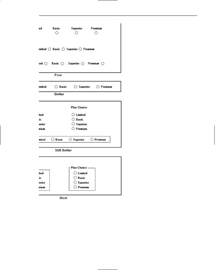
Figure 7.26

472Part 2: The User Interface Design Process
■If vertical space on the screen is limited, orient the buttons horizontally.
■Provide adequate separation between choices so that the buttons are associated with the proper description.
— A distance equal to three spaces is usually sufficient.
Figure 7.27
■ Enclose the buttons in a border to visually strengthen the relationship they possess.
Figure 7.28
The preferred orientation of radio buttons is columnar. This aids visual scanning and choice comparison. Controls with small button indicators usually fit best in this manner because choice descriptions do not have to be restricted in size. Left-align the buttons and choice descriptions. Provide adequate separation-about three spacesbetween choices if they must be presented horizontally. Enclose the buttons in a border. Rectangular boxes should be of equal height and/or width and be butted up against one another. This will distinguish them from nonexclusive choice fields (check boxes) that will be separated from one another. Figure 7.29 illustrates the best ways to, and not to, present radio buttons.
Organization
■Arrange selections in expected order or follow other patterns such as frequency of occurrence, sequence of use, or importance.
—For selections arrayed top to bottom, begin ordering at the top.
—For selections arrayed left to right, begin ordering at the left.
■If, under certain conditions, a choice is not available, display it subdued or less brightly than the available choices.
Selection choices should be organized logically. If the alternatives have an expected order, follow it. Other ordering schemes such as frequency of use, sequence of use, or importance may also be considered. Always begin ordering at the top or left. If, under certain conditions, a choice is not available, display the nonselectable choice subdued or less brightly than the available choices.
Step 7: Choose the Proper Screen-Based Controls 473
Figure 7.29: Ways to, and not to, present radio buttons.

474 Part 2: The User Interface Design Process
Related Control
■Position any control related to a radio button immediately to the right of the choice description.
■If the radio button choice description also acts as the label for the control that follows it, end the label with an arrow (>).
Responsible Person > Grandfather
No Resposible Party
Figure 7.30
Position any control related to a check box immediately to the right of the choice description. If a the check box label also acts as the label for the control that follows it, present it in mixed case, sentence style text, and end the label with an arrow (>) to relate the choice description to the control.
Captions
■Structure:
—Provide a caption for each radio button control.
•Exception: In screens containing only one radio button control, the screen title may serve as the caption.
■Display:
—Fully spelled out.
—In mixed-case letters, capitalizing the first letter of all significant words.
■Columnar orientation:
—With a control border, position the caption
•Upper-left-justified within the border.
Figure 7.31
•Alternately, the caption may be located to the left of the topmost choice description.

Step 7: Choose the Proper Screen-Based Controls 475
Figure 7.32
—Without an enclosing control border, position the caption
• Left-justified above the choice descriptions, separated by one space line.
Figure 7.33
•Alternately, the caption may be located to the left of the topmost choice description.
Figure 7.34
■Horizontal orientation:
— Position the caption to the left of the choice descriptions.
Figure 7.35
• Alternately, with an enclosing control border, left-justified within the border.
Figure 7.36
— Be consistent in caption style and orientation within a screen.

476 Part 2: The User Interface Design Process
Structure. Using a static text or group box control field, display the caption fully spelled out, using mixed-case letters in the headline style. Some occasional common abbreviations may be used, however, to achieve the alignment goals to be specified.
Columnar orientation. The preferred location of a radio button control caption within a screen can vary. Ideally, the caption is placed upper-left-justified within a line border or group box that surrounds columnar-oriented radio buttons, as shown in the example in the preceding guideline summary. If other controls on a screen possess captions positioned to the left, and the radio button control is aligned with these controls, position the caption to the left of the control. This will help achieve screen efficiency, minimize viewer eye movements, and provide caption and choice distinctiveness. Without an enclosing control border, position the caption left-justified above the choice descriptions, or to the left of the topmost choice description.
Horizontal orientation. In a horizontal orientation, position the caption to the left of the choice descriptions, or left-justified within an enclosing control border. If the screen contains only one radio button control, the screen title may serve as the control caption. Be consistent in caption style and orientation within a screen.
Keyboard Equivalents
■Assign a keyboard mnemonic to each choice description.
■Designate the mnemonic by underlining the applicable letter in the choice description.
Figure 7.37
Assign unique keyboard mnemonics for each alternative in the standard way, choosing the first letter (or another) and designating it by character underlining.
Selection Method and Indication
■Pointing:
—The selection target area should be as large as possible.
•Include the button and the choice description text.
—Highlight the selection choice in some visually distinctive way when the cursor’s resting on it and the choice is available for selection.
•This cursor should be as long as the longest choice description plus one space at each end. Do not place the cursor over the small button.

Step 7: Choose the Proper Screen-Based Controls 477
Figure 7.38
■Activation:
—When a choice is selected, distinguish it visually from the unselected choices.
•A radio button should be filled in with a solid dark dot or made to look depressed or higher through use of a shadow.
—When a choice is selected, any other selected choice must be deselected.
■Defaults:
—If a radio button control is displayed that contains a choice previously selected or a default choice, display the selected choice as set in the control.
Pointing. The selection target area should be as large as possible in order to make it easy to move to. If a small button is the selection indication method used, the target area should include the button and the choice description text. If the rectangular box selection method is used, the entire box should be the target. Highlight the selection choice in some visually distinctive way when the pointer is resting on it and the choice is available for selection. If a small button is the selection indication method used, a distinctive reverse video, reverse color, or dotted or dashed box selection cursor or bar may be used to surround the selected choice description. This cursor should be as long as the longest description plus one space at each end. The cursor should not cover the small button.
Activation. When a choice is selected, distinguish it visually from the unselected choices. A radio button should be filled in with a solid dark dot or other similar marking (for example, making the button look depressed or higher than the others through the use of a drop shadow). A rectangular box can be highlighted in a manner different from when it is pointed at, or a bolder border can be drawn around it. When a choice is selected, any other selected choice must be deselected or made inactive.
Defaults. If a selection field is displayed with a choice previously selected or a default choice, display the currently active choice in the same manner as when it is selected.
MYTH Our software is highly usable — it includes all the latest interface widgets.

478 Part 2: The User Interface Design Process
Check Boxes
■Description:
—A two-part control consisting of a square box and choice description.
—Each option acts as a switch and can be either “on” or “off.”
•When an option is selected (on), a mark such as an “X” or “check” appears within the square box, or the box is highlighted in some other manner.
•Otherwise the square box is unselected or empty (off).
—Each box can be
•Switched on or off independently.
•Used alone or grouped in sets.
■Purpose:
—To set one or more options as either on or off.
■Advantages:
—Easy-to-access choices.
—Easy-to-compare choices.
—Preferred by users.
■Disadvantages:
—Consume screen space.
—Limited number of choices.
—Single check boxes difficult to align with other screen controls.
■Proper usage:
—For setting attributes, properties, or values.
—For nonexclusive choices (that is, more than one can be selected).
—Where adequate screen space is available.
—Most useful for data and choices that are
•Discrete.
•Small and fixed in number.
•Not easily remembered.
•In need of a textual description to describe meaningfully.
•Most easily understood when the alternatives can be seen together and compared to one another.
•Never changed in content.
—Can be used to affect other controls.
—Use only when both states of a choice are clearly opposite and unambiguous.
Description. Check box controls, also referred to as tick box or ballot box controls, differ from radio buttons in that they permit selection of more than one alternative. Each option acts as a switch and can be either “on” or “off.” When an option is selected (on), an X or check appears within the square box, or it is highlighted in some other manner. When not selected, the square box is unselected or empty (off). Each box can be switched on or off independently. Check boxes may be used alone or grouped in sets.
Check boxes, too, may take different physical forms and be called by different names. The most common name is check boxes, the name used by Microsoft

Step 7: Choose the Proper Screen-Based Controls 479
Windows. Others names include toggle buttons, switches, and two state nonexclusive settings. Not only their names differ; differences also exist in the way these fields are presented on screens. One very common display method is a check box, which, resembling its namesake, consists of a square placed adjacent to each alternative. When the choice is selected, some systems place an X in the square to provide a visual indication that it is active. Others, including Microsoft Windows, place a check mark in the square, or fill in the selected square or make it look depressed when selected.
Interestingly, in the past decade, Microsoft Windows and others have switched from Xs to checks as the “on” mark in a check box. This has occurred because of possible confusion concerning Xs that have existed in some using communities. In an engineering environment, for example, an X marked in a box means not applicable or not set, while a check mark customarily means active or set. Internationally, also, an X is not universally recognized. (This control is called a check box, isn’t it?)
Another style for this type of field is a button or box with the choice description inscribed inside. When selected, the alternative is highlighted in some way. To distinguish these fields visually from similarly constructed fields presenting mutually exclusive choices, the buttons are not adjacent to, or butted up against, one another. Check boxes are illustrated in Figures 7.39 and 7.40. Again, deciding on which style to use seems to be more a matter of preference than performance (other than for the possible confusion of Xs and checks). No published comparison studies are available for guidance.
Purpose. The purpose of a check box, then, is to set one or more options either on or off.
Figure 7.39: Check boxes.
Figure 7.40: Check boxes.