

350 The Digital Filmmaking Handbook, 4E
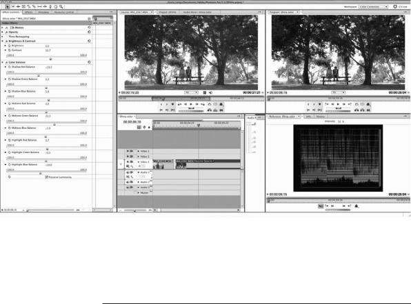
Figure 16.5
The Color Balance filter in Adobe Premiere Pro offers a complete set of controls for each color channel (red, green, and blue) and each part of the luminance range (shadows, mid-tones, and highlight).
Seeing Color
The appreciation of color is a highly subjective process, and it can be affected by the amount of light in the room, the type of monitor you are using, and the colors of the walls in the room itself.
To see color in the best possible way, using a good monitor is really important and so are the lighting conditions where you do your color work. Ambient light can cause you to misjudge colors and black levels. If your project is meant to be seen in a dark theater environment, you should be doing your color correction work in a similarly lit space. Most film and TV projects are intended to be viewed in dark conditions and that is why most editing rooms are dark and often the walls are painted a neutral gray.
Judging the color balance of a video image by eye can be a bit difficult at times, but there are tools available to help you “see” the video image better—waveforms and vectorscopes (see Figure 16.6).
Waveforms display the lights and darks, or luminance, of the video signal. At the left side of the waveform, there is a scale measuring brightness in units called IRE. Pure white is indicated by 100 IRE and black is set at either 0 or 7.5 IRE. By looking at the waveform display, you can see if the image is too bright (as shown in Figure 16.7) or too dark (see Figure 16.8). Later in this chapter, we’ll show you how to set the white levels and black levels using a waveform display. Often, everything else will fall into place once you have these two key variables in place.

Chapter 16 n Color Correction |
351 |
Figure 16.6
A simplified waveform (left) and vectorscope (right) displaying the SMPTE color bars test pattern.
Figure 16.7
The waveform of this image shows that it’s too bright. (See also Color Plate 21.)

352 The Digital Filmmaking Handbook, 4E
Figure 16.8
The waveform of this image shows that it’s too dark. (See also Color Plate 22.)
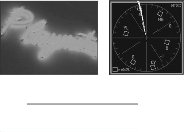
Vectorscopes (see Figure 16.6) display the color information, or chrominance, in the video signal. Vectorscopes are similar to a color wheel: each area shows a different part of the color spectrum and within each section, there is a small box that shows the ideal positioning, or level, for each color. (YL is yellow, R is red, and so on.) Anything that goes beyond these boxes is highly saturated and anything that goes past the edge of the circle is so saturated that it will result in decreased image quality (see Figure 16.9).
After checking the black-and-white levels, you can use the vectorscope to make sure the color information is set correctly.
You can use either hardwareor software-based monitors to view waveforms and vectorscope in order to check the video levels. Professional colorists prefer hardware monitors, but most others find that the software-based monitors that are part of any professional editing application are sufficient for their needs. Be aware that waveform monitors and vectorscopes do not do anything to the video signal itself—they simply display it, just like regular video monitors. To adjust the video signal, you’ll have to use color correction filters in your editing application.
Waveforms and vectorscopes serve one really important function and that is they let you know when color correction goes too far and actually makes the quality of your image worse. Whites that go above 100 IRE, blacks that are not even close to the black line on the waveform (7.5 IRE), and colors that stretch to the outer edge of the circle in the vectorscope are all signs that your image quality is in serious trouble.
Chapter 16 n Color Correction |
353 |
Figure 16.9
The vectorscope of this image shows that the red is oversaturated, a common problem with neon light. (See also Color Plate 23.)
Safe Colors
NTSC and PAL video have much smaller color gamuts than your computer monitor does. This means that colors that look fine on your computer screen might not display correctly—in fact, they might look plain awful—when displayed on an NTSC monitor. Very saturated colors will tend to bleed and fringe, with reds suffering worst of all. Most editing and effects applications provide an NTSC Colors filter that will convert your graphics to NTSC-safe colors.
A Less Scientific Approach
Using waveforms and vectorscopes can help you avoid making color correction choices that accidentally degrade your image. But within the guidelines that they provide, there is a lot of room for interpretation, and there is no replacement for developing a good eye and learning to trust your own opinion. After all, that is what the best colorists do: they make sure the film or video will pass a basic quality control test and then they work their magic.
Knowing a little more about how color works with video will definitely help. When you were a kid, you were shown the color wheel and taught about colors and how they mix together. The primary colors are red, blue, and yellow, and the opposite of red is green, the opposite of blue is orange, and the opposite of yellow is purple. These opposite colors are known as the secondary colors. The color mixing system you were taught in elementary school is subtractive color, and it works with paint, crayons, ink, and so on.
Video, like film, is made up of light, and light follows the rules of additive color. The primary colors for video are red, green, and blue, and the secondary colors are cyan, magenta, and yellow (see Color Plate 24). For video, the opposite of red is cyan, the opposite of green is magenta, and the opposite of blue is yellow.