

The Essential Guide to UI Design
.pdf
750 Part 2: The User Interface Design Process
Web Page Guidelines
The following specific Web page layout and navigation principles, previously discussed in Steps 3 and 4, must also be considered in page design. Important principles are summarized here.
Page Layout
■General:
—Provide a layout that is
•Efficient.
•Logical.
•Consistent.
•Self-explanatory.
•Scannable.
—Strike a proper balance between
•Textual information.
•Graphics.
•Links.
■Layout Grid:
—Create and use a layout grid.
■Elements:
—Restrict the number of elements per page.
■Size:
—Minimize page length.
•Generally, use shorter pages for
•Homepages.
•Navigation pages.
•Pages needing to be quickly browsed or read online and information quickly found.
•Situations where a page will be loading over slow modems and all pages are not needed.
•Generally, use longer pages for
•Content pages where uninterrupted reading is desirable.
•Content pages in which an entire concept must be understood without interruption.
•To match the structure of a paper counterpart.
•To make pages more convenient to download.
•To make pages more convenient to print.
■To simplify page maintenance,
•Generally, restrict to two or three screens of information.
•Place critical or important information at the very top so it is always viewable when the page is opened.
•Locate within the top 4 inches of page.
•Anticipate page breaks.
■Avoid horizontal scrolling.
■Allow complete page printing.

Step 13: Organize and Layout Windows and Pages 751
■Organization:
—Place critical or important information at the very top so it is always viewable when the page is opened.
•Locate it within the top 4 inches of page.
—Limit large images above the fold.
—Position remaining elements according to importance.
—Reduce graphic complexity and textual density toward the page bottom.
■Formatting:
—Provide sufficient but moderate amount of white space.
•A minimum of 30 percent.
—Keep the length of textual lines short.
•If fast reading is required, use line lengths of about 75 to 100 characters.
•If user preference is important, a length of about 50 to 60 characters is acceptable.
•Very narrow columns should be avoided.
—Keep text and related graphics close to each other.
—Provide adequate horizontal spacing.
—Use horizontal rules sparingly.
■Multiple Audiences:
—If distinctively different audiences exist for presented information, provide information formatted for each audience.
■Platforms:
—Design for different platforms and screens.
—Specify an image-safe area.
■Frames:
—Use frames with caution.
•Consider them for global elements.
■Fixed versus fluid layout.
—Use a fluid layout.
■Change:
—Change the site and page organization and structure only when significant benefits exist.
Well-organized, thoughtfully-laid-out, and consistent Web pages will permit people to easily learn a site’s structure, allow users to effectively and quickly scan its pages, and foster interest in its content. Layout does influence satisfaction with the page, found Chaparro et al. (2005). A well-designed page will possess the following qualities.
General
Efficient. A page will be more powerful if more is said with less. Every element of the design must support the goal of the message being presented. Eliminate all superfluous elements. Avoid clutter that prevents people from finding what they want. Exercise extreme care in using decorative elements.
Logical and consistent. Locate important page elements in consistent locations on all pages. A logical and consistent layout of the site and its pages will enable people to quickly find what they are looking for. As said earlier in this book, people

752 Part 2: The User Interface Design Process
develop expectations for how to find different types of information and how to perform particular tasks. A layout that matches a person’s expectations speeds learning and enables prediction of where to find things and how to do things. Illogical and inconsistent structures lead only to user frustration.
Self-explanatory. Each page should be self-explanatory, giving a clear indication of what Web site it belongs to and where it fits within the structure of the Web site’s information space. Present the proper information, and arrange it, so users always know where they are. Remember, most pages can be accessed from outside the site.
Scannable. Allow people to easily scan a page and select relevant and useful information. To foster scannability, include headings that accurately reflect the content of text. Also create short paragraphs and use simple bulleted lists (complex bullets, such as diamonds and fingers, may create unnecessary visual noise). Avoid the use of too many links and use plenty of white space.
Proper balance. Always strike a proper balance between textual information, graphics and navigation links. A page’s elements must balance, interact with, and support each other. As mentioned earlier, studies show people prefer textual content, so do not clutter up the page with too many graphics, particularly at the top. A large top graphic may push important textual content and navigation links off the bottom of the page where they cannot be seen. Always make sure text is visible first so people can start reading right away. Conversely, densely packed text will be difficult to read. Long and detailed textual information can usually be relegated to secondary pages.
MYTH This way of doing it must be right because (fill in the blank) does it that way.
Layout Grid
To provide both structure and consistency to a Web site, establish a standard layout grid, or grids, for each of the site’s pages. Multiple, but similar, grids may be necessary for site pages with different purposes or varying complexity. These design grids will be composed of rectangular sections into which the page’s navigation components (headings, text, and graphics) will be placed. To develop the grids,
■■Gather representative samples of the contents of site pages. Include all types of pages: navigation pages, content pages, simple pages, and complex pages.
■■Experiment with various arrangements for all kinds of pages, painting or sketching patterns of organization on sample pages.
■■Follow all layout guidelines (alignment, balance, and so on) and evolving page organizational standards in the sketching process.
■■Establish a design grid (or grids) for the identified page types by maintaining as much consistency between page types as possible.
■■Plug in content (navigational components, text, and graphics) for each page.

Step 13: Organize and Layout Windows and Pages 753
Ideally, one standard design grid may satisfy the needs of many Web sites. Larger sites with more content may require multiple grids. Keep in mind that fewer grids are better, and if you use multiple grids, maintain as much consistency as possible between the grids’ layouts.
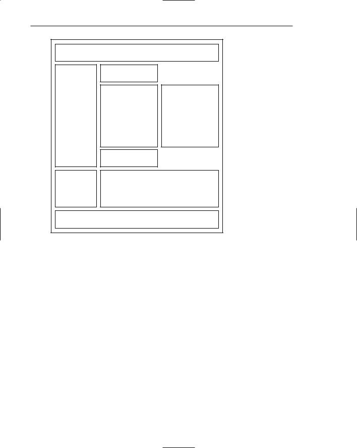
The use of the grids on all pages will provide a unifying character within and between pages, a standard look and feel. Regular and repeating organizational patterns help readers to understand site’s organization and aid them in maintaining a sense of place. Grids allow pages to be laid out without the designer having to stop and rethink the basic design approach for every new page. Pressing needs of the moment will also have much less of an influence on design. Examples of page layout grids, both poor and good, are illustrated in Figure 13.34. The poor grid is haphazard in design, and there is little connection of the elements. The good grid reflects much greater alignment and better visual connection of elements. It is structured and more consistent. As described in Step 3, the good grid has a visual complexity measure that is 47 percent lower than the poor grid.
Navigation
Heading
Graphic
Text
Navigation
Heading
Graphic
Text
Navigation
 Poor grid (continues) Figure 13.34: Page layout grids.
754 Part 2: The User Interface Design Process
Good grid
Figure 13.34: Continued.
Elements
To keep pages simple, restrict the number of distinct functional elements on a page. Elements include such things as the title, the navigation bar, the textual link listing to major site areas, textual content, graphics, and the page footer. The more elements on a page, the greater the competition between the elements for a person’s attention. Too many elements will eventually overwhelm the user’s information-processing system.
Size
Page length. The many issues associated with page length are thoroughly described in Step 3 (such as vertical scrolling, user memory requirements, user tasks, and monitor sizes), so optimum page length must balance all these factors. In general, the best approach seems to be to minimize a page’s length, restricting it to two or three screens of information.
Anticipate page breaks. In laying out pages exceeding one screen in length, always consider where the browser window will cut off a page when it loads. If the break occurs at a logical point on the page, and the page appears to fit totally on the screen, people may assume that it ends at that point and look no further down. Where potential screen cut-offs can occur, present a design element (textual or

Step 13: Organize and Layout Windows and Pages 755
graphical) that, by its appearance, is obviously not completed or finished. This signals to the user that there is more below and indicates a need to scroll down.
Horizontal scrolling. While people can accept some vertical scrolling, horizontal scrolling is cumbersome and disliked. Lay out a page so that horizontal scrolling is never necessary. Also ensure that a page can be fully printed on a standard 81⁄2 × 11 inch portrait orientation.
Organization
Important elements at the top. Critical or important information should be placed where it will be immediately visible when the page is displayed. As described earlier, in Web page design this is referred to as “above the fold,” a term borrowed from newspaper page layout. Above the fold is about the top 4 inches of a page and is the area of the page most users are assured of seeing. Information “below the fold” will usually require scrolling to access and may not always be seen. Positioning large images above the fold may cause readers to assume there is no information further down the page.
Generally, the top of the page should be more dense and packed with more useful and interesting information than the area lower down. Include in this area the page title, links to other important content and pages, and summary information so the user can determine whether continued reading is desirable. Less important information should be positioned lower down on the page.
Positioning. The effect of presented information drops very quickly as one moves lower down the page. Visually prioritize the page information space by establishing an information hierarchy, using contrast, size, location pattern, and other concepts discussed in Step 3.
Reduced complexity. Reduce graphic complexity and textual density as one moves lower down a page or to interior site pages. Produce diminishing or thinning vertical gradients of complexity, providing quieter and less-distracting design elements. This will enable people to focus on the content, which must have some interest because they have navigated that far. To be distracted by irrelevant information or useless animation at that point can be very irritating.
Formatting
White space. To enhance readability and organization, and make the page more inviting, allow a sufficient amount of white space on each page. According to many experts, white space should consume at least 30 percent of a page. (Remember, white space is a design element, not something to always be consumed.) Of the remaining 70 percent of space, restrict text to no more than another 30 percent. The remaining 40 percent may be used for graphics. If the entire 40 percent is not used for graphics, more text may be included. White space should always be used to separate paragraphs. A satisfactory balance between text and white space must be achieved to avoid excessive scrolling.
Textual line length. If fast reading is required, use line lengths of about 75 to 100 characters. If user preference is important, a length of about 50 to 60 characters is acceptable. Avoid very narrow columns.

756 Part 2: The User Interface Design Process
Text and related graphics. Keep text and any related graphics close to each other. The viewer will assume a connection between elements located in close proximity. Also, keep chunks of related text in closer proximity than unrelated text, to ensure a connection.
Horizontal spacing. Provide sufficient horizontal spacing so that groupings of information are obvious. A chunk of text, its heading, and any related graphic should be readily discernible as a grouping.
Horizontal rules. Use horizontal rules sparingly on pages. These rules can break up page flow and signal a page’s end when it is not intended. Use horizontal rules only if the objective is to break the flow. Uses might be, for example, to separate standard header and footer information from basic page content.
Multiple Audiences
If distinctively different audiences exist for presented information, provide pages formatted for each audience. Information can be presented at different levels of detail, or at different reading levels, for example. Allow users from each audience to have access to all versions, however. Initially, do not segment the Web site on the homepage itself. Provide links to multiple versions from the homepage or on a later page.
Platforms
Anticipate the typical screen and resolution and specify an image-safe area of the screen that will always be visible to most viewers. The most important information can be located here. This is not an ideal solution because users with very small screens will still have to scroll and those with large screens will be viewing the page through a window that is smaller than the actual screen size.
Frames
Use frames with caution. As discussed in Step 4, frames can be confusing for many users. They may cause problems with scrolling, bookmarking, and printing. If a person arrives at a framed page from a search facility, the page is seen without the accompanying frames. The site name and a link to the homepage must always be provided on the content page so the user does not reach a dead-end. They also reduce the content window size.
Frames, however, are useful for presenting global page elements such as navigation links, or information, that must remain visible on the screen while additional information is displayed. Frames containing links are sometimes called simultaneous menus because a selection in one frame causes another to change its contents. Side-by-side frames appear to work best, the links appearing on the left side and the resulting information on the right side.
Fixed versus Fluid Page Layouts
Layouts of a Web page may be either fluid or fixed (sometimes referred to as frozen). The fluid layout is the most traditional, the contents of a Web page filling the entire window, expanding and contracting with the size of the window. The fluid layout is simplest to implement. Common fixed layouts are centered or left-justified. The centered layout is

Step 13: Organize and Layout Windows and Pages 757
centered within the boundaries of a display, requiring users to only focus on a narrower layout in the middle of the display no matter what screen resolution is being used. The left-justified layout is positioned against the left border of the display and is usually slightly wider than the centered layout. Bernard and Larsen (2001c) compared these three layout styles and found no differences in search time, accuracy in finding information, or in search efficiency. However, study participants felt that the fluid style was best suited to reading and finding information. It was also the preferred layout style.
Change
In an environment as volatile and changing as the Web, the urge to try the newest and latest concepts in design and layout always exists. Use restraint. A Web site’s fashion should be evident in its content, not its design. Fashion changes all the time, and constant changes in design will continually antagonize users who have invested time and effort in understanding a site’s structure and organization. Change the organization and structure only when significant benefits for the user and the Web site owner are perceived to exist.
Navigation Elements
■Differentiate and group navigation elements.
—Provide a global navigation bar at the top of each page.
—Provide a local category or topical links navigation bar on the left side of a page.
•For long lists, consider placing within a frame.
—Optionally, provide a secondary navigation column on the right side of the page.
—Provide explicit or embedded textual links within the contents area.
•Consider duplicating embedded links in the left side of the navigation bar.
—Place minor illustrative, parenthetical, or footnote links at the end of the page.
—For long pages provide
•“List of Content” Links.
•Important global or local links in a navigation bar repeated at the page bottom.
■Create a common and consistent theme.
■Never create pages without navigational options.
A Web site contains at least three levels of navigation elements: global or site-wide; local and specific; and minor or footnote. Clearly differentiate these navigation elements from one another and locate them consistently from page to page. Commonly selected items should be positioned close to the edge of a screen to expedite their selection.
Global. Global or site-wide navigation elements provide access to the site’s total scope or categories of available information. An evolving standard in design is to locate the global navigation elements horizontally at a page’s top.
Category or topical. Local, specific and contextual navigation elements within the category or topical area being presented are typically displayed in a column array down the left page side. For long lists consider placing the links within a frame navigation panel.

758 Part 2: The User Interface Design Process
Explicit or embedded links. Phrases or embedded links will be provided within the contents area of a Web page. An embedded link is one found in the middle of prose or continuous text. Embedded links are frequently used to lead to supporting information or provide definition of terms. They are designated by an underline and a unique color. Because users preferred redundant links, consider duplicating embedded links in the left side navigation bar.
Minor. Minor illustrative, parenthetical, or footnote links can be arrayed horizontally at the page bottom.
List of content. For long pages with sections that are not visible without scrolling include a set of links to each page section at the top of the page. These “anchor” or “within page” links provide a reminder of the page’s contents, a page outline that can be easily reviewed, and a quick way to navigate to desired sections. These links also assist people in getting to a specific section if they arrive from a different page.
Important links. For long scrolling pages, repeat important global or local links at the page bottom. When finishing a page, the user, then, will not have to scroll upward to locate important navigation links.
Common theme. A common and consistent Web site navigation theme will enable people to more easily understand and learn its structure. Incorporate different styles for these different navigation elements to aid people in understanding the differences in their meaning and function.
Always present options. All pages must have navigation options. Never create pages without navigation options.
Homepage
■Limit to one screen.
■Clearly identify the Web site’s content and purpose.
■Elements to include:
—Masthead, name or logo of Web site owner and tagline.
—Web site name.
—Brief description of Web site.
—Summary of the key informational content.
—Navigation links to most (if not all) of the site or major sections.
—Site overview or map.
—Summary of the latest news or promotions.
—Search facility.
A site’s homepage is a concrete and visual anchor point; a safe haven to return to when one is confused or decides to do something else. The homepage also gives people a first impression of a site, and first impressions can create a positive or negative feeling, or a feeling somewhere in between. A negative first impression can lead to rejection, whereas a positive first impression can create an urge for further exploration. In many ways, the homepage is a site’s most important page.
