

The Essential Guide to UI Design
.pdf
660Part 2: The User Interface Design Process
■Clearly reflect objects represented.
■Simply reflect objects represented, avoiding excessive detail.
■Create as a set, communicating relationships to one another through common shapes.
■Provide consistency in icon type.
■Create shapes of the proper emotional tone.
Concrete and familiar shapes. Ideally, an icon’s meaning should be self-evident. This is enhanced when concrete shapes are provided, those that look like what they are. A study found concrete icons are easier to recognize for infrequent users but frequent users perform equally well using both concrete and abstract icons. An icon should also be intuitive or obvious, based upon a person’s preexisting knowledge. Familiar shapes are those images that are well learned. Figure 11.2 illustrates concrete and familiar icons for a file folder, book, and telephone as well as images for the same objects that are more abstract and unfamiliar. A study found that concrete, familiar icons were preferred to abstract, unfamiliar ones.
Keep in mind, however, that familiarity is in the eye of the viewer. The concrete images pictured may be familiar to us, readers of this book, but not to a tribal chief living in a remote area of the world where these objects do not exist. Similarly, items familiar to those working on the factory floor may not be at all familiar in the office or in the home, and vice versa. Mayhew (1992) also cautions that some abstract images should not be discounted because they have become familiar, in spite of their being abstract. On a road sign, for example, an angled red bar inscribed over an object means do not do what is pictured beneath (at least to most people, as described earlier). While abstract, it is a very familiar shape today. If an abstract image must be used, it should be capable of being learned quickly and easily recalled. Familiarity can only be determined through knowing one’s user.
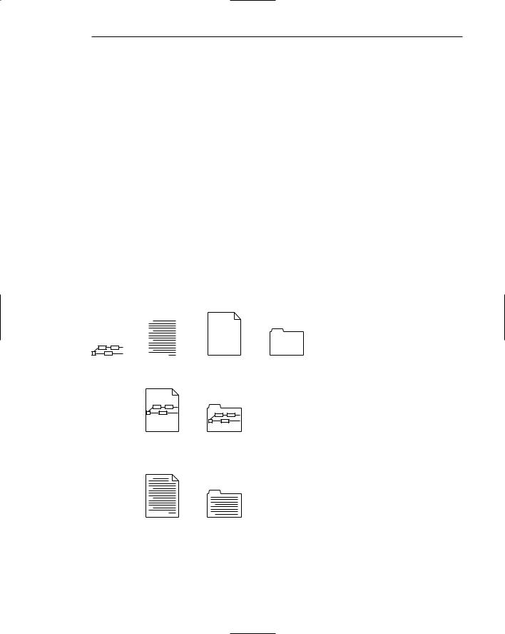
Visually and conceptually distinct shapes. It must be easy to tell icons apart so the chances of confusing them are minimized. Differentiation is aided when icons are visually different from one another. It is also aided when icons are conceptually different, that is, when they portray specific features of an object that are relatively unique within the entire set of objects to be displayed. Figure 11.3, based upon Mayhew (1992), illustrates how distinctiveness may be achieved for two similar items: a dictionary and a telephone book. Visual distinctiveness is achieved by incorporating unique features of each: for the dictionary, it is its content of letters and words; for the telephone book, numbers and the telephone bell. Visual distinctiveness is degraded when borders are placed around icons, as illustrated in Figure 11.4. Borders tend to obscure the shape of the object being displayed.


662 Part 2: The User Interface Design Process
ABC...
...XYZ
ABC...
...XYZ
Figure 11.4: Borders degrading icon distinctiveness.
Clearly reflect objects. The characteristics of the display itself should permit drawings of adequate quality. Poorly formed or fuzzy shapes will inhibit recognition.
Simply reflect objects. Construct icons with as few graphical components as necessary, using no more than two or three, if possible. Also, use simple, clean lines, avoiding ornamentation. Byrne (1993) found that simple icons, icons containing fewer graphical elements, were located faster in a visual search task than complex icons, icons with more components. He concluded that complex icons seemed to clutter a screen with information that people were unable to employ to their advantage. Too much detail inhibits rather than facilitates perception, as illustrated in Figure 11.5. For real-world objects, use only enough detail to permit recognition and recall.
11 |
12 |
1 |
|
|
12 |
10 |
|
|
2 |
|
|
9 |
|
|
3 |
9 |
3 |
8 |
|
|
4 |
|
|
7 |
6 |
5 |
|
|
6 |
|
|
|
|
||
POOR |
|
|
GOOD |
||
Figure 11.5: Avoid excessive detail in icon design.

664 Part 2: The User Interface Design Process
Drawing Icon Images
■Provide consistency in shape over varying sizes.
■Do not use triangular arrows in design to avoid confusion with other system symbols.
■When icons are used to reflect varying attributes, express these attributes as meaningfully as possible.
■Provide proper scale and orientation.
■Use perspective and dimension whenever possible.
■Accompany icon with a label to assure intended meaning.
Consistency. When drawing images, create consistency in shapes for identical icons of differing sizing. Preserve the general shape and any distinctive detail. Consistency is achieved through limiting the variations of angles, line thicknesses, shapes, and amount of empty space.
Triangular arrows. Avoid using a triangular graphic similar to that used as a cascade symbol for menus, a drop-down button for controls, and scroll arrows. The similarity may cause confusion.
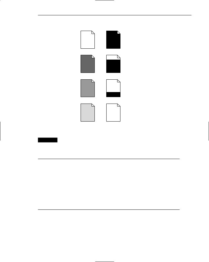
Meaningful attributes. When an icon is also used to express an attribute of an object, do this as meaningfully as possible. The status of a document, for example, might be represented by displaying it in a different shade, but would be more effectively illustrated by filling it in, as illustrated in Figure 11.7. Shading requires remembering what each specific type of shading stands for; the filled-in proportion is more intuitively obvious.
Scale and orientation. Ensure that the size and orientation are consistent with other related objects. Also ensure that they fit well on the screen.
Perspective and dimension. Use lighting and shadow to more accurately reflect the real-world experiences of people. When a light source is used, it must be located upper left, as is done with other screen elements.
Caption or label. Because icons may not be used often, the ability to comprehend, learn, and recall an icon’s meaning can be greatly improved by attaching textual captions or labels to them. This is especially important for new or infrequent users. Wiedenbeck (1999), comparing textual and iconic links, found inexperienced people performed best with text-only links. Frequent users used either equally effectively but icons were not faster, relative to text links alone. The preferred label location is directly beneath the icon, not within it, because of the international considerations discussed in Step 10. Labels beneath the icon also provide a larger target, speeding selection. Labels should always be related to icons in a consistent positional way. “Mystery icons,” icons with no caption or label to explain them, lead to a user guessing game and many errors. While ToolTips can be used to present labels, they are time-consuming to present, taking about twothirds of a second to appear and be comprehended. Scanning an entire row of 15 icons with ToolTips, therefore, will consume about 10 extra seconds.
Step 11: Create Meaningful Graphics, Icons, and Images 665
POOR GOOD
Report Finished
Report Mostly Completed
Report Started
Report Planned
Figure 11.7: Expressing attributes in icon design.
MAXIM If people must remember hieroglyphics, they won’t stick around long.
Icon Animation and Audition
■Animation:
—Use:
•To provide feedback.
•For visual interest.
—Make it interruptible or independent of user’s primary interaction.
—Do not use it for decoration.
—Permit it to be turned off by the user.
—For fluid animation, present images at 16 or more frames per second.
■Audition:
–– Consider auditory icons.
Animation. Recent research has explored the use of bringing to life on screens the icons representing objects and actions. An animated icon appears to move instead of maintaining a static position on the screen. Animation can take two forms, best described as static and dynamic. A static icon’s appearance is unchanged over a period of time and changes only at the moment that a system

666 Part 2: The User Interface Design Process
event occurs. An example would be the open door of a mailbox shutting when an electronic message is received. A dynamic icon’s movement is independent of a system event, changing appearance to represent functions, processes, states, and state transitions. An example is an icon that begins movement to illustrate an action when a pointer is moved close to it.
Animation can be used to provide feedback and to create visual interest. Researchers caution, however, that there are many outstanding issues. Among them are that few animation creation rules exist, prototyping is difficult, a scheme for how they fit into a larger system is lacking, and whether they can be made useful for more complex and abstract concepts is not known. Morimoto et al. (1993) found that dynamic animation of the type in the preceding example did not increase the comprehensibility of icons. Its only advantage was its entertainment value. Faraday and Sutcliffe (1997) did find animation was useful in calling attention to an item to which users should first attend.
Some general guidelines, however, seem appropriate. First, do not prevent the user from interacting with the system while the animation is performed. Unless the animation is part of a process, it should be independent of what the user is doing. It should also be interruptible. Be conservative in its use; do not use animation simply for decoration. It can be very distracting or annoying. Finally, provide the user with the option of turning it on or off, as desired. Microsoft recommends that to achieve fluidity in movement, images should be presented at a speed of at least 16 frames per second. The reader interested in more information on animation is referred to Baecker and Small (1990).
Audition. Objects make sounds as they are touched, dragged, bumped against one another, opened, activated, and thrown away. Auditory icons are computer sounds replicating everyday sound-producing events. When a printer near one’s desk begins printing, the sound of the printing mechanism is heard. This provides auditory feedback that a print operation one has just asked for has successfully started. An auditory icon would be the same sound, generated by the computer. Another example would be to convey information about an object’s dimensions. If a file is large, it can sound large. If an object is dragged over a new surface, the new surface is heard. If an ongoing process starts running more quickly, it sounds quicker. Sounds can convey information about many events in computer systems, permitting people to listen to computers as we do in the everyday world. It may be well suited to providing information
■■About previous and possible interactions.
■■Indicating ongoing processes and modes.
■■Useful for navigation.
■■To support collaboration.
Auditory icons are distinct from earcons, abstract synthetic tones used in structured combinations to create sound messages. Auditory icons may also be susceptible to the distracting influences that sounds can cause to listeners, especially others. The use of sound is discussed in more detail in Step 9. The reader in need of more information on auditory icons is referred to Garver (1993).

Step 11: Create Meaningful Graphics, Icons, and Images 667
The Icon Design Process
■Define the icon’s purpose and use.
■Collect, evaluate, and sketch ideas.
■Draw in black and white.
■Draw using an icon-editing utility or drawing package.
■Test for user
—Expectations.
—Recognition.
—Learning.
■Test for legibility.
■Register new icons in the system’s registry.
Define purpose. To begin the design process, first define the icon’s purpose and use. Have the design team brainstorm about possible ideas, considering realworld metaphors. Simple metaphors, analogies, or models with a minimal set of concepts are the best places to start in developing icons.
Collect, evaluate, and sketch ideas. Start by designing on paper, not on the computer (Fowler and Stanwick, 1995). Ask everyone to sketch his or her ideas. Do not worry about too much detail; exact pixel requirements are not necessary at this time.
Draw in black and white. Many icons will be displayed in monochrome. Color is an enhancing property; consider it as such.
Test for expectation, recognition, and learning. Choosing the objects and actions, and the icons to represent them, is not a precise process, and will not be easy. So, as in any screen design activity, adequate testing and possible refinement of developed images must be built into the design process. Icon recognition and learning should both be measured as part of the normal testing process.
Test for legibility. Verify the legibility and clarity of the icons in general. Also, verify the legibility of the icons on the screen backgrounds chosen. White or gray backgrounds may create difficulties. An icon mapped in color, then displayed on a monochrome screen, may not present itself satisfactorily. Be prepared to redraw it in black and white, if necessary.
Register new icons in the system’s registry. Create and maintain a registry of all system icons. Provide a detailed and distinctive description of all new icons.
Screen Presentation
■Follow all relevant general guidelines for screen design.
■Limit the number of symbols to 12, if possible, and at most 20.

668Part 2: The User Interface Design Process
■Arrange icons
—In a meaningful way, reflecting the organization of the real world.
—To facilitate visual scanning.
—Consistently.
■Place object and action icons in different groups.
■Present an interactive icon as a raised screen element.
■Ensure that a selected icon is differentiable from unselected icons.
■Permit arrangement of icons by the user.
■Permit the user to choose between iconic and text display of objects and actions.
In designing, or establishing, screen layout rules, adhere to the following presentation rules.
General guidelines. Follow all relevant general guidelines for screen design. Icons are but one part of a larger picture.
Number of icons. A person’s ability to identify shapes is limited (see Figure 11.1). A literature review suggests using no more than eight to twelve or so functions that require icons at one time. At most, present no more than 20. If labels are attached to icons, however, the meaning of the icon is greatly clarified. Too many icons on a screen, though, will greatly increase screen clutter and create confusion. In general, fewer are better.
Arranging icons. Organize icons in a way that reflects the real-world organization of the user. Place object icons and action icons within different groupings. Visual scanning studies, in a non-iconic world, universally find that a top-to-bottom scan of columnar-oriented information is fastest. Generalization of these findings to an icon screen may not necessarily be warranted if icons have attached labels. Columnar orientation icons (with labels below the icons) will separate the labels from one another by the icons themselves. The labels will be farther apart and fewer icons will fit in a column than in a horizontal or row orientation. A row orientation would seem to be more efficient in many cases, as adjacent icons will be in closer physical proximity. Until research evidence is established to the contrary, organizing icons either in a column or a row seems appropriate. In either case, a consistent straight eye movement must be maintained through the icons.
Object and action icons. Conceptually similar items should always be arrayed together. Locating them will be easier.
Interactive icons. To provide a visual indication that an icon is interactive or clickable, present it in a three-dimensional state raised from the screen background.
Selected icon. Ensure a selected icon is visually differentiable from unselected icons. One common method to achieve this is to present the selected icon in a three-dimensional pressed state.
User arrangement. Allow the user to arrange the icons in a manner that is meaningful for the task. A default arrangement should be provided, however.
Iconic or text display. In some situations, and for some users, pure text labels may be more meaningful than icons. The option to display text only should always be provided.

Step 11: Create Meaningful Graphics, Icons, and Images 669
Multimedia
The graphical flexibility of the Web permits inclusion of other media on a screen, including images, photographs, video, diagrams, drawings, and spoken audio. The availability of these additional interface elements has, however, been a double-edged sword. On the one hand, the various media can be powerful communication and attention-getting techniques. Multimedia can hold the user’s attention, add interest to a screen, entertain, and quickly convey information that is more difficult to present textually. It can also make the Web much more accessible to people with disabilities. On the other hand, effective use of multimedia in design has been hindered by a lack of knowledge concerning how the various media may best be used, and a scarcity of applied design guidelines. (GUI guidelines relevant to Web page design have been available for years, but their existence was either unknown or ignored.) Effective multimedia use has also been hindered by the “let’s use it because we have it” attitude exhibited by many designers. (To be fair, early GUI design has suffered from the same problem.) The resulting usability problems, user confusion and frustration, poor screen legibility, and slow downloads, and so on have created situations where the user was too often denied an efficient and meaningful Web experience.
As a result, recent studies (Spool et al., 1997, for example) have found that the most difficult-to-use Web sites were those that were graphically intense, and the top Web sites were characterized by little, if any, multimedia. Studies have also found that for users, text is currently a much more important Web site component than graphics (at least at this stage in Web evolution). Today, consequently, good interface design employs multimedia in a conservative and appropriate manner. The objective is good interaction design, not “sparkle.” In the future, experts say, multimedia elements will be much better integrated with browsers, alleviating many of today’s usability problems.
Graphics
■Use graphics to
—Supplement the textual content, not as a substitute for it.
—Convey information that can’t be effectively accomplished using text.
—Enhance navigation through
•Presenting a site overview.
•Identifying site pages.
•Identifying content areas.
■Limit the use of graphics that take a long time to load.
■Coordinate the graphics with all other page elements.
■Graphics should not look like gratuitous decorations or banner ads.