

The Essential Guide to UI Design
.pdf
760 Part 2: The User Interface Design Process
Table 13.1 (continued)
COMPONENT |
PURPOSE |
PAGE FREQUENCY |
LOCATION |
Page’s author or |
To identify page’s |
Every page |
Footer |
contact person |
author, or to indicate |
|
|
|
page’s contact person. |
|
|
|
|
|
|
Contact e-mail |
To solicit queries |
Every page |
Footer |
address |
or comments. |
|
|
|
|
|
|
Comment facility |
To solicit queries |
As necessary |
Footer |
|
or comments. |
|
|
Other contact details |
To identify other |
As necessary |
Footer |
(telephone number, |
methods for |
|
|
mailing address, |
soliciting queries |
|
|
and so forth) |
or comments. |
|
|
|
|
|
|
Copyright |
To identify page’s |
Every page |
Footer |
information |
legal ownership. |
|
|
|
To caution against |
|
|
|
unauthorized use. |
|
|
|
|
|
|
Date of creation |
To indicate currency |
Every page |
Footer |
or update |
of information. |
|
|
|
|
|
|
Links to: |
|
|
|
|
|
|
|
Skip to main |
An accessibility |
Every page |
Top |
content |
consideration. |
|
|
|
|
|
|
Other major |
To provide easy |
Every page |
Top, footer also for |
sections of site |
access to all major |
|
long pages |
|
site content. |
|
|
|
|
|
|
Homepage |
To return to |
Every page |
Top-left, footer also |
|
homepage. |
|
for long pages. |
Index page |
To return to index. |
Every page |
Top, footer also for |
|
|
|
long pages |
|
|
|
|
Site map or |
To return to site map |
Every page |
Top, footer also for |
directory |
or directory. |
|
long pages |
|
|
|
|
Next page |
To go to next page |
Every page |
Bottom |
|
in a sequence. |
(if applicable) |
|
Previous page |
To return to |
Every page |
Bottom |
|
previous page. |
(if applicable) |
|
|
|
|
|


762 Part 2: The User Interface Design Process
Screen 1.2
This is a much better screen. The title is capitalized to set it off from the remainder of the screen. The radio buttons and check boxes are arrayed vertically to facilitate scanning and comparison of alternatives. All controls are enclosed in borders to focus the viewer’s attention to them. While the overall organization does not assist the viewer in establishing a scanning direction (horizontal or vertical), the kind of information presented does not make this critical. The screen can be effectively used from left to right or from top to bottom. Family, Style, and Color are alphabetized. Using the complexity measure discussed in Step 3, this redesigned screen is 42 percent less complex than the original.
Screen 1.2
Example 2
This is a representation of an actual screen from Microsoft Windows. Two alternate designs are presented.

Step 13: Organize and Layout Windows and Pages 763
Screen 2.1
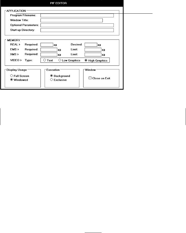
This is a screen with several faults. On a positive note, the captions on the left side are nicely aligned, as are the top four text boxes. The box alignment, however, breaks down in the middle of the screen. Also, what appear to be captions (because they possess an ending colon) are really headings, communicating a false message to the viewer (Memory Requirements, EMS Memory, and XMS Memory). The word “memory” repeated four times in succession seems redundant, indicating the potential for a heading. One radio button field (Video Memory) is arrayed horizontally, the others (Display Usage and Execution) are arrayed vertically. The control “Close Window on Exit” seems lost.
Screen 2.1
Screen 2.2
This is a much-improved alternative. Groupings of elements are provided. Section borders, with titles, are included in the upper part of the screen to strengthen the perception of groupings. Control borders in the lower part of the screen serve the same purpose. Proper alignment of data fields is achieved in the top two sections of the screen. The redundant word “memory” is incorporated as a section heading. Section headings are displayed capitalized to distinguish them from control captions. Subsection headings are created in the Memory section where the heading-caption confusion previously existed. Subsection headings are set off by capitalization and arrows.
764 Part 2: The User Interface Design Process
The radio buttons/check boxes at the bottom of the screen are arrayed horizontally to provide screen balance. The “Close Window on Exit” control field is given an (admittedly redundant) caption to allow a control border consistent with its neighbors and to create screen balance. The Video (Memory) control remains, as a trade-off, arrayed horizontally. It would have been desirable to organize its choices vertically, but the best overall fit within the screen is achieved by horizontal orientation. This redesigned version of the screen is actually 4 percent more complex than the original. The addition of headings and subheadings added to its complexity measure. In spite of this, it is a better screen. Additional information added to a screen to aid understanding can sometimes increase its complexity. So, use the complexity measure as a guide, not as an absolute and final measure of a screen’s effectiveness.
Screen 2.2

Step 13: Organize and Layout Windows and Pages 765
Screen 2.3
Here is another redesigned version of this screen. The Memory section has been restructured to maintain a top-to-bottom flow. The trade-off is that two columns are now required to present the information. This version is 8 percent more complex than the original, again because of the added information. Which version do you prefer, 2.2 or 2.3?
Screen 2.3
More examples and an exercise for Step 13 can be found on this book’s companion Web site, www.wiley.com/college/galitz.


768Part 2: The User Interface Design Process
■■Identifying the purpose and scope of testing.
■■Understanding the importance of testing.
■■Developing a prototype.
■■Developing the right kind of test plan.
■■Designing a test to yield relevant data.
■■Soliciting, selecting, and scheduling users to participate.
■■Providing the proper test facility.
■■Conducting tests and collecting data.
■■Analyzing the data and generating design recommendations.
■■Modifying the prototype as necessary.
■■Testing the system again.
■■Evaluating the working system.
Usability
The concept of usability, a common theme running through this text, was introduced and defined in the introduction to Part 2. By way of a summary, the following dimensions of usability were described by Quesenbery (2003):
Effective. The completeness and accuracy with which users achieve their goals.
Efficient. The speed and accuracy with which users can complete their tasks.
Engaging. The degree to which the tone and style of the interface makes the product pleasing or satisfying to use.
Error tolerant. How well the design prevents errors and helps with recovery from those that do occur.
Easy to learn. How well the product supports both initial orientation and an increase in the understanding of its capabilities.
The Purpose of Usability Testing
Usability testing serves a twofold purpose. First, it establishes a communication bridge between developers and users. Through testing, the developer learns about the user’s goals, perceptions, questions, and problems. Through testing, the user is exposed to the capabilities of the system early on, before design is solidified.
Second, testing is used to evaluate a product. It validates design decisions. It also can identify potential problems in design at a point in the development process where they can be more easily addressed. Testing also enables comparison of alternate versions of a design element, when a clear direction is not immediately evident. How well the interface and screens meet user needs and expectations can also be assessed.
Thorough testing also has one other benefit for the developer. It can prevent the massive embarrassment that often results from letting things “slip through the cracks.”

Step 14: Test, Test, and Retest 769
The Importance of Usability Testing
A thorough usability testing process is important for many reasons, including the following:
Developers and users possess different models. As discussed earlier, developers and users have different expectations and levels of knowledge. Specialized knowledge possessed by the developers enables them to deal with complex or ambiguous situations on the basis of context cues not visible to the users. Developers also frequently use terminology that does not always match that of the users.
Developer’s intuitions are not always correct. The intuition of designers, or anyone for that matter, no matter how good or bad they may be at what they do, is error prone. This is illustrated by the previously reported Tullis and Kodimer (1992) study evaluating several screen-based controls. They found that programmers’ predictions of control usage speed correlated only .07 with actual measured speeds. They also found that programmers’ predictions of user control preferences correlated only .31 with actuality. Intuition is too shallow a foundation on which to base design decisions.
There is no average user. We all differ — in looks, feelings, motor abilities, intellectual abilities, learning abilities and speeds, device-based control preferences, and so forth. In a keyboard data entry task, for example, the best operators will probably be twice as fast as the poorest and make 10 times fewer errors. The design must permit people with widely varying characteristics to satisfactorily and comfortably learn and perform the task or job.
It’s impossible to predict usability from appearance. Just as it is impossible to judge a person’s personality from his or her looks, it’s impossible to predict a system’s usability from its appearance.
Design standards and guidelines are not sufficient. Design standards and guidelines are an important component of good design, laying the foundation for consistency. But design standards and guidelines often fall victim to trade-offs. They also cannot address all the countless design element interactions that occur within a completed system.
Informal feedback is inadequate. Informal feedback is a hit-and-miss proposition. Parts of the system may be completely overlooked; significant problems in other parts may never be documented.
Products’ built-in pieces almost always have system-level inconsistencies. This is a normal and expected result when different developers work on different aspects of a system. We might also say that developers differ — there is no average developer.
Problems found late are more difficult and expensive to fix. Unless they’re really severe, they may never be fixed.
Problems fixed during development mean reduced support costs later. Support costs are directly proportional to the usability problems that remain after development. The more problems, the higher the support costs.