

- •About the Author
- •About the Technical Editor
- •Credits
- •Is This Book for You?
- •Software Versions
- •Conventions This Book Uses
- •What the Icons Mean
- •How This Book Is Organized
- •How to Use This Book
- •What’s on the Companion CD
- •What Is Excel Good For?
- •What’s New in Excel 2010?
- •Moving around a Worksheet
- •Introducing the Ribbon
- •Using Shortcut Menus
- •Customizing Your Quick Access Toolbar
- •Working with Dialog Boxes
- •Using the Task Pane
- •Creating Your First Excel Worksheet
- •Entering Text and Values into Your Worksheets
- •Entering Dates and Times into Your Worksheets
- •Modifying Cell Contents
- •Applying Number Formatting
- •Controlling the Worksheet View
- •Working with Rows and Columns
- •Understanding Cells and Ranges
- •Copying or Moving Ranges
- •Using Names to Work with Ranges
- •Adding Comments to Cells
- •What Is a Table?
- •Creating a Table
- •Changing the Look of a Table
- •Working with Tables
- •Getting to Know the Formatting Tools
- •Changing Text Alignment
- •Using Colors and Shading
- •Adding Borders and Lines
- •Adding a Background Image to a Worksheet
- •Using Named Styles for Easier Formatting
- •Understanding Document Themes
- •Creating a New Workbook
- •Opening an Existing Workbook
- •Saving a Workbook
- •Using AutoRecover
- •Specifying a Password
- •Organizing Your Files
- •Other Workbook Info Options
- •Closing Workbooks
- •Safeguarding Your Work
- •Excel File Compatibility
- •Exploring Excel Templates
- •Understanding Custom Excel Templates
- •Printing with One Click
- •Changing Your Page View
- •Adjusting Common Page Setup Settings
- •Adding a Header or Footer to Your Reports
- •Copying Page Setup Settings across Sheets
- •Preventing Certain Cells from Being Printed
- •Preventing Objects from Being Printed
- •Creating Custom Views of Your Worksheet
- •Understanding Formula Basics
- •Entering Formulas into Your Worksheets
- •Editing Formulas
- •Using Cell References in Formulas
- •Using Formulas in Tables
- •Correcting Common Formula Errors
- •Using Advanced Naming Techniques
- •Tips for Working with Formulas
- •A Few Words about Text
- •Text Functions
- •Advanced Text Formulas
- •Date-Related Worksheet Functions
- •Time-Related Functions
- •Basic Counting Formulas
- •Advanced Counting Formulas
- •Summing Formulas
- •Conditional Sums Using a Single Criterion
- •Conditional Sums Using Multiple Criteria
- •Introducing Lookup Formulas
- •Functions Relevant to Lookups
- •Basic Lookup Formulas
- •Specialized Lookup Formulas
- •The Time Value of Money
- •Loan Calculations
- •Investment Calculations
- •Depreciation Calculations
- •Understanding Array Formulas
- •Understanding the Dimensions of an Array
- •Naming Array Constants
- •Working with Array Formulas
- •Using Multicell Array Formulas
- •Using Single-Cell Array Formulas
- •Working with Multicell Array Formulas
- •What Is a Chart?
- •Understanding How Excel Handles Charts
- •Creating a Chart
- •Working with Charts
- •Understanding Chart Types
- •Learning More
- •Selecting Chart Elements
- •User Interface Choices for Modifying Chart Elements
- •Modifying the Chart Area
- •Modifying the Plot Area
- •Working with Chart Titles
- •Working with a Legend
- •Working with Gridlines
- •Modifying the Axes
- •Working with Data Series
- •Creating Chart Templates
- •Learning Some Chart-Making Tricks
- •About Conditional Formatting
- •Specifying Conditional Formatting
- •Conditional Formats That Use Graphics
- •Creating Formula-Based Rules
- •Working with Conditional Formats
- •Sparkline Types
- •Creating Sparklines
- •Customizing Sparklines
- •Specifying a Date Axis
- •Auto-Updating Sparklines
- •Displaying a Sparkline for a Dynamic Range
- •Using Shapes
- •Using SmartArt
- •Using WordArt
- •Working with Other Graphic Types
- •Using the Equation Editor
- •Customizing the Ribbon
- •About Number Formatting
- •Creating a Custom Number Format
- •Custom Number Format Examples
- •About Data Validation
- •Specifying Validation Criteria
- •Types of Validation Criteria You Can Apply
- •Creating a Drop-Down List
- •Using Formulas for Data Validation Rules
- •Understanding Cell References
- •Data Validation Formula Examples
- •Introducing Worksheet Outlines
- •Creating an Outline
- •Working with Outlines
- •Linking Workbooks
- •Creating External Reference Formulas
- •Working with External Reference Formulas
- •Consolidating Worksheets
- •Understanding the Different Web Formats
- •Opening an HTML File
- •Working with Hyperlinks
- •Using Web Queries
- •Other Internet-Related Features
- •Copying and Pasting
- •Copying from Excel to Word
- •Embedding Objects in a Worksheet
- •Using Excel on a Network
- •Understanding File Reservations
- •Sharing Workbooks
- •Tracking Workbook Changes
- •Types of Protection
- •Protecting a Worksheet
- •Protecting a Workbook
- •VB Project Protection
- •Related Topics
- •Using Excel Auditing Tools
- •Searching and Replacing
- •Spell Checking Your Worksheets
- •Using AutoCorrect
- •Understanding External Database Files
- •Importing Access Tables
- •Retrieving Data with Query: An Example
- •Working with Data Returned by Query
- •Using Query without the Wizard
- •Learning More about Query
- •About Pivot Tables
- •Creating a Pivot Table
- •More Pivot Table Examples
- •Learning More
- •Working with Non-Numeric Data
- •Grouping Pivot Table Items
- •Creating a Frequency Distribution
- •Filtering Pivot Tables with Slicers
- •Referencing Cells within a Pivot Table
- •Creating Pivot Charts
- •Another Pivot Table Example
- •Producing a Report with a Pivot Table
- •A What-If Example
- •Types of What-If Analyses
- •Manual What-If Analysis
- •Creating Data Tables
- •Using Scenario Manager
- •What-If Analysis, in Reverse
- •Single-Cell Goal Seeking
- •Introducing Solver
- •Solver Examples
- •Installing the Analysis ToolPak Add-in
- •Using the Analysis Tools
- •Introducing the Analysis ToolPak Tools
- •Introducing VBA Macros
- •Displaying the Developer Tab
- •About Macro Security
- •Saving Workbooks That Contain Macros
- •Two Types of VBA Macros
- •Creating VBA Macros
- •Learning More
- •Overview of VBA Functions
- •An Introductory Example
- •About Function Procedures
- •Executing Function Procedures
- •Function Procedure Arguments
- •Debugging Custom Functions
- •Inserting Custom Functions
- •Learning More
- •Why Create UserForms?
- •UserForm Alternatives
- •Creating UserForms: An Overview
- •A UserForm Example
- •Another UserForm Example
- •More on Creating UserForms
- •Learning More
- •Why Use Controls on a Worksheet?
- •Using Controls
- •Reviewing the Available ActiveX Controls
- •Understanding Events
- •Entering Event-Handler VBA Code
- •Using Workbook-Level Events
- •Working with Worksheet Events
- •Using Non-Object Events
- •Working with Ranges
- •Working with Workbooks
- •Working with Charts
- •VBA Speed Tips
- •What Is an Add-In?
- •Working with Add-Ins
- •Why Create Add-Ins?
- •Creating Add-Ins
- •An Add-In Example
- •System Requirements
- •Using the CD
- •What’s on the CD
- •Troubleshooting
- •The Excel Help System
- •Microsoft Technical Support
- •Internet Newsgroups
- •Internet Web sites
- •End-User License Agreement
Chapter 35: Analyzing Data with Pivot Tables
Another Pivot Table Example
The pivot table example in this section demonstrates some useful ways to work with pivot tables.
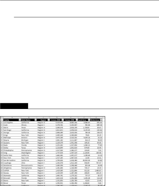
Figure 35.28 shows part of a table with 3,144 data rows, one for each county in the United States. The fields are
•County: The name of the county
•State Name: The state of the county
•Region: The region (Roman number ranging from I to XII)
•Census 2000: The population of the county, according to the 2000 Census
•Census 1990: The population of the county, according to the 1990 Census
•LandArea: The area, in square miles (excluding water-covered area)
•WaterArea: The area, in square miles, covered by water
On the CD
This workbook, named county data.xlsx, is available on the companion CD-ROM. n
FIGURE 35.28
This table contains data for each county in the United States.
Figure 35.29 shows a pivot table created from the county data. The pivot table uses the Region and State Name fields for the Row Labels, and uses Census 2000 and Census 1990 as the Column Labels.
739

Part V: Analyzing Data with Excel
FIGURE 35.29
This pivot table was created from the county data.
I created three calculated fields to display additional information:
•Change (displayed as Pop Change): The difference between Census 2000 and Census 1990
•Pct Change (displayed as Pct Pop Change): The population change expressed as a percentage of the 1990 population
•Density (displayed as Pop/Sq Mile): The population per square mile of land
Tip
To view (or document) calculated fields and calculated items in a pivot table, choose PivotTable Tools Options Calculations Fields, Items & Sets List Formulas. Excel inserts a new worksheet with information about your calculated fields and items. Figure 35.30 shows an example. n
740

Chapter 35: Analyzing Data with Pivot Tables
FIGURE 35.30
This worksheet lists calculated fields and items for the pivot table.
This pivot table is sorted on two columns. The main sort is by Region, and states within each region are sorted alphabetically. To sort, just select a cell that contains a data point to be included in the sort. Right-click and choose from the shortcut menu.
Sorting by Region requires some additional effort because Roman numerals are not in alphabetical order. Therefore, I had to create a custom list. To create a custom sort list, access the Excel Options dialog box, click the Advanced tab, and click Edit Custom Lists. Click New List, type your list entries, and click Add. Figure 35.31 shows the custom list I created for the region names.
FIGURE 35.31
This custom list ensures that the Region names are sorted correctly.
741

Part V: Analyzing Data with Excel
Producing a Report with a Pivot Table
By using a pivot table, you can convert a huge table of data into an attractive printed report. Figure 35.32 shows a small portion of a pivot table that I created from a table that has more than 40,000 rows of data. This data happens to be my digital music collection, and each row contains information about a single music file: the genre, the artist name, the album, the filename, the file size, and the duration.
FIGURE 35.32
A 132-page pivot table report.
The pivot table report created from this data is 132 pages long, and it took about five minutes to set up (and a little longer to fine-tune it).
742

Chapter 35: Analyzing Data with Pivot Tables
On the CD
This workbook, named music list.xlsx, is available on the companion CD-ROM. n
Here’s a quick summary of how I created this report:
1.I selected a cell in the table and chose Insert Tables PivotTable.
2.In the Create PivotTable dialog box, I clicked OK to accept the default settings.
3.In the new worksheet, I used the PivotTable Field List and dragged the following fields to the Row Labels area: Genre, Artist, and Album.
4.I dragged these fields to the Values area: Track, Size, and Duration.
5.I used the Data Field Settings dialog box to summarize Track as Count, Size as Sum, and Duration as Sum.
6.I wanted the information in the Size column to display in megabytes, so I formatted the column using this custom number format:
###,###, “Mb”;;
7.I wanted the information in the Duration column to display as hours, minutes, and seconds, so I formatted the column using this custom number format:
[h]:mm:ss;;
8.I edited the column headings. For example, I replaced Count of Track with Tracks.
9.I changed the layout to outline format by choosing PivotTable Tools Design Layout Report Layout Show In Outline Form.
10.I turned off the field headers by choosing PivotTable Tools Options Show
Show Field Headers.
11.I turned off the buttons by choosing PivotTable Tools Options Show
+/- Buttons.
12.I displayed a blank row after each artist’s section by choosing PivotTable Tools Design Layout Blank Rows Insert Blank Line after Each Item.
13.I applied a built-in style by choosing PivotTable Tools Design PivotTable
Styles.
14.I increased the font size for the Genre.
15.I went into Page Layout view and adjusted the column widths so that the report would fit horizontally on the page.
Note
Step 14 was actually kind of tricky. I wanted to increase the size of the genre names, but leave the subtotals in the same font size. Therefore, I couldn’t modify the style for the PivotTable Style I chose. I selected the entire column A and pressed Ctrl+G to bring up the Go To dialog box. I clicked Special to display the Go To Special dialog box. Then I selected the Constants option and clicked OK, which selected only the nonempty cells in column A. I then adjusted the font size for the selected cells. n
743