

The Essential Guide to UI Design
.pdf
550Part 2: The User Interface Design Process
Table 7.3 (continued)
OR:
• Typed entry is never necessary. |
Drop-Down/Pop-Up |
• Content can never change. |
List Box |
• Adequate screen space is not available. |
|
|
|
OR: |
|
|
|
• Typed entry may be necessary. |
Combo box |
• Content can change. |
|
• Adequate screen space is available. |
|
|
|
OR: |
|
• Typed entry may be necessary. |
Drop-Down/Pop-Up |
• Content can change. |
Combo Box |
• Adequate screen space is not available. |
|
2. IF: |
USE: |
|
|
•Mutually exclusive alternatives.
•Discrete data.
•Best represented verbally.
•Potentially large in number (9 or more).
AND:
• Typed entry is never necessary. |
Single-Selection List Box |
•Content can never change.
•Adequate screen space is available.
OR:
• Typed entry is never necessary. |
Drop-Down/Pop-Up |
• Content can never change. |
List Box |
• Adequate screen space is not available. |
|
|
|
OR: |
|
|
|
• Typed entry may be necessary. |
Combo Box |
• Content can change. |
|
• Adequate screen space is available. |
|
|
|
OR: |
|
• Typed entry may be necessary. |
Drop-down/Pop-up |
• Content can change. |
Combo Box |
• Adequate screen space is not available. |
|
3. IF: |
USE: |
|
|
• Mutually exclusive alternatives. |
Palette |
• Discrete data. |
|
• Best represented graphically. |
|
• Content rarely changes. |
|
• Small or large number of items. |
|

Step 7: Choose the Proper Screen-Based Controls 551 |
||
Table 7.3 (continued) |
|
|
|
|
|
4. IF: |
USE: |
|
|
|
|
• Mutually exclusive alternatives. |
|
|
• Not frequently selected. |
|
|
• Content does not change. |
|
|
• Well-known, easily remembered data. |
|
|
• Predictable, consecutive data. |
|
|
• Typed entry sometimes desirable. |
|
|
|
|
|
AND: |
|
|
|
|
|
• Adequate screen space is not available. |
Spin Box |
|
OR: |
|
|
|
|
|
• Adequate screen space is available. |
Combo Box |
|
|
|
|
5. IF: |
USE: |
|
• Mutually exclusive alternatives. |
Slider |
|
•Continuous data with a limited range of settings.
•Value increases/decreases in a well-known, predictable way.
•Spatial representation enhances comprehension.
6. IF: |
USE: |
• Nonexclusive alternatives. |
|
• Discrete data. |
|
• Best represented verbally. |
|
• Typed entry is never necessary. |
|
• Content can never change. |
|
• Adequate screen space is available. |
|
|
|
AND: |
|
• Very limited in number (2 to 8). |
Check Boxes |
|
|
OR: |
|
|
|
• Potentially large in number (9 or more). |
Multiple-Selection List Box |
Choosing between Buttons and Menus for Commands
Determining the proper way to present a command also depends on several factors. The following considerations are involved in choosing the correct command form:
■■Whether or not the command is part of a standard tool set.
■■The total number of commands in the application.
■■The complexity of the commands.
■■The frequency with which commands are used.
■■Whether or not the command is used in association with another control.
Guidelines for choosing the proper command form are presented in Table 7.4.

552 Part 2: The User Interface Design Process
Table 7.4: Choosing a Command Form
IF THE COMMANDS: |
USE: |
Are standard commands provided by a |
Commands provided by the tool set. |
tool set. |
|
|
|
Total seven or more, and can be |
Menu bar and pull-downs |
arranged hierarchically into groups. |
|
Total six or fewer, are selected frequently, |
Buttons in a window |
and affect an entire window. |
|
|
|
Total seven or more, are selected |
Buttons in a toolbar |
frequently, and affect an entire window. |
|
|
|
Are used with other controls, or are |
Buttons in a dialog box |
complicated commands and need to |
|
be simplified. |
|
|
|
Are sometimes used frequently and are |
Buttons in a dialog box |
sometimes used infrequently. |
|
Are frequently accessed and have only |
Toggled menu item |
two conditions. |
|
|
|
Examples
Improper and proper usage of several controls are illustrated and discussed.
Example 1
This is an instance of improper and proper presentation of command buttons.
Screen 1.1
Here the design and display of buttons is poor. Problems include: (1) The buttons are split between the left and right side of the screen, causing a wide separation. Positioning buttons to the left, from a screen usage and flow standpoint, is illogical. (2) Differences in sizes exist between buttons. OK, a very frequently used button, is the smallest, slowing down selection speed if a pointer is used. (3) Different size labels also exist (OK and Search). (4) There appears to be redundancy in button use and purpose. How does OK differ from Save? What does Edit do? (5) From an organization standpoint, standard and application buttons appear to be intermixed. (6) The Back and Next actions are widely separated, making fast reversal of actions more difficult.
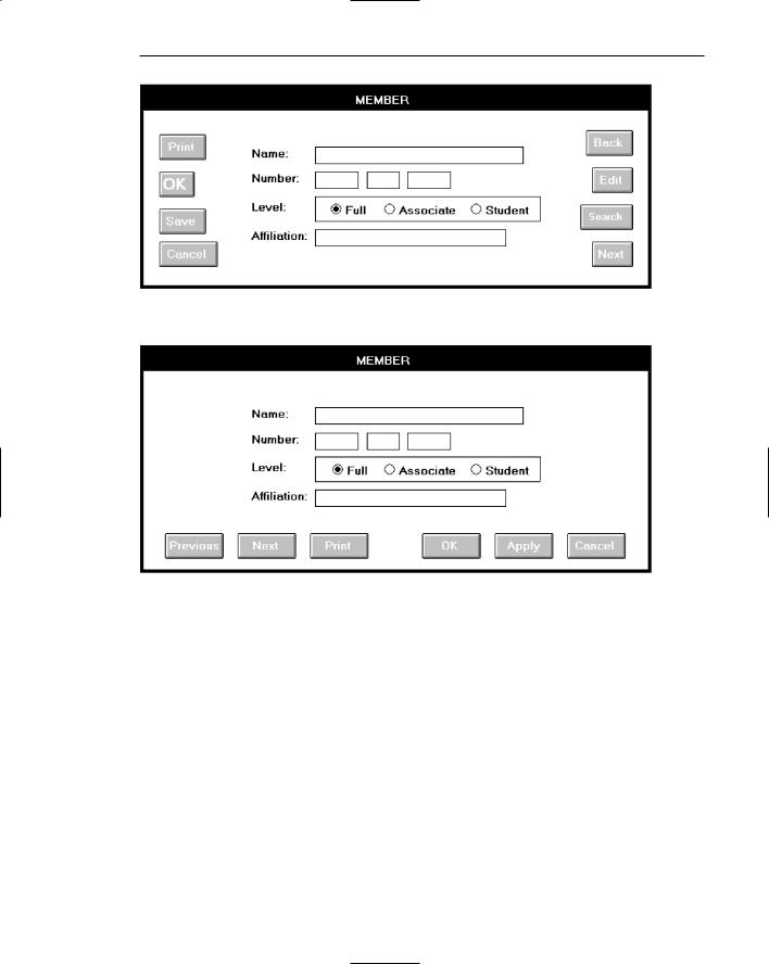
Step 7: Choose the Proper Screen-Based Controls 553
Screen 1.1
Screen 1.2
Screen 1.2
This shows a much better button design and presentation. Enhancements include: (1) The buttons are located at the bottom of the screen, in a position following the screen usage flow. (2) Button size is standardized, presenting generally larger targets. (3) Button label size is standardized. (4) The seemingly redundant buttons are eliminated.
(5) Function-specific buttons are grouped separately from standard buttons, and button groupings are created through a larger spacing between Print and OK. (6) Back, now called Previous, and Next are positioned together for fast paging reversal.
Example 2
Here inconsistent locations of command buttons are reviewed.

554 Part 2: The User Interface Design Process
Screens 2.1 to 2.4
These are the button locations found on four windows within a graphical system. Positions include spread out across the window’s bottom (Screen 2.1), left-justified at the bottom (Screen 2.2), centered along the right side (Screen 2.3), and top-justified along the right side (Screen 2.4). Memorization and prediction of button location will be very difficult, slowing down the experienced user.
Screen 2.5
Proper positioning would have found all the command buttons consistently positioned, as at the bottom center, illustrated in Screen 2.5.
Screen 2.1
Screen 2.2

Step 7: Choose the Proper Screen-Based Controls 555
Screen 2.3
Screen 2.4
Screen 2.5
556 Part 2: The User Interface Design Process
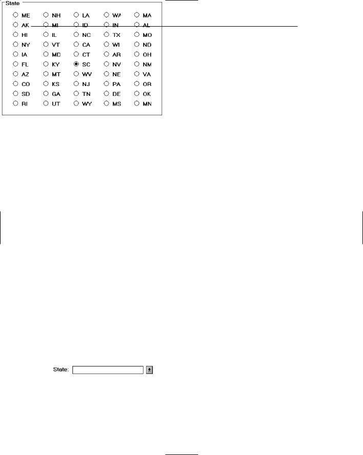
Example 3
This is an example of improper and proper use of a control.
Control 3.1
The names of states must be selected using radio buttons. Problems include: (1) The large number of choices presented makes scanning very difficult. (2) Are all the state abbreviations familiar to you, and all users? (3) The organization of states must have been established by a lottery. The name of the state I want is Mississippi. How do I find it in the array?
Control 3.2
This shows a much better alternative, a drop-down/pop-up combination box. If the state name is known, it can be typed in the field. Ideally, typing the state code, if known, will also be acceptable. If the name of a particular state is unknown, or if it’s spelling is unclear, the drop-down/pop-up can be retrieved and the state name selected from the list presented. Ideally, also, a misspelled keyed state name will still be correctly identified by the system and displayed properly.
Control 3.1
Control 3.2
Step 7: Choose the Proper Screen-Based Controls 557
Example 4
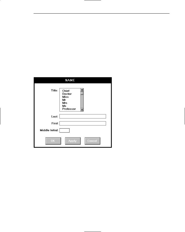
Here is another example of improper and proper use of a control.
Screen 4.1
A listing of names is being collected. A courtesy title is selected through list box; last name, first name, and middle initial are typed. The problem: The task is heavily keyboard intensive. To select a title requires shifting to an alternative device control, such as a mouse, or tabbing through the list box listing to find the proper title. This slows down the keying process and may be awkward. The list box also consumes a great deal of space on the screen.
Screen 4.1
Screen 4.2
A solution: Collect the courtesy title using a pop-up/drop-down combination box. Familiar titles may be quickly typed, along with the remainder of the name data. Rare or unusual titles may be identified by selecting, displaying, and searching the listing of all alternatives. The title may then be entered in the field by selecting from the list or keying it into the field.

558 Part 2: The User Interface Design Process
Screen 4.2
Example 5
Again, here is an example of improper and proper use of controls.
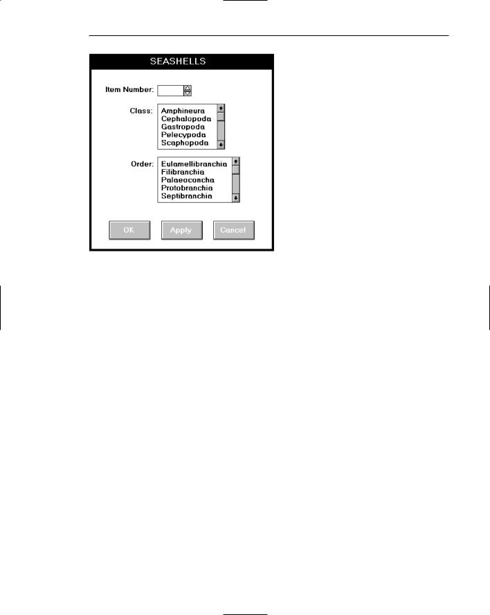
Screen 5.1
A collection of seashells is being cataloged by class and order. Text boxes are provided for the task. The catalog process includes typing words such as “Cephalopoda” and “Eulamellibranchia.” The process is slow and conducive to spelling errors.
Screen 5.1
Step 7: Choose the Proper Screen-Based Controls 559
Screen 5.2
Screen 5.2
A solution: Present Class and Order in list boxes from which the proper varieties are selected. This will speed up the cataloguing process and eliminate the possibility of spelling errors. To make the entire procedure a selection task, also make Item Number a selectable and incrementable spin box.
Example 6
Again, here is an example of improper and proper use of a control.
Screen 6.1
An international corporation is setting up a worldwide account database. Names from dozens of different countries are added each day. Country is collected though a spin box. Is this proper usage for a spin box?