

The Essential Guide to UI Design
.pdf
490 Part 2: The User Interface Design Process
Figure 7.55: Palette.
Graphical Representations
■Provide meaningful, accurate, and clear illustrations or representations of choices.
■Create images large enough to
—Clearly illustrate the available alternatives.
—Permit ease in pointing and selecting.
■Create images of equal size.
■Always test illustrations before implementing them.
Provide meaningful, accurate, and clear illustrations of alternative choices. Create equal size images large enough to illustrate clearly the available alternatives and permit ease in pointing and selecting. Always test illustrations with users before implementing them, to ensure that they will work satisfactorily. While most palettes will not possess textual choice descriptions, under certain circumstances textual descriptions may be needed. For example, a choice might require selection of a style of font. The palette may contain the names of the available styles (such as Roman) with the text displayed as the font style would actually appear.
Size
■ Present all available alternatives within the limits imposed by
— The size of the graphical representations. –– The screen display’s capabilities.
Because palettes will consume less screen space, more choices can be displayed in a given area of a screen than can be displayed when using textual descriptions. Present all available alternatives within the limits imposed by how big the graphical representations must be and the capabilities of the display hardware in creating clear illustrations. Limitations in people’s ability to accurately differentiate the kinds of graphical representations being presented must also be considered.

Step 7: Choose the Proper Screen-Based Controls 491
Layout
■Create boxes large enough to
—Effectively illustrate the available alternatives.
—Permit ease in pointing and selecting.
■Create boxes of equal size.
■Position the boxes adjacent to, or butted up against, one another.
■A columnar orientation is the preferred manner.
■If vertical space on the screen is limited, orient the choices horizontally.
Palette boxes must be large enough to illustrate effectively the available alternatives and to maximize ease in selecting. Created boxes should be of equal size and positioned adjacent to, or butted up against one another, because they are mutually exclusive choices. Columns are preferred, but horizontal rows can be used if space constraints exist on the screen.
Organization
■Arrange palettes in expected or normal order.
—For palettes arrayed top to bottom, begin ordering at the top.
—For palettes arrayed left to right, begin ordering at the left.
■If an expected or normal order does not exist, arrange choices by frequency of occurrence, sequence of use, importance, or alphabetically (if textual).
■If, under certain conditions, a choice is not available, display it subdued or less brightly than the other choices.
Palettes should be organized logically. If the alternatives have an expected order, follow it. Colors, for example, should be ordered from the right or top by their spectral position: red, orange, yellow, green, blue, indigo, and violet. If an expected or normal order does not exist, arrange choices by frequency of occurrence, sequence of use, or importance. Palettes with text may be arranged alphabetically. If, under certain conditions, a choice is not available, display the unavailable choice subdued or less brightly than the available choices.
Captions
■Provide a caption for each palette.
—On screens containing only one palette, the screen title may serve as the caption.
■Display the caption fully spelled out using mixed-case letters.
■Columnar orientation:
—The field caption may be positioned left-aligned above the palette.

492 Part 2: The User Interface Design Process
Figure 7.56
— Alternately, the caption may be positioned to the left of the topmost alternative.
Figure 7.57
■Horizontal orientation:
— The field caption may be positioned above the palette.
Figure 7.58
— Alternately, the caption may be positioned to the left of the alternatives.
Figure 7.59
Use a static text control to provide a caption for each palette. In screens containing only one palette, the screen title may serve as the caption. Display the caption fully spelled out using mixed-case letters, although some abbreviations may be used to achieve the alignment goals to be specified. Captions may be located above or to the left of the palette, as previously shown. With a horizontal orientation, the caption may be positioned above the palette or to the left of the alternatives. Positioning on any one screen will be dependent on other caption-control relationships within the screen.
Selection Method and Indication
■Pointing:
—Highlight the choice in some visually distinctive way when the pointer or cursor is resting on it and the choice is available for selection.

Step 7: Choose the Proper Screen-Based Controls 493
■Activation:
—When a choice is selected, distinguish it visually from the unselected choices by highlighting it in a manner different from when it is pointed at, or by placing a bold border around it.
■Defaults:
–– If a palette is displayed with a choice previously selected or a default choice, display the currently active choice in the manner used when it was selected.
Pointing. The selection target should be as large as possible in order to make it easy to move to. Highlight the selection choice in some visually distinctive way when the pointer or cursor is resting on it and the choice is available for selection.
Activation. When a choice is selected, distinguish it visually from the unselected choices by highlighting it in a manner different from when it is pointed at, or by placing a bolder border around it.
Defaults. If a palette is displayed with a choice previously selected or a default choice, display the currently active choice in the manner used when it was selected.
List Boxes
■Description:
—A permanently displayed box-shaped control containing a list of attributes or objects from which
•A single selection is made (mutually exclusive), or
•Multiple selections are made (non-mutually exclusive).
—The choice may be text, pictorial representations, or graphics.
—Selections are made by using a mouse to point and click.
—Capable of being scrolled to view large lists of choices.
—No text entry field exists in which to type text.
—A list box may be may be associated with a summary list box control, which allows the selected choice to be displayed or an item added to the list.
■Purpose:
—To display a collection of items containing
•Mutually exclusive options.
•Non-mutually-exclusive options.
■Advantages:
—Unlimited number of choices.
—Reminds users of available options.
—Box always visible.
■Disadvantages:
—Consumes screen space.
—Often requires an action (scrolling) to see all list choices.
—The list content may change, making it hard to find items.
—The list may be ordered in an unpredictable way, making it hard to find items.

494Part 2: The User Interface Design Process
■Proper usage:
—For selecting values or setting attributes.
—For choices that are
•Mutually exclusive (only one can be selected).
•Non-mutually exclusive (one or more may be selected).
—Where screen space is available.
—For data and choices that are
•Best represented textually.
•Not frequently selected.
•Not well known, easily learned, or remembered.
•Ordered in an unpredictable fashion.
•Frequently changed.
•Large in number.
•Fixed or variable in list length.
––When screen space or layout considerations make radio buttons or check boxes impractical.
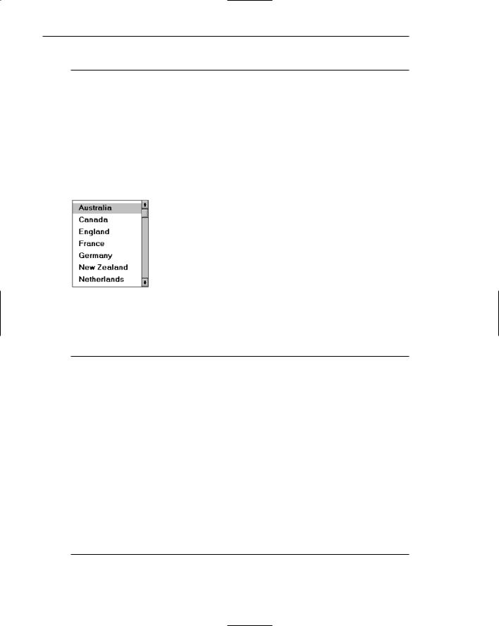
Description. A list box is a permanently displayed rectangular box control that contains a list of values or attributes from which single or multiple selections are made. It can also be referred to as a fixed list box because it is fixed on the screen. In Java, they are called lists, and in HTML, selection lists/scrolling lists. The choices are usually text, but they may be pictorial representations or graphics as well. A list box may be scrollable to view large lists, and the user uses a mouse to point and click to make selections. No text entry field exists in which to type text, but a single-selection list box may be associated with a text box where the selected choice is displayed or an item may be added to the list. Examples of singleselection list boxes are illustrated in Figure 7.60.
Purpose. The purpose of a list box is display a collection of items. The choices may be mutually exclusive (single-selection) or not mutually exclusive (multipleselection).
Advantages/disadvantages. List boxes are always visible, reminding users of the choices available. They permit an unlimited number of options to be displayed. Among their disadvantages are the excessive screen space they consume and the possible necessity for time-consuming scrolling to see all items. Because the list content can change, and items can be ordered in an unpredictable way, it can be hard to find items.
Proper usage. List boxes are used for selecting objects or values or setting attributes, either mutually exclusive or not, where sufficient screen space is available to display six to eight choices. Their best use is for data and choices that are textual; large in number; fixed or variable in list length; not well known, easily learned or remembered; and ordered in an unpredictable fashion. List box items should not have to be selected or changed frequently. List boxes may be used when screen space, list size, and data volatility considerations make use of radio buttons and check boxes impractical. The content of a list box is easier to change than that of radio buttons and check boxes.

Step 7: Choose the Proper Screen-Based Controls 495
Figure 7.60: List boxes.
List Box General Guidelines
First, general list box guidelines will be presented. Then, specific guidelines for singleand multiple-selection lists will be reviewed.
Selection Descriptions
■Clearly and meaningfully describe the choices available. Spell them out as fully as possible.
— Graphical representations must clearly represent the options.
■Present in mixed case, using the sentence style structure.
■Left-align into columns.
Selection descriptions will reflect the selection alternatives available. They should be meaningful, fully spelled out, and follow the sentence style of presentation. Array the descriptions into columns. Meaningful ordering schemes include logical order, frequency of use, sequence of use, and importance. If no such pattern exists, arrange the list alphabetically. Display the list of choices using mixed-case letters.
List Size
■No actual limit in size.
■Present all available alternatives.
■Require no more than 40 page-downs to search a list.
––If more are required, provide a method for using search criteria or scoping the options.
A list being displayed in a fixed list box has no actual size limit. All available alternatives should be capable of being displayed. Searching a very long list, however, can be very time-consuming. A list should not require more than 40 page-downs to completely search it. If more are necessary, provide a method for using search criteria or scoping the options, perhaps through a first-letter search.
496Part 2: The User Interface Design Process
Box Size
■Show as many items as possible, considering screen space constraints.
■Minimally, must be long enough to display six to eight items without requiring scrolling.
—Exceptions:
•If screen space constraints exist, the box may be reduced in size to display at least three items.
•If it is the major control within a window, the box may be larger.
—If more items are available than are visible in the box, provide vertical scrolling to display all items.
■Must be wide enough to display the longest possible choice.
Figure 7.61
—When box cannot be made wide enough to display the longest entry
•Make it wide enough to permit entries to be distinguishable, or,
•Break the long entries with an ellipsis (...) in the middle, or,
•Provide horizontal scrolling.
The exact size of a fixed list box will depend on its function and screen space constraints. Generally, boxes should be restricted to displaying no more than eight choices at one time. Larger boxes that eliminate the need for scrolling, however, are preferable to list boxes that require scrolling. If screen space constraints exist, the box may be reduced in size to display at least three items. If scrolling is necessary, include a scroll bar on the right side of the box.
The list box should be wide enough to display fully all item wording. When a box cannot be made wide enough to display the longest entry, make it wide enough to permit entries to be distinguishable, or, break the long entries with an ellipsis in the middle. If breaking long entries, preserve the important characteristics needed to distinguish them. When shortening an item’s name in this way, include a ToolTip that displays the item’s full name.
As a last resort, provide horizontal scrolling and a scroll bar at the bottom of the list box. Many people dislike horizontal scrolling, however.
Organization
■Order in a logical and meaningful way to permit easy browsing.
—Consider using separate controls to enable the user to change the sort order or filter items displayed in the list.

Step 7: Choose the Proper Screen-Based Controls 497
■If a particular choice is not available in the current context, omit it from the list.
––Exception: If it is important that the existence and unavailability of a particular list item be communicated, display the choice dimmed or grayed out instead of deleting it.
Choices should be organized logically to permit easy browsing. If the alternatives have an expected order, follow it. Other ordering schemes such as frequency of use, sequence of use, or importance may also be considered. When no obvious scheme exists, use alphabetic order. You can provide separate controls to enable the user to change the sort order or filter items displayed in the list.
If a particular choice is not available in the current context, it should be omitted from the list. If it is important that the existence and unavailability of a list item be communicated, however, display the choice dimmed or grayed out instead of deleting it.
Layout and Separation
■Enclose the choices in a box with a solid border.
— The border should be the same color as the choice descriptions.
■Leave one blank character position between the choice descriptions and the left border.
■Leave one blank character position between the longest choice description in the list and the right border, if possible.
Enclose the box in a solid border in the color of the choice descriptions. To provide adequate legibility, leave one space between the choice descriptions and the left border, and one space between the longest choice description and the right border.
Captions
■Use mixed-case letters.
■The preferred position of the control caption is above the upper-left corner of the list box.
Figure 7.62
—Alternately, the caption may be located to the left of the topmost choice description.

498 Part 2: The User Interface Design Process
Figure 7.63
• Be consistent in caption style and orientation within a screen, and related screens.
To identify the list box, a field caption in mixed-case letters, with each significant word capitalized is necessary. A list box does not have a caption, so create one using a static text control. Place this caption either above the upper-left corner of the box or to the left of the first choice description. The caption style chosen will again be dependent upon caption-control relationships in other controls included within the screen. It should be consistently oriented with the other control captions.
Disabling
■When a list box is disabled, display its caption and show its entries as grayed out or dimmed.
Display a list box’s caption and entries as dimmed or grayed when the list box is entirely disabled.
Selection Method and Indication
■Pointing:
—Highlight the selection choice in some visually distinctive way when the pointer or cursor is resting on it and the choice is available for selection.
■Selection:
—Use a reverse video or reverse color bar to surround the choice description when it is selected.
—The cursor should be as wide as the box itself.
Figure 7.64
— Mark the selected choice in a distinguishing way.

Step 7: Choose the Proper Screen-Based Controls 499
■Activation:
–– Require the pressing of a command button when an item, or items, is selected.
Pointing. Highlight the selection choice in some visually distinctive way when the pointer or cursor is resting on it and the choice is available for selection. One method used for this is to place a bold border around the choice.
Selection. Indicate the selected choice through use of a reverse video or reverse color bar, as wide as the box itself. Visually differentiate multiple-choice (nonexclusive) from single-choice (mutually exclusive) fixed list boxes, as described in the following sections.
Activation. Require the pressing of a command button when an item, or items, is selected. Double-clicking is difficult for many people. Always provide for a single click followed by a button press.
Single-Selection List Boxes
■Purpose:
—To permit selection of only one item from a large listing.
■Design guidelines:
—Related text box:
•If presented with an associated text box control,
—Position the list box below and as close as possible to the text box.
—The list box caption should be worded similarly to the text box caption.
Figure 7.65
—If the related text box and the list box are very close in proximity, the caption may be omitted from the list box.