

The Essential Guide to UI Design
.pdf
500 Part 2: The User Interface Design Process
Figure 7.66
––Use the same background color for the text box as is used in the list box.
—Defaults:
•When the list box is first displayed:
— Present the currently active choice highlighted or marked with a circle or diamond to the left of the entry.
— If a choice has not been previously selected, provide a default choice and display it in the same manner that is used in selecting it.
— If the list represents mixed values for a multiple selection, do not highlight an entry.
—Other:
•Follow other relevant list box guidelines.
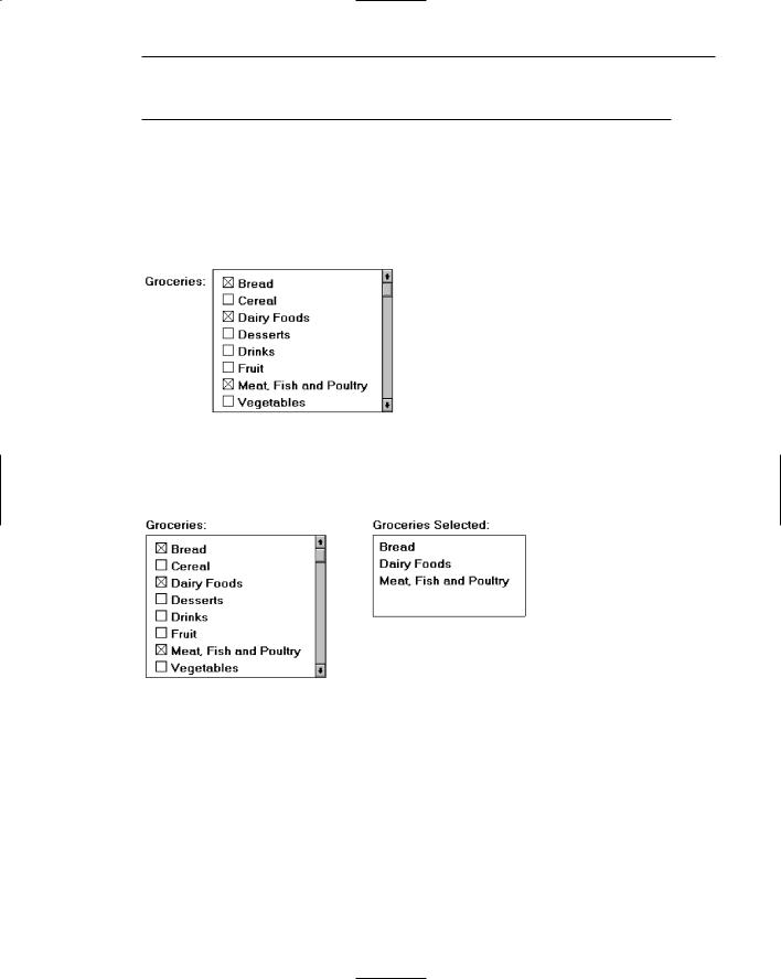
Purpose. A single-selection list box is used for selecting only one item in a list. It provides a mutually exclusive operation similar to a group of radio or option buttons. This kind of list box, however, can handle a large number of items more efficiently.
Related text box. If the list box is associated with a text field, position the list box below and as close as possible to the related text box. If this cannot be accomplished, position the text box to the left. Captions of related text boxes and list boxes must be worded similarly. If, however, the text box and the list box are located in close physical proximity, the caption may be omitted from the list box. Visually relate a list box to a text box by using the same background color for both boxes.
For single-selection fixed list boxes, indicate an active choice by highlighting it or marking it with a circle or diamond to the left of the choice description. If the list represents mixed values for a multiple selection, do not highlight any entry.
Step 7: Choose the Proper Screen-Based Controls 501
Extended and Multiple-Selection List Boxes
■Purpose:
—To permit selection of more than one item in a long listing.
•Extended list box: optimized for individual item or range selection.
•Multiple-selection list box: optimized for independent item selection.
■Design guidelines:
—Selection indication:
•Mark the selected choice with an X or check mark to the left of the entry.
Figure 7.67
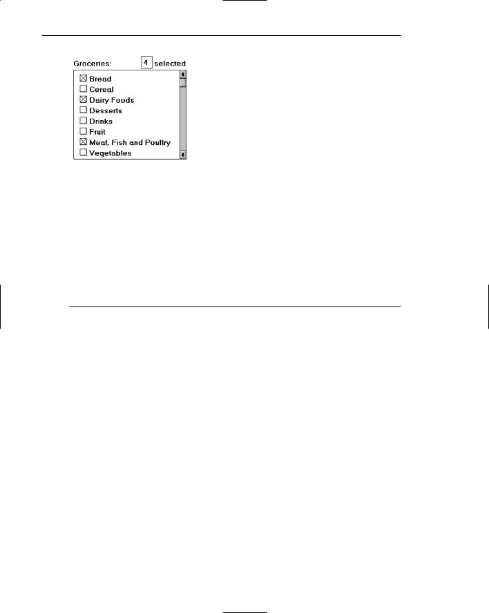
•Consider providing a summary list box.
—Position it to the right of the list box.
—Use the same colors for the summary list box as are used in the list box.
Figure 7.68
—Provide command buttons to Add (one item) or Add All (items) to the summary list box, and Remove (one item) or Remove All (items) from the summary list box.
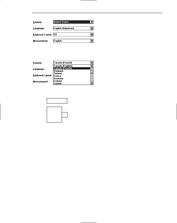
•Consider providing a display-only text control indicating how many choices have been selected.
—Position it justified upper-right above the list box.
502 Part 2: The User Interface Design Process
Figure 7.69
—Select All and Deselect All buttons
•Provide command buttons to accomplish fast Select All and Deselect All actions, when these actions must be frequently or quickly performed.
—Defaults:
•When the list box is first displayed:
––Display the currently active choices highlighted.
––Mark with an X or check mark to the left of the entry.
––If the list represents mixed values for a multiple selection, do not highlight an entry.
—Other:
•Follow other relevant list box guidelines.
Purpose. Multiple-selection list boxes permit selection of multiple items from a long listing. They provide a nonexclusive operation similar to a group of check boxes. This kind of list box, however, can handle a large number of items more efficiently. Extended list boxes are optimized for individual item or range selection. Multiple-selection list boxes are optimized for independent item selection.
Selection indication. For choice selections, mark them with an X or check mark to the left of the entry. Also consider providing a summary list box, another list box containing a compilation of the active selections from the multiple-selection list box. This will permit quick scanning and comparison of these active choices and greatly reduce the need for scrolling if the selectable list is lengthy. The summary list box can be made scrollable, if necessary. Position the summary list adjacent to, and to the right of, the multiple-selection list box. Use the same colors for the summary list box and the multiple-selection list box. Include command buttons to Add (one item) or Add All (items) to the summary list box, and Remove (one item) or Remove All (items) from the summary list box.
Also consider providing a display-only text box control indicating how many choices have been selected in the multiple-selection list box. This text box can be associated with either the multiple-selection or summary list box. It is useful in situations where the multiple selections may be numerous and all the choices cannot be seen without scrolling. It is also useful when the user must know exactly how many choices have been selected. Position this text box justified upper-right above the list box.

Step 7: Choose the Proper Screen-Based Controls 503
Select All and Deselect All buttons. Provide command buttons to accomplish fast “select all” and “deselect all” actions, when these actions must be frequently or quickly performed.
Defaults. When the list box is first displayed, the active selection will depend on previous activities. If a choice has been previously selected, display the currently active choice in the same manner used when it was selected. If the list represents mixed values for a multiple selection, do not highlight any list entries.
List View Controls
■Description:
—A special extended-selection list box that displays a collection of items, consisting of an icon and a label.
—The contents can be displayed in four different views:
•Large Icon: Items appear as a full-sized icon with a label below.
•Small Icon: Items appear as a small icon with label to the right.
•List: Items appear as a small icon with label to the right. ––Arrayed in a columnar, sorted layout.
•Report: Items appear as a line in a multicolumn format.
––Leftmost column includes icon and its label.
––Subsequent columns include application-specific information.
■Purpose and usage:
—Where the representation of objects as icons is appropriate.
–– To represent items with multiple columns of information.
Description. A list view control is a special extended-selection list box that displays a collection of items, each consisting of an icon and a label. List view controls can display content in four different views: large icon, small icon, list, and report. The control also supports options for aligning, selecting, and sorting icons, and for editing icon labels.
Purpose and usage. Use list views when the representation of objects as icons is appropriate, or to represent items with multiple columns of information.
Drop-Down/Pop-Up List Boxes
■Description:
—A single rectangular control that shows one item with a small button to the right side.
•The button provides a visual cue that an associated selection box is available but hidden.
—When the button is selected, a larger associated box appears, containing a list of choices from which one may be selected.

504Part 2: The User Interface Design Process
—Selections are made by using the mouse to point and click.
—Text may not be typed into the control.
■Purpose:
—To select one item from a large list of mutually exclusive options when screen space is limited.
■Advantages:
—Unlimited number of choices.
—Reminds users of available options.
—Conserves screen space.
■Disadvantages:
—Requires an extra action to display the list of choices.
—When displayed, all choices may not always be visible, requiring scrolling.
—The list may be ordered in an unpredictable way, making it hard to find items.
■Proper usage:
—For selecting values or setting attributes.
—For choices that are mutually exclusive (only one can be selected).
—Where screen space is limited.
—For data and choices that are
•Best represented textually.
•Infrequently selected.
•Not well known, easily learned, or remembered.
•Ordered in a unpredictable fashion.
•Large in number.
•Variable or fixed in list length.
—Use drop-down/pop-up lists when
•Screen space or layout considerations make radio buttons or single-selection list boxes impractical.
•The first, or displayed, item will be selected most of the time.
–– Do not use a drop-down list if it important that all options be seen together.
Description. A drop-down/pop-up list box is a single rectangular field with a small button to the side and an associated hidden list of options. In Java, they are called choice/pop-up lists, in HTML, selection lists/pop-up menus. The button provides a visual cue to the user that an associated selection box of choices is hidden but available on demand. When requested, a larger associated rectangular box appears containing a scrollable list of choices from which one is selected. Selections are made by using the mouse to point and click. No text field exists in which to type text.
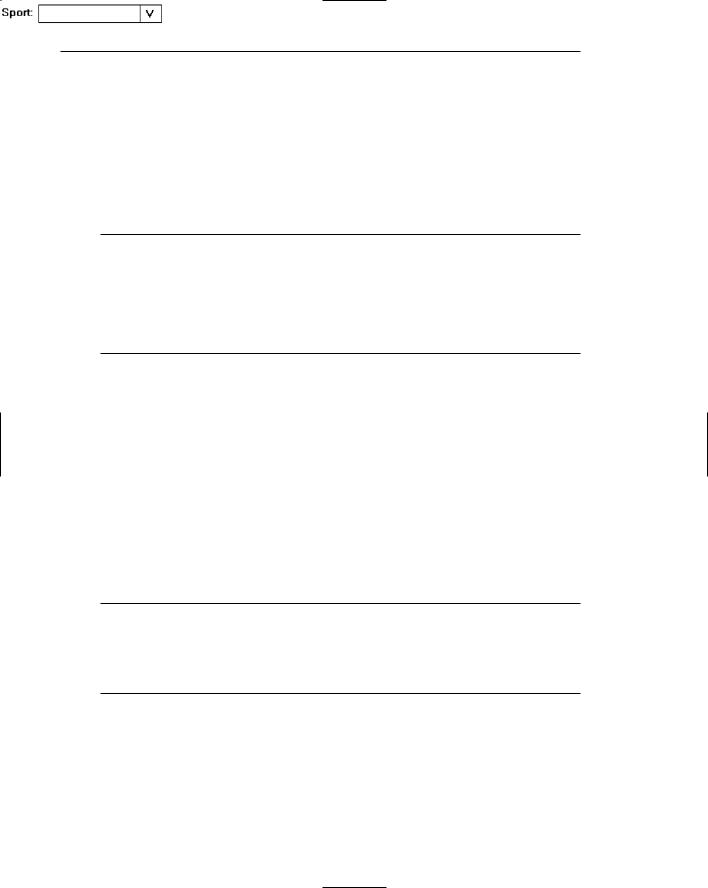
Fields of this nature go by many different names. They are called drop-down lists because they appear to drop down from the single-selection field. Microsoft Windows calls them drop-down list boxes. Other common names are pull-down lists, option menus, and simply list boxes. Other list boxes of this type seem to pop up on the screen, either next to or over the selection field. Even a Microsoft Windows “drop-down” will “pop up” if it is opened near the bottom of the screen. In this discussion, these variously named controls will be given the generic name of drop-down/pop-up list boxes. A drop-down list is illustrated in Figures 7.70 and 7.71. Figure 7.72 shows a pop-up list.
Step 7: Choose the Proper Screen-Based Controls 505
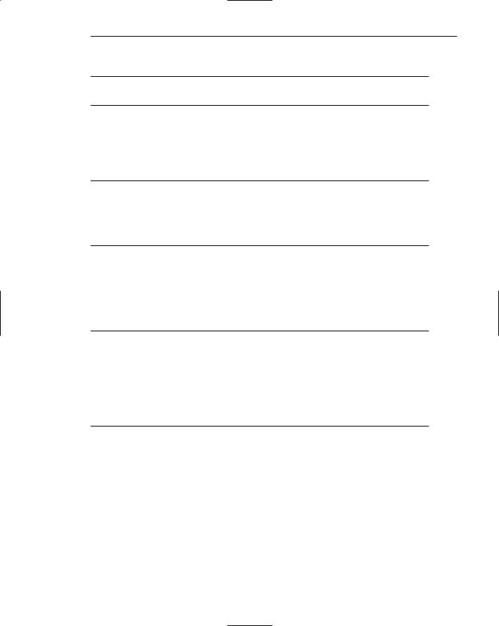
Figure 7.70: Drop-down list boxes. There are four unopened boxes: Country, Language, Keyboard Layout, and Measurement.
Figure 7.71: Drop-down list box opened for Country.
Horizontal: Left |
▲ |
▼ |
Set
Right
Horizontal: Centered ▲
Left
▼
Full
Figure 7.72: Pop-up list box, closed and opened.
Purpose. The purpose of these list boxes is to permit selection from a large set of mutually exclusive choices when screen space is scarce.
Advantages/disadvantages. The most useful feature of drop-down/pop-up list boxes is that they conserve screen space. They may be retrieved on demand, reminding users of the choices available. They permit an unlimited number of options to be displayed.
A significant disadvantage of these lists is that they necessitate an extra step to display the available options. Scrolling may also be necessary to see all items. Because items can be ordered in an unpredictable way, they can be hard to find occasionally. Generally, drop-down/pop-up list boxes require more work on the part of the user than many other screen controls because of the activation step and the possible need for scrolling. A study comparing drop-down/pop-up lists to other similar controls will be described later in this step.
Proper usage. Drop-down/pop-up list boxes are used much like regular list boxes, except that the choices are not visible at all times. They are used for selecting values or setting attributes when sufficient screen space is not available to display the choices permanently. Their best use is for data and choices that are textual; large in number; fixed or variable in list length; not well known, easily learned or
506 Part 2: The User Interface Design Process
remembered; and ordered in an unpredictable fashion. Items should not have to be selected frequently. Drop-down/ pop-up lists are most useful when screen space or layout considerations make radio buttons or single-selection list boxes impractical. It is also desirable that most users select the first, or displayed, item in the listing so the box does not have to be opened. Never use a drop- down/pop-up list if it is important that all options be seen together at one time.
Prompt Button
■Provide a visual cue that a box is hidden by including a downward pointing arrow, or other meaningful image, to the right side of the selection field.
— Position the button directly against, or within, the selection field.
Figure 7.73
Most systems indicate the presence of a drop-down or pop-up list by associating a meaningful icon with the applicable field. This icon can be seen positioned to the left of the selection field, within the selection field as is done by Microsoft Windows, or to the right of the selection field. Other platforms do not provide any visual indication that a hidden list is available. An indication to the user that a drop-down or pop-up list is available should be indicated on the screen. This is especially critical if not all fields have associated hidden lists. The best location is to the right of the selection field where it is out of the way until needed. To visually differentiate it from another control (the drop-down/pop-up combination box), position the button abutting or within the selection field. (A drop-down/pop-up combination box button will be separated by a space.) The indicator should be large enough to provide a good pointing target.
Selection Descriptions
■Clearly and meaningfully describe the choices available. Spell them out as fully as possible.
—Graphical representations must clearly represent the options.
—Left-align them in columns.
–– Display the descriptions using mixed-case letters.
Selection descriptions will reflect what choices exist in the control. They should be meaningful, fully spelled out, and organized in columns. Display the list of choices using mixed-case letters. Box descriptions should be displayed in the same color as the selection field text. If a particular choice is not available in the current context, it should be omitted from the list.

Step 7: Choose the Proper Screen-Based Controls 507
List Size
■Not limited in size.
■Present all available alternatives.
A list being displayed in a drop-down/pop-up list box has no size limit. All available alternatives should be capable of being displayed. It would seem practical that for large scrollable lists, the same rules as presented for list boxes should also be applied. Restrict page-downs to no more than 40 and provide a method to scope actions.
Box Size
■Long enough to display six to eight choices without scrolling.
—If more than eight choices are available, provide vertical scrolling to display all items.
■Wide enough to display the longest possible choice.
■When a box cannot be made wide enough to display the longest entry
—Make it wide enough to permit entries to be distinguishable, or,
—Break long entries with ellipses (...) in the middle, or,
–– Provide horizontal scrolling.
Drop-down/pop-up list boxes should be restricted to eight or fewer choices. If more must be displayed, permit scrolling and include a scroll bar on the right side of the box. The list box should be wide enough to fully display all selection choice wording. When a box cannot be made wide enough to display the longest entry, make it wide enough to permit entries to be distinguishable, or break the long entries, inserting an ellipsis in the middle. If breaking entries, preserve the important characteristics needed to distinguish them. When shortening an item’s name in this way, include a ToolTip that displays the item’s full name. As a last resort, provide horizontal scrolling and a scroll bar at the bottom of the list box. Avoid horizontal scrolling whenever possible, however.
Organization
■Order in a logical and meaningful way to permit easy browsing.
■If a particular choice is not available in the current context, omit it from the list.
––Exception: If it is important that the existence and unavailability of a particular list item be communicated, display the choice dimmed or grayed out instead of deleting it.
508 Part 2: The User Interface Design Process
Selection choices should be organized logically. If the alternatives have an expected order, follow it. Other ordering schemes such as frequency of use, sequence of use, or importance, may also be considered. Always begin ordering at the top or left. If, under certain conditions, a choice is not available, display the unavailable choice subdued or less brightly than the available choices.
Layout and Separation
■Enclose the choices in a box composed of a solid line border.
—The border should be the same color as the choice descriptions.
—Leave one blank character position between the choices and the left border.
––Leave one blank character position between the longest choice description in the list and the right border, if possible.
To provide adequate legibility, leave one space between the choice descriptions and the left border, and one space between the longest choice description and the right border. Extending the listing box to the right edge of the prompt button allows the user to move easily from the button to the list. To set off the box from the screen body background, use the same color background for the box as is used in the entry field. Also incorporate a solid line border around the box in the same color as the choice descriptions.
Captions
■Display using mixed-case letters.
■Position the caption to the left of the box.
–– Alternately, it may be positioned left-justified above the box.
To identify the drop-down/pop-up list box, a field caption in mixed-case letters, with each significant word capitalized is necessary. Use a static text control to create the caption. The recommended position is to the box’s left. Select a positioning consistent with other controls presented on the window.
Defaults
■When the drop-down/pop-up listing is first presented, display the currently set value.
■If a choice has not been previously selected, provide a default choice.
When the drop-down/pop-up listing is first presented, display the currently set value. If a choice has not been previously selected, provide a default choice. The list must be opened to change the choice.
Step 7: Choose the Proper Screen-Based Controls 509
Disabling
■When a drop-down/pop-up list box is disabled, display its caption and entries as disabled or dimmed.
Display a drop-down/pop-up list box’s caption and entries as dimmed or grayed out when the list box is entirely disabled.
Selection Method and Indication
■Pointing:
—Highlight the selection choice in some visually distinctive way when the pointer or cursor is resting on it and the choice is available for selection.
■Activation:
–– Close the drop-down/pop-up list box when an item is selected.
Highlight the selection choice in some visually distinctive way when the pointer or cursor is resting on it and the choice is available for selection. Close the listing when an item is selected.
Combination Entry/Selection Controls
It is possible for a control to possess the characteristics of both a text field and a selection field. In this type of control, information may either be keyed into the field or selected and placed within it. The types of combination entry/selection fields are spin boxes, attached combination boxes, and drop-down/pop-up combination boxes.
Spin Boxes
■Description:
—A single-line field followed by two small, vertically arranged buttons.
•The top button has an arrow pointing up.
•The bottom button has an arrow pointing down.
—Selection/entry is made by
•Using the mouse to point at one of the directional buttons and clicking. Items will change by one unit or step with each click.
•Keying a value directly into the field itself.
■Purpose:
—To make a selection by either scrolling through a small set of meaningful predefined choices or typing text.
■Advantages:
—Consumes little screen space.
—Flexible, permitting selection or typed entry.