

BIG PICTURE
Find a big view. It could be an urban or a rural vista. Before you focus on details, look across the full range of it for how the colors and forms come together to give you a feeling of the place. Distance creates perspective, in the same way that stepping back from your work allows you to see how the piece is coming together.
PRACTICE
•Look at the landscape as a whole. Pick out something that interests you and put down that first color, trying to match its value as best you can. Focus on the main elements and simplify; tuning out details will allow you to concentrate on the big notes of color that you first see.
•Look for big shapes of color, as if the scene before you was a puzzle. Paint the proportions of color—for example, is it 75 percent blue with purple accents? Divide up your paper to reflect the proportions you see in front of you.
•Observe the layers of color; break the vista into foreground, middle ground, and background. The area closest to you typically has the strongest colors, shifting to midtones as you move back in space, often ending in a muted blue gray in the distance.
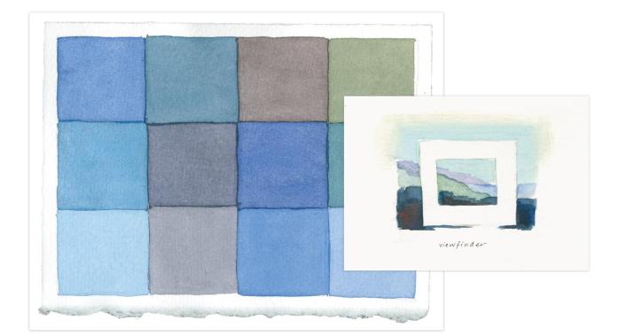
•Sometimes the view is just too big to focus on. A simple viewfinder helps our brains make sense of the chaos. I use a 3” x 3” square and a 2” x 4” rectangle made of heavyweight paper. Hold the viewfinder at arm’s length to find a composition of colors that you want to paint.
•Capture ephemeral events. While I was painting a palette of a view one day, a bluebird swooped in. I quickly added his intense blue against the lime-green grasses into my palette. It provided a welcome accent of an opposite color and made the palette more interesting.
•Create a series of three palettes from the same view. If it’s big, break it into sections and do a palette for each section, then look at them side by side.
DETAIL
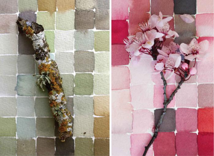
Inspecting small things invites you to look carefully and slowly. Get specific: a color is often not just one color but many shades and gradations. Note the way color changes as it wraps around a form. An apple might have a highlight of yellow shifting toward orange red, then cool violet as it approaches the curved edge, transitioning to a warm purple shadow. There are many shades of gray in a rock, or pinks in a cherry blossom sprig. In every season, there are many wonderful, small moments to enjoy in the natural world.
PRACTICE
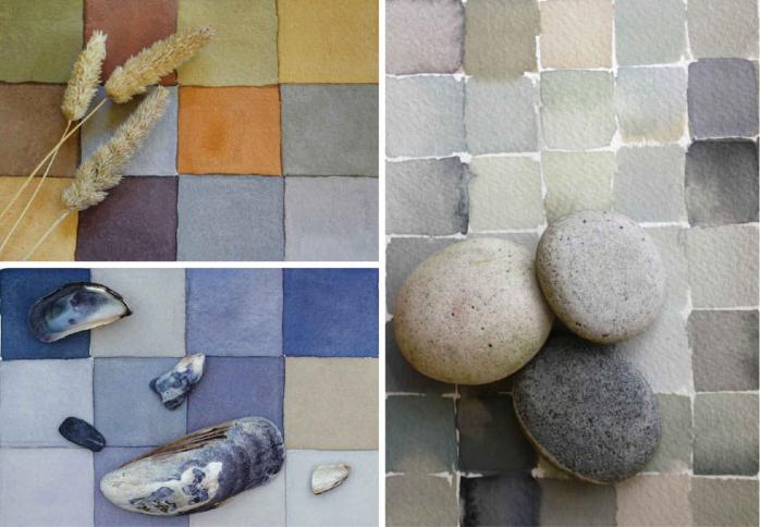
•Find a small object and explore all the notes of color. From these, create a value study. What are the lightest lights, the darkest darks, and all the hues in between? Keep mixing and trying out the paints until you think you have it right. To create a more detailed palette, try using just one brush width for each note of color.
•While you’re working, keep your brush loose and your body relaxed. From time to time, step back from your work and get some perspective on it. Walk away and then come back. Turn the paper upside down. You may see things in a new light.