PREPARATION
Paper Size & Grid
I like to use a 5.5” x 7.5” sheet of paper when painting a color palette. A 20” x 30” piece of watercolor paper is a good place to start for a variety of paper sizes; fold it in half, creasing with a bone folder a few times, then tear. Keep folding and tearing until you have the sizes you want.
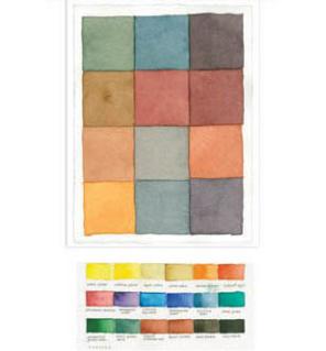
On one of the pieces, lightly pencil in a frame about a half-inch from the edge to leave room for notes, and draw a 12-box grid.
A grid allows you to create a replicable structure so you can compare palettes over time. Experiment with your own dimensions and grid.
Pigments & Color Theory
Whether you are working with tube or pan pigments, there are hundreds of colors to make by mixing paint. Start by painting swatches of all your colors so you know what you are working with.
From color theory we know that any three primary colors, a triad, can make many colors that will be harmonious. I work with a variety of triads—various blues, reds, and yellows—to achieve a larger range of bright and subdued colors. I sometimes use an even more limited palette of just two colors, but I’m also quick to bend the rules and experiment with other color mixes. Mixing color and water in different proportions can create thousands of colors. Different palettes are useful for different subjects and views.
The beauty of working with tubes is that you can customize your own palettes. I know painters who bring different sets of colors with them, depending on where they are traveling: for example, in the American Southwest where there are warm, subdued earth colors, or in India, with its riot of color.