


COLOR MEMORY
Artists mine their memories to inspire painting. This is time travel using colors as stepping-stones into your memory bank. To find your color memories, look within to the colors stored in your life experiences, a place between memory, dream, and presence.
PRACTICE
For these practices, you may want to work larger, on a 11” x 15” watercolor paper, to encourage a sense of freedom. Limit yourself to twenty minutes for each memory exercise. This is a fun exercise to do with friends and compare memories.
•Close your eyes and think back to a place or object in a particular moment in your life, whether yesterday or years ago: a summer day in your childhood, the view from your bedroom window, a favorite object, a place you loved.
•Start by writing details you remember on the paper, or start with the color and add the words later. Beginning anywhere on the paper, fill the page. Be generous with the color. Mix one color you remember and let the process lead you to other colors.
•Don’t worry if the colors run or overlap, and don’t think about what it looks like. Take that little note of color in your memory and say to yourself, “Was that a teal green? Or was it lighter? Or greener?”
•If you feel stuck, invite in all of your senses to ignite your memory. The more you do this exercise, the more your memories will flow, so try doing more than one.
NAMING COLORS
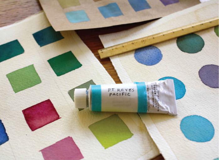
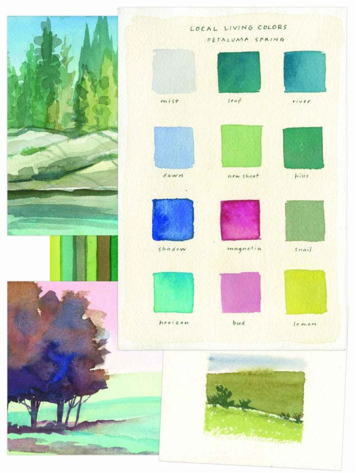
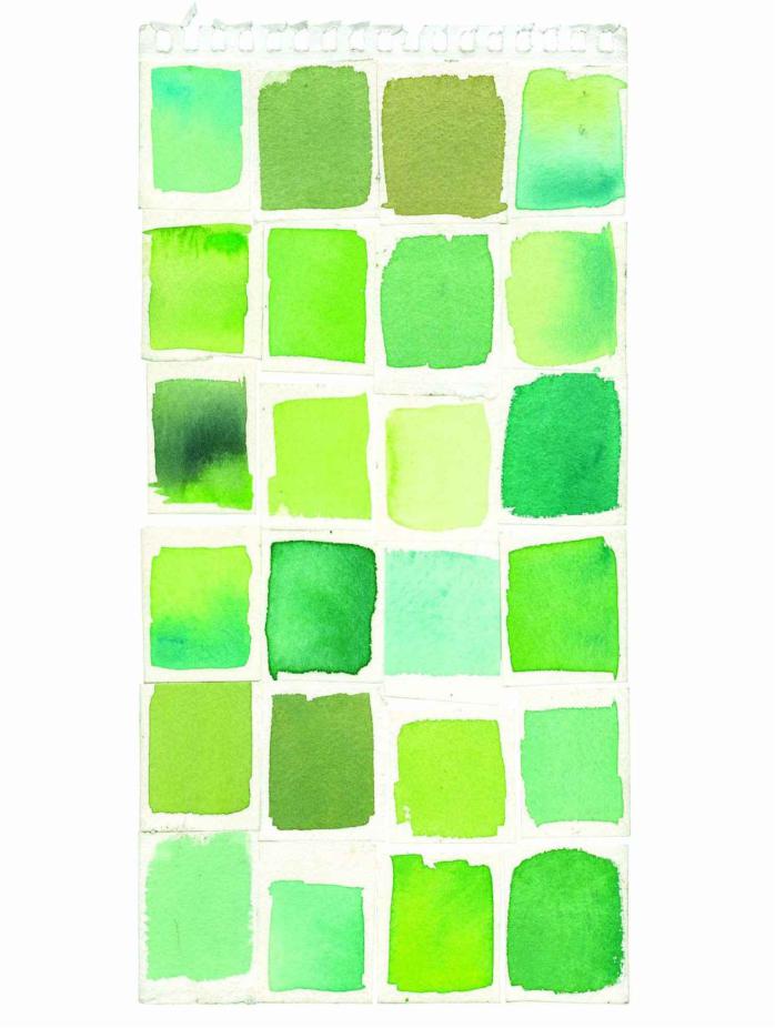
From the time we were coloring with crayons, colors were given names: blizzard blue, shocking pink, jungle green, cornflower, maize. Names are useful, giving us a collective language. But consider naming colors for yourself, from your own experience, and have fun developing your own personal color vocabulary. Are you painting Maine-rock gray, tree-bark gray, misty-Atlantic gray, pigeon-feather gray, sidewalk gray?
I like to rename my colors and make them more personal to me. You can also rename colors to make them more personal to you. What has more resonance—Pantone 299 or Point Reyes Pacific Blue? Each place inspires new color names. Every day can bring a new set of names.
PRACTICE
•Wherever you are right now, look around. Consider everything part of the local color and part of your palette of place. What would you name the color of the tea you are drinking? The color of the wall as the sun hits it? The No. 2 Dixon Ticonderoga pencil? The colors of your friend’s eyes?
•What qualities can you use to describe your color names: light, dark, deep, gentle, luminous, dull, soft, transparent, opaque? “Deep scarlet plum” has more detail than “red.” Colors have their own energies and moods: happy, moody, pensive, calm, thrilling, quirky. Combine words and color and see what you come up with.
CHAPTER SIX
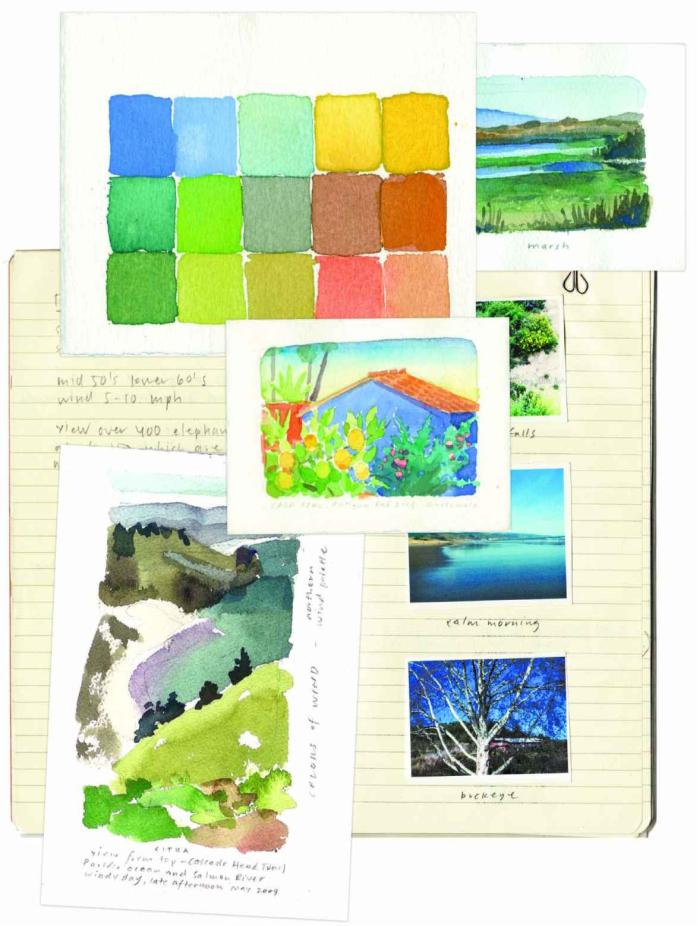
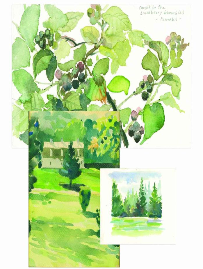
Palettes to Painting: Some Places
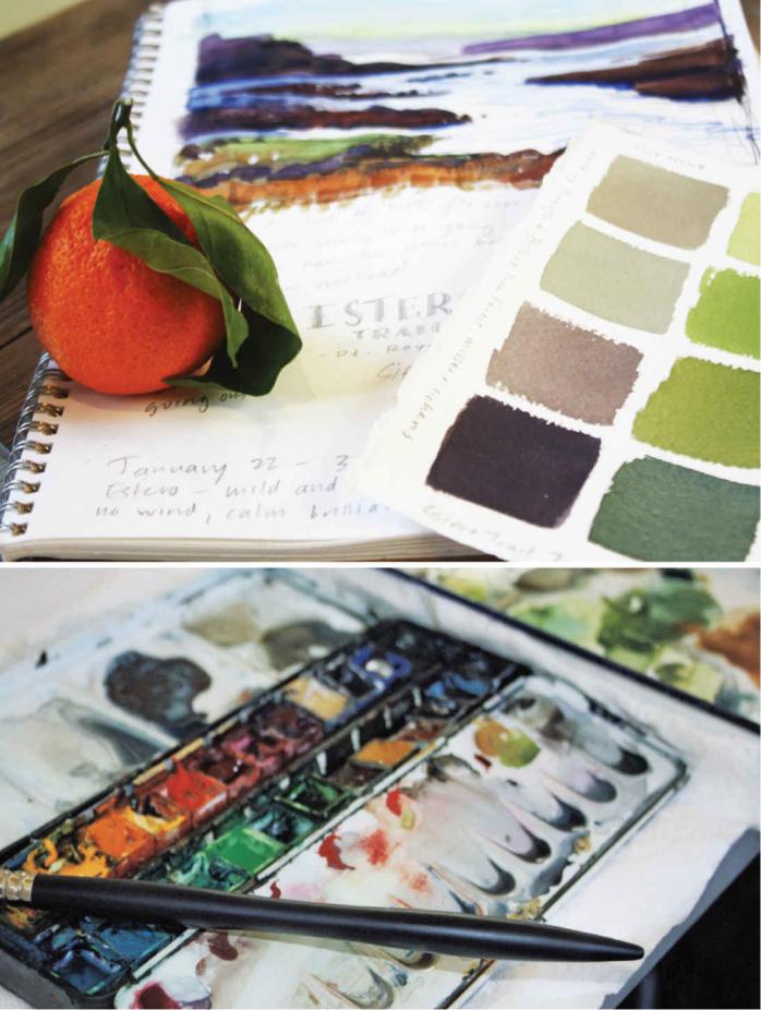
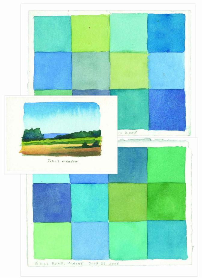
There is no perfection in painting. It is an ongoing practice that invites you to open your eyes to the world around you and cultivate your sense of curiosity and wonder.
Through creating color palettes, I look more deeply and intensely at the colors I see, then move them into a painting.

CHAPTER SEVEN
Color Mixing: The Basics
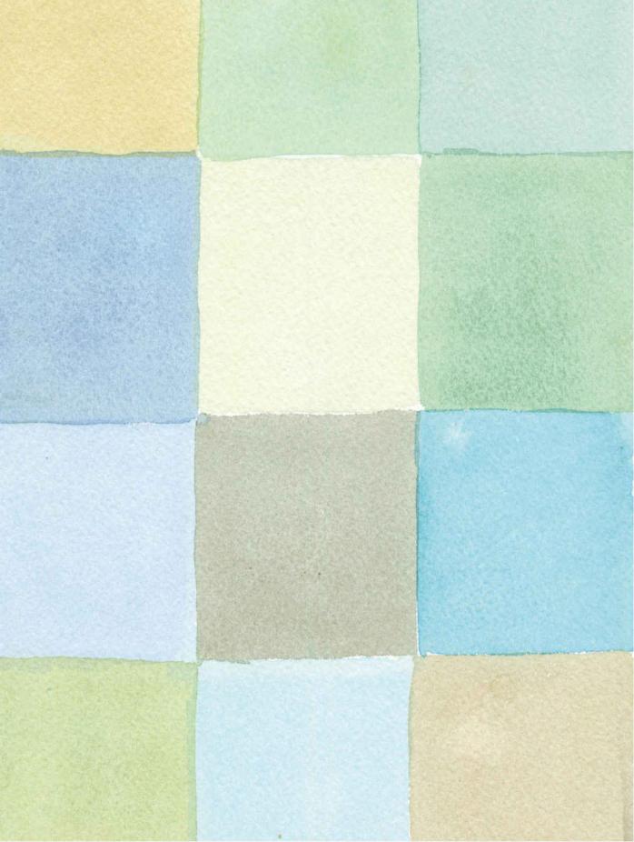
Color mixing is a key part of developing your color sense. You need to experiment in order to learn how colors interact when you mix them. As you do, you will develop an intimate knowledge of how your materials work together: the ratio of pigment to water, the differences between transparent and opaque pigments, cool versus warm colors, knowing your brushes, and all the nuances of color mixing. By practicing mixing colors, you’ll know what to use to get the color you want when you’re out in the field. Try out pigments from different manufacturers to see the properties of each.
There are no mistakes. It’s about experimentation—see what happens when you put unusual colors together. Start developing recipes that you like. Take notes.
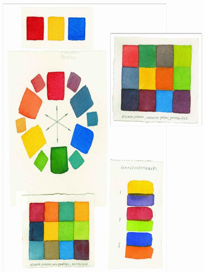
There’s a world of resources, both in books and online, about color principles and paint mixing. Here are the basics.
Limited palette 1 (clear and bright): Permanent rose, lemon yellow, cobalt blue
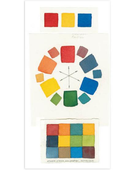
Limited palette 2 (versatile):
Permanent alizarin crimson, new gamboge, Prussian blue
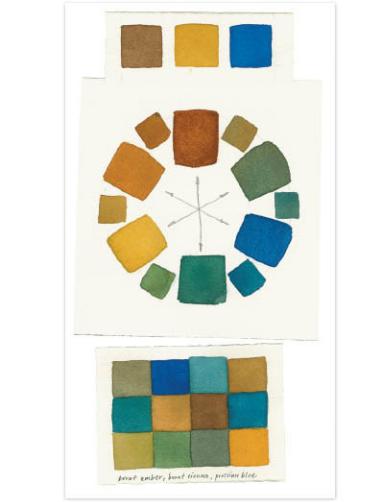
Limited palette 3 (earth-based palette): Burnt umber, burnt sienna, Prussian blue
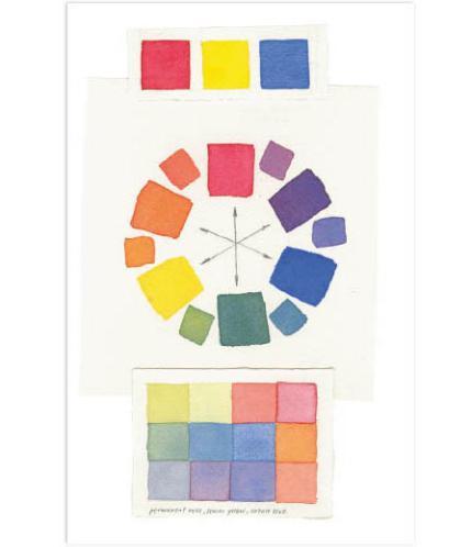
Limited palette 4 (basic and bold):
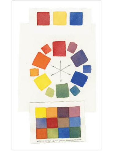
Permanent alizarin crimson, lemon yellow, ultramarine blue