


Managing Layout
6.7.4. Modal Windows
A modal window is a child window that has to be closed by the user before the use of the parent window can continue. Dialog windows are typically modal. The advantage of modal windows is the simplification of user interaction, which may contribute to the clarity of the user interface. Modal windows are also easy to use from a development perspective, because as user interaction is isolated to them, changes in application state are more limited while the modal window is open. The disadvantage of modal windows is that they can restrict workflow too much.
Figure 6.10. Screenshot of the Modal Window Demo Application
Depending on theme settings, the parent window may be grayed while the modal window is open.
The demo application of Vaadin includes an example of using modal windows. Figure 6.10, “Screenshot of the Modal Window Demo Application” above is from the demo application. The example includes the source code.
Security Warning
Modality of child windows is purely a client-side feature and can be circumvented with client-side attack code. You should not trust in the modality of child windows in security-critical situations such as login windows.
6.8. HorizontalSplitPanel and VerticalSplitPanel
HorizontalSplitPanel and VerticalSplitPanel are a two-component containers that divide the available space into two areas to accomodate the two components. HorizontalSplitPanel makes the split horizontally with a vertical splitter bar, and VerticalSplitPanel vertically with a horizontal splitter bar. The user can drag the bar to adjust its position.
You can set the two components with the setFirstComponent() and setSecondComponent() methods, or with the regular addComponent() method.
190 |
Modal Windows |

Managing Layout
// Have a panel to put stuff in
Panel panel = new Panel("Split Panels Inside This Panel");
//Have a horizontal split panel as its root layout HorizontalSplitPanel hsplit = new HorizontalSplitPanel(); panel.setContent(hsplit);
//Put a component in the left panel
Tree tree = new Tree("Menu", TreeExample.createTreeContent()); hsplit.setFirstComponent(tree);
//Put a vertical split panel in the right panel VerticalSplitPanel vsplit = new VerticalSplitPanel(); hsplit.setSecondComponent(vsplit);
//Put other components in the right panel vsplit.addComponent(new Label("Here's the upper panel")); vsplit.addComponent(new Label("Here's the lower panel"));
The result is shown in Figure 6.11, “HorizontalSplitPanel and VerticalSplitPanel”. Observe that the tree is cut horizontally as it can not fit in the layout. If its height exceeds the height of the panel, a vertical scroll bar will appear automatically. If horizontal scroll bar is necessary, you could put the content in a Panel, which can have scroll bars in both directions.
Figure 6.11. HorizontalSplitPanel and VerticalSplitPanel
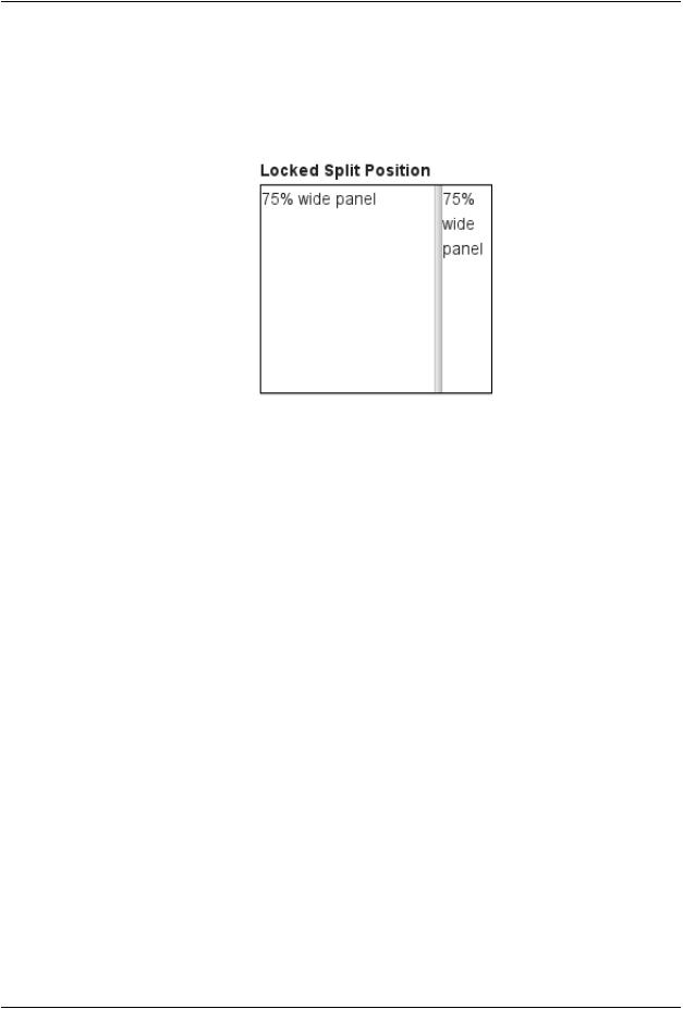
You can set the split position with setSplitPosition(). It accepts any units defined in the Sizeable interface, with percentual size relative to the size of the component.
// Have a horizontal split panel
HorizontalSplitPanel hsplit = new HorizontalSplitPanel(); hsplit.setFirstComponent(new Label("75% wide panel")); hsplit.setSecondComponent(new Label("25% wide panel"));
// Set the position of the splitter as percentage hsplit.setSplitPosition(75, Sizeable.UNITS_PERCENTAGE);
Another version of the setSplitPosition() method allows leaving out the unit, using the same unit as previously.The method also has versions take take a boolean parameter, reverse, which allows defining the size of the right or bottom panel instead of the left or top panel.
The split bar allows the user to adjust the split position by dragging the bar with mouse. To lock the split bar, use setLocked(true). When locked, the move handle in the middle of the bar is disabled.
HorizontalSplitPanel and VerticalSplitPanel |
191 |
Managing Layout
// Lock the splitter hsplit.setLocked(true);
Setting the split position programmatically and locking the split bar is illustrated in Figure 6.12, “A Layout With Nested SplitPanels”.
Figure 6.12. A Layout With Nested SplitPanels
Notice that the size of a split panel must not be undefined in the split direction.
CSS Style Rules
/* For a horizontal SplitPanel. */
.v-splitpanel-horizontal {}
.v-splitpanel-hsplitter {}
.v-splitpanel-hsplitter-locked {}
/* For a vertical SplitPanel. */
.v-splitpanel-vertical {}
.v-splitpanel-vsplitter {}
.v-splitpanel-vsplitter-locked {}
/* The two container panels. */
.v-splitpanel-first-container {} /* Top or left panel. */
.v-splitpanel-second-container {} /* Bottom or right panel. */
The entire split panel has the style v-splitpanel-horizontal or v-splitpanel-vertical, depending on the panel direction. The split bar or splitter between the two content panels has either the ...-splitter or ...-splitter-locked style, depending on whether its position is locked or not.
6.9. TabSheet
The TabSheet is a multicomponent container that allows switching between the components with "tabs". The tabs are organized as a tab bar at the top of the tab sheet. Clicking on a tab opens its contained component in the main display area of the layout.
You add new tabs to a tab sheet with the addTab() method. The simple version of the method takes as its parameter the root component of the tab.You can use the root component to retrieve its corresponding Tab object. Typically, you put a layout component as the root component.
// Create an empty tab sheet. TabSheet tabsheet = new TabSheet();
192 |
CSS Style Rules |

Managing Layout
//Create a component to put in a tab and put
//some content in it.
VerticalLayout myTabRoot = new VerticalLayout(); myTabRoot.addComponent(new Label("Hello, I am a Tab!"));
//Add the component to the tab sheet as a new tab. tabsheet.addTab(myTabRoot);
//Get the Tab holding the component and set its caption. tabsheet.getTab(myTabRoot).setCaption("My Tab");
Each tab in a tab sheet is represented as a Tab object, which manages the tab caption, icon, and attributes such as hidden and visible. You can set the caption with setCaption() and the icon with setIcon(). If the component added with addTab() has a caption or icon, it is used as the default for the Tab object. However, changing the attributes of the root component later does not affect the tab, but you must make the setting through the Tab object. The addTab() returns the new Tab object, so you can easily set an attribute using the reference.
// Set an attribute using the returned reference tabsheet.addTab(myTab).setCaption("My Tab");
You can also give the caption and the icon as parameters for the addTab() method.The following example demonstrates the creation of a simple tab sheet, where each tab shows a different Label component. The tabs have an icon, which are (in this example) loaded as Java class loader resources from the application.
TabSheet tabsheet = new TabSheet();
// Make the tabsheet shrink to fit the contents. tabsheet.setSizeUndefined();
tabsheet.addTab(new Label("Contents of the first tab"), "First Tab",
new ClassResource("images/Mercury_small.png")); tabsheet.addTab(new Label("Contents of the second tab"),
"Second Tab",
new ClassResource("images/Venus_small.png")); tabsheet.addTab(new Label("Contents of the third tab"),
"Third tab",
new ClassResource("images/Earth_small.png"));
Figure 6.13. A Simple TabSheet Layout
The hideTabs() method allows hiding the tab bar entirely.This can be useful in tabbed document interfaces (TDI) when there is only one tab. An individual tab can be made invisible by setting setVisible(false) for the Tab object. A tab can be disabled by setting setEnabled(false).
Clicking on a tab selects it. This fires a TabSheet.SelectedTabChangeEvent, which you can handle by implementing the TabSheet.SelectedTabChangeListener interface. The source component of the event, which you can retrieve with getSource() method of the event, will be the TabSheet component. You can find the currently selected tab with getSelectedTab() and select (open) a particular tab programmatically with setSelectedTab(). Notice that also adding the first tab fires the SelectedTabChangeEvent, which may cause problems in your handler if you assume that everything is initialized before the first change event.
TabSheet |
193 |

Managing Layout
The example below demonstrates handling TabSheet related events and enabling and disabling tabs. The sort of logic used in the example is useful in sequential user interfaces, often called wizards, where the user goes through the tabs one by one, but can return back if needed.
import com.vaadin.ui.*;
import com.vaadin.ui.Button.ClickEvent;
import com.vaadin.ui.TabSheet.SelectedTabChangeEvent;
public class TabSheetExample extends CustomComponent implements Button.ClickListener, TabSheet.SelectedTabChangeListener {
TabSheet tabsheet = new TabSheet();
Button tab1 = new Button("Push this button"); Label tab2 = new Label("Contents of Second Tab"); Label tab3 = new Label("Contents of Third Tab");
TabSheetExample() {
setCompositionRoot(tabsheet);
//Listen for changes in tab selection. tabsheet.addListener(this);
//First tab contains a button, for which we
//listen button click events. tab1.addListener(this);
//This will cause a selectedTabChange() call. tabsheet.addTab(tab1, "First Tab", null);
//A tab that is initially invisible. tabsheet.addTab(tab2, "Second Tab", null); tabsheet.getTab(tab2).setVisible(false);
//A tab that is initially disabled. tabsheet.addTab(tab3, "Third tab", null); tabsheet.getTab(tab3).setEnabled(false);
}
public void buttonClick(ClickEvent event) {
//Enable the invisible and disabled tabs. tabsheet.getTab(tab2).setVisible(true); tabsheet.getTab(tab3).setEnabled(true);
//Change selection automatically to second tab. tabsheet.setSelectedTab(tab2);
}
public void selectedTabChange(SelectedTabChangeEvent event) {
//Cast to a TabSheet. This isn't really necessary in
//this example, as we have only one TabSheet component,
//but would be useful if there were multiple TabSheets. final TabSheet source = (TabSheet) event.getSource();
if (source == tabsheet) {
//If the first tab was selected.
if (source.getSelectedTab() == tab1) {
// The 2. and 3. tabs may not have been set yet. if (tabsheet.getTab(tab2) != null
&& tabsheet.getTab(tab3) != null) { tabsheet.getTab(tab2).setVisible(false);
tabsheet.getTab(tab3).setEnabled(false);
}
}
}
}
}
194 |
TabSheet |