Chapter 4
Windows Forms
Solutions in this chapter:
■Introducing Windows Forms
■Writing a Simple Windows Forms Application
■Writing a Simple Text Editor
■Using the ListView and TreeView Controls
■Creating Controls
;Summary
;Solutions Fast Track
;Frequently Asked Questions
137
138 Chapter 4 • Windows Forms
Introduction
With so much focus on Web-based user interfaces, it’s easy to dismiss the traditional Windows architecture when developing for the Internet.The recent popularity, however, of peer-to-peer file sharing and online chat programs demonstrates that the “rich client” can work extremely well over the Internet, and provide features unavailable in thin client model.The .NET platform provides a modern solution for developing Windows applications, with the following key features:
■A revamped object-oriented model, with a focus on consistency and extensibility
■A rapid application development environment in Visual Studio
■Easy access to the Internet through .NET networking libraries and Web Services
■Managed execution environment that allows custom controls to be hosted in a Web page
■Compilation to a small executable
And, of course, you no longer have any installation worries—you just need to copy a small executable to the target machine and run it. Rich client has become thin.
The components provided in the .NET library for writing Windows applications can broadly be divided into two groups:Windows Forms (the components that manage windows and controls) and the graphics device interface known as GDI+ (the classes that encapsulate the lower-level graphics functions).This chapter covers Windows Forms in some detail, also touching upon GDI+, and it takes you step by step through the process of creating typical rich client applications.
Introducing Windows Forms
In essence,Windows Forms is a collection of classes and types that encapsulate and extend the Win32 API in a tidy object model. In other words, the components used to create Windows GUI applications are provided as .NET classes and types that form part of an orderly hierarchy.
This hierarchy is defined by inheritance: Simple reusable classes such as Component are provided, and then used as a base from which more sophisticated classes are derived.We can draw a useful overview by representing the inheritance
www.syngress.com
Windows Forms • Chapter 4 |
139 |
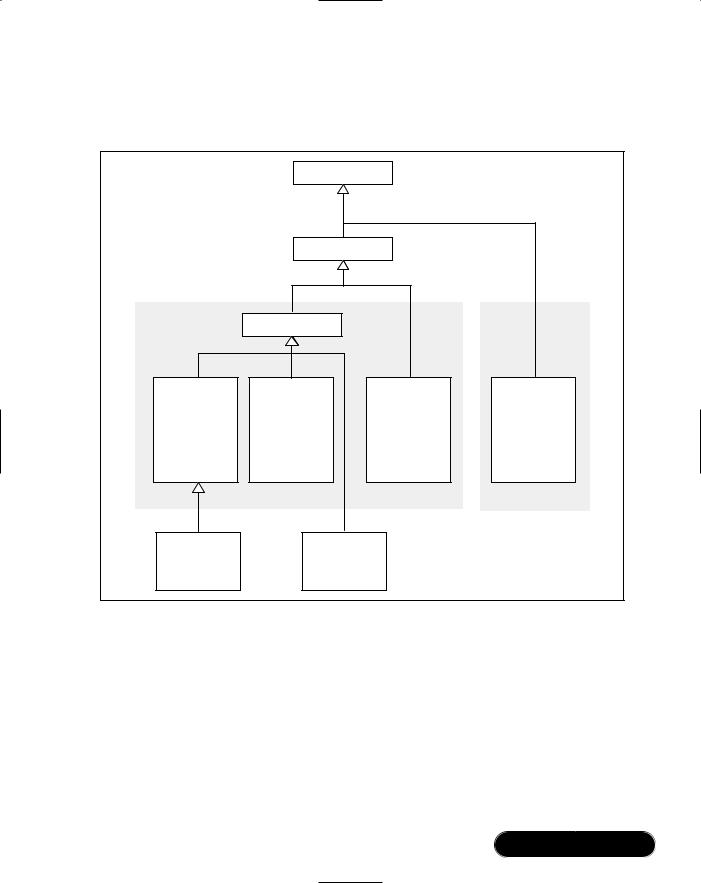
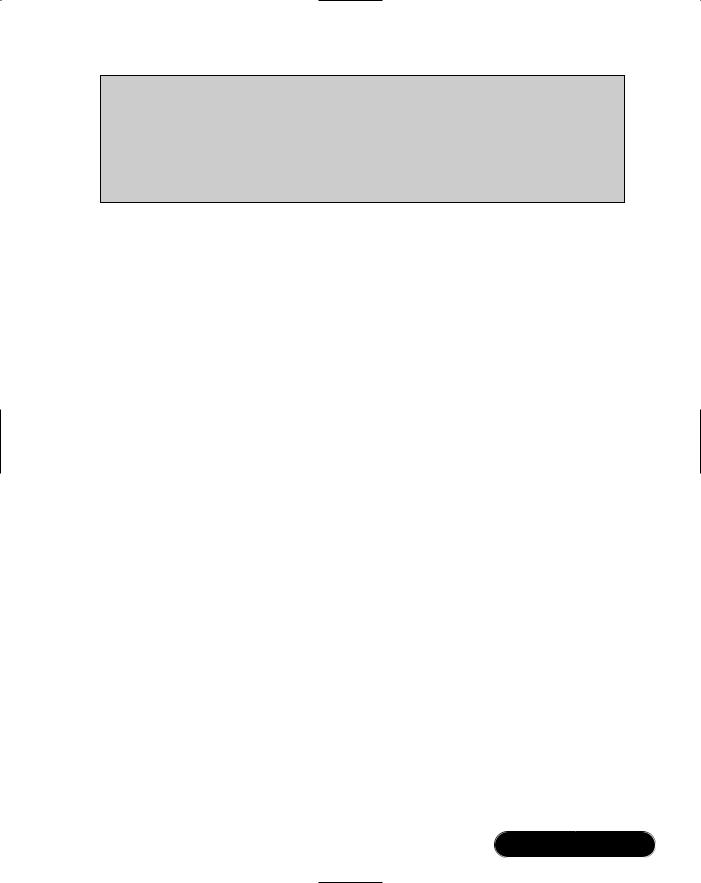
hierarchy in a treelike diagram. Figure 4.1 summarizes at a high level the classes that comprise Windows Forms and GDI+.
Figure 4.1 A Summary of Window Forms and GDI+ Classes
|
|
Object |
|
|
|
|
Component |
|
|
|
Control |
|
|
|
Containers Hosting |
Windows Forms |
Windows Forms |
GDI+ Classes |
|
Child Controls |
Controls |
Components |
Graphics |
|
Form |
Label |
Timer |
||
Pen |
||||
Panel |
Button |
MainMenu |
Brush |
|
TabPage |
TextBox |
ImageList |
Bitmap |
|
GroupBox |
CheckBox |
... |
... |
|
UserControl |
ListBox |
|
|
|
... |
... |
|
|
|
|
|
System.Windows.Forms |
System.Drawing |
|
Subclassed Forms |
|
Custom Controls |
|
|
and UserControls |
|
drawn with GDI+ |
|
The arrows represent inheritance: Control assumes all the functionality of Component, which assumes all the functionality of Object.Table 4.1 provides a quick and pragmatic summary of the four essential classes on which the Windows Forms types are based.
www.syngress.com

140 Chapter 4 • Windows Forms
Table 4.1 Core Classes
Class |
What It Does |
Why We Need It |
Object |
Acts as a base class for all |
|
types in the .NET Framework. |
For a tidy unified type system, and to provide core functionality available to all types (such as ToString).
Component Provides the basics of containership, facilitates hosting in a visual designer, and defines a protocol for resource disposal.
So Visual Studio’s Designer can host a wide variety of controls and components in a generic way, to provide a base from which you can write nonvisual components, and to allow the cleanup of Windows handles and file handles in a timely and reliable manner.
Control |
Provides the core functionality |
|
for a visual control that |
|
responds to mouse and key- |
|
board messages, accepts focus, |
|
and can participate in drag- |
|
and-drop operations. |
As a common superclass for all controls, such as textboxes, labels, and buttons, allowing them to be treated in a consistent manner, as well as providing a base from which you can derive your own custom controls.
Form |
Defines a class representing a |
|
window to which you can add |
|
controls. |
To provide a base class with standard windowing and containership functionality that you can subclass to create forms in your application.
Creating a Windows Forms application is largely just a matter of instantiating and extending the Windows Forms and GDI+ classes. In a nutshell, you typically complete the following steps:
1.Create a new project defining the structure of a Windows Forms application.
2.Define one or more Forms (classes derived from the Form class) for the windows in your application.
3.Use the Designer to add controls to your forms (such as textboxes and checkboxes), and then configure the controls by setting their properties and attaching event handlers.
www.syngress.com

Windows Forms • Chapter 4 |
141 |
4.Add other Designer-managed components, such as menus or image lists.
5.Add code to your form classes to provide functionality.
6.Write custom controls to meet special requirements, using GDI+ classes to handle low-level graphics.
In this chapter, we cover each of these steps through a series of walkthroughs. Starting with a new Windows Forms project, we visually add controls to a simple form, add an event handler, and then demonstrate how controls can be added at runtime. In the next walkthrough, we write a simple text editor, illustrating menus, single and multiple-document interfaces, dialog forms, and visual inheritance. In the following example, we introduce the ListView and TreeView controls, going step-by-step through the process of setting up a splitter, adding a context menu, and enabling drag and drop between the controls. In the final walkthrough, we write our own controls—starting with a simple address container and finishing with a scrolling text banner.We then show how custom controls can be hosted on an HTML page—demonstrating how C# and Windows Forms can be used to write Java-like Internet applets.
Writing a Simple Windows
Forms Application
The first step to building a Windows Forms application is creating a project. A Windows Forms project is just like any other type of project in that it consists of a grouping of source code files, a list of references to required .NET code libraries, and an appropriate configuration of compilation and debugging options. When you use Visual Studio to create a project from a template, it sets all of this up for you, providing a “skeleton” appropriate to the template you’ve selected. In the case of Windows Forms, this consists of the following:
■A project of Output Type Windows Application.You can view or change this in the Project | Properties dialog box.
■References to the .NET assemblies required for typical Windows Forms applications (covering most of the types in the Windows Forms namespace). You can see a list of the project references in the Solution Explorer.
■A blank form, called Form1 (a C# class with the structure required for a visually editable form).
■A Main method in Form1 that instantiates and displays the form.
www.syngress.com
142 Chapter 4 • Windows Forms
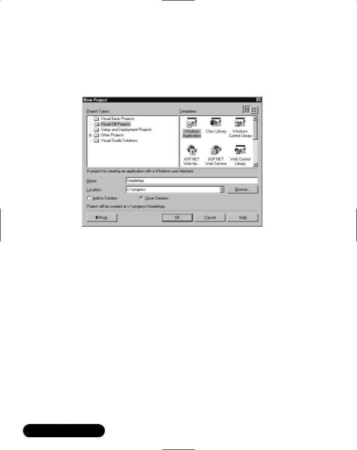
Let’s start the walkthrough by creating a new Windows Forms project. From the main menu, choose File | New | Project, click Visual C# Projects, and choose the Windows Application template (see Figure 4.2). Change the project name to SimpleApp and click OK.
Figure 4.2 Creating a New Windows Forms Project
Adding Controls
Once we’ve created the project,Visual Studio opens the main form (Form1) in the Designer—the visual editor for our C# form class. Basically, a form created in Visual Studio is just a C# file, defining a class based on System.Windows.Forms.Form, containing code to add and configure the controls created visually.Visual Studio is a “two-way tool” meaning that we can work with the same code either visually (using the Designer) or programmatically (in the Code Editor).
Let’s use the Designer to add a few controls to Form1.We can add controls and components from the toolbox window and then configure them using the Properties window.
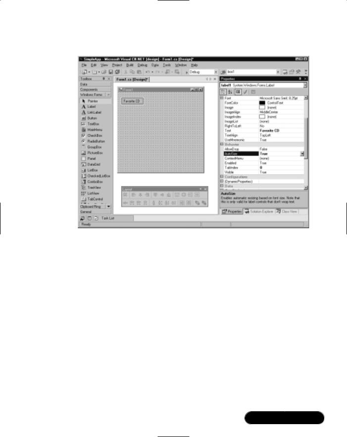
1.From the toolbox, add a Label control to the form. By default,Visual Studio will name the control Label1.
2.From the Properties Window (F4) change label1’s Text property to Favorite CD, and change its AutoSize property to True (see Figure 4.3). This tells the control to size itself according to the metrics of the font and width of the text.
www.syngress.com
Windows Forms • Chapter 4 |
143 |
Figure 4.3 Adding and Configuring a Label Control
3.Now add a TextBox from the toolbox onto the form, and position it below the label. Enlarge it horizontally and clear its Text property.
4.Add another label to the form, setting its Text property to Favorite Style, and AutoSize property to True.
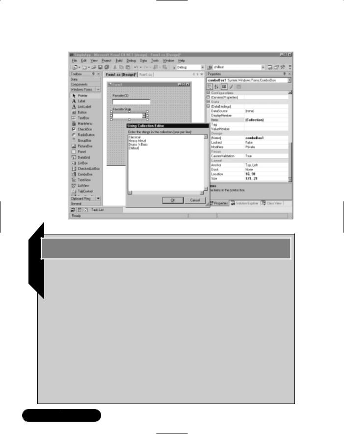
5.Add a ComboBox and position it below the Favorite Style label. Clear its Text property.
6.Select the combo’s Items property, and then click the ellipses on the right to open the String Collection Editor.Type in a few styles of music— each on a separate line, as shown in Figure 4.4.
7.Click OK, and then press F5 to save, compile, and run the application.
www.syngress.com
144 Chapter 4 • Windows Forms
Figure 4.4 Populating a ComboBox Items Collection
Developing & Deploying…
Working with Controls: Using TextBoxes
To create and work with textboxes having more than one line:
1.Set MultiLine to True and AutoSize to False.
2.Set AcceptsTab and AcceptsReturn to True to allow tabs and new lines to be entered via the keyboard.
3.Set the ScrollBars property to Vertical (or Both if WordWrap is false).
4.Use the Lines property to access the control’s text one line at a time.
5.Use \r\n for a new line, for example, Flat 18\r\nQueen St.
To use the control for entering a password, set the PasswordChar property to *. To read or update selected text, use the SelectionStart,
SelectionLength, and SelectedText properties.
www.syngress.com

Windows Forms • Chapter 4 |
145 |
Adding an Event Handler
Let’s add some functionality to the form.
1.Add a Button and ListBox to the form.
2.Select the button, and change its Text property to Update.Then click the lightning icon in the Properties window to switch to the Events View (see Figure 4.5).
Figure 4.5 Properties Window Events View
Think of these events as “hooks” into which we can attach our own methods.You can either double-click on an event to create a new eventhandling method, or use the drop-down list to connect into an existing compatible method.
3.Double-click on the Click event.Visual Studio will write a skeleton event-handling method, wiring it to the event. It will then place you in the Code Editor, inside the empty method definition:
private void button1_Click(object sender, System.EventArgs e)
{
}
The .NET convention for event handling requires two parameters: a sender parameter of type object, and an event arguments parameter of
www.syngress.com
146 Chapter 4 • Windows Forms
type EventArgs—or a descendant of EventArgs.The sender parameter tells us which control fired the event (this is useful when many controls have been wired to the same event-handling method).The second parameter is designed to supply special data about the event. In the case of Click, we have a standard EventArgs object, and this contains no useful infor- mation—it’s just there to meet the protocol required to support more sophisticated events (such as KeyPress or MouseDown).
The actual name for this method (button1_Click) is just a convenient identifier generated by Visual Studio;Windows Forms doesn’t impose any particular naming convention.
4. Add the following code to the event handler:
private void button1_Click(object sender, System.EventArgs e)
{
listBox1.Items.Clear();
listBox1.Items.Add ("Fav CD: " + textBox1.Text);
listBox1.Items.Add ("Fav Style: " + comboBox1.Text);
}
Here we’re manipulating our list box through its Items property. Items returns a collection object, having methods to add and remove items from its list. Note how we access each control through its name—this is possible because the Designer creates class fields matching the names of each control.You can see these declarations at the top of the class definition.
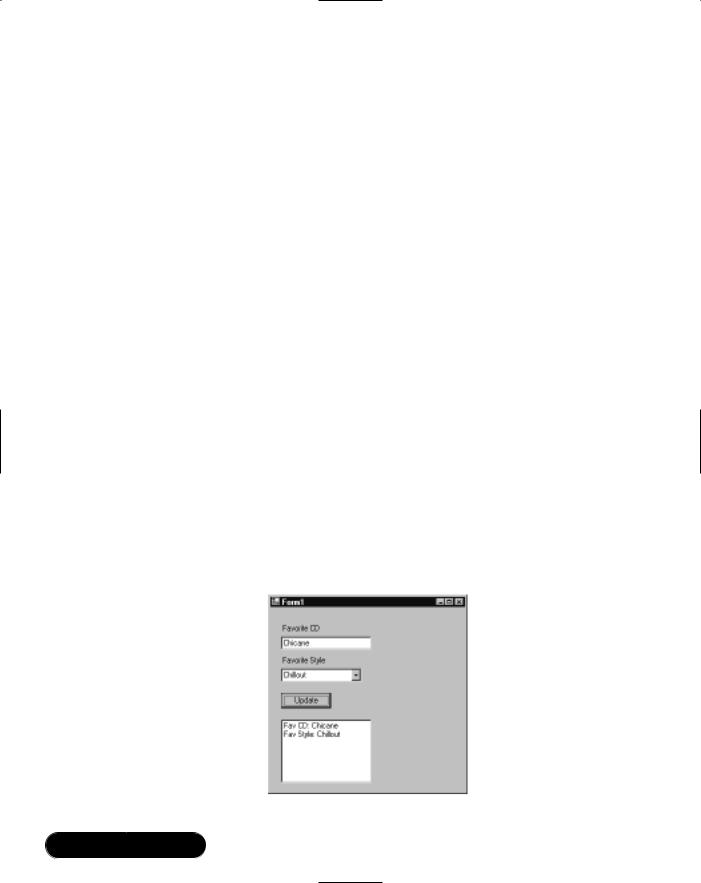
5.Press F5 to compile and run the program (see Figure 4.6).
Figure 4.6 Running a Simple Windows Forms Application
www.syngress.com
Windows Forms • Chapter 4 |
147 |
Developing & Deploying…
Working with Controls: Using the
ComboBox and ListBox Controls
To add items to the controls’ selection lists programmatically:
1.Call the Item property’s Add method to append to the end of the list, for example:
myControl.Items.Add ("My New Item");
2.Use the Item property’s Insert method to insert within the list.
3.Because these methods expect an Object type, the item you add can be of any class, including your own (this is polymorphism in action—one of the benefits of a working in an object-oriented language). The control simply calls the item’s ToString method to determine what to display.
To get the currently selected item:
1.Use the Text property to return a string.
2.Use SelectedIndex to get a numeric position within the list.
3.Use SelectedItem to get an object reference. If the item is of your own custom class, you’ll need to explicitly cast the returned value back to your type.
To allow the user to select only from items in a ComboBox list, set the DropDownStyle property to DropDownList.
Adding Controls at Runtime
Sometimes it’s necessary to add controls without the help of the Designer. For instance, you might want some controls to appear on a form only when a particular button is clicked.
In learning how to programmatically add controls, it’s very helpful to examine a visually created form in the Code Editor. If you expand the Designer Generated Code region, you’ll see a method called InitializeComponent containing all the code that creates and configures each of the form’s visual components.
www.syngress.com
148 Chapter 4 • Windows Forms
WARNING
Although reading Designer-generated code is useful in understanding how components are instantiated and configured, you shouldn’t make manual changes to this code without exercising some caution. In particular, you should check that the control renders as expected in the Designer before saving the form. You should also check your code after making some visual change—Visual Studio completely rewrites the Designer-generated code section, so your modifications may not appear as originally entered.
Here are the four steps to programmatically adding a control or component:
1.Add a class field declaration for the new control.
2.Instantiate the control.
3.Configure the control by setting its properties and adding event handlers, if required.
4.Add the control to the form’s Controls collection (or alternatively, to the Controls collection of a container control, such as a GroupBox).
Let’s work through an example: we’ll create a new form, add a button, and then have a textbox appear when the user clicks the button:
1.Create a new Windows Forms project called SimpleApp2 and add a Button control from the toolbox onto the new form.
2.Press F7 to open the Code Editor, and locate button1’s declaration. Below this, add a similar declaration for our new textbox, as follows (you can exclude the System.Windows.Forms prefix if your form has the appropriate using statement):
private System.Windows.Forms.Button button1;
private System.Windows.Forms.TextBox myTextBox;
You need to understand that this declaration doesn’t actually create a textbox. All it does is instruct the compiler, once our form is instantiated, to create a field that can reference (point to) a textbox object—one that does not yet exist.This declaration exists so as to provide a convenient way to refer to the control throughout the lifetime of the form. In the cases where we don’t need to explicitly reference the control after its been created, we can do away with this declaration.
www.syngress.com
Windows Forms • Chapter 4 |
149 |
3.Return to the Designer, and double-click on the button.This is a quick way to attach an event handler to the button’s default event (Click).
4.Add the following code to the button’s event handler:
private void button1_Click(object sender, System.EventArgs e)
{
// Create the actual textbox and assign its reference to myTextBox
this.myTextBox = new TextBox();
//Position the control myTextBox.Location = new Point (30, 20);
//Put the control on the form. this.Controls.Add (myTextBox);
}
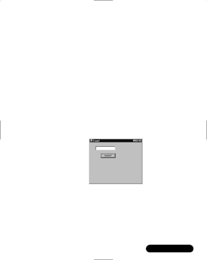
5.Press F5 to test the application (illustrated in Figure 4.7).
Figure 4.7 Adding Controls at Runtime
You might have noticed that we created a Point object to position the control. Point, Size, and Rectangle are three “helper types” defined in the System.Drawing namespace, and are used extensively in Windows Forms—as well as other parts of the .NET Framework.Table 4.2 illustrates how these types are most commonly applied in Windows Forms.
www.syngress.com
150 Chapter 4 • Windows Forms
Table 4.2 Helper Types for Positioning and Sizing
|
Type |
Example |
|
Notes |
|
|
|
|
|
|
|
|
Point |
button1.Location = |
new Point (100, 80); |
Sets button1’s |
|
|
struct |
|
|
position 100 pixels |
|
|
|
|
|
across and 80 pixels |
|
|
|
|
|
down. |
|
|
|
button1.Left = 100; |
Equivalent to the |
|
|
|
|
button1.Top = 80; |
|
above. |
|
|
|
Console.WriteLine |
(button1.Location.X); |
Equivalent to out- |
|
|
|
|
|
putting button1.Left. |
|
|
|
button1.Location.X = 100; |
Not permitted because |
|
|
|
|
|
|
of the way structs are |
|
|
|
|
|
marshaled in C#. |
|
Size struct
button1.Size = new Size (75, 25); |
Resizes button1 to 75 |
|
|
|
by 25 pixels. |
button1.Width = |
75; |
Equivalent to the |
button1.Height = |
25; |
above. |
// Assuming "this" is our form |
Attempts to resize the |
|
this.Size = new Size (button1.Right, |
form so it just fits |
|
button1.Bottom); |
|
button1. However, the |
|
|
form’s Size property |
includes the title bar and borders—its usable space is less, and button1 won’t quite fit.
this.ClientSize = new Size (button1.Right, button1.Bottom);
ClientSize excludes title bars and borders so this works correctly.
Rectangle |
button1.Bounds = new Rectangle |
Rectangle combines |
struct |
(100, 80, 50, 20); |
Point and Size. |
|
button1.Bounds = new Rectangle |
Moves and sizes |
|
(0, 0, this.ClientSize.Width, |
button1 to fill the |
|
this.ClientSize.Height); |
whole client area of |
|
|
our form (later we’ll |
|
|
see that docking pro- |
vides a better solution to achieving this).
www.syngress.com
Windows Forms • Chapter 4 |
151 |
Developing & Deploying…
Working with Controls: Using Controls Collections
The form class is an example of a control that hosts other controls. Windows Forms manages this containership by providing a Controls property, returning a ControlCollection object that has methods to add, remove, and access the child controls. Like other .NET collections, it implements standard interfaces such as ICollection and IList—and this means we can work with them all in a similar way.
To access an individual control by its position in the collection, use its Indexer—for example:
Controls[0].Hide() // hide the first control in the collection
To iterate through every control, use the foreach structure—for example:
// Write the Text property of each control on the form
foreach (Control c in Controls)
Console.WriteLine (c.Text);
To remove a control from the collection, use the Remove method— for example:
Controls.Remove (txtMiddleName);
To reparent a control to another collection:
■Change the control’s Parent property.
■A control’s position in the collection determines its z-order (front-to-back order), where position 0 is at the front. When you use Bring To Front and Send To Back in the Designer, you’re actually changing the control’s position in its parent’s Controls collection. You can also achieve the same thing at runtime by calling the object’s BringToFront and SendToBack methods, or by using the parent collection’s SetChildIndex method.
Here are some other commonly used container-style controls that offer the same property:
Continued
www.syngress.com
152Chapter 4 • Windows Forms
■Panel A simple container for other controls.
■GroupBox A container with a border and caption text, used for visually grouping controls on a form. It’s also often used to host RadioButton controls (only one radio button can be checked at a time inside each group box).
■TabPage A TabControl contains a collection of TabPage con- trols—each of which acts as a container for child controls, with its own Controls property.
Attaching an Event Handler at Runtime
Let’s suppose we want to set up our newly created textbox so that when it’s right-clicked, a message box appears.We need to add an event handler to the textbox at runtime, and there are two steps to this:
■Writing the event-handling method.
■Attaching the method to the control’s event.
In our case, we’ll need to attach to the textbox’s MouseDown event (because there’s no specific right-click event). First, we need to write the event-handling method, with parameters of the correct type for a MouseDown event.You can determine an event’s signature in two ways:
■Look for the event in the Microsoft documentation, and then click on its delegate (in our case, MouseEventHandler).
■Using the Designer, add a dummy control of the type we’re attaching to, create an appropriate event handler, and then delete the dummy control. The event-handling method will still be there—with the correct signature. All we need to do is rename it.
Here’s how we do it:
1. Using either approach, add a method to our form, as follows:
void myTextBox_MouseDown (object sender, MouseEventArgs e)
{
if (e.Buttons == MouseButtons.Right)
// Show is a static method of System.Windows.Forms.MessageBox MessageBox.Show ("Right Click!");
}
www.syngress.com

Windows Forms • Chapter 4 |
153 |
2.Next, we attach this method to myTextBox’s MouseDown event. Return to the button1_Click method and add the following line of code:
myTextBox.MouseDown += new MouseEventHandler (myTextBox_MouseDown)
On the left-hand side, myTextBox.MouseDown is the event to which we’re attaching, using the += operator. On the right-hand side, we’re creating a new MouseEventHandler delegate instance: in other words, an object containing a pointer to a method (myTextBox_MouseDown) conforming to MouseEventHandler’s signature.
3. Test the application.
Developing & Deploying…
Why We Need Delegates
It’s often asked, “why can’t we simply assign a target method (for example, myTextBox_MouseDown) directly to an event?” C# doesn’t allow this because the language is strongly typed, and the event needs to pass parameters to the target method. If we could assign a method directly to an event, there would be no place to formalize the number and types of these parameters (the method signature). We need a way of describing an agreed method signature, and for this we have delegates. The easiest way to think of a delegate is in two parts:
■The delegate definition This simply describes a method signature.
■A delegate instance This is an object containing a pointer to a method conforming to the signature.
Most of the delegate definitions you’ll come across are part of the
.NET Framework—although sometimes you define your own—usually when writing custom controls. Delegate instances, however, are created whenever you hook up to an event.
Here’s an example of a complete delegate definition:
public delegate void EventHandler (object sender, EventArgs e)
As you can see, all this does is set out a signature: two parameters, one of type object, and the other of type EventArgs, and a void return type. EventHandler is the “plain vanilla” delegate used extensively in the
Continued
www.syngress.com
154 Chapter 4 • Windows Forms
.NET Framework. Events are declared of this type if they don’t require any special information sent to the target.
Here’s an example of a delegate instance:
EventHandler eh = new EventHandler (textBox1_Click);
This simply contains a reference (pointer) to textBox1_Click. The compiler will check that the target method’s signature agrees with the delegate definition (EventHandler). The following line of code attaches eh to myTextBox’s click event:
myTextBox.Click += eh;
Review Chapter 2 for more information on delegates and events.
Writing a Simple Text Editor
This walkthrough will take you through developing a simple Notepad-style text editor, demonstrating the following:
■Adding a menu
■Creating and activating a new form
■Creating a Multiple Document Interface
■Creating a dialog form
■Using form inheritance
■Adding a tab control
■Anchoring controls
■Connecting the dialog form
The code for this walkthrough is on the accompanying CD-ROM, in folder the TextEditor directory.
Starting the Project
First, we’ll create a new project.We’ll then rename the main form Visual Studio creates for us to something more meaningful:
1.Create a new Windows Forms Project, naming the project TextEditor.
2.From the Solution Explorer, rename Form1.cs to MainForm.cs (press F2 or right-click and choose Rename). Also, from within the Properties
www.syngress.com
Windows Forms • Chapter 4 |
155 |
window, change the form’s name to MainForm (this changes its class name), and change its Text property to Simple Editor.
3.In the Code Editor, check that the class’s Main method references MainForm rather than Form1, changing it if necessary.
Creating a Menu
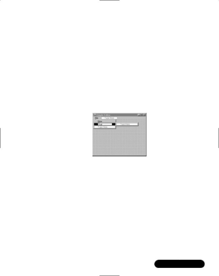
Next, we’ll create the main menu:
1.From the toolbox, drag a MainMenu component onto the form.The Designer provides a WYSIWYG interface for populating the menu. In other words, it’s just a question of typing directly into the menu.
2.Type in menu items for File, New, and Exit, as in Figure 4.8.
Figure 4.8 Creating a Main Menu
To enter the underlined accelerator keys, put an ampersand (&) before the desired character (the same principle works with label controls).To enter the separator between New and Exit, type a single hyphen (-).
3.Click on the New menu item, and from the Properties window, set its shortcut to Ctrl+N.
4.Right-click on one of the menu items, select Edit Names, and enter meaningful menu item names such as miFile, miNew, and miExit. This will help later on with coding and debugging. Right-click again and uncheck Edit Names.
5.Double-click on the Exit menu item.This will create and attach an event handler (to Click, the default event for the MenuItem class) and place you in the code window. Add the following line:
private void miExit_Click(object sender, System.EventArgs e)
{
www.syngress.com
156 Chapter 4 • Windows Forms
Close();
}
Because we’re in the application’s startup form, closing the form is sufficient to close the application (and any other forms that are open). If we wanted to exit the application from another form, we could instead call Application.Exit().
6. Run the application.There’s our menu!
Developing & Deploying…
Working with Controls: Using Menus
Menus are not strictly controls—in fact, they’re based on Component— because menus and menu items don’t exhibit the normal behavior of a control. Each menu is encapsulated by a MainMenu component, comprised of a collection of MenuItem components. Although you can have any number of main menus on a single form, only one can be active at a time (this is determined by the form’s Menu property). A context menu (right-click pop-up menu) is encapsulated by the ContextMenu component, and this also comprises a collection of MenuItems.
To add a menu item at runtime:
1.Define an appropriate event-handling method for the menu item’s Click event, such as the following:
void miNew_Click (object sender, EventArgs e)
{
MessageBox.Show ("New Item Clicked!");
}
2.Create and configure a MenuItem object, and then add it to the main menu’s MenuItem collection. For example:
MenuItem mi = new MenuItem
("New", new EventHandler (miNew_Click));
mi.Shortcut = Shortcut.CtrlN;
mainMenu1.MenuItems.Add (mi);
Continued
www.syngress.com
Windows Forms • Chapter 4 |
157 |
To add subitems at runtime:
1.Define an event-handling method, then create and configure a MenuItem object as in the previous bullet item.
2.Add the new object to the parent menu item’s MenuItem collection, as follows:
miFile.MenuItems.Add (mi);
To enable and disable menu items, set the menu item’s Enabled property to True or False (the parent menu item’s Popup event is a convenient place in which to do this). To check and uncheck menu items, set the menu item’s Checked property to True or False.
Adding a New Form
Let’s create a new form for editing text documents:
1.Go to Project | Add Windows Form, name the class EditForm.cs, and then change the form’s Text property to Untitled.
2.Drag a TextBox control from the toolbox to the form, and from the Properties windows, change its name to txtEdit.
3.Clear the textbox’s Text property and change its font’s point size to 10.
4.Set AutoSize to False and MultiLine to True.This allows us to vertically enlarge the textbox.
5.Change the Dock property to Fill (from the drop-down, click the box in the center).This expands the textbox so that it fills the entire client area (inside area) of the form. If you subsequently resize the form, the textbox will still fill the entire area.
6.Set AcceptsReturn and AcceptsTab to True.
7.Drag a MainMenu control onto the form, and create a View | Options menu structure, as in Figure 4.9.
Let’s now hook this up to our main form.
8.Return to the main form, and double-click on the menu item for New. Add the following code to its event handler:
private void miNew_Click(object sender, System.EventArgs e)
{
EditForm ef = new EditForm(); // Create new instance of form
www.syngress.com
158 Chapter 4 • Windows Forms
ef.Show(); |
// Display form modelessly |
}
Figure 4.9 EditForm Menu structure
Now run the application, and click New a few times to open up several text editor windows. Notice how each of the forms is modeless (you can click randomly on any form) and top-level (each window floats independently on the desktop). If we moved the File menu to the child form itself, and did away with the main form entirely, we’d have a Single Document Interface (SDI) application. Internet Explorer is an example of an SDI (see Figure 4.10).
Figure 4.10 Single Document Interface
www.syngress.com
Windows Forms • Chapter 4 |
159 |
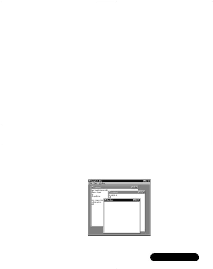
Creating a Multiple Document Interface
In the example in the preceding section, we would prefer the editor forms to be physically constrained to the main parent window, and to have only one menu, with the View menu items merged into the main menu.This describes a Multiple Document Interface (MDI) style. Let’s turn our interface into an MDI:
1.Enlarge the main form, and change its IsMdiContainer property to True.
2.Click on our main menu component and add a new menu item for a Window menu. Set its MdiList property to True (this instructs Windows to add items for child forms automatically) and set its MergeOrder to a large value such as 20 (so that the Window menu item appears at the right-hand side, when merged with child menus).
3.Press F7 to return to the Code Editor, and enhance the event handler for miNew as follows:
private void miNew_Click(object sender, System.EventArgs e)
{
EditForm ef = new EditForm();
ef.MdiParent = this; |
// this makes ef an MDI |
// child form
ef.Show();
}
4.Run the application.We now have an MDI (see Figure 4.11).
Figure 4.11 Multiple Document Interface
www.syngress.com

160 Chapter 4 • Windows Forms
Let’s now enhance this by adding “Tile” and “Cascade” menu items:
1.Add menu items to the Window menu, titled Tile Vertical, Tile Horizontal, and Cascade.
2.Double-click each of the menu items to create event handlers. In each method, call the form’s LayoutMdi method with an appropriate member of the MdiLayout enumeration, such as in the example below:
private void miTileVertical_Click(object sender,
System.EventArgs e)
{
LayoutMdi (MdiLayout.TileVertical);
}
Creating a Dialog Form
A form with OK and Cancel buttons is usually described as a dialog. In most cases, dialog forms are modal rather than modeless, meaning the user must accept or cancel before clicking on another form. Making and displaying a dialog form involves three parts:
■Creating a form that has the “look and feel” of a dialog
■Displaying the form modally—using ShowDialog() instead of Show()
■Disposing of the form when we’re finished
Let’s first create a basic dialog form. Later we’ll use this as a base for creating an Options Form within our text editor:
1.Add a new form to the project called DialogForm.
2.Put two buttons onto the form. Name one btnOK and the other btnCancel. Change their Text properties to OK and Cancel.
3.Set the DialogResult property of the OK button to OK and the Cancel button to Cancel.This instructs the form to automatically close when the button is pressed (and to return an appropriate DialogResult to the calling program).
4.Click directly on the form, and change its FormBorderStyle property to FixedDialog.This will prevent the user from resizing the form. Of course, you can still resize it from within the Designer.
www.syngress.com

Windows Forms • Chapter 4 |
161 |
5.Set MaximizeBox and MinimizeBox properties to False and the
StartPosition to CenterScreen.
6.Set the AcceptButton property to btnOK and the CancelButton property to btnCancel.This will hook up the Enter and Escape keys to the OK and Cancel buttons (see Figure 4.12).
Figure 4.12 Basic Dialog Form
7.Finally, we need to remove the form’s icon and associated menu.This is not possible with the Designer, however, it can be done programmatically. In the form’s constructor, after the call to InitializeComponent, add the following:
this.Icon = null;
8.Next, we need to activate and test the dialog.We’ll do this from the Options menu item in EditForm. Return to EditForm and double-click on the Options menu item. Add the following code:
private void miOptions_Click(object sender, System.EventArgs e)
{
DialogForm df = new DialogForm();
if (df.ShowDialog() == DialogResult.OK)
MessageBox.Show ("OK Pressed!");
df.Dispose(); // modal forms don't dispose automatically!
}
The ShowDialog method returns a DialogResult enumeration, and this tells us how the form was closed.You can also query the form’s DialogResult property to
www.syngress.com

162 Chapter 4 • Windows Forms
the same effect.The call to Dispose is required because a form activated with ShowDialog does automatically clean up when it’s closed.This is a useful feature because it allows us to query the state of its controls after the form’s been closed. But once we’re done, we must remember to call Dispose—otherwise the form will continue to consume operating system resources—even after the garbage collector has released its memory.This completes the skeleton dialog form.You can run the application as it is, to ensure that the form works as expected.
Debugging…
Remembering to Call Dispose
As a rule, if a .NET object has a Dispose or Close method, it must be called once the object is no longer required. But in practice, we rarely dispose Windows Forms components explicitly because most components are parented to a container collection that handles disposal automatically. For instance, a control object is normally parented to a form’s Controls collection (or some other Controls collection), and this is programmed to dispose all child controls automatically with the parent.
In a couple of situations, however, you do need to explicitly dis- pose—when you’ve programmatically instantiated an object having a Dispose method that’s not managed through a component collection (such as a Bitmap), and when you’ve instantiated a form modally (by calling ShowDialog).
Disposing is about releasing resources—such as Windows handles and file handles. It’s not about releasing memory: The CLR’s garbage collector does this automatically (some time) after an object is no longer referenced. Calling Dispose does not influence garbage collection, and conversely, the garbage collector knows nothing about Dispose.
It’s sometimes asked, “why doesn’t the class’s destructor handle disposal?” The answer is that inherent limitations are associated with destructors activated via automatic garbage collection, and disposal is considered too important to be subject to these limitations.
Using Form Inheritance
The dialog form we’ve just designed is an example of a template that could be utilized in many places within an application.We could keep this form as it is
www.syngress.com
Windows Forms • Chapter 4 |
163 |
(our “skeleton” dialog), and then whenever we need a real dialog, we could create a copy to which we add controls.
But this approach is inflexible in that if we later enhance the base dialog form, we’d have to manually update each of the forms we’ve already created. By using inheritance, we get around this problem: Forms that have been subclassed from the base dialog form will automatically assume its functionality—even if the base class is later modified.
Let’s turn our DialogForm into a reusable base class.We need to make only one small change. Select the OK button and change its Modifiers property to Protected (sometimes called Family), and likewise with the Cancel button.
This allows subclasses to access the buttons—and change their properties. Subclassed dialogs will need to modify the buttons’ Location properties, otherwise they’ll be stuck in one position on the form.
WARNING
Once you’ve created a reusable form, such as a dialog, it’s quite tempting to subclass it again to create another reusable form—such as a tabbed dialog, which in turn is subclassed into a sizable tabbed dialog, then a dialog with an Apply button, and so on. This leads to a messy and inflexible hierarchy, causing many more problems than the designer set out to solve. It’s usually best to keep (implementation) inheritance as simple as possible—the best object-oriented designs often employ component reuse and interface inheritance as alternatives to keep complexity and coupling to a minimum. It’s worth reading a book or two on objectoriented design before diving into a big project—if these concepts are unfamiliar.
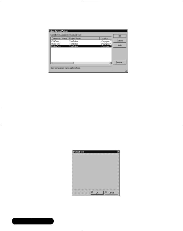
Now we can subclass and create the options form. First, rebuild the project (Shift+Ctrl+B).Then select Project | Add Inherited Form, name the class
OptionsForm, and select DialogForm from the Inheritance Picker (see Figure 4.13).
To test this, modify the miOptions_Click method in EditForm so that it instantiates OptionsForm instead of DialogForm and run the application.
www.syngress.com
164 Chapter 4 • Windows Forms
Figure 4.13 Inheritance Picker
Adding a TabControl
When designing a form, it’s a good idea to start with a TabControl if you plan to have a lot of controls—or if you anticipate a lot of controls in the future. It discourages future developers from cluttering the form, as well as giving dialog forms a tidy presentation.
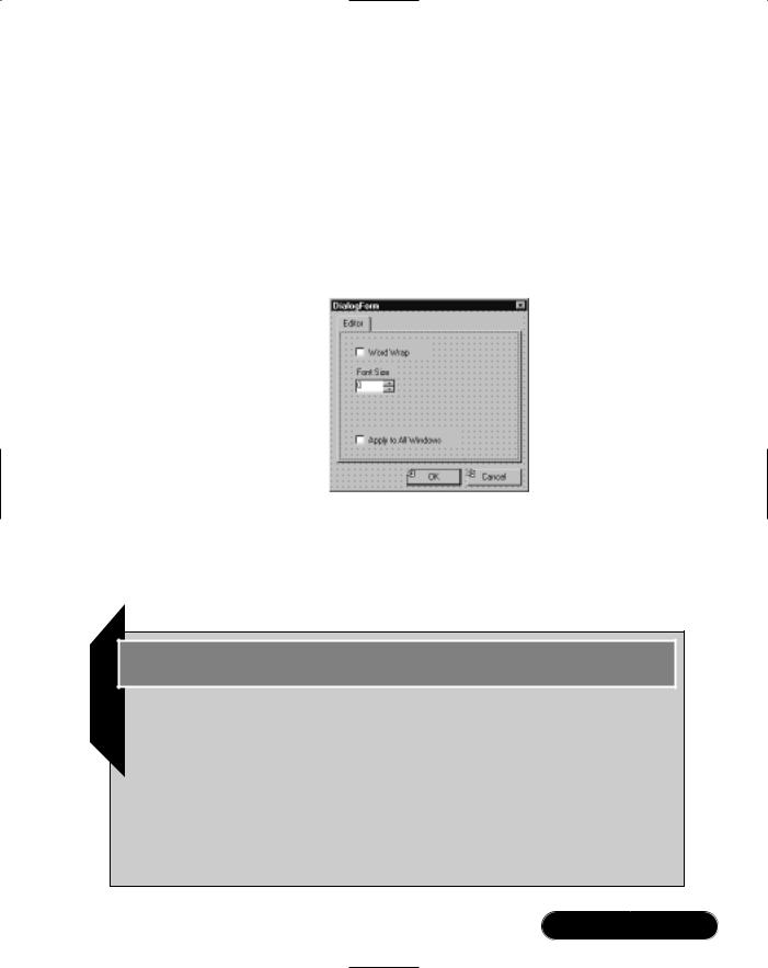
Let’s add a tab control to OptionsForm:
1.Drag a TabControl onto the options form, and align it with the OK and Cancel buttons, as shown in Figure 4.14. (The easiest way to align the Cancel button is to select it together with the tab control by using the Ctrl key, and then choosing Align Rights from the Layout toolbar or Format menu.)
Figure 4.14 Options Form with TabControl
2.Select the tab control and then click Add Tab at the bottom of the Properties window.
www.syngress.com
Windows Forms • Chapter 4 |
165 |
3.Click inside the dashed rectangle on the tab control to select a TabPage, and then set its Text property to Editor.
Note that you can also add and configure tab pages by clicking the ellipses on the tab control’s TabPages property. Now we’ll add controls to the tab page.
4.Put a couple of checkboxes, a NumericUpDown control, and a label onto the tab page, as in Figure 4.15. Name the controls chkWordWrap, chkApplyAll, and nudFontSize.
Figure 4.15 Adding Controls to the TabPage
5.Choose View | Tab Order and click each control in sequence, from top to bottom.This sets the order of focus when the Tab and Shift+Tab keys are used.
Developing & Deploying…
Working with Controls: Using TabControls
A TabControl consists of a collection of TabPages, each of which hosts a collection of controls.
To determine the active tab page:
1.Use the SelectedTab property to get a TabPage object.
2.Use the SelectedIndex property to get its position.
To add a page at runtime:
Continued
www.syngress.com

166 Chapter 4 • Windows Forms
1. Create a new TabPage control:
TabPage tp = new TabPage ("Advanced Properties");
2.Add the new TabPage control to the tab control’s TabPages collection:
tabControl1.TabPages.Add (tp);
To programmatically add controls to a tab page:
1.Declare, create, and configure the control as if it were to go directly on the form.
2.Add the control to the tab page’s Controls collection instead of the form’s Controls collection:
tabPage4.Controls.Add (myTextBox);
/*or*/ tabControl1.TabPages[3].Controls.Add (myTextBox);
Anchoring Controls
Next, we’ll make the form sizable.This is a useful feature in forms that have controls with a lot of information to display—such as the TabPage Collection Editor in Visual Studio. Of course in our case, we have only two checkboxes and an updown control, but we’ll gloss over that for now:
1.Change the tab control’s Anchor property to all four sides (from the drop-down, click on the bottom and right rectangles so that all four rectangles are selected). Selecting two opposite sides instructs a control to expand or shrink in that direction. Our tab control will expand or shrink both vertically and horizontally.
2.Change the OK and Cancel button’s Anchor properties to Bottom and Right (from the drop-down, uncheck the rectangles at the top and left, and check those at the bottom and right).This instructs the buttons to maintain their alignment to the bottom and right of their parent container (in this case the form).
3.Change the Form’s FormBorderStyle to Sizable.
Now try resizing the form.You can test this better by adding a dummy list box to the tab page (placing it the area at the right), and anchoring it to all four sides. Anchoring works in the same way at runtime.
www.syngress.com
Windows Forms • Chapter 4 |
167 |
Developing & Deploying…
Navigating in the Designer and Code Editor
■To select the parent of the control you’re on, press Escape. For example, if you have a TabPage selected, pressing Escape will select its TabControl, and pressing Escape again will select the form.
■In the Code Editor, press Ctrl+spacebar to redisplay an object’s list of members. Press Shift+Ctrl+spacebar to redisplay its parameters.
■Use the F12 shortcut to jump to a class or member’s definition.
■Enable Auto Hide on the Output and Task List windows to see more form and code.
Changing the Startup Form
Once you have several forms in your application, you might want to change the form used for startup.This is simply a matter of moving the Main method:
1.Cut and paste the Main method from the old startup form to the new startup form.
2.Update this method so that it instantiates the new form class instead.
As long as you have only one Main method in your project, the compiler will find it, and make that class the startup object. If you have more than one method in your project with this name, you need to specify which should be the startup object in the Project | Properties dialog.
Connecting the Dialog
Let’s now write the code to make the Options form function.We’ll need to pass data to and from the dialog form—in our case, the editing form’s textbox.To do this, the first thing we’ll need is a field in the Options form to hold a reference to textbox it’s controlling:
www.syngress.com
168 Chapter 4 • Windows Forms
1. Add the following declaration to the OptionsForm class:
public class OptionsForm : TextEditor.DialogForm
{
private TextBox hostControl;
Next, we’ll need some way to get the textbox in, so we can save it to the class field.The easiest way is through its constructor. Once we have the textbox, we can also set the initial values for the word wrap and font size controls.
2. Modify the form’s constructor, as follows:
public OptionsForm (TextBox hostControl)
{
InitializeComponent();
// Save hostControl parameter to class field
this.hostControl = hostControl;
chkWordWrap.Checked = hostControl.WordWrap;
nudFontSize.Value = (decimal) hostControl.Font.Size;
}
When the user clicks OK, we need to update the textbox’s word wrap and font properties.
3.Double-click on the OK button to attach a Click event handler, and enter the following:
private void btnOK_Click(object sender, System.EventArgs e)
{
hostControl.WordWrap = chkWordWrap.Checked ;
hostControl.Font = new Font
(hostControl.Font.Name, (float) nudFontSize.Value);
}
The method that displays this form is going to be responsible for propagating the settings to all other open windows, if the Apply All checkbox is checked.This means we need to provide a way in which this checkbox can be queried from outside the class.
www.syngress.com

Windows Forms • Chapter 4 |
169 |
4. Add a property definition inside the OptionsForm class as follows:
public bool ShouldApplyAll
{
get {return chkApplyAll.Checked;}
}
Finally, we need to make a couple of modifications to EditForm.We require a property to expose the textbox, and miOptions_Click needs to be updated so that it passes in the form’s textbox to OptionsForm, and then checks and handles the “Apply All” scenario.The following below illustrates how to iterate through MDI child forms. Note that because the MdiChildren collection consists of plain Form objects, we need to cast each child into the expected class, so we access its specific properties (in this case, EditControl).
5. Make the following changes to EditForm.cs:
public TextBox EditControl
{
get {return txtEdit;}
}
private void miOptions_Click(object sender, System.EventArgs e)
{
OptionsForm of = new OptionsForm (txtEdit);
if (of.ShowDialog() == DialogResult.OK && of.ShouldApplyAll) foreach (Form child in MdiParent.MdiChildren)
{
TextBox childEdit = ((EditForm) child).EditControl; childEdit.WordWrap = txtEdit.WordWrap; childEdit.Font = txtEdit.Font;
}
of.Dispose();
}
This completes the simple text editor.
www.syngress.com
170 Chapter 4 • Windows Forms
Debugging…
Using the Console Class
You’ll remember from the second chapter that the Console class provides Write and WriteLine methods that send output to the screen in command-line applications. You can call the same methods from a Windows Forms application, and the text will be diverted to Visual Studio’s Output window—providing a quick and easy mechanism for generating debugging output.
Using the ListView
and TreeView Controls
Most people are very familiar with Windows Explorer: On the left is a tree view displaying folders hierarchically; on the right is a list view offering four modes of display (Large Icons, Small Icons, List, and Detail). In this walkthrough, we’ll create a ListView and TreeView control, add images and items, and then attach a context menu to allow the user to switch between each of the four views.Then we’ll insert an Explorer-style splitter and enable a simple drag-and-drop facility between the controls.The code for this walkthrough is on the accompanying CD-ROM, in the WeatherView folder.
Building an ImageList
Before we can set up a list or tree view capable of displaying icons, we need to create an ImageList component. An image list is just a convenient repository, into which we can load a collection of same-sized images, and then use in any number of controls on the form.
In this example, we’ll create two image lists: one suitable for a TreeView and a ListView’s Small Icons view and another suitable for a ListView’s Large Icons view:
1.Create a new Windows Forms project called WeatherView, and drag an ImageList from the toolbox to the form. Because it’s a component rather than a control, its icon appears in the bottom section of the Designer.
www.syngress.com
Windows Forms • Chapter 4 |
171 |
2.Change its Name property to ilSmall, and its ImageSize to 16x16 pixels—this is the size of the small icons we’ll be loading.
3.Next we need to find some images to load in. Search your hard drive for the Elements folder (this is usually in Program Files\Microsoft Visual Studio.NET\Common7\Graphics\Icons).
4.Expand the component’s Images collection property, and add four icons appropriate for Sun, Snow, Clouds, and Rain (see Figure 4.16).
Figure 4.16 Populating an ImageList
Note that while we’ve loaded images from ICO files, the image list control stores the data in ordinary bitmap format.
5.Add a new ImageList called ilLarge, change its ImageSize to 32x32 pixels, and repeat the previous steps (using the same icons).
6.Check that the images in the two lists appear in the same order. If not, use the up and down arrow buttons in the Collection Editor to rearrange the images.
NOTE
When designing custom graphics for use in an ImageList control, saving into the GIF format is a good idea, because it provides transparency in an easy and reliable manner. If you’re using Microsoft Paint in Windows 2000, you can select the transparency color from Image | Attributes (this option is only enabled once the file’s been saved as a GIF).
www.syngress.com
172 Chapter 4 • Windows Forms
Adding a ListView
Now that we have the image lists set up, creating a list view is easy:
1.Add a ListView control to the form, setting its LargeImageList property to ilLarge and its SmallImageList property to ilSmall.
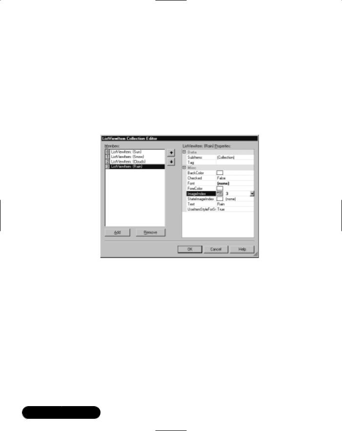
2.Expand its Items property and add four items with text properties: Sun, Snow, Clouds, and Rain. Set the ImageIndex on each to the corresponding icon (see Figure 4.17).
Figure 4.17 ListViewItem Collection Editor
The control defaults to the Large Icons view.You can see the Small Icons view by changing the control’s View property in the Designer.
3.Attach a handler to the control’s ItemActivate event, and add the following code:
MessageBox.Show (listView1.SelectedItems[0].Text);
Because list views allow multiple items to be selected, the control has a collection property for this purpose. In this case, we’re interested only in the first selected item.
4.Run the application and double-click on a list item to test the event handler.
www.syngress.com
Windows Forms • Chapter 4 |
173 |
Using the Details View
The Details view allows us to add columns.This is often used in Windows Forms to provide simple grid control, without with the need for a dataset. In this example, we’re going to enhance our list view by defining two columns:
1.Change the list view’s View property to Details, and then expand its Columns collection property. Add two columns, and set their Text properties to Outlook and Probability.
Once you close the dialog, you can visually resize the columns by dragging their headers in the Designer.
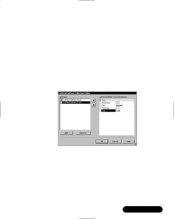
2.Return to the Items Collection Editor, and for each member, open its SubItems collection. Add a subitem, and set its Text property to some random value, such as in Figure 4.18.
Figure 4.18 Adding SubItems to a ListViewItem
We’ll also add an item programmatically.
3.In the form’s constructor, after the call to InitializeComponent, add the following:
ListViewItem lvi = new ListViewItem
(new string[] { "Hail", "Possible" } );
listView1.Items.Add (lvi);
4. Run the form (see Figure 4.19).
www.syngress.com
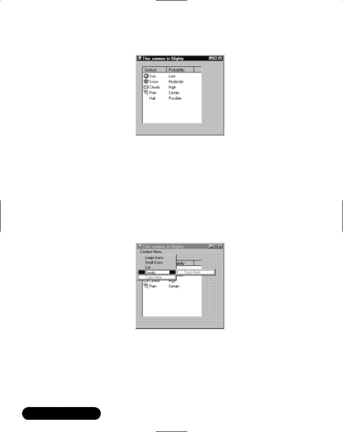
174 Chapter 4 • Windows Forms
Figure 4.19 Details View at Runtime
Attaching a Context Menu
It would be nice if the user could right-click on the list view control, and then from a menu, select one of the four available views:
1.Add a ContextMenu component to the form, naming it cmView, and type in four menu items: Large Icons, Small Icons, List, and Details, as shown in Figure 4.20. Right-click and select Edit Names, and rename them miLargeIcon, miSmallIcon, miList, and miDetails.
Figure 4.20 Designing a Context Menu
2.Double-click each of the menu items, to create handlers for their Click events. Code each method as follows (where XXXX is LargeIcon,
SmallIcon, List, or Details):
private void miXXXX_Click(object sender, System.EventArgs e)
{
www.syngress.com

Windows Forms • Chapter 4 |
175 |
listView1.View = View.XXXX;
}
3.Select the cmView component, and in the Properties window, switch to the Events view and then double-click its Popup event. Here’s where we’ll tick the selected view:
private void contextMenu1_Popup(object sender,
System.EventArgs e)
{
miLargeIcon.Checked = (listView1.View == View.LargeIcon); miSmallIcon.Checked = (listView1.View == View.SmallIcon); miList.Checked = (listView1.View == View.List); miDetails.Checked = (listView1.View == View.Details);
}
4.Finally, select the list view control, set its ContextMenu property to cmView, and then test the form.
Adding a TreeView
Setting up a tree view control is rather similar to setting up a list view. First you create and attach an image list (if icons are required), and then add items to the tree—either visually or programmatically. In this example, we’ll use one of the image lists we created earlier:
1.Put a TreeView control on the form, set its ImageList property to ilSmall.With this control, there’s only one image list, equivalent to the list view’s Small Icons view.
2.Expand the tree view’s Nodes collection, and add three root nodes for Sun, Snow, and Clouds.Then add a child node for Rain, below Clouds. Set their Label, Image, and Selected Image properties as in Figure 4.21.
Now we’ll add an item programmatically.The tree view’s items are managed through Nodes—a property returning a collection—rather like with the list view control’s Items property, except that in this case it’s hierarchical. Nodes itself has itself a Nodes property, returning another tree node collection. Adding nodes is largely just a question of finding the right place in the containership tree.
www.syngress.com
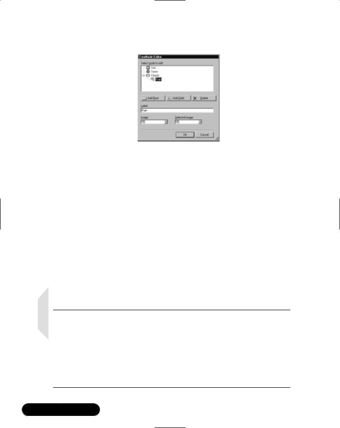
176 Chapter 4 • Windows Forms
Figure 4.21 TreeNode Editor
Let’s insert a node as a child to Snow. First, we need to know its numeric position. Because it’s second in the list, and the list is zeroindexed, its position is 1.We’ll also give the new node an ImageIndex— in this case, we’ll use Snow’s image (also position 1).
3.Add the following to the form’s constructor:
//Use snow's ImageIndex (1) for image & selected image TreeNode tn = new TreeNode ("Sleet", 1, 1);
//treeView1.Nodes[1] is the Snow Node.
//We want to add to *its* node collection. treeView1.Nodes[1].Nodes.Add (tn);
4.Test the form.
NOTE
Sometimes you need to add custom information to list view items or tree nodes. The easiest solution is to use the Tag property. This property is of type Object (allowing data of any class to be stored)—and this works in the same way as the Tag property in the Control class. As an alternative you can subclass ListViewItem or TreeNode, adding your own fields and methods, and then instantiating the subclassed versions instead to create items or nodes. Note that with the latter approach, you cannot then add your subclassed items or nodes through the Designer.
www.syngress.com
Windows Forms • Chapter 4 |
177 |
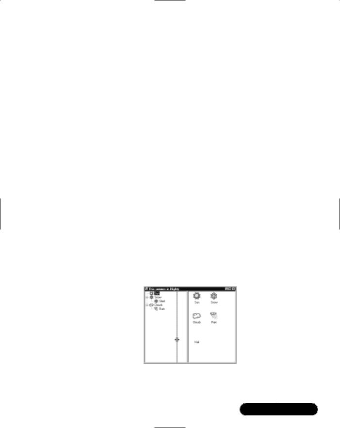
Adding a Splitter
Let’s now add an Explorer-style splitter bar between the tree view and list view controls. Getting a splitter to work is largely about getting all the controls in the correct front-to-back order (z-order). In a nutshell, we need the following:
■A side-docked control, at the back of the z-order
■ A splitter control, docked to the same side, in the middle of the z-order
■A fill-docked control, at the front of the z-order
We already have the two controls we want to split—all that’s required is the splitter control, and of course, everything in the right z-order.
1.Set the tree view’s Dock property to Left (click the leftmost rectangle in the drop-down).This pushes it up hard against the left-hand side of the form.
2.Add a Splitter control from the toolbox, and change its Dock property to Left (if not already docked left). Because we’ve just put it on the form, it’ll be in front of the tree view, and will appear to its right.
3.Set the list view’s Dock property to Fill (click the center rectangle in the drop-down) and then right-click the control and select Bring to Front. Now it’ll be at the front, with the splitter in the middle, and the side-docked tree view at the back.
4.Test the application.The controls will automatically resize as you drag the splitter (and also when you resize the form), as shown in Figure 4.22.
Figure 4.22 Splitter Control at Runtime
www.syngress.com
178 Chapter 4 • Windows Forms
Implementing Drag and Drop
When demonstrating the list view and tree view controls, it’s hard to put them side-by-side without someone asking about drag and drop.The good news is that dragging between these controls is reasonably easy to implement in Windows Forms.
WARNING
When you create a Windows Forms project, Visual Studio adds the [STAThread] attribute to the startup form’s Main method. This tells the compiler to apply the Single Threaded Apartment threading model, allowing your application to interoperate with other Windows and COM services. If you remove this attribute, features such as drag and drop will not work—even between controls within your own application.
Let’s take a look at drag and drop in general.As you might guess, it consists of two parts. In the first part, you need to identify when the user starts dragging the mouse, and then ask Windows to start the operation, supplying data necessary for the recipient when processing the drop. In Windows Forms, this is done as follows:
1. Decide from which event to start the operation. If you’re dragging from a list view or tree view control, it’ll be the special event called ItemDrag. With other controls, it will usually be the MouseDown or MouseMove event.
2.Package information to be sent to the target in a DataObject. If you want to interoperate with another Windows application, you must use one or more of the standardized formats listed in the DataFormats class, such as
Text or HTML.
3.Decide on what actions (such as Move or Copy) are permitted.You can’t always be sure at this point on what will end up happening, because it could depend on where the item is dropped.
4.Call DoDragDrop to start the operation.
The second part is about enabling a target control to accept a drop. In Windows Forms, this is done as follows:
1. Set the target’s AllowDrop property to True.
www.syngress.com

Windows Forms • Chapter 4 |
179 |
2.Handle the DragEnter or DragMove event. DragEnter fires just once when the cursor enters the control; DragMove fires continually as the cursor moves through the control. In the event handler, you need to decide if the drop is allowable—and this is done by checking that the packaged data is of an expected type. If so, you set the DragEventArg parameter’s Effect property to one of the permitted actions, and this enables the drop (changing the cursor accordingly).
3.Handle the DragDrop event.To get at the packaged data, you first need to extract it and cast it back into its original type.
NOTE
The advantage of passing a DataObject to DoDragDrop is that you can include data in multiple formats, allowing external applications, such as Microsoft Word, to function as drop targets. Standard formats are defined (as static public field) in the DataFormats class.
In our example, we’re going to allow dragging from the tree view to the list view:
1. Double-click the tree view’s ItemDrag event, and type the following:
treeView1.DoDragDrop (e.Item, DragDropEffects.Move);
The first parameter is our package of information. Because we’ve not wrapped it in a DataObject,Windows Forms does this for us automatically, as if we did the following:
treeView1.DoDragDrop (new DataObject (e.Item),
DragDropEffects.Move);
e.Item is the actual data we want to send to the target: in this case the TreeNode we’re dragging.The second parameter describes the allowed actions: In this example, we’re going to allow only moving.
2.Set the list view’s AllowDrop property to True.
3.Double-click the list view’s DragEnter method, and type the following:
private void listView1_DragEnter(object sender,
System.Windows.Forms.DragEventArgs e)
{
www.syngress.com
180 Chapter 4 • Windows Forms
if (e.Data.GetDataPresent (typeof (TreeNode)))
e.Effect = DragDropEffects.Move;
}
e.Data returns the packaged information, as a DataObject. Regardless of how the data went in when we called DoDragDrop, we always get back a DataObject.This class is designed to hold information in multiple formats, and we call its GetDataPresent method to find out if a particular type of data is supported.
4. Double-click the list view’s DragDrop event, and type the following:
private void listView1_DragDrop(object sender, DragEventArgs e)
{
if (e.Data.GetDataPresent (typeof (TreeNode)))
{
TreeNode tn = (TreeNode) e.Data.GetData (typeof (TreeNode));
listView1.Items.Add (tn.Text, tn.ImageIndex); treeView1.Nodes.Remove (tn);
}
}
We use the data object’s GetData method to retrieve our original data, and then cast it back to the original type. Once this is done, we can treat it again as a normal TreeNode.
5.Test the application.You’ll now be able to drag items from the tree view to the list view.
Developing & Deploying…
Dragging Into a Tree View
If setting up to drag into a tree view, you might want the dropped item to be inserted into the tree at the position under the mouse pointer. For this, you first need to determine which tree node is positioned under the mouse, as follows:
Continued
www.syngress.com
Windows Forms • Chapter 4 |
181 |
void treeView1_DragDrop(object sender, DragEventArgs e)
{
Point pos = treeView1.PointToClient (new Point (e.X, e.Y)); TreeNode tn = treeView1.GetNodeAt (pos);
...
Creating Controls
Sometimes your requirements demand extending or replacing standard Windows Forms controls. It could be that your requirements are specific to a particular application—or they could warrant developing a general-purpose component for use in thousands of applications.Writing and deploying custom components is easy, because .NET components are self-describing, they don’t require registration, and are not accidentally overwritten by subsequent software installations. Let’s look at the three most common scenarios:
■You have a recurring group of controls that you would like to make into a reusable component (a UserControl).
■You need a control that cannot be assembled or adapted from existing components (a custom control).
■You want to extend a standard control—in order to modify or enhance its appearance or behavior (an inherited control).
In the following sections, we’ll walk through solutions to each of the scenarios.
Creating a User Control
Suppose your application contains several forms with a group of controls for entering an address. Assembling these controls into a reusable class would be nice—both for visual consistency, and so that common functionality can be added, such as postcode lookup. In this walkthrough, we’ll create a user control to show how to do this:
1.Create a new Windows Forms project, and then choose Project | Add User Control, naming the file Address.cs.
2.Add a group of controls suitable for entering an address, such as in the example in Figure 4.23.
www.syngress.com

182 Chapter 4 • Windows Forms
Figure 4.23 UserControl in Designer
3.Build the project (Shift+Ctrl+B) and return to Form1. At the bottom of the toolbox, in the Windows Forms tab, will be a new control called Address. Add this to Form1 and then run the application.
Adding a Property
Our address control is not much use because there’s no way for the form to determine what the user typed in. For this, we need to add properties to our control. Here’s how we add a property to allow access the contents of the Street textbox:
1. Add the following declaration to the Address class:
[Category ("Data"), Description ("Contents of Street Control")] public string Street
{
get {return txtStreet.Text;} set {txtStreet.Text = value;}
}
The first line is optional—it specifies Category and Description attributes, to enhance the control’s presentation in the Designer.Without the Category attribute, the property would appear in the “Misc” section in the Properties window.
2.Rebuild the project, and return to Form1.The address control now has a Street property into which you can type. Of course, it can also be accessed programmatically as with any other control property.
Adding Functionality
Once the control has been set up, it’s fairly easy to modify its class so as to add reusable functionality, such as postcode lookup. It’s just a matter of capturing events such as TextChanged or Validating and then updating the properties of other
www.syngress.com

Windows Forms • Chapter 4 |
183 |
controls accordingly.We don’t provide an example, because it doesn’t introduce aspects of Windows Forms we haven’t already covered. However, it’s worth mentioning that in a real situation you would consider good object-oriented design, and abstract the postcode-lookup functionality into a class separate from the user interface.You could also consider basing this class on a (C#) interface—to which the user control would be programmed.This would allow the control to plug in to different implementations (to facilitate internationalization, for instance).
Writing a Custom Control
If your needs are more specialized, you can paint a control from scratch with GDI+. In principle, this is fairly simple:You subclass Control, and then override its OnPaint method, where you render the graphics.You can also capture mouse and keyboard events by overriding methods such as OnMouseDown and OnKeyPress.
NOTE
Every event had a corresponding protected method, prefixed with the word On. Some people have asked about the difference between handling the event (such as Paint) and overriding the protected OnXXXX method (such as OnPaint). There are a number of differences:
■Overriding the protected method is faster because the CLR doesn’t have to traverse an event chain.
■Because the protected method fires the event, you can effectively snuff the event simply by failing to call base.OnXXXX.
■Events can be attached and detached at runtime; code in overridden OnXXXX methods always runs.
■When subclassing a control, you generally override protected methods rather than handling events.
GDI+ is accessed through a Graphics object—a representation of a drawing surface, with methods to draw lines, shapes, and text. GDI+ is stateless, meaning that a graphics object doesn’t hold properties to determine how the next object will be drawn (the “current” color, pen, or brush)—these details are supplied with each call to a GDI+ drawing method.Tables 4.3 and 4.4 summarize the most common GDI+ helper types.
www.syngress.com

184 Chapter 4 • Windows Forms
Table 4.3 Commonly Used GDI+ Helper Types
Type |
Description |
|
|
Color struct |
Represents an RGB or ARGB color (where A represents alpha, |
|
or transparency). Also used in Windows Forms. |
Font class |
Represents a font consisting of a name (referred to as the |
|
font “family”), a size, and a combination of styles (such as |
|
bold or italic). Also used in Windows Forms. |
Brush class |
Describes a fill color and style for areas and shapes. A brush |
|
can consist of solid color, graded color, a bitmap, or hatching. |
Pen class |
Describes a line color and style. A pen has a color, thickness, |
|
dash-style, and can itself contain a brush describing how the |
|
line should be rendered. |
|
|
Table 4.4 Instantiating GDI+ Helper Types
Type |
Example |
|
|
Notes |
|
|
|
|
|
|
|
|
|
Color |
Color |
gray |
= Color.FromArgb |
Creates a color from its |
|
|
|
(192, |
192, |
192); |
|
red, blue, and green |
|
|
|
|
|
|
intensities (0 to 255). |
|
|
Color |
blueWash = |
Color.FromArgb |
The alpha component |
|
|
|
(80, |
0, 0, |
128); |
|
is optional and speci- |
|
|
Color |
grayWash = |
Color.FromArgb |
fies opacity: 0 is |
|
|
|
(80, |
gray); |
|
|
totally transparent; |
|
|
|
|
|
|
255 is totally opaque. |
|
|
|
|
|
|
gray is defined above. |
|
Color green = Color.Green;
Green is a static property of the Color struct.
|
Color background = SystemColors.Control; |
Use this class if the |
||
|
Color foreground = |
color you need is part |
||
|
SystemColors.ControlText; |
of the Windows color |
||
|
|
|
scheme. |
|
Font |
Font f1 |
= new Font ("Verdana", 10); |
When specifying font |
|
Font f2 |
= new Font ("Arial", 12, |
|||
|
styles, use the bitwise |
|||
|
FontStyle.Bold | FontStyle.Italic); |
OR operator (|) to |
||
|
Font f3 |
= new Font (f2, |
combine members of |
|
|
FontStyle.Regular); |
the enumeration. |
||
|
|
|
There are 13 ways to |
|
|
|
|
call Font’s constructor. |
|
Continued
www.syngress.com

Windows Forms • Chapter 4 |
185 |
Table 4.4 Continued
Type |
Example |
Notes |
Brush |
Brush blueBrush = Brushes.Blue; |
Returns a solid blue brush.
Brush border = SystemBrushes.ActiveBorder;
The preferred way to obtain brushes consistent with the Windows color scheme.
Brush grayBrush = new SolidBrush (this.BackColor);
Brush crisscross = new HatchBrush (HatchStyle.Cross, Color.Red);
The Brush class itself is abstract; however, you can instantiate its subclasses such as
SolidBrush or HatchBrush.
Pen |
Pen p = Pens.Violet; |
Creates a violet pen with thickness of one pixel.
Pen ht = SystemPens.HighlightText;
The preferred way to obtain pens consistent with the Windows color scheme.
Pen |
thick |
= |
new |
Pen |
(Color.Beige, |
30); |
A beige pen 30 pixels |
|
|
|
|
|
|
|
wide. |
Pen |
ccPen |
= |
new |
Pen |
(crisscross, |
20); |
A pen 20 pixels wide |
|
|
|
|
|
|
|
drawn with the criss- |
cross brush (defined earlier in this table).
In this walkthrough, rather than defining our control as part of a Windows Forms project, we’ll make a class library—so our control can be used in a number of different applications:
1.From File | New Project, choose the Windows Control Library template, calling the library FunStuff.Visual Studio assumes we’ll start with a user control. However in this case we want a custom control.
2.From the Solution Explorer, delete UserControl1.The project should now be empty.
www.syngress.com
186Chapter 4 • Windows Forms
3.From Project | Add New Item, select Custom Control. Name the file ScrollingText.cs.
4.Switch to the Code View. Notice that Visual Studio has based our class on Control, and that it has added code to overwrite the OnPaint method. This is where we use GDI+ to draw the control—for now, we’ll just fill the control’s area with red, and then draw a green ellipse in the middle.
5.Enter the following code into the overridden OnPaint method:
protected override void OnPaint(PaintEventArgs pe)
{
pe.Graphics.Clear (Color.Red);
Brush b = Brushes.Green;
pe.Graphics.FillEllipse (b, ClientRectangle);
b.Dispose();
base.OnPaint (pe);
}
The PaintEventArgs parameter contains a Graphics object used to access GDI+ methods—such as Clear and FillEllipse.We use static properties of the Color and Brushes types as shortcuts to creating Color and SolidBrush objects. ClientRectangle describes the inside bounds of the control based on a (0, 0) origin. (In this case, the inside and outside areas are equivalent because there are no Windows-imposed borders or scrollbars).We call base.OnPaint so that the Paint event still fires—in case the end user of our control wants to attach to this event for any reason.
6.Build the project.We now have a custom control (ScrollingText) as part of a reusable library (FunStuff ).
Developing & Deploying…
Using GDI+ to Draw Custom Controls
To obtain a Graphics object:
■From within a subclassed OnPaint method, use
PaintEventArgs parameter’s Graphics property.
Continued
www.syngress.com
Windows Forms • Chapter 4 |
187 |
■From outside an OnPaint method, use Control.CreateGraphics or Graphics.FromImage. It’s not often that you should need to access GDI from outside OnPaint—an example is the use of MeasureString to calculate how many pixels are required to display a string in a given font. Remember to call Dispose when you’re finished.
To draw a bitmap, create an image using the Bitmap class’s constructor, and call DrawImage, for example:
Image im = new Bitmap (@"c:\docs\pics\mypic.bmp");
pe.Graphics.DrawImage (im, ClientRectangle);
im.Dispose();
To repaint the control, call Invalidate.
To draw 3D borders, sizing handles, selection frames, disabled text, and images, use static methods provided in the ControlPaint class.
Testing the Control
Now that we’ve built the custom control, we can use it two different ways:
■From a new Windows Forms project, we can add the compiled custom control to the toolbox.We do this by right-clicking the toolbox, selecting Customize Toolbox, and from the .NET Framework Components tab, clicking Browse and locating the Control Library DLL (in our case, FunStuff\bin\debug\FunStuff.dll).The component (ScrollingText) will then appear in the list, and if checked, will be added to the toolbox.
■We can create a solution containing two projects: both the Control Library and a new Windows Forms project.
Normally, you opt for the second approach if you are still developing the control (and have access to its project file and source code), because it means you can more easily make any necessary changes.This is what we’ll do in our example:
1.From the Solution Explorer, right-click on the solution and select Add | New Project.Then choose the Windows Application template, naming the project TestFunStuff.
www.syngress.com
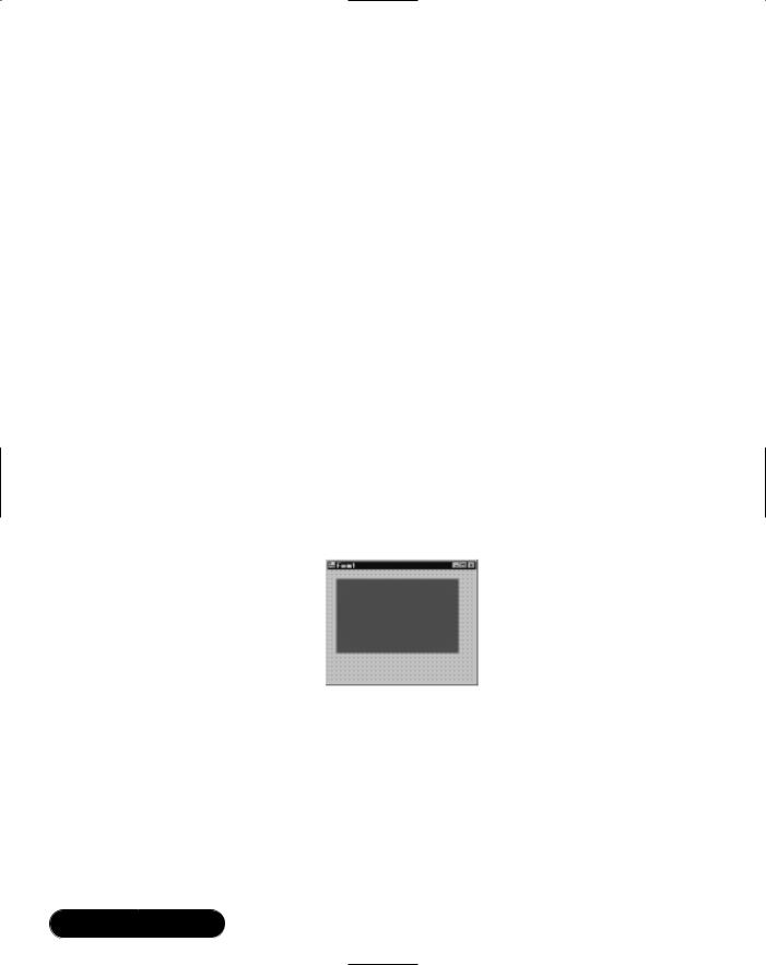
188Chapter 4 • Windows Forms
2.Locate the ScrollingText control in the toolbox, and drag it to Form1. If the control is not in the toolbox, rebuild the project and look again. If it still doesn’t appear, right-click the toolbox, select Customize ToolBox, and from the .NET Framework Components tab, click Browse and locate the Control Library DLL (try FunStuff\bin\debug\FunStuff.dll), and then check the ScrollingText component in the list.
You’ll notice that as you resize the control in the Designer, it won’t render properly because the control doesn’t assume it needs to be redrawn when resized.We can resolve this in two ways:We can override its OnResize method, calling Invalidate (marking the control “dirty” so that it gets redrawn), or in the control’s constructor we can set a special flag to have this happen automatically. Let’s take the latter approach:
3.Modify the control’s constructor as follows:
public ScrollingText()
{
SetStyle (ControlStyles.ResizeRedraw, true);
}
4.Rebuild the project and return to Form1. It will now render properly in the Designer when resized (see Figure 4.24).
Figure 4.24 Custom Control in Designer
5.Finally, we should test the form at runtime. Because we started out creating a control library, the startup project will be a DLL—which can only compile and not run.We can change this from the Solution Explorer: Right-click the TestFunStuff project, select Set as Startup Project, and then run the application.
www.syngress.com

Windows Forms • Chapter 4 |
189 |
Enhancing the Control
Let’s turn this custom control into a real-world example: a scrolling text banner. This is easier than it sounds: it’s simply a matter of maintaining a text string, to which with a Timer, we periodically remove a character from the left—and add to the right.The text is rendered using DrawString in the Graphics class, using a graded brush for effect.We can also allow the user to start and stop the animation by overriding the control’s OnClick method.The code for the ScrollingText control is on the accompanying CD-ROM, in the FunStuff folder. Here’s the complete code listing:
using |
System; |
using |
System.Collections; |
using |
System.ComponentModel; |
using |
System.Drawing; |
using |
System.Data; |
using |
System.Windows.Forms; |
namespace FunStuff
{
public class ScrollingText : System.Windows.Forms.Control
{
Timer timer; |
// this will animate the text |
string scroll = null; |
// the text we're going to animate |
public ScrollingText()
{
timer = new Timer(); timer.Interval = 200; timer.Enabled = true;
timer.Tick += new EventHandler (Animate);
}
void Animate (object sender, EventArgs e)
{
// Create scroll string field from Text property
www.syngress.com

190 Chapter 4 • Windows Forms
if (scroll == null) scroll = Text + " ";
//Trim one character from the left, and add it to the right. scroll = scroll.Substring (1, scroll.Length-1)
+scroll.Substring (0, 1);
//This tells Windows Forms our control needs repainting. Invalidate();
}
void StartStop (object sender, EventArgs e) { timer.Enabled = !timer.Enabled; }
// When Text is changed, we must update the scroll string. protected override void OnTextChanged (EventArgs e)
{
scroll = null; base.OnTextChanged (e);
}
protected override void OnClick (EventArgs e)
{
timer.Enabled = !timer.Enabled; base.OnClick (e);
}
public override void Dispose()
{
//Since the timer hasn't been added to a collection (because
//we don't have one!) we have to dispose it manually. timer.Dispose();
base.Dispose();
}
www.syngress.com
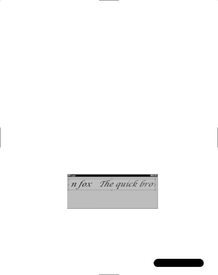
Windows Forms • Chapter 4 |
191 |
protected override void OnPaint(PaintEventArgs pe)
{
// This is a fancy brush that does graded colors.
Brush b = new System.Drawing.Drawing2D.LinearGradientBrush (ClientRectangle, Color.Blue, Color.Crimson, 10);
//Use the control's font, resized to the height of the
//control (actually slightly less to avoid truncation) Font f = new Font
(Font.Name, Height*3/4, Font.Style, GraphicsUnit.Pixel);
pe.Graphics.DrawString (scroll, f, b, 0, 0); base.OnPaint (pe);
b.Dispose(); f.Dispose();
}
}
}
Figure 4.25 illustrates the control in the test form, at design time, with its Text and Font properties set. A nice touch in Visual Studio is that the control animates in the Designer.
Figure 4.25 Completed Scrolling Text Control in Designer
Subclassing Controls
Once we’ve designed a user control or custom control we can use inheritance to subclass it in the same way we did with our reusable dialog earlier in the chapter. You can also inherit from a standard control such as a TextBox or Button—in
www.syngress.com

192 Chapter 4 • Windows Forms
order to modify its appearance or behavior without going to the trouble of designing a new control from scratch.
Visual Studio distinguishes between inheriting user controls and custom controls.You can create an inherited user control directly—from Project | Add Inherited Control—whereas to create an inherited custom control (or to subclass a standard control) you need to write the class manually.The easiest way to go about this is to ask Visual Studio to create a custom control, and then in the Code Editor, to edit the control definition’s base class.
To take an example, suppose your marketing department demands customizable “skins” in your Windows application. One approach (other than skinning the marketing department!) is to subclass some of the standard controls, such as Button and Label.The challenge would then be to decorate the controls without upsetting their existing graphics. Let’s walk through this briefly:
1.From a new or existing Windows Forms project, go to Project | Add New Item and select Custom Control.
2.Switch to the Code Editor, and change the class definition so that we’re subclassing Button instead:
public class WashedButton : System.Windows.Forms.Button
Now we need to override OnPaint. First, we’ll have to invoke the base class’s code so that it renders the button.Then we’ll “wash” the control with a linear gradient brush—the same brush used in the scrolling text example, except that we’ll use translucent colors so as not to erase the existing graphics.This is called alpha blending and activated simply by using a color with an alpha-value.
3. Update the OnPaint method as follows:
protected override void OnPaint(PaintEventArgs pe)
{
base.OnPaint (pe);
// Create two semi-transparent colors
Color c1 = Color.FromArgb (64, Color.Blue);
Color c2 = Color.FromArgb (64, Color.Yellow);
Brush b = new System.Drawing.Drawing2D.LinearGradientBrush (ClientRectangle, c1, c2, 10);
pe.Graphics.FillRectangle (b, ClientRectangle); b.Dispose();
www.syngress.com
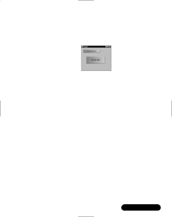
Windows Forms • Chapter 4 |
193 |
}
4.Build the project, and put the custom control onto a form as we did in the previous walkthrough (see Figure 4.26).
Figure 4.26 Subclassed Buttons in Designer
Custom Controls in Internet Explorer
The scrolling textbox we wrote in the “Writing a Custom Control” section is begging to be hosted on a Web page. Its compiled assembly is small enough to be downloaded over the Internet in a couple of seconds, and is secure because .NET code runs in a managed environment, rather like Java’s virtual machine. In fact, both C# and Windows Forms have their roots in Java—their technical predecessors being J++ and its supplied Windows Foundation Classes. Of course,Windows Forms applets require that the client has a Windows operating system—with the
.NET runtime installed. It also requires support at the server-end.
Setting Up IIS
Before starting this walkthrough, you need to check that Internet Information Services is installed and running. IIS is shipped with Windows 2000 Professional— you can check that it’s present and install it from the Control Panel (go to
Add/Remove Programs | Windows Components and locate Internet Information Services).To check that it’s running, choose Administrative Tools | Services from the Control Panel and locate the World Wide Web Publishing Service.
Creating a Virtual Directory
We’ll need a Virtual Directory to host the Web page and applet.This is done using the Internet Services Manager—in Windows 2000, we can access this through the Control Panel, under Administrative Tools.
www.syngress.com

194Chapter 4 • Windows Forms
1.From Internet Services Manager, expand your computer’s icon and right-click Default Web Site choosing New | Virtual Directory. The Virtual Directory Wizard will then appear.
2.When prompted for an alias, type FunStuff.
3.It will then ask for a directory:When testing, it’s easiest to specify the folder where Visual Studio compiles the component library’s DLL (for example, FunStuff\bin\debug).
4.The wizard will then prompt for Access Permissions. Check Read and Run Scripts and uncheck everything else.
Writing a Test Page
We’ll need to create an HTML page to test the component.We can do this either in Visual Studio or with an independent HTML or text editor program such as Notepad. In this example, we’ll use Visual Studio’s editor. Note that the file will have to be in the folder specified when creating the virtual directory:
1.From Visual Studio, reopen the FunStuff solution. Click on the FunStuff project in the Solution Explorer, then click the Show All Files icon. Expand the folder containing the compiled DLL (for example, bin\debug), right-click the folder, and select Add | Add New Item and use the HTML Page template, naming the file test.htm.
2.Switch to the HTML view and add the following, inside the <BODY> section of the page:
<p> Testing our control! </p>
<object id="test"
classid="http:funstuff.dll#FunStuff.ScrollingText"
height="50" width="500">
<param name="Text" value="The quick brown fox...">
</object>
This is rather like inserting a Java applet or ActiveX control. For the Class ID, we specify the DLL containing the custom control, followed by the class’s full name, including its namespace (note that this is case-sensi- tive).The object size is specified in pixels—it’s for this reason that when
www.syngress.com

Windows Forms • Chapter 4 |
195 |
writing the control, we created a font matching the height of the control, rather than the other way round.
3.The final step is viewing the test page. Start Internet Explorer, and open http://localhost/FunStuff/test.htm (see Figure 4.27).
Figure 4.27 Custom Control in Internet Explorer
www.syngress.com

196 Chapter 4 • Windows Forms
Summary
Tools for writing Windows applications have come a long way since the early days of Visual Basic and C++; in this chapter we examined Windows Forms, Microsoft’s modern object-oriented solution.
One of the benefits of an object-oriented framework is consistency:The same core classes, interfaces, and protocols are used repeatedly throughout the framework. And at the heart of consistency is inheritance: A combo box supports all the functionality of a control, which supports all the functionality of a component.This means that most of the objects we worked with here, were in effect, components, and it was by virtue of this we could manipulate them in the Designer, and know that they would be disposed automatically with the host control.
We dealt in this chapter with many components that hosted child objects: Forms that hosted controls, tab controls that hosted tab pages, menus that contained menu items, tree view controls that contained nodes. In all cases, the child objects were managed through a property returning a collection object—implementing consistent interfaces for adding, removing, and enumerating the members.
A Windows application is a consumer of events, and we saw in this chapter how this is modeled in Windows Forms through C# events and delegates. In adding an event handler programmatically, we saw how to instantiate a delegate object—a pointer to a method of an agreed signature, and then how it’s attached to an event, using the += operator.
In writing a text editor, we discovered the default behavior of newly activated forms—modeless and top-level. But by changing a few properties, we created a multiple document interface (MDI) application, and later on we saw how we could use the MdiChildren collection property to enumerate the child forms.We also created a modal dialog, by building a form with the “look and feel” of a dialog, and then activating it with ShowDialog.
The anchoring and docking features make it easy to design forms that can be usefully resized.We found that anchoring was useful in creating a sizable dialog form, and docking was required when setting up a list view/tree view/splitter combination. Because docking space is allocated on a “first-come, first-served” basis—where controls at the back of the z-order are first—we needed to ensure the z-order of the participating controls was correct.
Windows Forms also provides access to operating system features such as drag and drop, and we looked briefly at a common scenario—calling DoDragDrop from a list view’s ItemDrag event; seeing how a DataObject is marshaled to the
www.syngress.com

Windows Forms • Chapter 4 |
197 |
recipient; and discussing how the DragEnter and DragDrop events on the target are handled to enable the operation.
The .NET Framework’s object-oriented model is extensible, and by subclassing the Windows Forms components and controls—as well as our own, we can start creating reusable classes. In the text editor example, we built a reusable dialog; later on we subclassed various Windows Forms classes to build custom controls.We derived from UserControl to create a composite of existing components, while we derived from Control to create a custom control on par with a label or textbox.
In our custom control, we used the stateless graphics device interface (GDI+) to render the graphics, through a Graphics object exposed in the PaintEventArgs parameter within the control’s OnPaint method. Many of the GDI+ methods, such as DrawLine or FillRectangle, accept as parameters helper objects, such as pens, brushes, or images.These objects we created and disposed explicitly.
In the last walkthrough, we hosted a custom control in Internet Explorer. This raised the issue of C# and Windows Forms as an alternative to Java for Internet applets—this is currently limited by its requirement for the (less portable) .NET Common Language Runtime (CLR) on the client machine. However, it does illustrate how Windows Forms programs can compile to small executables that can run securely, requiring no special setup or deployment.These features—combined with other benefits provided by C# and the .NET CLR— make the platform a good choice for developing modern Internet-connected Windows applications.
Solutions Fast Track
Writing a Simple Windows Forms Application
;Use Visual Studio’s Windows Forms project template to create the structure of a Windows application.
;Add controls and components visually using the Designer, and then use the Properties window to configure the objects and add event handlers.
;To add controls programmatically, first declare, instantiate, and configure the controls, then add them to the form or parent container’s Controls collection.
www.syngress.com
198Chapter 4 • Windows Forms
;To attach an event handler at runtime, define a method matching the event delegate’s signature, then attach a delegate instance wrapping the method to the event using the += operator.
Writing a Simple Text Editor
;To add a main menu, use the MainMenu component—and then enter its items visually in the Designer.
;A new form is displayed by instantiating its class and calling Show.This results in a top-level modeless form.
;To implement a multiple document interface, set the parent window’s IsMdiContainer property to True, and then assign each child’s MdiParent property to the parent form.
;Use form inheritance to encapsulate common functionality. But keep the abstractions simple to minimize coupling and complexity.
;Use a TabControl to simplify forms with many controls.
;Use the anchoring and docking features to create resizable forms.
;Define public properties in a form’s class to expose its controls to other forms or classes.
;Use the MdiChildren collection of an MDI parent to traverse its child forms.
Using the ListView and TreeView Controls
;First set up one or more ImageList components if icons are required in the ListView or TreeView.
;Add items to a ListView control through its Items collection property.
;Use the ListView’s details view for a multicolumn grid-like control.
;Add items to a TreeView through its Nodes collection property. Subnodes can also be added to each node in the same way.
;To configure a splitter control, first set the docking properties of the participating controls, then arrange their z-order.
;Start a drag-and-drop operation by calling DoDragDrop from the Itemdrag event on the source control, passing any data required by the recipient.
www.syngress.com
Windows Forms • Chapter 4 |
199 |
;Enable a drop target by setting its AllowDrop property to True, and then handling its DragEnter and DragDrop methods.
Creating Controls
;To encapsulate a reusable group of controls, build a UserControl and then add properties to enable access to its data.
;When you need to start from scratch, define a custom control—overriding the Control class’s OnPaint method to render its graphics, using GDI+.
;When using GDI+, remember to dispose any Pens and Brushes that you create.
;Utilize inheritance to enhance existing controls, overriding their methods to add or change functionality.
;Use the object tag to insert controls from component libraries into HTML pages, specifying the assembly’s DLL and the control’s fully qualified name.
Frequently Asked Questions
The following Frequently Asked Questions, answered by the authors of this book, are designed to both measure your understanding of the concepts presented in this chapter and to assist you with real-life implementation of these concepts. To have your questions about this chapter answered by the author, browse to www.syngress.com/solutions and click on the “Ask the Author” form.
Q: Can I easily rename a solution or project?
A:Yes—right-click from the Solution Explorer and choose Rename.You’ll also have to edit the namespace declarations in any source code files you’ve created.
Q: How do I detach an event handler?
A:In the same way you attach an event handler, except using the -= operator. For example:
button1.Click -= new EventHandler (button1_Click);
www.syngress.com
200 Chapter 4 • Windows Forms
Q:Where is image data loaded into ImageList controls actually stored in the project?
A:Each form has an associated resource file (with a .resx extension) where image data and localized strings are stored.You can see this by clicking the Show All Files icon in the Solution Explorer.
Q: Can a textbox control contain text in more than one color or font?
A: No. For this you need to use the RichTextBox control.
Q: How can I add icons to menu items?
A:Unfortunately there is no built-in feature for this.You need configure the menu items to be owner-drawn (set OwnerDraw to True) and then use GDI+ to draw both the text and graphics (handle the MeasureItem and DrawItem events). Microsoft’s “Got Dot Net” site (www.gotdotnet.com) is a good place to start for information about implementing owner-drawn controls.
Q: What’s the difference between tab-order and z-order?
A:Tab-order describes the order of focus as the user moves between controls using the Tab and Shift+Tab keys.This is determined by the control’s TabIndex property—set either in the Properties window, or by selecting View | Tab Order and then clicking each control in order. Z-order describes the front-to-back order of controls, and this set in the Designer using the Bring to Front and Send to Back layout options. Z-order matters when controls visually overlap and also when docking:Those at the back of the z-order will be assigned docking space first.
Q:I need to determine the current mouse position and state of the Shift, Control, and Alt keys—but I’m not inside an event handler that provides this information. How can it be done?
A:Use the MousePosition, MouseButtons, and ModifierKeys static properties of the Control class.
Q: How can I screen input in a textbox?
A:For this, it’s usually best to start by subclassing the TextBox control so that your solution is reusable within your project (or outside your project). Override OnTextChanged, or for more control, OnKeyPress and OnKeyDown.
www.syngress.com

Windows Forms • Chapter 4 |
201 |
OnKeyPress fires for printable characters; OnKeyDown fires for all key combinations. Both of these offer a Handled property in the event arguments parameter, which you can set to True to cancel the event.
Q:When designing an inherited or custom control, can I trap windows messages such as WM_PASTE?
A: Yes—by overriding the WndProc method.
Q: Is there a Windows Forms newsgroup where I can get help?
A:Microsoft provides a newsgroup: microsoft.public.dotnet.framework
.windowsforms.
www.syngress.com