

Professional VSTO 2005 - Visual Studio 2005 Tools For Office (2006) [eng]
.pdf
The Char ting Tool
Today, with a flood of products on the market, it is often difficult to choose an adequate charting package that will suit your budget-conscious needs. To add to the difficulty, most third-party charting packages only incorporate one type of functionality — charts. If you require a mix and match of functionality such as charts with pivot tables or charts with Excel spreadsheets, you will need to purchase and combine different packages. This is a strong case for VSTO-based charting because it is more than a simple chart package. VSTO combines the use of the Spreadsheet, Chart, InfoPath, and Outlook object functionality seamlessly under one roof.
This chapter is designed with the required theory and terminology up front. The code is provided after the theoretical portion is complete. You should make every effort to at least be familiar with the charting terms otherwise the going will be rough. For the early parts of the chapter, the code examples will usually be complete, stand-alone applications. However, as we progress, these coding examples will dwindle into code snippets. The chapter will walk you through chart creation and data-loading process. Once you are comfortable putting a basic chart together, the remainder of the chapter will focus on some advance charting aspects to include point manipulation, image and background additions, and legend customizations.
Design-Time Char ting
VSTO-based applications can create and render charts that are based on the Microsoft Excel Chart object. As previously pointed out, this object can be manipulated at design time as well as runtime. Charts that render at design time allow the developer to get an immediate feel for the data and how it may be displayed ahead of deployment. Such time-saving techniques can actually reduce the time to market for the application. First, I’ll spend some time focusing on the design-time aspects.
Chapter 6
Chart Wizard
The Chart Wizard is well known to Office developers and end users. It may be less well known to .NET developers. The Chart Wizard is a step-by-step guide to generating charts based on a data source. The Chart Wizard can only source its data from an Excel spreadsheet. The data to be displayed is modeled in real time in the chart engine.
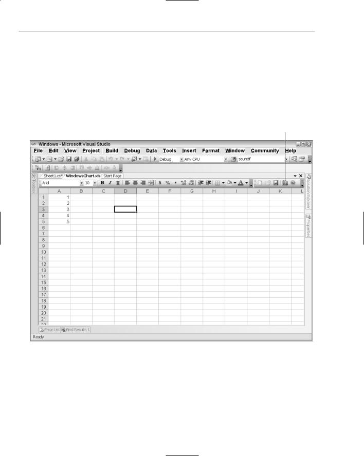
The Chart Wizard is available in the standard toolbar in Microsoft Excel. The Chart Wizard is not available for Microsoft Outlook–based applications or for Microsoft Word applications. Figure 6-1 shows the Chart Wizard icon on the standard toolbar.
Chart Wizard icon
Figure 6-1
The next few examples will focus on manipulating the Chart Wizard, so you can gain a feel for the various objects and the influence they exert on the chart object. Once you are comfortable manipulating the chart in design mode, the rest of the chapter is dedicated to manipulating charts at runtime. Most of the manipulation will exactly reproduce the design-time features. But the runtime manipulation will also add functionality that is not present in the design-time framework.
210
The Charting Tool
Charting Nomenclature
Charting terminology can seem foreign at times, since it is based on terms that are unfamiliar to the
.NET developer who is without Microsoft Office development experience. However, understanding this terminology is of fundamental importance if you intend to build charting applications. In fact, the Chart API absolutely assumes that the developer has more than a passing knowledge of the nomenclature. If you do not possess this knowledge, you may waste valuable time trying to decipher charting errors. In addition, developing applications with more involved charting requirements can make for an unpleasant experience.
Consider the case where a manager requests that a certain line drawn on a chart application be named appropriately. Without a basic understanding of the charting nomenclature, the developer cannot easily find the object responsible for naming the line. This is, by far, the biggest challenge that developers face; that is, relating charting terminology to the actual objects that compose a chart. By the end of the chapter, you will consider such requests trivial to implement.
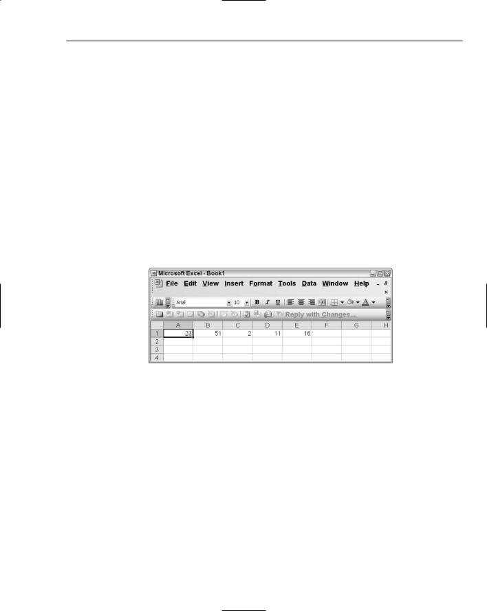
Let’s begin by creating a new Excel project. See Chapter 2 for the details on creating an Excel project from scratch. Once the project is created, enter numeric data in row 1 for columns A1 through E1, as shown in Figure 6-2. Select the range A1 through E1 before continuing, so that the chart engine knows which cells to use to load data.
Figure 6-2
Next, open the Chart Wizard by selecting the charting icon on the standard toolbar in the design-time environment of Visual Studio Tools for Office.
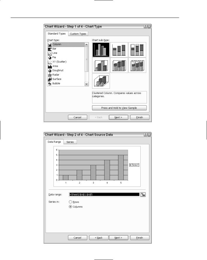
The Chart Wizard contains four pages, the first of which is shown in Figure 6-3. Notice the button labeled Press and Hold to View Sample. If you press and hold the button, the Chart Wizard displays a sample column chart based on the column chart selection in the Chart Type window. For these examples, we will retain the default column chart selection. However, you can change the chart type at any time.
Notice also that there are seven subtypes in the right window for the column chart. If you care to do the math, the chart engine can render 75 different chart types straight out of the box. This does not include the custom types that are available in the tab labeled Custom Types in Figure 6-3. Click Next to proceed to page 2, shown in Figure 6-4.
211
Chapter 6
Figure 6-3
212 |
Figure 6-4 |
The Charting Tool
Page 2 allows the user to bind the chart data to the cells in the spreadsheet. The Chart Wizard defaults to binding whatever data was selected at the time you clicked the chart button. Notice that the Column radio button is selected. The setting forces the Chart Wizard to use columns as the data source for the Category (X) axes. If you choose the Rows radio button, you will notice that the chart changes to reflect the settings and sources its data from the Category (X) axes from the spreadsheet row. Click Next at the bottom of the property page to proceed to step 3. Page 3 should resemble Figure 6-5.
Figure 6-5
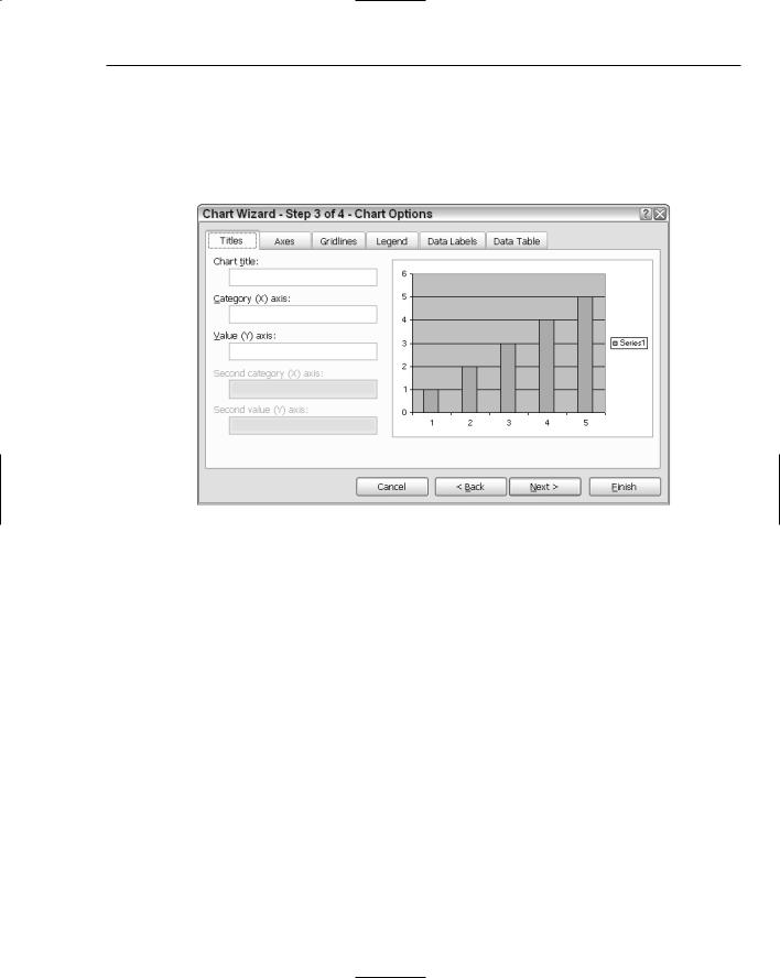
These are the important parts of a VSTO-based chart that you must be familiar with in order to develop charting applications. The next few sections explain these terms with practical examples. In the selected titles tab, notice that the rightmost portion contains a column chart displayed inside a rectangular area.
The square area is called the chartspace. The chartspace is exposed through a chartspace object at runtime. The chartspace object holds the chart and the associated objects.
The actual chart is rendered inside the chartspace. This smaller rectangular space is called the chart plot area. The chart plot area represents the actual surface where the chart is being rendered. The chart plot area must necessarily sit inside the chartspace. The chart plot area is exposed through the chartplotarea object at runtime and is fully customizable. For instance, it is possible to assign different colors or even images to the chart plot area. Several examples of this type of customization will be presented in later portions of the chapter. But for now, let’s focus on charting terminology.
Titles
The first tab in Figure 6-5 shows the Title property. The Title property has an associated title object in the chart API. Every chart has zero or more titles or captions. The title must be a string identifier. By default, the chart title is displayed prominently at the top of the chart. However, the title can be moved to a different location at runtime. Enter the phrase “This is my Chart Title” in the chart title text box shown in Figure 6-5. Notice that the chart title is updated immediately.
213
Chapter 6
The title you have entered is considered the default title. However, a chart can have as many as five different or similar titles. We will provide details of how to display multiple chart titles on a chart surface later in the chapter.
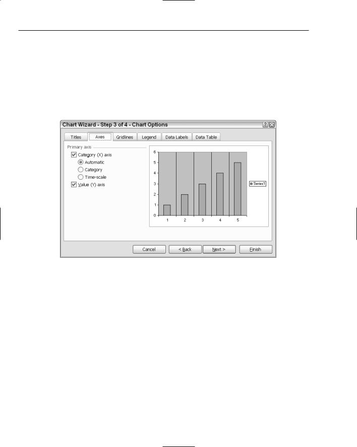
Axes
The second tab in Figure 6-5 shows the Axes property. A chart must contain at least two axes. The major axes of a chart are the major vertical and horizontal lines displayed in Figure 6-6. In mathematics, the horizontal and vertical chart axes are named X and Y, respectively. However, the Excel charts use a more appropriate naming convention.
Figure 6-6
The category axis and value axis correspond loosely to the X and Y axes, respectively. The reason for breaking with the mathematical naming convention is that the X and Y axes are necessarily perpendicular to each other. However, Excel can render charts where the axes are not necessarily oriented perpendicularly to each other. For instance, the radar, pie, doughnut, and polar charts do not have conventional X and Y axes. These charts have axes that radiate outward from the center. For these charts, the category and value axes terminology are more appropriate. It may be helpful to examine these charts by clicking the Press and Hold to View Sample button for one of the charts to see the orientation of the axes. We probe these special charts later in the chapter.
You may select and deselect the checkbox shown in Figure 6-6 to see how it affects the chart. Each selection is rendered in real time. Notice that there are three radio buttons. Automatic indicates that the chart will examine the data and try to determine what the data represents before it is used on the category axis. Normally, the data will be numeric. No change is expected for the Category radio button since the data being sourced from the spreadsheet displays automatically to the category axis. If you select Timescale you will notice that the chart imposes a date/time on the category axes. We talk more about this time-scale feature in a moment.
214
The Charting Tool
Time Scaling
Time scaling is a charting feature that implements a time interval on a chart axis. The time-scale algorithm works by first recognizing data input as date/time measurements. Then, the chart makes the appropriate adjustments so that these intervals are suitable to be plotted. Right away, you should observe that quite a lot of data manipulation is involved in the process of adjusting the data to suite specific time intervals. For the most part, and if you are aware of this algorithm, the intervals can generally improve data interpretation and analysis.
Time-scale axes are only available on stock charts, line, column, bar, and area charts. However, the timescale axes is not available when any of these charts contain category labels that are automatically displayed on more than one line.
Time-scale units are set according to the difference between points on the category axis. It is possible to change this unit to a different unit. Valid units are day, month, and year.
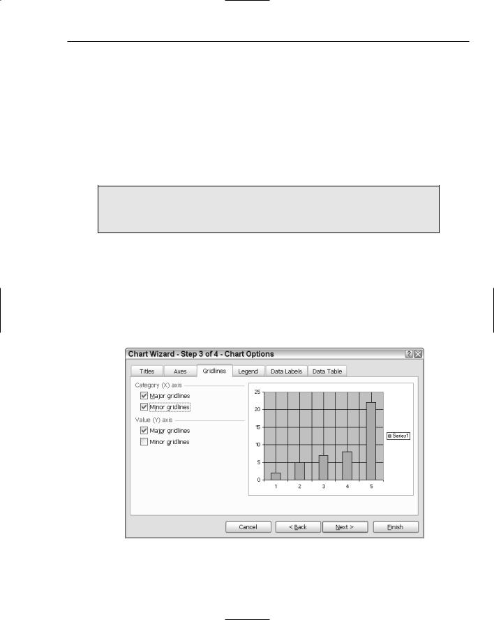
Gridlines
Gridlines represent vertical or horizontal lines that are drawn in the chart plot area in addition to the category and value axis. Gridlines may also be concentric, as in the case of a pie or radar chart. The category axis and the value axis are each considered gridlines as well. Major gridlines differ from minor gridlines in that major gridlines define the major category units on the category axis, as you can see in Figure 6-7. For instance, recall that the chart sourced its data from column A1 through E1. Each column, 1 through 5, forms a major gridline. Minor gridlines fall halfway between each pair of major gridlines. Major gridlines and minor gridlines form an intersecting grid on the chart plot area.
Figure 6-7
215

Chapter 6
You should experiment with the gridlines of a chart by selecting and deselecting the appropriate checkboxes in Figure 6-7. Underneath, gridlines map directly to gridline objects so that it is easy to impose gridlines on or remove them from the chart plot area. However, the gridlines implementation does not allow code to target individual gridlines. Customization applied to the gridline object affects all gridlines on the chart.
Series
A series is a contiguous array of points on a chart. These points represent the data values that are constructed from the category and value axis pairs. When the chart detects that a series of points are available, it immediately assigns a default name to that series and performs some other internal operations on the series that we consider later. The default name or caption represents the title for the series. Later in this chapter, you will learn how to take control of this naming process to impose your own titles on the series.
Each series is represented by a Series object. Series objects live in a Series collection. In our example, recall that the data being rendered as part of the series was sourced from Row A. On page 2 of the Chart Wizard, Figure 6-4, the series defaulted to columns. This means that there is only one series in the chart represented by row 1. However, if you go back to page 2 of the Chart Wizard and change the setting so that Rows is selected instead of Column, you should see that the chart is updated to show series 1 through 5. The reason for this is that the chart now sources its series data from the columns on the spreadsheet. The five columns containing data are mapped to five series on the chart surface.
Now that you are familiar with the series terminology, you can go back to page 2 of the Chart Wizard, Figure 6-4, and choose the Series tab. Notice that you can add as many series as you want. However, there is a limitation imposed on the number of series on a chart surface. More details are provided at the end of the chapter under “Chart Limitations.” Examine Figure 6-8 for one possible customization.
Before moving on, you should notice that Figure 6-7 contains a data label for category axis. This is simply another one of the five possible titles that a chart can have.
Legend
The legend represents the rectangular area of the chart shown in Figure 6-8 that contains the name series1. A legend displays information associated with the lines drawn on the chart plot area. Examine Figure 6-9; by default, the legend is positioned to the right of the chart plot area inside the chartspace.
Notice the various settings for the legend. As you select the different settings, the position of the legend is updated. Observant readers will notice that these positions are 90 degrees apart. It is not possible to position a chart at 15 degrees using the Chart Wizard. However, using code, you can position the chart legend on any part of the chart space.
By default, the legend object holds the default name or legend entry of each series as it is added to the chart plot area. The legend entry contains a key or color-coding that corresponds to the particular series. The legend key is helpful for identifying the different series on the chart. The legend can be customized through code by accessing the legend object. A chart can only contain one legend. Even with this limitation, it is possible to draw your own legend on the chart. The advanced section of the chapter will show you how to draw custom objects on the chart surface.
The legend entry and legend key values cannot be assigned directly through the Chart Wizard at runtime or at design time. However, both of these values may be changed after the Chart Wizard has created the chart. An example will be provided later.
216

The Charting Tool
Figure 6-8
Figure 6-9
217