

Professional VSTO 2005 - Visual Studio 2005 Tools For Office (2006) [eng]
.pdfChapter 6
Figure 6-32
It goes without saying that the code only uses the AddPicture method, but it is possible to add more shapes to the chart’s surface. However, it bears repeating that you should always attempt to practice moderation with your feature list.
Charts with Special Needs
Some charts can render directly to the chart surface and not necessarily to the chart plot area. While it is not important to understand the reason why this is so, these changes do have significant implications for constructing these charts. To avoid complications, you need to be familiar with these charts.
The pie, doughnut, and polar charts are rendered directly to the chartspace object and not to the chart plot area. Also, the concept of X and Y axes is not applicable. Instead, you must use the value and category terminology. Finally, these charts contain only one data series. It is not possible to render a multiseries chart of the pie, doughnut, or polar type.
The code to produce these charts remains basically the same as that of standard charts. This is due in large part to a good design on the part of the VSTO architects. However, if you must manipulate these charts through code, the differences between a standard chart and a chart with special needs becomes apparent rather quickly. Usually, these differences are manifested through runtime exceptions in the code.
268

The Charting Tool
Consider Listing 6-27, an example of how to render a chart. We perform some common customization as well to complete the example.
Visual Basic
Private Sub CreateAndCustomizePie()
Dim xlChart As Excel.Chart = DirectCast (Globals.ThisWorkbook.Charts.Add(), Excel.Chart)
Dim cellRange As Excel.Range = Me.Range(“a1”, “e1”) xlChart.SetSourceData(cellRange)
xlChart.ChartType = Excel.XlChartType.xl3DPieExploded
Dim series As Excel.Series = DirectCast(Globals.ThisWorkbook.ActiveChart.SeriesCollection(1), Excel.Series)
series.Shadow = True
Dim oPoint As Excel.Point = DirectCast(series.Points(4),Excel.Point)
oPoint.Explosion = 600 oPoint.HasDataLabel = True
oPoint.Interior.Color = ColorTranslator.ToOle(Color.Wheat) xlChart .SetBackgroundPicture(“c:\download\images.jpg”)
Dim pieGroup As Excel.ChartGroup = CType(xlChart.ChartGroups(1), Excel.ChartGroup)
pieGroup.GapWidth = 9 pieGroup.FirstSliceAngle = 45
xlChart .HasLegend = False End Sub
C#
private void CreateAndCustomizePie()
{
Excel.Chart xlChart = (Excel.Chart)Globals.ThisWorkbook.Charts.Add(missing, missing, missing, missing);
Excel.Range cellRange = this.Range[“a1”, “e1”] as Excel.Range; xlChart.SetSourceData(cellRange, missing);
xlChart.ChartType = Excel.XlChartType.xl3DPieExploded;
Excel.Series series = xlChart .SeriesCollection(1) as Excel.Series; series.Shadow = true;
Excel.Point oPoint = series.Points(4) as Excel.Point;
oPoint.Explosion = 600; oPoint.HasDataLabel = true;
oPoint.Interior.Color = ColorTranslator.ToOle(Color.Wheat);
xlChart .SetBackgroundPicture(@”c:\download\flag.bmp”); Excel.ChartGroup pieGroup = (Excel.ChartGroup)xlChart.ChartGroups(1); pieGroup.GapWidth = 9;
pieGroup.FirstSliceAngle = 45;
xlChart .HasLegend = false;
}
Listing 6-27 A pie chart with an explosion
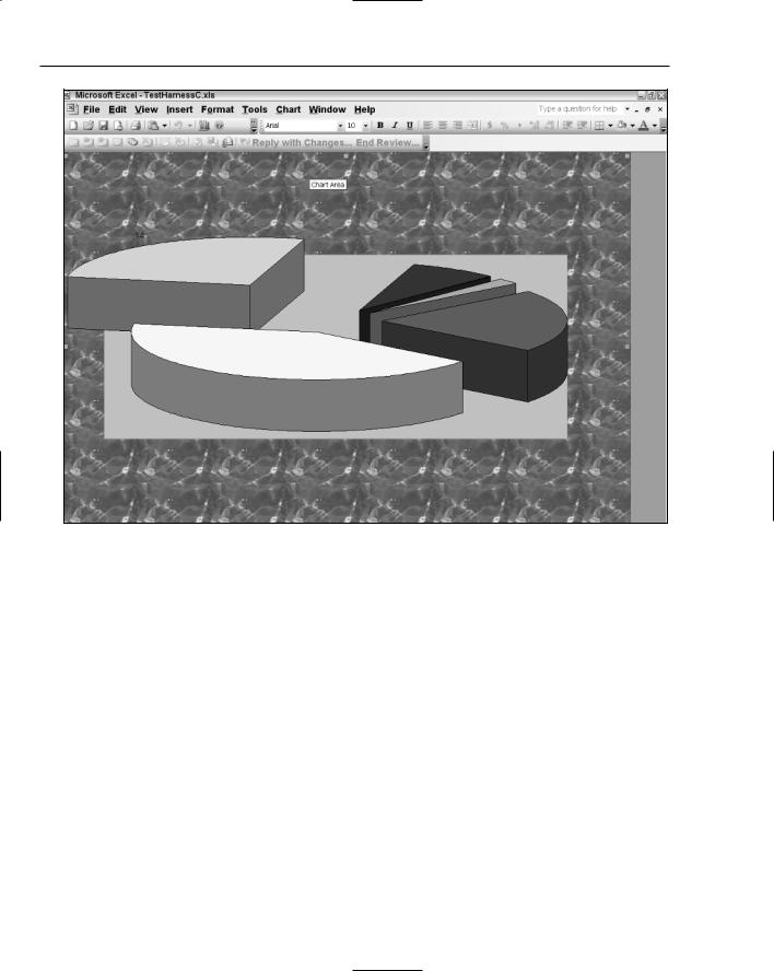
The code in Listing 6-27 produces the image in Figure 6-33. The image in Figure 6-32 has been used as the background in 6-33.
269
Chapter 6
Figure 6-33
Listing 6-27 shows that there is quite a lot going on in the code. First, we create an exploded pie chart. This is a regular 3-D pie chart with one slice of the pie removed. Exploded pie charts are typically used to emphasize some part of the data. Using the usual means, we obtain a series and add a shadow for a professional effect. Then, we select the fourth slice from the point object and cause it to explode by 600 units. See Figure 6-32 for the details. We add a particular color to the exploded slice. Actually, Color.Wheat is not particularly impressive and doesn’t really stand out, but the point of the exercise is to show that we can target the slice with code.
The code also shows that the background or chartspace of the chart can be customized as well. In this case, we have used a simple image from a .bmp file to serve as the background. Expect this to be replaced with a corporate logo in a production environment.
We talked about chart groups in some detail previously and even presented code to isolate chart groups. Following from this discussion, the code gets the default group and applies some customizations. The GapWidth property instructs the chart to vary the space between each individual slice as a percentage of the slice width. In a nutshell, the gap between each slice is shrunk or expanded appropriately. Had we not set this property, the pie chart would look less pleasing, since the default GapWidth property is rather awkward.
270

The Charting Tool
The FirstSliceAngle also targets the exploded slice. This setting is specific to pies and doughnut charts that use 3-D rendering. The property sets the angle of the slice to 45 degrees. Angling the slice can be a very effective visual cue for the end user. Finally, the legend is turned off.
Char t Limitations
Most of the documentation available for charting is incomplete on MSDN. There are very few workable examples as of this writing. One way to workaround this nuisance is to use an enhancement to the IntelliSense editor found here: www.microsoft.com/downloads/details.aspx?FamilyID= e455f3d6-4177-4876-bcb3-2791625ea7ab&displaylang=en. This enhancement adds valuable information to every property or method that displays in the IntelliSense window. You may use this information to better construct arguments that are passed to poorly documented methods.
In the interest of full disclosure, the VSTO chart object falls short of the mark as compared to other charting packages such as the Office Web Components or the Excel Interop libraries. More is possible with these packages, and there is no cost associated with them; that is, they are available as free downloads. However, you must note that the VSTO chart is relatively new. Expect an improved feature set as this package matures.
One of the stumbling blocks of the VSTO charting package is that it can only be bound to a range in a spreadsheet. After you get over this speed bump, you should realize that this is an inconvenience for which there are quite a few workarounds. In fact, Chapter 3 showed several approaches to loading data from a variety of data sources. Simply use the spreadsheet to load data from these sources, and then bind the Excel range to the chart. It’s the long way around the block, but it is sufficient.
Another limitation of the chart control is that there may only be two axes. That is, a third axis representing depth cannot be imposed on a chart. However, this does not mean that the chart cannot render in three dimensions. It simply means that the depth cannot be easily adjusted, since there is no axis available to serve as a point of reference. This chapter has presented several examples of 3-D drawing.
The following hard limits apply to charts that are based on Excel spreadsheets.
The chart object can only refer to 255 worksheets.
The data series in a chart cannot exceed 255.
Each data series cannot exceed 32,000 points. However, the data points in a 3-D chart are limited to 4000.
The total number of data points for all data series in one chart cannot exceed 256,000.
The line styles cannot exceed 8.
The line weights cannot exceed 4.
There can only be 18 area patterns displayed on screen.
The total area pattern and color combinations displayed cannot exceed 56,448.
271

Chapter 6
Summar y
This chapter focused on the chart terminology from a practical perspective. Rather than throwing out terms and definitions that may or may not sink in, this chapter used the chart wizard and the designtime environment to align key charting terminology with the chart feature set so that a strong bond between the definition and the actual implementation is formed in the mind of the reader that cannot be easily broken or forgotten.
In the majority of cases, you can simply change the chart type to have the chart render a different family of charts. We have noted that the chart can render at least 75 different types of charts, and this is available through a single line of code. There is one exception. Charts with special requirements need a few housekeeping items adjusted before you can simply change the type.
This chapter also showed that chart series are made up of contiguous points. Every point in this series may be targeted through code. You should note that, we have only examined the trivial case where the data set is manageable and the number of points is relatively small. However, real-world charting applications can typically render a great number of points. Code to examine and manipulate each point on the chart surface may incur a performance penalty, so you should exercise due restraint when implementing this approach.
The ability to add shapes are also an interesting addition to VSTO. For the most part, VSTO hides most of the manual labor for this process. Simply call the appropriate method with the required parameter list, and the chart will render the shape. This is a welcomed feature, and one that was long overdue. It also allows the developer to get around some obstacles imposed by VSTO. For instance, a chart can only contain one legend. However, you can now impose your own legend as a rectangle sited appropriately on the chart. You can use the border object to customize the border of the custom legend and you can use the SeriesCollection to determine the appropriate LegendEntries for the custom legend.
If you must develop charting applications for Windows, this chapter showed you how to develop robust applications that is responsive and chock full of functionality. In short, enterprise-level charting applications are available today through VSTO.
272

Pivot Table Automation
Pivot tables are objects that are able to display data from relational databases and multidimensional data sources, such as Online Analytical Processing (OLAP) cubes. The pivot table provides user interface levers that the end user can use to push and prod the data, exposing relationships and patterns in a way that is simply not possible with any other Windows control. That type of analytic interactivity is also fundamentally different from any other Windows control in that the knowledge worker, not the developer, determines the degree of analysis that is performed on the data.
Pivot tables are new to most .NET developers with no Microsoft Office development experience. However, pivot tables are extremely important for end users who must analyze data. Often, the route of less resistance adopted by .NET programmers is to provide data analysis in the form of datagrids with master/detail relationships. End users accustomed to sophisticated data analysis through the pivot table will find such datagrids immature and clumsy. For instance, the user loses the ability to drill through and to slice and dice data. Although the master/detail DataGrid or GridView object is not exceedingly complex in implementation, it significantly restricts the user to programmer-imposed functionality. Consequently, the master/detail datagrid offers only limited interactivity compared to the pivot table report application.
The basic idea behind a pivot table is to allow the end user to view a cross-section of the data. For instance, in a financial application, the user may want to view profit versus loss. When anomalies are detected, the knowledge worker has the option to manipulate the pivot table in such a way as to clarify the reasons for these anomalies. The primary lever for this activity is the ability to pivot one axis against the other.
The cycle of pivoting and drilling is practically limitless. But you should note that no work is done by the developer to accomplish this. The functionality is already built into the pivot table component. It supports drill-through functionality, pivoting, drag and drop, filtering, and a host of other functions right out of the box. Most Windows controls can meet this demand.
While a large majority of this functionality is readily available to the knowledge worker, you also have the option to build or customize this functionality through code. This chapter will focus on manipulating pivot tables at design time and runtime. The code will show how easy it is to load data into Pivot tables using a variety of options. Once you understand how to load data, the chap-

Chapter 7
ter will show you how to manipulate data and display it to the user. The remainder of the chapter is geared toward showing you how to accomplish common functionality in the pivot table through code. Finally, we examine some advance techniques and strategies for pivot table customizations. The material is presented in such a way as to allow you to grow in comfort with the PivotTable object. With the basics in place, you will be able to build your own customizations into any pivot table application.
Design-Time Pivoting
This section will show you how to hook a pivot table object to a data source. Once the data source appears in the control, you will learn how to slice and dice data. It’s important to note that pivot table applications are extremely easy to build and involve very little programming effort, as the code will demonstrate. The reason for this is that the user assumes all the responsibilities of data analysis. As a developer, your duty is simply to make the data available to the pivot table object. The user takes over from that point.
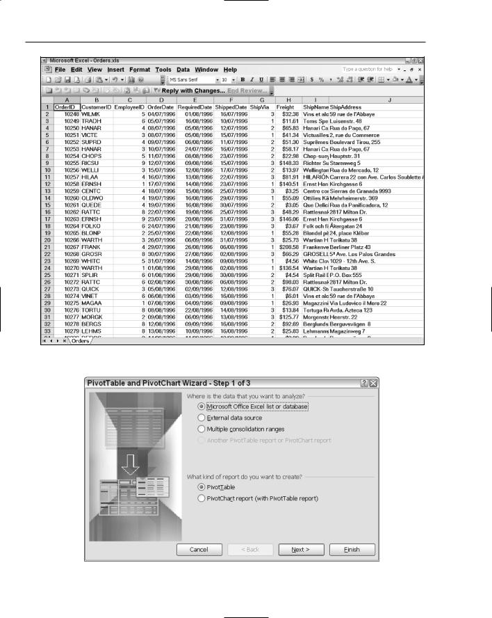
Consider an Excel spreadsheet that looks similar to Figure 7-1. An analyst working for the accounts payable department may want to find the customers who placed orders using specific shipping agents on a particular day. Or, consider a fraud department investigating the number of suspicious orders shipped to a particular address. In that case, the information is contained in the body of the pivot table report.
Figure 7-1
274

Pivot Table Automation
In the absence of a pivot table report application, these scenarios and others often require a database person in the background who must understand the request from the IT worker and then translate these requests into SQL query statements that retrieve the data from a data store. You should be able to appreciate the overhead of the database person who is a middleman in the chain. Needless to say, if that database person does not sufficiently understand the requests, incorrect data is harvested often with disastrous results. For instance, imagine an auditor who receives incorrect data from the database middleman while performing a corporate tax audit!
Now, consider the case where the data is available and the pivot table is already set up to connect to that data source. The IT worker can bypass the middleman and immediately begin to push and prod the data into a series of reports. Even in the situation where the data is not immediately available from the data store, this is simply expensed as a one-time setup cost by a developer. It does not need to be redone if requirements for the data change.
VSTO PivotTable Wizard
The VSTO pivot table is intrinsically tied to the Excel object. VSTO does not provide the ability to generate a stand-alone pivot table application. To begin building a pivot table application, first create an Excel project as described in Chapter 1. Name the project Pivot. Navigate to the design view. In the Excel spreadsheet, enter the following data as listed in Figure 7-2. This data will be loaded into the PivotTable object. You do not have to enter all the rows, 3 to 5 rows is more than sufficient to create a working example. You can also limit your columns to EmployeeID, ShipVia, and CustomerID fields. If you have access to the Northwinds sample database from Microsoft, simply extract these fields into a table. Then, export the entire table to an .xls file. This .xls file will serve as your data source.
The data in Figure 7-2 was generated from the popular Microsoft Northwind database using appropriate SQL queries. The data was then exported to an .xls file.
If you do not have the Northwind database system, simply create an empty worksheet and add only the relevant columns with data. Unless specifically stated otherwise, the default dataset for the pivot table list objects for the next few sections will be sourced from the data presented in Figure 7-2.
Next, select Data Microsoft Office Excel data. Select Pivot table and Pivot chart report. The action will surface the PivotTable Wizard. Figure 7-3 shows page 1 of the PivotTable Wizard.
Follow the wizard through to load data into the pivot table object. Once the wizard has walked you through the process, the pivot table will be displayed on screen similarly to Figure 7-1. You should note that if your underlying data is not the same as that presented in Figure 7-2, the appearance of the pivot table report will vary. The impact of these differences is negligible.
275
Chapter 7
Figure 7-2
Figure 7-3
276
Pivot Table Automation
Pivoting and Drilling
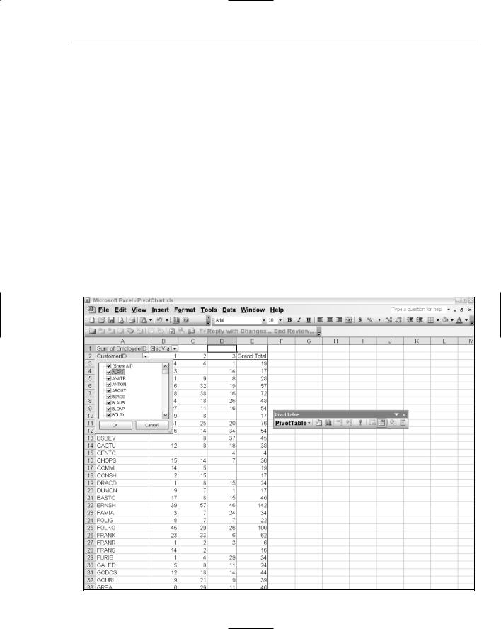
Let’s walk through pivoting and drilling in a pivot table report object. The example proceeds from the previous section and assumes that you have created a pivot table report with data in it. Drag the CustomerID field from the pivot field list on to the row axis and drop it on the row axis drop zone so that the row axis contains a number of customer field names. The row axis drop zone is the leftmost area of the pivot table, where data can be released after a drag operation. The row axis drop zone is clearly marked on the pivot table during the design phase.
Next, drag the orderID from the pivot field list to the column axis drop zone, and drop it so that the column axis contains a number of orders. Finally, drag the EmployeeID field from the pivot field list object onto the data axis drop zone so that values show up in the body of the pivot table. The data axis drop zone is the center portion of the pivot table where data can be released after a drag operation. The data axis drop zone is clearly marked on the pivot table during the design phase. Done!
From this point, if you are satisfied with the report, you can simply select File Print so that the data prints out to the default printer attached to the machine. However, you may also select the down arrow button on any of the axes to display the filter dialog box, as shown in Figure 7-4. Check or uncheck the items in the filter dialog to trim the report to your specifications, and then click OK. At this point, your pivot table report will be adjusted to reflect the results of the filter. When you are satisfied, you can choose to export or print the report. The print functionality prints the data in the pivot table; it does not print the pivot table dialogs and objects.
Figure 7-4 |
277 |