

Visual Web Developer™ 2005 Express Edition For Dummies - Alan Simpson
.pdf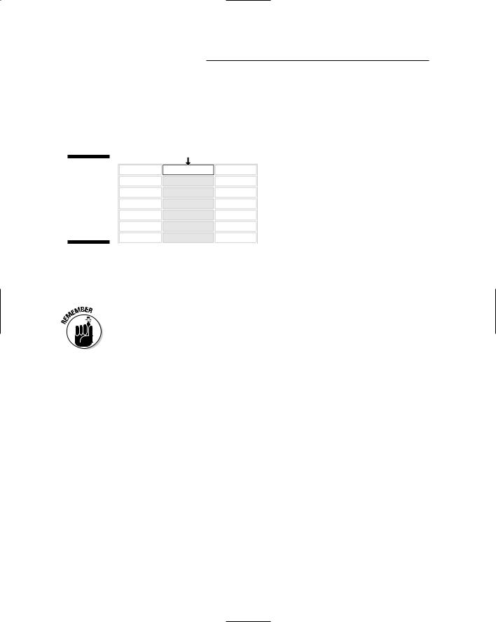
80 Part II: Building Your Web Site
You can also select a column by clicking its top border. Likewise, you can select a row by clicking its leftmost border. You have to get the tip of the mouse pointer right on the border, so the mouse pointer turns to a little black arrow first, like the example in Figure 5-4. Don’t hold down the mouse button until you see the little black arrow.
Figure 5-4:
Little black mouse pointer for selecting table columns.
To select multiple columns, you can drag the little black mouse pointer left or right through the top border of other columns. Likewise, drag the little black arrow up and down to select multiple rows in the table.
When you select multiple cells, one of the selected cells won’t be gray. Instead it will be white with a black border like the top cell in Figure 5-4. That’s normal. Don’t drive yourself nuts trying the make the last selected cell gray. It’s not necessary.
Selecting cells
To select a single cell, just click in the cell. To select multiple adjacent cells, drag the mouse pointer through the cells you want to select. To select multiple, nonadjacent cells, click in the first cell you want to select, and then hold down the Ctrl key as you click other cells. To deselect a single selected cell, Ctrl+Click that one selected cell.
Most of the selected cells will be highlighted (grayed). But as when selecting rows and columns, one selected cell will be white with a black border. When using the Ctrl+Click method, the last cell you select with be the white one.
Merging cells
You can merge two or more cells to form a single large cell. For example, if you want to center a heading in the first row of the table, you can merge all of its cells so it’s just one long cell across the table. Then you can type any text you like in that cell and center it above the table.
Chapter 5: Creating Web Pages 81
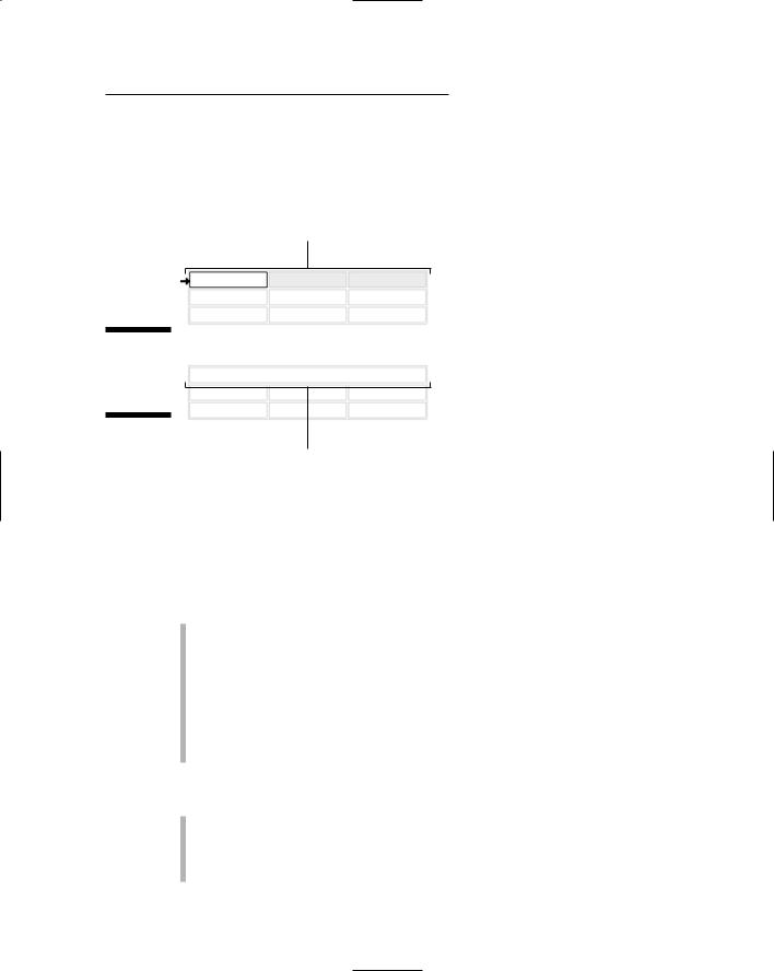
To merge cells, select the cells you want to combine into a single cell. Then right-click any selected cell and choose Merge Cells. For example, the top of Figure 5-5 shows three cells across a table selected. Just below that is the result of merging those three cells.
Selected cells
Figure 5-5:
Merging all cells in a row.
Merged cells
Styling cells
When it comes to styling things in a Web site, there are lots of ways to go. But because the world seems to be gravitating toward a universal XHTML standard, the Style Builder will be your best bet. First you have to make sure you know what you’re about to style. Three rules apply:
To style a single cell, click that cell (the Properties sheet will show <TD>, indicating that you’re about to style a table cell.
To style multiple cells, rows, or columns, select whatever you want to style. The Properties sheet won’t show any tag when multiple items are selected.
To select the entire table, right-click a cell and choose Select Table. The Properties sheet shows a <TABLE> tag, indicating that you’re about to style the entire table.
Then you can get to the Style Builder by using either of these methods:
Right-click the item or selection and choose Style. (If Style is disabled on the menu, use the next method instead.)
Scroll down to, and click on, the Style property in the Properties sheet, and then click the Build button that appears.

82 Part II: Building Your Web Site
Either way, the Style Builder opens. Items down the left column represent different things you can style, such as the font, background, text, position, and so forth. When you click a category name, the main pane to the right shows options in that category.
For example, suppose you selected the top row across a table. In the Font category of the Style Builder, you can choose a font family and style for text within those cells. Figure 5-6 shows the font set to Arial, its Color to Navy, its size to 12 points, and its weight to Boldface. The Sample Text at the bottom of the screen shows you how things will look when your selected options are applied.
Figure 5-6:
Some Font
options
selected
in Style
Builder.
To add a little background color to the selected cells, click Background in the Style Builder. Then click the Build (...) button. In the Color Picker that opens, click any color you like, and then click OK. The preview sample at the bottom of the style builder shows how your text will look against the background color you chose.
To center text in all of the selected cells, click the Text category at the left side of the Style Builder, and then choose Centered from the Horizontal option under Alignment. To determine how text aligns vertically in a tall cell, choose either Top, Middle, or Bottom from the Vertical option under the Alignment heading.
To style the borders around the selected cell(s), click the Edges button. Under Borders, select which borders you want to style. In Figure 5-7, for example, I opted to style only the Bottom border as a thin, navy-blue solid line.
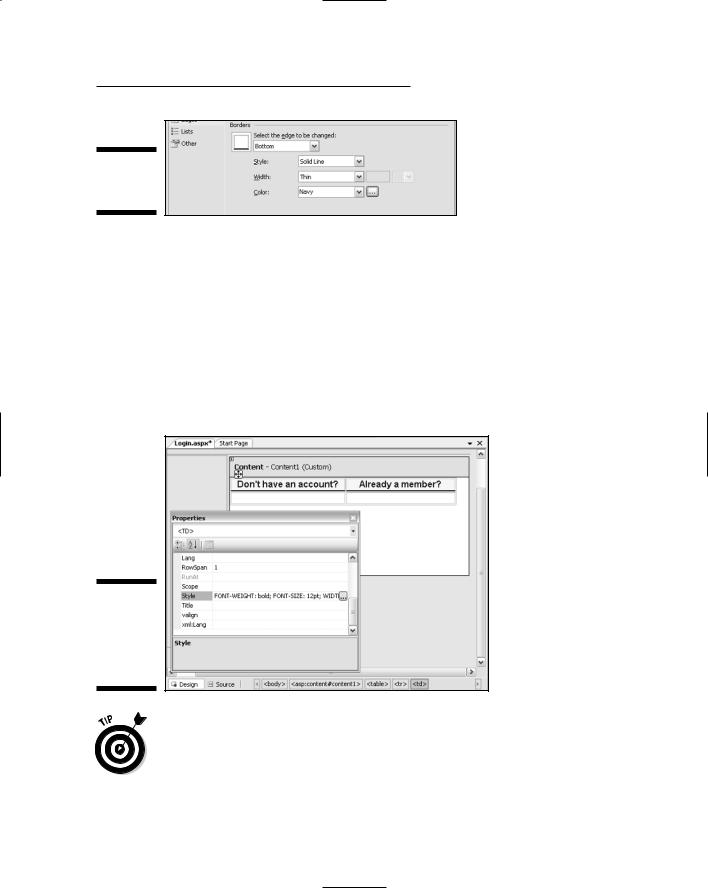
Chapter 5: Creating Web Pages 83
Figure 5-7:
Styling table cell borders.
When you’ve finished making your selections in the Style Builder, click OK. The items you styled take on the chosen new style. Figure 5-8 shows an example where the top two cells now have a background color and dark border along the bottom. The text in each cell is 12pt Arial Bold, and centered within each cell.
Figure 5-8 also shows how the Style property looks after clicking OK in the Style Builder. Your selections are converted to CSS formatting syntax. You can change the style at any time by clicking the Style property again, and the Build button again. The Style Builder opens again, and you can make whatever changes you want.
Figure 5-8:
Two styled table cells and a Properties sheet.
If you just want to format a small chunk of text within a cell, select that small chunk of text only. Then use the Formatting toolbar to apply a font, color, italics, or whatever.
Chapter 6 will get more into the Style Builder. For now, that should be enough to get you working with tables in the VWD Design surface. But there’s one other thing I should mention about tables in this chapter. And that is . . .

84 Part II: Building Your Web Site
Adding controls to table cells
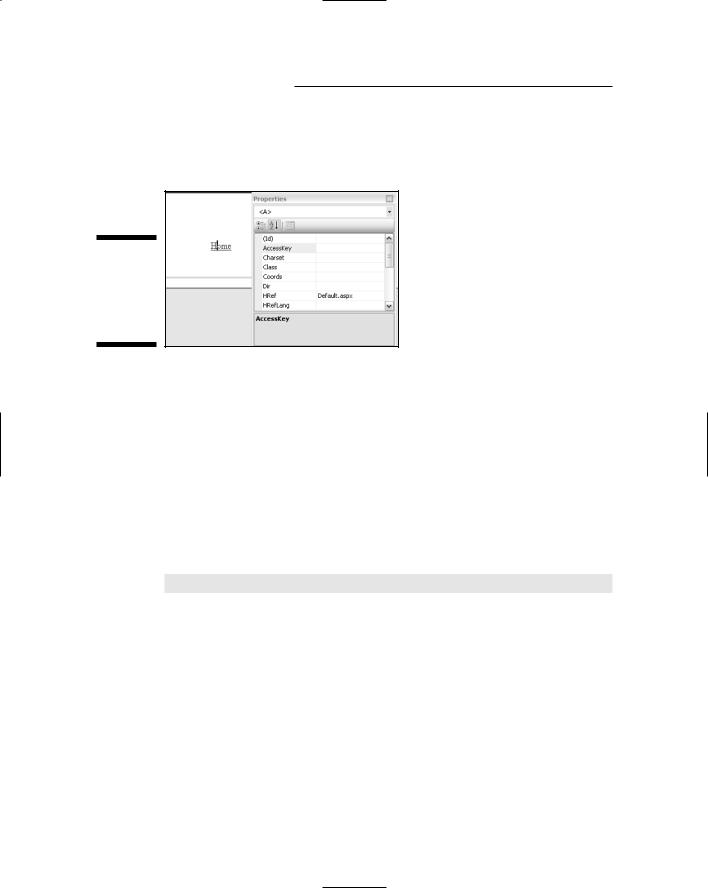
If you’re creating an .aspx page, you can also add ASP.NET Web server controls to table cells. Doing so couldn’t be easier: You just drag the control from the Toolbox into a table cell. In Figure 5-9, for example, I dragged a Login control from the Toolbox into the table cell under the heading “Already a member?”
Drag and drop into cell
Figure 5-9:
Login control added to a table.
Chapter 7 gives you more info on using and formatting ASP.NET controls like Login.
So like I said, that’s the basics of working with tables. Now, on to another common design element found in Web pages.
Adding Hyperlinks to Pages
There are many ways to add hyperlinks to pages in VWD. Here’s a method for creating a link to any page on the Web:
1.If you haven’t already done so, type the text that you want to serve as the link.
2.Select the text that will act as a link.
In Figure 5-10, I’ve typed and selected the phrase “Sign up now!”

Chapter 5: Creating Web Pages 85
Figure 5-10:
Selected text and Convert to Hyperlink button.
3.Click the Convert to Hyperlink button in the Formatting toolbar.
In Figure 5-10, the mouse pointer is resting on the Convert to Hyperlink button. When you click this button, the Hyperlink dialog box appears.
4.Choose the link’s Type.
For example, choose http: for a Web page.
5.Type (or paste) the complete URL of the target Web page.
6.Click OK.
The selected text shows as blue and underlined.
The blue-and-underlined text doesn’t act as a link in VWD. To test the link, open the page in a Web browser.
Quick links to pages in your site
If you want to create a link to another page in your Web site, you can just drag that page’s name from Solution Explorer onto the page. Initially, the text on the page will exactly match the filename of the page, as given here:
Default.aspx
To change the text of the link to something more meaningful than the file name, select the hyperlink text. Type your new text in its place. Changing the text of the link won’t change the file to which the link refers. When you click the link to select it in your page, the Properties sheet will show an <A> tag (because all links are <A> tags in HTML).
86 Part II: Building Your Web Site
Figure 5-11 shows an example where the cursor is in a link (Home). The Properties sheet shows an <A> tag, and the HRef property is the page that the link will open (when used in a Web browser).
Figure 5-11:
Here is the cursor in a hyperlink on a Properties sheet.
Creating bookmarks
Your page can contain bookmarks, places that you can jump directly to from any link in the same page, or any link in any other page. To create a bookmark, click where you want to place the bookmark in your page, so the cursor is positioned where you want the bookmark to be. Then choose Format Insert Bookmark from the menu bar. Type in a name for your bookmark (for example, Top for a bookmark at the top of a page). Then click OK.
You won’t see any trace of the bookmark in Design view because bookmarks are not visible there (or in Web browsers). You can see the bookmark only in Source view, where it will be expressed in HTML and look something like this:
<a name=”YourName”></a>
where YourName refers to whatever name you gave your bookmark.
Linking to bookmarks
To create a link to a bookmark from within the same page, follow these steps:
1.Type the text of the link exactly as you would for creating a link to an external page.
For more about this process, refer to the earlier section, “Adding Hyperlinks to Pages.”

Chapter 5: Creating Web Pages 87
2.Select that text and click the Convert to Hyperlink toolbar button.
3.In the dialog box that opens, choose Other as the link type.
For the URL, type the bookmark name preceded by a pound sign (#). For instance, if you named a bookmark Top, you’d type #Top as the URL.
When you click the link in Source view, the Properties sheet shows an <A> tag. The HRef property is the one whose name has a leading pound sign (for example, #Top). As with any link, you can’t really test these out in the VWD Design view. You have to open the page in a browser to test your links.
Adding and Styling Pictures
The easiest way to include pictures in your Web site is to first get them into a folder in the VWD Solution Explorer. As discussed in Chapter 2, you can just drag the picture icons from any folder in Windows Explorer to any folder in Solution Explorer.
To add a figure to your page, just drag the picture’s icon from Solution Explorer onto your page. In Design view, the figure looks much as it will in a Web browser, though when it’s selected on the page it will show borders that won’t appear in the Web browser.
To select a picture, click it. After it’s selected, the picture appears framed with a border showing three dragging handles (as in Figure 5-12). Also, the Properties sheet displays an <IMG> tag; the Src (source) property will be the path to the image file, as is also shown in the figure.
Figure 5-12:
Selected picture and Properties sheet.
88 Part II: Building Your Web Site
Sizing a picture
To size a picture interactively — changing its aspect ratio without distorting the picture — drag the handle in the lower-right corner of the selected picture. To widen or narrow the picture without regard to aspect ratio, drag either of the other two handles.
You can also set the height and the width, in pixels, using the Height and Width properties in the Properties sheet or the Style Builder. The Style Builder also offers options for controlling the position of the picture and its borders, so we’ll look at those techniques next.
Styling pictures
To style the picture, right-click it and choose Style, or, in the Properties sheet, click the Style property (just under the Src property), then click the Build button that appears. The Style Builder opens. Options relevant to pictures are in the Layout and Edges categories of the Style Builder, as the next subsections show.
Positioning pictures
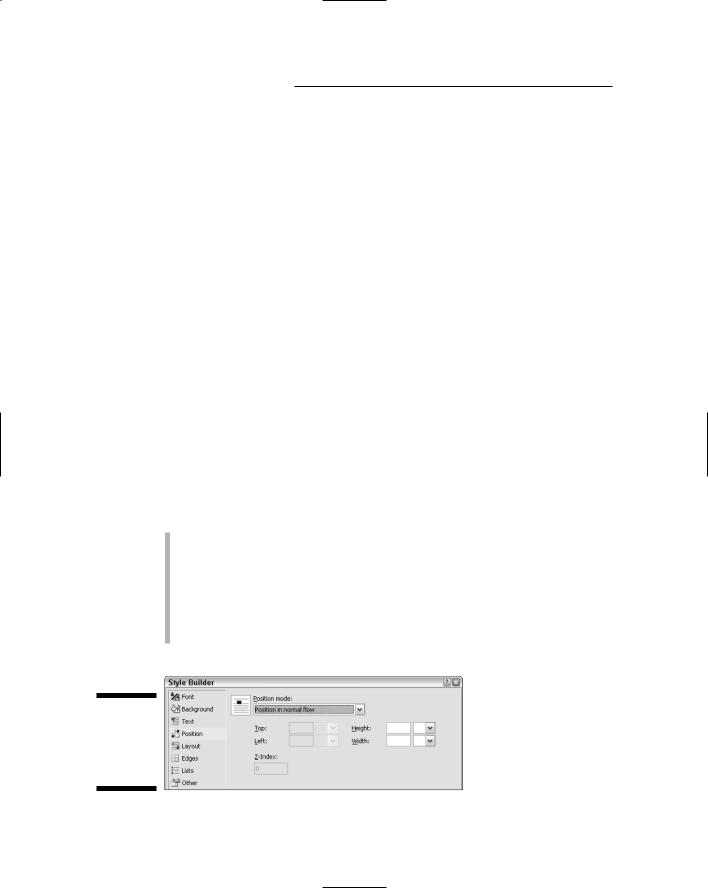
When you click the Position category in the Style Builder (Figure 5-13), you can choose any of the following options from the Position Mode drop-down list to position the image:
Position in normal flow: Anchors the figure to neighboring text so it sticks to the current paragraph. (This is the most common selection.)
Offset from normal flow: Anchors the figure to the neighboring text, offset from where it would normally appear in the flow by whatever amount you specify in the Top and Left options.
Absolutely position: Anchors the figure to a specific place on the page, independent of text flow.
Figure 5-13:
Position options in Style Builder.

Chapter 5: Creating Web Pages 89
The Height and Width options let you set the height and width of the picture in pixels, points, percentage of the page width, or any other of several units of measure.
The Top and Left options are enabled only if you choose “Offset from normal flow” or “Absolutely position.” If you choose “Offset from normal flow,” you can define the offset using Top and Left. For example, entering 10px for Top and 10px for Left would position the picture 10 pixels down and to the right of where it would have been positioned if you chose “Position in normal flow.”
If you choose “Absolutely position” from the Position Mode drop-down list, the Top and Left options define where the picture is placed relative to the upper-left corner of the page. For example, setting each measurement to 10px would put the upper-left corner of the picture 10 pixels away from the upperleft corner of the page.
The Z-Index option applies only to absolutely positioned objects, and defines the layer in which the object exists. The page itself is always layer 0. Objects at layer 1 can cover the page. Objects at level 2 can cover objects at level 1, and so forth, just like sheets of paper with the bottom sheet being layer 0.
Note that anything at a lower layer will be covered by an object at a higher layer. So if you position a picture absolutely or offset it, there’s a good chance that the picture will cover the text beneath it. Not good.
Wrapping text around a picture
For text that’s positioned to flow with text (as opposed to positioning the images absolutely), click the Layout category name at the left side of the Style Builder. Then use the “Allow text to flow” option to set whether (and how) text flows around the figure. Your options, in a nutshell, are these:
To the right: The picture aligns to the left margin and text flows to the right side of the picture, as in the top example in Figure 5-14.
Don’t allow text on sides: No text flows around the picture, as in the example in the center of Figure 5-14.
To the left: The picture aligns to the right margin and text flows down the left side of the picture, as in the bottom of Figure 5-14.
Bordering pictures
To put a border around a picture, or to increase the distance between a picture and the text that flows around it, use the Edges category in the Style Builder (Figure 5-15). In particular, you can use the Margins options to define the amount of space between the picture border and neighboring text.