

Visual Web Developer™ 2005 Express Edition For Dummies - Alan Simpson
.pdf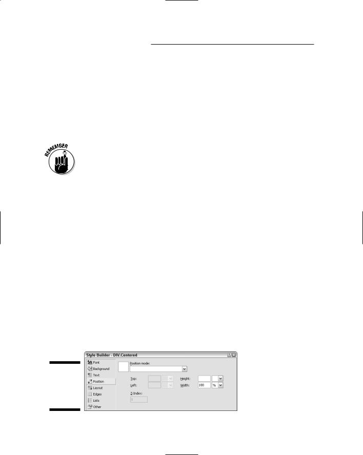
110 Part II: Building Your Web Site
If you’re styling an <img> tag used to show a very tiny picture, use the text-top, baseline, and text-bottom vertical alignment options; these give the picture a precise vertical position relative to inline text. The middle example in Figure 6-12 shows examples of vertically positioning a tiny happy-face image.
If you’re styling a block element that contains text and has some height to it, use the Top, Middle, and Bottom vertical alignment options to align text within the box. In Figure 6-12, the Top, Middle, and Bottom vertical alignment options are applied to cells in a table where the row is three lines tall.
When you’re styling a table, keep inheritance — the relationship between parent and child tables — in mind. Any alignment options that you want to apply to the table as a whole should be defined in the table element (the <table> tag in HTML), because each cell in the table is a child element, defined by <td> tags, within the table. Therefore, any style you define for the table will be inherited by all cells in the table.
Of course, you can always override the style in any cell or group of cells. When you change the setting of a single cell, you do so only for that one cell, that one <td> tag. Other cells still inherit the characteristics of the parent
<table> tag.
The spacing and flow options in the Text category of the Style Builder are largely self-explanatory. As soon as you choose an option, the preview sample given here shows you the effects of your choice. The words “Normal Text” in the preview never change, so you can compare the results of any change you make to that text. If you don’t like a change you’ve made, choose <not set> to cancel your selection, or delete whatever you typed into an option.
Styling position
The Position category of Style Builder, shown in Figure 6-13, offers options for sizing and positioning pictures (the <img> tag), tables (the <table> tag), and block elements that contain text like the <div>...</div> (division) tags.
Figure 6-13:
The Position
category in
the Style
Builder.
Chapter 6: Designing with Styles 111
From the Position Mode drop-down list, you can choose from the following options:
Position in normal flow: The element is “glued” to its neighboring text (usually a paragraph). When the paragraph moves, the text moves with it. This is the default for most blocks; they end up in normal flow if you don’t specify otherwise in a style.
The “palm tree” and “laughing kid” pictures in Figures 5-14 and 5-16 of Chapter 5 are in <img> tags that are positioned in normal flow.
Offset from normal flow: Same as above, but the item can be offset from its default position. Choosing this option enables the Top and Left options; use those to specify the offset. For example, entering 10px for Top and 5px for Left would move the element down 10 pixels and 5 pixels to the right, where it would have been positioned by default.
Absolutely position: Places the block at a specific position on the page. The block is not “glued” to any neighboring text. When you insert or delete text above the block, text below that point moves around the object rather than dragging the block with it.
Choosing the Absolute position options enables the Top and Left options. Use them to define where you want to place the upper-left corner on the page. You can express the measurement in pixels, percent, points, or whatever is most convenient for you.
For example, if you absolutely position the top of a block element to 40%, and the left to 10px, the top-left corner of the block will be 40% of the distance to the bottom of the page, and 10 pixels away from the left margin. The block won’t change position as you add or delete text above it.
If you choose Absolute position, you can also set a Z-Index for the block. A Z- Index is a number that defines the layer on which a block element is placed. Think of a stack of paper, with each sheet of paper as a layer. The sheet at the bottom of the stack is at layer 0 (or Z-Index 0). The next sheet up is at layer
1 (Z-Index 1), and covers the sheet below it. The next sheet up is at layer 3 (Z-Index 2), and it covers layers below it.
Using Z-Indexes is tricky, because items with Z-Indexes greater than zero can cover content on your page. That sort of thing can really bother visitors who are trying to read your page. So you want to stay away from setting any Z-Index unless you have a specialized application for it in your site.
The Height and Width options in the Style Builder Position options let you define the size of the image, table, or other block element you’re styling. You can define the size in pixels, a percent of the page width (or height), or any of several other units of measure.
112 Part II: Building Your Web Site
Styling layout
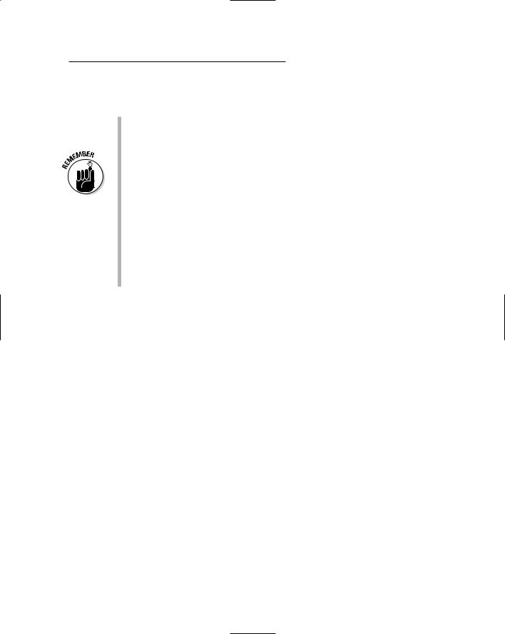
In the Layout category of the Style Builder, you find options that control how elements appear on your page in relation to one another. Some are beyond the scope of this book. But the first three Flow Control options (shown in Figure 6-14) are right up our alley.
Figure 6-14:
Some options in the Layout category of Style Builder.
Visibility: This option controls whether or not the block is visible on the page. For instance, you might want to make an element initially invisible, and then have it appear when the visitor clicks a link or button. The Visibility options are Hidden (the element isn’t visible on the page)
and Visible (the element is visible). The <not set> option is the same as Visible.
Display: This option determines whether the item is displayed as a block element or inflow element. If treated as a block element, the item is placed in its own box on the page, like a table or image. If treated as an inflow element, the style is applied inline. Boldface and italics are good examples of inline elements. Both apply their styles to text without disrupting the flow of text.
Do Not Display: This option omits the element from the page altogether — but it’s not the same as the Invisible option (which sends the element to the client PC but hides it from view, perhaps temporarily). The Do Not Display option prevents the element from being sent to the browser. That reduces the download time. A good example would be sending content to visitors selectively, based on the capabilities of the visitor’s Web browser.
Allow Text To Flow: These options determine whether (and where) text flows around the block element you’re styling. Figure 5-14 in Chapter 5 showed an example using images. You have three basic choices:
•Choosing Do Not Allow Text On Sides prevents any text from wrapping around the element. The element appears on its own line.
•Choosing To The Right causes the element to align to the left margin, so text can flow down the right side of the element (as with the laughing boy in Figure 5-16 in Chapter 5).
Chapter 6: Designing with Styles 113
•Choosing To The Left causes the item to align to the right margin, so text can flow down its left border.
If you want a really thorough description of CSS layout properties, see
Chapters 8 through 10 in the CSS 2.1 spec at www.w3.org/TR/CSS21.
Styling boxes and borders
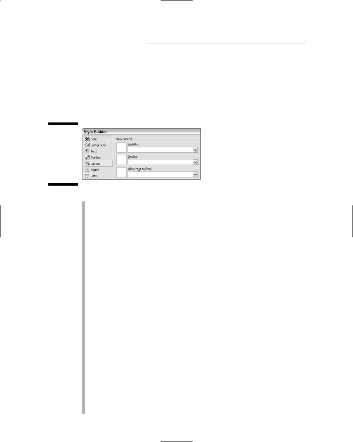
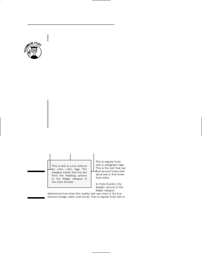
Many design elements, like pictures, tables, and chunks of text enclosed in <div>...</div> tags, form boxes on your page. The Edges category in Style Builder allows you to define the spacing outside the box, inside the box, and the appearance of the borders around the box. If you’re defining the style of a box that contains text or an image, the settings apply as follows:
Margins: Defines the margins outside of the box (how near neighboring text can get to the box).
Padding: Defines margins inside the box (how near text inside the box can get to the box border).
Borders: Defines the style, width, and color of the border surrounding the box.
Figure 6-15 illustrates where the Margins and Padding settings apply to a box that contains text.
Padding |
Border |
Margin |
Figure 6-15:
Margins,
padding, and borders for a box.
A table’s margins are, in effect, little gaps between cells, as shown in Figure 6-16. The padding puts space between a cell’s inner border and the contents of the cell. The Borders options control what kind of lines go around the table and between the cells.
114 Part II: Building Your Web Site
Padding Margin
Figure 6-16:
Margins,
padding, and borders for a table.
When designing borders, you can choose to define all the borders at once, or just the left, right, top, or bottom margin.
You can also collapse the vertical borders in a table so there’s only one line and no gap between cells vertically. This only works if you’re defining the style characteristics of a table element (that is, using a <table> tag). To collapse vertical borders in the table, click Other in left column of the Style Builder. Then, under the Tables heading, choose Collapse Cell Borders from the Tables drop-down list.
Saving Style Builder choices
When you’ve finished choosing options from the Style Builder, just click OK. Your selections are translated into appropriate CSS property: value pairs and inserted between the curly braces for the rule. Here’s a general example:
DIV.BoxedText
{
border-right: navy thin solid; padding-right: 25px; border-top: navy thin solid; padding-left: 25px;
float: left; padding-bottom: 25px; margin: 0px 25px 15px 0px;
border-left: navy thin solid; padding-top: 25px; border-bottom: navy thin solid; width: 30%;
background-color: #ffffcc;
}
To change your selections, right-click anywhere between the curly braces and choose Style Builder again. Make your changes and click OK. Remember, your style sheet can contain as many, or as few, style rules as you like.

Chapter 6: Designing with Styles 115
All those property: value pairs that Style Builder creates are straight from the online CSS specification, available at www.w3.org/TR/CSS21.
Saving a CSS style sheet
When you’ve finished working with a style sheet, just close and save it as you would any other document. The styles you defined won’t be applied to anything until you link the style sheet to a page (or Master Page), as discussed next.
Linking to a Style Sheet
Figure 6-17:
Link a style
sheet to a
Master
Page.
The rules you create in a CSS style sheet are applied only to the pages to which you link the sheet. If you’ve created a Master Page, you can link the style sheet to the Master Page. The styles automatically carry over to all content pages that use the Master Page.
The easy way to link to a style sheet is just to drag its icon from Solution Explorer into the page you’re editing. For example, to add a CSS link to a Master Page, you simply open the Master Page (by double-clicking its icon in Solution Explorer), drag the CSS file’s icon from Solution Explorer to the upper-left corner of the page you’re editing, and drop it there.
Figure 6-17 shows an example: I’m dragging a style sheet named
MyStyles.css into an open Master Page named MasterPage.master.
Drag CSS file
to page
To use your style sheet in an HTML page (or an .aspx page that doesn’t use the master), just open that page in Design view and drag the style sheet’s icon from Solution Explorer onto the page.

116 Part II: Building Your Web Site
Unless there are styles in the style sheet that apply to tags already in the Master Page, you won’t notice any difference. But if you switch to Source view, you’ll see that VWD has inserted a link to the style sheet between the <head> and </head> tags near the top of the page. That link will look something like this example:
<link href=”../StyleSheets/MyStyles.css” rel=”stylesheet” type=”text/css” />
Keep in mind that only pages that have that tag near the top use the styles in the style sheet. If you create a new page from scratch, and don’t specify a Master, drag the CSS file over to the page to create the link.
Using Styles in a Page
After you’ve linked a style sheet to a page, HTML element styles will be formatted automatically. For example, if you styled the body{} element, then body text in the page takes on the style you defined immediately.
As you format text in the page, any new styles will come into play as you use the element. For example, let’s say you created a style for Heading 1 elements in your CSS style sheet, like this:
H1
{
font-size: 16pt;
font-family: ‘Arial Black’; font-style: italic;
}
Any text in the document that is already formatted as H1 will automatically be displayed in the new style. That is, any text between the <h1> and </h1> tags in the Web page will be displayed in 16 point Arial Black italic font.
Exactly how you use a style rule to format new or existing content on the page depends on which type of selector defines the rule. I’ll start with the easiest one, in which the selector’s name matches an HTML tag (for example, as H1 or BODY).
Applying CSS element selectors
A CSS element selector is any CSS rule whose name does not contain a dot. The name of the selector matches the name inside the HTML tags of the element. Applying such a selector takes no real effort at all. You just apply the element as you normally would.
Chapter 6: Designing with Styles 117
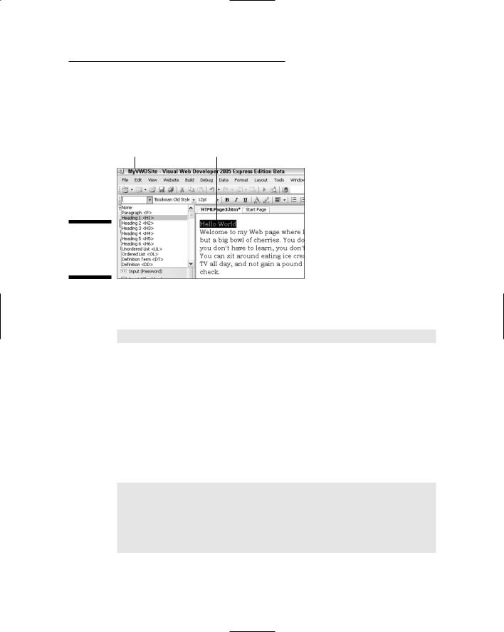
For example, suppose the currently linked CSS style sheet contains the H1 style shown earlier. In the current document, you select a chunk of text, and then choose the Heading 1 style from the Block Format drop-down list on the Formatting toolbar, as in Figure 6-18. The style is applied to the selected text.
Block format |
Selected text |
Figure 6-18:
Applying an
element
style.
In Source view, the formatted text is contained in the usual pair of HTML tags, like this:
<h1>Hello World</h1>
The words Hello World take on the formatting defined by the H1 style rule in the style sheet. You don’t have to do anything special to make that happen. The connection between <h1> in the page and the H1{...} style in the style sheet is built-in and automatic. If you change the H1{} style rule in the style sheet, the change shows up in all pages automatically.
Applying CSS class selectors
CSS class selectors aren’t associated with any particular HTML element. In a style sheet, their names are preceded by a dot, as in this .Mono class selector:
.Mono
{
font-family: ‘Courier New’ , Monospace; font-style: normal;
color: navy;
}
118 Part II: Building Your Web Site
Using CSS class selectors in VWD is a bit of a pain, because their names don’t show up in IntelliSense menus or any drop-downs anywhere. You have to remember the names and type them yourself. For an inline style like the
.Mono example, your best bet would be to enclose the text to be formatted in <span>...</span> tags in Source view and specify the class name in the <span> tag, as follows:
<span class=”Mono”>text to format goes here</span>
Note that within the <span> tag you don’t include the leading dot, just the name. The class name must be enclosed in single or double quotation marks.
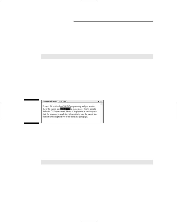
You’ll need to work directly in Source view to type the tags. But it will be easiest to find the text if you first select that text in Design view. For example, let’s say in Figure 6-19 you want to display the sample code LET X = 10 in monospace. First, select that text as shown in Figure 6-19 by dragging the mouse pointer through only that text.
Figure 6-19:
Selecting
text in
Design
view.
To switch to Source view, click the Source button at the bottom of the Design surface. The text you selected in Design view is still selected in Source view, making it a little easier to find among all the other stuff that appears in Source view.
Next, click a space just to the left of the first character you want to format, then manually type in the <span> tag, as follows:
<span class = “Mono”>
VWD automatically adds the closing </span> tag right after the opening tag. You need to move that closing tag so that it’s after the text to which you want to apply the style. A simple way to do that would be to cut and paste the text so that it’s between the two tags. For example, in Figure 6-20 I’ve moved the sample code LET X = 10 so it’s between the <span class=”Mono”>...</span> tags.

Chapter 6: Designing with Styles 119
Figure 6-20:
Applying a CSS class selector to an <em> tag.
When you switch back to Design view, only the text within the tags will be formatted with the Mono style.
If you switch to Design view and the text isn’t formatted as expected, either you forgot to link the style sheet to the current page, or you misspelled the class name in the Style tag.
Applying element class selectors
Element class selectors have a dot embedded in the name. The first part of the name defines which tag you use to apply the style. For example, here is an element-class selector named ColHead that can only be applied to table cells (<TD> tags).
TD.ColHead
{
font-weight: bold; font-family: Arial; background-color: #ffffcc; border-bottom: navy thin solid;
}
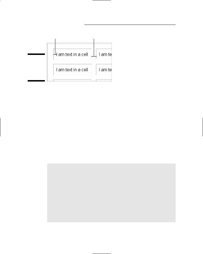
To use an element class like TD.Colhead, you have to apply the class to text that’s already formatted by the HTML element, TD in this example. Because <TD>...</TD> tags define table cells, you have to start, in Design view, by clicking on text that’s already in a table cell.
You can take a shortcut and select the items you want to format. For example, to apply the TD.ColHead class selector to all the cells in a row, select the row as in the example at the top of Figure 6-21. The Properties sheet won’t show a tag name when you have multiple elements selected. But you can still type the class name, ColHead, in the Class property for the selection, as in the center of that same figure. Press the Tab key to complete the entry, and the selected cells will take on the style, as in the bottom of that same figure.