

Beginning Object-Oriented ASP.NET 2.0 with VB.NET From Novice to Professional
.pdf
C H A P T E R 9
■ ■ ■
ASP.NET Controls
In this chapter, I’ll cover ASP.NET controls, which are used to create a user interface on a web form. After an introduction, I’ll also expand on the Help Desk application from Chapter 8.
HTML Server Controls
HTML elements are not available to the server, because they are text that is passed through to the browser. HTML server controls are HTML elements (grouping of tags) that contain attributes that make them both visible to and programmable on the server. By creating HTML server controls and adding HTML elements to those controls, the HTML elements are exposed and can be programmed on the server. HTML attributes, such as Width for the <td> tag, are exposed in an HTML server control as a property (properties will be covered later in this chapter).
Any HTML element on a page can be converted to an HTML server control. To make an HTML element a server control, add the attribute RUNAT="SERVER", as in the following examples.
HTML Input element:
<input id="Button1" type="button" value="button" />
HTML Input server control:
<input id="Button1" type="button" value="button" runat="server" />
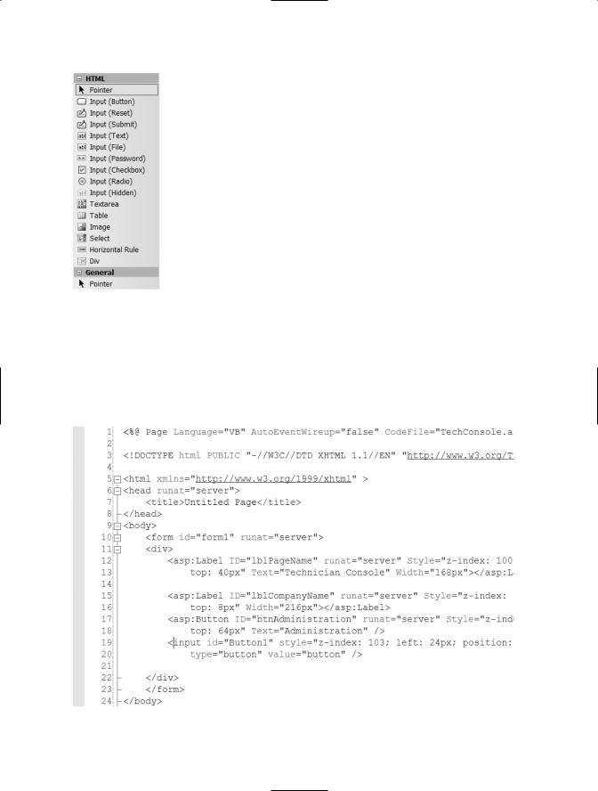
The runat attribute tells the ASP.NET page framework that it should create an instance of the control for server-side page processing. You can also use the form designer to change an HTML element into a server control. To show this, open the Help Desk application you previously created and then open the TechConsole.aspx page. Within the Toolbox, find the HTML section of the Toolbox as shown in Figure 9-1. To find the HTML Section, you may need to scroll up or down the Toolbox. The HTML section of the Toolbox will have a title
of HTML.
149
150 C H A P T E R 9 ■ A S P. N E T C O N T R O L S
Figure 9-1. HTML section of the toolbox
Drag and drop the Input (Button) HTML element from the toolbox onto the TechConsole.aspx page. After dragging the element onto the form, click the Source button at the bottom of the Designer, if you are not already in Source mode (see Chapter 8 for more instructions). The HTML source for the page will appear, as shown in Figure 9-2.
Figure 9-2. Source for HTML Input element
C H A P T E R 9 ■ A S P. N E T C O N T R O L S |
151 |
Notice that there is an HTML tag that begins with asp:Button. This tag is for the Administration button that was placed on TechConsole.aspx previously. The tag that begins with input is the HTML element that was just placed there. Also notice the asp:Button tag has a runat attribute with a value of “server”, while the input tag does not. This tells the .NET Framework that this is a server control.
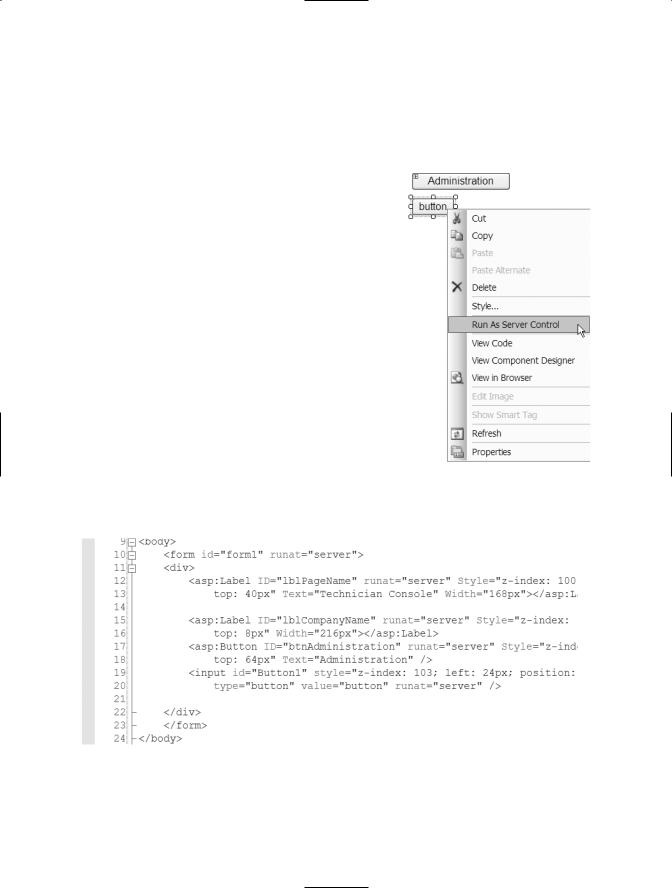
To convert this HTML element to an HTML server control, which can then be used at the server, click on the Design button at the bottom of the Designer to move back to Design mode. After doing this, right-click on the HTML Input button on the form and then choose Run As Server Control, as shown in Figure 9-3.
This will add the necessary attribute to the HTML element, in order to make the element a server control, and therefore allow it to be executed from the server. Click the Source button at the bottom of the Designer again to view the updated HTML element. The revised source includes the runat attribute, as shown in Figure 9-4.
Figure 9-3. Choosing Run As
Server Control
Figure 9-4. Revised HTML element with runat attribute

152 C H A P T E R 9 ■ A S P. N E T C O N T R O L S
Notice the tag is still an Input tag, not an asp:Button tag. This is because the HTML element is being run at the server instead of being a full-blown server control. After adding the runat attribute, you can reference a control within your code if you assign an ID attribute to it. In this example the ID is Button1. I’ll cover working with the methods and properties of a control, along with a description of the property differences between an HTML element and a standard sever control later in this chapter.
Web Server Controls
Web server controls are similar to HTML server controls, except the web server control does not map directly to an HTML server control. The HTML rendered by the control may be different than what you write program code to interact with. When you’re using the HTML server control, you can change and program the exact HTML attributes. But with the web server control you are dealing with properties and methods of the control, which in turn generates the necessary HTML attributes and tags. Web server controls include normal form controls, such as buttons and text boxes, as well as controls that can display data in grids and choose a date.
Web server controls also provide a more complete object model and automatic browser detection, in order to determine the best output for a browser. Some controls include the ability to define a customized look for the control through the use of a template. Also, some controls allow you to determine whether the events on the control cause an immediate postback to the server or instead wait for the form to be submitted.
As shown in both Figure 9-3 and Figure 9-4, the web server controls all begin their tags with asp: followed by the type of control they represent (button, textbox, and so on). When the page runs, the web server control is rendered to the page using appropriate HTML. The control determines which HTML to render, based on the browser type and the settings that have been provided as properties for the control.
Working with Control Properties and Events
Both HTML server controls and web server controls allow you to manipulate some of the attributes of the HTML to be rendered, as well as defining what happens when
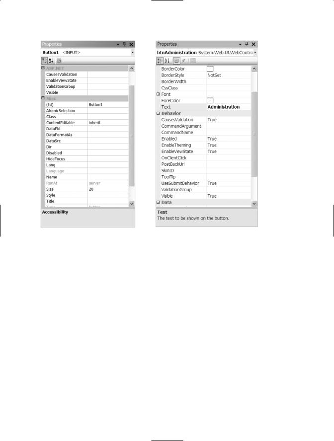
events occur. There is a large difference between properties that can be changed for an HTML server control, shown in Figure 9-5, and the properties that can be changed for a web server control, shown in Figure 9-6.
In Figure 9-5 notice the limited properties that can be changed. These are a direct match to the possible HTML attributes for a button. In Figure 9-6, the list of properties is much richer in features and goes well beyond the possible HTML attributes for a button.
C H A P T E R 9 ■ A S P. N E T C O N T R O L S |
153 |
Figure 9-5. HTML server control properties
Figure 9-6. Web server control properties
Change the ID property of the new HTML button control to btnAddNew. Notice there isn’t a text property for the HTML button control. Instead there is a value property. The value property of an HTML control is the same as the Text property of a server control. Change the Value property of the same control to New Ticket.
Click the Administration button and view the Properties window. Again, notice the number of properties that can be changed. These properties are broken down into categories. The first is Accessibility, which are the properties that can be used to make the button accessible through the keyboard as well as the tab index. You can use the Tab Index property of each control on a form to set the order in which controls are given focus when the Tab key is used. This allows the user to tab through the controls. You should incorporate this functionality when doing a data entry form (like AddTicket.aspx), so that the user can enter information using the keyboard and then tab to the next control, where they can enter more information, and continue that cycle.
The next category of properties is Appearance. Use these properties to determine how the control will look to the user. This includes the background and foreground color as well as font. You can change the font by expanding the font section within this category. Many of the common fonts are listed in a drop-down list. You can also choose the

154 C H A P T E R 9 ■ A S P. N E T C O N T R O L S
size of the font and whether the font should be in bold or italics or neither. When choosing a font, be careful to choose a common font. Be aware that some browsers may not support certain types of fonts, so it is a good idea to use the most common fonts, such as Arial and Times New Roman.
The next category of properties is Behavior. This category contains properties that determine some action or behavior of the control. This includes the enabled property, which can be used to either enable or disable a control. A disabled control will appear gray on the screen and the user will not be able to interact with it, either by clicking it, if it’s a button, or by typing in a text box. The Visible property determines whether the control can be seen or not. As shown in the previous chapter there are cases when you may want to show a button (visible = true) when a certain criterion is met, but then not show the button (visible = false) when that criterion is not met. The Tooltip property within this section can be used to display a message when the mouse is over the control. This can be used to give directions to a user or to provide a name for a control that a user can understand.
The next category of properties is Data. For a button control, this property can be used to bind a certain value to the text property. It can also be used to assign a configuration or application setting to the text property, so that it can be changed later. You can use configuration and application files and settings to hold text that will be assigned to the text property of a control. This way that text value can be changed when necessary without having to recompile and redeploy the application. (Compiling and redeploying are outside the scope of this book.)
The next category of properties is Layout. There are two properties here, height and width. You can use these properties to define a default height and width for the control instead of resizing the control manually on the screen. If you want all of the controls to be the same size you could use this to make sure they are all the same size.
The last category of properties is Misc. This category will list any properties that did not fit into the other categories. For the Administration button the only property here is the ID property. The ID property is the name of the control to be used in code. By default each control has a name based on the control type and how many of those controls exist on the same form. You can’t have more than one control on the same page with the same name. If you attempt to do this, you will receive an error message when you move away from the Properties window.
Not all server controls have the same properties. This is the advantage to using web server controls versus HTML controls. The web server controls have been built to generate the necessary HTML for a set of properties and therefore have been customized for that type of control. If you click the label “Technician Console” on the TechConsole.aspx page and view the properties you will notice the list of properties is slightly different. For example the label control does not have a Causesvalidation property and some other properties within the Behavior category. The reason is these properties are not relevant to the label control. They are relevant to the button control and some others but not
the label.
C H A P T E R 9 ■ A S P. N E T C O N T R O L S |
155 |
Both HTML and web server controls have events as well as properties. You can view the events for either type of control by being both in the Designer and in Design mode (not Source mode), right-clicking, and then choosing View Code. You can write code to be executed each time one of these events occurs by choosing the server control and then the event. The events do vary based on the type of control (HTML versus web server control). For example, right-click the TechConsole.aspx page anywhere on the form and choose View Code. From the top left drop-down list choose btnAddNew. From the top right drop-down list choose ServerClick. This will create a server click event for btnAddNew. Notice there is already a Click event for btnAdministration. Again the difference is that btnAddNew is an HTML control. Within the ServerClick event of the btnAddNew control type Response.Redirect("AddTicket.aspx"). This will redirect the browser to AddTicket.aspx when the New Ticket button is clicked.
Validation Controls
Validation controls are controls that include logic that allows you to test a user’s input. Validation controls can be used to check for a required field, test against a specific value or pattern, verify that entered data falls within a range, as well as for allowing custom validation.
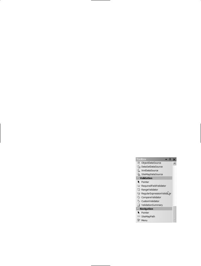
To show this in action, you are going to add validation controls to the AddTicket.aspx page within the Help Desk application. Save the changes you’ve made to the TechConsole.aspx page and close it. Then, open the AddTicket.aspx page. To use a validation control, find the Validation section of the toolbox, as shown in Figure 9-7.
From the Toolbox choose the RequiredFieldValidator control and drag it next to the User Login text box on the AddTicket.aspx (you may need to move other controls around). The resulting Design View is shown in Figure 9-8.
Next, view the properties for the control, shown in Figure 9-9.
There are two properties that you should look for. The first is the Error Message property, which is the property that controls the error message that will be displayed. Enter User Login is required in the Error Message Property box.
The second property is the ControlToValidate property. This property provides a drop-down list of all the possible controls that you can validate on the form, as shown in Figure 9-10.

156 C H A P T E R 9 ■ A S P. N E T C O N T R O L S
Figure 9-8. Form after RequiredFieldValidator control added
Figure 9-9. Validation control |
Figure 9-10. ControlToValidate |
|
properties |
property |
|
C H A P T E R 9 ■ A S P. N E T C O N T R O L S |
157 |
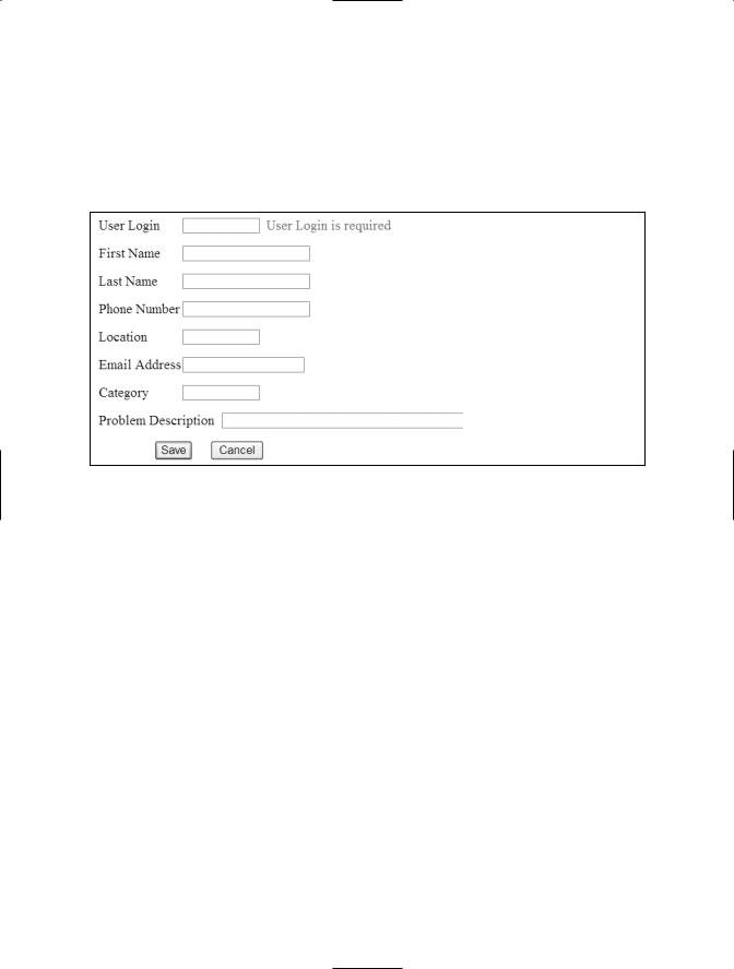
Next, choose txtUserLogin from the list. Also, change the ID property to UserLoginRequired. Now, to show how the validation control works, choose Start without Debugging from the Debug menu. Do not enter any values for any of the fields and then click the Save button. You’ll see text appear next to the User Login text box, which matches the ErrorMessage property of the validation control, as shown in Figure 9-11.
Figure 9-11. Validation message returned
You’ll notice that the error message stating that none of the values were provided was not displayed, as it was in the same situation in Chapter 8. The reason for this is that the validation control is fired prior to the code for the button event. Therefore, this validation occurs before any of the code in the click event of the Save button is run. This is a good way to make sure that the user sees any errors before they move off the page. This also saves round trip (transfer to the server and back) work as your code on the server, within the Ticket class, is never executed because the error is found at the client instead of the server.
The RangeValidator control is another useful validation control. This control can be used to verify that your values are within acceptable ranges. For example, if you want a user to enter a value that should be between 1 and 10, this control will display an error message if the value is outside of that range.
To show this, drag and drop the RangeValidator control to the AddTicket.aspx page and then place it next to the Location text box control. For now, the Location control is gathering a number and passing it to an integer public property of the Ticket class. Click on the RangeValidator control and view the properties. Change the ErrorMessage property to Location is out of Range, change the control to validate to txtLocation, and change the ID property to LocationRange. Notice that there is a MaximumValue and MinimumValue property. These are the lowest and highest values that can be entered into the validated control. Enter 1 as the MinimumValue and 10 as the MaximumValue.

158 C H A P T E R 9 ■ A S P. N E T C O N T R O L S
Another useful validation control is the RegularExpressionValidator. This control can be used to verify that the fields have the correct type of information entered, whether phone number, zip code, or e-mail address. The control does this by making sure that the information entered into the control matches the pattern for each of these types of values. To use this control, drag and drop the RegularExpressionValidator control to the AddTicket.aspx form, next to the Email Address text box. Set the ErrorMessage property to Email Address is not valid, and the ID property to EmailMailExpression. Set the Controltovalidate property to Txtemailaddress. Also, notice that there is a Validationexpression property. Click the ellipses next to this property to get a box that allows you to choose which expression to use. When you find the one called Internetemailaddress, choose it.
To test out the validation controls, choose Start without debugging from the Debug menu. This time enter any value for User Login, enter 15 into the Location text box, and then tab off the text box. You will get an error message, telling you that the Location is not in range, immediately. Type emailaddress into the e-mail address text box and then tab off. This time you’ll get the Email Address is not valid error message immediately.
You can use all of the validation controls that I’ve covered to give the user feedback as quickly as possible.
Master Pages
Master pages allow you to create a consistent look for all pages within an application. A single master page defines a standard look and feel for either a group of pages or an entire application. Individual content pages can contain specific content as needed though—when a user requests the individual content page it’s merged with the master
page to produce the output. A master page has a file extension of .master and has a predefined layout that includes static text, HTML elements, and/or server controls. Master pages allow centralized common functionality, which allows you to make updates in one place, use one set of controls and code for multiple pages, and allow you to control the layout of the final page by giving you control of the placeholders.
To try this out, you’re going to add a master page to the Help Desk application. First, add a new master page, the same way that you would add any new form. Give
your page the name HD.Master (the default extension of a master page). Next, you’re going to add a company logo to the master page so that it appears on each page. To do this, you need to copy the image file that you want to use into the same folder as your web site (most likely c:\inetpub\wwwroot\HelpDesk). After the image file is within the web site folder, click the web site URL within the Solution Explorer and choose Add Existing Item. When the Add Existing Item window appears, choose the image file. Now that