

Professional Visual Studio 2005 (2006) [eng]
.pdf
Chapter 5
The General Settings section, shown in Figure 5-4 in collapsed state, contains a large array of different settings that can be included or excluded from the backup process. You can choose to back up your settings for individual windows and lists, the Toolbox, and even more esoteric options such as file extension mappings.
After you select the settings you require to be exported, click the Next button to specify where the settings should be saved. Visual Studio 2005 will generate a default filename and location, but you can override either if necessary. Depending on the selection of options, the backup process can take up to a couple of minutes to collect the necessary information.
Importing a settings file is just as easy. The same wizard is used but you select the Import option on the first screen. Rather than simply overwrite the current configuration, the wizard allows you to back up the current setup first (see Figure 5-5).
Figure 5-5
You can then select from a list of preset configuration files — the same set of files from which you can choose when you first start Visual Studio 2005 — or browse to a file that you created previously. Once the settings file has been chosen, you can then choose to only import certain sections of the configuration.
56

Customizing the IDE
The wizard excludes some sections by default, such as the list of External Tools or Command Aliases, so that you don’t inadvertently overwrite customized settings. Make sure you select these sections if you want to do a full restore.
If you just want to restore the configuration of Visual Studio 2005 to one of the default presets, you can choose the Reset All Settings option in the opening screen of the wizard, rather than go through the import process.
Splitting Up the Workspace
When using the default Tabbed Windows layout, you normally only see one file at a time in the main workspace. This can be frustrating if you’re constantly switching back and forth between two files. For example, when you’re working with a form, sometimes you need to work with both Design and Code views simultaneously, and the constant switching between the tabs can be awkward.
As mentioned previously in Chapter 2, you could switch to Multiple Documents view and tile the various windows like previous development environments have done in the past. However, Visual Studio 2005 provides an alternative solution — splitting the workspace either horizontally or vertically.
To split the workspace, choose Window New Horizontal Tab Group or Window New Vertical Tab Group depending on the orientation of the split you need. Figure 5-6 shows the workspace with a single vertical split. Alternatively, you can click and drag the tab off the tab list. Visual Studio will present a small context menu that enables you to choose which type of split you want to perform (or a Cancel button if you didn’t intend to split the workspace at all).
You can split the workspace into more than two groups too, with the only limit being that you can’t have empty tab groups, and you can’t have the one file view in multiple tab groups (the Design view of a form can only be shown in one tab group at a time).
Files can be moved between tab groups by right-clicking their tab and choosing Move to Previous Tab Group or Move to Next Tab Group. These commands are also available in the Window menu once multiple tab groups are visible.
You can split the workspace either horizontally or vertically at any one time, but not both.
If you do need to view the same file in two parts, which is often the case when you’re writing code in one section of a class or module that refers to another section of the same code module, you can choose the Window Split command to add a horizontal bar for the code window (this command is only available for code windows, as it doesn’t make sense to perform a similar split in Design view).
An alternative method to splitting the code window is to click and drag the small bar above the vertical scrollbar in the code window itself.
57
Chapter 5
Figure 5-6
Summar y
By now you’ve configured your environment to suit your own working style. The Toolbox contains the elements you need, the Solution Explorer shows the items within your projects in a logical manner, and the various windows of most use to you are positioned in a logical fashion for the way you work. You can also back up all these settings so you don’t need to set them again. In the next chapter you’ll capitalize on all this work by seeing Visual Studio 2005 in action when designing forms, revealing how the tool windows work with you to efficiently design window layouts.
58

Form Design
Now that you have the Visual Studio 2005 IDE set up in a way that suits you, it’s time to take a look at the ways it can help you design your forms and windows. From simple drag-and-drop procedures to place graphical controls onto the form, through the handling of nonvisual elements, to advanced placement and alignment controls, the form editor built in to Visual Studio 2005 provides you with immense power without having to dive into code.
This chapter walks you through these processes, bringing you up to speed with the latest additions to the toolset so that you can maximize your efficiency when creating Windows applications.
The Form Itself
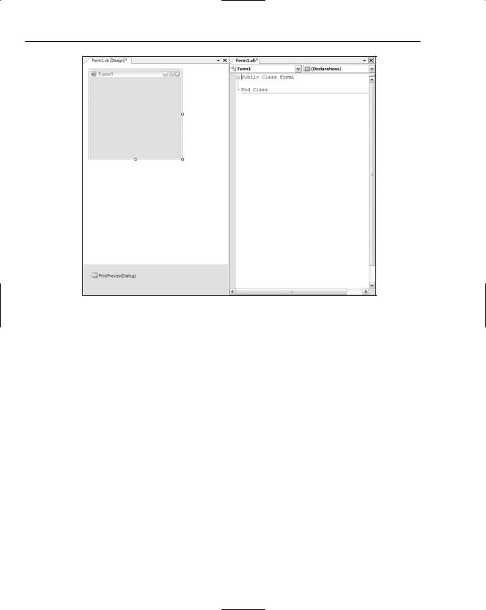
When you create a Windows application project, Visual Studio 2005 will automatically create a single blank form ready for your user interface design (see Figure 6-1). Before you commence placing elements on the form, you might want to set a few properties on it to match your application requirements.
The first action you’re likely to take is to set the physical size of the form. To do this you have two options available. The first is to grab any of the three size grippers on the bottom and right edges of the form in Design view and drag it to the size you require.
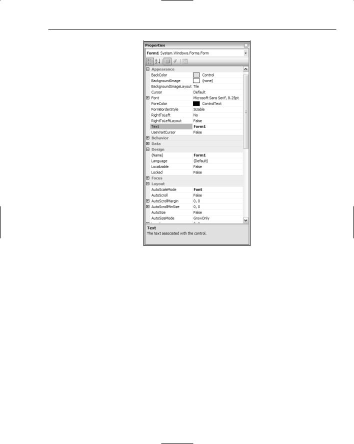
However, this method can be inexact, as you don’t get any feedback on precisely how big the form is. The second option you can choose to set the size is to do it via properties. At the bottom-right corner of Figure 6-1 is the Properties window (you’ll see this in detail in a moment), which contains many attributes for the form when it is selected as the active component. The Size property is
a compound property made up of Height and Width. You can set the dimensions of the form with pixel values by entering either individual values into the Height and Width properties, or a compound Size value in the form width, height.

Chapter 6
Figure 6-1
The default form created for your application is defined with the most commonly used properties, such as icon; minimize, maximize, and close buttons, and a resizable border. Changing any of these settings is just as simple as changing the Size property.
The Properties window shown in Figure 6-2 displays a subset of the available properties for customizing the form’s appearance and behavior. As mentioned in Chapter 1, you can arrange the properties either alphabetically or into categories, such as those shown in Figure 6-2. To change most properties, it’s just a matter of selecting it from the list and overwriting the existing value with the new data. For example, to change the form’s caption bar text from Form1 to something more appropriate for your application, you would locate the Text property and overtype Form1 with your new caption text.
Some properties have only a small set of options from which to choose. These will be presented in a ComboBox from which you select the correct option. For consistency, the Properties window uses this method for simple true or false properties as well.
60
Form Design
Figure 6-2
To change the other components that appear in the caption bar of your form, you can use the following properties:
Property |
Effect |
|
|
ShowIcon |
This toggle option enables you to hide the form’s icon in the top-left |
|
corner. |
MinimizeButton |
The MinimizeButton option enables you to indicate that the mini- |
|
mize button is not required. If the maximize button is displayed, |
|
rather than hide the minimize button, setting this value to False will |
|
simply disable the button from being used at runtime. |
MaximizeButton |
Similar to the MinimizeButton option, this property controls |
|
whether the maximize button (or restore button depending on the |
|
current state of the form) is required. If both the MinimizeButton |
|
and MaximizeButton options are set to False, then both buttons |
|
will be removed from the caption bar of the form. |
|
|
|
Table continued on following page |
61

Chapter 6
Property |
Effect |
|
|
HelpButton |
Inactive by default, if you want to supply help to your application in |
|
the form of the quick help icon, set this property to True. Note that |
|
this property setting is ignored if the minimize and maximize buttons |
|
are displayed. |
ControlBox |
Rather than set individual controls for each of the icons and buttons |
|
on the caption bar, you can use this property to remove them all at |
|
once. |
|
|
If the form’s purpose differs from the normal behavior, you may need a fixed-size window or a special border, as seen in tool windows. The FormBorderStyle property controls how this aspect of your form’s appearance is handled. The following table describes the different values and what effect they have on the display of your form:
FormBorderStyle |
Effect |
|
|
FixedSingle |
A single-pixel border is drawn around the form but the form itself |
|
is fixed in size. Note that if you use this with the MaximizeButton |
|
property set to True, your users will still be able to switch the |
|
form’s state between maximized and the regular, fixed size, which |
|
may be undesirable. |
Fixed3D |
Similar to FixedSingle, Fixed3D draws the form with a sunken |
|
look. This style of window is not used actively in modern applications |
|
but it may be useful to create a different feel for your application’s |
|
form. |
FixedDialog |
FixedDialog is the style of border used for dialog boxes such as |
|
color and font selection and confirmation dialogs. It also uses a single- |
|
pixel border. The main difference between this and FixedSingle is |
|
that the icon is not displayed by default using this style of border. |
Sizable |
This is the default setting for this property. It draws a slightly wider |
|
border suitable for gripping and resizing. |
FixedToolWindow |
Tool windows are those small windows that are simply headed |
|
with a caption bar of text and the close button. This style restricts |
|
the size to whatever you specify. |
SizableToolWindow |
The same as FixedToolWindow except that the end user can resize |
|
the window. This is the style Visual Studio 2005 uses for its own |
|
tool windows, such as the Properties window. |
|
|
You can use these properties in conjunction to easily create any of the standard window designs you see in the Windows system, from fixed dialog options screens to sizable forms such as those you see in Notepad.
62
Form Design
Form Design Preferences
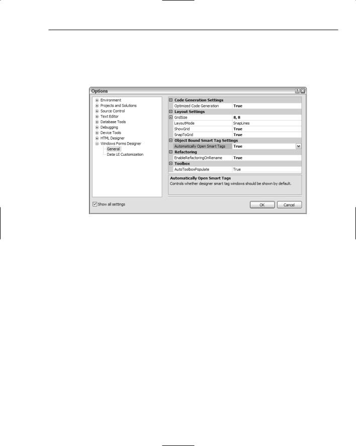
Before you start placing components on the form, there are some IDE settings you can change to simplify your user interface design phase. In the Options dialog (shown in Figure 6-3) of Visual Studio 2005 there are two pages of preferences that deal with the Windows Forms Designer.
Figure 6-3
The main settings that affect your design are the layout settings. By default, Visual Studio 2005 uses a new layout mode called SnapLines. Rather than position visible components on the form via an invisible grid, SnapLines helps you position them based on the context of surrounding controls and the form’s own borders. You’ll see how to use this new mode in a moment, but if you prefer the older style of form design that originated in Visual Basic 6 and was used in the first two versions of Visual Studio .NET, you can change the LayoutMode property to SnapToGrid.
Once the LayoutMode property has been changed the other Layout Settings preferences become available. The first is GridSize, which is used when positioning and sizing controls on the form. As you move them around the form, they will snap to specific points based on the values you enter here. Most of the time, you’ll find a grid of 8 × 8 (the default) too large for fine-tuning, so changing this to something such as 4 × 4 might be more appropriate.
ShowGrid will display a network of dots on your form’s design surface when you’re in SnapToGrid mode so you can more easily see where the controls will be positioned when you move them. Finally, setting the SnapToGrid property to False will deactivate all layout aids and result in pure free-form form design.
While you’re looking at this page of options, you may want to change the Automatically Open Smart Tags value to False. The default setting of True will pop open the smart tag task list associated with any control you add to the form, which can be distracting during your initial form design phase.
63
Chapter 6
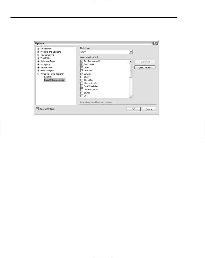
The other page of preferences that you can customize for the Windows Forms Designer is the Data UI Customization section (see Figure 6-4). This is used to automatically bind various controls to data types when connecting to a database.
Figure 6-4
As you can see in the screenshot, the String data type is associated with five commonly used controls, with the TextBox control set as the default. Whenever a database field that is defined as a String data type is added to your form, Visual Studio 2005 will automatically generate a TextBox control to contain the value.
The other controls marked as associated with the data type (ComboBox, Label, LinkLabel, and ListBox) can be optionally used when editing the data source and style, as described in Part VII of this book.
It’s worth reviewing the default controls associated with each data type at this time and making sure you’re happy with the types chosen. For instance, all DateTime data type variables will automatically be represented with a DateTimePicker control, but you may want it to be bound to a
MonthCalendar.
Adding Controls to Your Form
You can add two types of components to your Windows forms: graphical elements that actually reside on the form itself, and service components that do not have a specific visual interface displaying on the form. The service components will be discussed in a moment, but for now you’ll learn how to add the visual controls to your form and customize them.
64
Form Design
Adding graphical controls to your form is done in one of two ways. The first method is to locate the control you want to add in the Toolbox and double-click its entry. Visual Studio 2005 will place it in a default location on the form — the first control will be placed adjacent to the top and left borders of the form, with subsequent controls tiled down and to the right.
The second method is to click and drag the entry on the list onto the form. As you drag over available space on the form, the mouse cursor will change to show you where the control will be positioned. This enables you to directly position the control where you want it, rather than first add it to the form and then move it to the desired location. Either way, once the control is on the form, you can move it as many times as you like, so it doesn’t really matter how you get the control onto the form’s design surface.
When you design your form layouts in SnapLines mode (see previous section), a variety of guidelines will be displayed as you move controls around in the form layout. These guidelines are recommended “best practice” positioning and sizing markers so you can easily position controls in context to each other and the edge of the form.
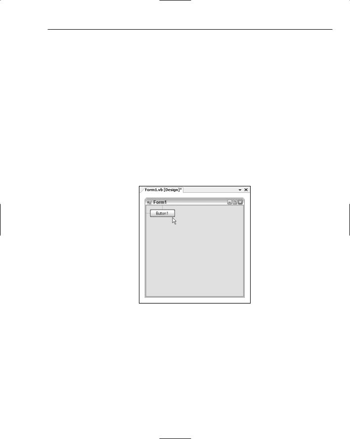
Figure 6-5 shows a Button control being moved toward the top-left corner of the form. As it gets near the recommended position, the control will snap to the exact recommended distance from the top and left borders, and small blue guidelines will be displayed.
Figure 6-5
Guidelines for Controls
These guidelines work for both positioning and sizing a control, enabling you to snap to any of the four borders of the form — but they’re just the tip of the SnapLines iceberg. When additional components are present on the form, many more guidelines will begin to appear as you move a control around.
65