

Professional Visual Studio 2005 (2006) [eng]
.pdf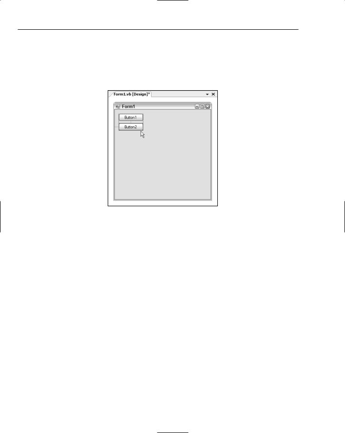
Chapter 6
In Figure 6-6, you can see the Button2 control being moved. The guideline on the left is the same as previously discussed, indicating the ideal distance from the left border of the form. However, now three additional guidelines are displayed. Two blue vertical lines appear on either side of the control, confirming that the control is aligned with both the left and right sides of the other button control already on the form (this is expected because the buttons are the same width). The other vertical line indicates the ideal gap between two buttons.
Figure 6-6
Vertically Aligning Text Controls
One problem with alignment of controls that has persisted since the very early versions of Visual Basic is the vertical alignment of text within a control, such as a TextBox compared to a Label. The problem was that the text within each control was at a different vertical distance from the top border of the control, resulting in the text itself not aligning.
Many programmers went through the pain of calculating the appropriate number of pixels that one control or the other had to be shifted in order to have the text portions line up with each other (and more often than not it was a smaller number of pixels than the grid size, resulting in manual positioning via the Properties window or in code).
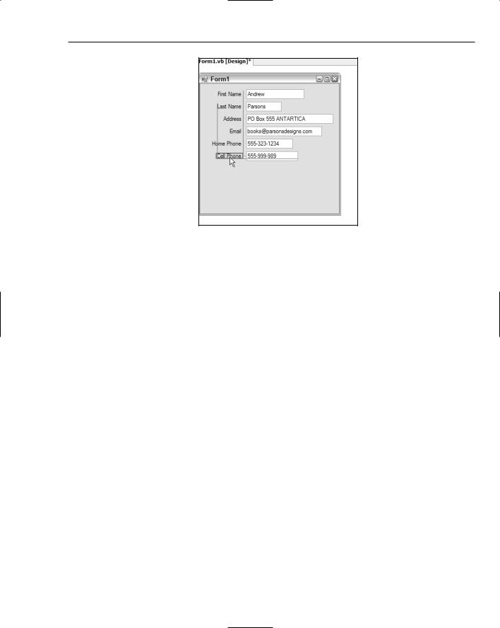
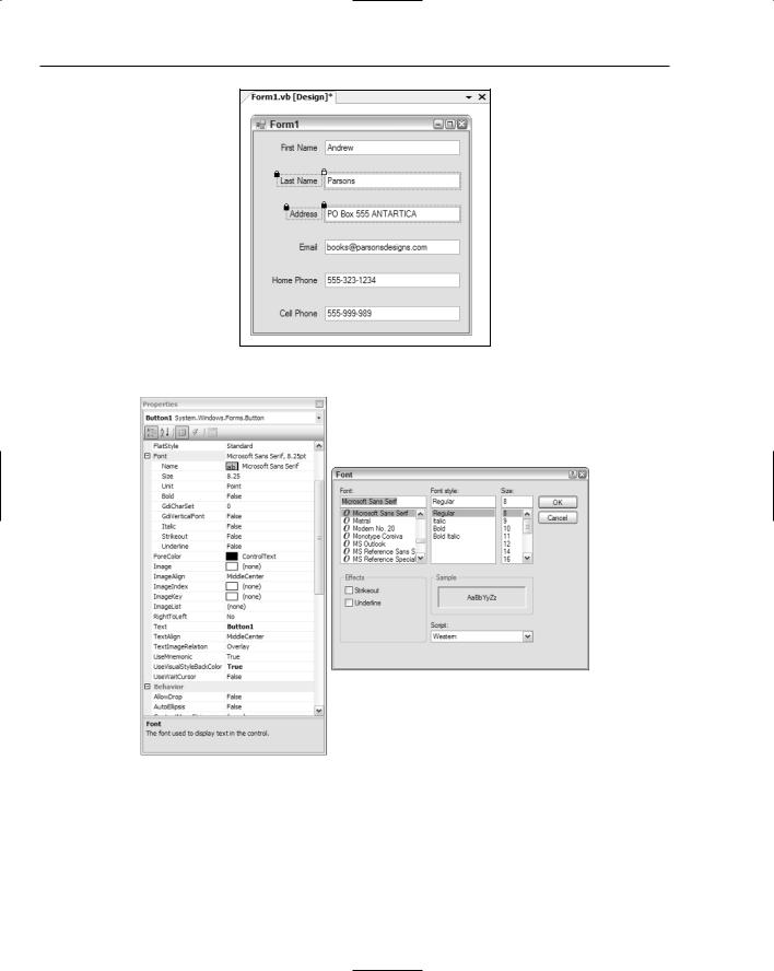
As shown in Figure 6-7, an additional guideline is now available when lining up controls that have text aspects to them. In this example, the Cell Phone label is being lined up with the textbox containing the actual Cell Phone value. A line, colored magenta by default, appears and snaps the control in place. You can still align the label to the top or bottom borders of the textbox by shifting it slightly and snapping it to their guidelines, but this new guideline takes the often painful guesswork out of lining up text.
Note that the other guidelines show how the label is horizontally aligned with the Label controls above it, and it is positioned the recommended distance from the textbox.
66
Form Design
Figure 6-7
Automatic Formatting of Multiple Controls
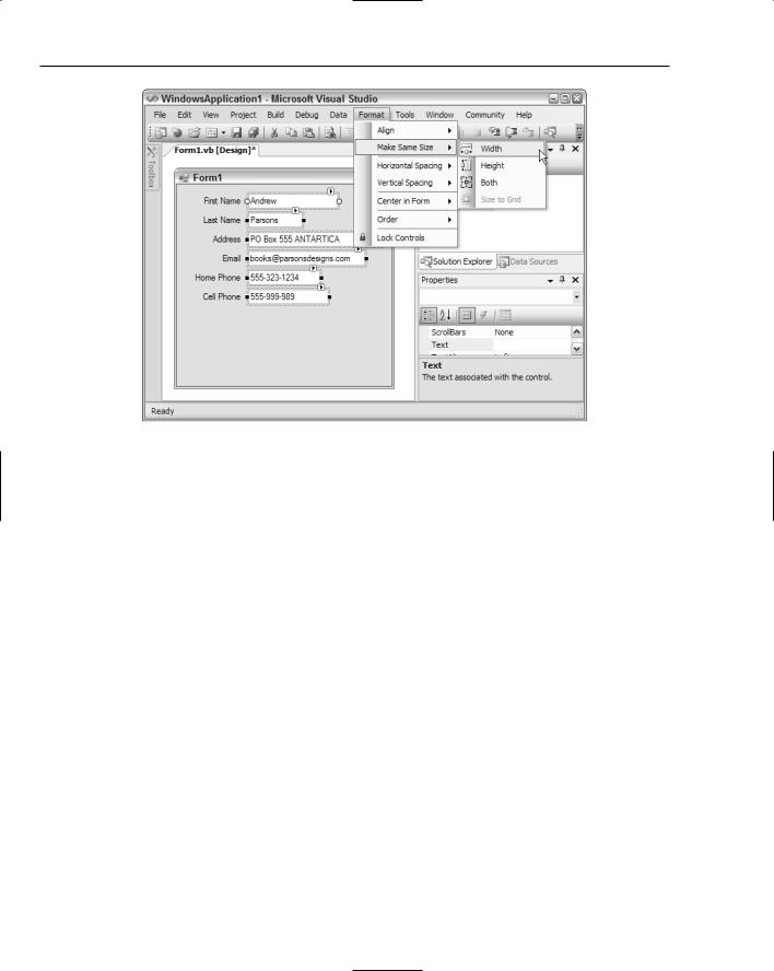
Visual Studio 2005 gives you additional tools to automatically format the appearance of your controls once they are positioned approximately where you want them. The Format menu is normally only accessible when you’re in the Design view of a form (see Figure 6-8). From here you can have the IDE automatically align, resize, and position groups of controls, as well as set the order of the controls in the event that they overlap each other.
The form displayed in Figure 6-8 contains several TextBox controls, all with differing widths. This looks messy and should be cleaned up by setting them all to the same width as the widest control. The old way of doing this would be to adjust the width of each one in turn to match the widest control — the Email field. However, as shown in the screenshot, the Format menu provides you with the capability to automatically resize the controls to the same width.
The commands in the Make Same Size menu use the first control selected as the template for the dimensions, so in this case you would first select the Email field, and then add to the selection by holding the Ctrl key down and clicking each of the other TextBox controls. Once they’re all selected, choose the Make Same Size Width command.
Automatic alignment of multiple controls can be performed in the same way. First, select the item whose border should be used as a base, and then select all of the other elements that should be aligned with it. Next, select Format Align and choose which alignment should be performed. In this example, the Label controls have all been positioned with their right edges aligned. This could have been done using the guidelines, but sometimes it’s easier to use this mass alignment option.
67
Chapter 6
Figure 6-8
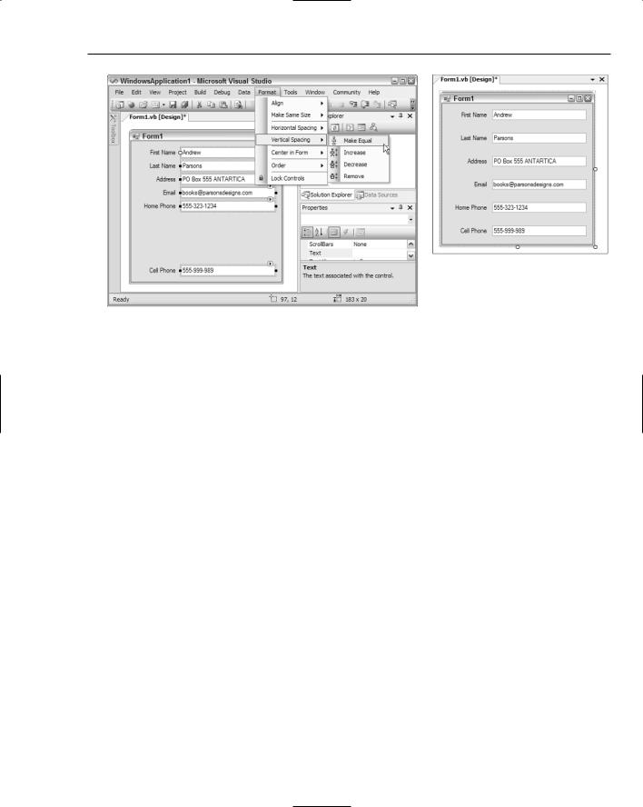
Two handy functions are the horizontal and vertical spacing commands. These will automatically adjust the spacing between a set of controls according to the particular option you have selected. The best way to illustrate how effective these commands are is to follow through an example task:
1.Start a new WindowsApplication project and add six Label controls and six TextBox controls to the form that is generated by Visual Studio. Change the text on the labels to match Figure 6-8:
First Name, Last Name, Address, Email, Home Phone, and Cell Phone.
2.Use the SnapLines mode to align the controls to the top edge of the form, and then to the ideal spacing between each Label and TextBox both vertically and horizontally. Remember to use the text guideline to align the text in the two different types of controls.
3.Once the controls are all positioned in context to each other, you’ll notice a large gap below the lowermost controls. This is what you’ll use to try out vertical spacing. Move the Cell Phone label and its associated textbox down so they are positioned an ideal distance from the bottom border of the form.
4.Select all of the TextBox controls and run the Format Vertical Spacing Make Equal command as shown in Figure 6-9. Visual Studio will reposition the TextBox controls so they span from the topmost control (the First Name textbox) to the bottom Cell Phone textbox with even spacing between each. Repeat the process for the Label controls.
The right side of Figure 6-9 shows the result of the commands with the Label and TextBox controls repositioned.
An alternative method to change the spacing between the controls to extend them to the bottom of the form is to use the Increase option. This will adjust the spacing in small increments of a few pixels at a time.
68
Form Design
Figure 6-9
Reducing the spacing between the controls can be performed with the Decrease spacing command to perform the process in increments, or the Remove command, to remove all spacing completely.
Locking Control Design
Once you’re happy with your form design you will want to start applying changes to the various controls and their properties. However, in the process of selecting controls on the form, you may inadvertently move a control from its desired position, particularly if you’re not using either of the snap layout methods or if you have many controls that are being aligned with each other.
Fortunately, Visual Studio 2005 provides a solution in the form of the Lock Controls command, available in the Format menu. When controls are locked, you can select them to set their properties but cannot move them from their position, nor can you change the size of the form itself.
Small padlock icons are displayed on controls that are selected while the Lock Controls feature is active (see Figure 6-10).
Setting Control Properties
Setting the properties on controls is achieved using the Properties window, just as you would for a form’s settings. Whereas previously most properties were simple text values, Visual Studio 2005 has increased the number of property editor types, which aids you in setting the values efficiently by restricting them to a particular subset appropriate to the type of property.
Many advanced properties have a set of subordinate properties that can be individually accessed by expanding the entry in the Properties window. Figure 6-11 displays the Properties window for a button, with the Font property expanded to show the individual properties available.
69
Chapter 6
Figure 6-10
Figure 6-11
In addition, many properties provide extended editors, as is the case for Font properties. In Figure 6-11, the extended editor button in the Font property has been selected, causing the Choose Font dialog to appear.
70
Form Design
Some of these extended editors invoke full-blown wizards, such as the Data Connection property on some data-bound components, while others have custom-built inline property editors. An example of this is the Dock property, for which you can choose a visual representation of how you want the property docked to the containing component or form.
Service-Based Components
As mentioned earlier in this chapter, two kinds of components can be added to your Windows forms — those with visual aspects to them and those without. Service-based components such as timers and dialogs or extender controls such as tooltip and error provider components can all be used to enhance the application; and they work in a similar way to visual controls, with a few exceptions.
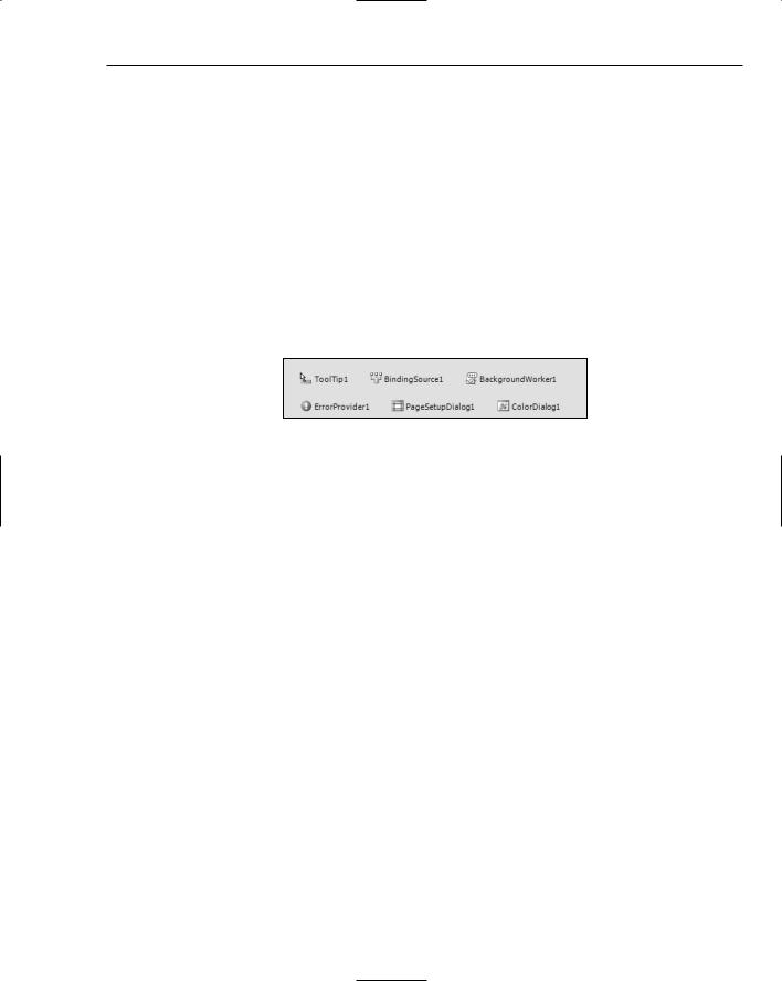
Rather than place these components on the form, when you double-click one in the Toolbox, or drag and drop it on to the design surface, Visual Studio 2005 will create a tray area below the Design view of the form and put the new instance of the component type there (see Figure 6-12).
Figure 6-12
To edit the properties of one of these controls, locate its entry in the tray area and open the Properties window.
Smart Tag Tasks
Smart tag technology was introduced in Microsoft Office. It provides inline shortcuts to a small selection of actions you can perform on a particular element. In Microsoft Word, this might be a word or phrase, while in Microsoft Excel it could be a spreadsheet cell. Visual Studio 2005 introduces the concept of design-time smart tags for a number of the controls available to you as a developer.
Whenever a selected control has a smart tag available, a small right-pointing arrow will be displayed on the top-right corner of the control itself. Clicking this smart tag indicator will open up a Tasks menu associated with that particular control.
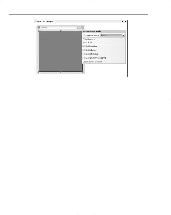
Figure 6-13 shows the tasks for a DataGridView control. The various actions that can be taken usually mirror properties available to you in the Properties window (such as the Multiline option for a TextBox control), but sometimes they provide quick access to more advanced settings for the component.
In this example, the Edit Columns and Add Column commands are not directly accessible in the list, while the Data Source and Enable settings directly correlate to individual properties (for example, Enable Adding is equivalent to the AllowUserToAddRows property).
While the Edit Columns and Add Column commands are not represented by individual properties, you’ll see in the next discussion that they are still accessible from the Properties window.
71
Chapter 6
Figure 6-13
Additional Commands
Some components have extra design-time actions that can be performed beyond the simple setting of control properties. These functions are accessible in the Properties window via the Commands section, which sits between the Properties window and the description of the selected property.
The Commands area of the Properties window can be hidden to give you more space when working with the regular properties. Right-click anywhere in the Properties window and select the Commands item from the context menu to toggle it off. To redisplay it, repeat this process and the Commands window will be shown again.
The Commands list is not visible if the selected component does not have functions that can be performed.
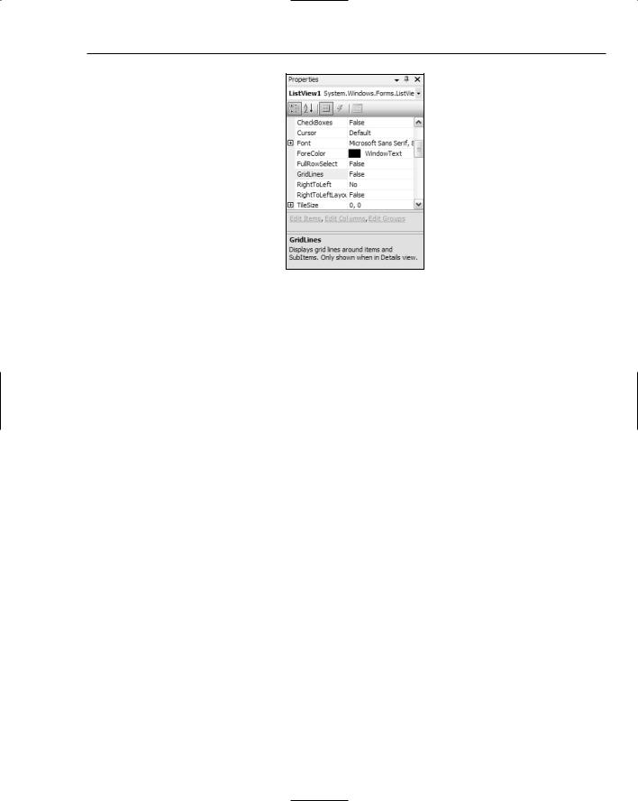
Figure 6-14 shows the Properties window view for a ListView control. As you can see in the middle pane, three advanced commands can be executed against this type of component: Edit Items, Edit Columns, and Edit Groups. Each of these hyperlinked labels will fire off a different collection editor dialog so you can easily customize the appearance of the ListView.
The Commands list is where the Edit Columns and Add Column functions (mentioned in the preceding discussion on smart tag tasks) will appear when designing a DataGridView.
Some controls, such as the MenuStrip component, will have commands that can automatically populate them with default values or add a suitable containing component and move the selected control into that container to meet best practices design.
72
Form Design
Figure 6-14
Container Controls
Several controls, known as container controls, are designed specifically to help you with your form’s layout and appearance. Rather than have their own appearance, they hold other controls within their bounds. Once a container houses a set of controls, you no longer need to move the child controls individually, but instead just move the container. Using a combination of Dock and Anchor values, you can have whole sections of your form’s layout automatically redesign themselves at runtime in response to the resizing of the form and the container controls that hold them.
Panel and SplitContainer
The Panel control is used to group components that are associated with each other. When placed on a form, it can be sized and positioned anywhere within the form’s design surface. Because it’s a container control, clicking within its boundaries will select anything inside it, so in order to move it, Visual Studio 2005 places a move icon at the top-left corner of the control. Clicking and dragging this icon enables you to reposition the Panel.
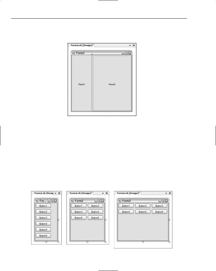
The SplitContainer control (shown in Figure 6-15) automatically creates two Panel controls when added to a form (or another container control). It divides the space into two sections, each of which you can control individually. At runtime, users can resize the two spaces by dragging the splitter bar that divides them. SplitContainers can be either vertical (as in Figure 6-15) or horizontal, and they can be contained with other SplitContainer controls to form a complex layout that can then be easily customized by the end user without you needing to write any code.
Sometimes it’s hard to select the actual container control when it contains other components, such as in the case of the SplitContainer housing the two Panel controls. To gain direct access to the Split Container control itself, you can either locate it in the drop-down list in the Properties window, or
73
Chapter 6
right-click on one of the Panel controls and choose the appropriate Select command that corresponds to the SplitContainer. This context menu will contain a Select command for every container control in the hierarchy of containers, right up to the Form itself.
Figure 6-15
FlowLayoutPanel
The FlowLayoutPanel control enables you to create form designs with a behavior similar to web browsers. Rather than explicitly position each control within this particular container control, Visual Studio will simply set each component you add to the next available space. By default, the controls will flow left to right, and then top to bottom, but you can use the FlowDirection property to reverse this order in any configuration depending on the requirements of your application.
Figure 6-16 displays the same form with six button controls housed within a FlowLayoutPanel container. The FlowLayoutPanel was set to fill the entire form’s design surface, so as the form is resized, the container is also automatically sized. As the form gets wider and there is available space, the controls begin to be realigned to flow left to right before descending down the form.
Figure 6-16
74

Form Design
TableLayoutPanel
An alternative to the previously discussed container controls is the TableLayoutPanel container. This control works much like a table in Microsoft Word or in a typical web browser, with each cell acting as an individual container for a single control.
Note that you cannot add multiple controls within a single cell directly. You can, however, place another container control such as a Panel within the cell, and then place the required components within that child container.
Placing a control directly into a cell will automatically position the control to the top-left corner of the table cell. You can use the Dock property to override this behavior and position it as required.
The TableLayoutPanel container enables you to easily create a structured, formal layout in your form with advanced features, such as the capability to automatically grow by adding more rows as additional child controls are added.
Figure 6-17 shows a form with a TableLayoutPanel added to the design surface. The smart tag tasks were then opened and the Edit Rows and Columns command executed. As a result, the Column and Row Styles dialog is displayed so you can adjust the individual formatting options for each column and row. The dialog displays several tips for designing table layouts in your forms, including spanning multiple rows and columns and how to align controls within a cell. You can change the way the cells are sized here as well as add or remove additional columns and rows.
Figure 6-17
75