

Professional Visual Studio 2005 (2006) [eng]
.pdf
Chapter 2
contents of properties without explicitly converting them. Going along with this is the Call ToString() on Objects in Variable Windows option for C# so that you don’t have to call ToString() when displaying object contents.
Require source files to exactly match the original version: In some cases it’s possible to debug source code that does not exactly match the compiled binary containing the debug symbols. This option alters that behavior so that the source file must match the executable, forcing you to find the matching source file prior to debugging.
Redirect all Output Window text to the Immediate Window: Sometimes it’s handy to have all of your debugging output in one place. This option causes any debug information to be printed to the Immediate window, where you can also interrogate variables and perform simple logic.
Edit and Continue
The most important addition to debugging in Visual Studio 2005, particularly for Visual Basic developers, is the Edit and Continue option. When debugging a problem, the programmer can change the code on-the-fly and let the debug process continue without having to stop and restart the solution. Some programmers don’t like this as an option and feel that it can cause bad programming practices because the code can be changed without saving the solution.
In fact, so many developers did not want Edit and Continue reintroduced into Visual Studio that Microsoft has included the option to turn it off, but there’s more to it than a simple checkbox, as shown in Figure 2-13.
Figure 2-13
When debugging native .NET code, you can also customize how the Edit and Continue process will work. For those who straddle the fence regarding whether to allow Edit and Continue to function, the Ask First checkbox gives you the option to reject the functionality at the time of debugging. This is useful if you occasionally change code during a debug session inadvertently; rather than Visual Studio simply recompiling the code in the background without your knowledge, you will be presented with a prompt to inform you that you are editing currently active code.
26

Options
Stale code is a new concept. It refers to sections of your program that you have changed previously but that cannot be immediately recompiled for debugging. With this option, code is marked (with a gray background by default) and you cannot further edit it if you encounter it later. When the debugger is able to, it will recompile this code with the changes made; and from that point on you’ll be able to re-edit the code. Activating the Warn About Stale Code option will result in the debugger displaying a dialog box whenever a stale code situation arises.
The last option to consider is the Allow Precompiling setting. Precompiling the headers in the background of a debug session allows any code changes applied during an Edit and Continue procedure to be applied more speedily, but it requires a large amount of physical memory to store the precompiled headers. If your machine is RAM constrained, consider deactivating this setting.
Summar y
This chapter covered only a core selection of the useful options available to you as you start to shape the Visual Studio interface to suit your own programming style; many other options are available. These numerous options enable you to adjust the way you edit your code, add controls to your forms, and even select the methods to use when debugging code. The settings within the Visual Studio 2005 Options page also allow you to control how and where applications are created, and even customize the keyboard shortcuts you use. Throughout the remainder of this book, you’ll see the Options dialog revisited according to specific functionality such as macros, debugging, and compiling.
In the next chapter you’ll look at how to further customize a section of the IDE — the Toolbox — and be introduced to the many building blocks Microsoft provides with Visual Studio 2005 to make the creation of your applications easy.
27


The Toolbox
One of the major advantages that Microsoft has offered its developer users over many other so-called integrated development environments (IDEs) is true drag-and-drop placement of many graphical elements for Windows form design. In fact, since early versions of Visual Basic, Microsoft has enabled developers to add nongraphical components such as timers as well. These components are all available in what is known as the Toolbox, a special window within the Visual Studio IDE.
This chapter first walks through the details of the Toolbox: how components are organized, how to add additional elements and controls, and how these components can be viewed by the developer. The second part of the chapter describes some of the more commonly used and interesting controls. If you’ve used previous versions of Visual Studio, you may want to skim this section to look at components that are new to Visual Studio 2005.
Describing the Toolbox
The Toolbox window contains all of the available components for the currently active document being shown in the main workspace. These components can be visual, such as buttons and textboxes, or invisible, service-oriented objects such as Timers and system event logs, or even designer elements such as Class and Interface objects used in the Class Designer view.
Regardless of which set of components are shown, the way they are used in a program is usually the same: Click and drag the desired component onto the design surface of the active document or double-click the component’s entry for Visual Studio to automatically add an instance of it to the current file.
With the introduction of Visual Studio .NET (also known as Visual Studio 2002), Microsoft began grouping the components into sections that logically segregated them. Rather than one big mess of components, as presented in Visual Basic 6, Visual Studio 2005 presents the available object types in simple groups.

Chapter 3
This default grouping enables you to more easily locate the controls you need; for example, data-related components are in their own Data group.
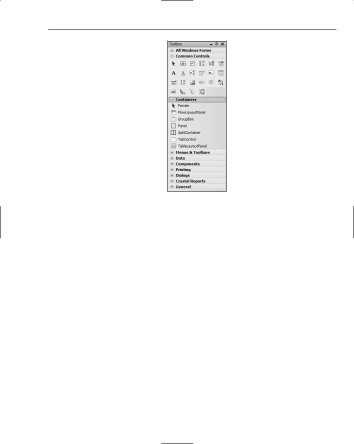
By default, groups are presented in List view (see Figure 3-1). Each component is represented by its own icon and the name of the component. This differs from the old way of displaying the available objects, where the Toolbox was simply a stacked list of icons that left you guessing as to what some of the more obscure components were.
Each group can be collapsed to hide unnecessary sets of components. You can change the view of each control group individually, so if you know what all the common controls are just by looking at their icon, right-click anywhere within the Common Controls group area and deselect the List View option. The view will switch to the old presentation of icons, all stacked up, with as many sitting horizontally next to each other as can fit in the width of the Toolbox window. In Figure 3-2 you can see that a typical width for the Toolbox results in six icons fitting side by side — certainly a space saver if you know what the icons represent!
Figure 3-1
30
The Toolbox
Figure 3-2
This screenshot also shows you an example of collapsing the groups of components you may not be currently interested in. To expand a group, just click the small plus sign (+) next to its title. On smaller screen resolutions, this technique is essential for quick navigation of your component list.
Arranging Components
Alphabetical order is a good default because it enables you to locate items that are unfamiliar. However, if you’re only using a handful of components and are frustrated having to continuously scroll up and down, you can create your own groups of controls and move existing object types around.
Repositioning an individual component is easy. Locate it in the Toolbox and click and drag it to the new location (as shown in Figure 3-3). When you’re happy with where it is, release the mouse button and the component will move to the new spot in the list. Moving it to a different group is done in the same way — just keep dragging the component up or down the Toolbox list until you’ve located the right group. These actions work in both List and Icon views.
If you want to copy the component from one group to another, rather than move it, hold down the Ctrl key as you drag and the process will duplicate the control so that it appears in both groups.
You can’t duplicate the control within a group — you can only copy it to another group in which it is not currently present.
31

Chapter 3
Figure 3-3
If you would rather, you can use the Cut, Copy, and Paste commands common to most Windows applications to move or copy your components. The right-click context menu has all three commands at the top of the list, or you can use the familiar keyboard shortcuts of Ctrl+X, Ctrl+C, and Ctrl+V, respectively. If you do attempt to cut a control from a group, Visual Studio 2005 will warn you that you are removing the item to confirm that you really want to perform the action. As long as you immediately paste it to the desired spot, you won’t have a problem.
Sometimes it’s nice to have your own group or collection of groups to host the controls and components you use the most. Creating a new group in the Toolbox is easy. Right-click anywhere in the Toolbox area and select the Add Tab command. A new blank tab will be added to the bottom of the Toolbox with a prompt for you to name it. Once named, you can then add components to it by following the steps described in this section.
When you first start Visual Studio 2005, the items within each group are arranged alphabetically. However, after moving items around, you may find that they’re in a bewildering state and decide that you simply need to start again. All you have to do is right-click anywhere within the group that’s become mixed up and choose the Sort Items Alphabetically command. Instantly your control list will be returned to its original order.
If you’ve become even more confused, with components in unusual groups, and you have lost sight of where everything is, you can choose Reset Toolbox from the same right-click context menu. This will restore all of the groups in the Toolbox to their original state, with components sorted alphabetically and in the groups they started in.
Note that performing Reset Toolbox will delete any of your own custom-made groups of commands, so be very sure you want to perform this function!
By default, controls are added to the Toolbox using their base name. This means you end up with some names that are hard to understand, particularly if you add COM controls to your Toolbox. Visual Studio 2005 enables you to modify the component’s name to something more understandable.
32

The Toolbox
To change the name of a component, right-click the component’s entry in the Toolbox and select the Rename Item command (see Figure 3-4). An edit field will appear inline in place of the original caption, enabling you to name it however you like, including the use of special characters.
Figure 3-4
Note that if you choose to rename an element in a group that is shown in Icon view, Visual Studio will switch it to List view first, and then place the editor in the place of the caption wherever the component now appears (it will scroll the list if necessary).
Adding Components
Sometimes you’ll find that a particular component you need is not present in the lists displayed in the Toolbox. Most of the main .NET components are already present, but some are not. For example, the WebClient class component is not displayed in the Toolbox by default. In addition, many components that are present in the Microsoft.VisualBasic.Compatibility.VB6 namespace can be useful to Visual Basic programmers who are used to functionality in older versions of VB, such as control arrays.
Finally, .NET solutions can use COM components in their design. Once added to the Toolbox, COM objects can be used in much the same way as regular .NET components, and if coded correctly they can be programmed against in precisely the same way, utilizing the Properties window and referring to their methods, properties, and events in code.
There is an All Windows Forms group of controls at the very top of the Toolbox that is collapsed by default. This group contains all of the components in the other groups, along with several other controls that are not shown anywhere else.
Basically, Microsoft determined that these additional controls were not used very often and relegated them to a secondary location. If you try to add a component and find that it’s already selected in the list of items, then it’s likely that it has been sitting in this group all along.
33

Chapter 3
To add a component to your Toolbox layout, right-click anywhere within the group of components you wish to add it to and select the Choose Items command. After a moment (this process can take a few seconds on a slower machine, as it needs to interrogate the .NET cache to determine all of the possible components you can choose from), you will be presented with a list of .NET Framework components, as Figure 3-5 shows.
Scroll through the list to locate the item you wish to add to the Toolbox and check the corresponding checkbox. You can add multiple items at the same time by selecting each of them before clicking the OK button to apply your changes. At this time you can also remove items from the Toolbox by deselecting them from the list. Note that this will remove the items from any groups to which they belong, not just the group you are currently editing.
If you’re finding it hard to locate the item you need, you can use the Filter box, which will filter the list based on name, namespace, and assembly name. On rare occasions the item may not be listed at all. This can happen with nonstandard components such as the ones you build yourself that are not registered in the global Framework cache. You can still add them by using the Browse button to locate the physical file on the computer.
COM components are added in the same manner. Simply switch over to the COM Components tab in the dialog window to view the list of available, properly registered COM components to add. Again, you can use the Browse button to locate controls that may not appear in the list.
Once you’ve selected and deselected the items you need, click the OK button to save them to the Toolbox layout.
Figure 3-5
34
The Toolbox
Commonly Used Elements
Visual Studio 2005 ships with many components ready for use in your own Windows and web applications. If you’re new to creating applications using Microsoft development tools, these next few pages will introduce you to some of the more commonly used controls that appear in the default Toolbox setup.
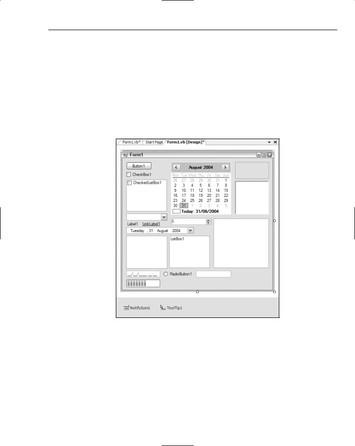
Figure 3-6 shows a form in Design view packed with controls. All of these controls were simply dragged from the Toolbox onto the design surface of the form and positioned so they were legible. As you can see, most controls come with default settings, such as appropriate size and sample text. All you need to do is customize these settings using the Properties window to fit your particular application’s needs and they are ready for use. Chapter 7 walks through the process of form design and discusses not only placing these components onto your forms, but also how the various properties can affect their behavior.
Figure 3-6
The controls shown in Figure 3-6 are described in the following list, starting from the top left and working down and then across:
Button: The Button control is perhaps the most common and simple component you will use on a Windows application form. It adds a single button to your form that the user can click so the application can perform an action or series of actions.
CheckBox: A CheckBox is like a toggle button. Each time the user clicks it, its state changes between unchecked and checked. You can use one of its properties to allow a third state of indeterminate, which is commonly used for checkbox controls that have multiple values underneath them in a hierarchy whereby some are active and some are not.
35