

- •Welcome to Seagate Crystal Reports
- •HANDS-ON (Report Design Environment)
- •HANDS-ON (Sections and Areas)
- •HANDS-ON (Report Creation and Design)
- •HANDS-ON (Finishing Your Report)
- •HANDS-ON (Exporting a Report)
- •HANDS-ON (Compiled Reports)
- •HANDS-ON (Viewing reports with a web browser)
- •Introduction
- •HANDS-ON (Reporting on OLAP data)
- •HANDS-ON (Multiple Section Reports)
- •HANDS-ON (Absolute Formatting)
- •HANDS-ON (Conditional Formatting)
- •HANDS-ON (Record and Group Selection)
- •HANDS-ON (Sorting, Grouping, and Totaling)
- •HANDS-ON (Formulas)
- •HANDS-ON (Running Totals)
- •HANDS-ON (Parameter Field Objects)
- •HANDS-ON (Charting)
- •HANDS-ON (Mapping)
- •HANDS-ON (OLE Objects)
- •HANDS-ON (Subreports)
- •HANDS-ON (Document Import Tool)
- •HANDS-ON (Cross-Tab Objects)
- •HANDS-ON (Queries)
- •HANDS-ON (Dictionaries)
- •HANDS-ON (Working With Databases)
- •North/South American Head Office
- •USA and Latin America
- •Asia/Pacific Offices
- •Europe/Middle East/Africa Offices
- •France – Southern European Head Office
- •Middle East Regional Office (ME & Northern Africa)
- •Glossary
HANDS-ON (Charting)
How to chart on a summary or subtotal field (group charts)
Many of the charts you create will be based on summary or subtotals within your report. In order to create these charts, you must have a summary or subtotal already inserted into your report. For more information on inserting summaries and subtotals, see How to summarize grouped data, Page 262 and How to subtotal grouped data, Page 264.
1With the summary or subtotal field selected, click the INSERT CHART button on the standard toolbar. The Chart Expert appears with the Type Tab active.
2Choose the type of chart that will best illustrate your data (see
Choosing a chart type, Page 370).
3Click the Group button on the Data Tab to specify that your chart will be based on grouped data.
4Use the Place Chart drop-down list and the Header and Footer options to specify map placement.
NOTE: When summarizing or subtotaling a field, the data is automatically grouped. For more information, see Sorting, Grouping, and Totaling, Page 245.
Charting |
375 |
5Use the appropriate drop-down lists to specify the data on which you want to chart.
6If desired, you can use the Text Tab to add text to your chart and the Axes Tab to add grid lines, data values, etc.
7Click the OK button when you are finished. The chart automatically appears in the Report Header or the Report Footer, depending on the option you chose in the Data Tab.
NOTE: When a chart is inserted, it may cover a portion of your report. You can move and resize the chart so that it fits properly within the report.
How to chart on a details field
|
A Detail chart allows you to create a chart based on specific values. Charts |
|
are often created based on a summary field in your report in which the |
|
values plotted in the chart depend on the values in the summary field. With |
|
a Detail chart, you can create a chart without the need for a summary field |
|
by using values that appear in the Details section of your report. |
|
To create a Detail chart, you need to specify two things: |
|
1. Conditions (there can be two), and |
|
2. Values (there can be multiple values). |
Condition |
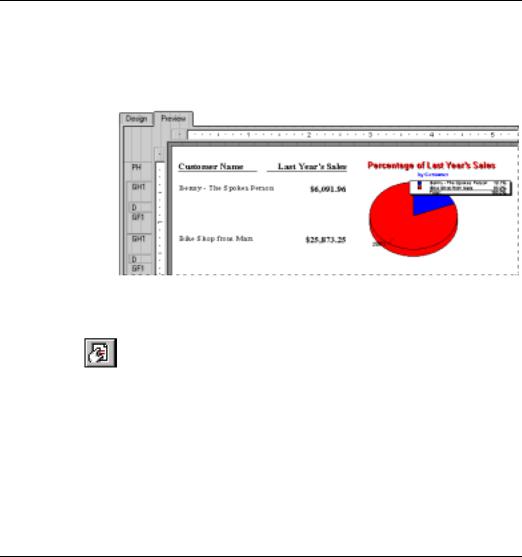
The Condition is used to indicate when to plot the point. For example, a |
|
chart showing last year’s sales for your customers uses the Customer |
|
Name field as the condition. Each time the condition changes (the |
|
customer name changes), a point is plotted. |
Value |
The Detail chart uses the Value to indicate what information is plotted as |
|
the points on your chart. For example, if you want to create a chart |
|
showing last year’s sales for your customers, the Last Year’s Sales field |
|
would be the value. Each time a point is plotted, it will be plotted at the |
|
point corresponding to the value in the Last Year’s Sales field. |
|
Creating and modifying your Detail chart is easy with the use of the Chart |
|
Expert. The Expert walks you through the creation of your chart step-by- |
|
step. |
|
1 Highlight the details field on which you want to chart and click the |
|
INSERT CHART button on the standard toolbar. The Chart Expert |
|
appears. |
|
2 Choose the type of chart you want to create by clicking the |
|
corresponding button on the Type Tab. See Choosing a chart type, Page |
|
370. |
376 |
Seagate Crystal Reports User’s Guide |
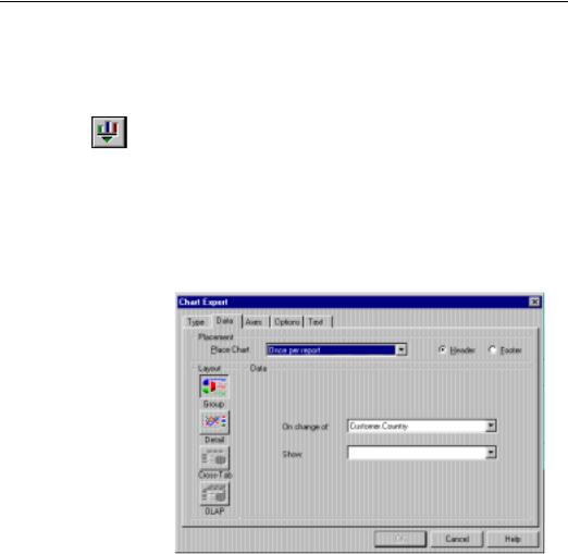
3Click the Data Tab to activate it.
4Use the Place Chart drop-down list and the Header and Footer options to specify chart placement.
5Click the DETAIL button to specify a Detail chart.
6Select the "on change of" field (the chart values will be shown on each change of this field) from the Data scroll box and click the arrow (>) button to the left of the On change of text box. The field appears in that text box.
7Use the Ctrl-Click combination to select the fields that you want used as chart values from the Data scroll box, and click the arrow (>) button to the left of the Show Values scroll box. The selected fields appear in that scroll box.
8Toggle the Don’t summarize values check box on if you do not want the program to automatically summarize the chart values.
9Enter a title, headings, etc., as desired using the Text Tab.
10Add a legend, grid lines, and other elements to your chart using the Axes and Options Tabs.
11Click the OK button when you are finished. The chart automatically appears in the Report Header or the Report Footer, depending on the option you chose in the Data Tab.
NOTE: When a chart is inserted, it may cover a portion of your report. You can move and resize the chart so that it fits properly within the report.
How to chart on a formula field
Seagate Crystal Reports allows you to create a chart based on a formula field. Charting on a formula field is much like charting on a details field (see How to chart on a details field, Page 376).
|
To create a chart for a formula field you need to specify two things: |
|
|
1. |
Condition, and |
|
2. |
Value. |
Condition |
The Condition is used to indicate when to plot the point. For example, a |
|
|
chart showing last year’s sales by Country uses the Country field as the |
|
|
condition. Each time the condition changes (the country changes), a point |
|
|
is plotted. |
|
Charting |
377 |

Value |
The Value is used to indicate what information is plotted as points on |
|
|
your chart. For example, if you want to create a chart showing a |
|
|
calculation for last year’s sales (i.e., a budget projection for next year of |
|
|
last year’s sales plus 10%), the Last Year’s Sales field would be the value. |
|
|
Each time a point is plotted, it will be plotted at the point corresponding |
|
|
to the value in the Last Year’s Sales field. |
|
|
1 |
Highlight the formula field on which you want to chart and click the |
|
|
INSERT CHART button on the standard toolbar. The Chart Expert |
|
|
appears. |
|
2 |
Choose the type of chart you want to create by clicking the |
|
|
corresponding button on the Type Tab. See Choosing a chart type, Page |
|
|
370. |
|
3 |
Click the Data Tab to activate it. |
|
4 |
Use the Place Chart drop-down list and the Header and Footer options |
|
|
to specify chart placement. |
|
5 |
Click the DETAIL button to specify a chart for formulas. |
|
6 |
Select the "on change of" field (the chart values will be shown on each |
|
|
change of this field) from the Data scroll box and click the arrow (>) |
|
|
button to the left of the On change of text box. The field appears in that |
|
|
text box. |
|
7 |
Use the Ctrl-Click combination to select the fields that you want used |
|
|
as chart values from the Data scroll box, and click the arrow (>) |
|
|
button to the left of the Show Values scroll box. The selected fields |
|
|
appear in that scroll box. |
|
8 |
Toggle the Don’t summarize values check box on if you do not want |
|
|
the program to automatically summarize the chart values. |
|
9 |
Enter a title, headings, etc., as desired using the Text Tab. |
|
10 |
Add a legend, grid lines, and other elements to your chart using the |
|
|
Axes and Options Tabs. |
|
11 |
Click the OK button when you are finished. |
|
|
The chart automatically appears in the Report Header or the Report |
|
|
Footer, depending on the option you chose in the Data Tab. |
NOTE: When a chart is inserted, it may cover a portion of your report. You can move and resize the chart so that it fits properly within the report.
378 |
Seagate Crystal Reports User’s Guide |
How to chart on cross-tab summaries
Seagate Crystal Reports allows you to include a chart based on summary values in your cross-tab report. For example, with a cross-tab that shows the amount of a certain product sold in each region of the United States, you may want to include a chart showing the percentage of total sales provided by each region for that product.
To create a Cross-Tab chart you must first have a cross-tab in your report.
For more information, see Cross-Tab Objects, Page 443.
1With the cross-tab highlighted, click the INSERT CHART button on the standard toolbar. The Chart Expert appears with the Type Tab active.
2Choose the type of chart you want to create by clicking the corresponding button on the Type Tab. See Choosing a chart type, Page 370.
3Click the Data Tab to activate it. Notice that the Cross-Tab Layout button is already selected.
4Use the Place Chart drop-down list and the Header and Footer options to specify chart placement.
5Use the Graph on drop-down list to specify the summarized field on which you want to base your chart.
6Use the By drop-down list to specify the primary row or column on which you want to base your chart.
7If desired, specify the secondary row or column on which you want to base your chart by using the Subdivided By drop-down box.
8Click the OK button when you are finished. The chart automatically appears in the Report Header or the Report Footer, depending on the option you chose in the Data Tab.
NOTE: When a chart is inserted, it may cover a portion of your report. You will need to move the chart and possibly resize it to fit in your report the way you want.
How to chart on an OLAP cube
The OLAP layout can be used to chart on an OLAP grid. In order to create an OLAP chart, you must first have an OLAP grid in your report. For more information, see Reporting on OLAP data, Page 171.
Charting |
379 |

1With the OLAP grid on which you want to chart selected, click the INSERT CHART button on the standard toolbar. The Chart Expert appears with the Type Tab active.
2Select the chart type that will best illustrate your data (see Choosing a chart type, Page 370).
3Click the Data Tab to activate it. Notice that the OLAP LAYOUT button is already selected.
4Use the Place Chart drop-down list and the Header and Footer options to specify chart placement.
5Use the Options section to specify style and formatting options related to the selected chart type.
6Click the Text Tab. You can use the text boxes on this tab to specify a chart title and format information.
Click OK when you are finished. The program places your chart in the Report Header, Group Header, Report Footer, or Group Footer section, depending on the options you selected.
How to edit a chart using the Chart Expert
Once you have created a chart, you may want to add a title, headings, or a legend, change fonts, or even change the type of chart. Modifying charts is easy with the use of the Chart Expert.
1Right-click the chart that you want edited and choose FORMAT CHART from the shortcut menu.
The Chart Expert appears with all the details of the selected chart.
2Make the desired changes and click OK to update the chart.
How to edit charts using PGEditor
The PGEditor is a powerful chart editor that offers 80 chart types and full formatting control of every chart element. The PGEditor is commonly used to format chart titles, change chart colors, and resize portions of the chart.
A very popular feature of the PGEditor is the ability to save chart formatting templates. These templates are like stylesheets for charts. They contain custom formatting instructions that can be applied instantly to new charts. If you continually create pie charts, for example, and you
380 |
Seagate Crystal Reports User’s Guide |

need the charts to appear in custom colors, you can create a template for those colors. Then, whenever a new chart is created, simply apply the template and the chart is formatted to the template specifications.
See SSCHART.HLP (located in the \CRW16\SSCHART directory (16bit), or \Program Files\Seagate Software\Sschart (32-bit)) for more information on the PGEditor application.
How to change chart size and position
You can use the Object Size and Position dialog box to specify the height, width, and position of a chart (in inches).
1From within either the Design or Preview Tab, right-click the chart and choose OBJECT SIZE AND POSITION from the shortcut menu. The Object Size and Position dialog box appears.
2In the X Pos text box, enter the desired distance in inches from the left edge of the chart object to the left margin of the report section. The default distance is 0.04 inches.
3In the Y Pos text box, enter the desired distance in inches from the upper edge of the chart object to the upper margin of the report section. The default distance is 0.02 inches.
4In the Height text box, enter the desired vertical height of the chart, in inches.
5In the Width text box, enter the desired horizontal height of the chart, in inches.
6Click OK to return to your report. The program will implement your specifications immediately.
How to change the border of a chart
1From the Design or Preview Tab, right-click the chart and choose CHANGE BORDER from the shortcut menu. The Format Editor appears with the Border Tab active.
2Change the border as needed.
3Click OK. The program immediately implements these changes.
Charting |
381 |
How to use the underlay feature with charts
Since charts can only print in certain sections of your report, the underlay feature gives you more power and control in the overall look of your report. Instead of having a chart print ahead of the data it represents, it can appear next to the data for a more comprehensible report. See Area printing characteristics, Page 59.
1Create the chart and place it in the Report Header section. For more information see How to chart on a summary or subtotal field (group charts), Page 375.
2Click the SECTION EXPERT button on the standard toolbar. The Section Expert appears.
3Highlight the Report Header section in the Sections list box and toggle the Underlay Following Sections option on.
4Click OK.
You are returned to your report. The chart will now underlay the sections below it. Move or resize the chart as desired.
Related Topics
How to make an object underlay a following section(s), Page 111
How to analyze a chart
The Analyzer Tab allows you to analyze charts in-depth. The commands on the Analyzer Tab shortcut menu help you customize a chart, allowing you to examine complex data and identify trends.
382 |
Seagate Crystal Reports User’s Guide |
Changing the chart title
Changing axis titles
Reversing the series order
There are a number of operations you can perform on any chart in the Analyzer Tab, as described below. There are also a few additional commands on the shortcut menu that are chart-specific. For example, in the case of a Pie chart, you may have commands for resizing the pie and for adjusting the pie rotation. In the case of a bar chart, you may have commands for staggering the labels. In this way, the Analyzer Tab offers you maximum flexibility.
NOTE: Changes performed in the Analyzer Tab are applied to the currently selected chart or charts. You can have two charts selected in the analyzer at one time. When you try to select a third chart and bring it into the analyzer, you will be asked to discard one of the previously selected charts.
To analyze a chart in depth, right-click the chart and choose LAUNCH ANALYZER from the shortcut menu. The program opens the Analyzer Tab.
To change the chart title:
1Right-click the chart and choose CHANGE CHART TITLE from the shortcut menu. The Change Label dialog box appears.
2Enter a new title in the text box.
3Click OK to return to the Analyzer Tab. The program implements the changes immediately.
You can change the titles for the X-, Y-, and Z-axes; there is a separate command for each, and each command will open the Analyzer Tab’s standard Change Label dialog box.
1Right-click the chart and choose the desired title change command (CHANGE X-AXIS TITLE, CHANGE Y-AXIS TITLE, or CHANGE Z-AXIS
TITLE) from the shortcut menu. The Change Label dialog box appears.
2Enter a new axis title in the text box.
3Click OK to return to the Analyzer Tab. The program implements your changes immediately.
You can reverse the order in which the series are displayed on the chart. Right-click the chart and choose REVERSE SERIES from the shortcut menu to toggle the check mark that appears beside the command on or off as needed. If the check mark is toggled on, the series will be reversed. If the check mark is toggled off, the series will be displayed in their default direction.
Charting |
383 |
Reversing the group order
You can reverse the order in which the groups are displayed on the chart. Right-click the chart and choose REVERSE GROUPS from the shortcut menu to toggle the check mark that appears beside the command on or off as needed. If the check mark is toggled on, the groups will be reversed. If the check mark is toggled off, the groups will be displayed in their default direction.
384 |
Seagate Crystal Reports User’s Guide |

18 Mapping
What you will find in this chapter...
Mapping Overview, Page 386
Choosing a map, Page 386
Where to place a map, Page 390
Analyzer Tab, Page 391
Data you can map on, Page 391
For more map information, Page 391
HANDS-ON (Mapping), Page 391
Mapping |
385 |

Mapping Overview
With Seagate Crystal Reports, you can include professional geographic maps in reports. Maps help analyze report data and identify trends more efficiently. For example, you could create a map that shows sales by region. You would then be able to:
●drill-down on the map regions to view underlying data,
●use one of the five map types to analyze the data, and
●use the Analyzer Tab to adjust the appearance and organization of the map (allowing you to better identify trends).
In order to place a generic, group-based map on a report, you must first have a group and a summary or subtotal field present in the report. However, the program does provide several specialized map layouts (Detail, Cross-Tab, and OLAP) that do not require groups and summaries.
NOTE: When a field is summarized or subtotaled, the program automatically groups the data. For more information, see Sorting, Grouping, and Totaling, Page 245.
NOTE: Mapping only appears in the 32 bit version.
Choosing a map
Map layouts
The Map Expert provides a wide range of mapping abilities, including:
●four map layouts, and
●five map types.
You can choose the map layout and type that is best suited to your data.
The Map Expert provides four powerful layouts. Each layout is especially useful for mapping on certain sets of data. Any of the following layouts can be used to create a map:
1.Group
The Group layout is a very simplified layout in which a summary on change of a geographic field (such as Region) is shown. In order to create a map using the Group layout, you must have at least one group and at least one summary field for that group.
386 |
Seagate Crystal Reports User’s Guide |
|
2. |
Detail |
|
|
The Detail layout is more complex than the Group layout. Use the |
|
|
Detail layout when using multiple map values, rather than only one, |
|
|
or when you do not have any groups or summaries in the report. |
|
3. |
Cross-Tab |
|
|
Use the Cross-Tab layout when mapping on a cross-tab object. The |
|
|
cross-tab information can be used as the basis of the map. A Cross- |
|
|
Tab map does not require groups or summary fields. |
|
4. |
OLAP |
|
|
Use the OLAP layout when mapping on an OLAP grid. The OLAP |
|
|
data can be used as the basis of the map. An OLAP map does not |
|
|
require groups or summary fields. |
|
NOTE: If there is no map associated with the data you specify, then no |
|
|
map will be shown. For example, if you create a map based on country |
|
|
and one of you detail records has a country for which there is no map an |
|
|
empty block will appear unless the section that the map is placed in has |
|
|
been formatted to suppress if blank. |
|
Map types |
The Map Expert also provides five basic map types, each suitable for a |
|
|
different strategy of data analysis. When deciding which map type best |
|
|
fits your report, you should consider the type of data you want to |
|
|
analyze. For example, if you want the map to display one data item for |
|
|
each geographic division (city, state, country, etc.), then you might use a |
|
|
Ranged, Dot Density, or Graduated map. On the other hand, if you want |
|
|
the map to display more than one value for each new geographic |
|
|
division, then you could use a Pie Chart map or a Bar Chart map. The |
|
|
map types are: |
|
|
1. |
Ranged |
|
|
A Ranged map breaks the data into ranges, assigns a specific color to |
each range, and then codes each geographic area on the map by color to display the range. For example, you could create a map that displays Last Year’s Sales by Region. If you have sales ranging from zero to 100,000, you might give the map five ranges, with equal intervals of 20,000 each. You could use shades of red (going from dark red to light red) to color code each region according to those sales figures. Then you could use this map to see where sales are the highest. With equal intervals, you might end up with all your regions ranging between zero and 20,000, except perhaps one region (for example, California) that might have exceptionally high sales (such as 98,000). This map would be a very distorted representation of the data. A more useful map would have ranges like 0-5000, 5001-10000, 10001-15000, 15001-20000, and over 20000. It is important to define your ranges carefully. There are four different range options:
Mapping |
387 |
●Equal count
This option assigns intervals in such a way that the same number of regions (or as close to the same number of regions as possible) appear in each interval. In other words, this option should assign intervals so that each color on the map is assigned to the same number of regions. The numeric quantity of the summary values in each interval may or may not be equal, depending on the individual regions and their summary values.
●Equal ranges
This option assigns intervals in such a way that the summary values in each interval are numerically equal. The number of regions in each interval may or may not be equal, depending on the individual regions and their summary values.
●Natural break
This option assigns intervals using an algorithm that attempts to minimize the difference between the summary values and the average of the summary values, for each interval.
●Standard deviation
This option assigns intervals in such a way that the middle interval breaks at the mean (or average) of the data values, and the intervals above and below the middle range are one standard deviation above or below the mean. Standard deviation is the square root of the variance. It projects how various values in a set of values deviate from the mean for that set.
2.Dot Density
A Dot Density map displays a dot for each occurrence of a specified item. For example, you might create a United States map that shows one dot for each shipbuilder in the nation. In states like Tennessee, there would be no dots. In some coastal states, such as South Carolina, you might be able to count the dots on the map, since their dispersal would be fairly wide. However, for states with major shipbuilding industries, such as California and Virginia, the dots would all merge together into a solid mass along the coastline. The purpose of a Dot Density map, then, is to provide an overall impression of the distribution of the specified item. A Dot Density map is much like a nighttime satellite photo of the U.S., where you can see the lights of all the cities. Such a map is not a very accurate means of communicating information (particularly if you have a large number of items), but is a good way to give an impression of the distribution.
388 |
Seagate Crystal Reports User’s Guide |
3.Graduated
A Graduated map is much like a Ranged map; it shows one symbol per instance of a specified item. This symbol is a circle by default, but you can choose a different symbol if you prefer. Each symbol is proportional in size to the value of the item it represents (within a range of three sizes). A Graduated map communicates the same information as the Ranged map, but you would usually create a Ranged map for a case in which the geographic areas will have distinct geographic boundaries (as in the case of regions), while you would use a Graduated map for displaying data that is linked to points rather than precise areas (as in the case of cities). For example, a map of an individual region could use graduated circles to represent the sales for each office. The size of each circle would be proportional to the sales (or to the sales range) of the office it represents. On this map, an office with a sales figure of $70,000 might have a large circle, and an office with a sales figure of $20,000 might have a small circle. So, a Graduated map provides a more efficient representation of point data than a Ranged map does, and it uses sized symbols rather than colors to distinguish variations in the values of the items it represents.
4.Pie Chart
A Pie Chart map displays a pie chart over each geographic area. The pie charts represent data items that make up a whole. Each slice of the pie represents an individual data item and shows that item’s percentage in the whole. For example, you could create a pie chart map showing heating fuel types by region. You might have four types of heating fuel (four slices in each pie): electricity, gas, wood, and solar. Each region would then have a pie chart showing the breakdown of heating fuel types within that region. Washington state would probably use a high percentage (a large slice of the pie) of electricity because of the hydropower in that region, while Idaho would probably use a high percentage (a large slice of the pie) of natural gas. You can use this map type to compare the distribution of several items within a particular region. You can also specify that the pie charts be sized proportionately, so that, as with the symbols in a Graduated map, the pie charts will appear in various sizes, depending on the underlying data values. This will allow you to compare the totals between regions.
5.Bar Chart
A Bar Chart map works like a Pie Chart map, but may be more useful for certain sets of data. Typically, you would use a Bar Chart map for items that do not total 100% (that is, for data items that do not make a whole, or for data items that are unrelated). For example, you could create a Bar Chart map that displays use of heating fuel by region.
You might choose to analyze use of three types of fuel: electricity,
Mapping |
389 |

gas, and solar. Each bar chart on the map could contain individual bars for each of these types. In this example, the data items (electricity, gas, and solar) do not comprise a whole. There may be other types of fuel used in these regions, such as wood, but this map only focuses on three of them. Also, the purpose of the map is to compare each region’s use of each fuel type with that of every other region. In a Pie Chart map, you could show these three fuel types as percentages of the entire fuel use within each region, and though you could compare the percentages for each region, you would probably not be able to compare the actual values for each region, because each region would have the same total value (100%).
Where to place a map
Drill-down with maps
When you choose where to place the map, you determine the amount of data that will be included in the map. For example, if you place the map in the Report Header section, the map includes data for the entire report. If you place it in a Group Header or Group Footer section, it displays group-specific data. This choice will also determine whether the map prints once for the entire report, or many times (once for each instance of a given group).
NOTE: If your report contains subreports, you can place maps in those subreports as well. See How to map on a subreport, Page 396.
Not only is mapping a powerful means of presenting data - it is also a powerful analysis tool. You can activate drill-down mode by rightclicking the map in the Preview Tab and choosing Drill-down from the shortcut menu. When you are in drill-down mode, and the mouse pointer is moved over a section of the map in the Preview Tab, and the pointer becomes a Drill-down cursor, double-click to view the underlying details for that section of the map.
NOTE: If you drill-down on a region that has no data associated with it, you will get a message saying "There are no detail records for that {Region Name]." For example, if you are looking at a world map and try to drill-down on Germany, but there is no Germany group in the report you will get the above message.
390 |
Seagate Crystal Reports User’s Guide |