

Taking Your Talent to the Web |
51 |
SCREENING ROOM
Luxuriating in your monitor’s 21” screen, you design a site that looks sensational. How will it look on a 14” screen? Will it even fit? That is the challenge of screen resolution.
Screens range from 14” to 21” (and higher), with 15” and 17” currently the most popular. By the time this book is printed, 17” screens will dominate the home market, and ladies named Mistress Beatrice will dominate everywhere else. Laptops will continue to offer 14” and 15” screens along with the coveted 17-incher. Not only do screens vary, resolutions vary. Some folks view the web at 640 x 480; others at 1600 x 1200 (or even higher). This wild fluctuation in monitor size and screen resolution has a critical effect on page layout.
Are we saying that your site must be able to fit inside a 640 x 480 environment? No, you don’t always have that much space. Consider that browsers do not make full use of the screen. In Windows, room is left at the bottom for the task bar, while the top of the screen is taken up with browser chrome (the buttons and text entry fields that allow users to navigate the Web). In Mac OS, the right-hand side of the screen is reserved for that little trail of icons representing the user’s hard drive, saved files, and other work-related shortcuts, and the top of the screen is again given over to browser chrome.
Accounting for OS interface elements and browser chrome, the usable space may be less than 580 x 380. But if you design precisely to fit that small space as if it were a fixed newspaper ad size, your site may look forlorn or even ludicrous on a larger monitor running at 1600 x 1200. What’s a mother to do?
Liquid Design
The solution is to embrace the fluid nature of the medium and, whenever possible, design in a resolution-independent manner. Glenn Davis, web critic and former Chief Technology Officer of Projectcool.com, uses the phrase Liquid Design to describe an approach to web design in which the content reflows as it is “poured” into any monitor size.
52 WHY: Designing for the Medium: Screening Room
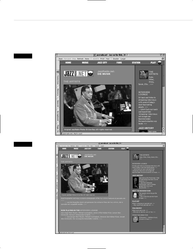
Figure 2.8
The original site design for jazzradio.net works well if the visitor’s monitor is small…
Figure 2.9
…and equally well if the monitor is large. Liquid Design makes users of any size monitor feel equally at home (www.jazzradio.net).
Narrow your browser window to 640 pixels or thereabouts, and visit www.jazzradio.net (see Figure 2.8). Now stretch your window as wide as it will go (Figure 2.9). Notice how the entire layout reflows to fill the screen. See also www.alistapart.com for another example of Liquid Design.
Taking Your Talent to the Web |
53 |
There are limits to how wide a web layout may be stretched before it begins to look ludicrous, but the goal is not to provide hours of “squash and stretch” fun for web users. (They’re not going to perform this exercise anyway.) The goal is to provide a site that seems to naturally fit each visitor’s monitor. This makes the visitor feel right at home, thereby encouraging her to spend more time on the site and drink milk right out of the carton when she thinks you’re not looking.
By contrast, with a more rigid approach to web layout, your site might appear to be “shoved into the corner” of a user’s large monitor. Or it might be too wide for the user’s small monitor, forcing her to scroll left and right (or more probably, encouraging her to leave and never come back).
A great majority of websites are designed at 800 x 600 fixed resolution in the belief that most users have screens wide enough to accommodate this width and height. True, “most” users can accommodate it, but why not build something that fits every user like a glove?
With Liquid Design, you can do just that.
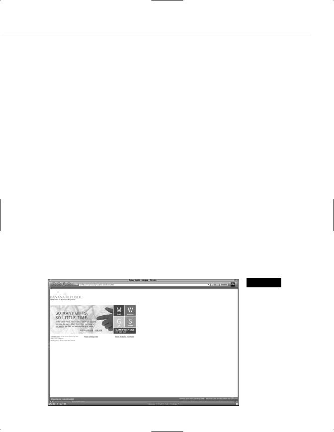
By contrast, Banana Republic (www.bananarepublic.com) (see Figure 2.10) and Three.oh (www.threeoh.com) offer fixed web layouts using absolute heights and widths. Banana Republic’s site does this to fit inside small monitors. It certainly does that, but its attractiveness is marred on large monitors—where most of the screen lies empty and yearning.
Figure 2.10
Fixed web layouts can be attractive, but on larger monitors the design can suffer from that “shoved into the corner” feeling (www.bananarepublic.com). Sites must be designed to work on small monitors but need not be designed to look ludicrous on large ones. Liquid Design can solve this problem.
54 WHY: Designing for the Medium: Screening Room
Where bananarepublic.com chooses a fixed layout approach to accommodate dinky screens, Three.oh’s large, fixed layout requires the visitor to own a monitor big enough to take in the entire design at a glance. Three.oh is elegantly designed and serves an audience of graphic artists. Thus, the assumption that site visitors possess a large enough monitor to see the whole thing is reasonable enough. But by adhering to a print-like model of site design, using absolute widths and font sizes, Three.oh rules out visitors saddled with small monitors as well as the visually impaired. The site’s designers no doubt feel justified in doing this because nondesigners and visually impaired folks could not possibly be interested in what the site has to offer. Most sites cannot make assumptions like this.
Liquid Design is accomplished through HTML tables that are built with percentages (rather than absolute widths), framesets that use percentages (rather than absolute widths), or CCS. Because 4.0 browsers are still in use at the time of this writing and will be for at least the next year, and because CSS support is less than perfect in 4.0 browsers, most designers choose tables or framesets to get the job done. We’ve created a simplified HTML example to show how Liquid Design differs from print-like, fixed design. Peek ahead to Chapter 8 if the markup confuses you.
Traditional versus Liquid Design
Here is a traditional, print-like approach to web design that uses table cells with absolute widths. All extraneous code has been deleted from this radically simplified example to focus on the points of difference between print-like and Liquid Design.
<html>
<table width=”600”> <tr>
<td width=”400”> <p>Content goes here.</p> </td>
<td width=”200”>
<p>Navigation goes here. This column is half as wide as the content column.</p> </td>
</tr>
</table>
</html>