

266 HOW: Style Sheets for Designers: Working with Style Sheets
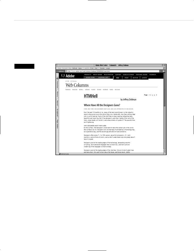
Leading on the Web serves exactly the same purpose as leading in print: it adds air to the “page” and enhances readability. On the screen-based Web, with its low typographic resolution, anything we can do to encourage readability is all right by us. By contrast, reading may be discouraged when we fail to apply leading and other CSS niceties to our text (see Figure 10.3).
Figure 10.3
The Adobe web column, written by your humble author, but laid out by Adobe’s online design team. CSS is used to control typography, but the small text is tough on the eyes. CSS leading and a larger font-size would make the reading experience more pleasurable. This typographic approach works well for image captions, a staple of the Adobe site, but it is less well-suited to longish articles (www.adobe.com).
Now that we’ve taken a brief look at the rudiments of CSS, let’s see how web designers can make this work on a site.
Types of Style Sheets
There are three main ways to use style sheets on a website:
1.By linking to an external style sheet from the HTML document
2.By embedding a style sheet within each HTML document
3.By adding styles inline in an HTML document

Taking Your Talent to the Web |
267 |
Additionally, it is possible to import one style sheet into another. Unfortunately, this technique is not supported by Netscape Navigator 4, so we will confine our discussion to the first three items. If Netscape 4 has gone to its reward by the time you buy this book, you can read up on “CSS import” at www.w3.org/Style/CSS/.
External style sheets
Linking to an external style sheet enables you control multiple web pages (or even an entire site) using a single CSS document. The more pages controlled by the same CSS document, the easier it becomes to make design changes to that site. It is literally possible to change the appearance of a 5,000-page website in under a minute, simply by editing one external Style sheet. Trust us, this is one maintenance chore you will genuinely enjoy.
Five steps to paradise: creating an external style sheet
1.Essentially, in BBEdit, PageSpinner, HomeSite, or any other HTML editor, the designer creates a style sheet. For simplicity’s sake, here is a basic one:
BODY {background: white; font-family: helvetica, arial, sans-serif;}
H1 {font-weight: bold; font-size: 24px; }
P, LI {font-size: 12px; line-height: 150%;}
2.The designer saves this document with a filename ending in .css. For instance, the name could be style.css, or clientname.css.
3.This CSS file is then uploaded to the server via FTP, just like an HTML
file.
4.Next, in the website’s HTML files, the designer inserts one additional line of code within the <HEAD> tag:
<html>
<head>
<title>Welcome to Widgets.com</title>
<link rel=”stylesheet” HREF=”style.css” TYPE=”text/css”> </head>
<body>
…and so on.

268 HOW: Style Sheets for Designers: Working with Style Sheets
5.The <link> tag calls up the separate syle sheet file (style.css) and uses its contents as instructions for displaying the page.
Note that it is possible to link to a CSS file using a relative path (“../styles/ style.css”), a rooted URL (“/path/from/server/root/style.css”), or a full URL (http://www.widgets.com/styles/style.css). This style sheet will now control any web page that links to it via the additional line of code within the <HEAD> tag. An entire site can be controlled in this way.
Embedding a style sheet
Web designers who wish to affect only one page may do so by embedding a style sheet within the <HEAD> tag of that web page.
<html>
<head>
<title>Style Sheets Rule!</title> <style type=”text/css”>
<!--
BODY {background: #ffc; font-family: palatino, georgia, times new roman, serif;} P {font-size: small; line-height: 125%;}
.sub {font: large bold arial, helvetica, sans-serif; margin-top: .25in;} -->
</head>
Note the use of commenting to prevent older, non-CSS-capable browsers from being confused by the code and to prevent search engines from pointlessly indexing your style sheet:
<!--
(Anything within comments will be ignored by browsers that do not understand the code, and ignored as well by search engines. Have a nice day.)
-->
What else is new in this example? The CSS is preceded by a tag that tells the browser how to interpret it:
<style type=”text/css”>
A more complete heading tells the browser not only that what follows is an embedded CSS, but also tells what type of media the CSS is intended to support:
<link REL=”StyleSheet” HREF=”style.css” TYPE=”text/css” MEDIA=”screen”>

Taking Your Talent to the Web |
269 |
The idea is that a document can link to several style sheets. For instance, one controls screen presentation (MEDIA=”screen”), another printing, and a third audio browsers. Not all browsers support this as of now, though it’s a good idea to begin fully spec’ing your CSS anyway.
In a Class by Itself
All of the preceding is straightforward, but what does .sub mean in this line?
.sub {font: large bold arial, helvetica, sans-serif; margin-top: .25in;}
The selector labeled .sub is a unique class, created by the web designer for his or her own particular design needs on this page.
That’s correct. CSS not only gives web designers the power to style traditional HTML markup, it also enables them to create and style unique items to suit their needs.
For instance, here, the web designer wished to create a special subhead class with a quarter-inch margin at the top. She decided to call it sub because the name was easy to remember and indicated the purpose (subhead) for which the class was created. The designer could have called this class unclecharlie if she wished.
To make use of this special class, the web designer will refer to it in the HTML document in this way:
<div class=”sub”>Here is my subhead, with a quarter-inch margin at the top.</div>
In the web page, the line, Here is my subhead, with a quarter-inch margin at the top would be large, bold, Arial or Helvetica (or generic sans serif) with (surprise!) a quarter-inch margin at the top.
Style sheets rock.
Adding styles inline
The inline method is used when the web designer wishes to change the appearance of a single tag or group of tags on one page, and not for changing the entire page or site. Adding styles inline does not offer web designers the true power of CSS because it forces them to restyle text one item at a time. Still, it can be very useful at times.

270 HOW: Style Sheets for Designers: Working with Style Sheets
For instance, an entire page or site may be set in medium-size Verdana (Helvetica, Arial, sans serif). But one line of text needs to stand out from the rest. Perhaps this line of text represents a letter from a customer—or a message from the U.S. Internal Revenue Service. The web designer decides that this particular line of text should be set in 12px Monaco.
She could create an entire class just for that line of text and include that class in the site’s global style sheet, but why create an entire class for one line of text on a single web page? Inline styling does the job better:
<p style=”font: 12px monaco, monospace;”> Greetings from the I.R.S.</p>
Inline styling seems like an oddity, but it is actually a wonderful supplemental tool—much like a tube of touch-up paint that is used to correct a small detail.
Inline styling is also quite effective for improving the appearance of <FORM> elements:
<div align=”center”> <form>
<input
type=”button” style=”font-size: 12px; font-family: geneva, arial; background-color: #ff6600; color: #ffffff;”
value=”Previous Reports” onClick=”window.location=’com0400d.html’;” onMouseOver=”window.status=’More of same.’; return true;” onMouseOut=”window.status=’’;return true;”>
</form>
</div>
Form elements also may be styled via DIV classes in a global style sheet. If every <FORM> button on your site is supposed to be orange (#ff6600) and use 12px Geneva or Arial type, by all means create an orangebutton class for the site, declare it on the global style sheet, and then refer to it in individual HTML pages, like so:
<div align=”center”> <form>
<input type=”button” class=”orangebutton”