


212 HOW: Visual Tools: Color My Web
GIF Animation
On the Web, images need not be static. Animated GIFs create the illusion of motion without requiring visitors to download and install third-party add-ons such as Flash, Shockwave, or the Adobe SVG plug-in (not that there’s anything wrong with Flash, Shockwave, or SVG, all of which are discussed in Chapter 12, “Beyond Text/Pictures”).
GIFs can contain more than one image, and the format was originally prized for its utility as a kind of multiple image storehouse. In the mid1990s, some smart soul figured out that these multiple images could be
“played” in sequence, creating the illusion of motion. The animated GIF was born, and the Web has never fully recovered. Photoshop’s ImageReady module enables you to easily create GIF animations. These can be freestanding, but might just as easily be incorporated into rollovers.
Create Seamless Background Patterns (Tiles)
These patterns or tiles formed a staple of web design in its early years. Many were downright ugly, and few appear in today’s sophisticated sites, but the technique can still prove useful when creatively reimagined by web designers with taste.
From this brief overview, it should be clear that the Photoshop/ImageReady combo is a powerful tool for web designers. Basically, with Photoshop and your HTML editor of choice, you can perform almost any web task.
Now let’s look at some problems peculiar to web design and see how you can solve them with Photoshop and ImageReady.
COLOR MY WEB: ROMANCING THE CUBE
Glance back at Chapter 2 for a refresher on the 216 color palette—or the Netscape Color Cube.
Designers work with computers that support millions of colors. But most web users are limited to thousands (or hundreds) of colors, and your design must work well in these environments.

Taking Your Talent to the Web |
213 |
Monitors limited to thousands of colors (16 bits) might seem to display realistic color, but it is never the actual color specified by the web designer. For mathematical reasons, colors shift slightly “off” in the 16-bit color space. This problem is insoluble and will haunt you like Jacob Marley’s ghost until cheap 24-bit graphics cards find their way into most PCs and vendors ship them configured to use the higher resolution and bit depth. (One of the tragic stupidities of the computer industry is that computers that can display millions of colors come configured to show thousands; those that can show thousands come configured to show hundreds, and so on. It’s tragic because ordinary citizens rarely realize that they can increase their PC’s graphic power with a quick trip to the appropriate control panel.)
Eight-bit (256 color) systems face an additional problem in that up to 40 of these 256 colors are “used up” in advance by the operating system itself. For instance, Windows reserves 40 (count ‘em) Windows system colors for its own display purposes. Knowing Windows, we should be glad it’s only 40. Nevertheless, that leaves exactly 216 colors at your disposal. (And GIF, as an “indexed” file format, only supports 255 colors anyway, two of which— black and white—are always present.)
What happens to viewers with lower-end graphics capabilities when you design with millions of colors they can’t see? The browser tries to simulate your color choices by combining adjacent pixels of color the visitor can see. This visual side effect is known as dithering, a verb that also means “babbling inconsequentially,” which is kind of what we’re doing here.
Dither Me This
You’ve chosen a subtle shade of off-white for your typography. The viewer’s graphics processor cannot reproduce that exact color, so the web browser breaks up your type into a series of adjoining pink and white pixels. If the viewer squints, she will get an approximation of the color you intended to use (see Figure 9.1).
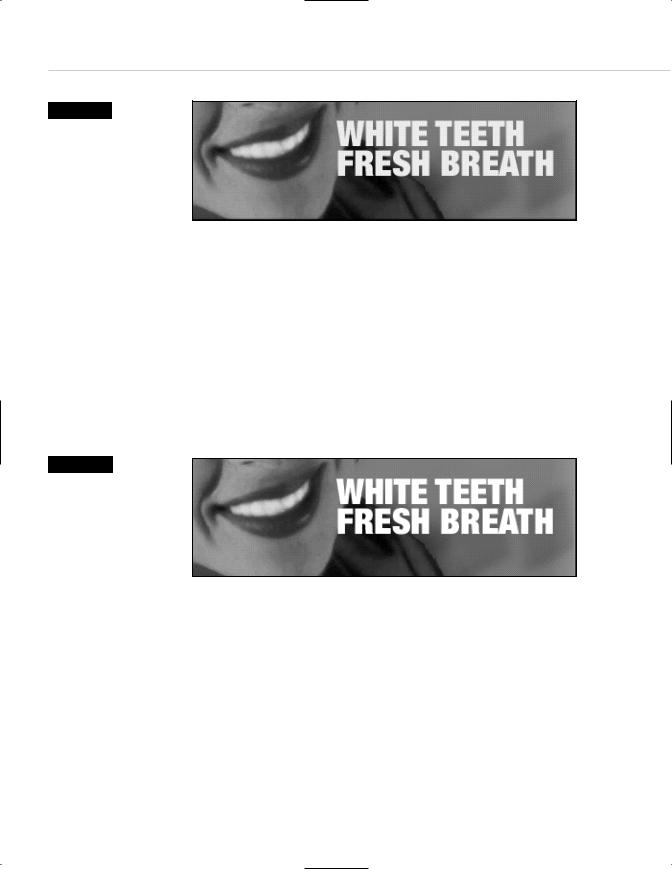
214 HOW: Visual Tools: Color My Web
Figure 9.1
The toothpaste may get teeth their whitest, but it doesn’t do much for
this off-white typographic headline. On 8-bit systems, the type gets pixellated, and we suspect the web designer will, too. (Image enlarged 200%.)
Figure 9.2
With the typography recast in web-safe white (#ffffff), the headline is no longer pixellated, increasing the chances that it will actually be read. The background image is still dithered, but users of 8-bit systems will accept that. (Image enlarged 200%.)
In small, transitional areas, dithering is okay. But when it occurs across large areas of solid color—or when it is visible in the primary letterforms of typography—the result will be visually hideous, and legibility can be seriously impaired. (Usability experts and web artists alike can agree that hideous, illegible type is not a good thing.)
Because the discrepancy between computers’ graphic capabilities is so enormous, it initially seems as though it would be impossible for a designer to create web pages that do not dither and degrade on most viewers’ monitors. The Color Cube saves the day (see Figure 9.2).
For typography, CSS or HTML background colors, or any other area of large,
flat color, if you stick to the web-safe color palette, you will avoid causing dithering and its resulting illegibility and aesthetic problems on 8-bit systems. As explained in Chapter 2, the practice will not help those with 16bit systems, but nothing can save those folks except a graphics card upgrade in their future.

Taking Your Talent to the Web |
215 |
Death of the Web-Safe Color Palette?
Creative people complain about everything. Web designers certainly complain about being limited to 216 web-safe colors, but to us this is like griping about the nip in the air while enjoying the scenic beauty of rustic New England. You want fall foliage, so put on an extra sweater.
Lulled by the music of these constant complaints, pundits perennially proclaim the death of the web-safe color palette, usually on the grounds that 16-bit systems enjoy a major market share. That 16-bit systems are widely used is undeniable: They are installed in 46% of PCs as of this writing. That the web-safe color palette is therefore dead is wishful thinking.
The web-safe color palette cannot die as long as it continues to solve problems for millions of web users. It does not solve every problem, but neither does penicillin, and nobody talks about the death of penicillin. We bring this up now because you will hear about it at the office and read about it in web design newsletters, mailing lists, and bulletin boards.
Who spreads these obituaries? Sometimes it’s information architects and interface developers who conduct meaningful research but draw debatable conclusions from their data. The Webmonkey article, “Death of the Web Safe Color Palette?" (http://hotwired.lycos.com/webmonkey/00/37/ index2a.html), proves beyond all doubt that 16-bit systems are hopelessly inadequate and invariably reveal the rabbits hiding in a web magician’s hat. But the article nihilistically concludes that all color palettes and traditional methods are meaningless in the chaos of the Web; whereas we judge simply that 16-bit users are hosed until they upgrade. Not long ago, 16-bit color was considered luxurious; cheap graphics cards changed the market, and the next generation of cheap 24-bit cards will change it again.
Few discussions of the topic have been as carefully researched as Webmonkey’s. The death of the web-safe color palette is generally announced by the same people who tell us that bandwidth no longer matters because
“everybody” will “soon” enjoy high-speed access. These folks often go on to proclaim that presently every site will be pumping out full-screen video productions to rival Hollywood blockbusters.