


62 WHY: Designing for the Medium: Typography
TYPOGRAPHY
Given what we’ve already discussed in terms of screen, color, and gamma differences, it should come as no surprise that there are vast differences in the way different platforms handle typography on the Web.
For one thing, different platforms offer different fonts. Two sans serif fonts, Geneva and Helvetica, come standard with Mac OS. Geneva is not found on any other platform, and while Helvetica is available in Linux, it may or may not be present on Windows systems. (Arial is the standard sans serif font that comes with Windows. There is also a version of Geneva that PC users can download, and we believe that three or four of them have done so.)
Confused, yet?
The 97% Solution
In 1997, Microsoft decided to do something about these typographic differences and commissioned a set of cross-platform web fonts for both Mac and Windows. These include Verdana, a lovely sans serif font designed by Matthew Carter; Georgia, also by Carter, a broad-in-the-beam serif font that can claim a distant kinship with Palatino; and Mac versions of the Windows fonts Arial, Impact, Times New Roman, Courier New, and so on.
The notion of cross-platform web fonts was a great idea. Unfortunately, not everyone bothered to download and install these fonts, so Microsoft included them in its Internet Explorer browser. (That took care of all the Windows users.) Microsoft then persuaded Apple to make IE the default browser that comes with the Macintosh Operating System. (That took care of the new Mac users and nearly took care of Netscape.)
This did nothing for Linux or UNIX users, but it did go a long way toward solving cross-platform font problems because Windows and Mac OS together make up about 97% of the market. (Depending on how you define the market, anyway.)
That still left a huge problem unsolved: the difference in typographic resolution between Mac OS and Windows.
Taking Your Talent to the Web |
63 |
Points of Distinction
By default in Mac OS, there are 72ppi, and a pixel is the same as a point. Thus 12pt. type is 12 pixels tall, 72pt. type is 72 pixels (or one inch) tall, and so on. Of course, most Mac users set their screens to higher resolutions, so this one-to-one equivalency between points and pixels soon becomes meaningless. But 72ppi is the starting point for Macs.
Windows users start off with 96ppi resolution; thus, 12pt. type in Windows is 16 pixels tall. Again, this varies according to the user’s choice of screen resolutions, but 96ppi is the starting point.
In 4.0 (and older) browsers, what looks readable on a Mac looks big and horsey on a Windows PC. Conversely, what looks tasteful and discrete on a Windows box is often illegibly small on a Mac.
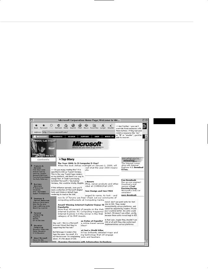
Figure 2.12
Font Wars: In 1997, CSS expert Todd Fahrner stuck this image in an obscure corner of the Web. It proved why using
points was a brain-dead approach to CSS (too bad so few people listened). He sarcastically observed that if things got much worse, Macs would have to use Windows-size typographic defaults. Three and a half years later, Fahrner’s sardonic prediction came true (http://style.metrius.com/ font_size/points/ font_wars.GIF).

64 WHY: Designing for the Medium: Typography
Particularly since web designers began overcoming their fear of style sheets, Windows-based designers who do not check their work cross-plat- form have been giving Mac users type they could neither read nor enlarge in the browser. On a PC, 8pt. type looks swell. On a Mac, it looks like 8 pixels, which is at least 1 pixel shy of legibility.
Year 2000—Browsers to the Rescue
In 2000, browser makers figured out how to compensate for this longstanding problem. The first to do so was IE5 Macintosh Edition, released in March 2000. IE5/Mac’s default setting is 16px type at 96ppi (Windows resolution). The Mac version of Netscape 6, released in November, followed suit.
In IE5/Mac and Netscape 6, users can change their preferences and restore the traditional “Mac” setting for text. By doing so, they risk continuing to be frustrated by the typographic resolution differences between their platform and the dominant Windows OS. But if they’re smart enough to change their settings once, they’re smart enough to change them back again when needed.
IE5/Mac also introduced text zooming, which enables users to enlarge (or shrink) HTML and CSS text on the page, no matter how the designer has formatted that text. This liberates web users from web designers’ mistakes and makes the medium more accessible to the visually impaired. Netscape 6 offers similar functionality, though for some reason it was left out of the Macintosh version (at least in the initial Netscape 6 release).
Of course, 4.0 browsers are still very much among us, and the 18-Month Pregnancy period has only just begun. Consequently, cross-platform font size issues will continue to plague the Web for some time to come. In Chapter 10, “Style Sheets for Designers,” we’ll explain how to use style sheets to compensate for all these incompatibilities.