

Taking Your Talent to the Web |
91 |
Because most web users have little time and less bandwidth to waste, good interfaces are rarely overwrought. Given the choice between a simple, functional design and one that is ornate, most folks prefer the simple web layout that loads quickly and is easy to understand. Web users don’t tell you this by peering over your shoulder; they tell you this by visiting the site or neglecting it.
Even when bandwidth is not an issue, quick, clear communication always will be. Users lucky enough to have T3, cable modem, or DSL access may not be slowed down by a cluttered interface, but they will be just as baf-
fled by it as dialup modem users are. Regardless of the user’s access speed, your communication must be fast and clear, or users will retreat faster than you can say “failed dot com.” It’s a peanut butter and jelly scenario: By focusing on functionality, you will develop low bandwidth interfaces; by focusing on bandwidth, you will develop interfaces that speak quickly and clearly.
Many web designers initially feel constrained by this. Some feel they cannot truly express their vision unless every page sports a 128K background JPEG, an animated menu bar, and a series of spinning logos and pulsing photographs. We’ve all had that feeling. It passes as you discover the joy of communicating richly while using a few elements well, or it never passes, and you locate clients with tastes as baroque as yours. When citizens avoid visiting the resulting sites, your client and you can toast your superiority to the rest of humanity and then hurry on to the next failure.
When bad web designers die and go to Hell, they will spend eternity searching for the Heaven option on an endless menu bar of purgatories. (That is, if they’re not simply stuck waiting for an infernal intro to finish downloading.)
Hypertext or Hapless Text
Brevity is just as important when putting text content on the Web. A book is easy to read. Hundreds of years of book design make it so. But on a glaring computer screen, at 72ppi (pixels per inch) or 96ppi, reading long passages is a chore. A reader will simply skip lengthy texts, whether they’re providing valuable product information or explaining how to use some advanced feature of the site.
92 WHY: Where Am I? Navigation & Interface: Clarity Begins at Home (Page)
By breaking text down into usable sub-units of information, a web designer can help readers find critical information and more easily absorb content. White space, while useful in print, becomes even more crucial on a web page. The logical separation of chunks of information helps engage readers and maintain their interest. Designers can use paragraphs, section breaks, and links to new pages to chunk information.
The more white space, the greater the chance that readers will remain engaged. Use CSS by itself or in combination with table-based layouts to create pages that demand to be read.
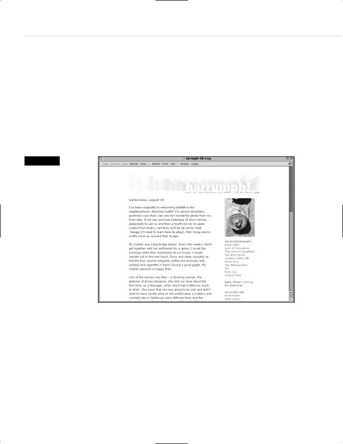
Figure 3.13
Readable typography, an elegantly spare layout, and plenty of white space add up to a site that welcomes readers—a quality that is depressingly rare on the Web (www.harrumph.com). Contrast this with
Figure 3.15.
In print, a designer might include ten sentences in a paragraph. On the Web, with its scrolling interface, ten sentences can feel like a life sentence. To enhance readability, web designers (or web designers in combination with web-savvy copywriters and editors) will separate one long paragraph into several shorter ones.
Learn when to stop one page and start another. Despite what some pundits tell you, readers will scroll to read an engaging story, but they will not scroll forever. After two or three screens, it may be time to present the

Taking Your Talent to the Web |
93 |
reader with an arrow (or other page indicator) allowing them to move on to the next page of text. Doing so can relieve eye fatigue, enhance the drama of the presentation (www.fray.com), or simply give your client another page on which to sell ad banners.
Remember in Chapter 2 when we talked about the tradeoff between one large image that takes a long time to download and many small images that take a long time to display? (If this were a web page, we’d provide a link here.) Well, the same kind of tradeoff goes on with text. Jam too much of it on a single web page, and readers may be frightened away. Provide too little, forcing the reader to click to a new screen after every paragraph or two, and you practically guarantee that no one will read to the end of the article or story.
Working with client-supplied text is particularly tricky. If average citizens are bad writers, clients are bad writers with egos. Upper Middle Managers would rather add value to cross-brand synergies while enhancing the functionality of strategically targeted product from the dairy side than put milk in their coffee. Rare is the client who writes the way people talk; rarer still is the client who uses few words when many will suffice.
In brochures and catalogs, such copy is ineffective. On a web page, it’s destructive on a nuclear scale. Consumers may ignore bad catalog copy if the layout and photography are compelling enough. But a site laden with vast blocks of ham-handed text is doomed. No visitor will stay long enough or scroll far enough to discover the million dollar photographs or compelling brand proposition buried on page three.
Laid out well (via text chunking and CSS), bad text can squeak by. Laid out badly, it kills websites dead. We cannot overemphasize the impact (and tragic rarity) of good writing on the Web nor the harm done by verbose and inexpressive texts, drizzled into layouts like so much phlegm. Learn web typography, practice text chunking, and work with good writers and editors. Do not let your clients or your project managers skimp on the writing budget unless you find failure exciting.
94 WHY: Where Am I? Navigation & Interface: Clarity Begins at Home (Page)
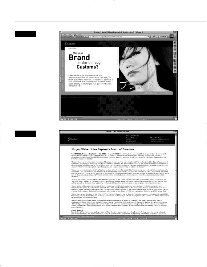
Figure 3.14
The front page of Sapient.com
(www.sapient.com),
a leading web agency, shows mastery and promise. Clean typography and highquality photography, balanced as skillfully as in a classic Ogilvie print ad, direct the visitor’s attention to the most important content. The carefully balanced page also makes use of Liquid Design (see Chapter 2) to accommodate variously sized monitors.
So far, so good.…
Figure 3.15
…Alas, once past the front page, visitors encounter too many pages like this one, where blocks of undifferentiated text, laid out with little care and no love, beg to be ignored rather than read. Since 99% of the Web consists of text that is intended to be read, the lack of attention to good textual presentation is tragic—hurting not only the site owner, but the would-be reader. Contrast this with Figure 3.13. (www.sapient.com).