

Taking Your Talent to the Web |
87 |
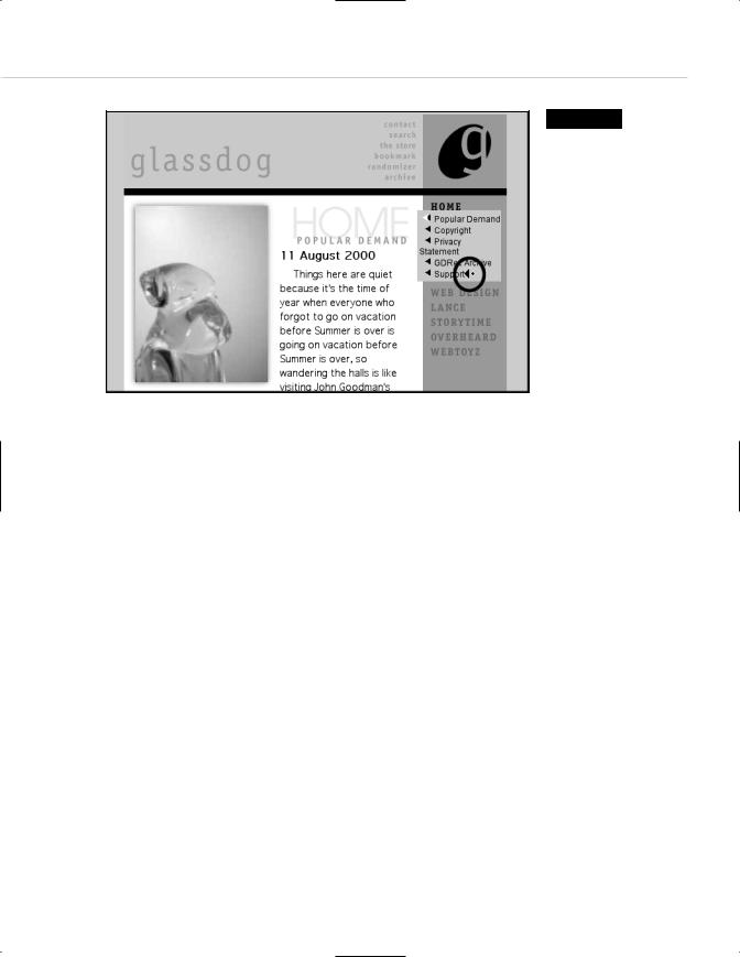
Figure 3.10
So why confuse them with this one? Changing familiar GUI elements “because you can” is a dog’s rationale for licking himself. In this case, it’s a Glassdog’s rationale (www.glassdog.com).
CLARITY BEGINS AT HOME (PAGE)
In developing GUI elements, web designers will frequently begin with the brand: funky elements for an entertainment site pitched at 20-somethings; somber, restrained elements for a news or medical site; and so on (more about branding in a moment). As each site presents a visitor with new GUI elements, those elements have the potential to brand the site while offering visitors a sense of identity and place. These elements also have the potential to confuse the heck out of people. As with the operating systems they mimic, GUI elements should be as clear and easy to use as possible. Clarity and ease of use are especially crucial factors in the development of iconic interface elements and site structure labels.
88 WHY: Where Am I? Navigation & Interface: Clarity Begins at Home (Page)
I Think Icon, I Think Icon
Graphical devices (icons) guide viewers through the site experience. Forward and reverse arrows are common ways of navigating from page to page. Graphical buttons are often used to trigger certain actions. For instance, a Play button may be used to trigger a recorded sound or an embedded, streaming QuickTime movie. A pen or pencil icon may link to a message board, or a book or newspaper icon can guide the visitor to a downloadable, printer-friendly version of the page’s content.
Printing in the Browser Wars
Why aren’t web pages themselves printer-friendly? It is because too often browsers are rushed into production as the latest assault in the “Browser Wars,” instead of offering carefully considered and usable features. By the time this book is released, the worst of the Browser Wars will be behind us.
Icons, with or without text labels, frequently serve as quick, visual cues to the site’s offerings. They also support international visitors for whom English is not a first language. Sites with massive amounts of content on their home pages, such as portals and magazine sites, can use icons to better organize and clarify sections (see Figures 3.11 and 3.12).
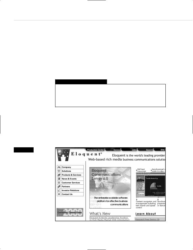
Figure 3.11
The icons seen here help draw the eye to the secondary menu, and some of them even communicate in ways a non-English speaking visitor might understand. Designing icons that communicate is difficult. Competing elements must fit within the narrow width of a lowest- common-denominator monitor, leaving little room in which to develop legible imagery (www.eloquent.com).
Taking Your Talent to the Web |
89 |
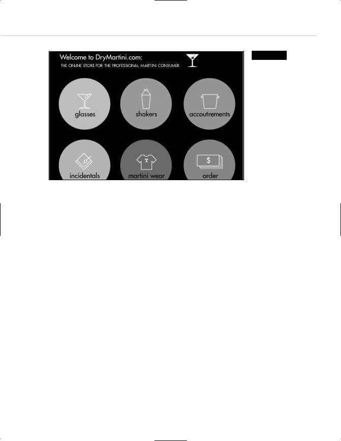
Figure 3.12
We are clearly in the land of the recreational website, as denoted by the tagline “professional martini consumer.” Few sites would devote all that screen space to a menu structure. Indeed, this site recently went offline for a redesign (www.drymartini.com).
On the Web, as in talking to a policeman, clarity is a virtue. While it is tempting to get really creative with such elements, the most creative solutions are often the clearest.
Say you are designing a site for a chain of Wild West theme hotels. In visiting the hotels and studying the chain’s promotional brochures and advertising, you can’t miss the fact that Western paraphernalia is used to brand the franchise—from the bronze horse-head coat hooks in guest closets to the cowhide couches in the lobby. Thinking like a brand steward, you decide it might be fun to use lassos rather than arrows to indicate “previous page” and “next page” on the site. To you, as a visual person, it is readily apparent that the rope at the edge of the lasso “points” forward or backward.
Well, cowboy, test that design on some users before you fight for it. If users are confused by your branded iconic elements—if the lassos strike users as meaningless ornamentation rather than functional GUI elements—be prepared to rustle up some traditional left and right arrows, even if it chaps your spurs.

90 WHY: Where Am I? Navigation & Interface: Clarity Begins at Home (Page)
Adding “invisible” text labels to an icon via the <ALT> attribute of the HTML image tag or the <TITLE> attribute of a linked image can help explain the icon’s purpose to inexperienced users. In modern graphical browsers, these <ALT> and <TITLE> attributes generate popup “tool tips” or help-bal- loon-style blurbs, enhancing the page’s interactivity in a meaningful and user-friendly way.
Such tags also make the content more accessible to the visually disabled, to those using non-graphical browsers or Personal Digital Assistants (PDAs) such as the Palm Pilot, and to folks using conventional browsers who surf with images turned off. (As mentioned in Chapter 2, accessibility makes good business and moral sense. Besides, it’s U.S. law.)
When invisible text labels are not enough, consider adding visible text.
Structural Labels: Folding the Director’s Chair
In the early days of the Web, designers and copywriters frequently had fun coming up with creative labels for menu bar sections and other navigational items. For instance, the home page of a video editing company’s site might be labeled “The Director’s Chair,” while downloadable video clips would be found in “The Screening Room.”
Today, most web agencies find it better to err on the side of clear copy than cute copy. After all, if the visitor does not immediately grasp what “The Screening Room” means, she could leave the site without having discovered one of its most important content areas. While alternatives to traditional labeling may be appropriate for some types of sites (gaming sites, fun sites for kids), many corporate sites depend on such traditional labels as Home, About, and Clients to facilitate easy user navigation. Dull as dishwater, we know. Be creative clearly, and it need not be dull at all.
The Soul of Brevity
Back in Chapter 2 we recalled David Siegel’s three hallmarks of good website design:
■Clarity
■Brevity
■Bandwidth