

Taking Your Talent to the Web |
55 |
Next, a similar web page, but this time it’s liquid. Specifying percentages rather than absolute widths enables the page to fit any screen while preserving the relative proportions of the original layout.
<html>
<table width=”100%”> <tr>
<td width=”66%”> <p>Content goes here.</p> </td>
<td width=”34%”><p>Navigation goes here. As in the previous example, this column is half as wide as the content column. However, this table will stretch or squash to fit any monitor comfortably.</p>
</td>
</tr>
</table>
</html>
The liquid approach handles our horizontal problem, but what about the vertical? Simple: Remember that the first 380 pixels of vertical space is the only area that all your visitors are certain to see without scrolling. Make sure that your navigational menu (if any), logo (if any), headlines (if any), and other important content fits comfortably within that vertical area. Less important information can fall below the fold, and no harm done. Your client’s advertisers will be clamoring for placement at the top of the screen for this very reason. Alas, if they get their wish, those with small monitors will see browser chrome, ad banners, and task bars to the exclusion of almost everything else. No wonder some people hate the Web the first time they see it.
COLOR MY WEB
As with the wide variety in screen resolutions, computers are far from uniform in their ability to display color. Designers work with machines that support millions of colors (24 or 32 bits). But many computer users are limited to thousands of colors (16 bits), and a significant minority is stuck with 256 colors (8 bits) or less.
56 WHY: Designing for the Medium: Color My Web
Monitors that are limited to 256 colors face an additional problem in that up to 40 of these colors are “used up” in advance by the operating system itself. For instance, Windows reserves 40 Windows system colors for its own display purposes in lower-end color environments. That leaves exactly 216 colors at your disposal.
In 1994, the makers of Netscape Navigator mathematically subdivided the color spectrum into 216 web-safe colors, which are equidistant from each other along the color wheel. You will hear this mathematical arrangement of web-safe colors variously referred to as the Netscape Color Cube, the web-safe palette, and variations thereof, many of them unprintable in a family publication.
The Color Cube is the bane of many web designers’ existence, but it need not be. Paper stocks have limitations; so do type families, and so does the Web. This is one of those limitations you can master upon accepting it as part of the discipline the medium imposes.
Know the Code
Photoshop 5 (and higher) includes a web-safe color palette, and the included VisiBone color palette is even more useful because it arranges the colors in ways with which designers can understand and work. But how can you tell in code alone if your colors are web-safe? Easy. Know the code. In HTML, all colors are indicated in three pairs (six digits) of hexadecimal code.
This, for instance, is red: #ff0000.
And this is a darker red: #cc0000.
What are these little characters? They are hexadecimal code for the Red, Green, and Blue channels of an RGB monitor. The first two digits indicate the amount of light pouring from the monitor’s Red channel; the second pair tells how much Green appears; and the third tells how much Blue.
With #ff0000, the Red channel is going full blast (#ff is the highest possible two-digit value in hexadecimal), and the other two channels are “turned off” (#00). (Most of the time, you will be working with subtler color values.)
Web-safe colors are composed only of the following hexadecimal pairs:
00 |
33 |
66 |
99 |
cc |
ff |
Thus, #3399ff is a web-safe color, while #07ba42 is not.
Taking Your Talent to the Web |
57 |
Only the 216 web-safe colors (colors that can be described with the hexadecimal pairs indicated in the previous sidebar) are guaranteed to display correctly in both Windows and Mac OS in the 8-bit environment. Any other color will dither (be broken into dots) on a 256-color monitor and will shift
(change to an unintended and subtly mismatched color) on a system with thousands of colors.
Thousands Weep
As of this writing, 56% of computer owners now have 16-bit color (thousands of colors), and this probably makes them happy because it makes the daily bikini models’ flesh tones look more realistic. But for web designers, 16-bit color is a nightmare.
Sure, the dithering in 8-bit (256-color) systems is downright ugly and can make a web page unreadable, but you can avoid it by sticking to the websafe Color Cube, which thus ends the problem. By contrast, the unavoidable color shifting that occurs on 16-bit systems springs from the dripping maws of Hell.
Say your web page has a web-safe, light brown background color. Say your client’s product shot is supposed to sit on the page. Say the background color in that product shot is subtly “off” from the background of your web page. Say you’re in big trouble, cowboy.
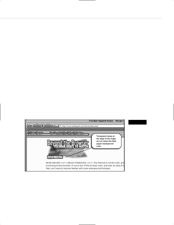
Figure 2.11
For reasons only a software company could explain, browsers and image editors round off 16-bit color calculations differently. As a result, for users of 16-bit color, image backgrounds and HTML (or CSS), backgrounds will never match (www.alistapart.com/ stories/beyond/).

58 WHY: Designing for the Medium: Color My Web
Due to differences between the way browsers calculate 16-bit color and the way image editors like Adobe Photoshop do it, in the 16-bit color space, browsers are off differently from the way GIF images are off. In other words, the background color of the image absolutely, mathematically cannot match the background color of the web page. All the web designer’s careful illusions are revealed. There is nothing you can do about this except wait for 24-bit color to become cheaper so that more consumers will adopt it.
Some web designers work around this problem by using transparent backgrounds. This is fine as long as the image does not serve also as a link. (Most images these days do.) Why are links problematic? Today most web pages use the CSS hover property to make links light up (meaning change colors) when the visitor drags her mouse over them. As you’ll see in Chapter 3, this kind of visual interactivity is helpful because it lets the user know that this particular set of words can take her somewhere else with a click of her mouse. When images serve as links and when links use the CSS hover property, the background color of a transparent image will change in response to the actions of the visitor’s mouse. Freddie Kreuger has nothing on this unintentional visual effect. Web designers who wish to avoid this horror will either create incredibly complex style sheets or simply use solid, websafe background colors in their images. And of course, these solid colors will be subtly mismatched on the screens of all 16-bit users. Welcome to the Web. Meantime, at least you can protect your 8-bit, 24-bit, and 32-bit using friends by sticking to the web-safe color palette as often as possible, particularly for large color fields, typography, and background colors.
At this point many designers scream: “These colors are ugly! This is not what I want.” You will find, after you work with these colors, that it is possible to create pleasing combinations with them, and you will develop your own techniques for doing so. We promise.
When saving images, you do not need to worry about intermediate colors. If your type is web-safe orange, and your background is web-safe blue, the edges of the type will be filled in with intermediately shaded pixels that are probably not web-safe. They do not have to be. As long as the large areas of color are web-safe, a little dithering around the edges of type and images goes unnoticed by most users.