

78 WHY: Where Am I? Navigation & Interface: Chaos and Clarity
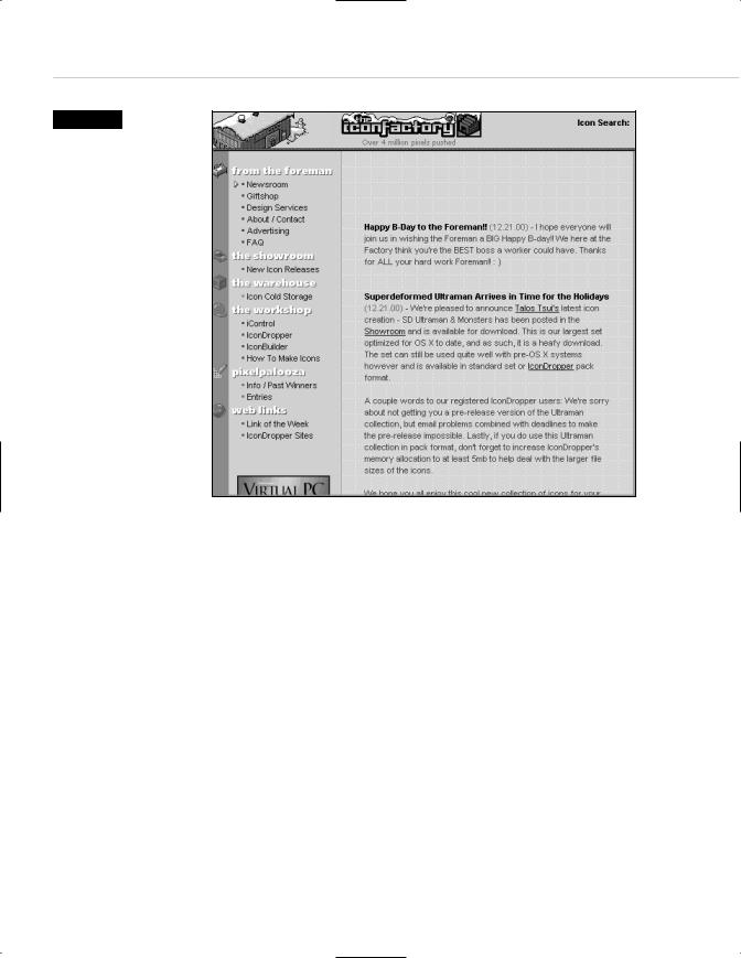
Figure 3.4
Ye Olde Left-Hand Nav Bar in action, seen here on the Winter 2000 edition of Icon Factory, creators of free, funky Mac desktop icons since 1995 (www.iconfactory.com). The left side is no better or worse than any other menu placement. But for several years, nearly all sites stuck their menus on the left because, well, nearly all sites stuck their menus on the left. Most left-hand navigation bars are nowhere near as cute ‘n cuddly as Icon Factory’s.
CHAOS AND CLARITY
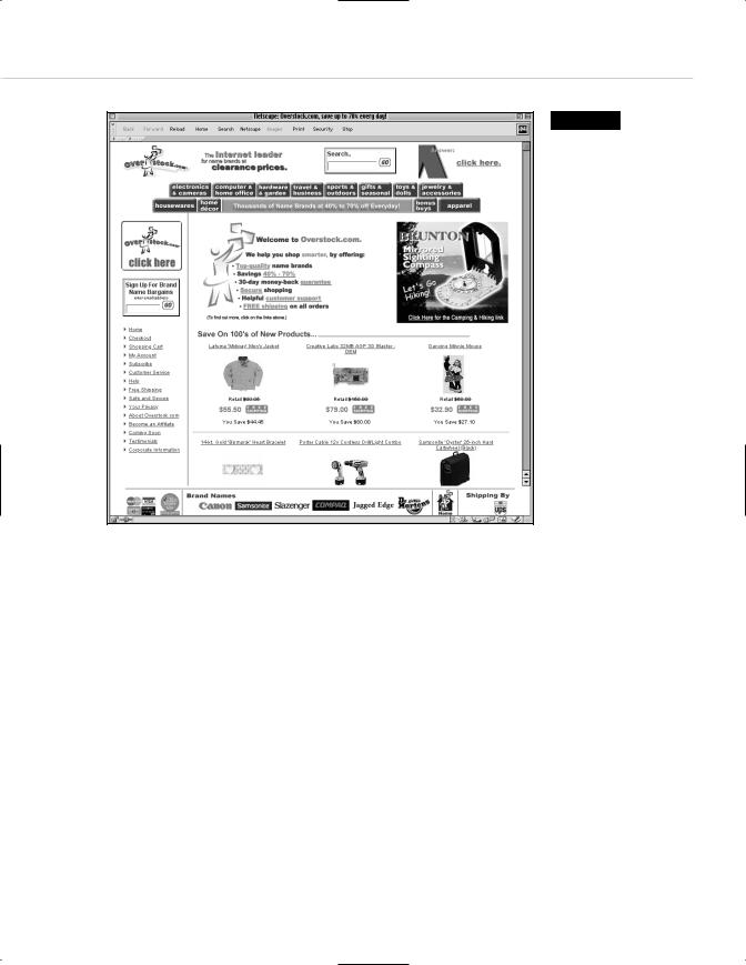
Beyond providing access to and subtly reinforcing a site’s content, the interface also enables people to engage in interactive behaviors, such as shopping and searching. Or it frustrates them and sends them scurrying to a competitor’s site, as in Figure 3.5, where clutter and lack of differentiation create chaos rather than a satisfying user experience. Sites of this nature, if they do not die immediately, persist in spite and not because of their architecture. They survive by offering something of value to those who are willing to overlook the experience’s deficiencies. With better architecture they would attract more customers.
Taking Your Talent to the Web |
79 |
Figure 3.5
Where do I go from here? Most likely, my browser’s Back button. Busy interfaces bore or confuse
all but the most diehard bargain seeker (www.overstock.com).
We once inherited an entertainment site that worked only on one platform and one browser (no names, please). Our client pointed out that he was getting four million visits a month. We replied that he was cheating himself out of an additional million visitors. Similarly, the owners of cluttered and confusing sites frequently mistake a profit margin for success. Better user experiences mean bigger profits, which is the best way to sell them to clients whose sole concern is money.
Clients are not alone in sometimes forgetting that sites are created to serve human needs. Web designers also can lose sight of their work’s primary objective.

80 WHY: Where Am I? Navigation & Interface: Chaos and Clarity
A Design Koan: Interfaces Are a Means too Often Mistaken for an End
As web designers become expert at crafting more and more sophisticated navigational structures, we sometimes forget that our interfaces do not come into being for their own sake. Interfaces are built to serve the user, not to demonstrate our cleverness and technical mastery (unless cleverness and technical mastery are an essential part of the brand). The best design may go unnoticed by users, but Heaven is watching and you will get your reward.
Universal Body Copy and Other Fictions
Good copy comes from the product; good interfaces come from considering the particular audience, content, and brand attributes of each site. When navigation anticipates the visitor’s needs and guides her through the site, it succeeds at the baseline level. When it does this in a fresh and brand-appropriate manner, it succeeds as effective web design.
In this sense, web design is no different from advertising, print, or product design. At the lowest level, an advertisement’s text must be grammatical, and its presentation must be legible. At the highest levels, design and concept are indistinguishable from the product experience. (Many would say they are the product experience.)
Impeccable graphic design does not necessarily equate to good interface design. As suggested by the design koan above, a site that looks drop-dead gorgeous but confuses visitors is a site that fails.
At the turn of the Millennium, several high-stakes web businesses went under because they forgot that their interfaces were supposed to be used by human beings. Looking at comps and demos, the board members said,
“Oooo-Ahhh!” But when attempting to navigate the completed sites, the public went, “Huh?” The public is the final court of appeals.
Taking Your Talent to the Web |
81 |
There were other reasons a number of web businesses failed in late 1999 and early 2000. Some businesses that served no earthly purpose and appealed to no imaginable audience managed to suck up venture capital anyway—until the investors woke up. But many sites with legitimate business models bit the dust when it was discovered that nobody could navigate them except, perhaps, the designers.
Each site speaks to a particular demographic. A site that is “everybody’s friend” is nobody’s best friend. Focused, usable, brand-supportive interfaces are as particular as the taste of a fresh-picked plum on a summer’s day.
While great web design, like all great design, is specific in nature, web design (like all design) has developed a series of guidelines and best practices that can aid you as you begin to shape your own sites. Some of these practices are rooted in common sense, others in human interface guidelines developed during the personal computer revolution of the 1980s. We will examine these guidelines in the following sections, bearing in mind that they are suggestions, not rules.
Interface as Architecture
Navigation is the experiential architecture of a site. Web designers use consistent visual cues to guide visitors through the site, as an architect guides a building’s visitors from the lobby to the elevator bank. Subtle visual hints cue a building’s visitors as to which areas of an office are open to the public, and which are private. Folks can find their way to a bathroom or a public telephone without asking for help. The goal of a navigational interface, like the goal of real-world architecture, is to enable people to do what they need to do.
As you develop web interfaces, ask yourself if you’re helping people find the site’s offices, elevators, and bathrooms or leaving them to fend for themselves. Poorly structured buildings win few tenants; poorly structured sites win few repeat visitors.