


82 WHY: Where Am I? Navigation & Interface: Ten (Okay, Three) Points of Light
TEN (OKAY, THREE) POINTS OF LIGHT
In her book, Web Navigation: Designing the User Experience (available at www.oreilly.com/catalog/navigation/), Jennifer Fleming describes ten qualities shared by successful navigational interfaces. Fleming’s ten points defy quick summarization, so we’ll settle for three of them. In Fleming’s view, good interfaces should:
1.Be easily learned
2.Remain consistent
3.Continually provide feedback
Be Easily Learned
A designer who buys Adobe Illustrator will accept the product’s learning curve; an online shopper will not invest the same kind of energy into
figuring out how www.halfpricefurniture.com works. Overly complex interfaces may please the designer who came up with them, but they rarely win favor with those trying to find their way through the site.
Why do most of us hate the remotes that come with our TVs and VCRs? Because there are too many buttons to push, and there is rarely an intuitive logic to the placement and size relationships of these buttons. We are always hunting for the button that resets the clock or programs the channels (and discovering that this function actually lies buried deep in a series of onscreen menus). We approach even the most basic tasks with the sense that we are somehow being forced to prove our mastery over a troublesome object.
Unless we wish to watch one TV channel for the rest of our lives, we have no choice but to click our way through the madness. But web users always have a choice—they can visit a website that is easier to use.
Remain Consistent
Each site presents the visitor with a unique interface. Compelling content or useful services are the only reason users bother learning how your site works. After they’ve gone to that trouble, they will not appreciate your changing the interface, misguidedly groping after “freshness.”
Taking Your Talent to the Web |
83 |
Web users are not mind readers. After they’ve learned that flowers serve as visual links (as in Figure 3.1), you’d be foolish to switch to a folder tab metaphor. If there are five main menu items per page, suddenly adding a sixth and seventh at the same hierarchical level could make naïve web users think they’ve somehow linked to an unrelated site. Sophisticated users will think the site is being redesigned, and they’ve somehow caught you in mid-process.
Many times beginning web designers feel that each section of a site requires its own distinctive signature. It usually makes more sense to provide a consistent interface, acknowledging the new section (if at all) with a subtle color change or a simple section title.
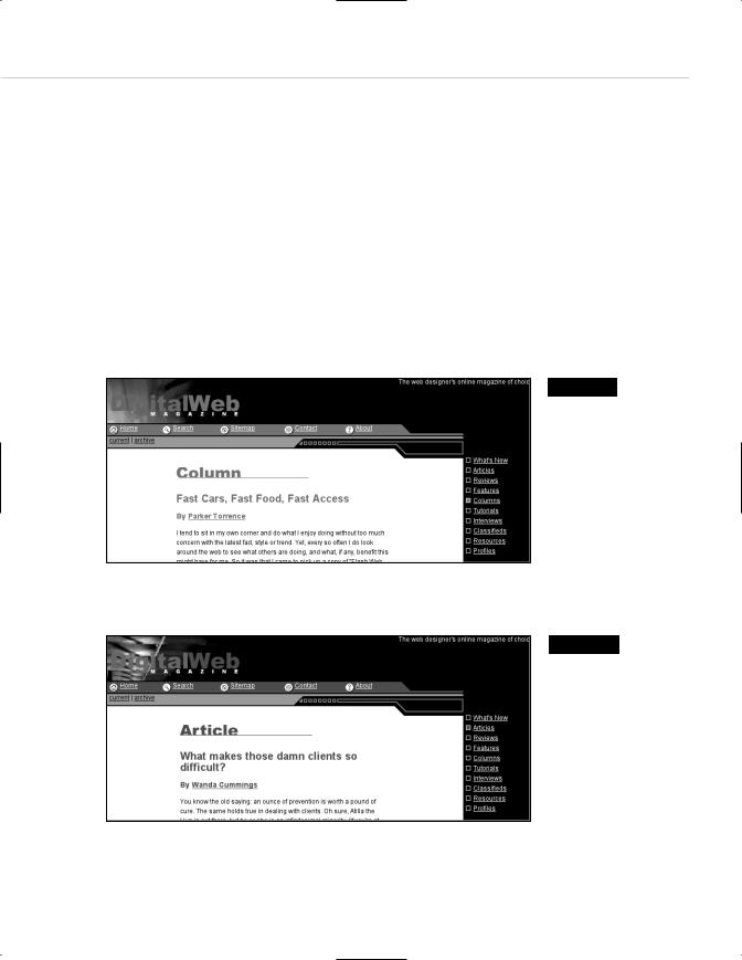
Figure 3.6
Digital Web Magazine, a popular online resource for web designers, offers a consistent interface between sections…
Figure 3.7
…but differentiates each section with a subtle color change. Because you can't tell that the color is changing with the color scheme of this book, you'll have to visit the site and see for yourself
(www.digital-web.com).gure
3.5