- •Taking Your Talent to the Web
- •Introduction
- •1 Splash Screen
- •Meet the Medium
- •Expanding Horizons
- •Working the Net…Without a Net
- •Smash Your Altars
- •Breath Mint? Or Candy Mint?
- •Where’s the Map?
- •Mars and Venus
- •Web Physics: Action and Interaction
- •Different Purposes, Different Methodologies
- •Web Agnosticism
- •Point #1: The Web Is Platform-Agnostic
- •Point #2: The Web Is Device-Independent
- •The 18-Month Pregnancy
- •Chocolatey Web Goodness
- •’Tis a Gift to Be Simple
- •Democracy, What a Concept
- •Instant Karma
- •The Whole World in Your Hands
- •Just Do It: The Web as Human Activity
- •The Viewer Rules
- •Multimedia: All Talking! All Dancing!
- •The Server Knows
- •It’s the Bandwidth, Stupid
- •Web Pages Have No Secrets
- •The Web Is for Everyone!
- •Swap text and code for images
- •Prune redundancy
- •Cache as Cache Can
- •Much Ado About 5K
- •Screening Room
- •Liquid Design
- •Color My Web
- •Thousands Weep
- •Gamma Gamma Hey!
- •Typography
- •The 97% Solution
- •Points of Distinction
- •Year 2000—Browsers to the Rescue
- •Touch Factor
- •Appropriate Graphic Design
- •User Knowledge
- •What Color Is Your Concept?
- •Business as (Cruel and) Usual
- •The Rise of the Interface Department
- •Form and Function
- •Copycats and Pseudo-Scientists
- •Chaos and Clarity
- •A Design Koan: Interfaces Are a Means too Often Mistaken for an End
- •Universal Body Copy and Other Fictions
- •Interface as Architecture
- •Ten (Okay, Three) Points of Light
- •Be Easily Learned
- •Remain Consistent
- •Continually Provide Feedback
- •GUI, GUI, Chewy, Chewy
- •It’s the Browser, Stupid
- •Clarity Begins at Home (Page)
- •I Think Icon, I Think Icon
- •Structural Labels: Folding the Director’s Chair
- •The Soul of Brevity
- •Hypertext or Hapless Text
- •Scrolling and Clicking Along
- •Stock Options (Providing Alternatives)
- •The So-Called Rule of Five
- •Highlights and Breadcrumbs
- •Consistent Placement
- •Brand That Sucker!
- •Why We Mentioned These Things
- •The year web standards broke, 1
- •The year web standards broke, 2
- •The year web standards broke, 3
- •The year the bubble burst
- •5 The Obligatory Glossary
- •Web Lingo
- •Extranet
- •HTML
- •Hypertext, hyperlinks, and links
- •Internet
- •Intranet
- •JavaScript, ECMAScript, CSS, XML, XHTML, DOM
- •Web page
- •Website
- •Additional terminology
- •Web developer/programmer
- •Project manager
- •Systems administrator (sysadmin) and network administrator (netadmin)
- •Web technician
- •Your Role in the Web
- •Look and feel
- •Business-to-business
- •Business-to-consumer
- •Solve Communication Problems
- •Brand identity
- •Restrictions of the Medium
- •Technology
- •Works with team members
- •Visually and emotionally engaging
- •Easy to navigate
- •Compatible with visitors’ needs
- •Accessible to a wide variety of web browsers and other devices
- •Can You Handle It?
- •What Is the Life Cycle?
- •Why Have a Method?
- •We Never Forget a Phase
- •Analysis (or “Talking to the Client”)
- •The early phase
- •Design
- •Brainstorm and problem solve
- •Translate needs into solutions
- •Sell ideas to the client
- •Identify color comps
- •Create color comps/proof of concept
- •Present color comps and proof of concept
- •Receive design approval
- •Development
- •Create all color comps
- •Communicate functionality
- •Work with templates
- •Design for easy maintenance
- •Testing
- •Deployment
- •The updating game
- •Create and provide documentation and style guides
- •Provide client training
- •Learn about your client’s methods
- •Work the Process
- •Code Wars
- •Table Talk
- •XHTML Marks the Spot
- •Minding Your <p>’s and q’s
- •Looking Ahead
- •Getting Started
- •View Source
- •A Netscape Bonus
- •The Mother of All View Source Tricks
- •Doin’ it in Netscape
- •Doin’ it in Internet Explorer
- •Absolutely Speaking, It’s All Relative
- •What Is Good Markup?
- •What Is Sensible Markup?
- •HTML as a Design Tool
- •The Frames of Hazard
- •Please Frame Safely
- •Framing Your Art
- •<META> <META> Hiney Ho!
- •Search Me
- •Take a (Re)Load Off
- •WYSIWYG, My Aunt Moira’s Left Foot
- •Code of Dishonor
- •WYS Is Not Necessarily WYG
- •Publish That Sucker!
- •HTMHell
- •9 Visual Tools
- •Photoshop Basics: An Overview
- •Comp Preparation
- •Dealing with Color Palettes
- •Exporting to Web-Friendly Formats
- •Gamma Compensation
- •Preparing Typography
- •Slicing and Dicing
- •Rollovers (Image Swapping)
- •GIF Animation
- •Create Seamless Background Patterns (Tiles)
- •Color My Web: Romancing the Cube
- •Dither Me This
- •Death of the Web-Safe Color Palette?
- •A Hex on Both Your Houses
- •Was Blind, but Now I See
- •From Theory to Practice
- •Format This: GIFs, JPEGs, and Such
- •Loves logos, typography, and long walks in the woods
- •GIFs in Photoshop
- •JPEG, the Other White Meat
- •Optimizing GIFs and JPEGs
- •Expanding on Compression
- •Make your JPEGS smaller
- •Combining sharp and blurry
- •Animated GIFs
- •Creating Animations in ImageReady
- •Typography
- •The ABCs of Web Type
- •Anti-Aliasing
- •Specifying Anti-Aliasing for Type
- •General tips
- •General Hints on Type
- •The Sans of Time
- •Space Patrol
- •Lest We Fail to Repeat Ourselves
- •Accessibility, Thy Name Is Text
- •Slicing and Dicing
- •Thinking Semantically
- •Tag Soup and Crackers
- •CSS to the Rescue…Sort of
- •Separation of Style from Content
- •CSS Advantages: Short Term
- •CSS Advantages: Long Term
- •Compatibility Problems: An Overview
- •Working with Style Sheets
- •Types of Style Sheets
- •External style sheets
- •Embedding a style sheet
- •Adding styles inline
- •Fear of Style Sheets: CSS and Layout
- •Fear of Style Sheets: CSS and Typography
- •Promise and performance
- •Font Size Challenges
- •Points of contention
- •Point of no return: browsers of the year 2000
- •Absolute size keywords
- •Relative keywords
- •Length units
- •Percentage units
- •Looking Forward
- •11 The Joy of JavaScript
- •What Is This Thing Called JavaScript?
- •The Web Before JavaScript
- •JavaScript, Yesterday and Today
- •Sounds Great, but I’m an Artist. Do I Really Have to Learn This Stuff?
- •Educating Rita About JavaScript
- •Don’t Panic!
- •JavaScript Basics for Web Designers
- •The Dreaded Text Rollover
- •The Event Handler Horizon
- •Status Quo
- •A Cautionary Note
- •Kids, Try This at Home
- •The Not-So-Fine Print
- •The Ever-Popular Image Rollover
- •A Rollover Script from Project Cool
- •Windows on the World
- •Get Your <HEAD> Together
- •Avoiding the Heartbreak of Linkitis
- •Browser Compensation
- •JavaScript to the Rescue!
- •Location, location, location
- •Watching the Detection
- •Going Global with JavaScript
- •Learning More
- •12 Beyond Text/Pictures
- •You Can Never Be Too Rich Media
- •Server-Side Stuff
- •Where were you in ‘82?
- •Indiana Jones and the template of doom
- •Serving the project
- •Doing More
- •Mini-Case Study: Waferbaby.com
- •Any Size Kid Can Play
- •Take a Walk on the Server Side
- •Are You Being Served?
- •Advantages of SSI
- •Disadvantages of SSI
- •Cookin’ with Java
- •Ghost in the Virtual Machine
- •Java Woes
- •Java Woes: The Politically Correct Version
- •Java Joys
- •Rich Media: Exploding the “Page”
- •Virtual Reality Modeling Language (VRML)
- •SVG and SMIL
- •SMIL (through your fear and sorrow)
- •Romancing the logo
- •Sounds dandy, but will it work?
- •Promises, Promises
- •Turn on, Tune in, Plug-in
- •A Hideous Breach of Reality
- •The ubiquity of plug-ins
- •The Impossible Lightness of Plug-ins
- •Plug-ins Most Likely to Succeed
- •Making It Work: Providing Options
- •The “Automagic Redirect”
- •The iron-plated sound console from Hell
- •The Trouble with Plug-ins
- •If Plug-ins Run Free
- •Parting Sermon
- •13 Never Can Say Goodbye
- •Separation Anxiety
- •A List Apart
- •Astounding Websites
- •The Babble List
- •Dreamless
- •Evolt
- •Redcricket
- •Webdesign-l
- •When All Else Fails
- •Design, Programming, Content
- •The Big Kahunas
- •Beauty and Inspiration
- •Index
190 HOW: HTML, the Building Blocks of Life Itself: HTML as a Design Tool
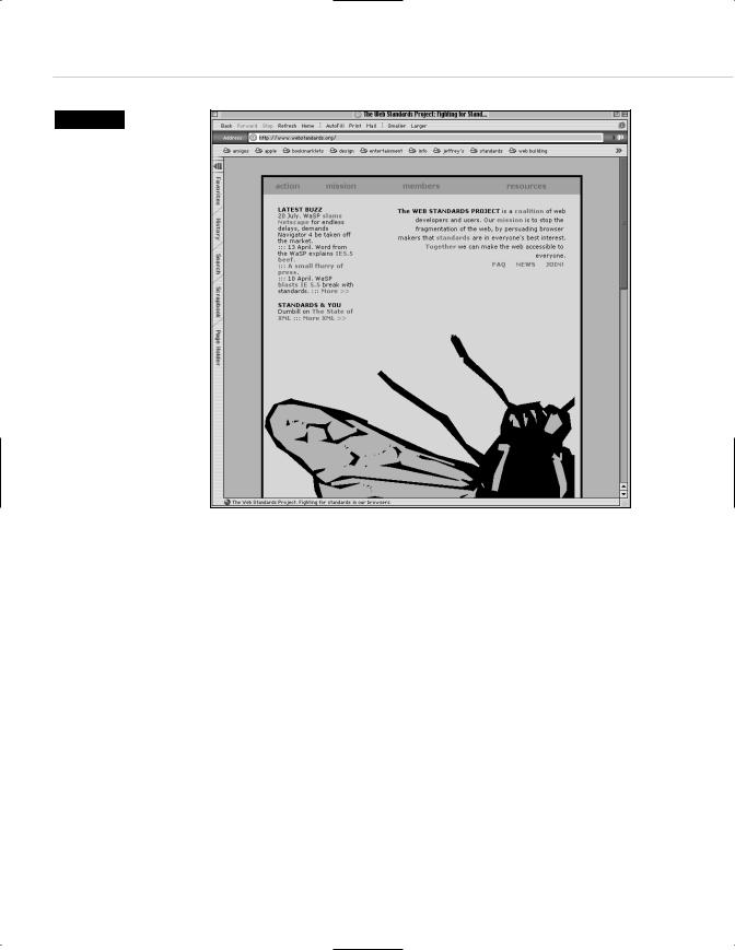
Figure 8.1
This site for the Web Standards Project contains almost no graphics. The shapes and colors are created using nothing more than HTML and CSS. It is possible to fill the screen with color and content without wasting bandwidth on images. As a bonus, the code validates (www.webstandards.org).
HTML AS A DESIGN TOOL
Though this won’t always be the case, one of the beautiful things about HTML (and eventually, CSS instead) is that it can be used as a powerful design tool—a design tool that loads instantly. No images are required; there are no fancy plug-ins and no worries about every user having the latest browser.
Consider the front page of The Web Standards Project (www.webstandards. org). Aside from one large Seymour-Chwast-like illustration, the rest of the front page is designed entirely with HTML and CSS. Now view the source.
An HTML color in the <BODY> tag defines the entire background. The content grid is made up of a table, and the grid areas and background colors are defined with table cell colors.
Taking Your Talent to the Web |
191 |
The content area is enclosed within a black outline created with one line of CSS. Originally, the same effect was created by wrapping one HTML table inside another.
CSS is used to create the typography and leading.
Creating a layout like this in Photoshop, cutting its elements into pieces, and assembling those pieces via HTML, would have resulted in a large web page composed of many small files that would take a long time to download. (And if the visitor had images turned off, the visual effect would be lost.)
Creating the layout in HTML and CSS means that the page loads almost instantly, no matter how slow the visitor’s connection may be. And the layout is backward compatible with browsers dating back to Netscape 3 (a 1997 browser), although the CSS formatting will be lost in that browser. Actually, the site is viewable in any browser. Older browsers will lose the design branding effects, but the content will still be readily accessible.
Note that this is a transitional web design strategy. It respects bandwidth by using web technology (instead of image files) to create visual and branding effects—but at the cost of relying on deprecated presentational HTML attributes. Most of these effects can be generated in CSS alone, with HTML serving simply as the structural container of content. This is what the W3C recommends, and this is the way we will build all sites in the near future and forever after. (We’re doing it at alistapart.com.)
However, as we mentioned in Chapter 2, old browsers that do a poor job at understanding CSS are still widely used in the market we serve. And as you’ll see in Chapter 10, browsers that stumble over CSS don’t simply render it incorrectly. They can actually crash and burn. For this reason, as you begin your career in web design, you will undoubtedly be using HTML tables and other deprecated presentational HTML attributes to control your web layouts and visual effects. Thus there is value in learning how to do this in ways that minimize wasted bandwidth and comply with the letter (though not the spirit) of W3C standards. The lessons you learn in building sites this way will apply equally well when you are free to control your site designs exclusively with CSS.
192 HOW: HTML, the Building Blocks of Life Itself: HTML as a Design Tool
Other sites that use HTML or XHTML as a creative design tool (abetted by CSS):
■www.glish.com (designed by Eric Costello)
■www.harrumph.com (designed by Heather Champ)
■www.assembler.org (designed by Brent Gustaffson)
■www.kottke.org (designed by Jason Kottke)
■www.blogger.com (designed by Derek Powazek)
■a.jaundicedeye.com/weblog/ (designed by Steven Champeon)
■www.zeldman.com (designed by Zeldman)
■www.alistapart.com (designed by Zeldman)
Use View Source to see how these sites use HTML table cells and table cell colors, CSS fonts, leading, margins, and background images to create full-
Figure 8.2
This site, though colorful, contains few graphics. Big color sections are created with CSS and HTML <DIV>s. The technique facilitates Liquid Design, reduces bandwidth, and makes the site more accessible (www.alistapart.com).
Taking Your Talent to the Web |
193 |
fledged visual experiences using nothing more than code (and a few lowbandwidth images).
PLUG-INS AND TABLES AND FRAMES,
OH MY!
In the transitional Web, designers use HTML tables to lay out pages, as just described (with additional commentary and how-to-do-it type verbiage to come in the next chapter). We also use <FRAMES>, a Netscape “extension” to HTML which has temporarily made it into the HTML 4 Transitional standard but which will eventually go the way of the Dodo bird.
Frames are nothing more than pages within pages, for example:
<FRAMESET COLS=”80,2,*” frameborder=”no” border=”0” framespacing=”0”> <FRAME SRC=”nav.html” NAME=”nav” marginwidth=”0” marginheight=”0” noresize scrolling=”auto”>
<FRAME SRC=”black.html” NAME=”black” marginwidth=”0” marginheight=”0” noresize scrolling=”no”>
<FRAME SCROLLING=auto SRC=”content.html” NAME=”content” marginwidth=”0” marginheight=”0”>
</FRAMESET>
In this markup, <FRAMESET> tells the browser that the page contains frames. <COLS> (short for columns) specifies that the frameset contains three columns. The first is 80 pixels wide; the second is 2 pixels wide; and the last fills the remaining width of the browser window.
We also can tell the browser whether or not we want borders on our frames; whether or not each frame should permit the viewer to scroll content; whether or not each frame is user-resizable; and what size margin we’d like on each frame. Because we’re designers, we turn margins off entirely (marginwidth=”0” marginheight=”0”) and use CSS or tables to control the margins on each individual frame—each frame, of course, being nothing more than an HTML document (nav.html, black.html, content. html).
We also name each frame for targeting purposes. After all, when visitors click in a menu area, we want the content they’ve chosen to show up in the content frame—not in the menu frame. Assigning a target name to each