

248 HOW: Visual Tools: Slicing and Dicing
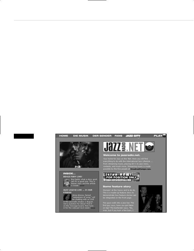
Figure 9.13
Here is a Photoshop web layout that combines photography, logos, and interface elements. We used this layout to sell a final web design to JazzRadio.Net (www.jazzradio.net).
SLICING AND DICING
Photoshop is the primary tool used to design navigational menus and their associated text (unless these menus are created in CSS, per the preceding discussion). Photoshop and Illustrator are also used to create assorted navigational elements such as arrows and buttons. The larger and more commercial the site, the greater the pressure to create uniquely branded elements.
These elements can be created in separate image documents. For instance, you might create hundreds of arrows in Illustrator before choosing one for your design. Similarly, you might (and probably will) go through several rounds of logo development.
But after they are created and chosen, all of these elements are generally layered into a single Photoshop comp, which is used to sell the work to the client (see Figure 9.13). Of course, as we’ve just said (and as Chapter 7 explained), this “selling” is a multistage process, with continual refinement occurring based on research, user testing, and the client’s strange whims.
Taking Your Talent to the Web |
249 |
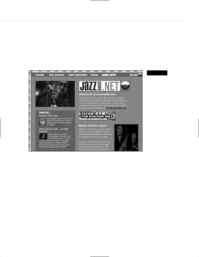
After it’s sold, production begins, and at this point Photoshop’s ImageReady module comes into its own. Knives were made to slice cake, and ImageReady was made to slice web comps. The process begins by dragging Photoshop guidelines across any area that will have to be sliced—for instance, dragging guidelines to separate one menu bar item from the next (see Figure 9.14).
Figure 9.14
The next phase is dragging Photoshop’s guides to mark areas to be converted to slices in the ImageReady module. (Photoshop 6 can create the slices itself.) Though slicing such comps is the normal next step, for this project we opened a text editor and re-created the
layout in HTML and CSS to minimize bandwidth and enable the layout to squash or stretch in true “liquid” fashion.
With Photoshop 6, you can create and name slices right in the Photoshop program itself. With Photoshop 5.5, having dragged guides, you “Jump to ImageReady” via the File menu and automatically convert your guides to slices at the touch of a button. ImageReady generates the relevant HTML, animations (if any), and JavaScript rollover functions (if any). We don’t mean to imply that this happens instantly, of course. There is a great deal of typing, dragging, and layer selection involved.
Rollovers are created by selecting new layers for each rollover state and typing the relevant URL and text (if any) in the Slices dialog box. Now you can see why rollover states are visually designed during the comping phase. Not only does this satisfy the client, it also enables you to focus on production tasks without worrying about previously unconsidered design issues.

250 HOW: Visual Tools: Slicing and Dicing
Performing all these production tasks is a fairly straightforward process, and the Photoshop manual spells it out so completely that we won’t bother doing so here. One thing Photoshop’s manual does not emphasize (but we will) is that you can often replace selected slices with bandwidth-friendly HTML and CSS equivalents. For example, instead of generating a large brown GIF image, you can generate an empty table cell filled with the appropriate background color, merely by choosing No Image from the Type drop-down menu.
This by no means converts a browser-centric, brand-heavy site into a light, accessible one. It does, however, help reduce overall file size, and it does make life a bit easier for those using nontraditional browsers, given that this will be one less pointless image to trouble them with its incomprehensibility.
After the process is completed, sophisticated web designers take the HTML and JavaScript generated by ImageReady, open it in an HTML text editor such as BBEdit, PageSpinner, or HomeSite, and edit as needed. For example, you might substitute a simpler JavaScript function for one generated by ImageReady.
ImageReady’s JavaScript is verily a two-edged sword. Novices and experienced web designers in a hurry can rightly consider ImageReady’s automated scripting a godsend. But it is equally easy to generate massively confusing or even completely dysfunctional scripts until you familiarize yourself with the process. The first time we used ImageReady to automatically generate image rollovers, we ended up with a folder full of bizarrely named duplicate slices and a script that changed every image on the page at the slightest movement of the mouse.
Then we read the manual.
Most professionals will use ImageReady to generate slices and raw HTML, then tighten up its markup for better standards compliance and lower bandwidth, and replace its often complex scripts with simpler ones. In large web agencies, web technicians will perform these tasks.
Taking Your Talent to the Web |
251 |
THINKING SEMANTICALLY
Photoshop and ImageReady perform vital tasks splendidly, but what they cannot do is generate semantic websites predicated on the separation of style from content. Being visual tools, they necessarily create visual sites— and of course this is what most clients want and what most designers are comfortable with. But this is not the only way and not necessarily the best way to create websites.
Visual sites are a comforting link to the past, to our history of print and package design—of concrete objects made beautiful and intelligible through precise design. Semantic sites are something else again.
Because they are rooted in images, and images are necessarily of fixed and specific sizes, Photoshop and ImageReady generate image-laden sites laid out in HTML tables with specific heights and widths. They do not generate the Liquid Design we discussed in Chapter 2 because it is not in the nature of a pixel-based program to develop abstractions of form. And certainly they cannot separate style from content because style is their content.
So separating style from content becomes your job, if you choose to accept it. As an interim step, what we’ve done in our shop over the past two years is confine ImageReady’s slicing skills to key elements that must be precisely sized—for instance, to branded navigational menu bars. But whenever possible, instead of slicing entire comps to create precise graphic web layouts, we use our comps as guidelines to create HTML (or, even better) CSS equivalents that are loose, flexible, and fairly minimalist.
This process enables us to create templates that function as “content containers.” Such sites are still branded and still function as all sites function, but they are less tied down by fixed elements than traditional sites. This makes them easier to revise and update (just change a style sheet) and harder for clients to screw up when they take over the maintenance chores. It also makes them easier for nontraditional browsers to process and positions them for the next phase of web development.

252 HOW: Visual Tools: Thinking Semantically
We have now broached the vital next step in the web’s history: the separation of style from content. Meanwhile, in our discussion of web typography, we have so far avoided the specifics of coping with actual web texts as opposed to decorative elements. So maybe it’s time to look at a technology that handles both the separation of style from content and the need for precise typographic control of web text.
The people of earth call it CSS, and the next chapter will explain how it works—and what to do when it stops working.

chapter 10
Style Sheets for
Designers
IN THE BEGINNING WAS THE WORD: without style and unadorned on a plain gray background.
The scientists who envisioned the Web saw it as a place for reasoned discourse conducted through documents whose structure was as logical as the arguments they propounded. HTML would present content and structure, and the browser (or User Agent) would interpret it visually, according to its own built-in rules of display. <h1>Headlines</h1> would look like whatever the browser decided they should look like (typically, 24pt. Times). <p>Paragraphs</p> would look like whatever the browser decided they should look like (typically, 12pt. Times).
In early browsers such as Mosaic and Netscape 1.0, web page backgrounds were generally gray. Why did browser developers choose this dingy color? The answers are lost in the mists of time. In other words, we have no idea. But we do have a theory. Namely, images seemed to want to appear against a black background for maximum contrast and impact. Text, of course, wanted to appear on white. We’re guessing that the makers of the first browsers compromised by giving us a washed-out gray that would provide rudimentary contrast for either type of foreground element. Regardless of their reasons, the resulting web pages were not much to look at.