


226 HOW: Visual Tools: Format This
text has less anxiety about the fact that some images may not have finished downloading. With sufficiently engaging text, the user will feel that the site is responsive. Keep this in mind when designing sites that require a great many images.
JPEG, the Other White Meat
The Joint Photographic Experts Group (JPEG) format should be familiar to you from stock photo houses, digital cameras, and the Photoshop tutorial itself. Usually seen with a .jpg file extension (as in landscape.jpg), JPEG supports 24-bit color and preserves the subtle hue and brightness variations found in photographs and other continuous-tone images. JPEG is therefore usually the format of choice when creating photographic images for the Web. Like GIF, JPEG is widely supported in visual web browsers.
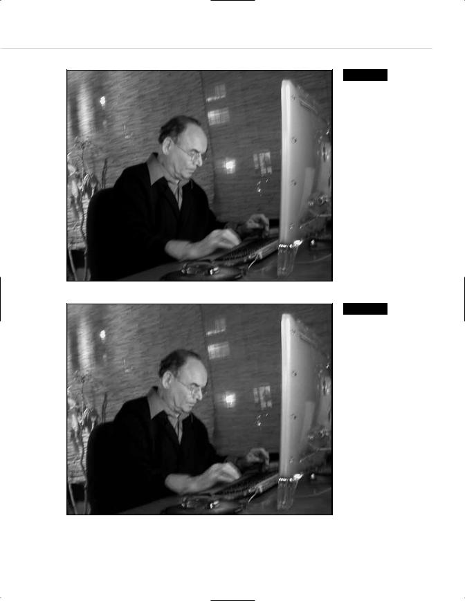
Just as MP3 music files toss away audio harmonics to achieve compact file sizes, JPEG’s compression works by selectively discarding bits of image data. Because a loss of quality is involved, JPEG compression is referred to as lossy compression. “Lossy” is an annoying word that looks wrong, but we appear to be stuck with it. In theory, the material discarded by the JPEG optimization process is data that is nearly invisible to the human eye (just as audio data discarded by the MP3 format is supposed to go practically undetected by your ears, though we’ve never met a music fan who could not hear the difference). The greater the JPEG compression, however, the more visible the “missing data” becomes. At extremely high compression ratios, JPEG images can display funky artifacts (see Figures 9.5 and 9.6).
Although JPEG is generally preferred for photographic images, when sharp detail is important, GIF is the better choice. JPEG tends to soften images as it compresses them. Particularly when you are working with typography, the softness of JPEG images can ruin the effect of a web graphic. Naturally, there is a workaround, as explained in the “Combining Sharp and Blurry” section later in this chapter.
Unlike GIF, the JPEG format does not retain specific web-safe (or other) colors. It promises you a rose garden, but the rose might be umber. In a silhouetted portrait where the edges of the image must match the background of the web page, you would therefore use GIF, not JPEG.
Taking Your Talent to the Web |
227 |
Figure 9.5
At moderate JPEG compression levels, image details are clear, but file size is high.
Figure 9.6
At high JPEG compression levels, file size is low (minimizing bandwidth) but so is the quality. Each JPEG optimization is an exercise in balancing file size versus quality of detail.

228 HOW: Visual Tools: Format This
Photoshop’s Save For Web function provides a small, Matte Color dialog box that purports to save an exact background color of your choice, even in the JPEG format. (Skip ahead to Figure 9.7, if you must. The Matte Color dialog appears at mid-right.)
Photoshop does all it can to fulfill this promise, but the JPEG format really is not built to handle specific colors like this. To viewers with 24-bit and higher systems, the background color will appear to match. For 16-bit and lower users, the mismatch may be clearly visible. So stick with GIF when you absolutely, positively, have to deliver a specific web-safe (or other) color.
In Photoshop, you can choose whether to save your JPEG as a baseline (standard) JPEG or as a progressive JPEG. Progressive JPEGs display a lowresolution version of the image almost immediately and then gradually come into crisper focus.
As with progressive GIFs, under the right circumstances, progressive JPEGs can create the illusion that the site is loading faster. As previously discussed, this varies depending on the viewer’s access speed, browser functionality, browser preferences, and the caprices of HTTP. And as in the discussion of GIFs above, when intended as background images, progressive JPEGs are a no-no unless you want some of your visitors to crashcrash.
Optimizing GIFs and JPEGs
When we export images such as GIFs and JPEGs, we choose the format most appropriate to the type of image we’re dealing with and then optimize it to create the best appearance possible, while using the least amount of bandwidth and computing resources.
In addition to optimizing (reducing file sizes), the exporting process allows us to further exert control over the color of our GIF images.
Photoshop 3, 4, and 5 offered early web designers very little in the way of optimization and color controls. As a result, a number of inexpensive, third-party, shareware plug-in products specifically tailored to the needs of web designers sprang up in the mid-1990s, most notably Boxtop

Taking Your Talent to the Web |
229 |
Software’s PhotoGIF, ImageVice, and ProJPEG (all are available at www.boxtop-software.com). These products were dandy (still are), but they did not come as standard equipment (still don’t). Arguably, they do a better job than Photoshop at handling some tasks.
Fortunately, Photoshop 5.5 and higher, together with ImageReady, offers a number of tools to help web designers create the best-looking image while using the least amount of bandwidth. Photoshop’s Save For Web command (found in File, Save For Web) enables web designers to preview the effects of various compression settings on their images and then execute those settings and save the resulting web-ready images (see Figure 9.7).
The Save For Web dialog is powerfully compelling in the breadth and subtlety of its tools. You can preview GIF versions using as few as two colors, as many as 256, or anything in between. You can use Adaptive, Selective, Perceptual, or web-safe color, with or without dithering, transparency, or interlacing (the “progressive” setting). You can skew images closer to or further from the web-safe palette as you desire. You also can name and save custom settings for later application to similar images.
Figure 9.7
Photoshop’s Save For Web dialog in action. In this “four-up” view, the original image appears at the upper left for easy comparison with various optimization schemes of your choosing.

230 HOW: Visual Tools: Format This
Work on one optimization setting at a time or view three at once—and compare them with the original to check for image degradation and color shifting. Get an instant readout of the effect your decisions will have on
file size and downloading speed. Enlarge images to check fine details. Lock selected colors before trying a new set. Shift one color at a time to its closest web-safe equivalent. We feel like press agents. We feel giddy. We love this dialog box. You will too.
Images in Save For Web mode also may be previewed at various JPEG settings, both baseline and progressive, and again the tools are remarkably powerful.
In general, the fewer the colors used in a GIF, the better it compresses. This is not because the color palettes themselves eat bandwidth; rather it is because of the way LZW compression works. More on that in a moment in the “Expanding on Compression” section that is coming up next.
Dithering images produces more photographic-like effects at the cost of slightly higher file sizes; images without dithering are smaller. We find that typographic GIFs are often cleaner and more legible when saved without dithering. Your mileage may vary. You can create either type of image (and preview the results) in Photoshop’s Save For Web dialog box.
After you decide which optimization scheme works best for a given image, the image can be saved in that format. Your chosen settings may be retained indefinitely, and can even be applied (as a droplet) to an entire folder of images.
Photoshop lets you name and store as many of these settings as you like. If a series of images you’ve created for Acme Widgets happens to work well in 12 colors with no dithering at 60% web-safe, you can name that setting 12color_nodither (or acme_widgets or 60websafe or donaldduck if you prefer). You can then save it forever—or at least until your backup media deteriorates and what’s left of your hair is white and listless. By then we’ll all be living on Mars while our clones do the work, anyway.
Alternately, you can use the ImageReady module to satisfy your wanton image compression and formatting needs. But Photoshop’s Save For Web is just as effective, and the true power of ImageReady comes later in the process (and this chapter).