

276 HOW: Style Sheets for Designers: Trouble in Paradise
The Master List
www.webreview.com/style/css1/charts/mastergrid.shtml
“The mother of all CSS (Cascading Style Sheet) charts,” which lists every aspect of the CSS spec and identifies how well it is supported by various Mac and Windows web browsers.
If the Master List did not convince you (or if you could not quite grasp its meaning), we’ll look at the alternatives one by one:
Font Size Challenges
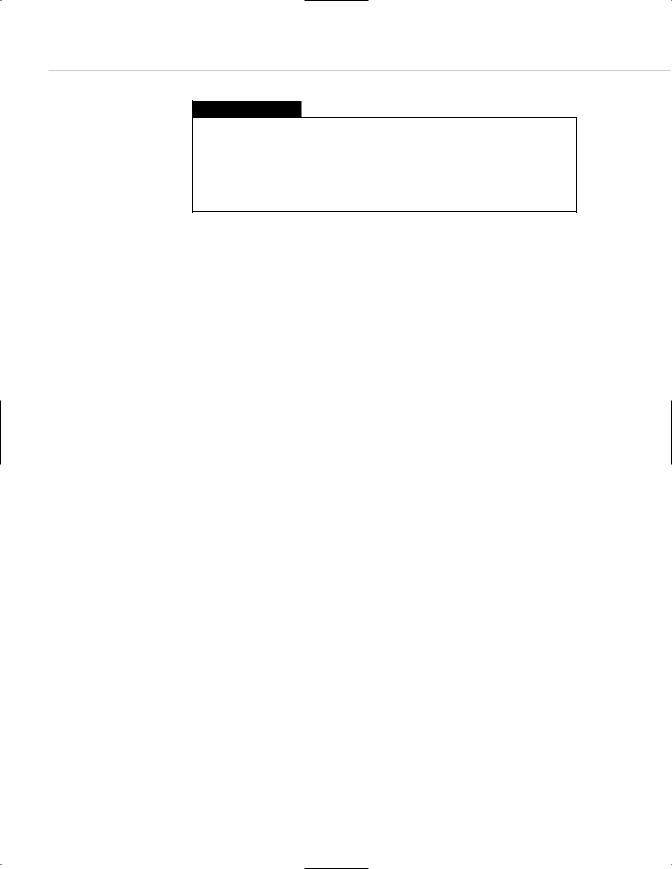
Among many other capabilities, CSS allows web designers to specify the size of typography on web pages. As shown below, font sizes can be indicated using any of the following: points, pixels, absolute keywords, relative keywords, length units, and percentage units.
H1 {font-size: 14pt}
H1 {font-size: 14px}
H1 {font-size: x-large}
H1 {font-size: larger}
H1 {font-size: 1.5 em}
H1 {font-size: 125%}
Too bad most of the stuff doesn’t work everywhere…yet.
Points of contention
Points are the units of measure with which designers are most familiar— from their years of creating print layouts in Quark XPress or similar programs. Unfortunately, points are meaningless on the Web. Points function as units of print, not as units of screen space. (Pixels are the only meaningful unit of screen space.) Due to platform and resolution differences, 14pt. can mean many things. What it does not mean is a specific unit of screen size.
Points are included in the CSS spec so that designers can set up a second style sheet for printouts, as mentioned earlier in this chapter—one CSS document to control the way the display looks on the screen and a second for printing.

Taking Your Talent to the Web |
277 |
In your print-oriented style sheet (if the browser supports this), it makes perfect sense to use points because printers understand points and can be thrown for a loop by pixels. In some older browsers, 12px type gets printed as 12 pixels, and those pixels are computed against the printer’s resolution. Got a 1200ppi printer? Your 12px type could be .01 inches tall. To avoid that kind of lunacy, points should be used in style sheets devoted to the printer—and nowhere else. (Better browsers recalculate style sheets according to the needs of the printer, but your visitors may not be using these browsers.)
In the world of print, there are approximately 72 points per inch. To match this, Mac OS offers a default resolution of 72 pixels per inch, mapping pixels to points (give or take a fraction). Of course, as soon as the Mac user changes her screen resolution, all bets are off. In Windows and other PC operating systems, there are 96 pixels per inch—until the PC user changes her screen resolution, and then all bets are off.
What this means is that point sizes are incompatible between Mac OS and Windows right from the get-go. For instance, when a Windows client sends a Microsoft Word document to a Mac-based graphic designer, the type is often too small for the designer to read. The same problem traditionally plagued web pages.
Leaving aside the fact that most users change their screen resolution (and therefore all bets are off), savvy developers have used JavaScript to serve appropriate point-size-based style sheets to Mac users versus PC users. It’s more complicated than using pixels, but at least it used to work.
Point of no return: browsers of the year 2000
In IE5/Mac and Netscape 6, this has changed. (See ALA’s “Why IE5/Mac
Matters” for a complete discussion of this issue.)
IE5/Mac sets as its default typographic preference 16px type at 96ppi. In other words, it brings the default Windows typographic resolution to the desktop of Mac users. Netscape 6 does exactly the same thing.

278 HOW: Style Sheets for Designers: Trouble in Paradise
This is not evil hegemony; it is simply common sense in that the more closely browsers adhere to commonalities, the less likely web users are to get hurt. Windows’ default resolution is no better or worse than Mac resolution. But it is the most commonly used resolution, so more sites are designed to accommodate it. Treating it as a de facto “standard” prevents Mac users from being hurt by the poor authoring practices of some web developers.
“Aha!” cries the Scripting Brigade. “So all we have to do is add a few more lines of code to our browser detection scripts, and we can serve Windowssize type to Mac users if they are surfing with IE5 or Netscape 6 and Macsize type if they are using older browsers?”
Not so fast, buckos. IE5/Mac starts at this default resolution but enables users to change it. They can change it back to standard Mac resolution (and how will you know if they’ve done that?). Adept users can change it to a size based specifically on their screen resolution, and Netscape 6 users can change their font size to any arbitrary value that strikes their fancy. You have no way of knowing if they’ve done this or not. Therefore, using JavaScript to detect the user’s browser and platform tells you exactly nothing about their default font size and its relationship to standard point sizes. There is only one thing of which we can be certain: If you use points to control sizes, you are kidding yourself.
What works? Pixels.
Pixels for fun and profit
Though screen resolutions vary, a pixel is always equal to a pixel. Pixels are the only reliable means of sizing typography if the web designer absolutely must control the size of type on the web page. Unfortunately, this practice might cause problems for some readers. For instance, if the designer has specified 10-pixel type:
1.The visually impaired might have difficulty reading the type. This is not a problem in IE5/Mac, which allows users to resize type at their discretion by using the included “text zoom” function. Netscape 6 offers similar functionality, and Opera 5 zooms the entire page at the touch of a button. So in those browsers, you can use pixels without causing accessibility problems for anyone. (But these, as we’ve already explained, are not the most popular browsers.)

Taking Your Talent to the Web |
279 |
2.Older browsers do not allow visitors to resize most CSS type— particularly type set in pixels, and IE5.5/Windows still does not offer text zooming at all. Thus, there will always be a potential accessibility hazard involved when you specify text in pixels—at least until IE for Windows offers text zooming or an equivalent solution. As explained in Chapter 2, we might have to wait 18 months or more for Netscape users to upgrade to the 6.0 browser and for Microsoft to implement text zoom in its Explorer browser for Windows.
3.If your style sheet calls up a scalable True Type font and if the user’s operating system includes that font (and supports True Type), your pixel-based style sheet will work just fine. But if the user’s system does not include a scalable version of that font or a suitable substitute or does not natively include True Type fonts (Linux for example), type set in pixels can display jaggedly and may be illegible.
Accessibility problems are deadly serious. This is not idle, theoretical chitchat. When people can’t read (or even access) your site, it hurts them, it hurts you, and it hurts your clients.
Accessibility problems aside, some designers quibble that pixels are bad because they vary according to screen resolution. A 400 x 400 pixel square
fills most of the screen at 640 x 480, and very little of it at 1600 x 1200.
To which we reply, so what? A 100 pixel–tall CSS headline will be the same height as a 100 pixel–tall GIF image. A 200 pixel–wide CSS div will be equivalent to a 200 pixel–wide JPEG image.
If you intend to create print-like layouts on the web—or even liquid layouts that depend on the relative sizing of elements—you have exactly one choice: pixels. If you can get away with a looser type of design (as you can, for instance, in a personal diary or an academic paper), so much the better. Most of us have to size the elements in our layouts, and most of us designers like it that way.
Besides, our other options simply do not work. For instance: