

- •Contents
- •Preface to the Second Edition
- •Introduction
- •Rails Is Agile
- •Finding Your Way Around
- •Acknowledgments
- •Getting Started
- •The Architecture of Rails Applications
- •Models, Views, and Controllers
- •Active Record: Rails Model Support
- •Action Pack: The View and Controller
- •Installing Rails
- •Your Shopping List
- •Installing on Windows
- •Installing on Mac OS X
- •Installing on Linux
- •Development Environments
- •Rails and Databases
- •Rails and ISPs
- •Creating a New Application
- •Hello, Rails!
- •Linking Pages Together
- •What We Just Did
- •Building an Application
- •The Depot Application
- •Incremental Development
- •What Depot Does
- •Task A: Product Maintenance
- •Iteration A1: Get Something Running
- •Iteration A2: Add a Missing Column
- •Iteration A3: Validate!
- •Iteration A4: Prettier Listings
- •Task B: Catalog Display
- •Iteration B1: Create the Catalog Listing
- •Iteration B4: Linking to the Cart
- •Task C: Cart Creation
- •Sessions
- •Iteration C1: Creating a Cart
- •Iteration C2: A Smarter Cart
- •Iteration C3: Handling Errors
- •Iteration C4: Finishing the Cart
- •Task D: Add a Dash of AJAX
- •Iteration D1: Moving the Cart
- •Iteration D3: Highlighting Changes
- •Iteration D4: Hide an Empty Cart
- •Iteration D5: Degrading If Javascript Is Disabled
- •What We Just Did
- •Task E: Check Out!
- •Iteration E1: Capturing an Order
- •Task F: Administration
- •Iteration F1: Adding Users
- •Iteration F2: Logging In
- •Iteration F3: Limiting Access
- •Iteration F4: A Sidebar, More Administration
- •Task G: One Last Wafer-Thin Change
- •Generating the XML Feed
- •Finishing Up
- •Task T: Testing
- •Tests Baked Right In
- •Unit Testing of Models
- •Functional Testing of Controllers
- •Integration Testing of Applications
- •Performance Testing
- •Using Mock Objects
- •The Rails Framework
- •Rails in Depth
- •Directory Structure
- •Naming Conventions
- •Logging in Rails
- •Debugging Hints
- •Active Support
- •Generally Available Extensions
- •Enumerations and Arrays
- •String Extensions
- •Extensions to Numbers
- •Time and Date Extensions
- •An Extension to Ruby Symbols
- •with_options
- •Unicode Support
- •Migrations
- •Creating and Running Migrations
- •Anatomy of a Migration
- •Managing Tables
- •Data Migrations
- •Advanced Migrations
- •When Migrations Go Bad
- •Schema Manipulation Outside Migrations
- •Managing Migrations
- •Tables and Classes
- •Columns and Attributes
- •Primary Keys and IDs
- •Connecting to the Database
- •Aggregation and Structured Data
- •Miscellany
- •Creating Foreign Keys
- •Specifying Relationships in Models
- •belongs_to and has_xxx Declarations
- •Joining to Multiple Tables
- •Acts As
- •When Things Get Saved
- •Preloading Child Rows
- •Counters
- •Validation
- •Callbacks
- •Advanced Attributes
- •Transactions
- •Action Controller: Routing and URLs
- •The Basics
- •Routing Requests
- •Action Controller and Rails
- •Action Methods
- •Cookies and Sessions
- •Caching, Part One
- •The Problem with GET Requests
- •Action View
- •Templates
- •Using Helpers
- •How Forms Work
- •Forms That Wrap Model Objects
- •Custom Form Builders
- •Working with Nonmodel Fields
- •Uploading Files to Rails Applications
- •Layouts and Components
- •Caching, Part Two
- •Adding New Templating Systems
- •Prototype
- •Script.aculo.us
- •RJS Templates
- •Conclusion
- •Action Mailer
- •Web Services on Rails
- •Dispatching Modes
- •Using Alternate Dispatching
- •Method Invocation Interception
- •Testing Web Services
- •Protocol Clients
- •Secure and Deploy Your Application
- •Securing Your Rails Application
- •SQL Injection
- •Creating Records Directly from Form Parameters
- •Avoid Session Fixation Attacks
- •File Uploads
- •Use SSL to Transmit Sensitive Information
- •Knowing That It Works
- •Deployment and Production
- •Starting Early
- •How a Production Server Works
- •Repeatable Deployments with Capistrano
- •Setting Up a Deployment Environment
- •Checking Up on a Deployed Application
- •Production Application Chores
- •Moving On to Launch and Beyond
- •Appendices
- •Introduction to Ruby
- •Classes
- •Source Code
- •Resources
- •Index
- •Symbols

SCRIPT.ACULO.US  542
542
In the win column, your controllers are much more compact without a lot of redirecting to helper methods or mostly duplicated though slightly different method names. The downside is that you cannot preferentially assign filters to just one type of request or the other. If you want gzip compression of the non-AJAX response, for example, you’d have to deal with it in the method itself. This could lead to redundant code if you needed gzip compression across several different methods, all supporting both kinds of requests.
23.2Script.aculo.us
Technically, AJAX is about asynchronous methods for sending data to and retrieving data from a server. Its original definition (Asynchronous JavaScript and XML) is pretty explicit in this regard. Purists will tell you that all the fancy UI tricks in the world aren’t really AJAX; they’re just DHTML gussied up for a new century.
Though this is certainly true, it also misses the point. Fancy UI effects might not be AJAX, but they are certainly Web 2.0, and they are every bit as important to modern Internet applications as the asynchronous data transfer is. That’s because your users can’t see TCP/IP traffic popping out of the back of their machines, and they can’t see asynchronicity. But they can see gradual fades, attention-getting highlights, pop-over graphics, and the other things that make a web application feel, well, less like a web application and more like an application.
Frankly, without interesting UI effects, AJAX might so confuse users that they stop using your application at all. The reason is that we’ve trained browser users to expect their pages to act a certain way; data isn’t going to just randomly plop into a part of the page that has been sitting empty all this time, we’re not causing round-trips to the server by mousing over a picture, the back button is just like undo, and so on. When we start using AJAX and break these expectations, we must take pains to make the changes obvious. It doesn’t hurt if they are also pretty, but obvious is much more important.
Script.aculo.us (http://script.aculo.us) is an open source framework by Thomas Fuchs of wollzelle Media Design und Webservices GmbH. It is a JavaScript library that provides a powerful, yet simple to use, effects library for HTML applications. It is built on top of Prototype and, like Prototype, is heavily integrated with Rails. Rails provides a library of helpers that make Script.aculo.us as easy to include in your application as Prototype, and as worth it.
In this section, we’ll look at the Script.aculo.us helpers and other helpers that provide UI effects. Specifically, we’ll see Script.aculo.us helpers for a wide array of visual effects and for drag-and-drop support. We’ll also see helpers for autocompleting text fields and in-place editing. Each helper provides an all-Ruby way to create complex, client-side, JavaScript-based behavior.
Report erratum

SCRIPT.ACULO.US  543
543
Autocompletion
Google Suggest was the first major Internet application to provide a typeahead find feature. Essentially, using type-ahead find, text fields on a web form became clairvoyant: as you type, they guess the possible values you are trying to type and start suggesting them for you. When you see this behavior, you normally see a list of possible matches presented in a select box either above or beneath the field in question. The user can either click their choice using the mouse or, if they don’t like moving their hand away from the keyboard, they can use the up and down arrow keys to move the selection around and pressing Enter will then copy the current selection to the textbox and close the list.
The first time a user experiences this, the reaction is often mild surprise and delight. The first time a web programmer experiences this, the reaction is often “That’s got to be a lot of JavaScript.” It turns out to not really be all that much JavaScript to start with, and Rails provides helpers that obviate even that.
A working autocomplete field is a complex mix of four moving parts. To create one, you need to define
• A text field for the user to type in
• A <div> to hold the selections
• A chunk of JavaScript to do the work, which:
1. observes the text field
2. sends its value to the server
3. places the server’s response in the <div>
• A server endpoint to turn the value into a list of choices
|
In addition to the four active parts, you will probably want a stylesheet that |
|
makes the <div> containing the choices look pretty. |
|
In this example, the user can edit a programmer’s favorite language. As they |
|
enter a language, the application will suggest possible matches based on what |
|
they have typed so far, drawn from a unique set of languages already on the |
|
server. Let’s look at the RHTML template to generate the UI: |
|
Download pragforms/app/views/user/autocomplete_demo.rhtml |
Line 1 |
<p><label for="user_favorite_language">Favorite language</label><br/> |
- |
<%= text_field 'user', 'favorite_language' %></p> |
-<div class="auto_complete"
-id="user_favorite_language_auto_complete"></div>
5 <%= auto_complete_field :user_favorite_language,
-:url=>{:action=>'autocomplete_favorite_language'}, :tokens => ',' %>
Report erratum
SCRIPT.ACULO.US  544
544
Figure 23.2: Autocomplete in Action
On line 2 we create the text field using the standard text field helper. There is nothing special about it; its value will be included with the other form fields when its containing form is submitted. Just beneath the text field we create the <div> to hold the list. By convention, its id should be the id of the text field suffixed with _auto_complete and it should have a CSS class of auto_complete.
Finally, on line 5, we invoke the helper that creates the JavaScript. Assuming we followed the conventions for naming the text field and <div>, the only options we need to pass are the id of the text field and the server endpoint, which receives the current value of the field. The helper will automatically discover the associated <div> and place the server results therein. Here’s the generated code.
<input id="user_favorite_language" name="user[favorite_language]" size="30" type="text" value="C++"/>
<div class="auto_complete" id="user_favorite_language_auto_complete"></div>
<script type="text/javascript"> //<![CDATA[
var user_favorite_language_auto_completer =
new AJAX.Autocompleter('user_favorite_language' , 'user_favorite_language_auto_complete', '/user/autocomplete_favorite_language', {})
//]]>
</script>
The AJAX.Autocompleter is provided by the Script.aculo.us library and does the work of periodically executing the filter.
Report erratum

SCRIPT.ACULO.US  545
545
auto_complete_field options
You might not like the default options. If not, the auto_complete_field helper provides a slew of other options to choose from.
If your autocomplete list field can’t have an id that follows the convention, you can override that with the :update option, which contains the DOM ID of the target <div>. You can also override the default server endpoint by specifying the :url option, which takes either a literal URL or the same options you can pass to url_for.
<%= auto_complete_field :user_favorite_language, :update => 'pick_a_language',
:url => {:action => 'pick_language'} %> <div class="auto_complete" id="pick_a_language"/>
You can set the :frequency of the observer of the field to adjust how responsive the autocomplete field is. Similarly, you can also specify the minimum number of characters a user has to enter before the autocomplete is fired. Combining these two options gives you fairly fine-grained control over how responsive the field appears to the user and how much traffic it generates to the server.
<%= auto_complete_field :user_favorite_language, :frequency => 0.5, :min_chars => 3
%>
Autocomplete is just another server-side callback. As we’ve learned already, it is important to notify your users when these asynchronous calls are being made on their behalf. You can use the :indicator option to specify the DOM id of a graphic to toggle on at the start of the call and toggle off upon completion.
<%= text_field :user, :language %>
<img id='language_spinner' src='spinner.gif' style='display:none;'/>
<div class="auto_complete" id="user_language_auto_complete" /> <%= auto_complete_field :user_language,
:indicator => 'language_spinner' %>
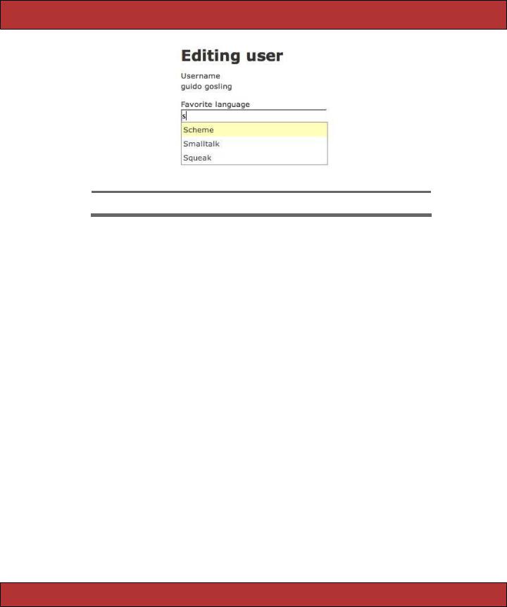
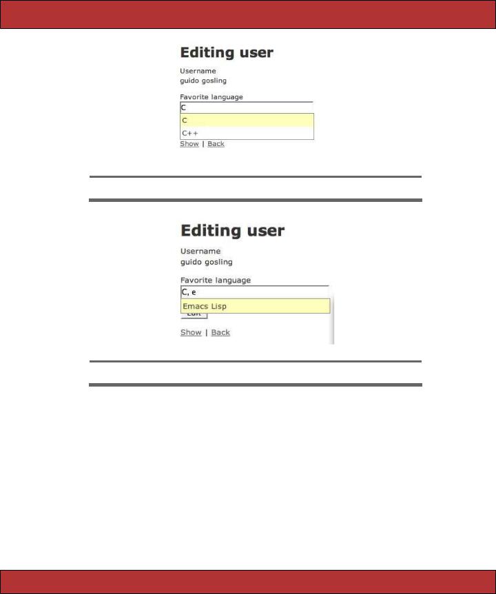
If the user needs to enter more than one value per autocompleting text field, you can specify one or more tokens that can be used to reset the behavior as they type. For example, we could allow the user to choose multiple favorite languages for the programmer by using a comma to separate the values.
<%= text_field :user, :languages %>
<div class="auto_complete" id="user_languages_auto_complete" /> <%= auto_complete_field :user_languages,
:tokens => ',' %>
As the user starts to enter a value, they’ll get the list of choices as shown in Figure 23.3, on the next page. Then, if they make a selection and type in one of the tokens (in this case, a comma), the list will show again and they can pick a second item, as shown in Figure 23.4, on the following page.
Report erratum
SCRIPT.ACULO.US  546
546
Figure 23.3: Choosing the First Item
Figure 23.4: Choosing the Second Item
Finally, you can specify a JavaScript expression to be called when the target <div> is either shown or hidden (:on_show, :on_hide) or after the text field has been updated by the user’s selection (:after_update_element). These callbacks allow you to specify other visual effects or even server-side actions in response to the user’s interaction with the autocomplete field.
On the server, you will want to write an action that can turn a partial value into a list of potential matches and return them as an HTML snippet containing just <li> elements. Our example uses a regular expression match to find the partial value anywhere in the language name, not just at the start of the name. It then renders them using a partial, taking care not to render using any layout.
Report erratum

SCRIPT.ACULO.US  547
547
Download pragforms/app/controllers/user_controller.rb
def autocomplete_favorite_language
re = Regexp.new("^#{params[:user][:favorite_language]}" , "i") @languages= LANGUAGES.find_all do |l|
l.match re end
render :layout=>false end
Download pragforms/app/views/user/autocomplete_favorite_language.rhtml
<ul class="autocomplete_list" > <% @languages.each do |l| %>
<li class="autocomplete_item" ><%= l %></li>
<% end %>
</ul>
In this case, LANGUAGES is a predefined list of possible choices, defined in a separate module.
Download pragforms/app/helpers/favorite_language.rb |
|
|
|
|
||
module FavoriteLanguage |
|
|
|
|
|
|
LANGUAGES = %w{ Ada |
Basic |
C |
C++ |
Delphi Emacs\ Lisp |
Forth |
|
Fortran |
Haskell |
Java |
JavaScript |
Lisp |
Perl |
Python |
Ruby |
Scheme |
Smalltalk |
Squeak} |
|
|
|
end |
|
|
|
|
|
|
It is equally (or even more) likely that you will want to pull the selection list from the database table itself. If so, you could easily change the code to perform a lookup on the table using a conditional find and then to render them appropriately. It turns out that if that is your expected behavior, there is a module included in Action Controller that allows you to specify that your controller supports autocomplete for a certain field of a certain class.
class UserController < ApplicationController auto_complete_for :user, :language
end
With that declaration in place, your controller now has an endpoint (called auto_complete_for_user_language in this case) that does the conditional find and formats the results as a collection of <li>s. By default, it returns the first 10 results in a list sorted in ascending order. You can always override these defaults by passing in some parameters.
auto_complete_for :user, :language,
:limit => 20, :order => 'name DESC'
Likewise, if you like the default style and behavior of the autocomplete field, you can use a different helper in the view to render the standard arrangement for you.
<%= text_field_with_auto_complete :user, :language %>
Report erratum

SCRIPT.ACULO.US  548
548
Finally, you can style the list of choices any way you desire. Rails provides a default style for you that is used by the auto_complete_for helper automatically, but you can embed it yourself if needed. This stylesheet turns a standard unordered list into something that looks and acts like a select box.
div.auto_complete { width: 350px; background: #fff;
}
div.auto_complete ul { border:1px solid #888; margin:0;
padding:0;
width:100%; list-style-type:none;
}
div.auto_complete ul li { margin:0;
padding:3px;
}
div.auto_complete ul li.selected { background-color: #ffb;
}
div.auto_complete ul strong.highlight { color: #800;
margin:0;
padding:0;
}
It is worth highlighting that there is no JavaScript to enable the arrow-up, arrow-down, highlight behavior of the list. It is enough to provide the stylesheet shown previously; all <ul> tags support that behavior (in relatively modern browsers) and just need styles to show off the changing state.
Drag and Drop and Sortable Elements
The point of all this AJAX and Web 2.0 stuff is to make your web applications more interactive—to make them more like desktop applications. There may be no more impressive example of this than drag-and-drop behavior.
There are two distinct styles of drag-and-drop behavior: moving items around within a list (sorting) and moving items around between lists (categorizing). In either case, you want to be able to specify three types of actors.
•The original container list
•The target container list (when sorting, it will be the same as the original)
•The elements that can be dragged
Additionally, you will need to specify the following behaviors.
•What to do when an item is dragged
•What to do when an item is dropped
•What information to send to the server upon completion
Report erratum

SCRIPT.ACULO.US  549
549
Figure 23.5: Drag-and-=Drop To-do Lists
Let’s look at dragging and dropping between lists to start with, and then we can see how much simpler sorting operations are. In this example, we’ll manage the to-do list for a programmer. There are two categories of todo items: pending and completed. We want to be able to drag items between the two lists and update the server whenever an item is moved.
First, let’s set up the visual portion of the page. We need to create a couple of visual spaces, one labeled “Pending” and the other labeled “Completed,” so that the user can see where to drag items.
Download pragforms/app/views/user/drag_demo.rhtml
<h2>Pending</h2>
<div id="pending_todos">
<%= render :partial=>"pending_todos" %>
</div>
<h2>Completed</h2>
<div id="completed_todos" >
<%= render :partial=>"completed_todos" %>
</div>
Each of our target <div>s has an id attribute that we’ll need later to bind behavior to the targets. Each is filled by rendering a partial; the contents of the <div>s will be <ul>s with their own ids. Here is the partial that renders the pending items.
Download pragforms/app/views/user/_pending_todos.rhtml
<ul id='pending_todo_list'>
<% @pending_todos.each do |item| %> <% domid = "todo_#{item.id}" %>
<li class="pending_todo" id='<%= domid %>'><%= item.name %></li> <%= draggable_element(domid, :ghosting=>true, :revert=>true) %>
<% end %>
</ul>
Report erratum

SCRIPT.ACULO.US  550
550
The partial creates a <ul> list of <li> elements, each with an id and of a certain class, in this case, pending_todo. You’ll see the first use of a drag-and- drop-related helper here, as well. For each <li> element, we also employ the draggable_element helper. This helper requires you to pass in the id of the element to be made draggable and allows several options.
•ghosting: Renders the item in 50% opacity during the drag (false means 100% opacity during drag)
•revert: Snaps the item back to its original location after drop (false means leave the item where dropped)
Back on the main page, we’ll have to identify the two drop targets. We’ll use the drop_receiving_element helper for that.
Download pragforms/app/views/user/drag_demo.rhtml
<%= drop_receiving_element('pending_todos',
:accept |
=> 'completed_todo', |
:complete |
=> "$('spinner').hide();" , |
:before |
=> "$('spinner').show();" , |
:hoverclass |
=> 'hover', |
:with |
=> "'todo=' + encodeURIComponent(element.id.split('_').last())" , |
:url |
=> {:action=>:todo_pending, :id=>@user})%> |
<%= drop_receiving_element('completed_todos', |
|
:accept |
=> 'pending_todo', |
:complete |
=> "$('spinner').hide();" , |
:before |
=> "$('spinner').show();" , |
:hoverclass |
=> 'hover', |
:with |
=> "'todo=' + encodeURIComponent(element.id.split('_').last())" , |
:url |
=> {:action=>:todo_completed, :id=>@user})%> |
This helper defines a target DOM element to receive dropped items and further defines the application behavior based on those events. In addition to the id of the target, the following options are available.
:accept => string
the CSS class of the items that can be dropped on this container
:before => snippet
a JavaScript snippet to execute prior to firing the server-side call
:complete => snippet
a JavaScript snippet to execute just after completing the XHR call
:hoverclass => string
applies this CSS class to the drop target whenever a candidate item is hovering over it
Report erratum
SCRIPT.ACULO.US  551
551
:with => snippet
a JavaScript snippet that executes to create the query string parameters to send to the server
:url => url
either the literal URL of the server endpoint or an url_for construct
:update => string
the DOM element to update as a result of the XHR call (in our example, we’re using RJS to update the page, which we will see in Section 23.3,
RJS Templates, on page 558)
In general, the Script.aculo.us helpers take all the same options as the Prototype helpers, since the former is built on top of the latter.
In our example, we specified that the pending_todos container accepts only completed_todo items, and vice versa. That’s because the purpose of the drag- and-drop behavior is to recategorize the items. We want to fire the XHR request to the server only if an item is moved to the other category, not if it is returned to its original location. By specifying the revert attribute on the individual draggable items, they will snap back to their original location if dropped somewhere other than a configured receiving target, and no extra round-trip to the server will be caused.
We’re also constructing our query string by parsing out the draggable item’s database id from its DOM id. Look at that JavaScript snippet.
"'todo=' + encodeURIComponent(element.id.split('_').last())"
The with parameter takes a snippet and feeds it the actual DOM element that was dropped as a variable called element. In our partial, we defined the ids of those elements as todo_database id, so when we want to send the server information on which item was dropped, we split the todo back off and send only the database id.
We’ve also defined a simple style for the drop targets and draggable elements.
Download pragforms/app/views/user/drag_demo.rhtml
<style>
.hover {
background-color: #888888;
}
#pending_todos ul li, #completed_todos ul li { list-style: none;
cursor: -moz-grab;
}
#pending_todos, #completed_todos { border: 1px solid gray;
}
</style>
Report erratum

SCRIPT.ACULO.US  552
552
The hover class causes the drop target to highlight when a draggable item is poised on top of it. The second rule specifies that any <li> elements within the pending_todos or competed_todos will use the -moz-grab cursor, the grasping hand icon, in order to provide a visual cue to the user that the item has a special property (draggability). The last rule just draws a border around our drop targets to make them obvious.
What if you wanted to create a sortable list instead of two or more categories of items? Sorting usually involves a single list whose order you want sent back to the server whenever it is changed. To create one, you need only to be able to create an HTML list and then specify what to do when the order changes. The helper takes care of the rest.
<ul id="priority_todos"> <% for todo in @todos %>
<li id="todo_<%= todo.id %>"><%= todo.name %></li>
<% end %>
</ul>
<%= sortable_element 'priority_todos',
:url => {:action => 'sort_todos'} %>
The sortable_element helper can take any of the standard Prototype options for controlling what happens before, during and after the XHR call to the server. In many cases, there isn’t anything to do in the browser since the list is already in order. Here is the output of the previous code.
<ul id="priority_todos">
<li id="todo_421">Climb Baldwin Auditorium</li> <li id="todo_359">Find Waldo</li>
</ul>
<script type="text/javascript"> //<![CDATA[
Sortable.create("priority_todos", {onUpdate:function(){ new AJAX.Request('/user/sort_todos',
{asynchronous:true, evalScripts:true, parameters:Sortable.serialize("priority_todos")})}})
//]]>
</script>
Script.aculo.us provides a helper JavaScript method called Sortable.serialize. It takes a list and creates a JSON dump of the ids of its contained elements in their current order, which is sent back to the server. Here are the parameters the action receives on re-order.
Processing UserController#sort_todos (for 127.0.0.1 at 2006-09-15 07:32:16) [POST] Session ID: 00dd9070b55b89aa8ca7c0507030139d
Parameters: {"action"=>"sort_todos" , "controller"=>"user" , "priority_todos"=>["359", "421"]}
Notice that the priority_todos parameter contains an array of database ids, not the DOM ids from the list (which were formatted as todo_421, not 421). The Sortable.serialize helper automatically uses the underscore as a delimiter to
Report erratum

SCRIPT.ACULO.US  553
553
parse out the actual database id, leaving you less work to do on the server. There is a problem with this behavior, however. The default is to eliminate everything before and including the first underscore character in the DOM id. If your DOM is is formatted as priority_todo_database id, then the serializer will send "priority_todos"=>["todo_359", "todo_421"] to the server. To override that, you have to provide the format option to the helper, which is just one of many sortable-specific options. In addition, you can pass any of the options that we have seen previously.
:format => regexp
a regular expression to determine what to send as the serialized id to the server (the default is / [ _]*_(.*)$/)
:constraint => value
whether to constrain the dragging to either :horizontal or :vertical (or false to make it unconstrained)
:overlap => value
calculate the item overlap in the :horizontal or :vertical direction
:tag => string
which children of the container element to treat as sortable (default is LI)
:containment => target
takes an element or array of elements to treat as potential drop targets (defaults to the original target element)
:only => string
a CSS class name or array of class names used to filter out child elements as candidates
:scroll => boolean
determines whether to scroll the list during drag operations if the list runs past the visual border
:tree => boolean
determines whether to treat nested lists as part of the main sortable list. This means that you can create multi-layer lists, and not only sort items at the same level, but drag and sort items between levels
For example, if your list uses DOM ids that look like priority_todo_database_id but also has items in it that couldn’t be sorted, your declaration might look like
<%= sortable_element 'priority_todos',
:url => {:action => 'sort_todos'}, :only => 'sortable',
:format => '/^priority_todo_(.*)$/' %>
Report erratum
SCRIPT.ACULO.US  554
554
In-place Editing
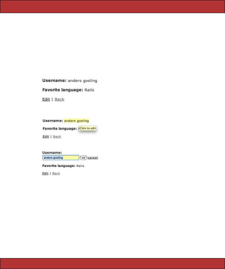
In-place editing is a convenience feature when you don’t want to create a fullfledged edit screen for every little piece of data on the page. Sometimes, there are only one or two items on a screen that need to be editable; instead of rendering them as an ugly and style-killing input field, you can render them as styled text but provide your users with a way to quickly switch them to an editable version and then switch back after the edit is complete.
Script.aculo.us provides helper methods for both the view and the controller to aid in creating the in-place editor. Let’s look first at how the page should act. Here’s the edit page for a user using in-place fields in normal mode.
The user mouses over the name field, getting an indication that the field is editable.
And here’s what the page looks like in full edit mode for the name field.
If you stick with the default settings, this is incredibly easy to create. In your controller, specify the name of the model class and column names you want your controller to support in-place editing for.
class UserController < ApplicationController in_place_edit_for :user, :username in_place_edit_for :user, :favorite_language
# ...
These helper methods actually create methods called set_user_username and set_user_favorite_language in your controller that the form will interact with to update the field data. These generated methods will update the current model instance with the new data and return the newly saved value.
Report erratum

SCRIPT.ACULO.US  555
555
Use the in_place_editor_field helper to create the control. In our example, we just iterate over all the columns on the model and create one for each.
Download pragforms/app/views/user/inplace_demo.rhtml
<% for column in User.user_columns %>
<p>
<b><%= column.human_name %>:</b>
<%= in_place_editor_field "user", column.name, {}, {
:load_text_url=> url_for(:action=>"get_user_#{column.name}", :id=>@user) } %>
</p>
<% end %>
<%= link_to 'Edit', :action => 'edit', :id => @user %> | <%= link_to 'Back', :action => 'list' %>
That’s all you need to create the default version. There are plenty of options you can specify to alter the default behavior, however.
:rows => number
number of rows of text to allow in the live editing field. If the value is more than 1, the control switches to be a <textarea>
:cols => number
number of columns of text to allow
:cancel_text => "cancel"
the displayed text of the link that allows the user to cancel the editing action
:save_text => "ok"
the displayed text of the button that allows the user to save the edits
:loading_text => "Loading..."
the text to display while the edits are being saved to the server; this is the equivalent of the progress indicators we used elsewhere
:external_control => string
the DOM id of a control that is used to turn on edit mode. Use this to override the default behavior of having to click the field itself to edit it
:load_text_url => string
a URL to send an XHR request to retrieve the current value of the field. When not specified, the control uses the innerText of the display field as the value
For example, with the form we have shown so far, if the user edits the username field and sets it to nothing, when they save the value, the field is no longer editable. This is because the default behavior is to make the user click the field itself to edit it, and if the field is blank, there is nothing to click. Let’s provide an external control to click instead of the field itself.
Report erratum

SCRIPT.ACULO.US  556
556
<% for column in User.user_columns %>
<p>
<input type="button" id="edit_<%= column.name %>" value="edit"/>
<strong><%= column.human_name %>:</strong>
<%= in_place_editor_field "user", column.name, {}, {:external_control => "edit_#{column.name}" } %>
</p>
<% end %>
This looks like the following.
Further, in the case of the blank value, you might want to provide some kind of default text in the editor field when the user goes to edit mode. To provide that, you have to create a server-side action that the editor can call to ask for the value of the field and then provide that in the load_text_url option. Here’s an example of creating your own helper method, much like in_place_edit_for to provide a default value.
class UserController < ApplicationController
def self.in_place_loader_for(object, attribute, options = {}) define_method("get_#{object}_#{attribute}") do
@item = object.to_s.camelize.constantize.find(params[:id]) render :text => @item.send(attribute) || "[No Value]"
end end
in_place_edit_for :user, :username in_place_loader_for :user, :username in_place_edit_for :user, :favorite_language in_place_loader_for :user, :favorite_language
In the view, you just pass the appropriate option.
<% for column in User.user_columns %>
<p>
<input type="button" id="edit_<%= column.name %>" value="edit"/>
<b><%= column.human_name %>:</b>
<%= in_place_editor_field "user", column.name, {}, {:external_control => "edit_#{column.name}" ,
:load_text_url=> url_for(:action=>"get_user_#{column.name}", :id=>@user) } %>
</p>
<% end %>
It looks like this.
Report erratum

SCRIPT.ACULO.US  557
557
Notice that the editor field has [No Value] in the text field since no value was retrieved from the database. Also, you can see that the in-place editor takes care of hiding the external button control when in edit mode.
Visual Effects
Script.aculo.us also provides a bevy of visual effects you can apply to your DOM elements. The effects can be roughly categorized as effects that show an element, effects that hide an element, and effects that highlight an element. Conveniently, they mostly share the same optional parameters and they can be combined either serially or in parallel to create more complex events.
The Script.aculo.us helper method visual_effect is used to generate the JavaScript equivalent. It is primarily used to assign the value to one of the life cycle callbacks of the standard Prototype helpers (complete, success, failure, etc).
For a full list of all the available effects, visit http://script.aculo.us. Instead of doing an exhaustive reference, we’re going to look at applying some in practice.
Think back to the drag-and-drop example. Let’s say you wanted to also highlight the drop target after its elements have been updated. We are already bound to the complete callback to turn off the progress indicator.
<%= drop_receiving_element('pending_todos', :accept=>'completed_todo', :complete=>"$('spinner').hide();" , :before=>"$('spinner').show();" ,
:hoverclass=>'hover',
:with=>"'todo=' + encodeURIComponent(element.id.split('_').last())" , :url=>{:action=>:todo_pending, :id=>@user})%>
To add a visual highlight effect, we just append it to the complete option:
<%= drop_receiving_element('pending_todos', :accept=>'completed_todo', :complete=>"$('spinner').hide();" + visual_effect(:highlight, 'pending_todos'), :before=>"$('spinner').show();" ,
:hoverclass=>'hover',
:with=>"'todo=' + encodeURIComponent(element.id.split('_').last())" , :url=>{:action=>:todo_pending, :id=>@user})%>
You can use the appear/disappear effects to fade the progress indicator in and out as well.
<%= drop_receiving_element('pending_todos', :accept=>'completed_todo', :complete=>visual_effect(:fade, 'spinner', :duration => 0.5), :before=>visual_effect(:appear, 'spinner', :duration => 0.5), :hoverclass=>'hover',
:with=>"'todo=' + encodeURIComponent(element.id.split('_').last())" , :url=>{:action=>:todo_pending, :id=>@user})%>
There are three visual effects that let you specify them as toggle effects. These are reversible pairs of effects that let you show/hide an element. If you specify
Report erratum